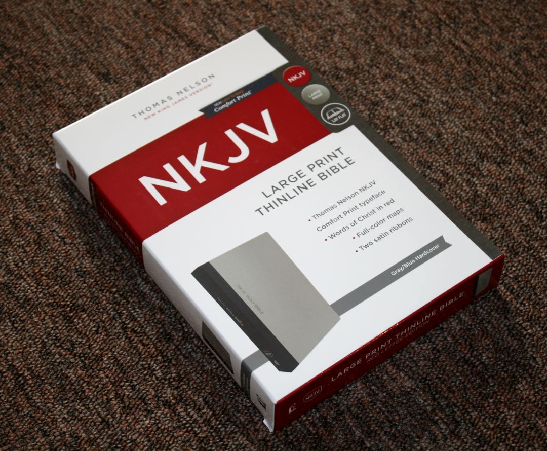
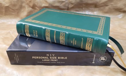
Thomas Nelson’s Comfort Print line has now been released in the New King James Version. Like the KJV and NIV, the NKJV has its own typeface designed specifically for it by 2K/Denmark. The Comfort Print typeface is part of Thomas Nelson’s beautiful Bible initiative, with the goal of making Bibles with better materials and designs. I’m reviewing the hardcover edition, ISBN: 9780718075569, made in China.
Thomas Nelson provided this Bible free for review. I was not required to give a positive review, only an honest one. All opinions are my own.
_________________________________________________________
This book is available at (includes some affiliate links)
and many local Bible bookstores
_________________________________________________________
Cover and Binding
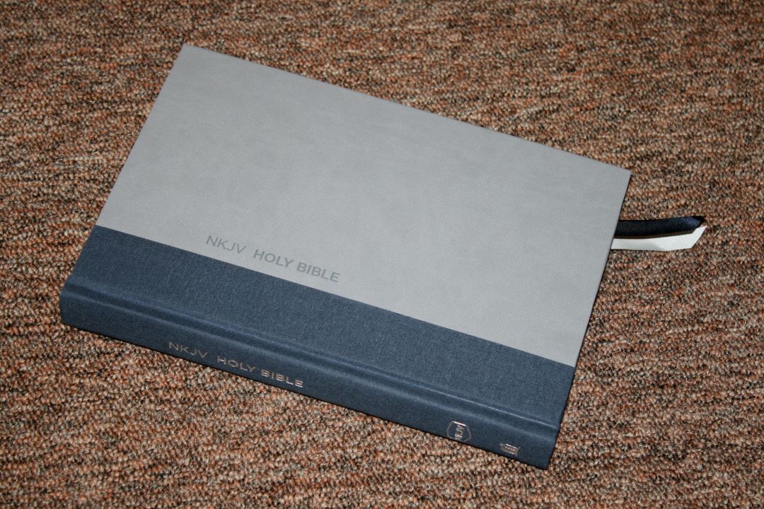
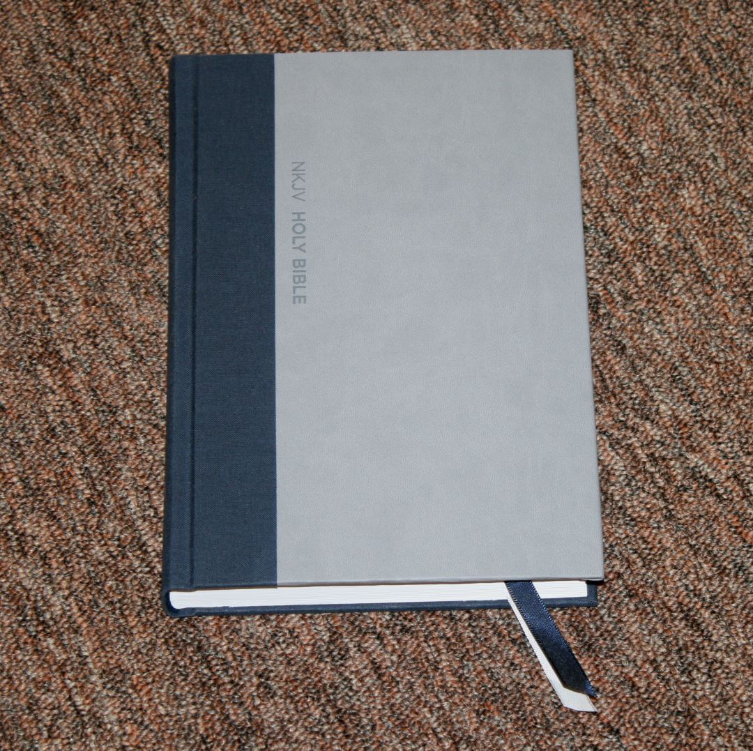
This edition is gray/blue hardcover. The blue portion is cloth and covers the back and spine, wrapping around to the front. The gray portion covers most of the front and has a different texture and feel. The blue is rough while the gray is smooth. This creates an interesting feeling when holding it.
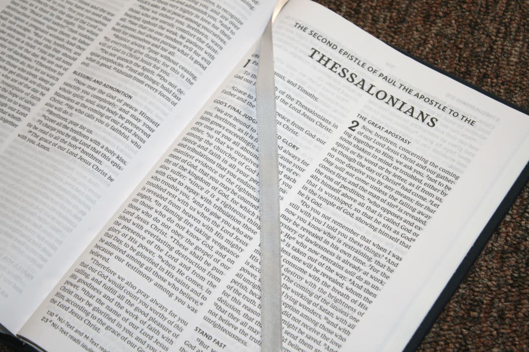
The binding is sewn and has no trouble lying open on any page. It includes two satin ribbons- one blue and one gray. The ribbons are thick, measuring 10mm. The overall size is and it weighs lbs. It’s thin and light, making it great for carry as long as you don’t need a smaller edition.
Paper
The paper is thin but opaque. I don’t know the thickness, but I think it’s somewhere around 28gsm. It’s white in color and extremely opaque- especially considering how thin it is. Even though the paper is thin, it has enough texture that I can rub the pages together to separate them with one hand. It’s also easy to grab the corner to turn pages. Most of the time I never had any issues with turning the pages. It has a little bit of cockling (where the paper wrincles in the gutter).
Typography
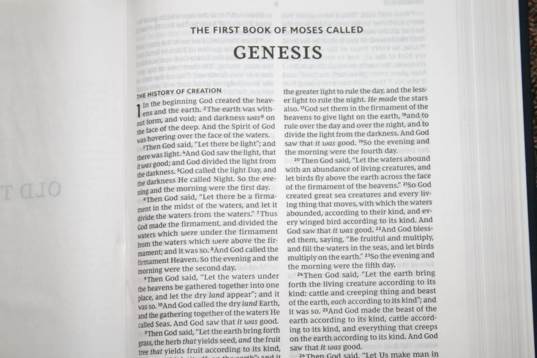
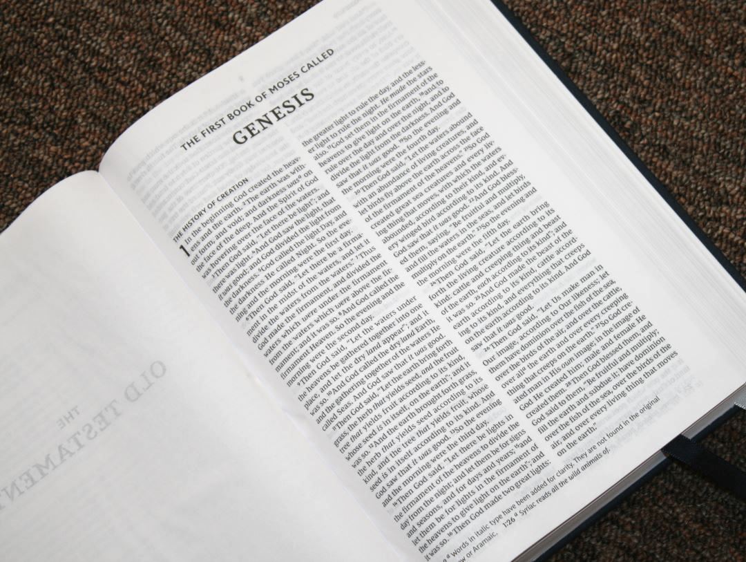
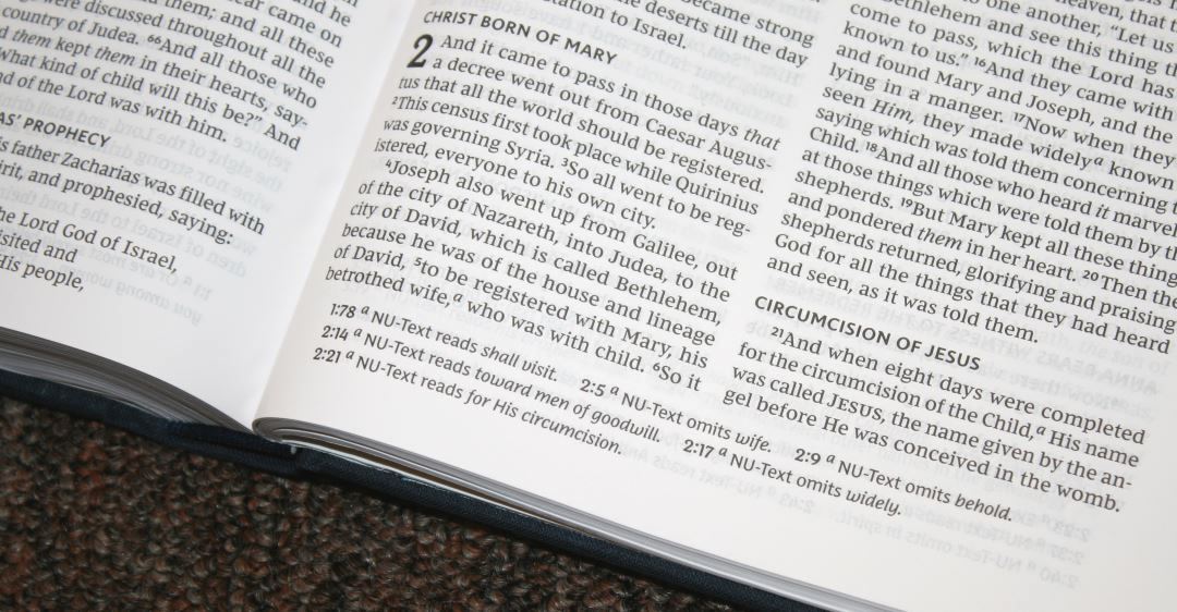
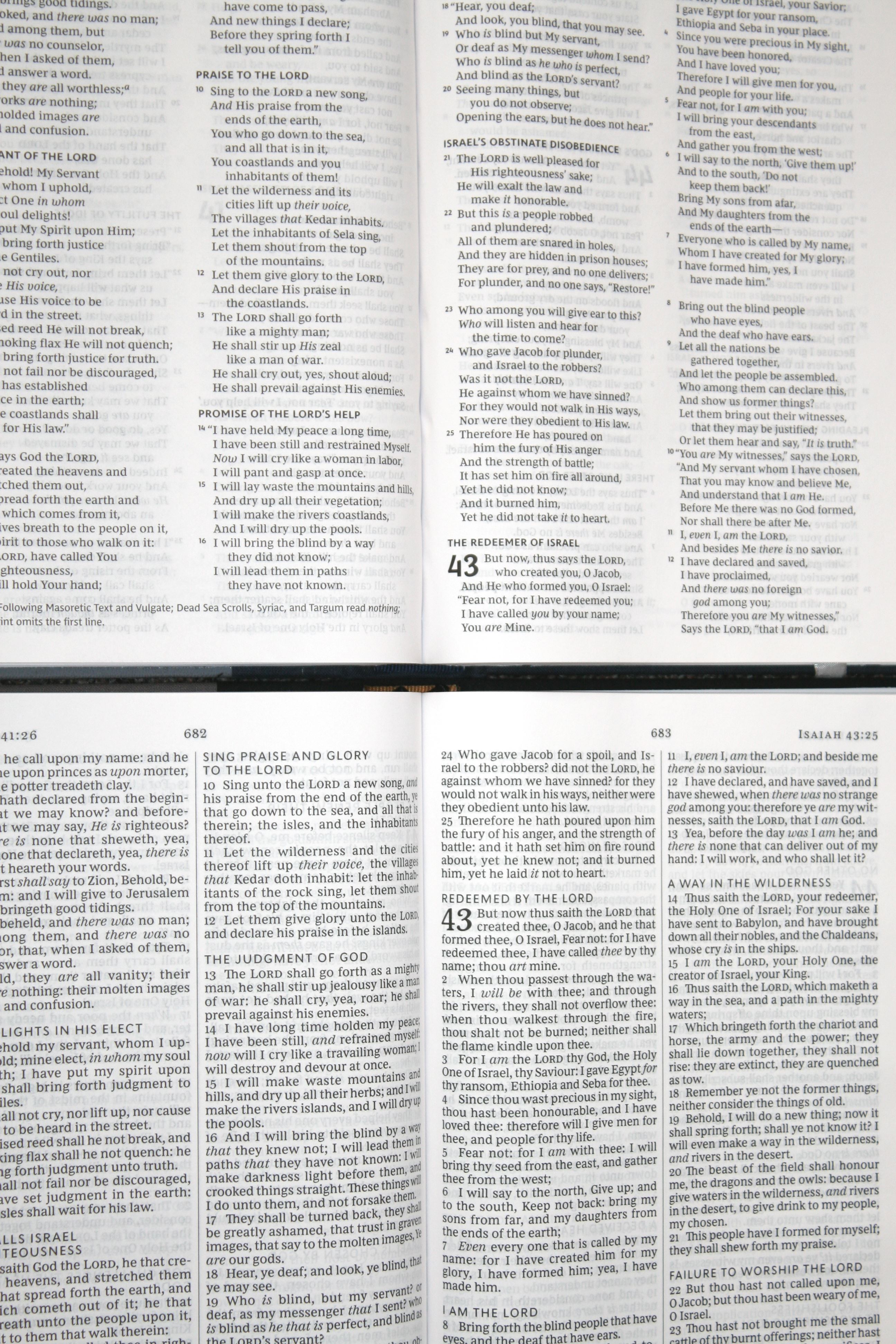
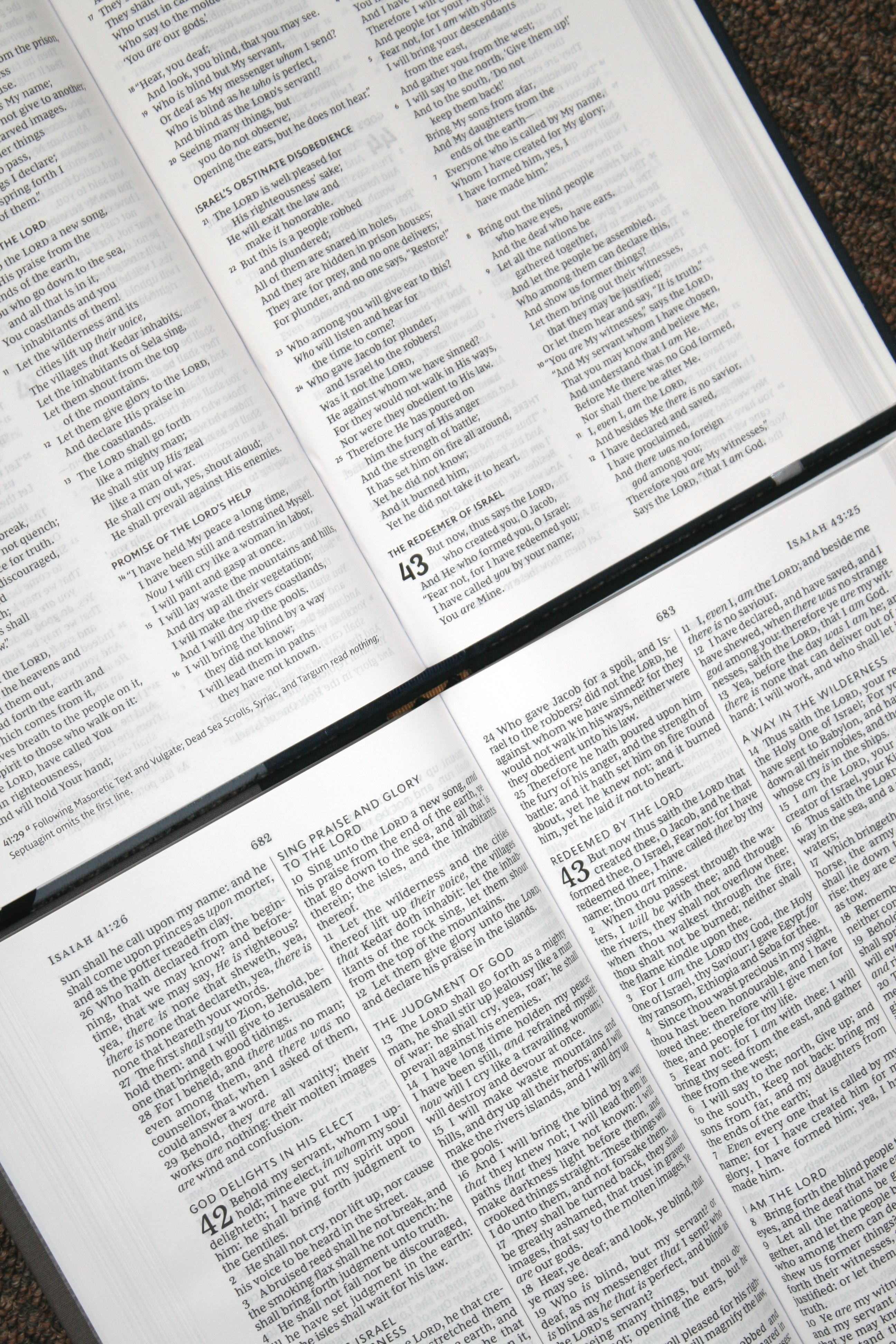
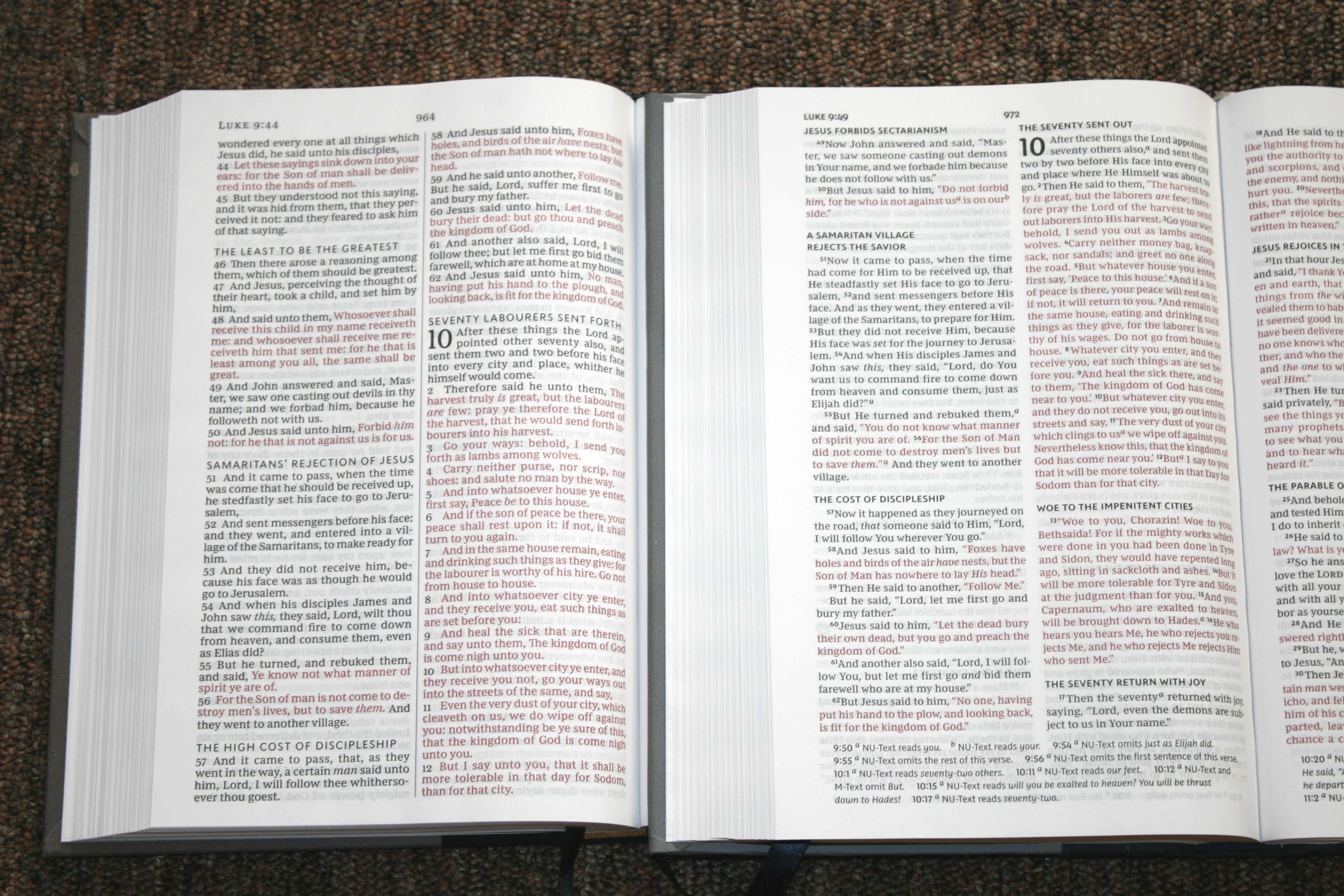
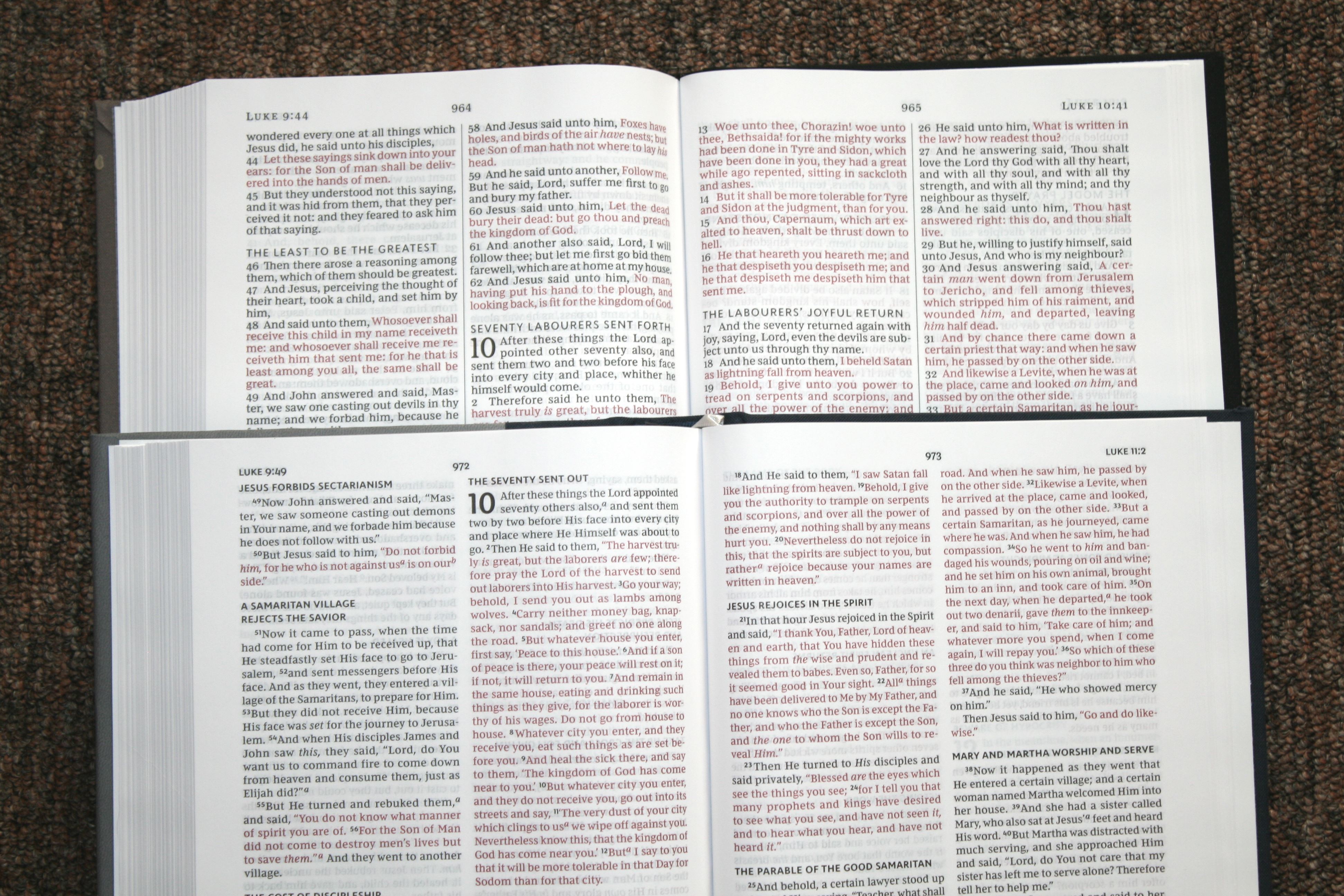
This is a text edition with translation footnotes and section headings. The text is presented in double-column paragraph format with footnotes in the footer. The header includes the page number in the center and the book name, chapter, and verse number in the outer margin. Section headings are bold and are printed in all-caps.
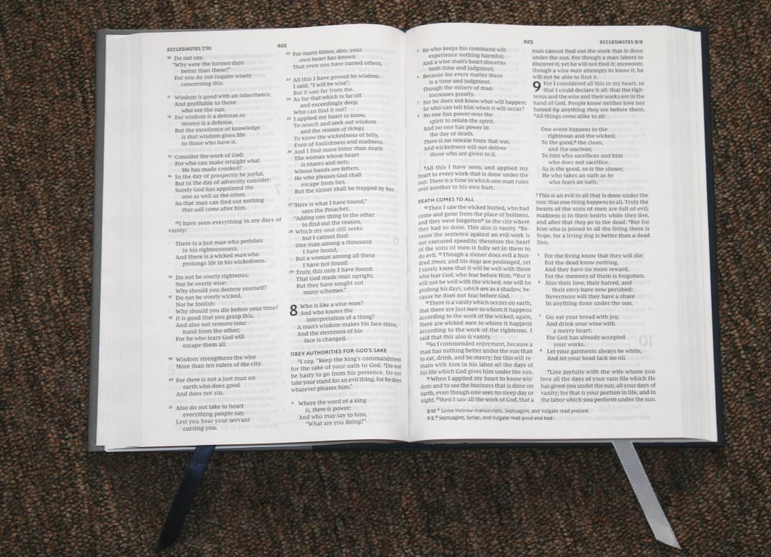
The Comfort Print typeface is 10.5 red letter. It’s slightly different from the KJV Comfort Print edition but it’s not so different that they don’t look related to each other. The typeface design is beautiful. This is an excellent typeface for reading and it doesn’t take as much space as the older typefaces, which allows more verses per page without it feeling crowded. The red is a medium to dark shade. Both the red and black are consistent throughout. The lines are matched on both sides of the page perfectly.
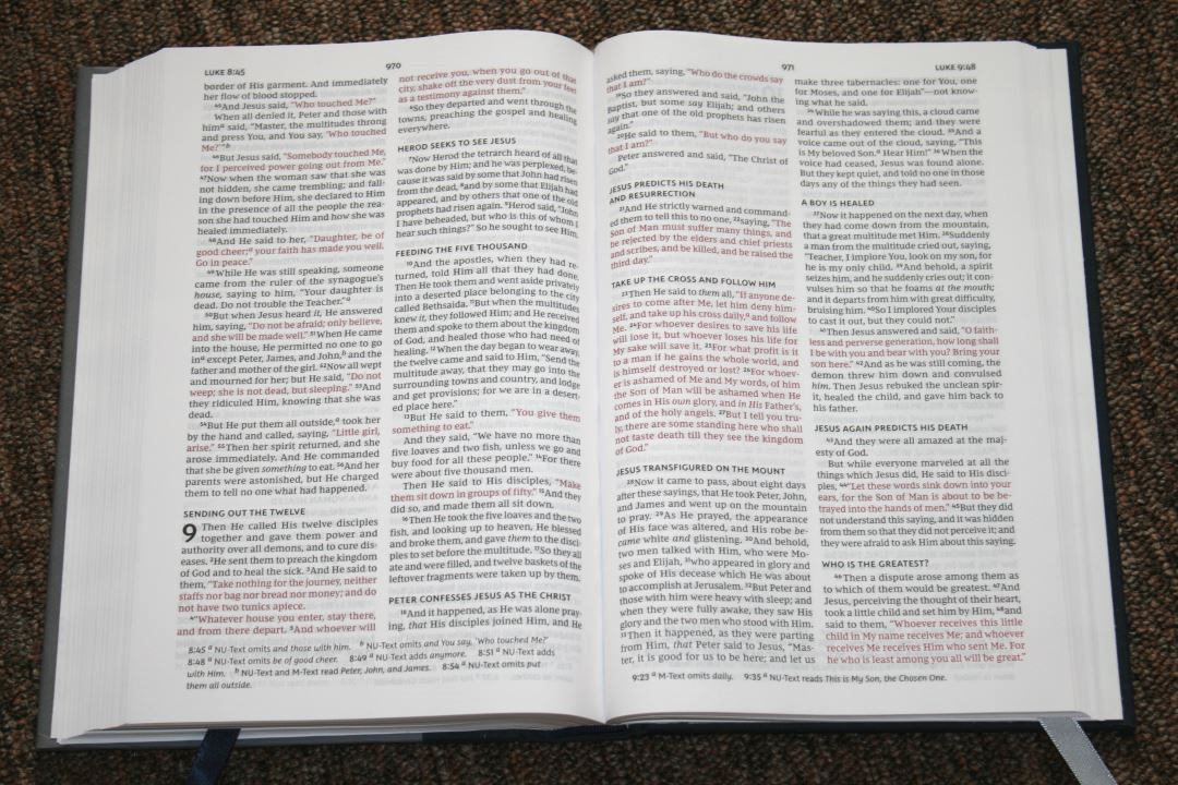
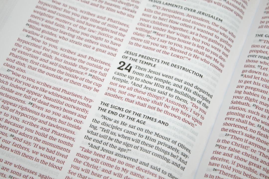
The two columns of text are wide enough to help create a highly readable layout. It has around 46 characters across and around 10 words per line. There’s always enough room so the text never feels cramped or has too much space. The poetic settings are beautiful. It’s difficult to get poetry right in double column layouts, but 2K/Denmark has done it with this one.
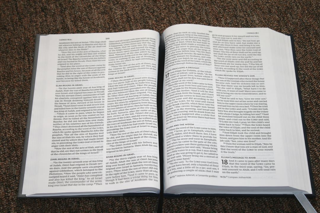
Translation footnotes are placed under the text and include the chapter and verse number, and then the letter the footnote is keyed with. The footnotes are not as large as the text but they’re still large.
I found this text to be great for preaching, teaching, and reading.
30 Days With Jesus

This is a table that provides 30 readings with each reading based on a specific theme. It includes the theme and list of passages for that theme. Many of them include reading from multiple locations. They cover themes such as his birth, specific healings, specific miracles, teachings, etc. These are excellent for devotionals.
Reading Plan
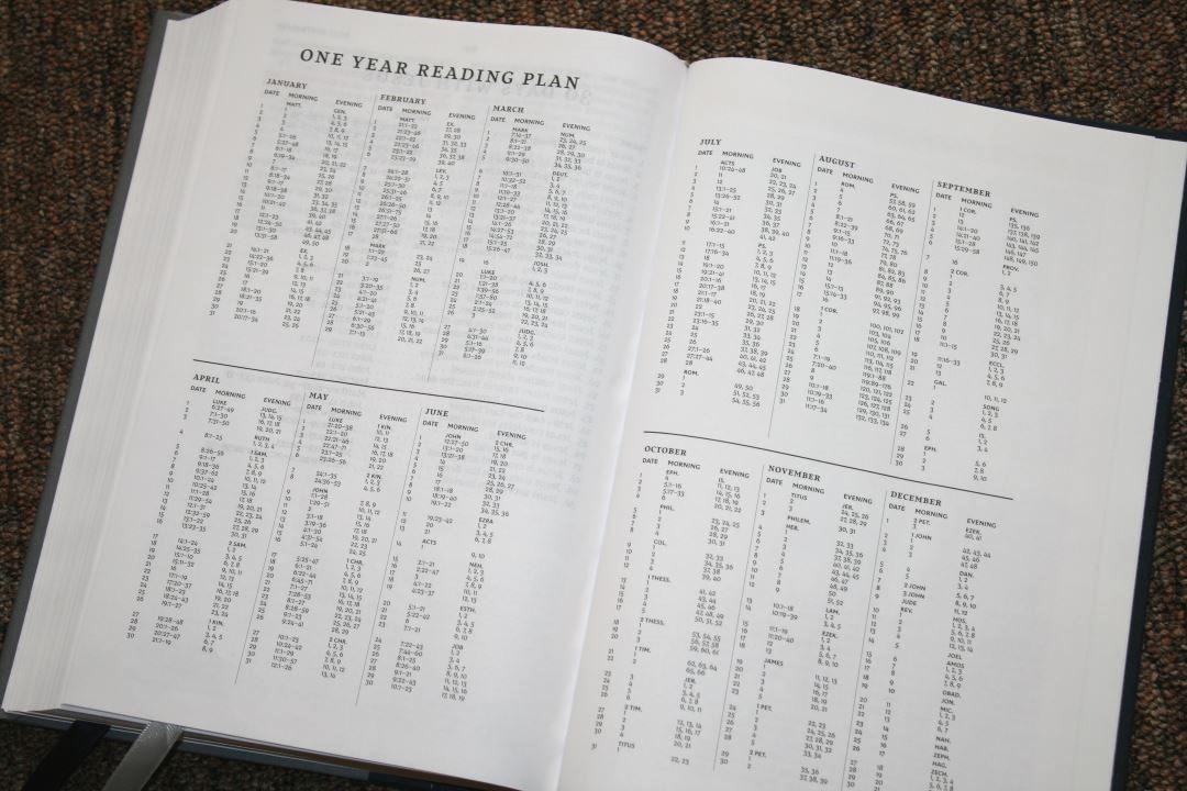
It includes a one-year reading plan, which provides two readings per day- one for the morning and one for the evening. The morning reading starts in the book of Matthew and the evening reading starts in Genesis. It also provides the month and day for each reading.
Maps
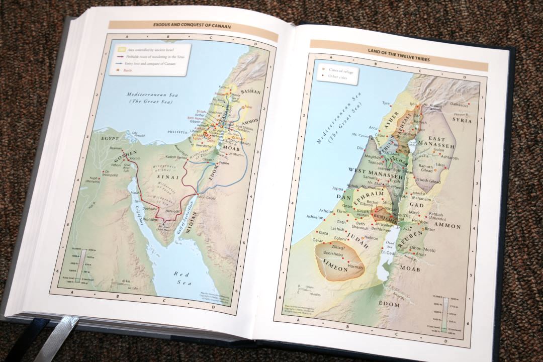
It has 8 pages of maps with 7 maps total on thick glossy paper. They cover topography with elevation key, distance, routes of journeys, battle locations, cities, kingdoms, controlled territories, roadways, dates, annotations, etc. The colors aren’t excessively bright but they’re bold enough to stand apart from each other. These are the types of colors I prefer for maps.
Maps include:
- World of the Patriarchs
- Exodus and Conquest of Canaan
- Land of the Twelve Tribes
- Kingdom of David and Solomon
- Jesus’ Ministry
- Paul’s Missionary Journeys
- Jerusalem in the Time of Jesus
Final Thoughts on the NKJV Thinline Bible
Thomas Nelson’s NKJV Large Print Thinline is an excellent addition to the Comfort Print line. The paper and print quality is top-notch for such an inexpensive edition and 2K/Denmark hit another home run with the layout and typeface. This is one of the best NKJV designs that I’ve seen. I’m glad to see the NKJV getting some design-love. Thomas Nelson’s NKJV Large Print Thinline is an excellent choice for reading, carry, teaching, and preaching.
Here are a few other articles related to the Comfort Print line:
KJV Large Print Thinline Review
_________________________________________________________
This book is available at (includes some affiliate links)
and many local Bible bookstores
_________________________________________________________
Photography by hannah C brown
Thomas Nelson provided this Bible free for review. I was not required to give a positive review, only an honest one. All opinions are my own.


Thank you again Randy so much for your time and effort in producing these reviews. You are the only one that does so many pictures with the size & typeface comparisons and it is such a blessing.
My initial impressions so far for this new Comfort Print Line:
I like it so much better than the new KJV Comfort Print Line. I really would of loved to have seen the KJV in a 2 Column-Paragraph Style just like the NKJV as well. We only have the Pitt Minion KJV in this format that I am aware of and for me it is so frustrating that we can’t get more typefaces for the KJV to be just like the NKJV.
So far this appears to be one of the best 2-Column Layout for the NKJV… IMO.
I have two large print and two standard print (black & brown leather soft.)
The Large Print lays pretty flat and I am impressed by this considering each was about $26.
The Standard Print does not lay flat as told, but I am use to this from most manufacturers for this size Bible. But it is still nice and about 150 to 200 pages in it will be laying flat with potential to lay a little flatter with more breaking in.
There is still a little bit of ghosting, but overall the paper is actually very nice and for this price it is a great deal.
I also tested the Value Thinline for 90cents less (14.99) than the normal standard print thinline (15.80) and it only has 1 ribbon compared to 2, the text on the inside margin goes a little more into the gutter, and there is no art gilding. The Value thinline is slightly smaller but lays less flat; it fought me more and will not lay flat even after breaking in. So I recommend the normal Thinline Standard Print.
NOTE: Though the pages are very nice for the price they do tend to stick together which is a manufacturing issue. But for the price I would not dare complain myself. I would suggest being very careful when you first get it and break it in properly with some nice fanning out of the pages. 😉
Some other thoughts on the 2-Column Paragraph NKJV Bibles available:
I really like the Holman Compact Ultrathin NKJV- 978-1-43364645-4.
This is also a typeface that was designed by 2K/Denmark.
But I have not found this typeface in a 8p font or higher.
The compact font can be hard to read for most.
Then there is the Pitt Minion NKJV.
This is a keeper for me for the size though it can be hard to read for most with the small font.
Why Cambridge has yet to produce this Typeface in a large font but in the same size as the Concord (KJV) boggles my mind.
The Wide-margin is still too small of a print IMO; so picture the NKJV Pitt Minion with an 8, 8.5, or 9p font and at the same size as the Cambridge Concord and you would have a winner.
We will also be getting the NKJV Personal Size Quentel very soon (per a Facebook Quote from one of the staff at EVB.com the NKJV is right behind the KJV, so I am assuming sometimes around the summer of 2018.) There is also a potential for the Wide-margin version of a NKJV Quentel just like the other versions and per the last survey it could possibly be an 8p to 9p font for all versions but yet to be decided of course.
I am more of an old school font person and find the Quentel Series actually harder to get use to and read. I also compared the Typeface of the New Comfort Print Line NKJV with the Regular Size (aka- Brick) NKJV Quentel- some of the poetry & prophecy lines are similar while others have a word or 2 more per line which I think makes it easier to read. The normal paragraph sections of the new comfort print also appear to have at least one more word per line consistently.
R.L. Allan got a hold of the Nelson Single Column NKJV. So maybe one day they will be able to get this Typeface and produce some very nice versions down the road.
Thanks all for reading and again thanks to Randy & his Wife for their reviews and updates on the new Bible releases. :):):)
Hi James! Thanks for the compliments and for your thoughts on these editions. We’re on the page. Another I’m hoping to see published is the Thinline Quentel in NKJV.
I purchased this Bible and it’s even better in person than it looks on here. Compared to Bibles under $100, this has some of the easiest to read print. For $20ish, it’s one of the best NKJV on the market.