
I recently had the opportunity to interview Doug Lockhart of HarperCollins about their new Comfort Print® line. We talked about the Beautiful Bible Initiative, the various Comfort Print® typefaces, and how this affects the reading experience. Needless to say I’m excited about the direction they’ve gone with their Bible designs. You’ll see why in this interview. Here’s the unedited interview…
Please introduce yourself to our readers.
Doug Lockhart, Senior Vice President, Bible Marketing and Outreach, HarperCollins Christian Publishing.
One of the phrases I’ve heard in the Bible publishing industry is Thomas Nelson’s and Zondervan’s Beautiful Bible Initiative. What is the Beautiful Bible Initiative?
HarperCollins Christian Publishing launched the Beautiful Bible Initiative in December 2015 to ensure that Thomas Nelson and Zondervan Bibles are beautiful in three significant ways: on the outside; on the inside; and in how they are communicated to the marketplace. We formed cross-functional teams who used their creativity and expertise to bring this vision to life. One of the results of the Beautiful Bible Initiative is the creation of three new, proprietary typefaces for the KJV, NKJV, and NIV translations, called Comfort Print® typefaces.
Tell us about Comfort Print® and what that means to Bible design and reading.
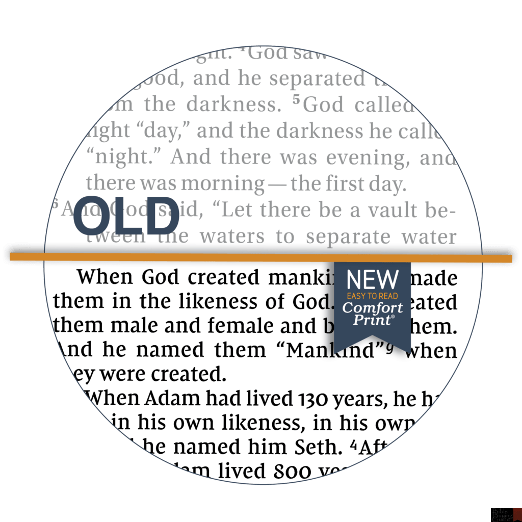
Thomas Nelson and Zondervan teamed up with 2K/DENMARK, the world’s foremost Bible type foundry, to develop these handcrafted Comfort Print® typefaces. The new Comfort Print® fonts draw out the unique character of each translation while simultaneously making Bible reading more comfortable and enjoyable, allowing readers to take in more of the story.
The Comfort Print® fonts were designed by 2K/Denmark. Why did you choose 2K/Denmark as your partner for font design?
2K Denmark has demonstrated a long-term commitment to the Bible. They love the Bible and their competencies are clear. The creation of three new, custom fonts was the most significant typeface order in Bible typeface design history, and 2K/DENMARK was eager to take on the challenge. 2K/DENMARK specializes in type design and typesetting, and they have deep roots in typography, design, and art history, so they understand and respect their craft—but they also dare to find new solutions using new technology. In addition to creating beautiful fonts, 2K/DENMARK rose to the challenge of making all three Comfort Print® typefaces extremely efficient, so we can often reduce the page count of our Bibles, especially in the NIV.
The KJV, NKJV, and NIV will have their own typefaces. What is the significance of this?
Correct! The first KJV Comfort Print® Bibles released in March 2017, the first NIV Comfort Print® Bibles in November 2017, and the first NKJV Comfort Print® Bibles will release in January 2018. Each of these translations has its own unique history and personality, so each has its own typeface.
After we drafted the initial brainstorm for the KJV and NKJV fonts, 2K/DENMARK founder Klaus Krogh completed significant research in Scotland, talking to bookstores and in university libraries. At St. Andrews University, he discovered a Thomas Nelson Bible from the 1840s with a distinctive Scotch-Roman typeface. This Bible served as the fundamental inspiration for the new Thomas Nelson KJV font.
The NKJV typeface balances its heritage with the KJV along with a modern feel for the NKJV user of today.
The NIV typeface faced a different challenge from the KJV: since it would not be based on historical inspiration, the typeface had to reflect the essence of the NIV—that is, it had to be authoritative, accessible, and global.
How has the Beautiful Bible Initiative affected your choices of paper?
The Beautiful Bible Initiative has caused our team to look at every aspect of producing a beautiful Bible including paper. Our team has assessed various paper weights, quality, and more efficient trim sizes. All to create the best reading experience.
The Beautiful Bible Initiative includes the outside as well as the inside. Tell about how this affects cover design and what types of covers we can expect to see.
We’ve evaluated and looked for new and innovative cover materials and design. Each Bible product is unique. Several new materials have already been included on Comfort Print® Bibles that have, and are currently releasing in the market. Material quality, new materials, creative treatments, and use of color have all been considered.
How will the Beautiful Bible Initiative affect layout design? Will we see a stronger focus on the text?
With the Comfort Print® portion of our strategy, we are very focused on the text, making sure people have a comfortable reading experience with every print size. This is and will continue to be a primary focus. You may have seen our recent releases of Reading Bibles in both the NKJV and NIV, as well as Sola Scriptura, a four-volume reading Bible in the NIV.
Do you have any parting thoughts for our readers?
It’s been a joy to see our Comfort Print® fonts go from concept to reality. These beautiful fonts, compelling layouts, and great cover designs are all coming together to create an engaging experience for Bible readers. Comfort Print® Bibles are easier to read at every size. Our hope is that consumers will read more, read longer, and read with enhanced comprehension.
How can our readers learn more about the Beautiful Bible Initiative and Comfort Print® Bibles?
To learn more about Comfort Print®, Zondervan’s new NIV Comfort Print® Bibles, and future Comfort Print® Bibles releasing from HarperCollins Christian Publishing, visit www.ComfortPrintBibles.com.
Ending Thoughts
I’d like to thank Doug Lockhart and HarperCollins for this interview opportunity. I’ve seen the KJV and NIV Comfort Print® Bibles and I’m impressed. The typeface, paper, and covers all look amazing. I love this new direction from publishers to place an emphasis on readability. This is something I’ve wanted for a long time and I’m grateful that publishers are on the same page. They’re keeping 2K/Denmark busy – and rightfully so as they’re some of the best Bible designers in the business. This is a great time for Bible publishing. I like the Comfort Print® line and I’m looking forward to what Thomas Nelson and Zondervan will bring us in 2018.


Trackbacks/Pingbacks