The New King James Version has always held a special place in my heart. My very first review Bible I ever received was a hardcover NKJV in 1984 and I’ve been in love with the translation ever since. Even though it’s a popular translation it hasn’t gotten a lot of quality editions. Schuyler fixes this problem with their NKJV Quentel. In this review, I take a look at the NKJV Quentel in black goatskin. Like all Schuyler’s it comes in a nice box for storage (all of mine stay in their boxes).
Schuyler’s Quentel Series
Schuyler’s Quentel is a series of premium Bibles that follow a specific design standard:
- Goatskin leather
- Sewn binding
- 11-point Milo font
- 36gsm or above paper
- 3 elegant ribbons
- 2K/Denmark design
- Jongbloed construction
Schuyler refines the Quentel with every edition. I believe the NKJV is the best one yet. I can sum up Schuyler’s flagship line of Bibles in one word: elegant.
Binding
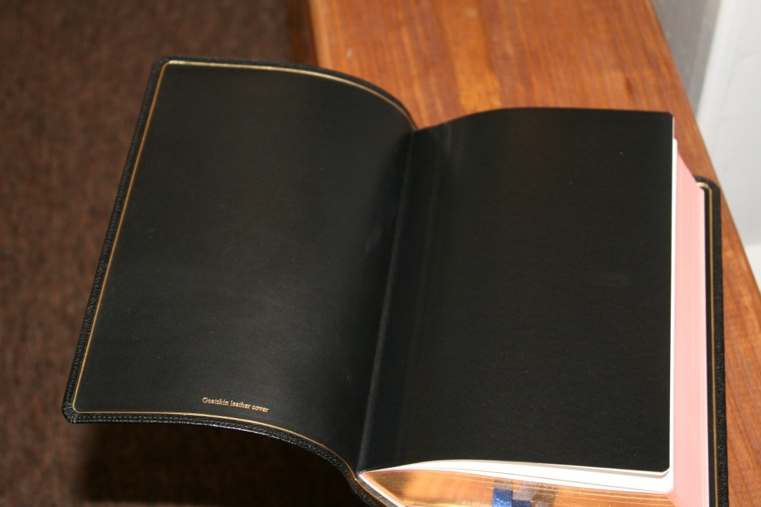
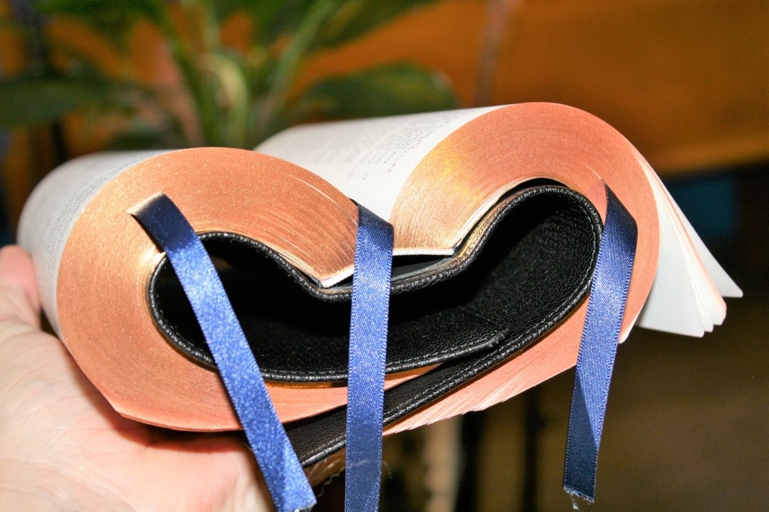
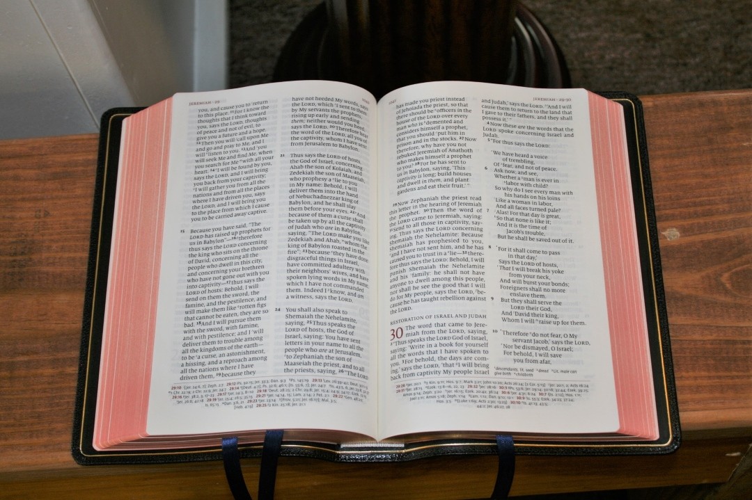
The cover is a natural grain goatskin that’s soft and pliable. The liner is actually edge-lined calfskin. It has a gold gilt-line on the inside of the cover that gives it an extra feel of elegance. It’s far more flexible than my first edition ESV Quentel but still retains its strength. It might take a few days for the cover to lay open in Genesis 1. With Schuyler’s hinge design you won’t have a Bible that splits with use. This thing is built to last and I have no doubts that it will. It’s Smyth sewn and lies flat easily.
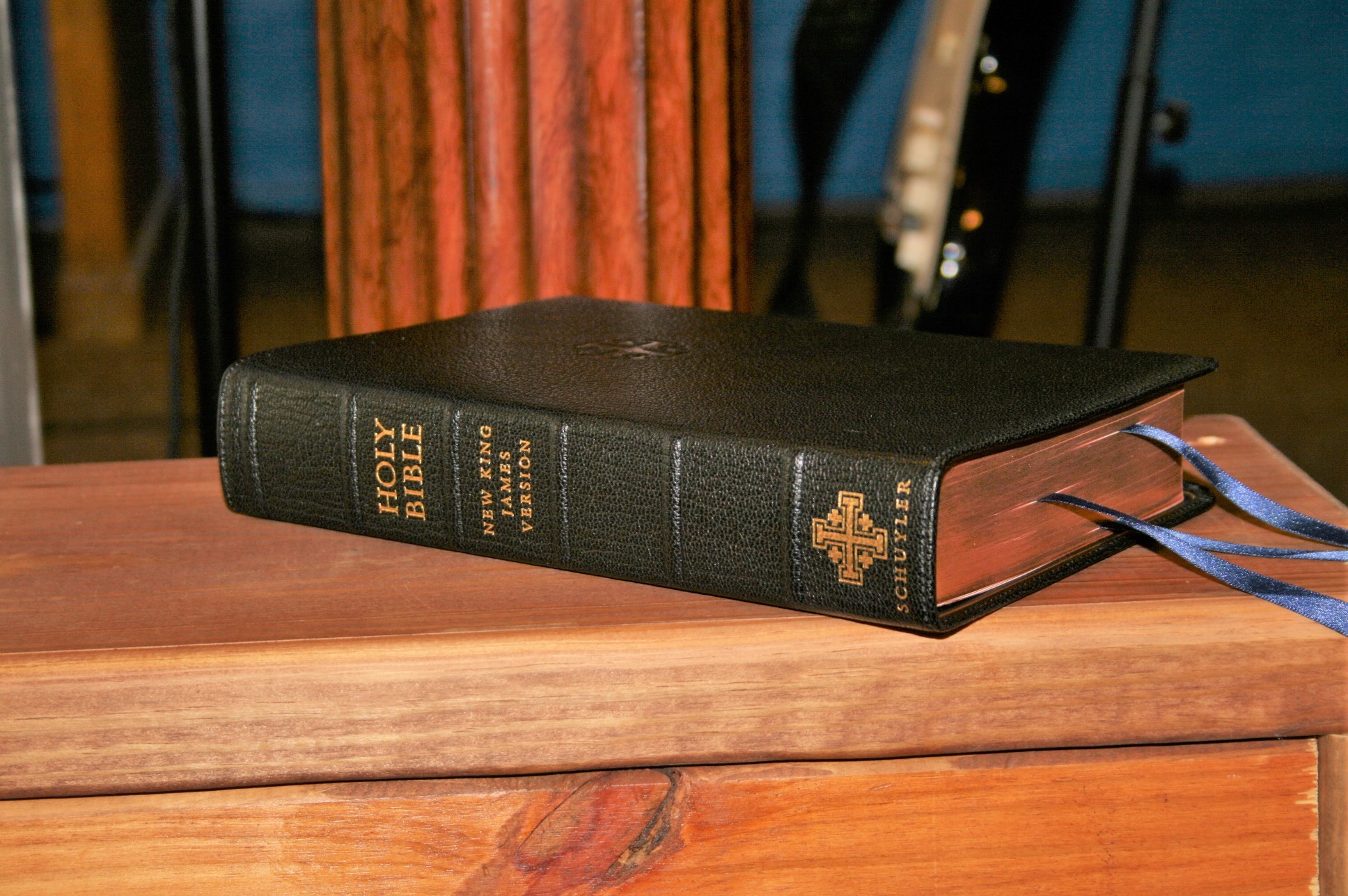
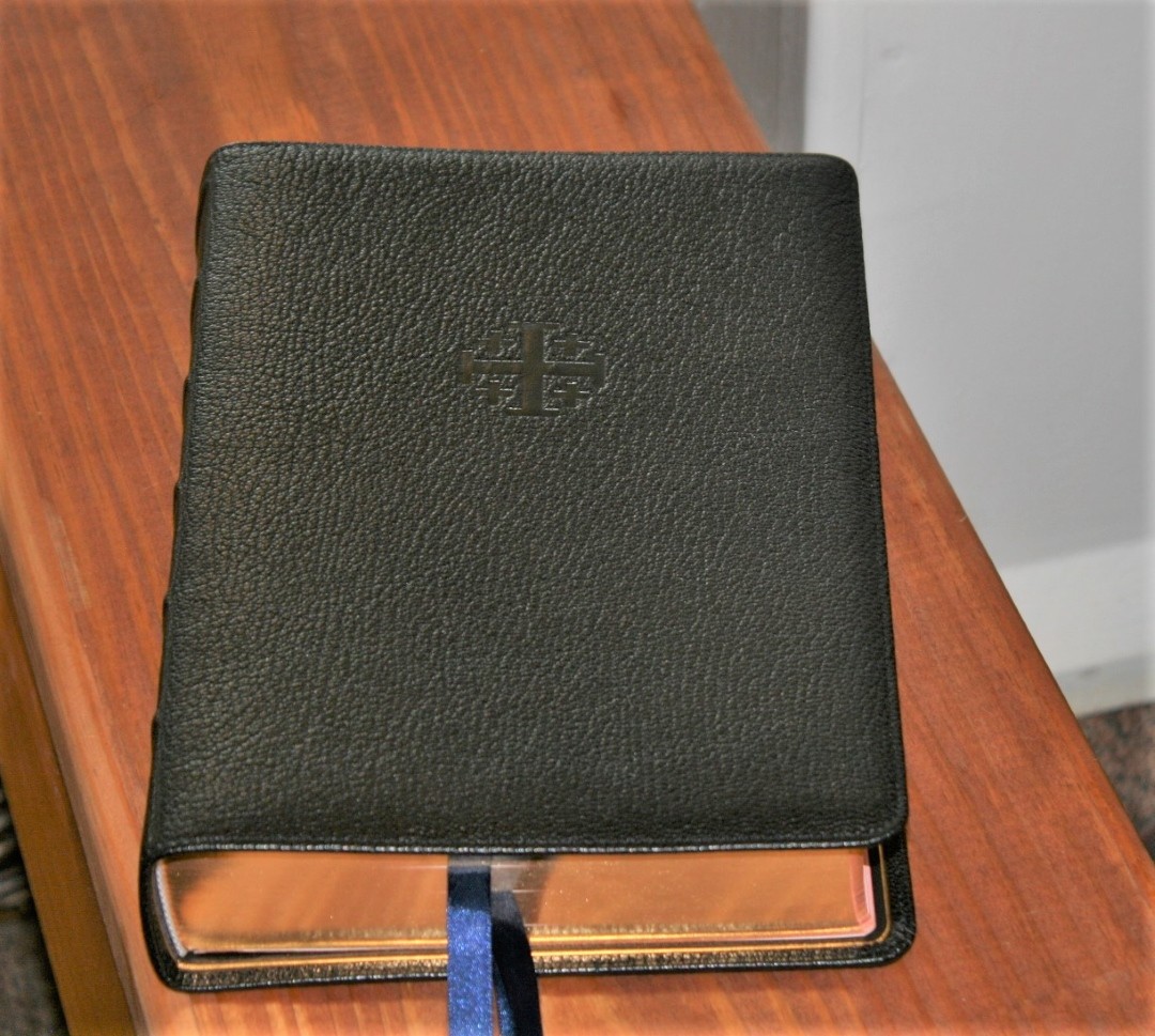
The cover is stitched around the perimeter and has a .35” yapp hanging over the page edges. It feels great in the hand. Unlike previous Quentels, this one has raised spine ribs. They look amazing and give the spine an elegance that’s been missing in the other editions. The spine also has gold stamping that includes the Jerusalem Cross. The Jerusalem Cross is dry stamped onto the front of the cover.
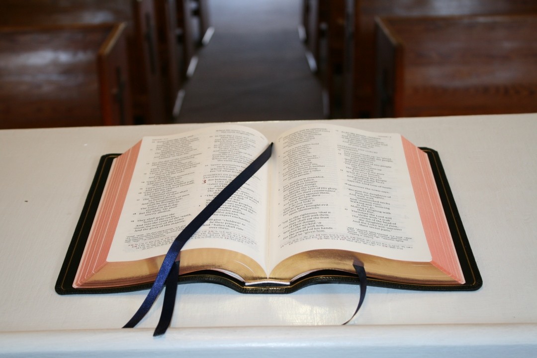
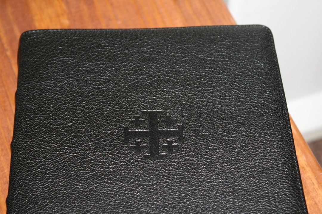 It weighs just under 3lbs at 2lbs and 15 oz. It’s .15” thinner than my first generation ESV Quentel. The text block is 1.3” thick and noticeably square with a 6.125 x 9.125 trim size.
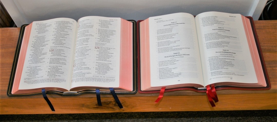
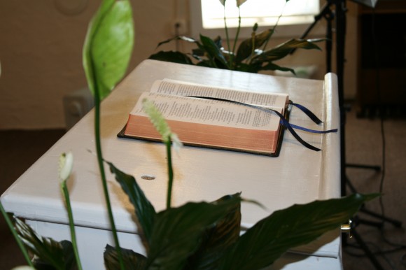
Other features include three navy ribbons that are almost .4” wide and page edges with red under gold art-gilt. Both add to the beauty of this edition and look great against the black goatskin.
Paper
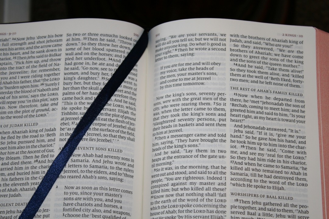
For me, the paper is the single most important physical aspect of a Bible. I would rather have okay print on awesome paper and awesome print on okay paper. The paper makes the print easier to read and I need thick pages to turn. The NKJV Quentel delivers on all accounts.
If you want some technical specs, the paper is 36gsm (24lb) with an opacity rating of 83% (only 1% less than the 38gsm ESV Quentel), a brightness of 86%, and bulk is 1.1 cm^3. All of this means the paper is very thick for a Bible and is extremely opaque. This is the kind of paper you can write on and highlight if you want. It has a slight cream tone that sets the perfect contrast for reading. To my eye, it looks creamier than the 38gsm ESV. I prefer the look of this 36gsm paper to the 38. It feels thick enough to turn easily but not so thick that it makes the Bible too large to manage. I’ve had no issues with reading or turning pages. It draws me in and makes me want to read it.
Typography
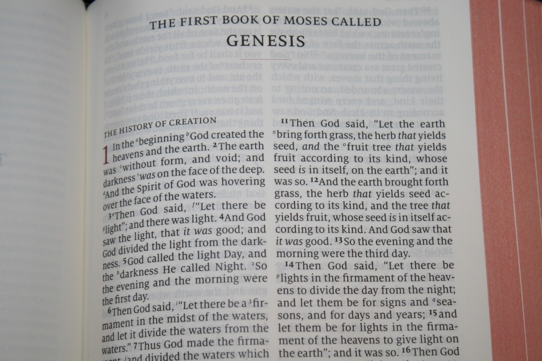
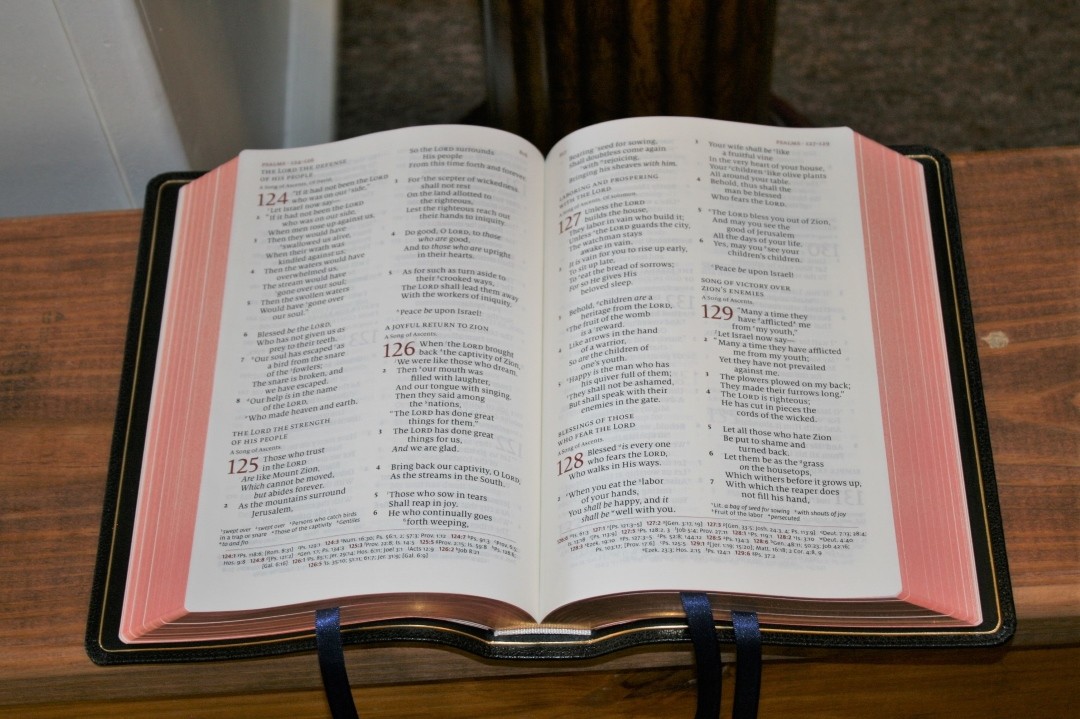
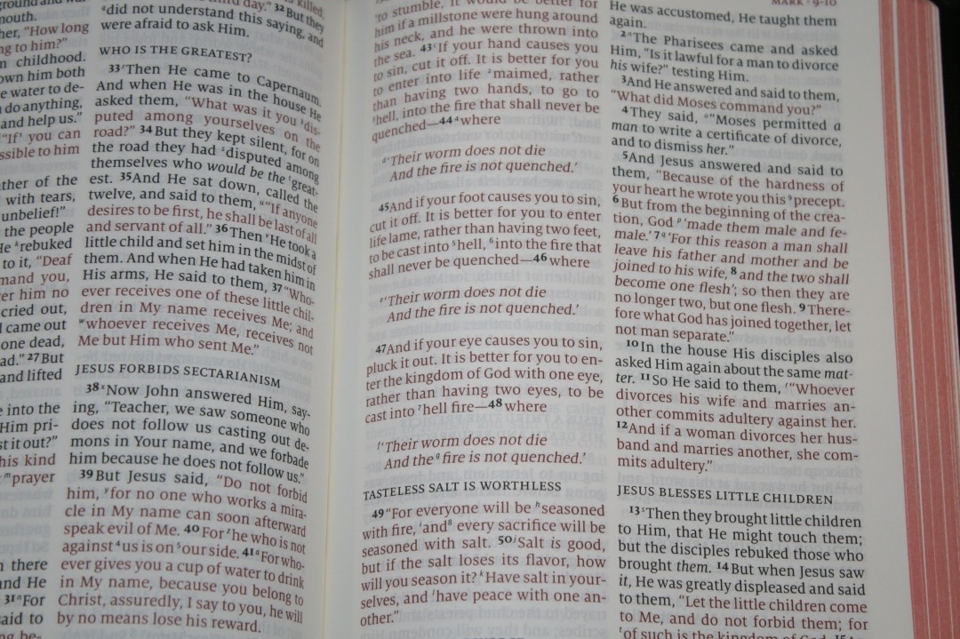
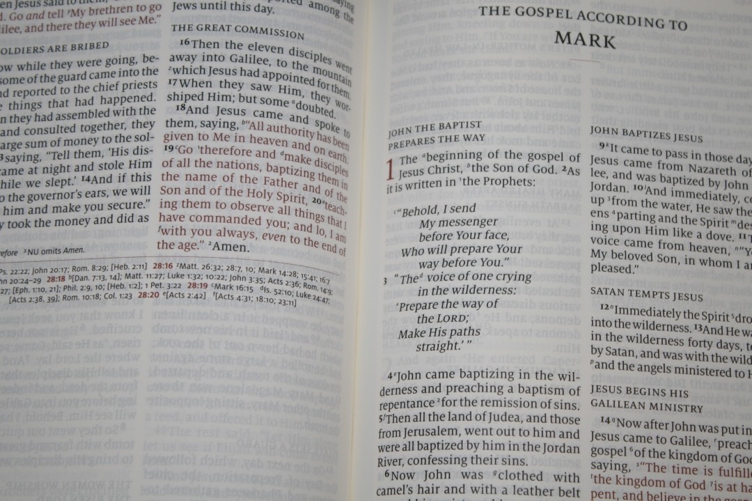
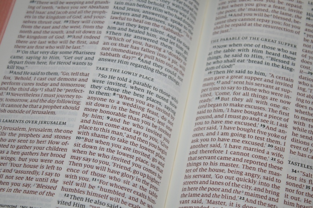
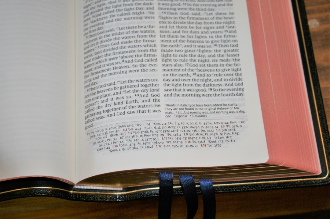
The text is presented in double-column paragraph format with poetry set in stanzas, letters indented, and section headings throughout the text. The NKJV, in general, has one of the best layouts of any translation (imo). It has more NT verses set in poetic format than most popular translations. Also, I love how it places letters (like in Ezra) in indented format setting them apart from the rest of the text. I would LOVE to see a KJV in this exact layout.
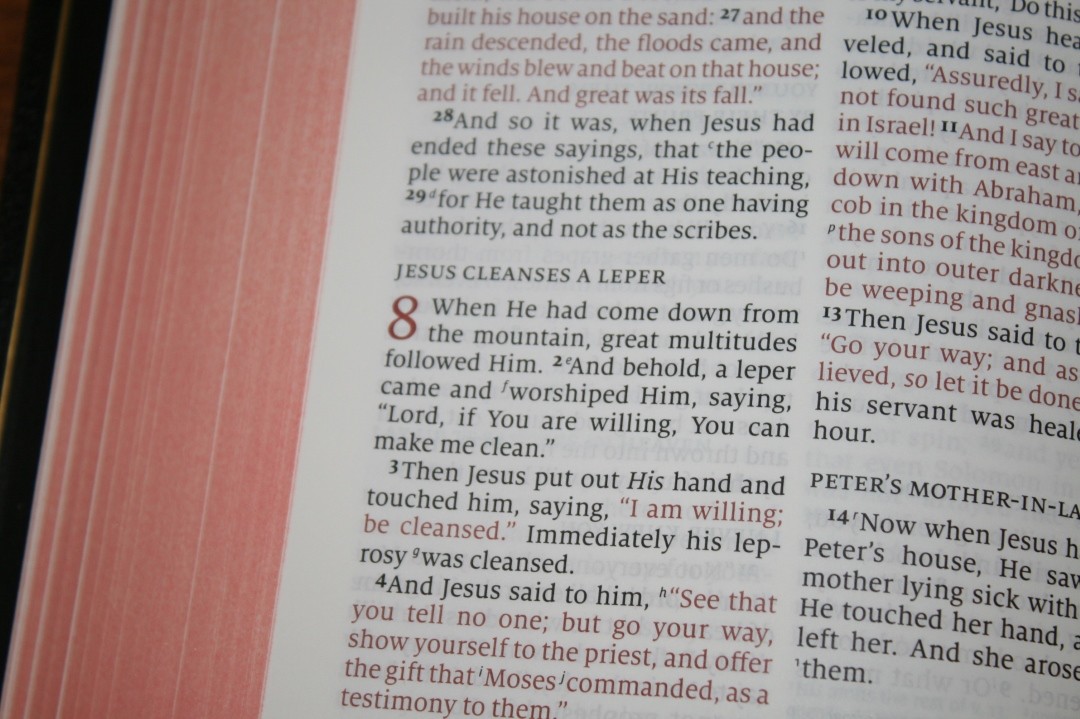
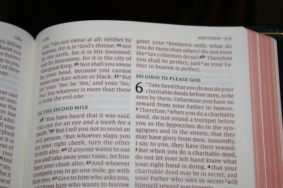
The font is 11-point Milo with a leading close to 12 pt. I chose the red-letter edition because it’s hard to find red-letter done right and I knew that Schuyler would not disappoint. The red is medium-dark and easy to read. The red goes all the way through Revelation (like all red letter should imo). I love this red! The black letter is medium-dark and consistent throughout.
The verse numbers stand out just enough to find verses easily. I usually have trouble finding verses in paragraph format but I haven’t had any problems finding verses with the NKJV Quentel. The cross-reference and footnote keys are much smaller compared to the font size than most Bibles. I personally appreciate this because they don’t get in the way of my reading. Bibles that have larger keys are harder to read and make me stumble as I’m reading aloud. A feature I found interesting is the chapter numbers. When the verse is black-letter the chapter numbers are red, but when the verse is red-letter the chapter numbers are black.
The almost .5” margins bring the text out of the gutter making the inner column easier to read. This is especially important for preaching when you need to see all of the text as you glance down to the pulpit. The columns are 2 3/8” wide and have around 36-38 characters across giving a line word-count around 7 or 8 on average. The text never feels crowded or never has too much space between the words.
The header includes chapter and verse numbers and the page number. Each is in red-letter, allowing them to stand apart from the text.
Double-Column vs Single-Column
It is easier to make a prettier layout with a single column. This has to do with how many characters you can get on a line for poetic settings or any other topic that you want to set apart such as letters, quotes, etc. With that said, I find it easier to read double-column settings. I wear bifocals and I find most single-column settings to be too wide. With double-column settings, I don’t have to turn my head to see all of the text within my viewing angle.
It’s a challenge to make a double-column setting look as good as a single-column setting, especially in poetic settings. Most double-column poetic settings end up having a single word on a line and the text is broken up so much that it breaks the poetic feel. 2K/Denmark’s Quentel design solves that problem completely by paying closer attention to poetic line-breaks. It will take two lines to do what you can do with one line in a single column, but they don’t have lines with a single word. The lines are divided carefully to keep the thoughts together and the result is a beautiful poetic setting.
Red-Letter vs Black-Letter
I’ve noticed that some translations have more of a following for red-letter than others. The NASB and ESV Quentels are black-letter only and I didn’t hear a lot of complaints about it, but for the NKJV Quentel, I’ve received a lot of comments from readers that are glad they will be available in red-letter as well as black-letter. The NKJV, in particular, is almost expected to be available in red-letter. It seems to follow the translations. I am glad that Schuyler has listened to their customers and have provided both options for the NKJV. It adds to the expense of production to have both, so this was an expensive project and wasn’t an easy choice to make. I love a good quality red letter and this red-letter delivers. Whether you prefer black or red letter, Schuyler delivers. Thank you, Schuyler, for giving us choices! #SchuylerRedLetter
References
The standard NKJV cross-references are here and there are more than 60,000 of them. References are placed in the footer in a single column with the standard Quentel tapered design, meaning the lines are shorter as they get closer to the bottom of the page. This time around the taper is more prominent. This is an interesting design feature that helps ground the page. The references are keyed to the text with letters. The chapter and verse numbers printed in red so they’re easy to find.
Here are some examples:
Genesis 1:1 – Ps 102:25; Is 40:21; Jn 1:1-3; Heb 1:10; Gen 2:4; Ps 8:3; 89:11; 90:2; Is 44:24; Ac 17:24; Rom 1:20; Heb 1:2; 11:3; Rev 4:11
Matthew 17:20 – Mat 21:21; Mk 11:23; Lk 17:6; 1 Cor 12:9
Mark 11:23 – Mt 17:20; 21:21; Lk 17:6
John 1:1 – Gen 1:1; Col 1:17; 1 Jn 1:1; Jn 1:14; Rev 19:13; Jn 17:5; 1 Jn 1:2; 5:20
1 John 1:1 – Jn 1:1; 1 Jn 2:13, 14; Lk 1:2; Jn 1:14; 2 Pet 1:16; Lk 24:39; Jn 20:27; Jn 1:1; 4; 14
Footnotes
Footnotes are placed symmetrically on both pages. On the right page they’re placed under the last verse in the right column, and on the left page they’re placed under the last verse of the left column. They have a 7-point font and are keyed to the text with numbers.
The NKJV footnotes are my favorite among the translations I use. They include manuscript variations (with each manuscript identified), alternate renderings, notes on the original languages, measurements, values, alternate names, etc.
Concordance
The concordance is the NKJV supplied by Thomas Nelson. It has 57 pages with three columns per page. This has to be the prettiest concordance I’ve seen in a Bible. The entries and verses are red while the portions of Scripture are black. It has plenty of white-space if you want to add more entries (if you need to). Just like the ESV edition, the text is very small compared to the rest of the Bible. If I would make one change in this Bible it would be to increase the font-size in the concordance to take up the whitespace. I don’t have any issues using it with my glasses, but I can see how some would have issues with it.
Here are a few examples with the numbers of entries for each one:
- Christ – 13
- Christian – 1
- Christians – 1
- Christs – 1
- Faith – 40
- Faithful – 20
- Faithfulness – 5
- Faithless – 2
- God – 38
- Goddess – 2
- Godhead – 2
- Godliness – 4
- Godly – 3
- Gods – 5
- Praise – 25
- Praised – 4
- Praises – 2
- Praiseworthy – 1
- Praising – 3
- Pray – 14
- Prayed – 2
- Prayer – 16
- Prayers – 5
Maps
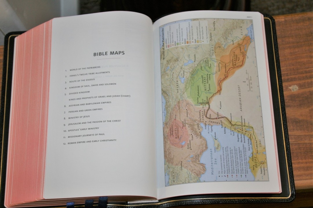
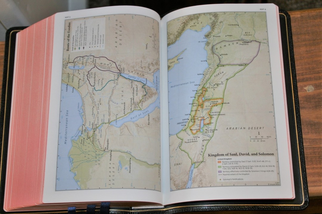
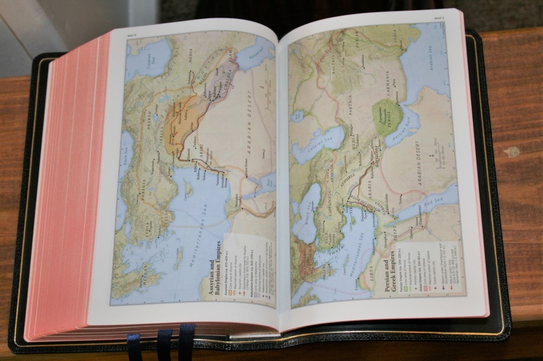
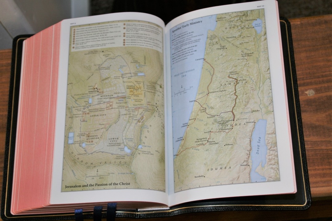
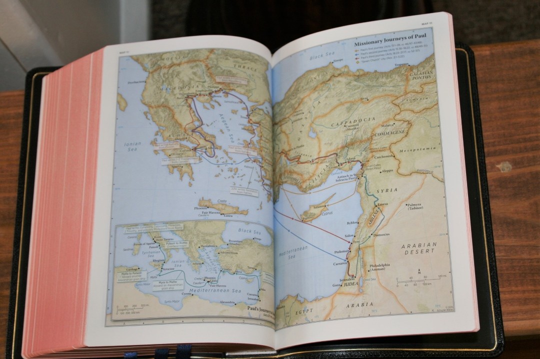
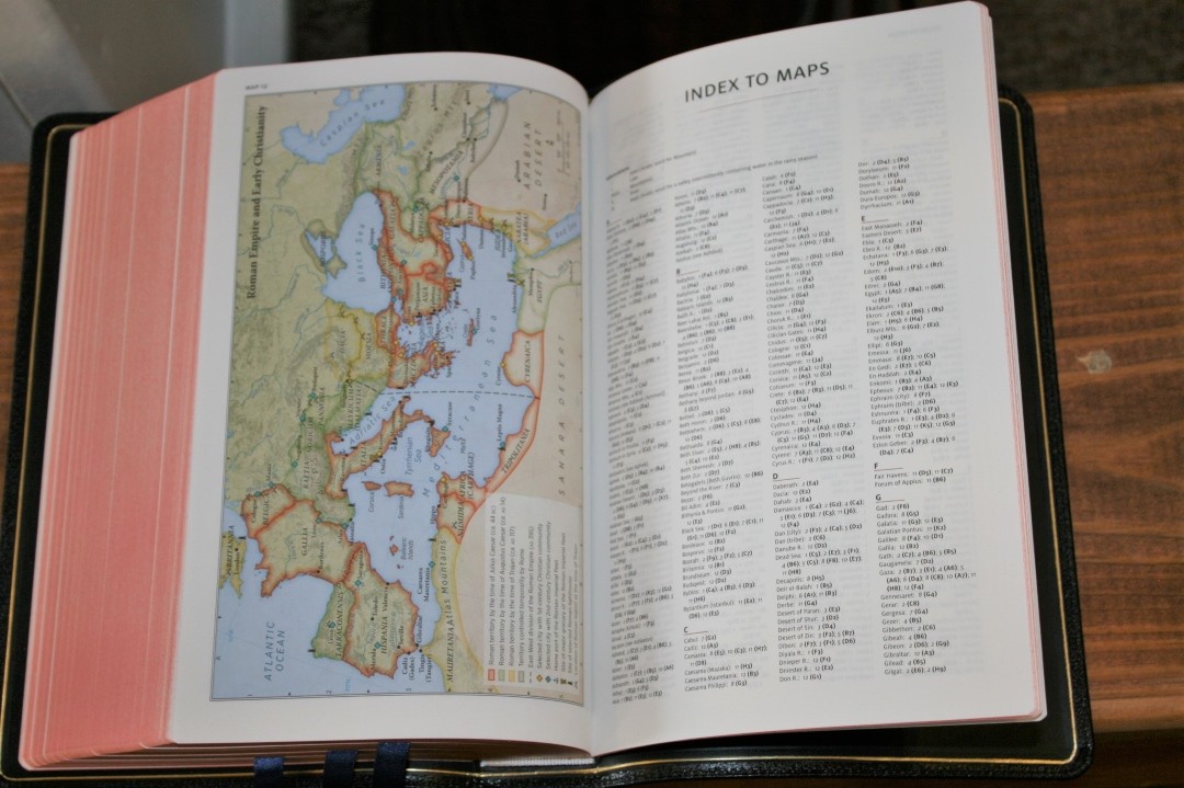
One of the items that I’ve been the most excited about is the new Schuyler maps. Schuyler has worked with Dr. Barry J. Beitzel, the editor of the Moody Bible Atlas, to create a new set of maps that use high-resolution images to show relief. The result is 12 beautiful maps that are a great resource for study. The maps include color-codes to show nations, 3D topography, routes, cities, capitals, distance keys, special sites, and Scripture references along with explanations of events. There’s also a chart within the maps that lists the Kings of Judah and Israel along with their contemporary prophets.
They’re printed on 60 GSM Primapage non-glossy paper, which is my personal favorite way of printing maps. I love the earth-tone colors as well as the overall look and design. These are my favorite maps in any Bible. I’m glad to hear they will be used in all upcoming Schuyler Bibles and in new printings of existing editions.
The maps include:
- World of the Patriarchs
- Israel’s Twelve Tribe Allotments
- Route of the Exodus
- Kingdom of Saul, David and Solomon
- Divided Kingdom
- Kings and Prophets of Israel and Judah (chart)
- Assyrian and Babylonian Empires
- Persian and Greek Empires
- Ministry of Jesus
- Jerusalem and the Passion of the Christ
- Apostles’ Early Ministry
- Missionary Journeys of Paul
- Roman Empire and Early Christianity
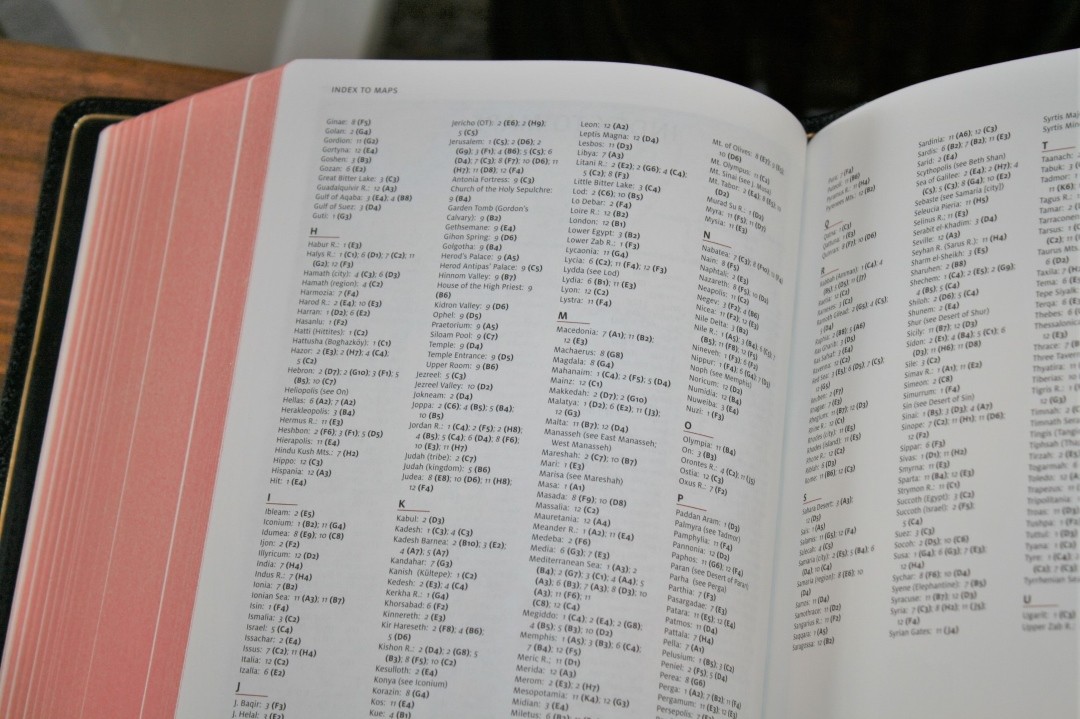
There’s also a 3-page index to maps. I’m glad to see the index included. I think all Bibles should have an index to maps.
Using the Schuyler NKJV Quentel
I used the NKJV Quentel extensively since receiving my review copy. Here are some of the ways I used it and my thoughts about each one.
Carry
Even though the NKJV edition is thinner than the ESV, this is still a large Bible. It feels like a regular sized study Bible. If you’re used to carrying a study Bible then you won’t have issues carrying this one. I didn’t have any issues carrying it everywhere I went. It is large, but for me, it isn’t too large.
Reading
This is an easy text to read. I love laying it in my lap or holding it (I don’t wrap the cover when I read. I prefer to have both pages viewable) in my hand. I can hold it open in one hand. The font style, size, smaller reference and footnote keys that are easy to ignore when I want to, the boldness of the text, and opacity and color of the paper create a perfect balance for reading. The tools don’t get in the way. It’s simply a joy to read.
Study
All the standard NKJV tools are here to help you do your own study (my favorite type of study) and Schuyler adds their own maps with an index.
- Cross references
- Footnotes
- Section headings
- Concordance
- Maps with index
While the tools don’t get in the way for reading they’re still located on the page where I want them and they’re easy to use.
Preaching
This is an excellent preaching Bible for those who leave the Bible on the pulpit or for those that don’t mind walking around with something the size and weight of a study Bible. I’m in that first category, so I had no problems preaching from it. It lays open on the pulpit and is easy to read from (thanks to the paper, print, and layout design including the wider inner margin) while preaching without having to get too close to the text. The section headings help to describe the context but they don’t stand out so much that they become distracting. The thick pages are easy to turn.
Writing
The 36gsm paper is excellent for writing. I don’t know if I will write in it, but for some excellent info on what pens and markers to use and to see them compared take a look at Mark Bertrand’s review at the Bible Design Blog. If I decide to write in it I might use PrismaColor pencils to color-code, Pigma Micron markers for underlining or drawing symbols in the margins, or possibly another type of highlighter.
Conclusion
If there ever was a Bible that would be my perfect Bible it could be this one. The paper and print are easy to read for long periods of time and the tools are great for study. The leather lining, spin ribs, and goatskin cover feel both elegant and durable. Schuyler has raised the bar yet again and this is no doubt the best NKJV in print. The Schuyler NKJV Quentel can easily be your one and only Bible. I’ll be using this Bible for many years to come.
Schuyler Publishing provided this Bible free for review. I was not required to give a positive review – only an honest review. My opinions are my own.












Great review! I agree that this is a wonderful presentation of God’s word. The NKJV is my favorite translation, and this edition is close to ideal.
Favorite bible ever!!
Excellent review!
Thanks Joseph!
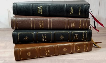
No problem! Looking at it further, I think the very first shot you have up there just about perfectly captures the book – the build and the texture of the leather really come through, as does the combination of gold leaf and art gilt. That is just a fine shot!
Does this Bible have the lined note paper in the back?
Hi. It does not have lined paper.
Just read your review of schuyler nkjv, by the way, your reviews are just great. I would love 36 gsm paper, unfortunately, schuyler only uses 28 gsm in all their bibles now. Nelson does 36 gsm in a pretty decent bible, less costly too, however printed in china.
Why did schuyler discontinue 36gsm….
Thanks Toby! The majority of readers wanted thinner and lighter Bibles.