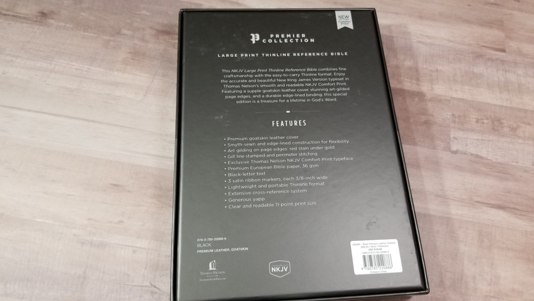
Thomas Nelson’s Premier Collection NKJV Large Print Thinline Reference Bible is a double-column reference edition with premium materials and construction at an affordable price. It includes goatskin leather and European paper and uses the Comfort Print text designed by 2K/Denmark – my favorite Bible designers. ISBN: 9780785220886. It was made in China with premium materials.
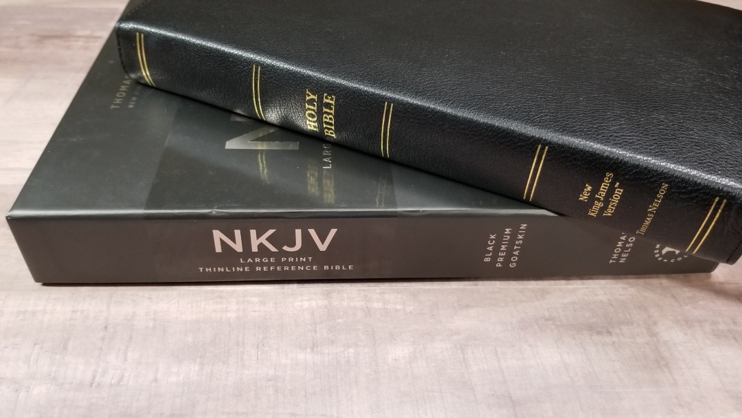
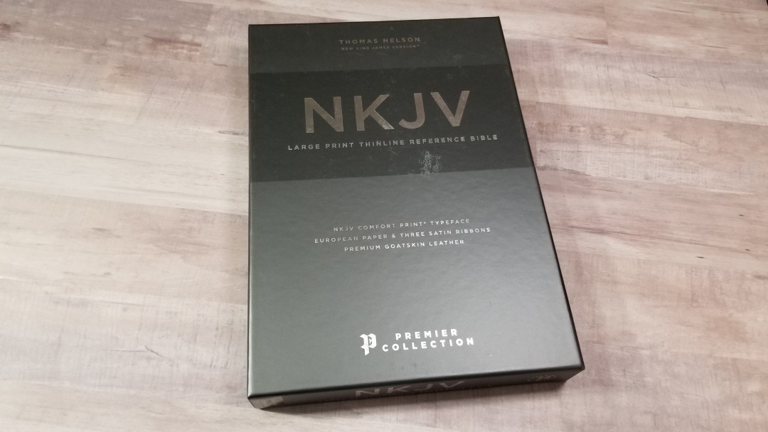
It comes in a sharp and sturdy box and the Bible is wrapped in heavy paper, giving the entire package and elegant look and feel.
Thomas Nelson provided this Bible in exchange for an honest review. I was not required to give a positive review, only an honest one. All opinions are my own.
_________________________________________________________
This Bible is available at (includes some affiliate links)
and many local Bible bookstores
_________________________________________________________
Video Review
Cover and Binding
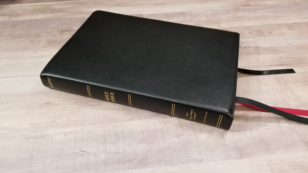
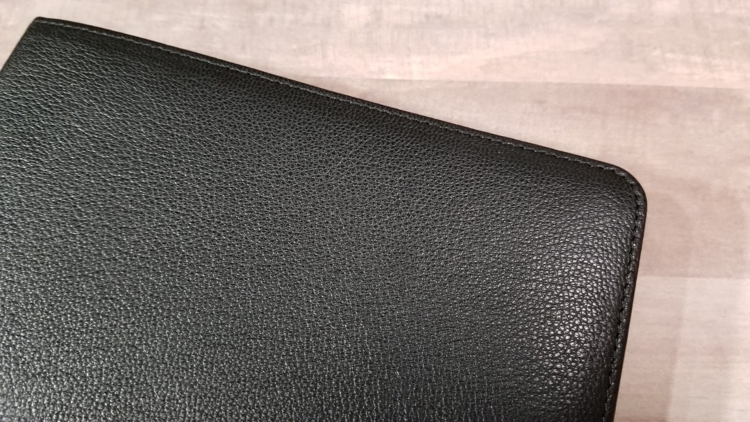
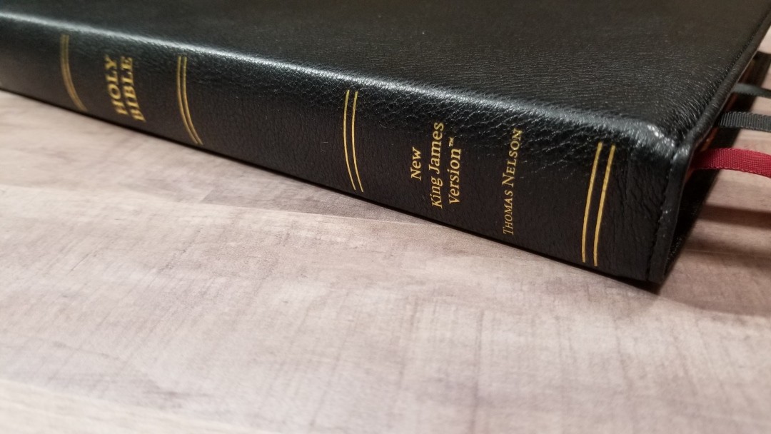
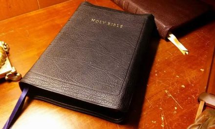
The cover is black goatskin. It’s soft to the touch and has an elegant natural grain. It has perimeter stitching. The liner is edge-lined leather and it includes a gilt line. The cover isn’t overly thin, but it is thin enough to be extra floppy. You can roll the cover any way you want and it lays perfectly flat every time. It’s Smyth sewn and has no trouble laying open on the first page.
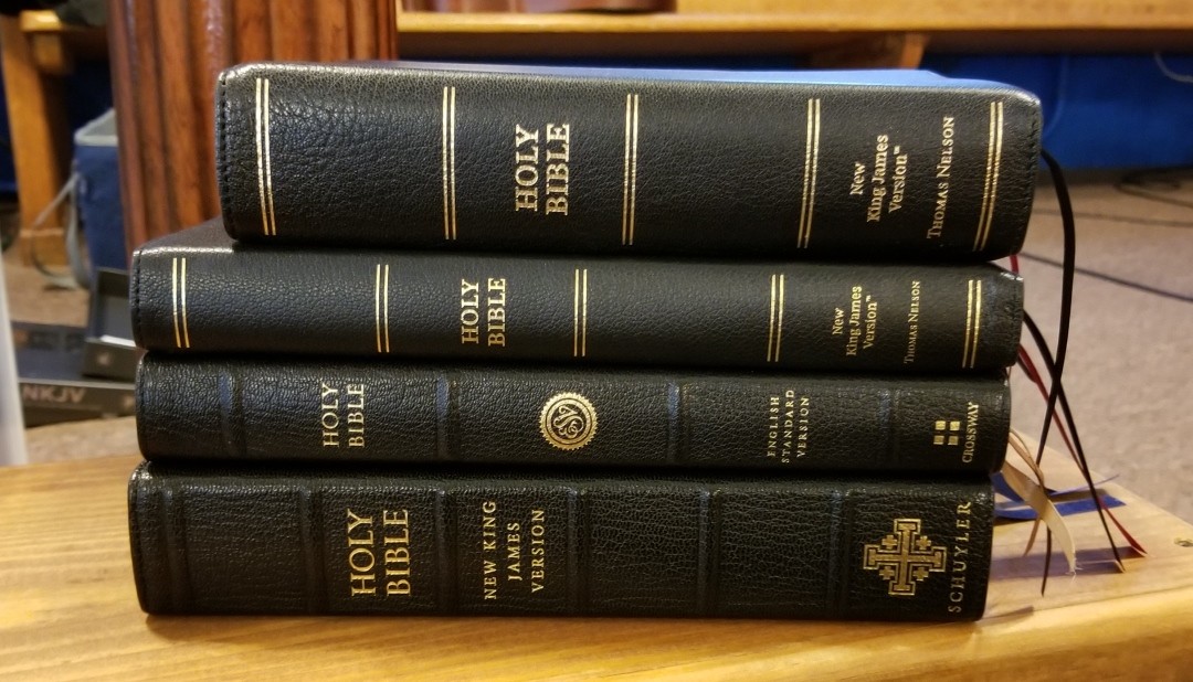
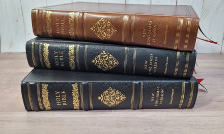
The front has no writing. The spine has HOLY BIBLE, NEW KING JAMES, and THOMAS NELSON printed in gold. It has 5 spine indications printed in gold. The spine of the cover is flexible and allows the text block to rise as the Bible is opened. I’d love to see this edition with spine ribs. Of course, that would add to the cost, but I think it’s worth it.
It weighs 2 lbs, 3.1 oz. The overall size is 9.8 x 6.75 x 1.1″. This is an excellent size for carry. I had no issues holding and carrying it around. The flexibility is easy to hold. The spine does feel a little flexible when the Bible is laying in my hand.
It includes three extra-long satin ribbons at 3/8″ each. They’re more than long enough to pull to the corner and open the Bible. The width feels right for the size of this Bible.
Paper
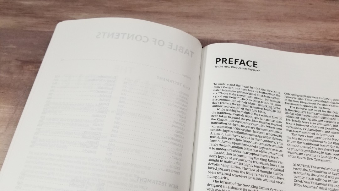
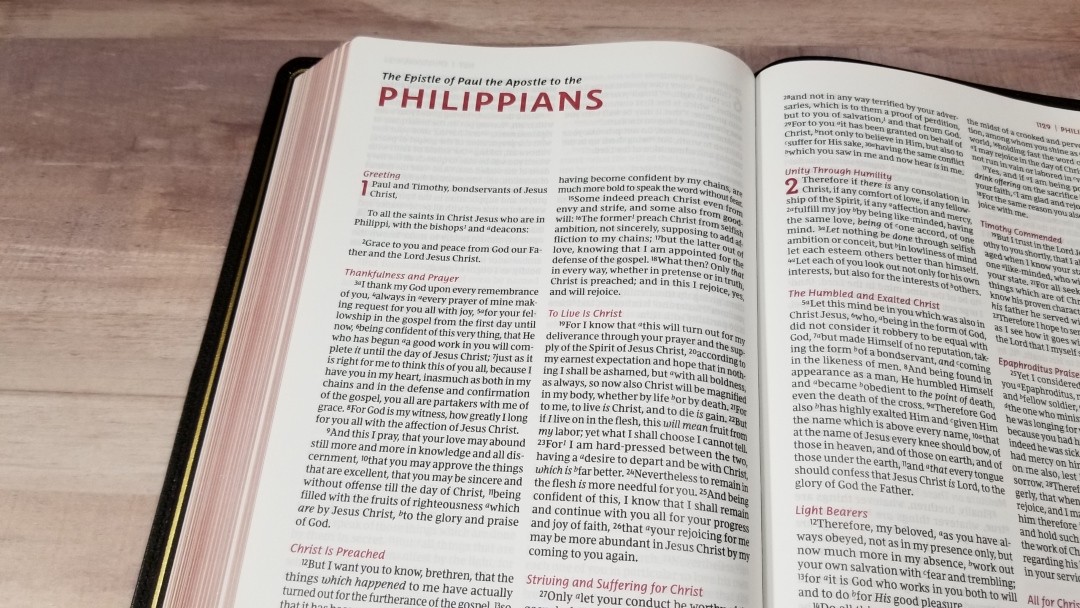
The paper is 36gsm premium European Bible paper. It’s white in color and it’s very opaque. I enjoy reading with this paper for long periods of time. It has a smooth texture that I find to be easier to turn pages than most Bibles. Page edges are art-gilt with red under gold. The red is darker than my copy of the Single Column NKJV. In my opinion, this art-gilt looks nicer.
Typography
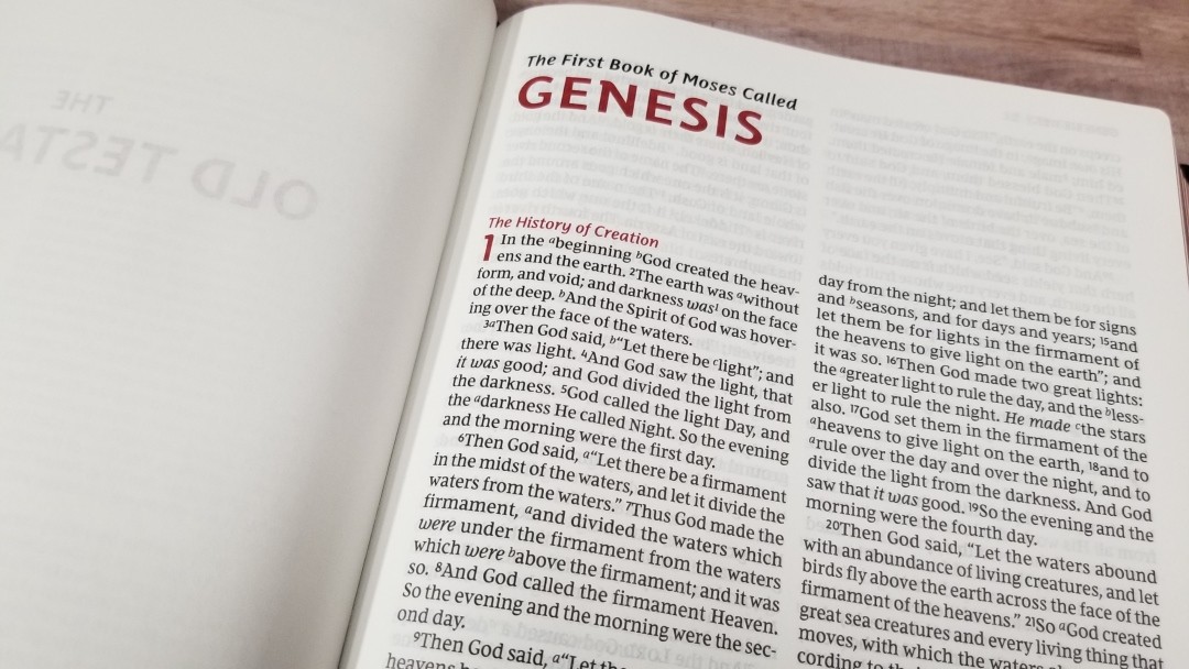
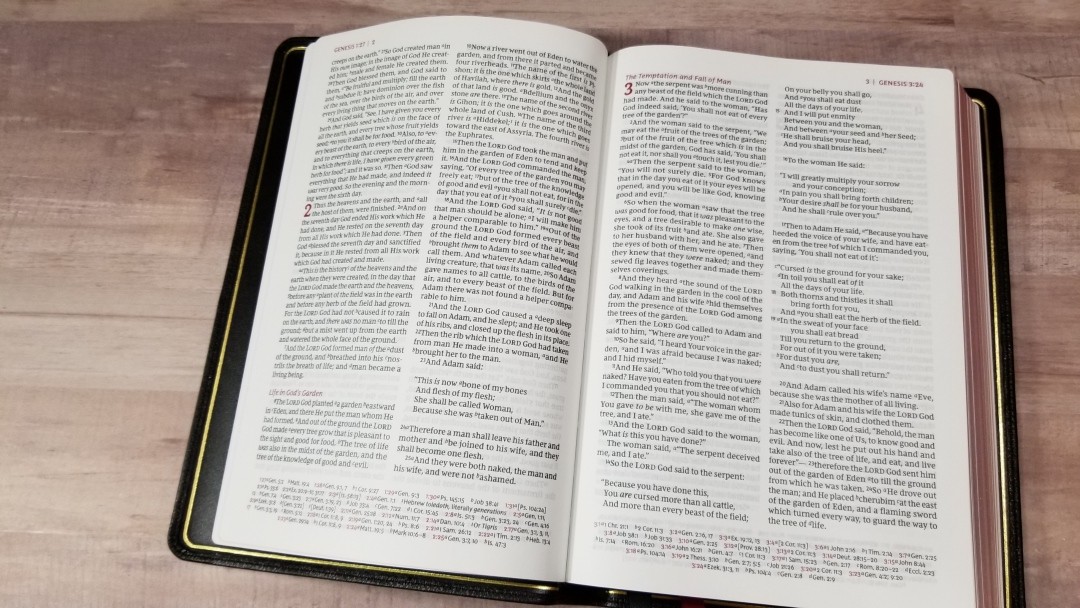
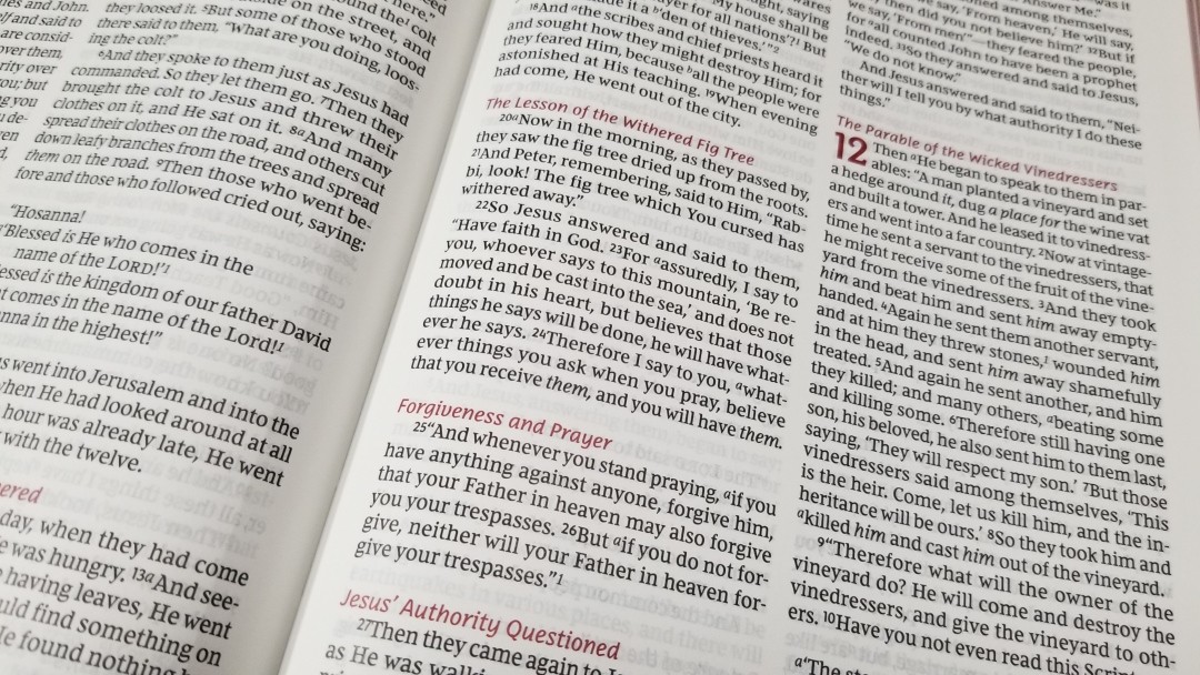
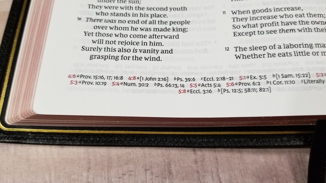
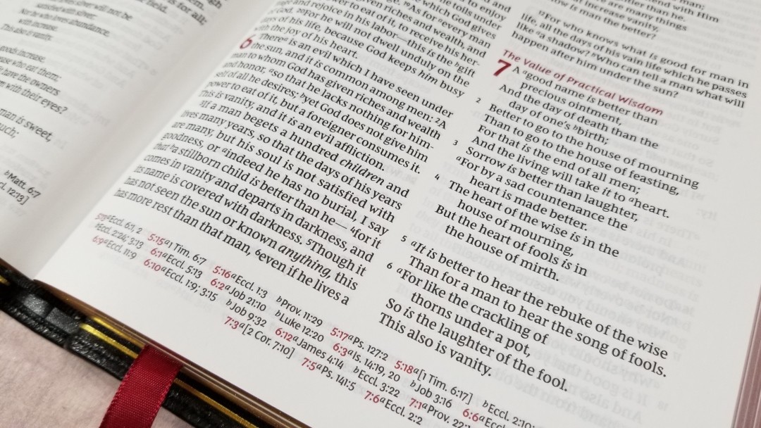
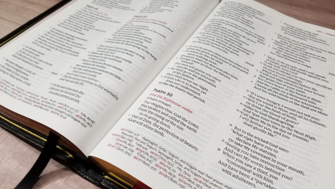
The text is presented in double-column paragraph format. The references are placed in the footer across the page. The header shows the book name and chapter numbers in the outer corner in red and then the page number in red with a black vertical line separating them. The Old Testament quotes use the new NKJV style that doesn’t include oblique type.
The typeface is the Comfort Print designed specifically for the New King James by 2K/Denmark. It’s labeled as 11-point, but I’m sure this is including the leading (the size of the font plus the space to the next line). It looks like a 9.5-point with 11 leading. It’s a black-letter text with red highlights for the page titles, section headings, drop caps, the book name and chapter numbers in the header, and the chapter and verse numbers in the footer that correspond to those in the text.
The red highlights look amazing and really set this design apart. This one doesn’t include the footnote and reference keys in red within the text like the Single Column edition does. Both look great but after using them I think I prefer them in black like this one. I’d love the see the verse numbers in red. It did take an extra second or two to find verses for preaching, so red highlights would help. Of course, it’s also possible they would stand out too much and be distracting. I still want to see it though.
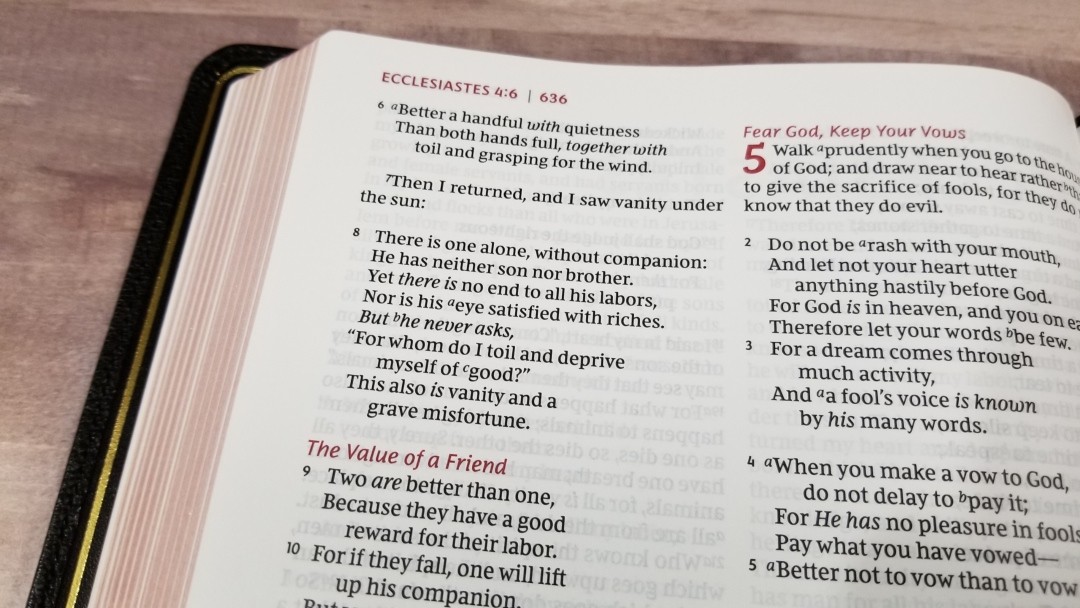
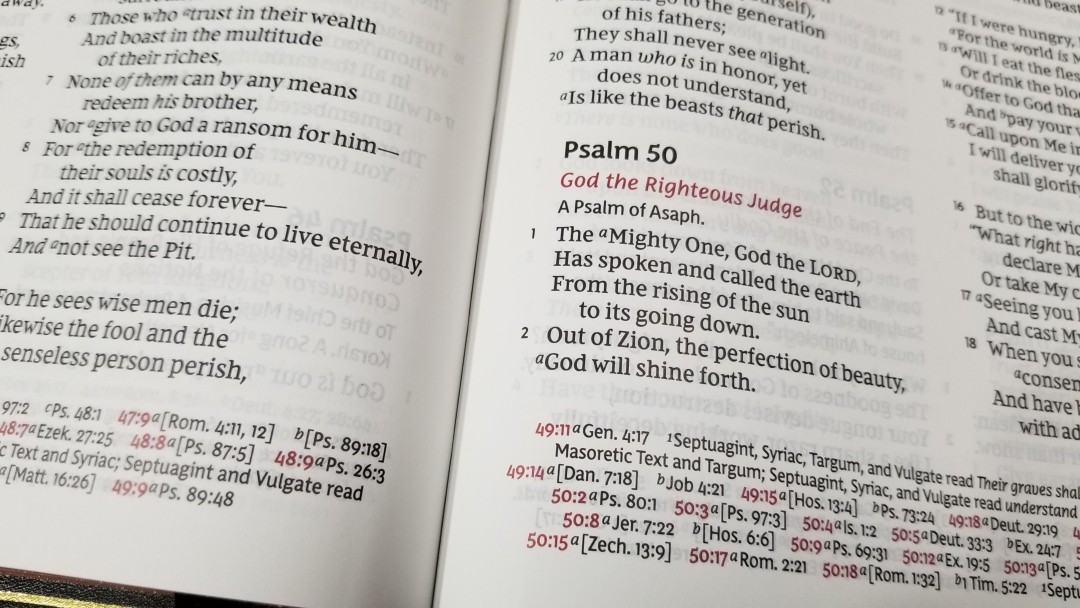
It has around 44 characters across with around 8-10 words per line. This is a high character-count for a double-column layout. My personal preference is somewhere between 44-66 characters, so this falls within my preferred layout design. This is one of the best, if not the best, double-column layouts that I’ve read from. One of my main complaints about double-column layouts is they don’t handle poetry well due to the narrow column-width. This Bible doesn’t have this problem. This is the best poetic setting I’ve seen in a double column layout. The word count is just right to give poetry the space it needs for clean line-breaks most of the time.
The text never feels crowded and it never has any awkward spaces between words. It’s printed with line-matching to make the text as readable as possible. The lines match up really well and the opacity of the paper keeps the text clean even though there’s printing behind it.
Cross-References and Footnotes
Cross-references and footnotes are placed in the footer and are keyed to the text with letters. The pilot chapter and verse numbers are in red. Cross-references and footnotes are printed across the page horizontally. This edition has far fewer cross-references than the Single Column NKJV edition from the Premier Collection. They’re good for quick study, but you might need other tools for more in-depth study.
Here are some example references to help you compare:
- Genesis 1:1 – Jn 1:1-3; Acts 17:24
- Deuteronomy 6:4 – 1 Cor 8:4, 6
- Isaiah 9:6 – Luke 2:11; John 3:16; Matt 28:18; Judg 13:18; Titus 2:13; Eph 2:14
- Matthew 17:20 – Lk 17:6
- Mark 11:23 – Matt 17:20; 21:21
- Mark 12:29 – Deut 6:4, 5
- John 1:1 – 1 John 1:1; Rev 19:13; John 17:5; 1 John 1:2; 5:20
- John 2:19 – Mat 26:61, 27:40
- Acts 2:38 – Luke 24:47
- 1 John 1:1 – John 1:1; John 1:14; 2 Pet 1:16; Luke 24:39; John 1:1, 4, 14
Footnotes are the standard NKJV translation notes, which are my favorite footnotes of the translations I use the most because they provide manuscript variations and identify the manuscripts.
Concordance
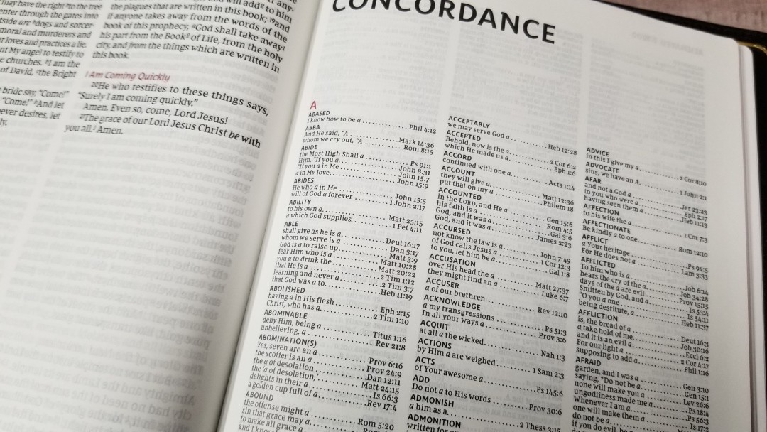
The concordance is 39 pages with 3 columns per page. This is the same concordance as the one in the Single Column, just with a different layout. The first or last word is placed in the header in red. It has a lot of entries, making this a good concordance for study. It includes Jesus, but it doesn’t include other common names. Here are some example entries and the number of references they provide:
- Christ – 13
- Christian(s) – 2
- Faith – 40
- Faithful – 20
- Faithfulness – 5
- Faithless – 2
- God – 38
- Goddess – 2
- Godhead – 2
- Godliness – 4
- Godly – 3
- Praise – 25
- Praised – 4
- Praises – 2
- Praiseworthy – 1
- Praising – 3
- Pray – 14
- Prayed – 2
- Prayer – 16
- Prayers – 5
Maps
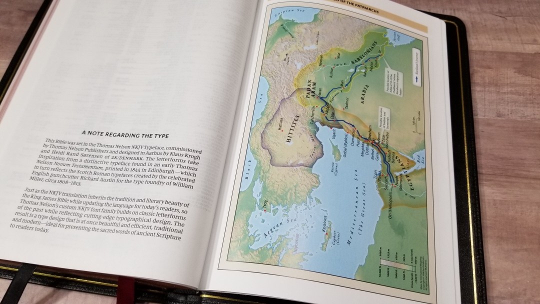
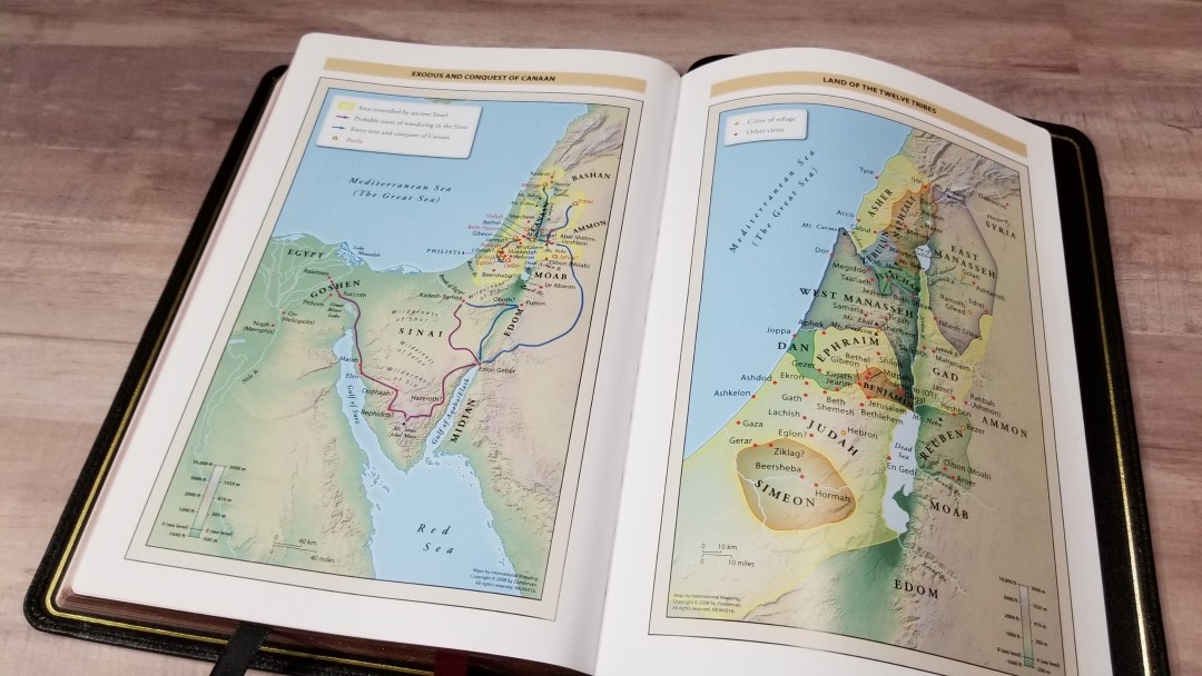
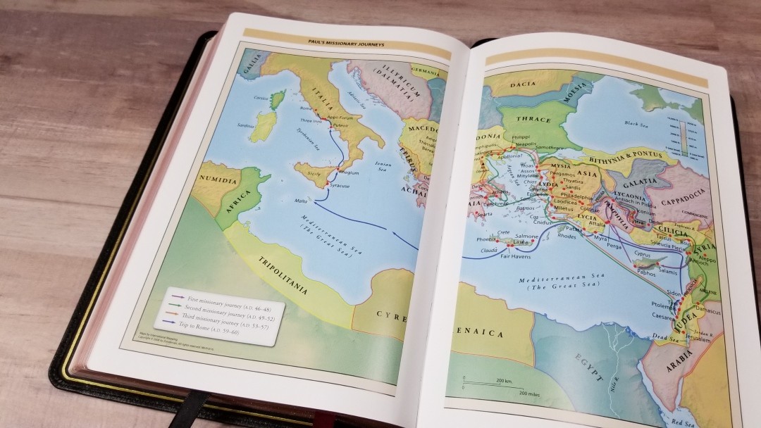
It includes the standard Zondervan maps found in other Thomas Nelson Bibles. It has 7 full-color maps printed on 8 pages of thick glossy paper. It does not include an index but the maps are annotated well. I’m fond of these bright earth-tone colors. They show topography, distance, routes, borders, possible locations of lost places, battles, elevation, cities, and locations for the events of Jesus’ ministry.
Maps include:
- World of the Patriarchs
- Exodus and Conquest of Canaan
- Land of the Twelve Tribes
- Kingdom of David and Solomon
- Jesus’ Ministry
- Paul’s Missionary Journeys
- Jerusalem in the Time of Jesus
Comparisons
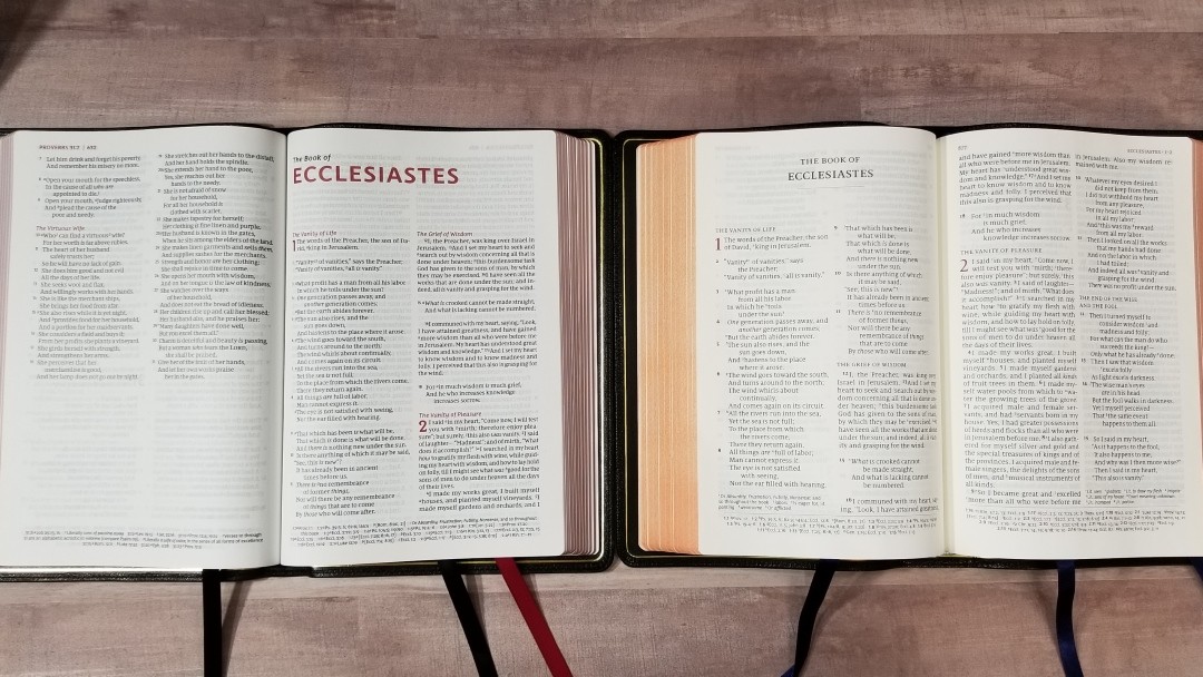
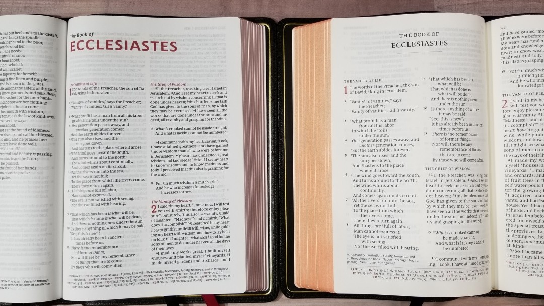
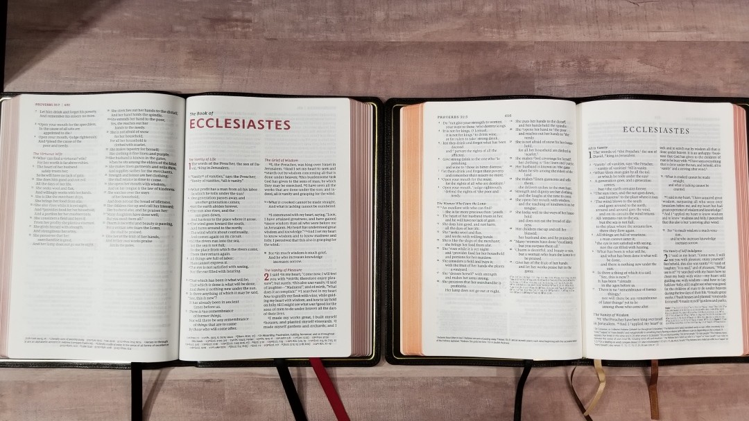
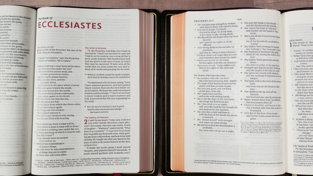
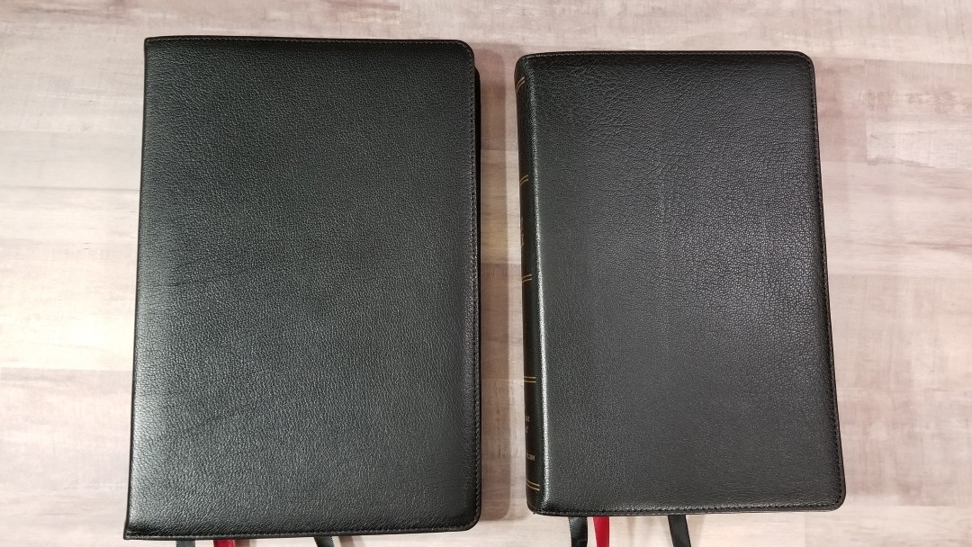
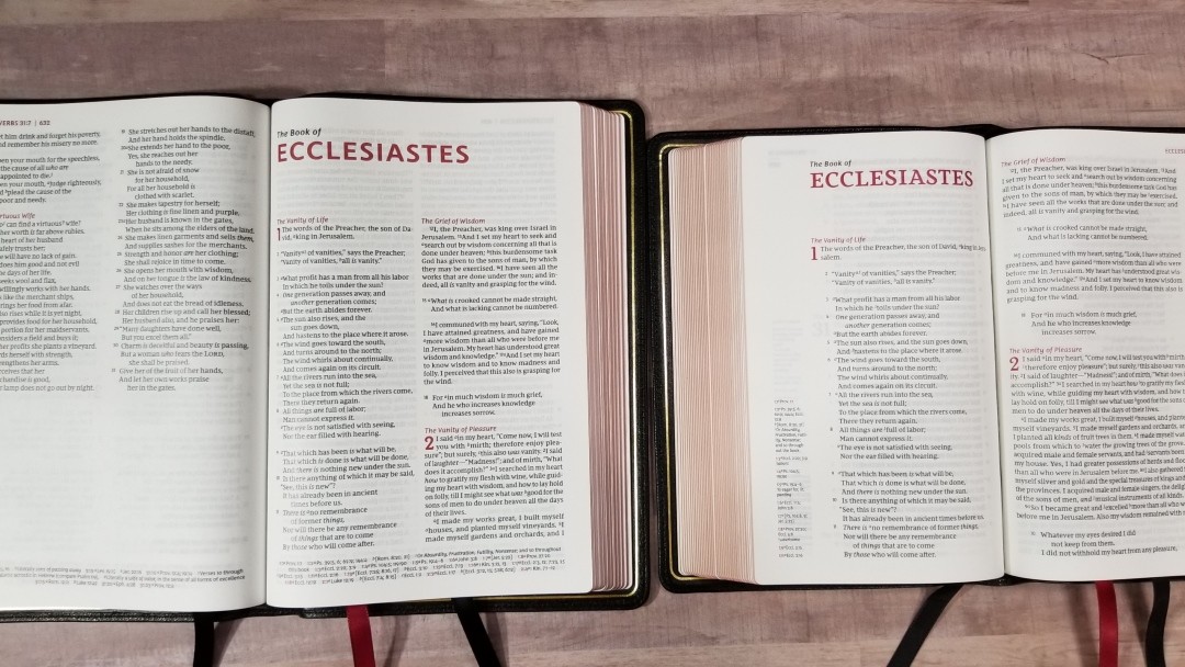
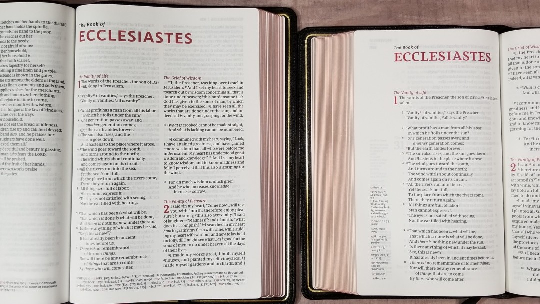
Here’s a look of the Premier Collection NKJV Large Print Thinline Reference Bible next to Quentel, ESV Omega, and NKJV Single Column.
Quentel
The Quentel is the obvious design inspiration for the NKJV Large Print Thinline Reference Bible (and that’s a good thing). The Quentel is thicker and heavier. Both have 36gsm paper, and both are premium paper, but the Quentel’s paper is in a higher/quality price-range (the same goes for the rest of its materials and manufacturing). The fonts for both Bibles are labeled as 11-point, but the Thomas Nelson looks smaller.
ESV Omega
I included the Omega because it’s actually the closest to this Bible is size overall size and font size. The Omega is more expensive, but it also has more expensive materials and manufacturing. The NKJV Thinline compares really well.
NKJV Single Column
The NKJV Single Column is the other NKJV from the Premier Collection. The font is .5 smaller, but this is hard to tell. Its layout looks amazing. It has far more cross-references. Its footprint is a touch smaller, but it’s around twice as thick and about 10 oz’s heavier. Both are awesome and it’s hard to choose between them.
Conclusion
The Premier Collection NKJV Large Print Thinline Reference Bible is absolutely beautiful. The Premier Collection is by far the highest quality I’ve seen in a Bible made in China and this one is no different. It compares favorably with Bibles in higher price ranges. The cover and paper quality are just slightly under the quality of Bibles that are twice the price, which is excellent.
This NKJV is one of the best designs I’ve seen in a thinline and it’s easily the best poetic setting I’ve seen in a double-column layout. It doesn’t make me feel the need for a single column as much as other double-column editions. The font is on the small side of large print, but I do consider this large print. If you’re familiar with the ESV Omega then you’d have a good idea of the font size and overall size of this Bible. It is short on references, but it might be enough for basic study. My favorite thing about this Bible is its design. Thomas Nelson has hit the perfect quality to price ratio with this Bible.
_________________________________________________________
This Bible is available at (includes some affiliate links)
and many local Bible bookstores
_________________________________________________________
Thomas Nelson provided this Bible in exchange for an honest review. I was not required to give a positive review, only an honest one. All opinions are my own.










Thanks for reviewing all of the Premier Collection Bibles from Thomas Nelson. As a long time NKJV reader, I’ve been looking for a well done high end edition that is not too cost prohibitive and this one truly fits the bill for me. I’ve had my copy of the Large Print Thinline Reference for a few weeks now and am consistently impressed by what a great Bible this is for my needs. Your review gives a comprehensive look at all of the features this Bible has. Thanks!
Thanks!!
This Bible looks amazing, especially for the price. My only complaints would be… 1. Why does Thomas Nelson put the little trademark “TM” by the version on the spine of the Bible? Just doesn’t seem right seeing that on a Bible. 2. It isn’t red letter text.
Randy, thanks for all that you do in reviewing Bibles. You do great work, and I really enjoy reading your reviews. I did notice an error in this review, however. In the section where you list the number of characters and words in a line you state the following, “This is one of the best, if not the best, single-column layouts that I’ve read from.”
Thanks!
Wow, this is an exciting development, providing a more accessible price point for better quality. As I further investigate switching to the NKJV, I am excited for these options. How does the single column compare to the Clarion?
Thanks again, Brian
The paper is more opaque than the Clarion and the print is darker and larger. The Bible itself is also a lot larger. I show a comparison of the two in the Single Column review.
Thank you!
“The Old Testament quotes use the new NKJV style that doesn’t include oblique type.”
Do you know why the NKJV is doing away with the oblique type for the OT quotes in the NT? I like that it is so easy to recognize the OT quotes.
I think they have done away with it. I liked that too.