
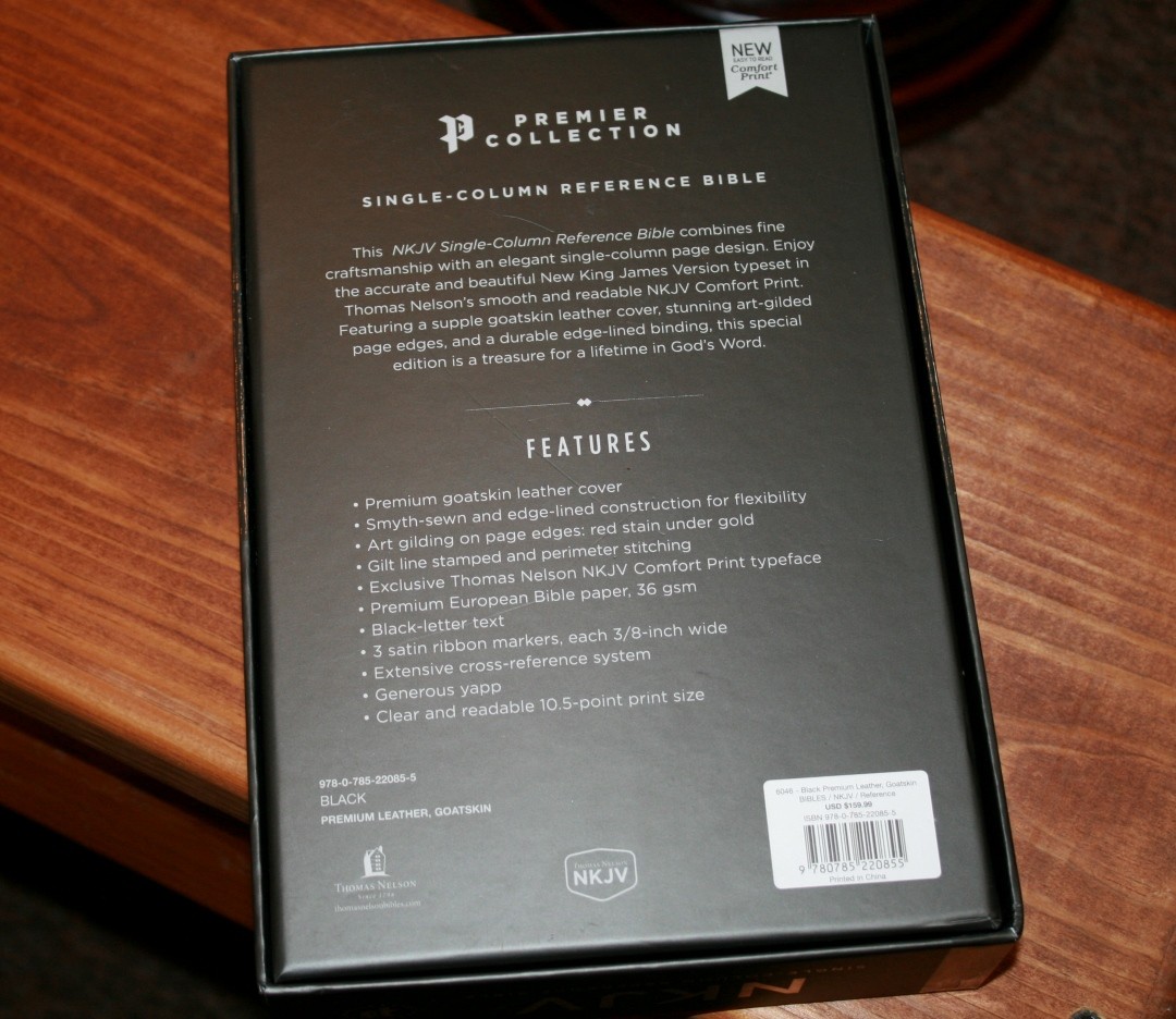
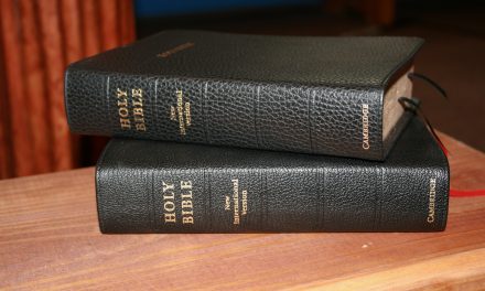
Thomas Nelson’s Premier Collection NKJV Single Column Reference Bible is a premium single-column edition at an affordable price. It’s made to last a lifetime and was built with goatskin leather and European paper, and includes the Comfort Print text designed by my favorite Bible designers- 2K/Denmark. ISBN: 9780785220855. It was made in China with premium materials.
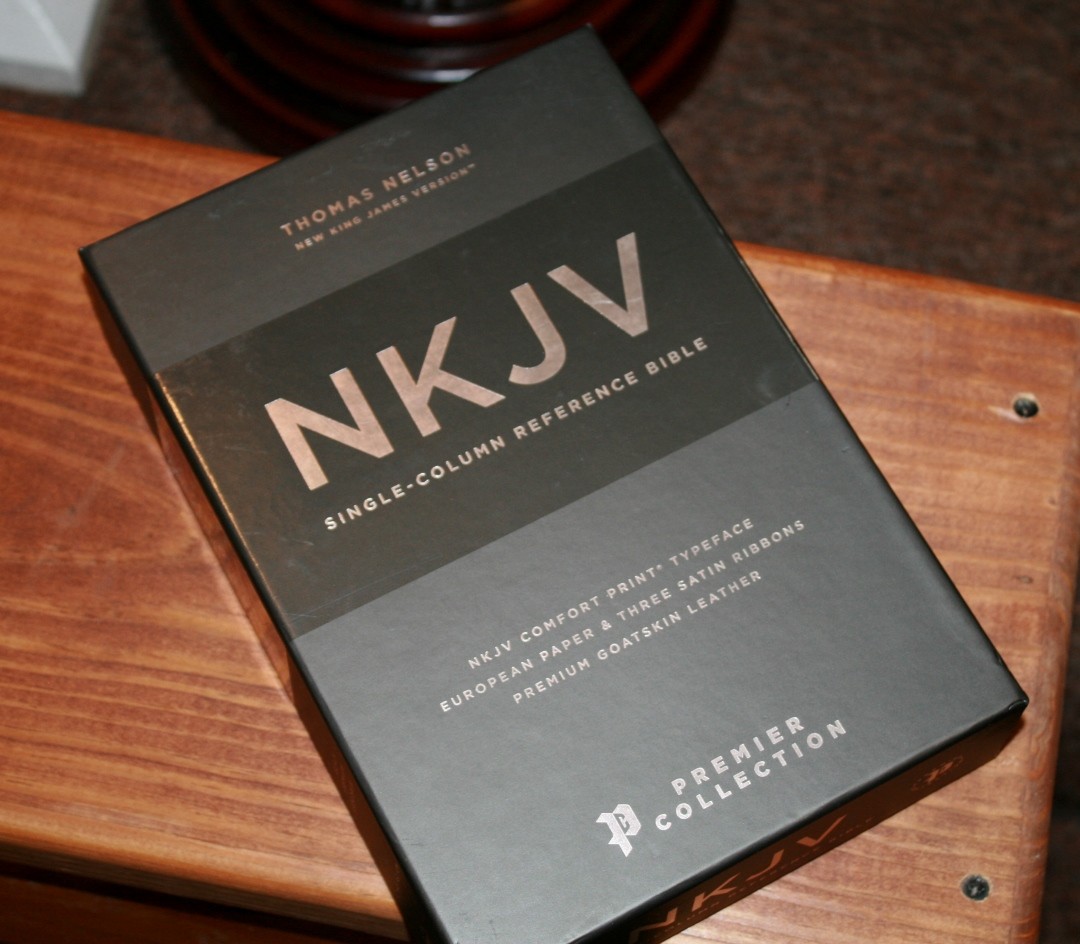
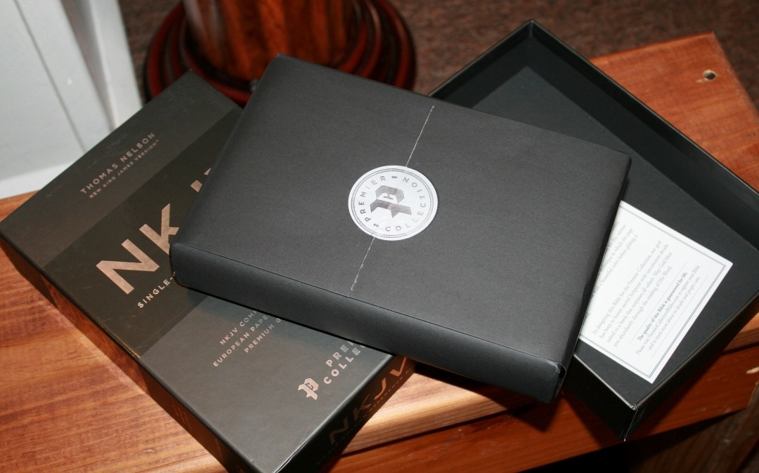
It comes in an elegant sturdy box and the Bible itself is wrapped in heavy paper. It looks and feels elegant before you even get to see the Bible itself.
Thomas Nelson provided this Bible in exchange for an honest review. I was not required to give a positive review, only an honest one. All opinions are my own.
_________________________________________________________
This Bible is available at (includes some affiliate links)
and many local Bible bookstores
_________________________________________________________
Video Review
Cover and Binding
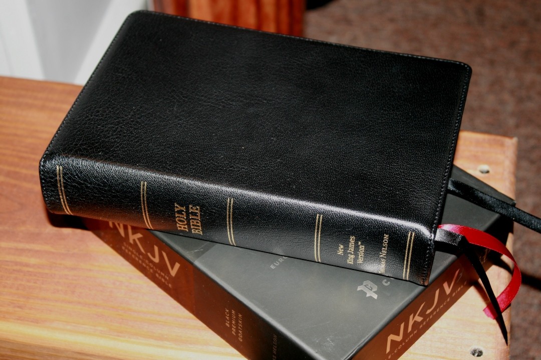
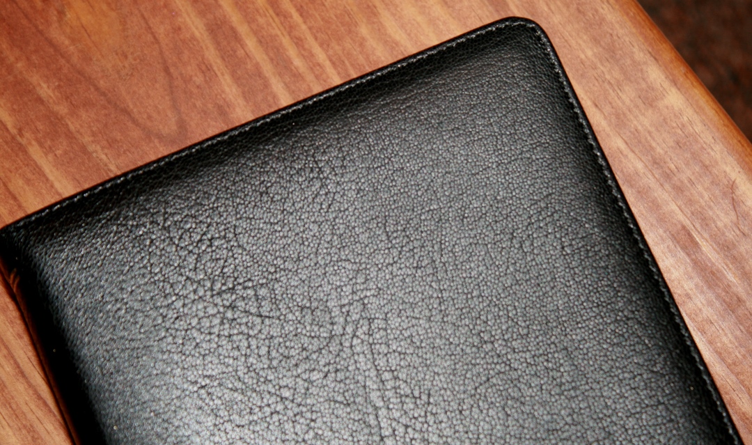
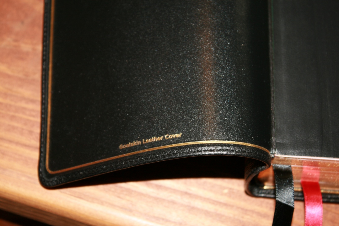
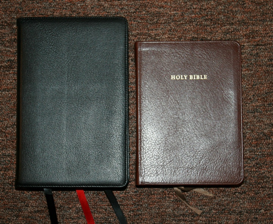
The cover is black goatskin. It’s soft to the touch and has a nice grain. The liner is edge-lined leather. It has perimeter stitching and it includes a gilt line. The cover doesn’t feel too thin. It’s about the same thickness of the Tyndale Select. It’s flexible without being too floppy.

The page that’s glued onto the liner’s leather tab is extra stiff. This has the advantage of keeping the page flat when the cover droops downward, but it also makes it more difficult to roll the cover (which I don’t do, so this doesn’t affect me). If this page does get bent it can make the cover to not lay flat. It’s easy enough to bend the page back though.
The front has no writing. The spine has HOLY BIBLE, NEW KING JAMES, and THOMAS NELSON printed in gold. It has 5 spine indications printed in gold. The spine of the cover is flexible, which allows the text block to rise as the Bible is opened. This helps keep the pages flat. This is even more important in a Bible this thick.
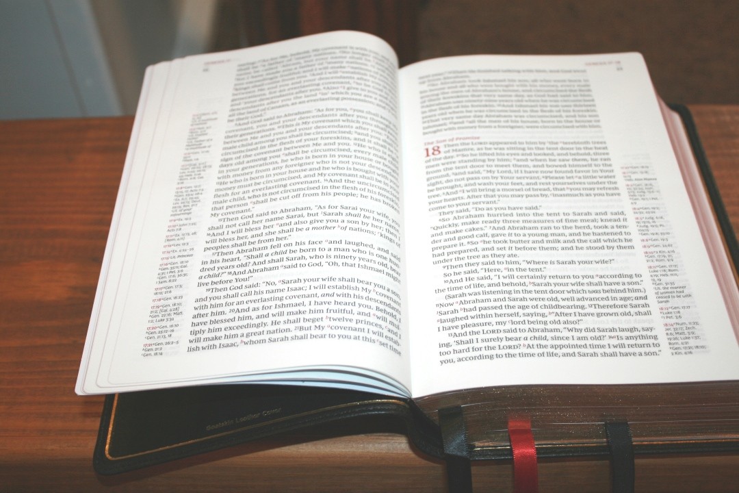
It’s Smyth sewn and has no trouble laying open on the first page. It also lays flat because the text block rises when the Bible is opened. It weighs 2 lbs, 11.9 oz. It does feel a little heavy after a few minutes. The overall size is 8.8 x 5.8 x 2″. It is thick for its footprint, but I had no issues holding and carrying it around. The flexibility is easy to hold. The spine does feel a little flexible when the Bible is laying in my hand.
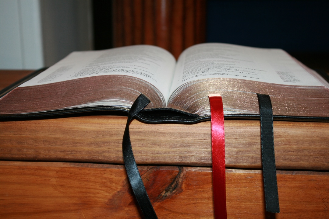
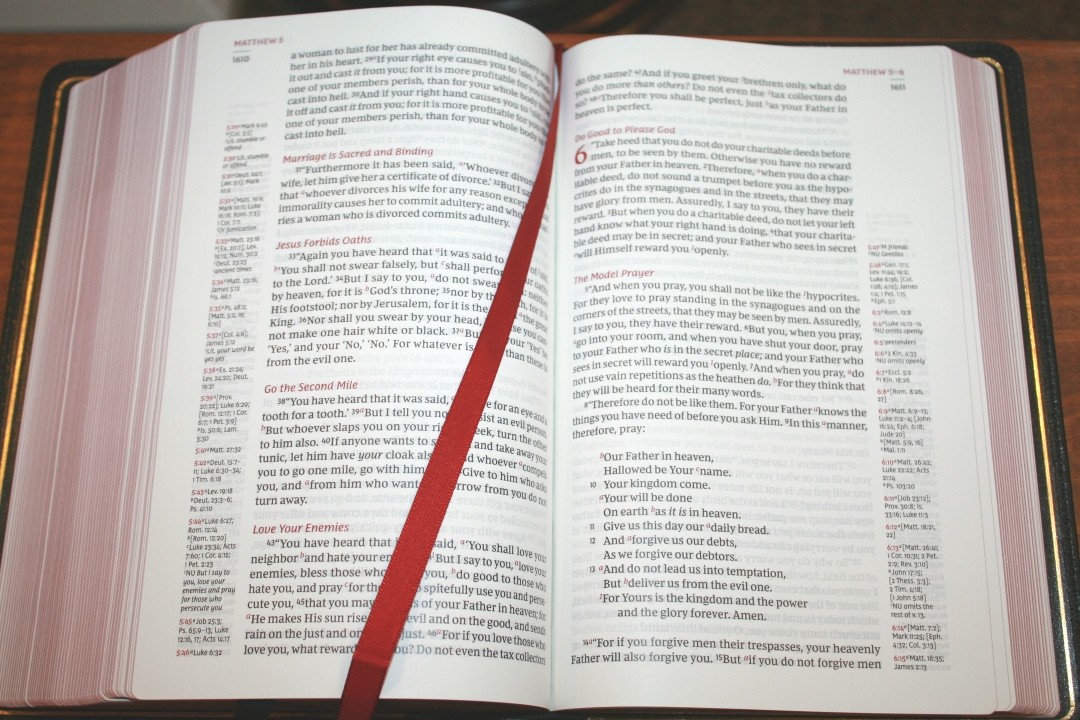
It includes three satin ribbons at 3/8″ each. They’re extra long and they’re cut straight. I like long ribbons, but these could be a touch too long if you have trouble getting ribbons caught on things. The width feels right for the size of this Bible.
Paper
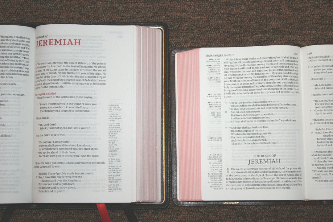
The paper is 36gsm premium European Bible paper. It’s white in color and it’s very opaque. It has a smooth texture that I find to be easier to turn pages than most Bibles. This is excellent paper for reading for long periods of time. Page edges are art-gilt with red under gold. The gold is sparkly shiny. The red isn’t a deep red. It reminds me of maroon, but it’s not as rich. It does look nice.
Typography
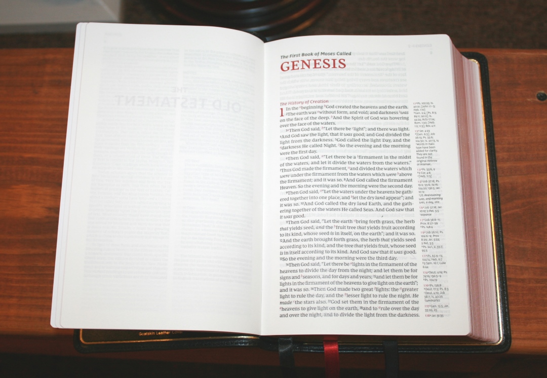
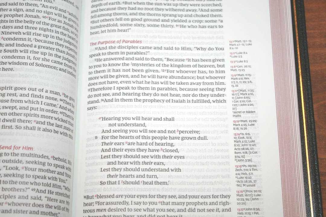
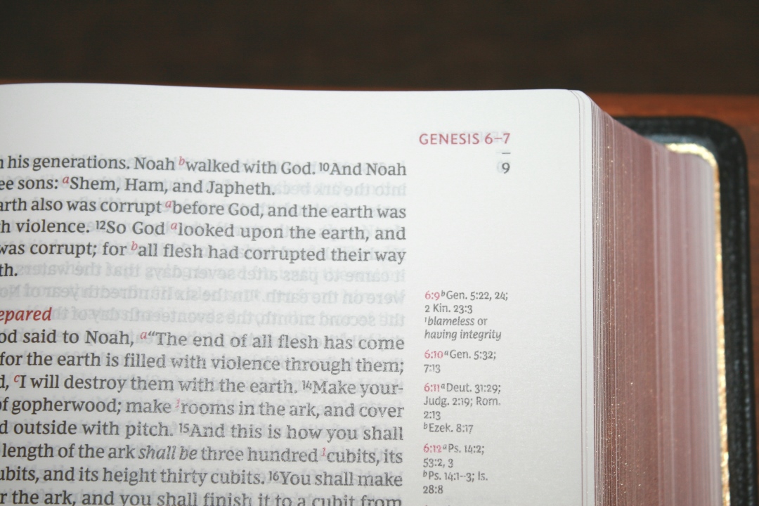
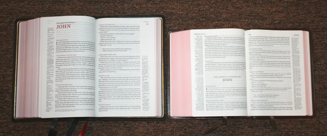
The text is presented in single-column paragraph format. The references are placed in the outer margin. The header shows the book name and chapter numbers in the outer corner in red with a black line under it and the page number in black under that.
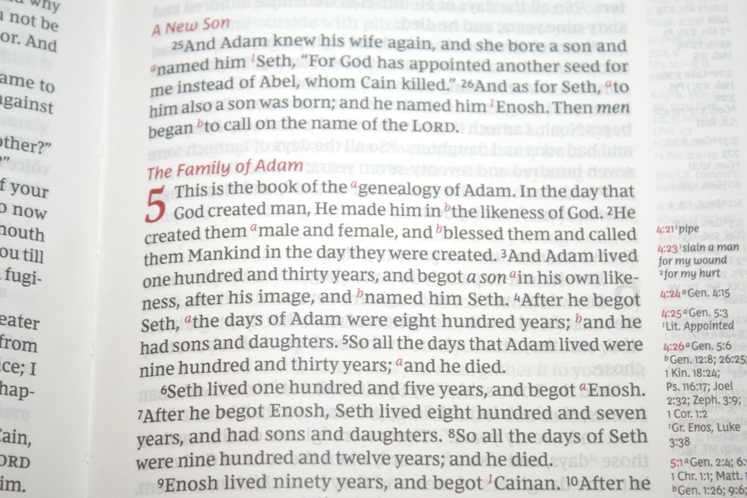
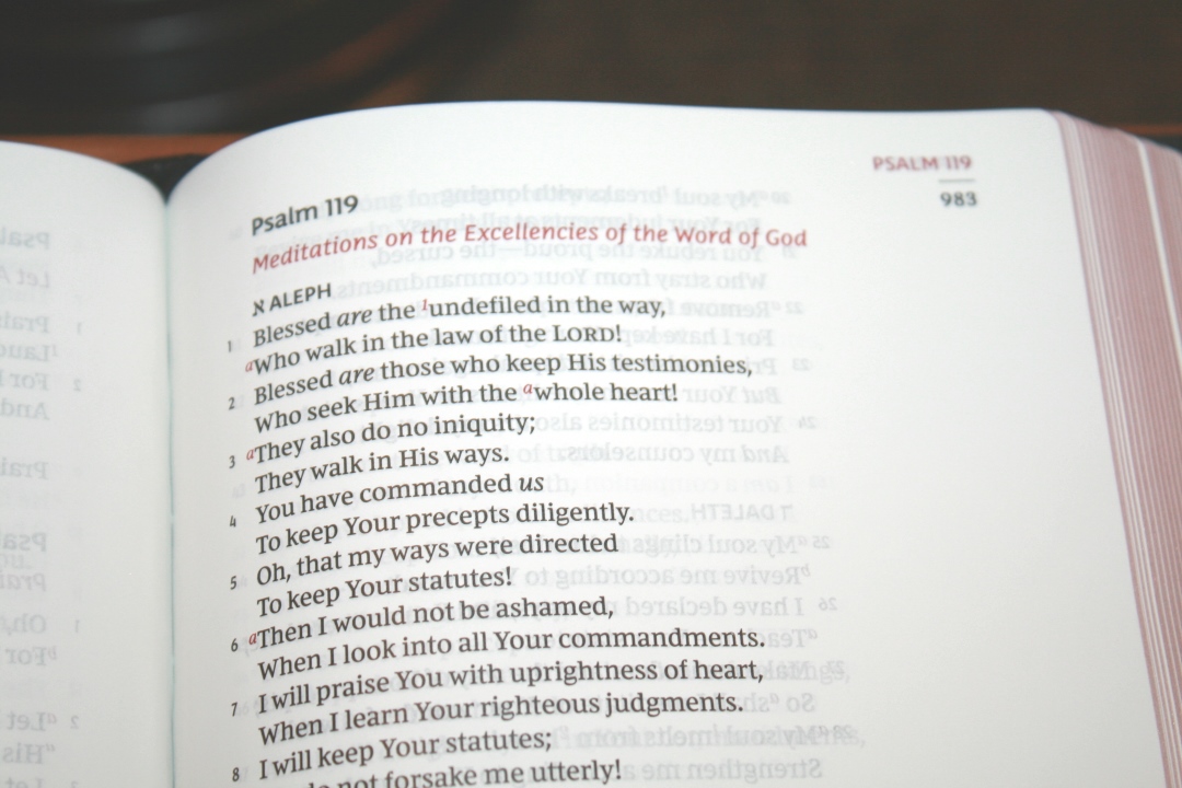
The typeface is the Comfort Print designed specifically for the New King James by 2K/Denmark. It’s labeled as 10.5. I think it’s a 9-point with 10.5 leading. It’s a black-letter text with red highlights including page titles, section headings, drop caps, cross reference, footnote keys, the book name and chapter numbers in the header, and the chapter and verse numbers in the margins that correspond to those in the text. I love the red highlights. I almost want to see the verse numbers in red. With everything else highlighted in red, they almost feel left out. That might be too much red though.

It has around 62 characters across with around 10-12 words per line. For me, this character and word count are ideal. This is one of the most comfortable single column layouts that I’ve read. The text never feels crowded and it doesn’t have too much space. It has line-matching to make the text as readable as possible.
Old Testament quotes continue the newer NKJV style and do not include oblique type.
Cross-References and Footnotes
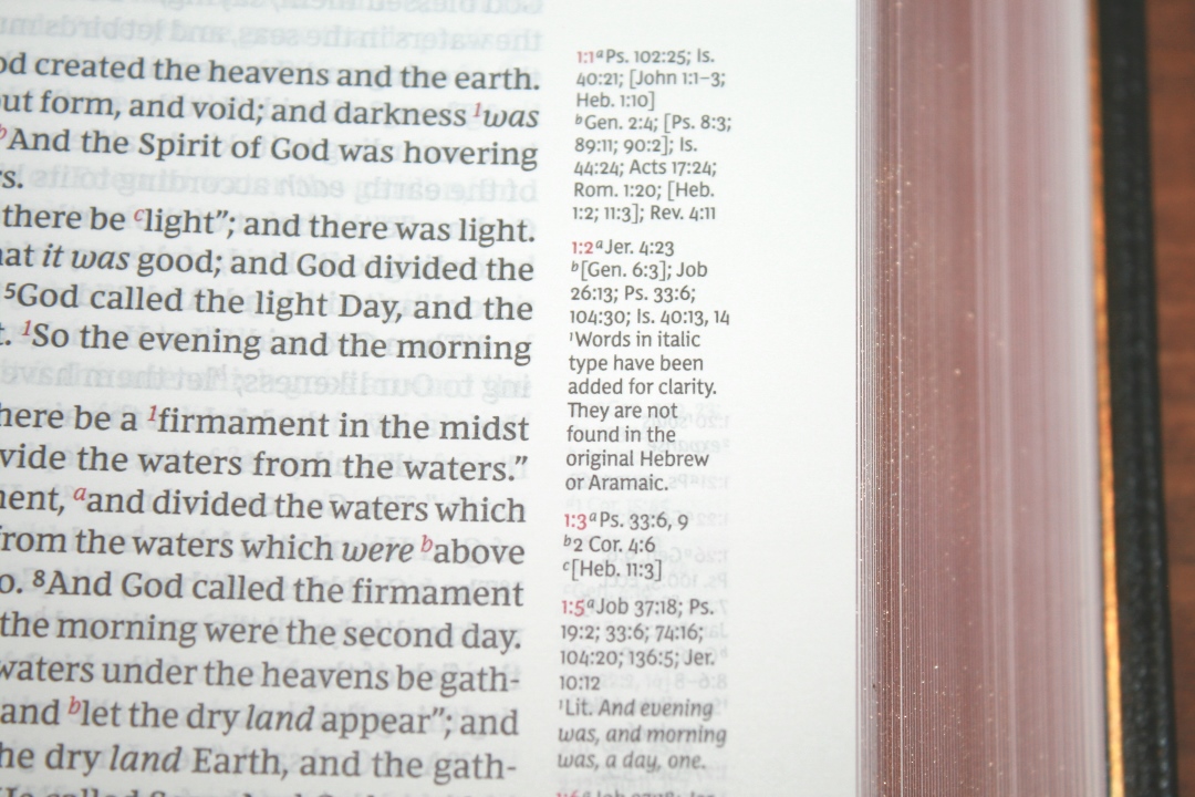
Cross-references and footnotes are placed in the outer margin, and as far down the page as possible. This means they’re not near the verses they correspond to, so I can’t use them to find verses as I do in the Clarion. They’re keyed to the text with letters. The pilot chapter and verse numbers are in red, which looks elegant in the margin. Cross-references and footnotes are placed under the pilot numbers. They’re left-justified.
Here are some example references to help you compare:
- Genesis 1:1 – Ps 102:25; Is 40:21; Jn 1:1-3; Heb 1:10; Gen 2:4; Ps 8:3; 89:11; 90:2; Is 44:24; Acts 17:24; Rom 1:20; Heb 1:2; 11:3; Rev 4:11
- Deuteronomy 6:4 – Deut 4:35; Mark 12:29; John 17:3; 1 Cor 8:4, 6
- Isaiah 9:6 – Isa 7:14; Luke 2:11; John 1:45; Luke 2:7; John 3:16; 1 John 4:9; Matt 28:18; 1 Cor 15:25; Rev 12:5; Judg 13:18; Titus 2:13; Eph 2:14
- Matthew 17:20 – Mat 21:21, Mk 11:23, Lk 17:6, 1 Cor 12:9
- Mark 11:23 – Matt 17:20; 21:21; Luke 17:6
- Mark 12:29 – Deut 6:4, 5; Is 44:8; 45:22; 46:9; 1 Cor 8:6
- John 1:1 – Gen 1:1; Col 1:17; 1 John 1:1; John 1:14; Rev 19:13; John 17:5; 1 John 1:2; 5:20
- John 2:19 – Mat 26:61, 27:40, Mk 14:58, 15:29, Lk 24:46, Acts 6:14, 10:40, 1 Cor 15:4
- Acts 2:38 – Luke 24:47
- 1 John 1:1 – John 1:1; 1 John 2:13, 14; Luke 1:2; John 1:14; 2 Pet 1:16; Luke 24:39; John 2:27; John 1:1, 4, 14
Footnotes are the standard NKJV translation notes. These are my favorite footnotes of the translations I use the most because they provide manuscript variations and identify the manuscripts.
Concordance
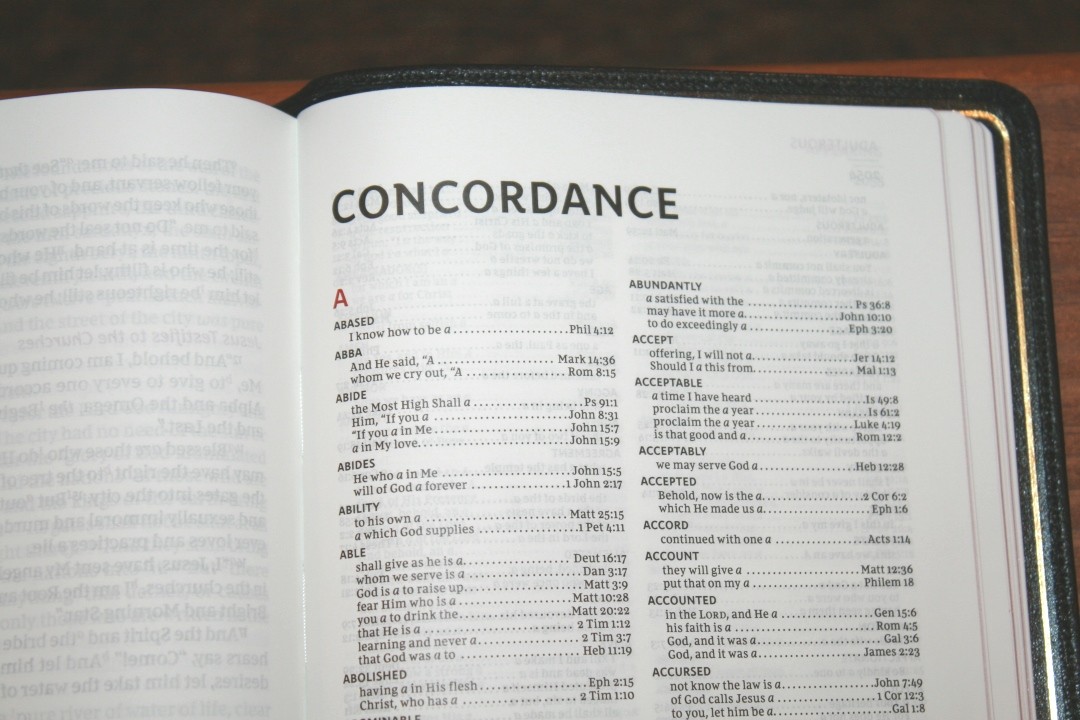
The concordance is 76 pages with 2 columns per page. The first or last word is placed in the header in red. It has a lot of entries, making this a good concordance for study. It includes Jesus, but it doesn’t include other common names. Here are some example entries and the number of references they provide:
- Christ – 13
- Christian(s) – 2
- Faith – 40
- Faithful – 20
- Faithfulness – 5
- Faithless – 2
- God – 38
- Goddess – 2
- Godhead – 2
- Godliness – 4
- Godly – 3
- Praise – 25
- Praised – 4
- Praises – 2
- Praiseworthy – 1
- Praising – 3
- Pray – 14
- Prayed – 2
- Prayer – 16
- Prayers – 5
One Year Reading Plan
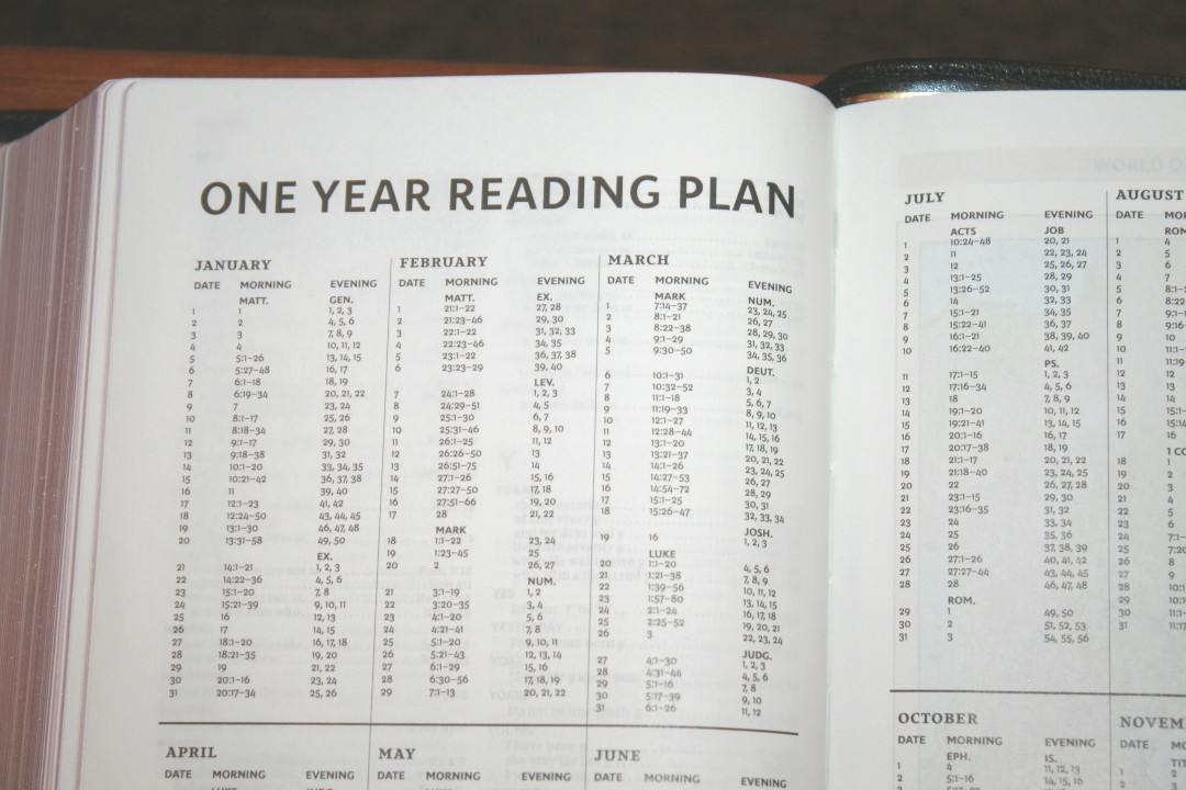
In the back is a one-year reading plan that provides two reading per day: morning takes you through the New Testament, and Evening takes you through the Old Testament. It shows a table with the month as the title, and then it shows the date and both readings. Both readings follow normal biblical order.
Maps
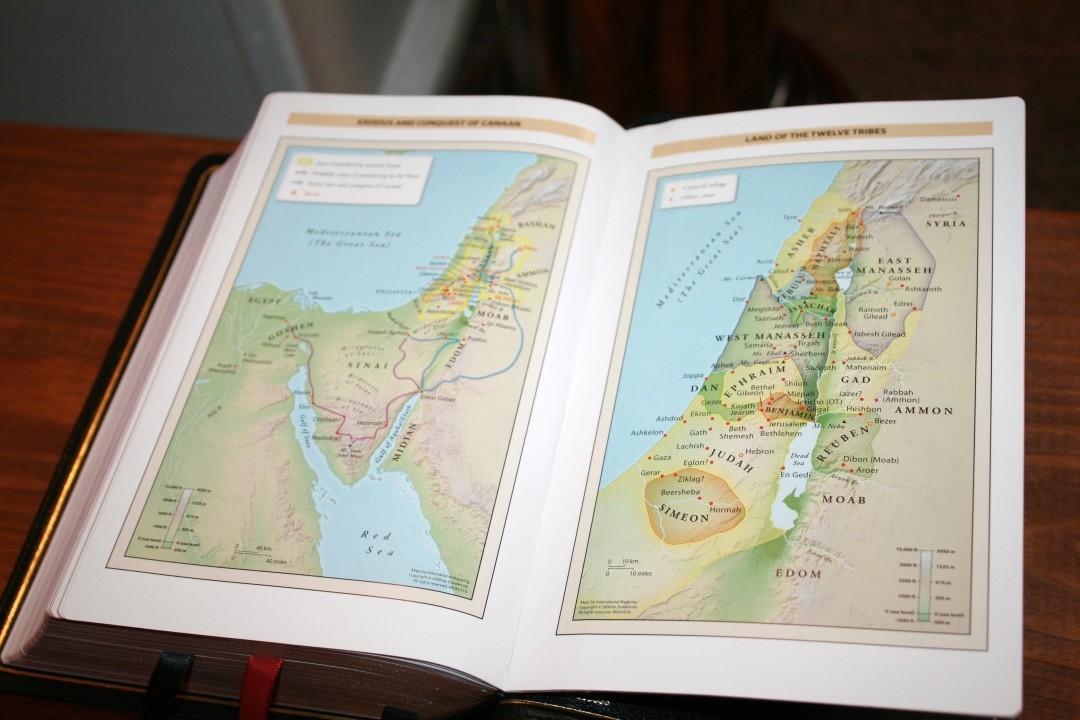
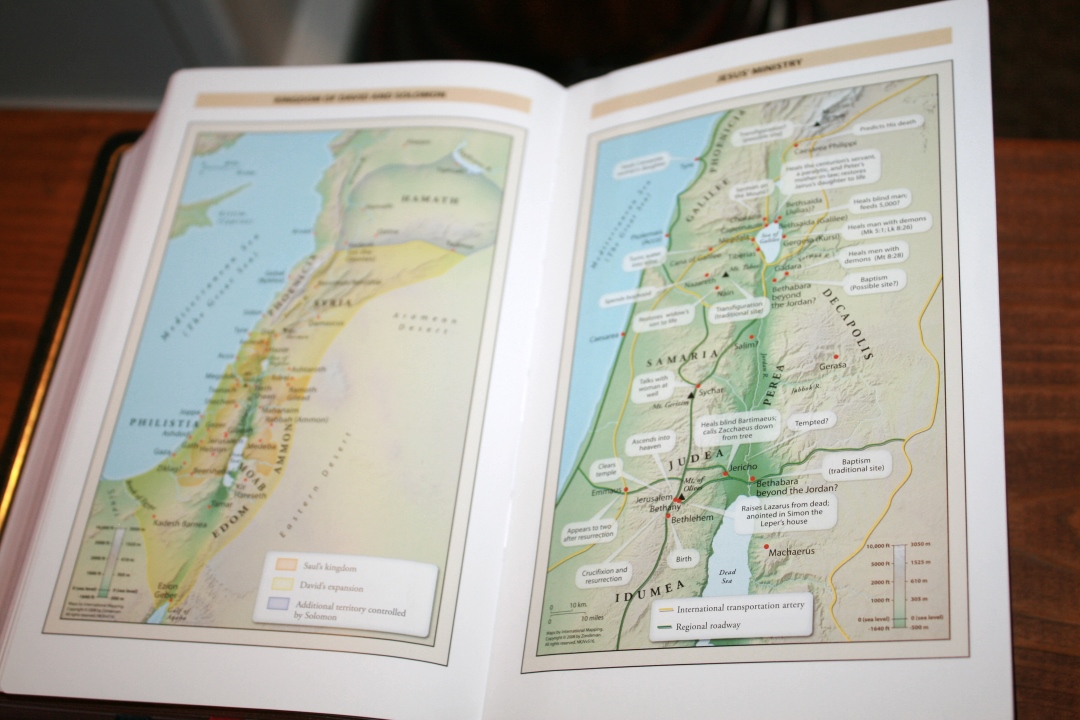
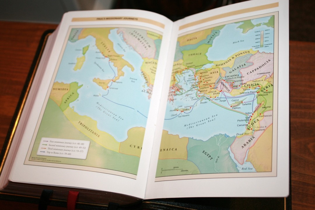
It includes the standard Thomas Nelson maps. This is 7 full-color maps printed on 8 thick glossy pages. It does not include an index but the maps are annotated well. I love the bright earth-tones. The maps show topography, distance, routes, borders, possible locations of lost places, battles, elevation, cities, and locations for the events of Jesus’ ministry.
Maps include:
- World of the Patriarchs
- Exodus and Conquest of Canaan
- Land of the Twelve Tribes
- Kingdom of David and Solomon
- Jesus’ Ministry
- Paul’s Missionary Journeys
- Jerusalem in the Time of Jesus
Comparisons

Here’s a look of the Premier Collection NKJV Single Column Reference Bible next to the Clarion and Humble Lamb single-column reference Bibles.
Clarion
The Clarion has a smaller footprint and a slightly smaller text. Its paper is thinner and not as opaque. The layout looks great, but it’s plane when compared to the Thomas Nelson. It weighs much less and is easier to hold and read for longer periods of time, but the Thomas Nelson isn’t so heavy that I won’t hold and read from it.
Humble Lamb
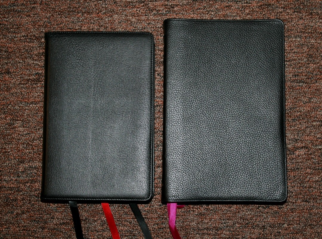

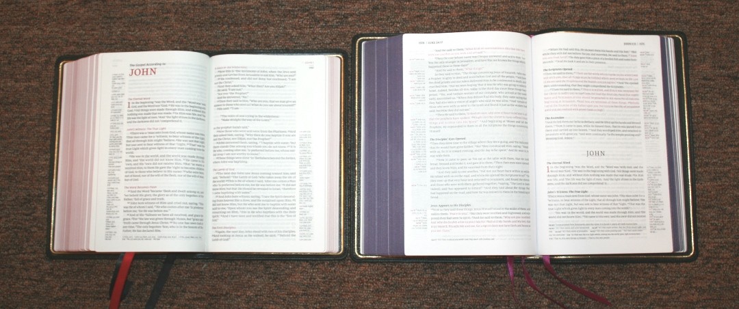
The Humble Lamb is larger but its font is actually smaller. Its paper isn’t as elegant and it has a rough texture. Its leather has more grain and looks great, but it’s also thinner and more flexible. I find the Thomas Nelson’s leather to be easier to hold on to.
Conclusion
The NKJV Premier Collection NKJV Single Column Reference Bible is absolutely beautiful. The Premier Collection is by far the highest quality I’ve seen in a Bible made in China. It compares favorably with Bibles in higher price ranges. The cover and paper quality are just slightly under the quality of Bibles that are twice the price.
I would consider any of the negatives I mentioned to be acceptable for this price range. Thomas Nelson hit a home run with the quality to price ratio and the design is gorgeous.
_________________________________________________________
This Bible is available at (includes some affiliate links)
and many local Bible bookstores
_________________________________________________________
Thomas Nelson provided this Bible in exchange for an honest review. I was not required to give a positive review, only an honest one. All opinions are my own.


How much margin would you say is available for taking notes, as compared to the Clarion?
This one has quite a bit more with a 1/2″ margin on the outside of the references while the Clarion has 1/4″. The amount of space between references is basically the same, but since this one places all of the blank space together it has more usable writing space than the Clarion. This paper is better for writing too.
This Bible or the NKJV Schuyler Quentel? If you had to choose. 🙂
That’s a tough one because they’re so different and both are amazing designs. The Schuyler is the higher quality Bible in materials and I love that layout, but for my personal use I lean toward smaller editions in single column. Their price reflect their quality and both are worth their money. If quality and large print was my goal I’d grab the Quentel, but for my personal reading a carry I grab this one. I think that’s the closest I can come to making a decision lol.
This is great! I wish they had it in a 11.5 or 12 pt font!
Why make the superscripts red instead of making the words of Christ in red?! Nelson lost my money.
I’d love to have this Bible rebound in a Sokoto goatskin. Do you happen to know if the page quality etc. is the same on the hardcover version as it is on the premium? Since I’m planning to have it rebound, I don’t want to waste money on purchasing the premium version if the only difference is in the cover. The specs on the website don’t say and Thomas Nelson hasn’t answered my query. Thanks for any info you can provide!
Hi Rachel. I haven’t seen the current model, but as far as I know, it’s not the same. Mine was from the first run, which did have the same paper, but the plan was to use a different paper in the second run.
Thank you very much! I definitely will go with the premium option then. I really appreciate you taking time to answer.
Hello! Do you know if they make the “insides” of this Bible in a different, more budget cover? I know that they used to have a leather soft cover that is now out of print. Just wondering if they’ve rebranded it somehow. I love all of the features of this Bible, just not in a position to pay for the premium finishing! Thanks!
Hi Carrie. The content is the same, but this one has premium paper. The first run of the Leathersoft did have this paper, but they mentioned that would change for the second run. I’ve only seen the first run, so I can’t confirm that.