
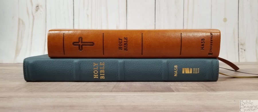
Zondervan’s NASB 1995 XL Bible presents an extra-large, 12.5-point, text in a square format that’s designed for easy carry. Matching the design of the NRSV XL, this Bible is shorter and wider than most Bibles. This keeps the Bible small and easy to handle without sacrificing the font size. It’s an excellent choice for those that prefer larger fonts for preaching or reading without eye-strain. It’s available in brown or teal Leathersoft (imitation leather). I’m reviewing the brown, ISBN: 9780310109402, made in China.
Zondervan provided this Bible in exchange for an honest review. I was not required to give a positive review, only an honest one. All opinions are my own.
_________________________________________________________
This Bible is available at (includes some affiliate links)
and many local Bible bookstores
_________________________________________________________
Table of Contents
Video Review
Binding
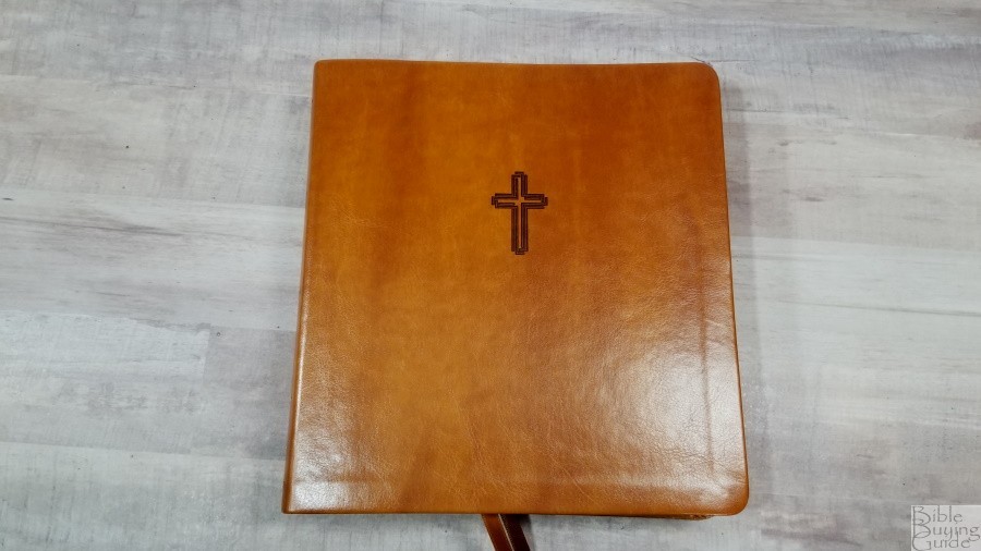
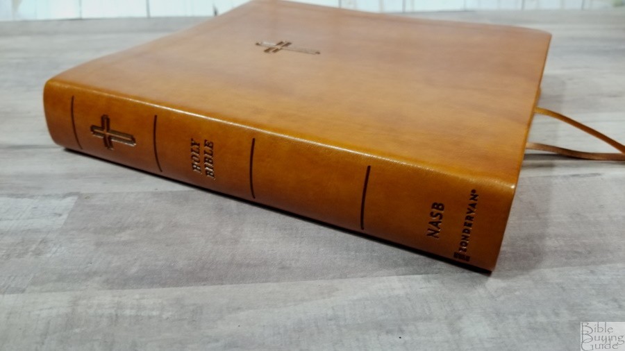
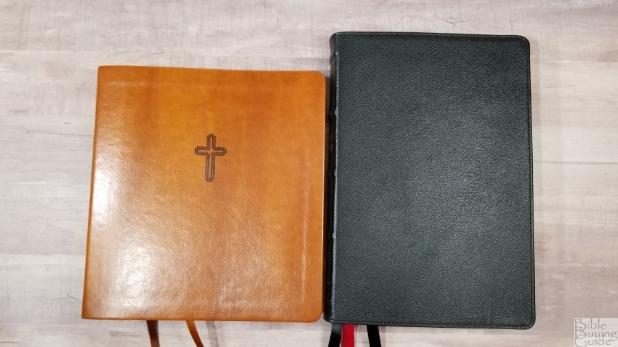
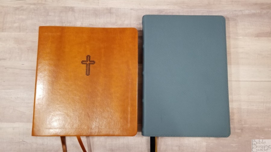
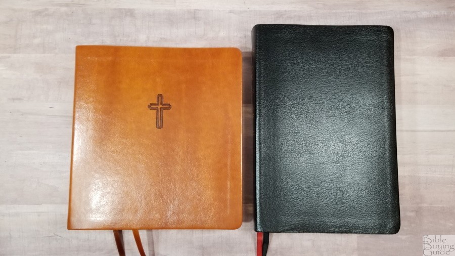
The cover is a brown imitation leather called Leathersoft. It has more of a caramel color and includes some visual and tactile texture. The front includes a debossed styled cross. The content on the spine is also debossed and includes that cross, the text, and lines to indicate spine ribs.
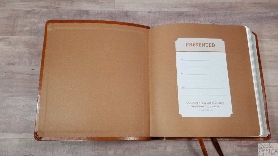
The liner is a paste-down paper that doubles as the presentation page. The text-block is sewn. It has no trouble staying open to any page out of the box.

It has two satin brown ribbons, a light brown and a medium brown, at 1/4″ wide. They’re extra long, which provides about an inch to grab when you pull them to the outer corner to open the Bible. The overall size is 7.75 x 8.26 x 1.25″. It weighs 2 lbs, 5.1 oz. I find this size great for carrying, but it is a little more difficult to handle than the standard shaped Bibles.
Paper
The paper is the same 30gsm paper that’s used in the other non-premium Bibles that I’ve seen from Zondervan. It’s white in color and has no glare under direct light. It’s decently opaque, but some lighting has more show-through than others. I find the texture to be ideal to separate the pages by rubbing them between my fingers. The page edges are gold gilted. I did have to separate every page (all 1648 of them). This paper is excellent for this price range.
Typography and Layout

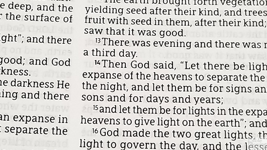
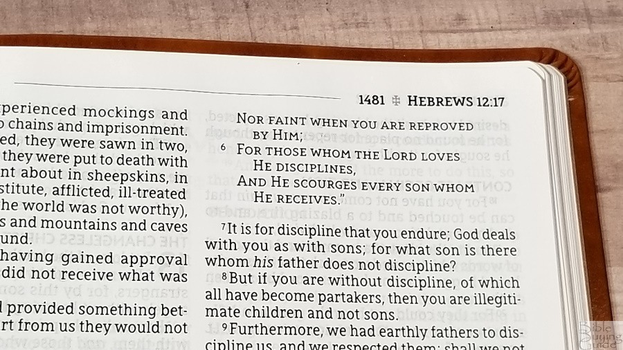
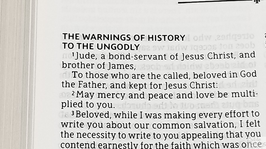
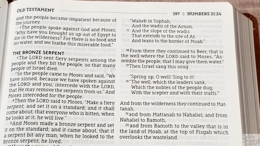
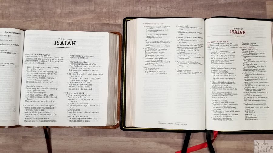
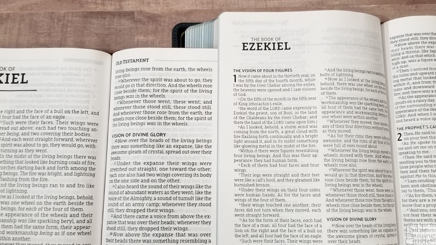
The text is presented in a double-column, verse-by-verse layout. Poetry is set to stanzas. Old Testament quotes in the New Testament are in all-caps. Section headings are larger and are in bold caps. Translation footnotes are placed in a single column in the footer. The header shows the book name, chapter and verse number, and page number in the outer margin. The inner margin shows which testament you’re reading. A horizontal line separates them.
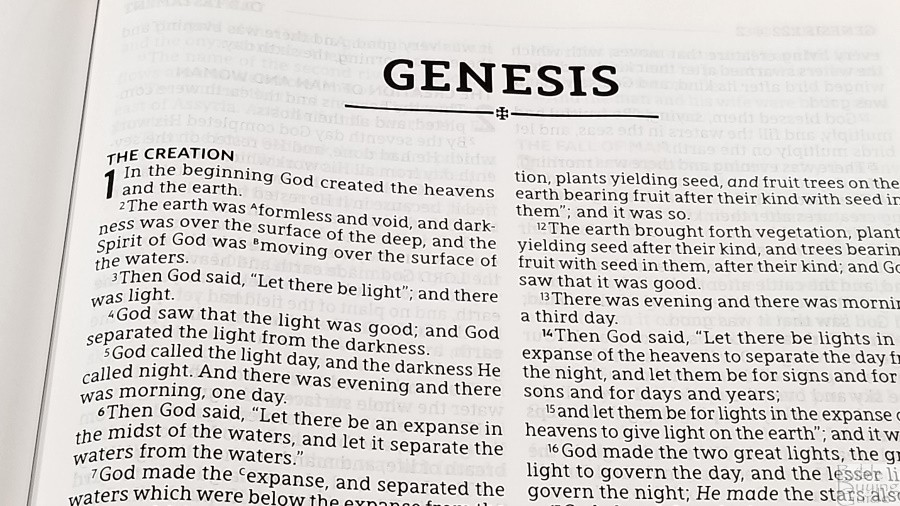

The font is a black-letter 12.5-point, Comfort Print typeface designed by 2K/Denmark for the Zondervan NASB. The font is dark and crisp. I find it to be an easy font to read. It has a good amount of space between the lines. Most lines have around 10 words, which provides an excellent balance between prose and poetry. It’s printed with line-matching, meaning that the lines on both sides of the page are printed in the same location. This greatly reduces the show through. The thinness of the spine allows the pages to lie completely flat. It only has about a 1/4″ inner margin, but that’s really all it needs to bring the text out of the gutter.
Verses are indented, so they’re easy to find at a glance. Verses that continue the sentence from the previous verse start with a lower-case letter. This is my preference for v-b-v settings, as it helps retain some readability.

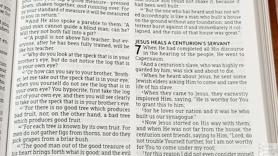
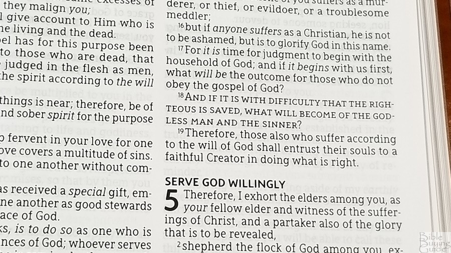
Paragraphs are bold with bold verse numbers. If the paragraph starts within the verse, the part of the verse that starts the paragraph is placed on a new like and the first letter is bold. This is the standard method to mark paragraphs in the ’95 NASB. Bold letters can look a touch odd, and it can sometimes be difficult to notice that a number is bolder than the others. I’d actually like to see paragraphs to be indented further than the rest of the text. I think this would work great even in a vbv setting.
Poetry doesn’t always break in the best places, but it does indent lines that continue from the previous stanza so it’s easier to follow. The beginning of each line starts with a capital letter, which is standard for the NASB.
Concordance
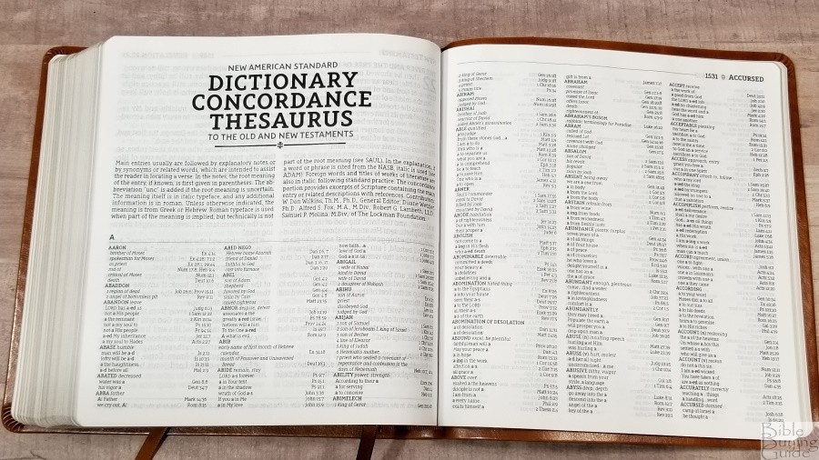
The concordance also combines a dictionary and thesaurus. It has 118 pages with three columns per page. The main entries include an explanatory note, synonyms, or related words. Root meanings, if they’re known, are provided in parenthesis. The meaning of the word is from Greek or Hebrew.
- Christ (Messiah) – 17
- Christian (follower of Christ) – 3
- Faith (believe, trust) – 36
- Faithful (loyal, trustworthy) – 15
- Faithfulness (loyalty) – 7
- Faithless (unbelieving) – 4
- God (Deity, Eternal One) – 37
- God (false diety, idols) – 8
- Goddess (female diety) – 3
- Godless (pagan, without God) – 5
- Godliness (holiness) – 5
- Godly (holy) – 6
- Praise (n) (acclamation, honor) – 10
- Praise (v) (extol, glorify) – 12
- Pray (ask, worship) – 19
- Prayer – 15
Comparisons
Here’s how the NASB XL compares to several other NASB’s from Zondervan.
NASB Preacher’s Bible
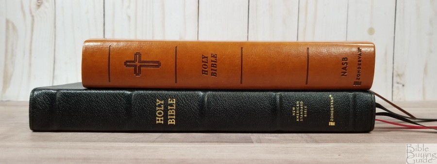

The NASB Preacher’s Bible is in a different category of materials. It’s thinner and the font is smaller.
NASB Large Print Thinline

The NASB Large Print Thinline is thinner and has a smaller font. It has the same paper.
NASB Gant Print Thinline

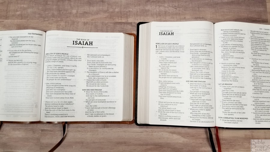

The NASB Giant Print Thinline is slightly thinner and has the same paper. The font seems to be the same size, but it has fewer words per line. This is most noticeable in the poetic settings. This is a good example of the advantage of having 10 words per line instead of 8. Far fewer lines have to wrap to the next line.
Conclusion

The NASB 1995 XL Bible is an interesting Bible. It’s designed like the NRSV XL. I love this design. It doesn’t feel like I’m carrying a large Bible, but I still have a 12.5 font to read on the go. It’s almost as easy to carry as a personal size Bible. It’s easy enough to hold open to read, but I think its best use is when lying on a table or pulpit. The size and shape are excellent for preaching and teaching. If you’re interested in a NASB with a larger font with a great layout and you don’t want an extra-large Bible, this one is an excellent choice.
_________________________________________________________
This Bible is available at (includes some affiliate links)
and many local Bible bookstores
_________________________________________________________
Zondervan provided this Bible in exchange for an honest review. I was not required to give a positive review, only an honest one. All opinions are my own.


I think this would have been so much better if it were in paragraph format instead of verse by verse.