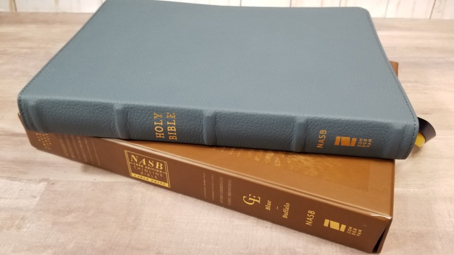
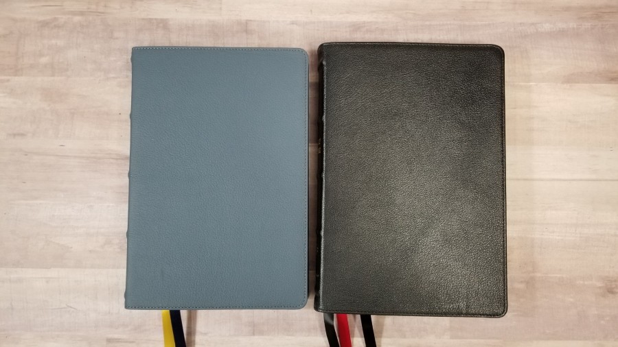
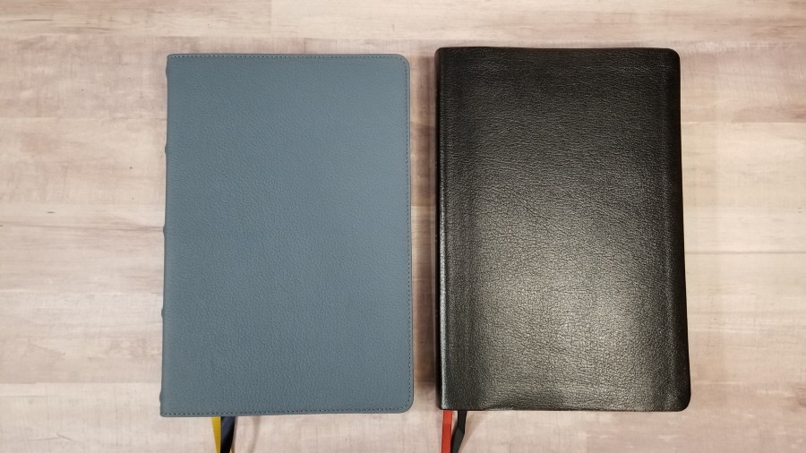
The NASB 1995 Large-Print Thinline Bible from Zondervan is a large-print thinline that’s easy to carry and use. It presents the 1995 NASB in a large, clear text in verse-by-verse, making it easy to preach from and follow along with others. I’m reviewing the blue buffalo leather with an edge-lined liner and raised hubs, ISBN: 9780310456308, printed in China. It comes in an interesting one-piece box with a textured design.
Zondervan provided this Bible in exchange for an honest review. I was not required to give a positive review, only an honest one. All opinions are my own.
_________________________________________________________
This Bible is available at (includes some affiliate links)
and many local Bible bookstores
_________________________________________________________
Table of Contents
Video Review
Binding
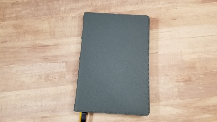
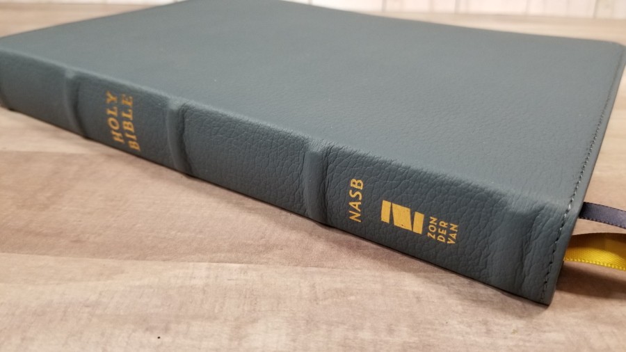
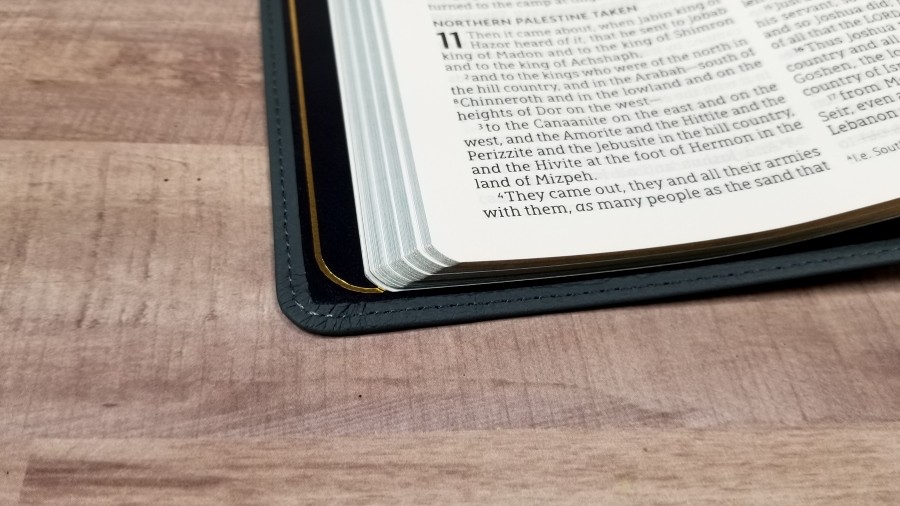
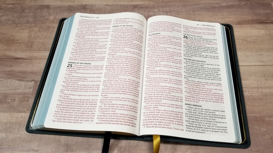
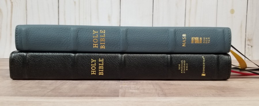
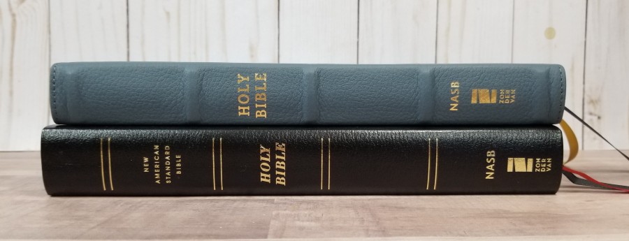
They refer to this leather as Blue Genuine Leather. It’s a lot better than regular genuine leather. This is buffalo leather. It’s a dusty blue and has a grain that looks like cowhide. It’s soft to the touch. It has nothing printed on the front. It includes perimeter stitching. The spine has 5 raised hubs that are wider than most thinline editions. The text on the spine is printed in gold.
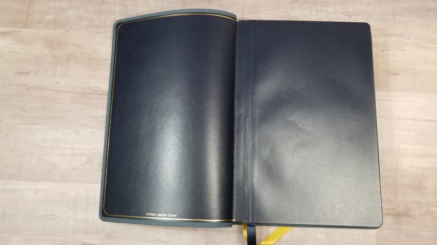
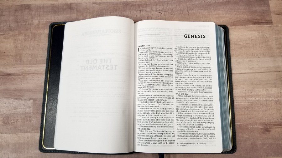
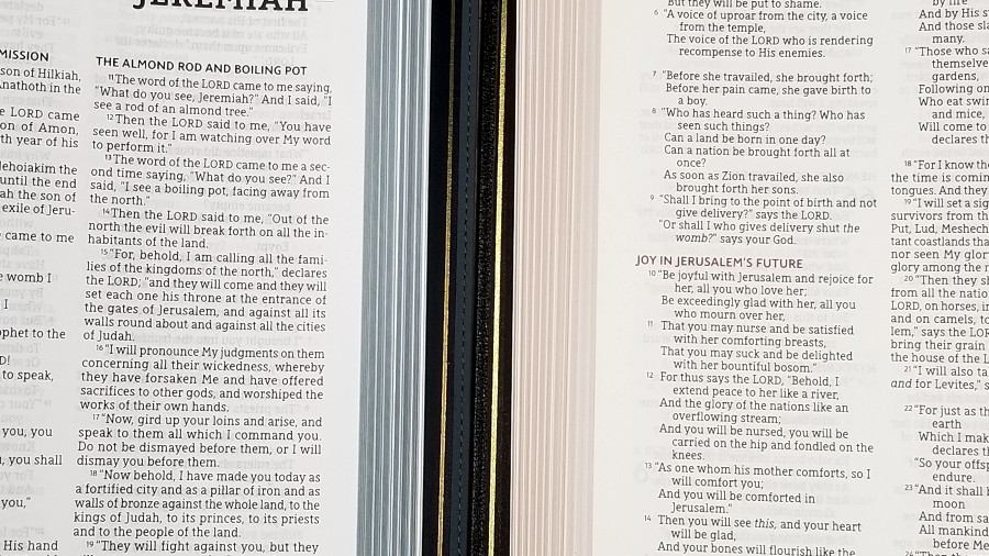
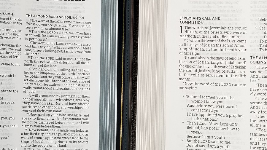
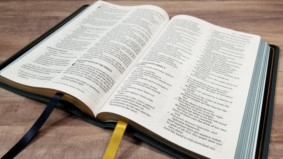
The liner is edge-lined with what seems to be a vinyl-coated card that matches the end-sheet. It includes a gilt-line. It doesn’t have much overhang, so the paper is closer to the folded leather than I prefer. The text-block is sewn. The edge-lined tab is stiff out of the box. It does stay open to any page with no trouble, but it has a noticeable hump for a few hundred pages in the front and back. I find it extremely annoying in Genesis, but it starts to flatten out in Exodus.
It has two 3/8″ ribbons: a dark blue ribbon for the Old Testament and a gold ribbon for the New Testament. The overall size is 6 1/2 x 9 7/16 x 1″ and it weighs 1 lb, 12.7 oz.
Paper
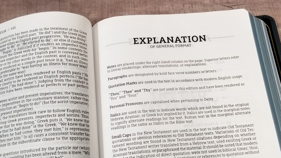
The paper seems to be the same or similar to the non-premium 30gsm that’s used in other thinlines by Zondervan. The texture is slightly rough, making it easy to separate and turn. It’s white in color and it’s highly opaque. The page edges are blue under gold art-gilt.
Typography and Layout
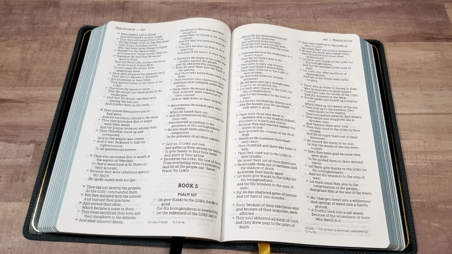
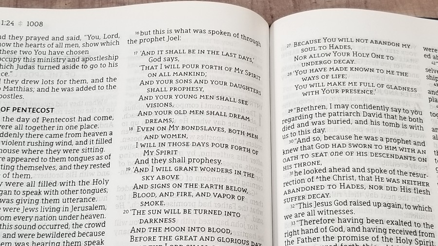
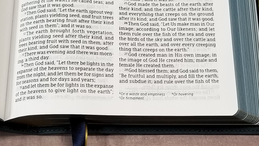
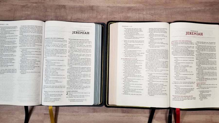
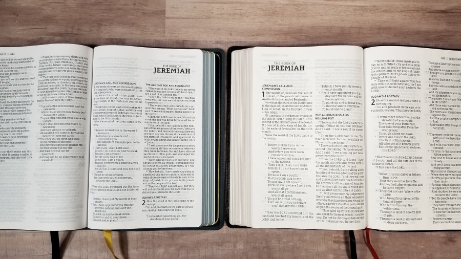
The text is in a verse-by-verse format. Poetry is in stanzas, letters are indented, Old Testament quotes are in all-caps, and all highlights are in black. The header shows the book name, chapter and verse, and the page number in the outer margin. Translation footnotes are placed under the last verse in a smaller font. Paragraphs are marked with slightly bolder verse numbers. Even though it’s v-b-v, the first word of a verse that continues the sentence from the previous verse is in a lower case letter (as it should be). It’s free of distractions, making it an excellent choice for peaching, teaching, or following along with someone.
The typeface is 10.5, red-letter, Comfort Print designed by 2K/Denmark for the Zondervan NASB. Both black and red are about a medium in darkness and they’re comfortable to read for long periods of time. I did detect some slight variation in darkness, but it wasn’t that bad. It has around 10 words per line with generous space between the words and lines. It’s printed with line-matching. Show-through is mostly noticeable in the poetic settings and even then it’s minimal. Poetry isn’t always divided into good places. Most lines go to the end of the line and indent the rest under the line. This causes it to have lots of lines with a single word.
Like the other NASB editions from Zondervan, this one uses the reduced set of translation footnotes. They’re keyed to the text with letters and they’re placed under the last verse with a line that divides the footnotes from the text. They don’t include the reference, so it can be difficult to find which verses they correspond to. The keys in the text are superscript. They’re slightly smaller than the verse numbers, but they look to be slightly bolder.
Extras
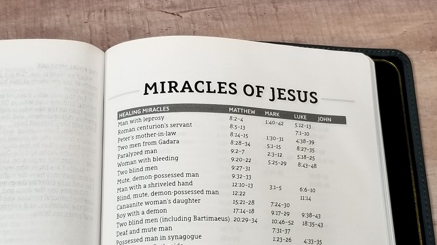
In the back are several tables and lists. Most are one or two pages. They provide a topic and a list of references and are good for personal study and sermon prep. They include:
- Miracles of Jesus
- Parables of Jesus
- Perspectives from the Bible
- Prayers of the Bible
- Promises from the Bible
Maps
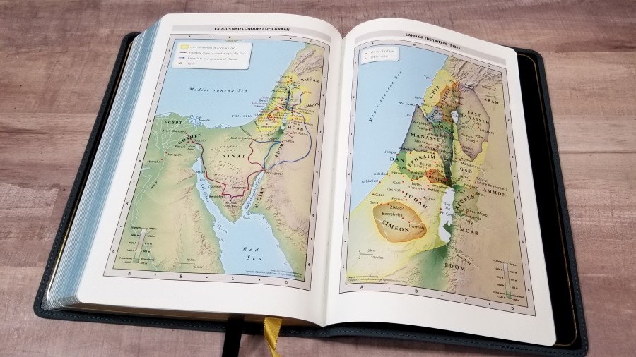
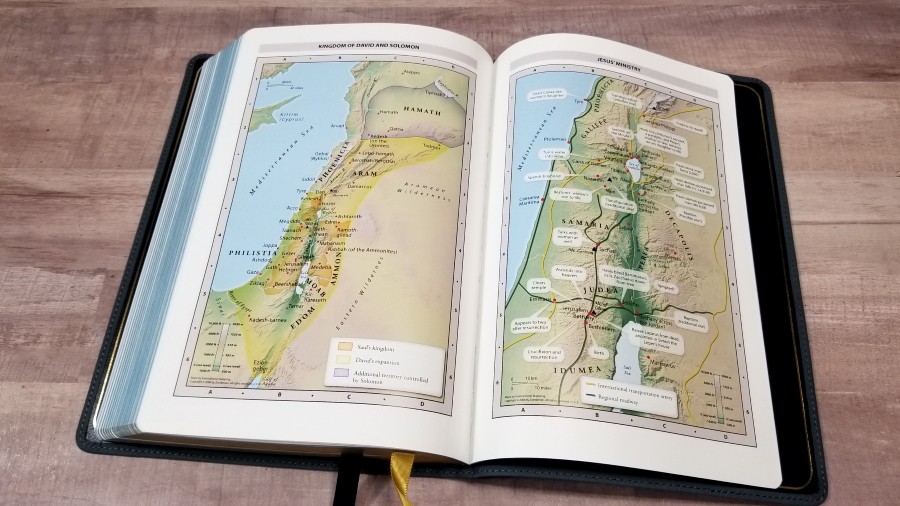
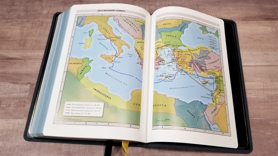
It includes 8 pages of full-color Thomas Nelson maps. They’re printed on thick glossy paper with bright colors and include topography, distance, routes, borders, possible locations of lost places, battles, elevation, cities, and locations for the events of Jesus’ ministry. It doesn’t have an index, but the maps are annotated well, making them easy to use.
Maps include:
- World of the Patriarchs
- Exodus and Conquest of Canaan
- Land of the Twelve Tribes
- Kingdom of David and Solomon
- Jesus’ Ministry
- Paul’s Missionary Journeys
- Jerusalem in the Time of Jesus
Comparisons
Here’s how the NASB 1995 Large-Print Thinline Bible compares to a few other NASB’s from Zondervan.
NASB Preacher’s Bible
The NASB Preacher’s Bible from Zondervan is a premium edition that has a darker but slightly smaller font. It also has a less consistent layout because it works to match the NASB Pew and Worship Bible for each page. It has the same extras but doesn’t include maps. The footprint and thickness are about the same. The ribbons are the same, but it has three.
NASB Giant Print Thinline Bible
The Zondervan NASB Giant Print Thinline Bible has a much larger font with fewer words per line. It has the same extras and no maps. The paper is the same and the ribbons are not as wide. The footprint is the same, but it’s 1/4″ thicker.
Conclusion
The NASB 1995 Large-Print Thinline Bible from Zondervan is a nice large print edition of the 1995 NASB. The paper isn’t premium, but it is opaque and easy to use. The print is highly readable and the vbv layout is good fpr preaching or following along with someone. I love the buffalo leather. The edge-lined tab is a touch stiff at first, though. This size is excellent for carry and preaching, and it’s a good alternative to the NASB Preacher’s Bible.
_________________________________________________________
This Bible is available at (includes some affiliate links)
and many local Bible bookstores
_________________________________________________________
Zondervan provided this Bible in exchange for an honest review. I was not required to give a positive review, only an honest one. All opinions are my own.










Trackbacks/Pingbacks