I recently had the opportunity to interview the amazing crew of 2K/Denmark, including Klaus E. Krogh (CEO), Magnus Gaarde (Head of Design) and Johs Krejberg Haahr (Bible Concept Developer). 2K/Denmark are some of my heroes of Bible design and I am grateful for them agreeing to this interview and for their time they put into these detailed answers.
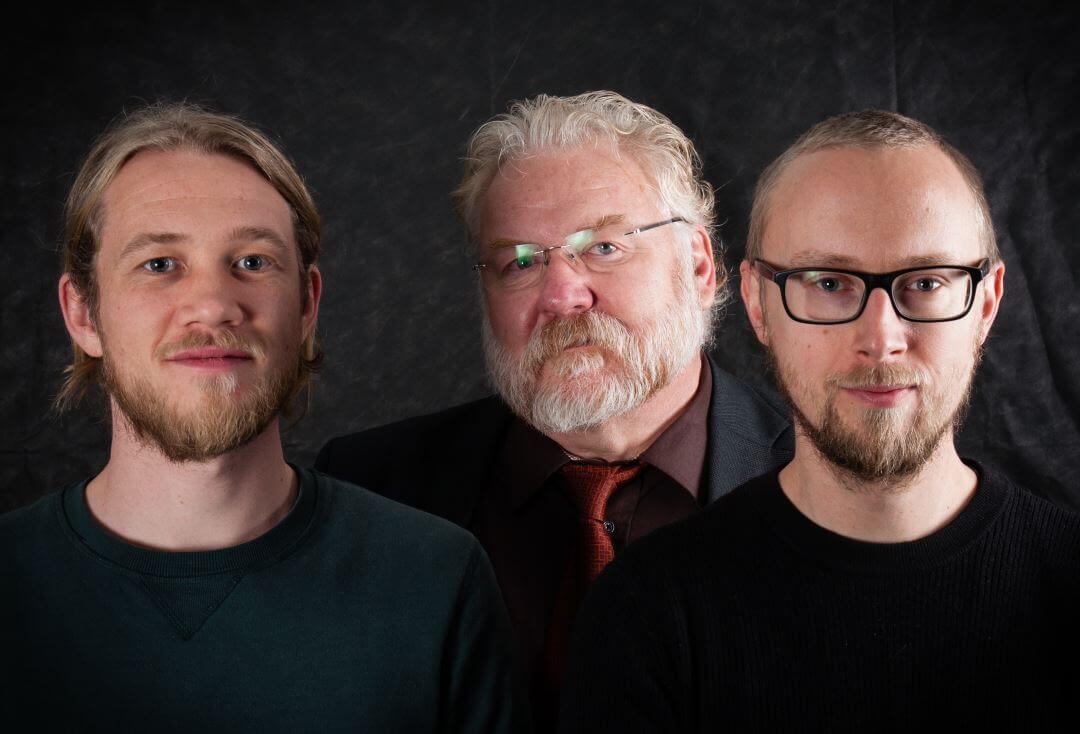
From left to right: Johs, Klaus and Magnus
In this interview they give us an inside look into the world of Bible design. Here’s the complete interview.
Introduce our readers to 2K/Denmark. Who are you and what is it you do?
Klaus:
2K/DENMARK is a graphic design company founded in 1987 as 2Krogh. Today we offer a range of services, such as type design, graphic design and typesetting, both digital and in printed media, working with publishers around the world. Over the years we have specialised in the design and typesetting of highly complex texts, primarily Bibles, but also trade books, text books, periodicals, hymnbooks, magazines and more.
It is our belief and experience that the best results are achieved through both designing and typesetting a book in one house, which means that our Design and Typesetting departments work closely together with constant internal quality checks of the products. The more difficult a typesetting job is, the more exciting it is for our typesetters. We do advanced math and chemistry typesettings, and study material for bibles with multiple streams of information.
We also are a fully fledged type foundry and do custom type designs for the most discerning group of clients: publishers for whom the text is the main product.
How do you approach a Bible design?
Magnus:
We go into every Bible design task with just one ambition: to make this Bible the best and most accomplished Bible design we have made so far. Obviously every design comes with its limits when it comes to production price, page count, target group etc, but within those given boundaries we challenge ourselves every time to make an even better Bible than the last one we made.
What are the challenges you face in designing a layout?
Magnus:
Design is never easy. Particularly within Bible design, which in many ways comes with a set of standards and a given amount of content, there are fewer knobs to turn – fewer design instruments to work with, which makes it even harder to be innovative and to create a strong product identity.
Klaus:
A recurring challenge is to strike the right balance between three interrelated, and to some extend contradictory aspects of a design: 1. to maximise readability, 2. to present the Bible in a beautiful and aesthetically pleasing form that is worthy of its content, 3. to manage the page count or the bulk of the book.
Is designing a small Bible more difficult than a large Bible?
Magnus:
Smaller Bibles are definately harder to design, due to the fact that the same amount of letters (around 4 million depending on the translation) has to fit into a more limited space. You have to push the boundaries when it comes to point size, leading, margins etc, while still maintaining readability and a generally pleasing layout.
How important is layout design for reading and study comprehension?
Johs:
It is of course possible to read and understand texts that are obviously bad designed. But it will continually require mental work from the reader that could be much better utilised in digging deep into comprehending the meaning of the texts. This is why professionally designed layouts and typefaces are extremely important, and especially so when it comes to Bibles where the devil as well as the gospel might be found in the detail.
If the understanding of God’s Word is impeded by the reader being forced to mentally work around a bad typographic design, then the Bible designer has failed her or his primary task: to present Scripture as readable, accessible, and clear as possible.
What are some of the ways you’ve made texts more readable even if they have study tools?
Johs:
A keyword here is unobtrusiveness. As one of the 10 design principles from the great designer Dieter Rams reads: Good design is unobtrusive. To me, the biblical text itself is always the most important part of any Bible and should consequently always be presented as such. All added material, be it study notes, verse numbers, or cross references, should be unobtrusive to the primary content. (That is still true even if the Bible translation is not the differentiating element compared to competing products.)
This is not to say that study notes cannot have, e.g., a bold typography and coloured backgrounds. It just means that elaborate designs and delightful details cannot be allowed to take the place and focus from the designer and typesetter leaving the biblical text neglected. The most humble forced line break in a biblical poetry stanza should be prioritised above even the most eye catching colour gradient background for a fact box.
How important are visual aids, such as images and drop caps, and what is the best way to utilize them?
Johs:
As stated above, there is definately a place and time for “visuals aids”, as long as they are exactly that – aids, helping the reader navigate and understand the texts. Can they, at the same time, function as pleasant and delightful “invitations” into the Bible text itself, that is obviously all the better, as long as the ornamental aspects do not overtake the aiding aspects of these elements.
More than a century ago the architect Adolf Loos – one of the early inspirators for the German functionalism – denounced ornament as a crime. Such statement is probably too one-sided and should at least be moderated by adding that ornament is a crime if it hampers the function (in this case, readability and accessibility) of the design. Unobtrusive design is not the same as drab or dismal design. Oppositely: elaborate or flashy design is not the same as overdone and inordinate design. But it takes a design professional to figure out the differences.
What trends do you see in Bible design?
Johs:
Unless you have been living under a rock for the last years (and given the fact that you read BibleBuyingGuide, you obviously have not) you will know that one of the most recognisable trends in Bible publishing is the Reader’s editions. That is coming from almost all major Bible publishers in these years. Much have been written in praise of this development, but only few wrote as insightful and as early as Mark Bertrand from BibleDesignBlog. One of those few is Glenn Paauw from Institute for Bible Reading. Glenn wrote an article for the latest issue of our magazine 2K/STORIES that I highly recommend if you’re interested in this topic and how to push this development of readable, unobtrusive, and back-to-basics Bibles even further.
Klaus:
A more general and slower evolving trend has been the steady but nevertheless significant increase in quality and availability of luxury Bibles. Exclusive Bibles in the $200+ price range are now available in most translations from many different publishers. I see this as a reaffirmation of the value of the book as a physical object for the reader to own, experience and pass on to future generations.
What kind of designs do you wish more publishers would ask for?
Klaus:
I am not saying, that they do not already do this, but we encourage publishers to be creative, playful, courageous in their attempts to create fresh expressions of what a Bible could be and look like – to engage and create fresh experiences with the Bible for new and seasoned Bible readers alike.
What are your thoughts on the future of Bible usability and design?
Klaus:
One of the developments in Bible design, that I think we will see, is an increasing awareness of the distinctiveness of the different Bible translations and a wish to mirror these qualities and differentiating characteristics into the design of Bibles, both in terms of typeface choices and the general feel of the designs. The result will probably and hopefully be a greater diversity in the Bibles getting published and a greater sense of identity between different editions of the same translations.
You’ve designed a font called Bible Serif. What’s the story behind this font and how do you hope to see this font used? How has it been received by publishers?
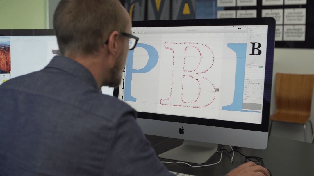
Magnus:
The Bible typefaces, which is actually a family of typefaces: Bible Sans, Bible Slab and Bible Serif, were designed to accommodate some of the challenges that we face every day, when designing and typesetting Bibles. Bible Serif is an awardwinnng typeface, that has been used (among elsewhere) in more than 30 new CSB editions so far.
The Bible Sans takes a very utilitaristic approach to type design providing the biggest amount of readable content pr square-inch possible. As such it is the obvious choice when typesetting very compact Bibles (e.g. a full Bible on 600 pages).
Let’s talk about what you like in Bibles. Do you prefer a clean text for reading or a text with study features such as footnotes and references?
Johs:
We use the Bible in many different ways and we have many different purposes with our reading. Sometimes we just want to immerse ourselves in the narrative. Sometimes we want to dig deep into the finer details of a pauline argument. Sometimes we search for a specific verse, sometimes we just feel for “wandering” around reading here and there. These different reading activities cannot all be optimally served using a jack of all trades Bible.
We are privileged to live in a place and time where many of us have the luxury to afford multiple Bibles, each made specifically for different kinds of reading. I could use a Reader’s Bible for my “recreational” reading and a full blown Study Bible or even a Bible commentary for my sermon preparations.
BUT, if I were to pick a single preference when it comes to printed Bibles, I would go with the trendy Bible buying crowd, and buy a Reader’s edition. The reason is, that one of the few (but nevertheless essential) things, that printed books do better than their digital counterparts is immersive deep reading. If I want an experience with the Bible, I prefer to have it in print. But if I want information or a better rational understanding of the Bible, desktop Bible software (in my case Accordance) is my preferred choice. This line of thought, echoing some of Mark Bertrands points here, is probably also one of the explanations why the Reader’s Bibles has gained in popularity almost in parallel with the rise of smartphones and the digital Bibles on them.
How can our readers learn more about 2K/Denmark?
Johs:
On our website, 2kdenmark.com, we highlight some of the work we do. But to really get a feel for how we work and our thoughts and ambitions, you should go to stories.2kdenmark.com where you’ll find the articles from the aforementioned 2K/STORIES, that we publish twice pr year. Also you could follow us on twitter and facebook. Alternatively you could search for “2K/” on BibleBuyingGuide.com and the other similar sites, to see what the reviewers say about our work. Recently, Thomas Nelson/Zondervan made some great videos, about our work with typeface design, that you might find interesting.
Do you have any parting thoughts for our readers?
Klaus:
We get out of our beds in the morning to design new, innovative, creative ways to read and interact with the Bible in the hope that more people would read more. What inspires us the most is to receive response from you, the readers and users of the Bibles we design. We follow (and occasionally engage in) discussions on different blogs, social media and we welcome contact via direct mail as well. Please let those comments keep coming; we really appreciate to hear about your experiences using the Bible.
The grass withers and the flowers fall, but the word of our God endures forever. – Isaiah 40:8
Ending Thoughts
I’d like to say a special thank you to Klaus, Johs, and Magnus of 2K/Denmark for taking the time out of their day for this interview, and to all of the 2K/Denmark crew for the work they do. Bible publishing is better because of them.
I’m glad to see this trend of Reader’s Bibles is becoming even more popular. Reader’s Bibles are on the mind of practically everyone I’ve interviewed and it’s become the Bible I prefer. I read more than anything and having a Bible that’s designed specifically for reading is by far the best way I’ve found to become fully immersed into God’s Word. I love the design’s 2/K Denmark has worked on and I can personally vouch for their Bible Serif typeface.
The information they’ve provided here about design has helped me understand why I’m drawn to some Bibles and not others. And it’s no surprise that most of them are 2K/Denmark designs. I can’t wait to see what they do next. If you haven’t seen a design by 2K/Denmark, I urge you to grab one and dig in.
Please check out their website and blog. And don’t forget to follow them on social media.
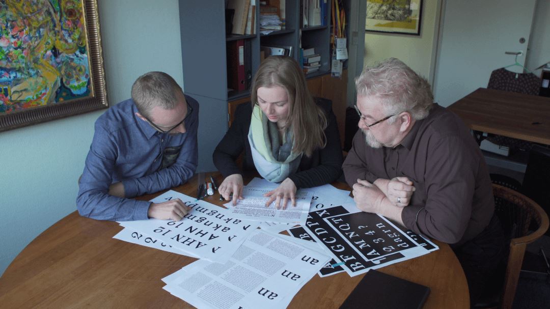
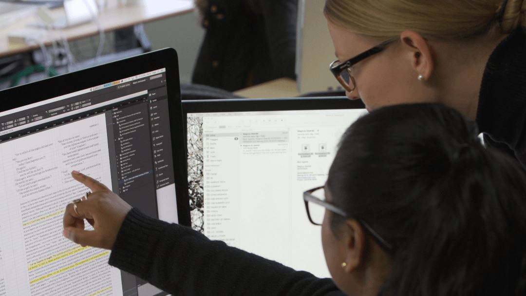
Images supplied by 2K/Denmark


Good morning Randy,
I simply do not believe how blessed we are to hear from the architects of the Bible readers revolution . What Bret Bertrand envisioned is like the growing cresindo from Handle’s Messiah. When Christians begin to read their bibles, experientially, they can thank God, who has used 2K/Demark .
Thank you, for bible geeks , Randy, are a good news blessing.
Prentiss Yeates.
Thanks Prentiss! I appreciate that very much!
Thank you Prentiss! I really appreciate your wording – that God is using us for his work.
We publish a printed edition of 2K/STORIES – most of the stories end up online at stories.2kdenmark.com, but most often the backside is not in a suitable article-form. Anyhow would like to quote a recent backside:
The Bible is something else – like nothing else. It mediates a relation between God and humankind. A disclosure of God to the world. A bridge between the eternal and the finite.
The Tabernacle was God’s chosen dwelling place in the wilderness, a means of manifesting his presence among his people. Bezalel son of Uri and Oholiab son of Ahisamak were chosen by God as the craftsmen to build it. God filled Bezalel with the spirit of God, in wisdom, and in understanding, and in knowledge, and in all manner of workmanship (Exodus 31:3) to qualify him to lead this honourable project.
As stewards of the Word of God, 2K/DENMARK aspires to attain such qualifications, too. In every project, we do our utmost to create Bible products whose quality is worthy of their sacred content.
I love the font in my new CSB study Bible. I can’t believe the difference and ease of reading it. So easy on eyes. So refreshing. A million light years from my Thompson bible. Thank you.