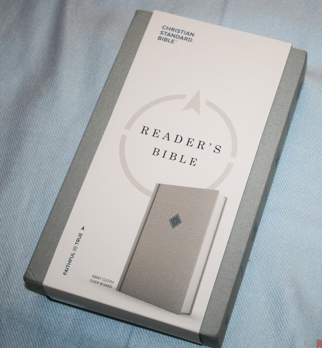
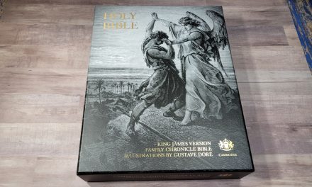
I enjoy reader’s Bibles. They remove the distractions like references, footnotes, section headings, and even chapter and verse numbers creating the ideal reading experience. Holman has raised the bar with their latest edition. The interior design, layout, and typeface were designed by 2K/Denmark – some of the best Bible designers in the world. In this review I take a look at Holman’s CSB Reader’s Bible in cloth over board. ISBN 9781433644177
Holman provided this Bible free for review. I was not required to give a positive review – only an honest review. My opinions are my own.
______________________________
Buy from Amazon
______________________________
Cover and Binding

My review copy is gray cloth over board with a light gray paper liner. It has a blue design on the front and on the spine. The spine also includes Holy Bible, Christian Standard Bible, Holman, and three lines as separators – all in blue. The text-block is section sewn and has no trouble staying open to any page. The construction and materials looks and feels like a high quality book.
The dimensions are different from the standard Bible. The overall size is 9.25 x 5.5 x 1.6″. I actually prefer these dimensions because they make a better layout. It includes a navy blue ribbon. It’s between 5-6mm wide. The head/tail bands are also navy blue.

It comes in a beautiful heavy-duty slip case that’s also cloth over board with the same gray and design. This is the most elegant slip case I’ve seen.
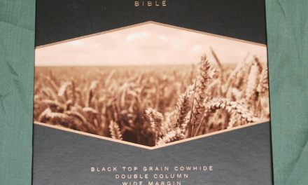
Paper
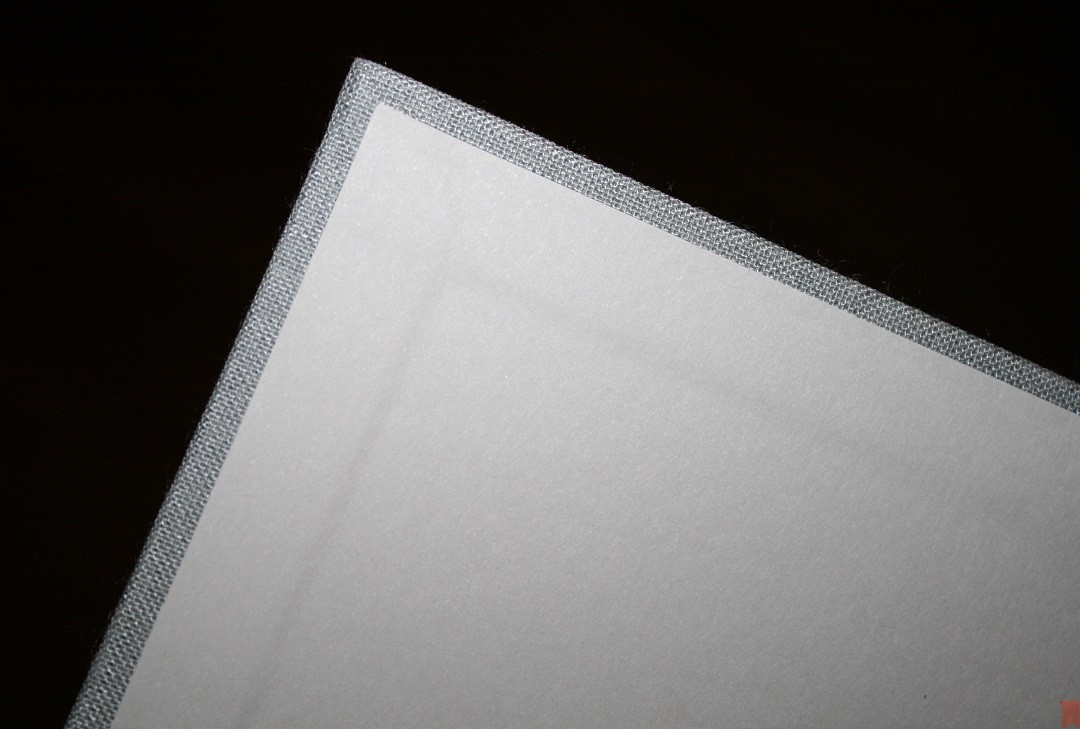
The paper in my review copy is white in color (any blue in these photos are a reflection of the background). I’m not sure of the gsm, but it feels somewhere around 28gsm to my fingers. It has a slight rough texture and is more opaque than the KJV and NKJV Holman reader’s editions that I have. I have no complaints about this level of opacity. It’s more opaque than Bibles with much thicker paper than this. There’s no glare under direct lighting. The glare in these photos are from a flash. I haven’t had any issues turning pages. It has 1840 pages, which are not gilted.
Typography
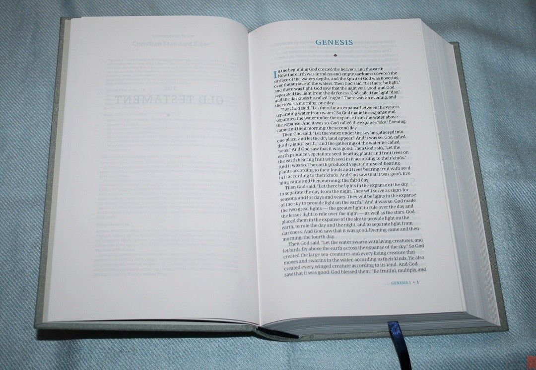
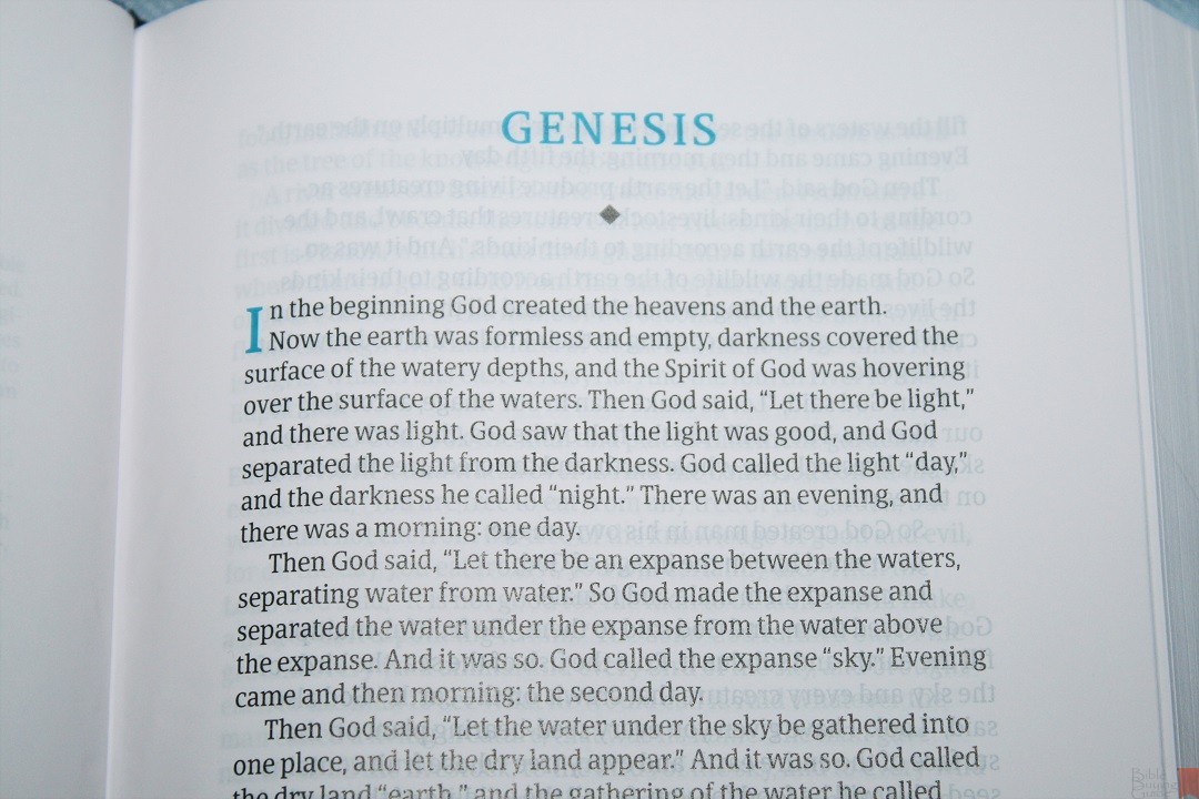
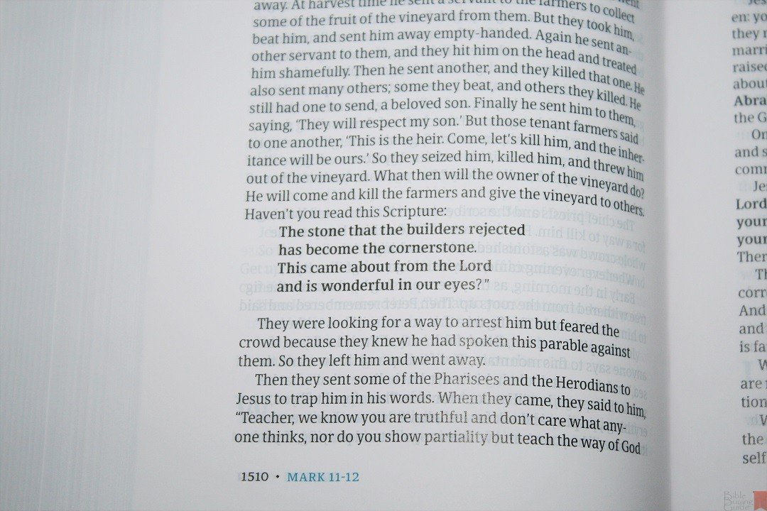
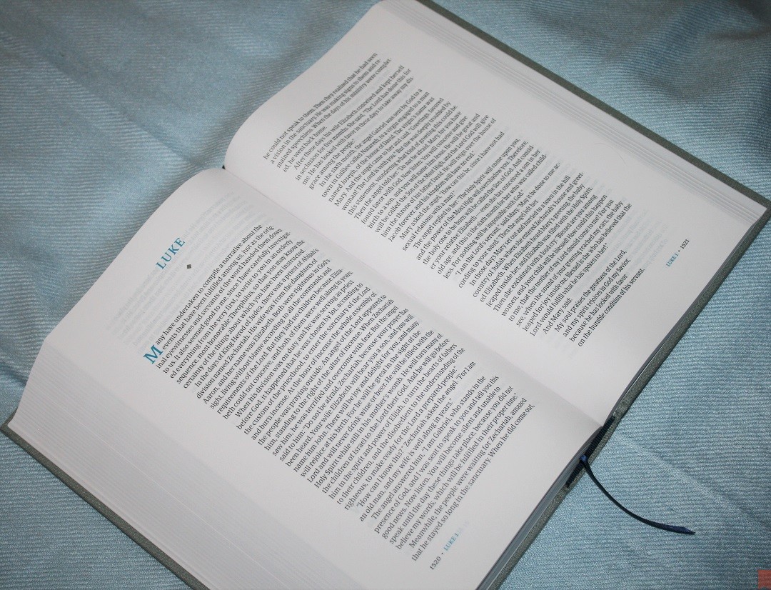
The text is presented in a single-column paragraph format with no distractions within the text. Chapters are identified by blue drop caps. There’s nothing in the header. The footer shows the book name and range of chapters on that page in the same blue as the drop cap, and the page number in the outer margin. Old Testament quotes are in bold. Poetry is set to stanzas. Letters are indented. The layout is is made for reading and it draws me in.

The font, called Bible serif and designed by 2K/Denmark, is just under 10 point, which is slightly larger than the KJV and NKJV from Holman, and has a generous leading to improve readability. It’s black-letter and is a nice and dark without being harshly bold. The print quality is highly consistent throughout. The text is printed with line-matching (meaning the lines on both sides of the page match for improved readability). The text is designed for optimal readability and it pays off in dividends.
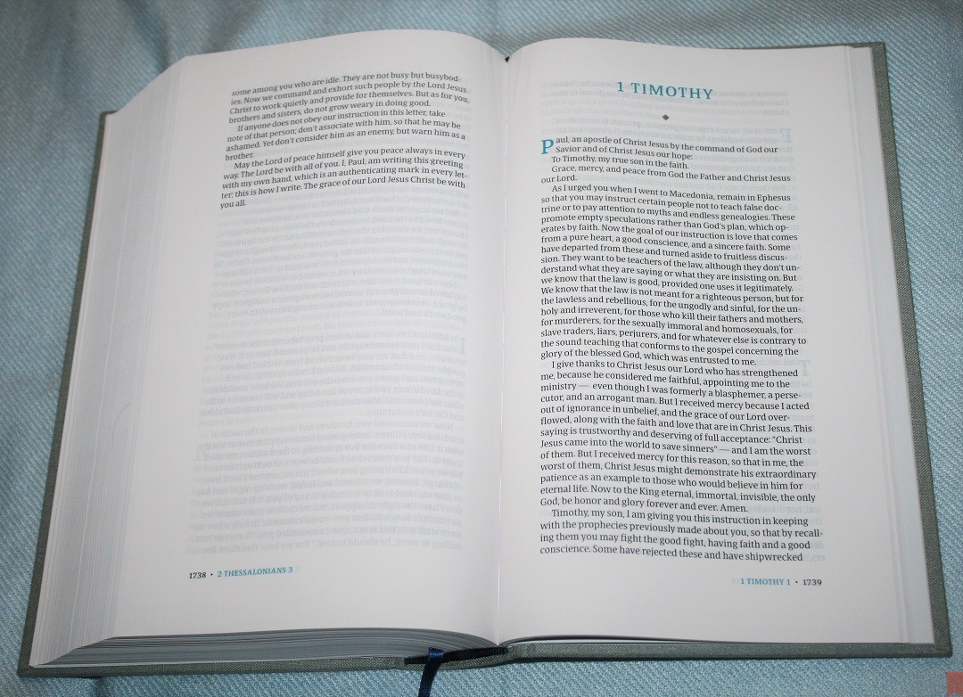


The poetic layout is one of the cleanest I’ve seen for poetry. All poetry is indented and lined up nicely on the page. When the line is too long for the width of the page the continuing line will be indented, but there aren’t many of them and they don’t stand out. When there’s a change in the stanza there’s a space between the stanzas.
The columns are 3.6″ wide and are not right-justified. This creates better spacing between the words. It has around 68 characters per line with 10-12 words per line, creating an optimal page layout. and 45 lines per page. Books start on a new page. It has a large enough inner margin that the text never bends into the gutter.
You could argue that the chapter drop caps create an unnatural break in the thought process and disrupts readability. An example would be the Acts 21-22 chapter break in the middle of a sentence. Of course this is an extreme example as most chapters break in much better places.
I personally think there needs to be some kind of break somewhere for your eyes and mind to pause, so the chapter drop caps work for me. It doesn’t have section headings but it does have breaks where the topic changes. I’m glad it doesn’t have section headings as this keeps the layout clean and distraction-free.
Maps

There are 8 full-color maps in the back on thick non-glossy paper. This is my favorite paper for maps. The maps use beautiful colors.
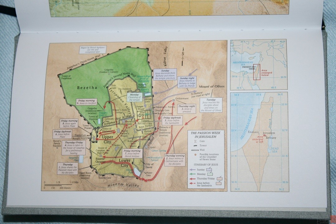
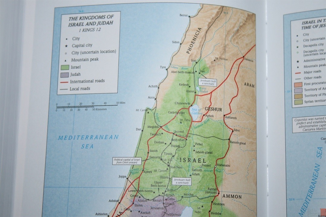
They include Scripture references, cities, mountains, routes, topography, major roads, global location, seas, capitals, territories, distance, and annotations. There isn’t an index but they are labeled well and I found them easy to use.
- The Migration of Abraham
- The Route of the Exodus
- The Tribal Allotments of Israel
- The Kingdoms of Israel and Judah
- Israel in the Time of Jesus
- The Ministry of Jesus Around the Sea of Galilee
- The Passion Week in Jerusalem
- Paul’s Missionary Journeys
Conclusion
I enjoyed reading Holman’s CSB Reader’s Bible. The overall size and dimensions feel great sitting in my recliner and the typeface is a joy to read for long periods of time. The layout design is optimal for readability, which is what I do the most anyway. I’m glad to see maps included. I’ve gotten in the habit of looking at the maps when I come across a location so I can get a better picture of the setting. If I could add one thing it would be a reading plan, but it’s probably a better idea to have them separate so you have more options.
Holman’s CSB Reader’s Bible is my favorite of the complete reader’s editions. 2K/Denmark have outdone themselves with this design. It gets the Bible Buying Guide Editor’s Choice award for best complete reader’s edition category (I’ll add the badge soon). I highly recommend the CSB Reader’s Bible to every CSB fan.
______________________________
Buy from Amazon
______________________________
Photography by hanna C brown
Holman provided this Bible free for review. I was not required to give a positive review – only an honest review. My opinions are my own.


Great review Randy! This is one I must get! Thanks for the excellent presentation.
Thanks John!
Hi Randy
How is it compared to the ESV Reader?
Paperwise, which one has thicker paper?
God bless.
They might be the same in thickness. The ESV has a cream tint while the CSB is white. I’ll have to dig the ESV out and do a comparison post.
I love the work of 2K/Denmark, thanks for the review. May I ask what country the Bible was printed in please?
Hi Jonathan. It was printed in China.
Hey Randy, what is the best KJV Reader’s Edition? The leathersoft hardback by Holman looks decent but this and Crossway’s cloth hardback are so much more aesthetically appealing.
Hi Will. Unfortunately there aren’t a lot of choices for reader’s editions in KJV. The Holman is the only one still in print. I like it enough to use it and recommend it. The one I personally use the most is the LCBP Paragraph (I like the larger font and highly opaque paper), but it’s out of print. Those are the only two that come to mind that don’t have verse numbers.
If you’re okay with verse numbers and other distractions, I recommend the Cambridge Clarion or New Cambridge Paragraph Bible. The Clarion has references and footnotes with keys in the text. The NCPB has footnotes but no keys in the text. Its verse numbers are so small they’re easy to ignore. Both have about the same size font (8.75).
Another option is the Hendrickson Large Print Pew Bible (review coming soon), which has verse numbers and is in double column paragraph format.
If you can find one I highly recommend the Thomas Nelson Single Column Bible (also review coming soon). It’s in paragraph format and has verse numbers and footnote keys with the footnotes placed at the bottom of the page.
Thanks for the explanation Randy. I also appreciate the comparison work you do. (I looked in the archive at your review of the Holman Reader’s KJV. The Clarion is very nice and I have considered it often. I had a bad experience with the Cambridge Personal Size New Paragraph Bible. So I am reluctant to purchase another Cambridge.
The most difficult aspect of purchasing a quality Bible for me is that there is no perfect Bible or publisher. And there could always be a Bible that has more of what you’re looking for a year or two down the road. Well, there are so many worse problems to have.
You’re welcome. And I know just how you feel!
I don’t consider the translator’s notes a “distraction”, but a necessity. This kind of bible isn’t everyone’s cup of tea. It’s strange that Holman didn’t give the CSB the abundance of annoying self-pronouncing text like they gave the KJV.
Good point about translators notes. I prefer to have them in Bibles I’m studying from, but for reading I prefer a clean text. This is because I use a different Bible for each purpose. If I was only using one Bible I want them included. I like the Concord’s approach where they’re next to the verse but not marked in the text.
I’ve wanted a one volume reader’s bible for awhile. The ESV reader’s isn’t as readable for me. This CSB one is perfect. I can take this one with me to church and follow along because of the clever unobtrusive design of notifying where the chapter’s begin with the first letter of chapters being drop capped and the information on the bottom of the page. The paper, print/line matching and font make it easy for me to read. I have sensitive eye’s and this bible is such a blessing.
Just a word about the translation. In my opinion it is a current english translation that is between the Nasb and NIV. I say that because archaic word’s such as in the ESV aren’t present. It is a very accurate translation and much closer to formal equivalent than many people realize. I am not offiliated with Holman. I am just very thankful to the Lord for this current accurate english translation.
Randy you are a blessing to me for what you do. Looking forward to seeing you around the throne of our blessed God and Savior in heaven one day sir.
Thanks Brian! I pray we both see each other around the throne of God. Thanks for your insights on the CSB translation. I agree with your assessment. I also find the small little clues (drop caps and info at the bottom) are a great help in following along while at the same time staying out of the way. This is a brilliantly designed Bible.
I purchased the CSB pew bible with 10 pt font for around $12 on Amazon and the paper is very good. You should check it out if you get a chance. Happy New Year to you and your family Randy!
Thanks Brian. I’ll check it out. Happy New Year!