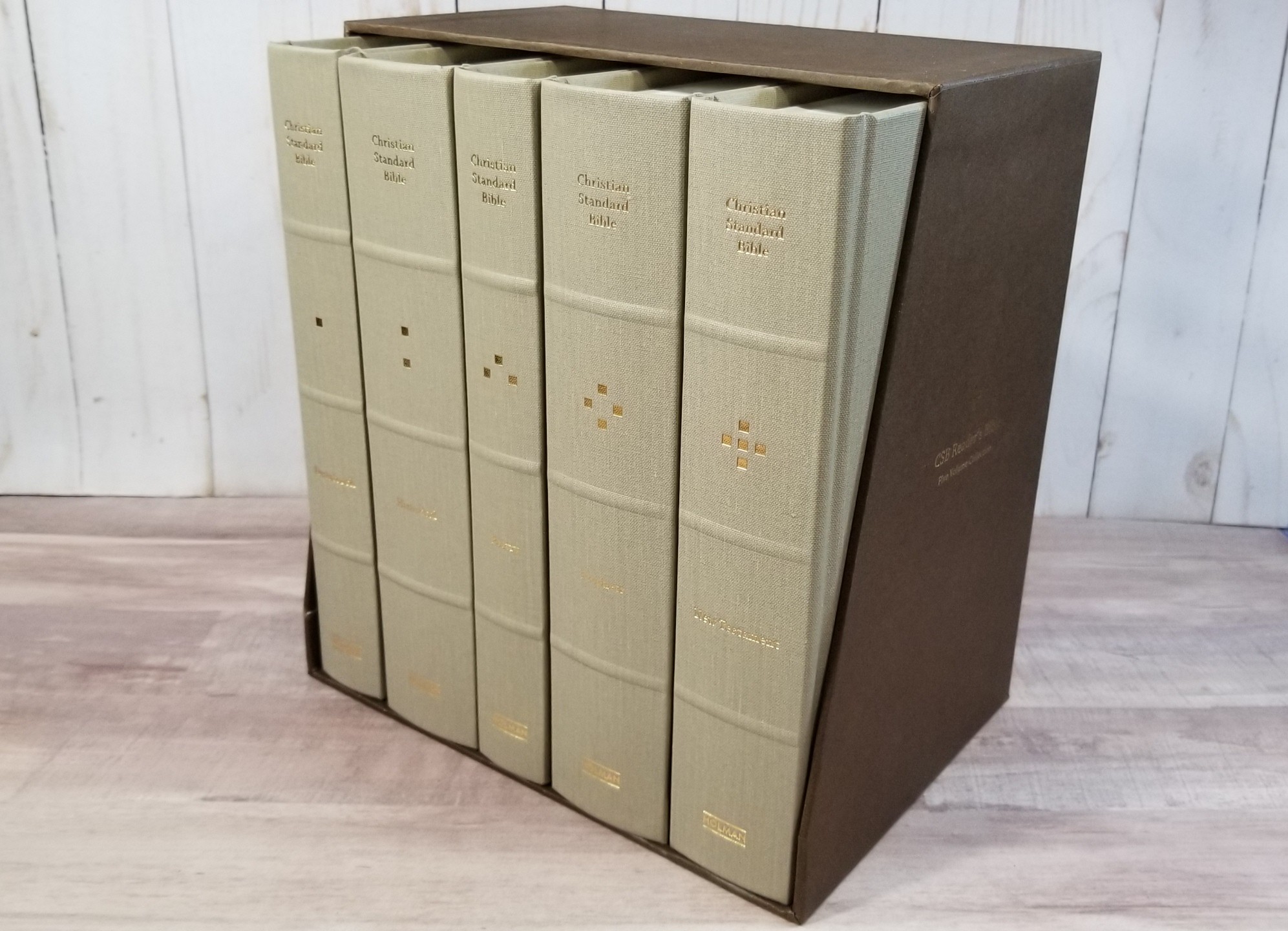
The CSB Reader’s Bible, Five-Volume Set from Holman is a multi-volume reader’s edition of the Christian Standard Bible that’s designed specifically to create the best possible reading experience. This has become a popular trend and I’m glad to see the CSB in this format. The CSB Reader’s Bible, Five-Volume Set is possibly the best reader’s edition so far. This edition is ISBN 978-1535965804, made in China.
Holman provided this Bible in exchange for an honest review. I was not required to give a positive review, only an honest one. All opinions are my own.
_________________________________________________________
This book is available at (includes some affiliate links)
and many local Bible bookstores
_________________________________________________________
Table of Contents
- Video Review
- The Five Volumes
- Materials
- Typography
- Table of Contents
- Slip Case
- Comparisons
- Conclusion
Video Review
The Five Volumes
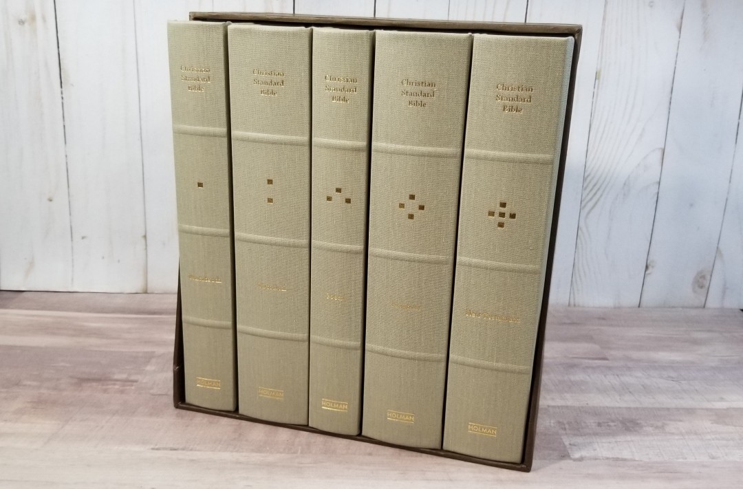
The 5 volumes present the books in the standard biblical order that we’re used to. The volumes include:
- Pentateuch (Genesis – Deuteronomy)
- Historical Books (Joshua – Esther)
- Poetry (Job – Song of Solomon)
- Prophets (Isaiah – Malachi)
- New Testament (Matthew – Revelation)
Materials
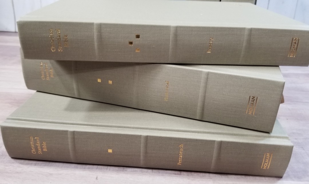
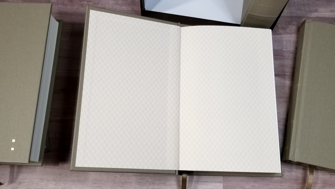
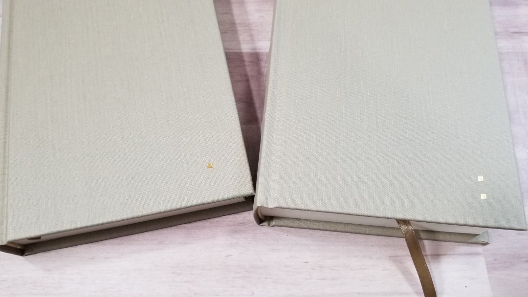
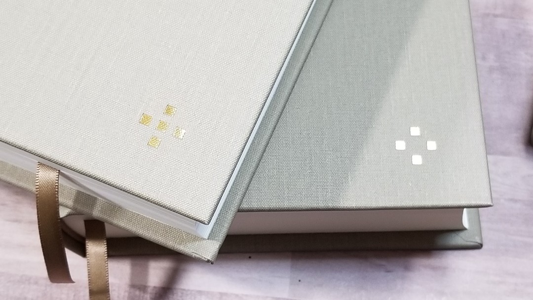
The books are hardcovers with tan cloth over board. The paper liner has diamond-shaped patterns. A pattern of squares on the front indicates the number of each volume. The spine has Christian Standard Bible, the square pattern for the volume number, the book title, and Holman printed in gold. They have 3 raised ribs to separate the sections.
The books are Smyth-sewn. The spine of the block rises upward when the book is opened to make the pages as flat as possible. They include a tan .25″ ribbon and matching head/tail bands. The ribbon is double-sided. It’s thin, but I think the size fits the book. Their overall size is 9 x 5.75″ and their thickness ranges from 1.25″ to 1.75 “. This is an excellent size to hold and read for long periods of time.
The paper is somewhere around 80gsm. It has a slightly cream color and it’s extremely opaque. It’s easy to turn and a joy to read from. It feels like the same paper as the first edition of the ESV Reader’s Set, but this paper is even more opaque than the ESV.
Typography
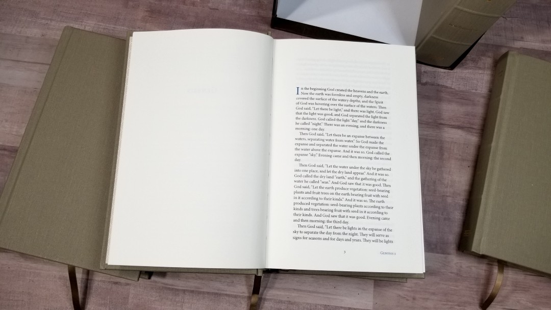
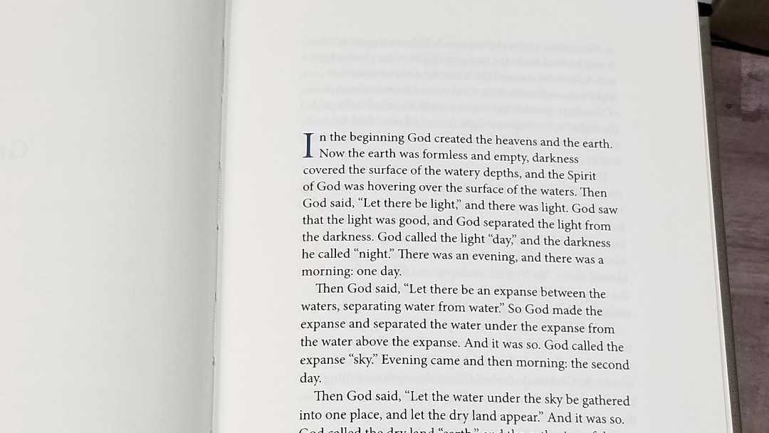
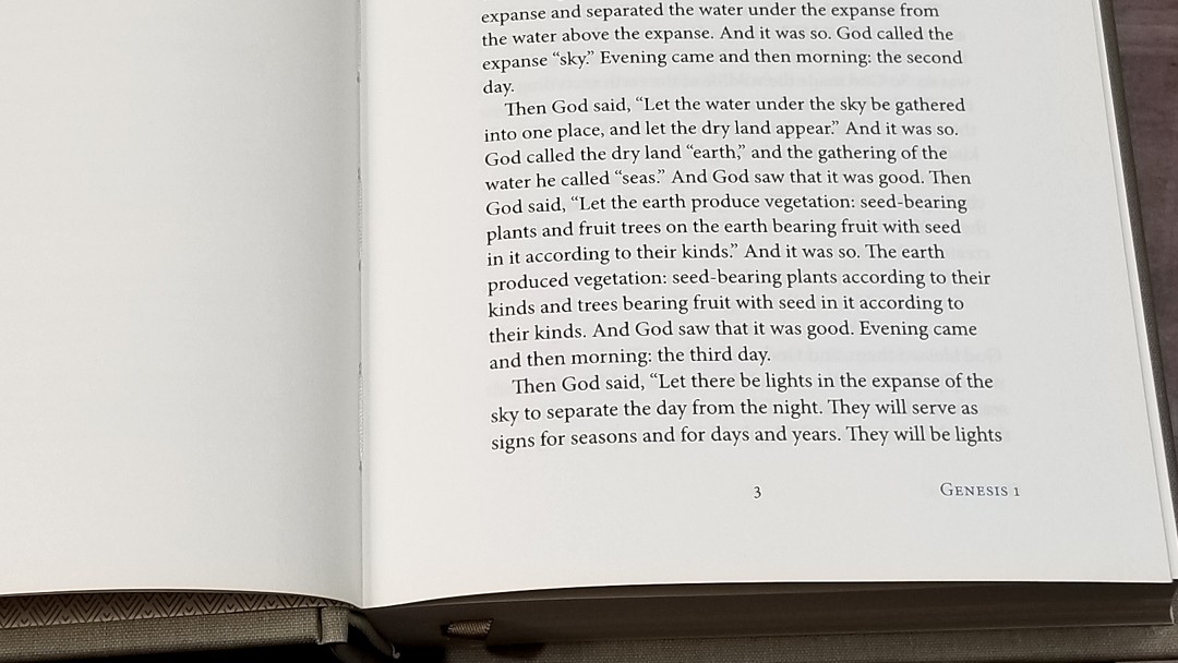
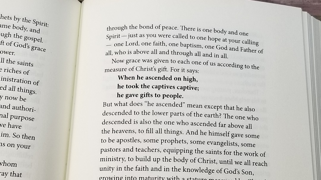
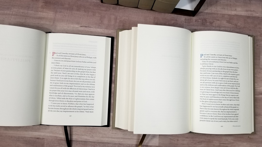
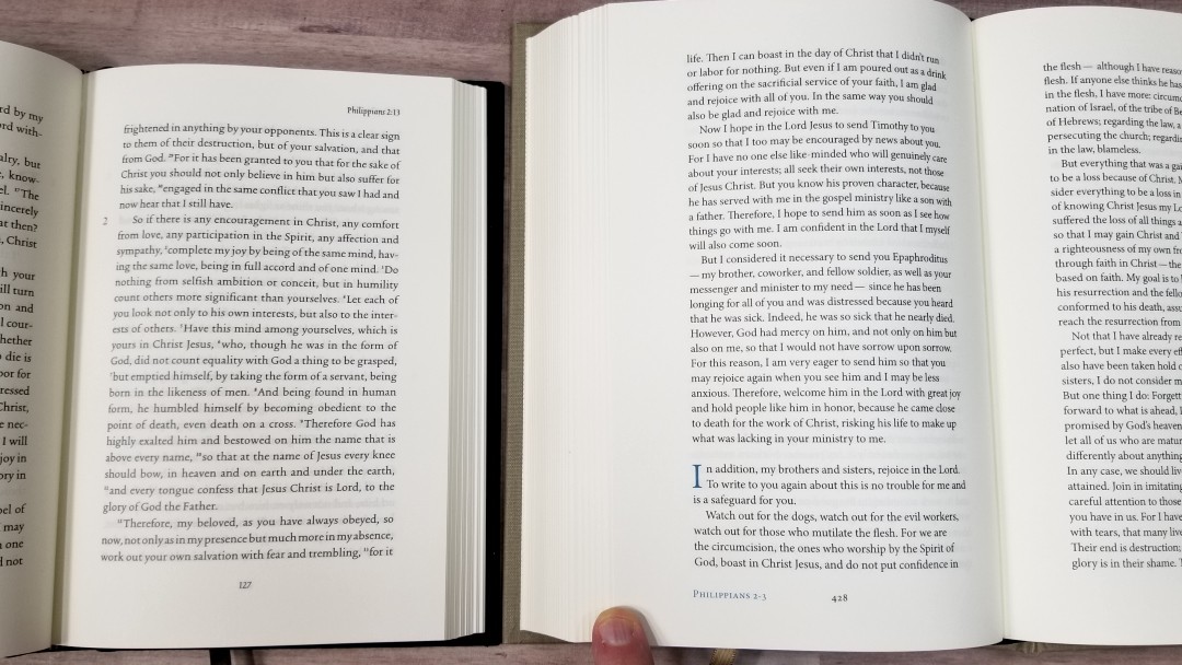
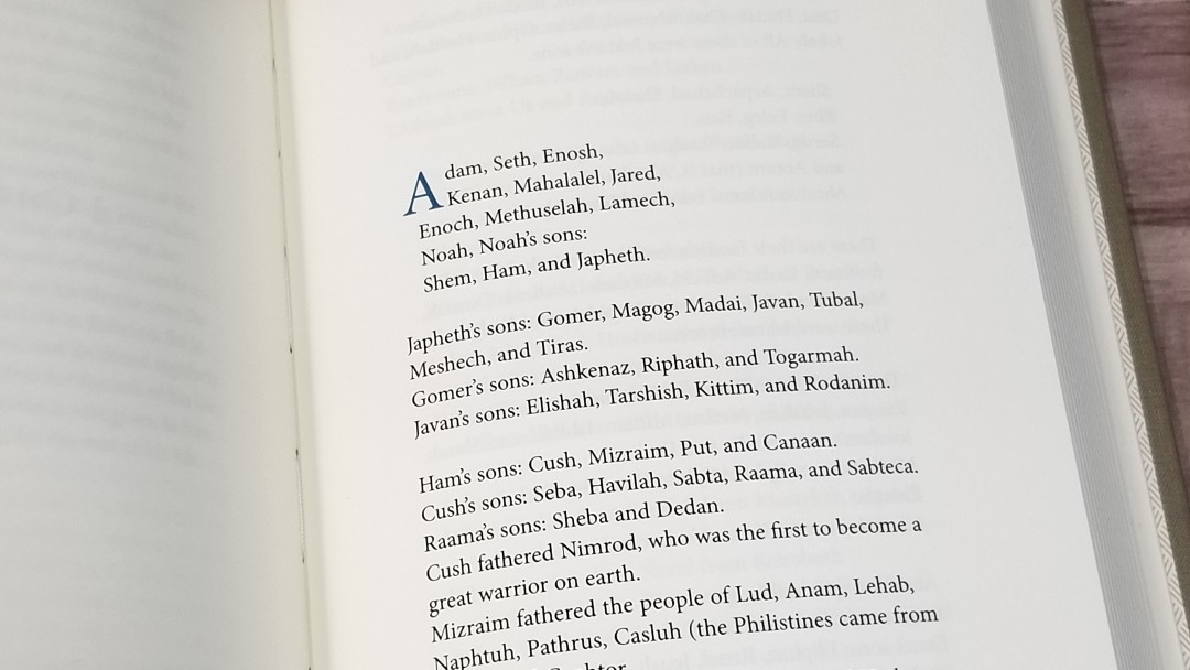
The text is presented in a single-column paragraph format. Poetry is set to stanzas. It has no chapter and verse numbers, no references, no, footnotes, and no section headings. The header is blank. The footer shows the book name and chapter numbers in the outer corner, and the page number in the center. Drop-caps for each chapter is in blue.
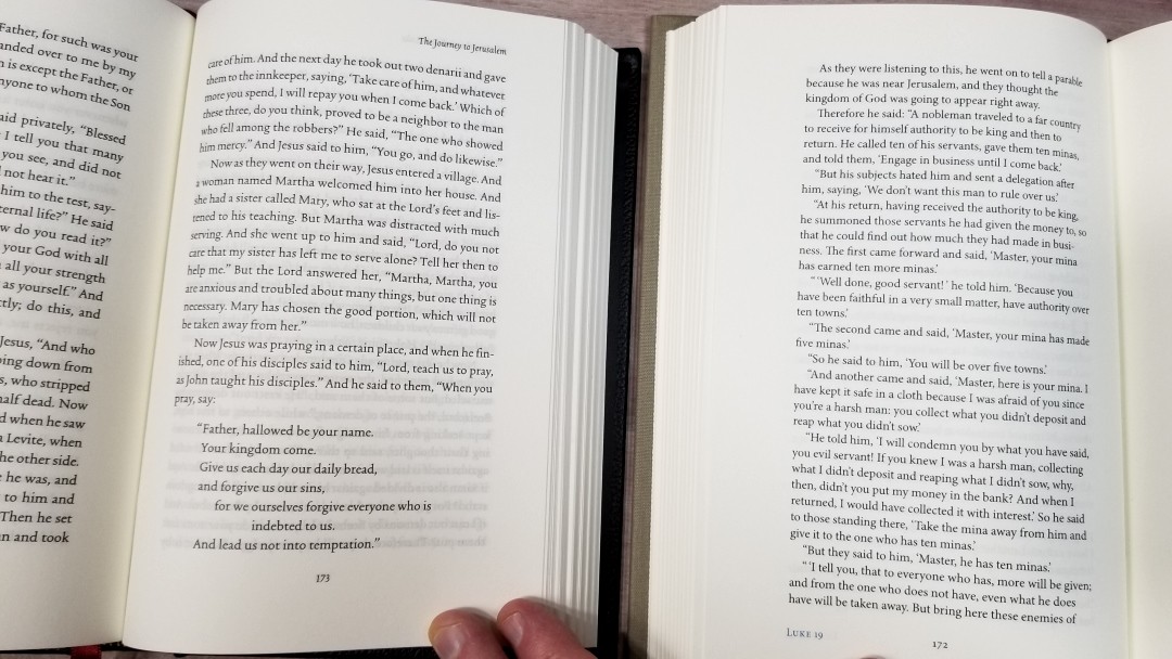
The typeface is around 11 point with a generous leading, creating 35 lines per page. It has around 10 words per line with a ragged right edge. It has around an inch margin of space around the text. This creates a lot of whitespace and helps make the text highly readable.
It’s printed with line-matching. Show-through is negligible and is possibly the least amount of the reader’s editions. The inner margin brings the text out of the gutter. The text is larger and has more space than the single-volume edition.
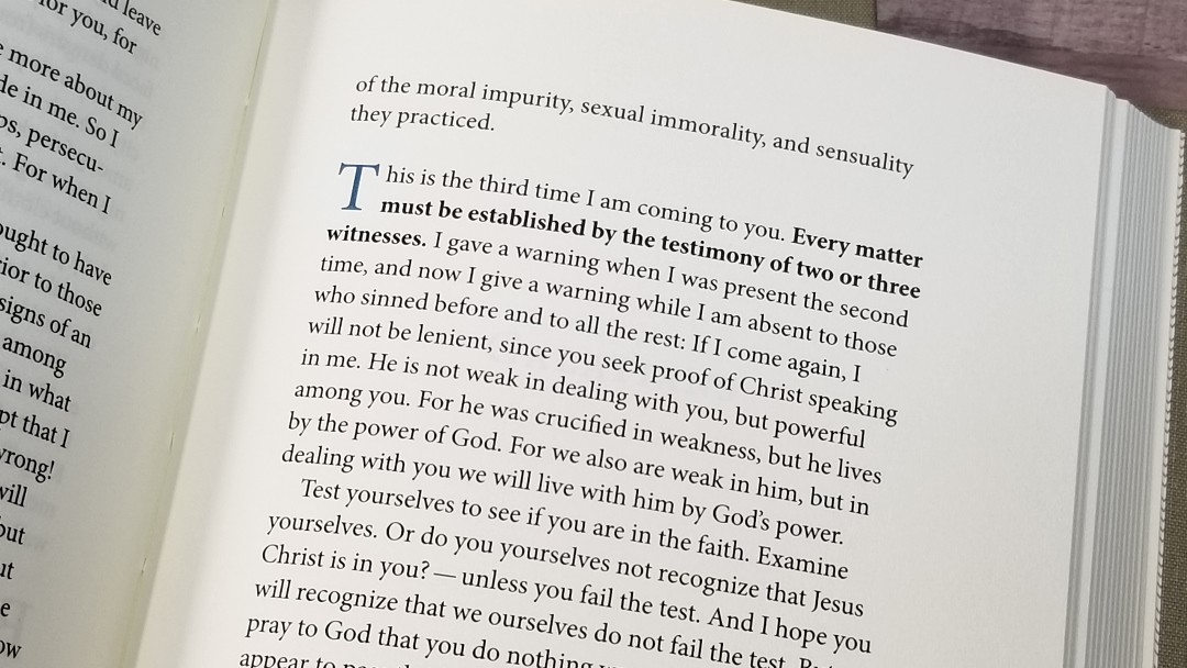
The beginning of each chapter is marked only with a blue drop-cap for the first word. They take two lines. They do break up the text a little, but I don’t find them too intrusive. Most of the time the chapters are broken in logical places. They make it easier to keep track of where I am. You can tell what the chapter numbers are by looking in the footer.
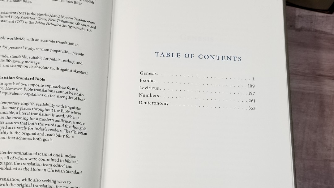
Table of Contents
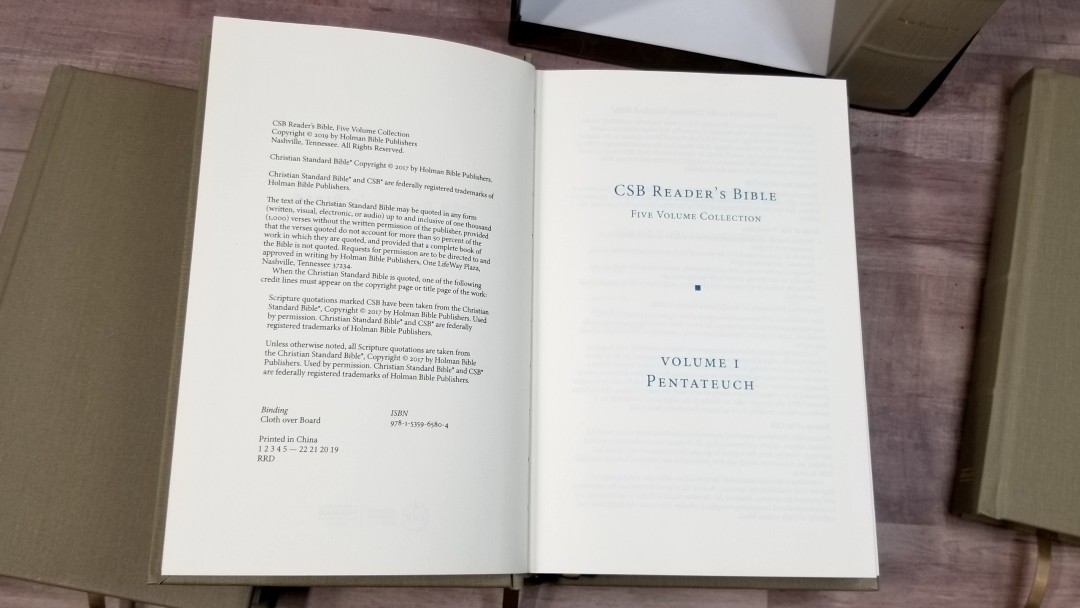
In the front of each book is a Table of Contents. It shows the name of each biblical book that’s in that volume with its page number. This is the only index, so there’s nothing to show page numbers of chapters.
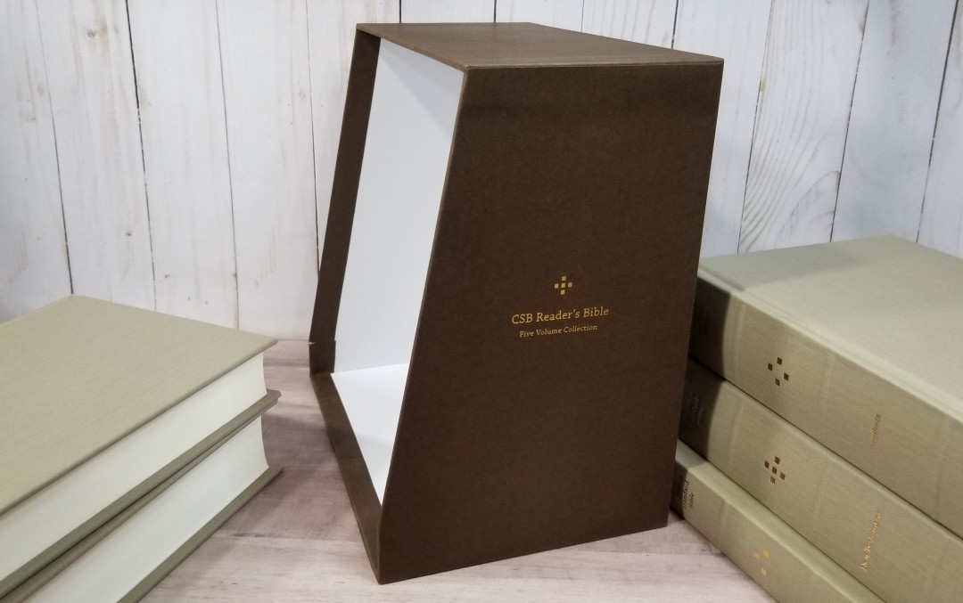
Slipcase
The slipcase is cardboard that’s sloped on the top to make it easier to grab the books. The case is brown and has the logo on the side. It does not include a track to support the pages. The case is a little thinner than I expected, but it should be fine sitting on the shelf.
Comparisons
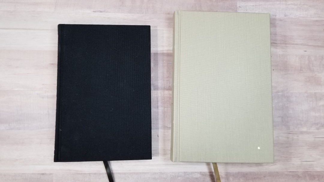
Here’s how it compares with the ESV 6-Volume Reader’s set. The paper in the cowhide edition has about the same thickness but isn’t as opaque. The set with verse numbers has a lot more show-through. The ESV is shorter. I prefer to have a single volume for the NT like the CSB.
Conclusion
The CSB Reader’s Bible, 5-Volume Set is an excellent reader’s edition. They seem to be made well. I especially like the paper. This is the most opaque paper I’ve seen in a reader’s edition. I like that the New Testament is placed within a single volume.
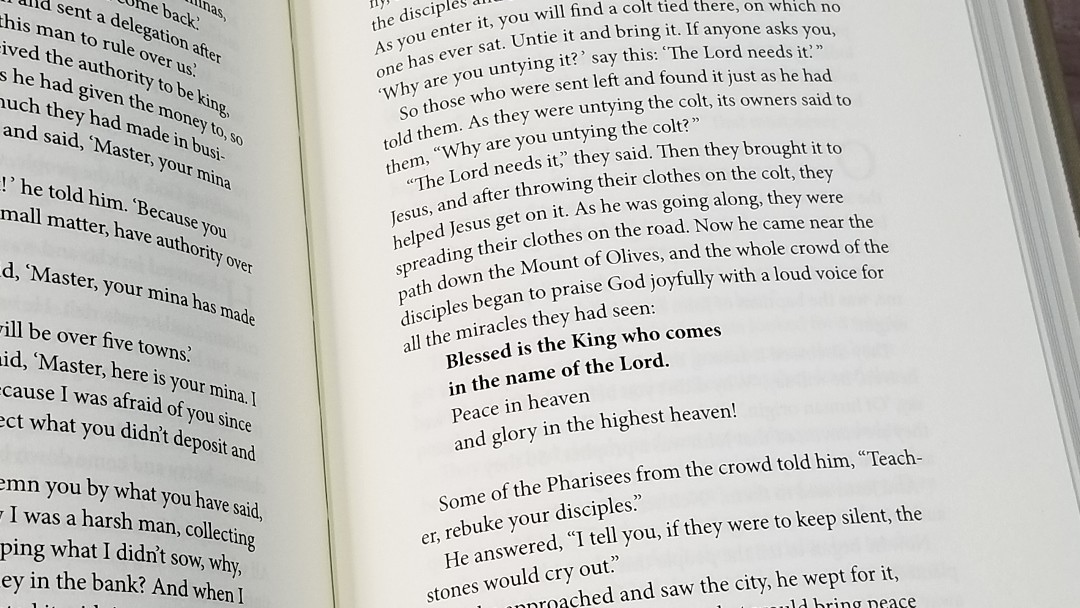
The text is large and clean. The ragged right edge keeps the spacing more consistent between the words. The word-count provides a good balance between the prose and poetic settings. The bold text for OT quotes isn’t my favorite method of identifying the quotes, but I’m not sure what would be better. I think it doesn’t need to stand out as much as it does.
The drop-caps look elegant and I don’t find them getting in the way most of the time. I love seeing the book name and chapter number at the bottom of the page. This helps me have an idea of where I am in the text and, along with the drop-cap, makes it much easier to follow along with a reading plan.
I’m glad to see such an elegant design for the CSB multi-volume set. I highly recommend the CSB Reader’s Bible, 5-Volume Set for anyone that reads the CSB.
_________________________________________________________
This book is available at (includes some affiliate links)
and many local Bible bookstores
_________________________________________________________
Holman provided this Bible in exchange for an honest review. I was not required to give a positive review, only an honest one. All opinions are my own.








I’m almost done reading through the CSB. I haven’t been thoroughly impressed with the translation, though I’m not entirely put off by it. Certain books are worse than others. English grammar seems to be the most common problem. Questionable choices with respect to translating certain words and phrases comes in second. But I like the look of this reader’s edition.