The hottest trends in Bibles right now is art-journaling. Most of the popular publishers are bringing out their own editions. Most include single column text with a 2” ruled margin for notes or drawings. Zondervan has taken that idea to a different level by adding drawings from 7 popular art-journaling artists. In this review, and with the help of my art-journaling wife, I take a look at Zondervan’s NIV Beautiful Word Bible.
Binding
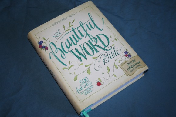
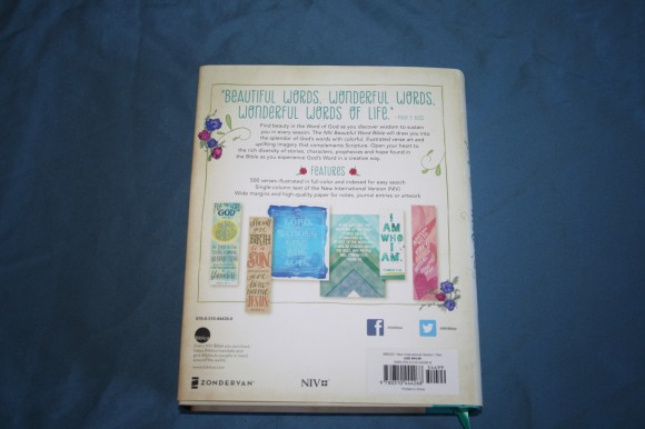
This edition is hard cover with a dust jacket. If you remove the dust jacket you’ll see a similarly designed cover in hand-drawn fonts. The binding is sewn and has no issues lying open. This edition is thinner than most journaling Bibles. It has a turquoise ribbon that matches the color scheme. The overall size is 6.5 x 8.25 x 1.5.
Paper
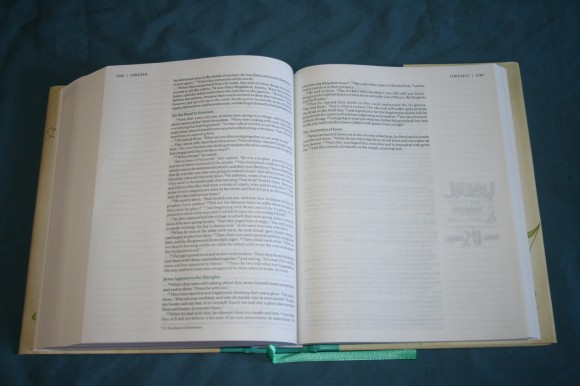
The paper is one of the biggest differences between the NIV and other journal Bibles. It’s a lot thinner and is white-tinted rather than cream-tinted. I’m guessing it to be around 30-32 gsm. It’s fairly opaque. It’s more like the paper found in modern study Bibles. I suspect it isn’t as good for art-work as the paper in other journaling Bibles. I think it would be better for writing notes.
Typography
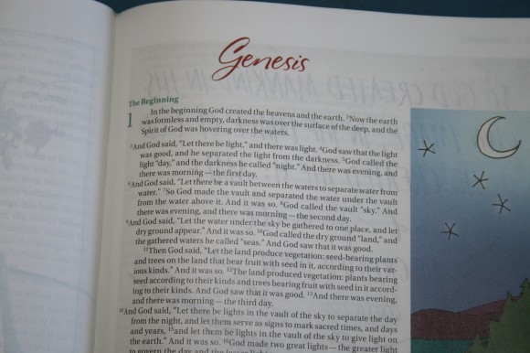
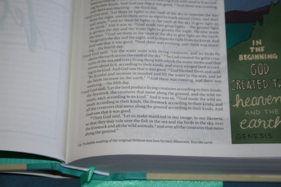
The text is presented in single-column paragraph format with poetry set in stanzas. The font is smaller than other journal Bibles at around 7 point. It’s black letter and has about a medium darkness and consistent throughout. It had no issues reading it.
The columns are 2 5/8 wide with 82 characters across and around 16 words on a single line. This gives enough room to make the layout look great, especially in poetry. The section headings and chapter numbers are teal. They’re easy to read and they stand out the way I like them too.
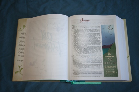
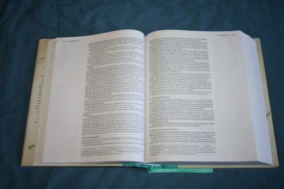 The journal section has 40 lines that are 2” wide for writing and drawing. Genesis 1 has 26 verses on the first page, so you’ll have just under two lines per verse.
Artwork
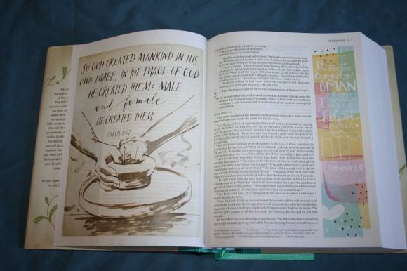
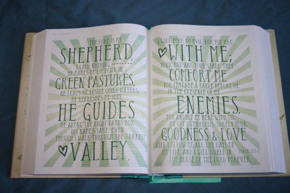
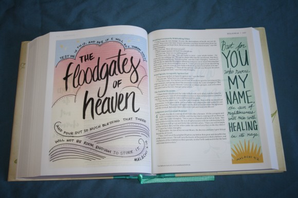
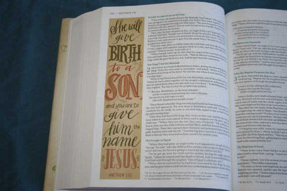
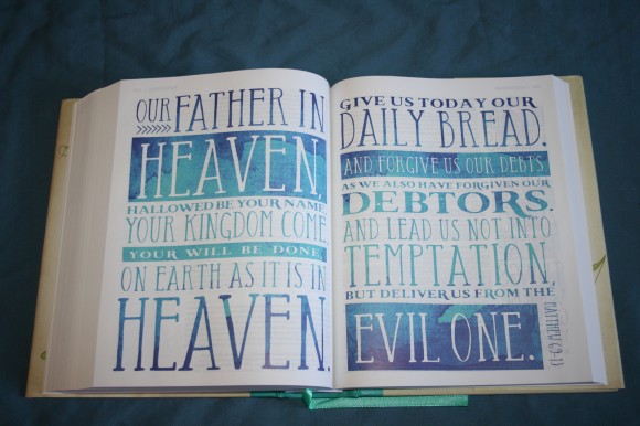
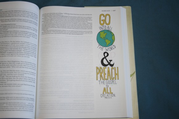
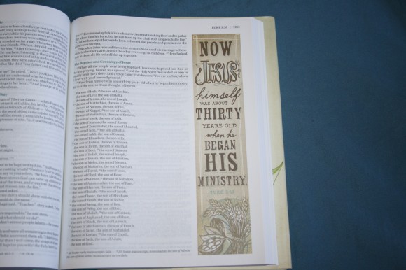
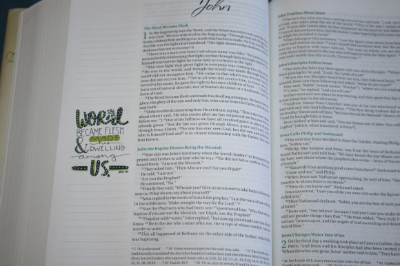
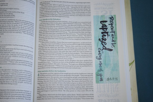
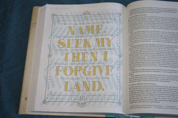
Seven artists created color illustrations for 500 Scriptures. Most take up the full margin of a page. There are several that take a full page. They don’t cover the text. Instead, pages were added for these drawings. I would like to have seen other pages added and left blank so you could add your own drawings. The artwork is superb and is great for coming up with ideas to do your own.
These 500 verses were chosen based on data from BibleGateway as the top verses that readers search. With that as a starting point they made sure that verses were chosen from every book of the Bible. The only problem with this is some of your favorite verses are already taken. That’s okay if you don’t plan to add a lot of your own work. I can actually use some of these for preaching.
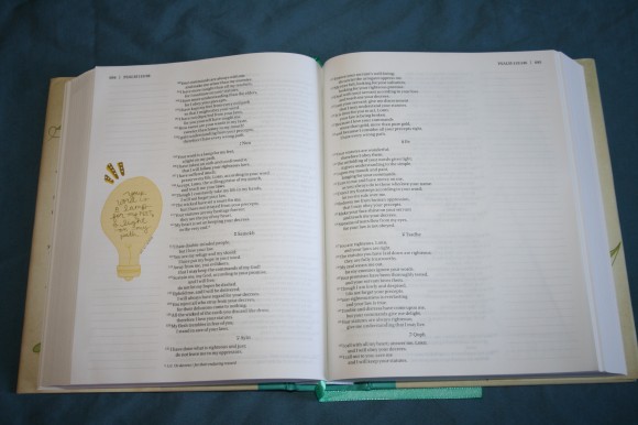
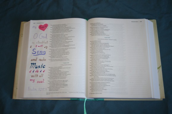
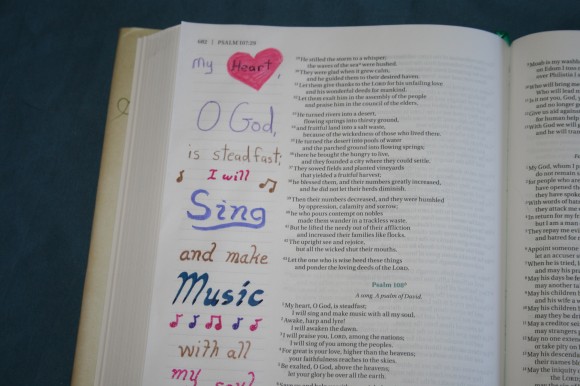
To try out how the paper performs I asked my wife to do a quick bit of artwork of her own.
Here’s what she used:
- Crayola Watercolor
- Prismacolor color pencils
- Crayola Twistable color pencils
- Lolliz Gel pens
- Hampton Art Calligraphy marker
- Michaels store brand brush pens
- Illustrated Faith Journaling Bible Mat
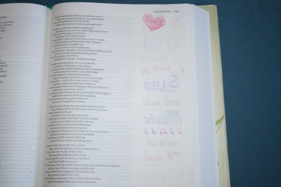
Ink and paint bleeds through but the pencils do not. I recommend this one more for those who want artwork in their Bibles but do not want to draw the artwork themselves. It seems better for notes with a pen, so maybe it’s a better choice for traditional journaling
Footnotes
The NIV footnotes are placed in the footer and are keyed to the text with letters. They include alternate renderings, quotes, weights and measures, manuscript variations, etc. It also includes references to clothing, flora, fauna, architecture, jewelry, musical instruments, and more.
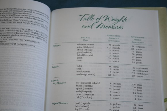
Table of Weights and Measures
This table is one page and covers weights, length, and capacities in both dry and wet measures. It shows the biblical unit, approximate American equivalent, and approximate metric equivalent.
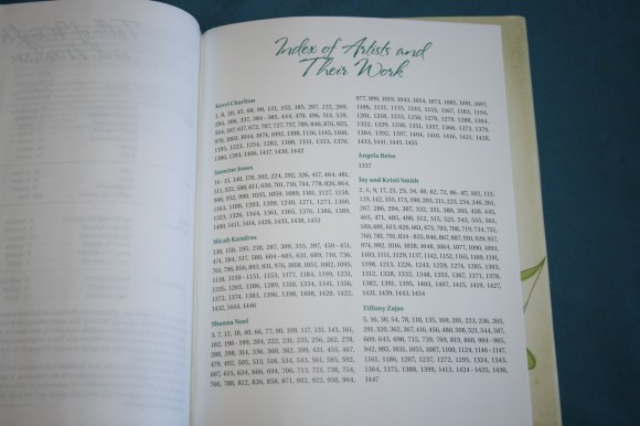
Index of Artists and Their Work
This shows the artists names along with the page numbers where their work appears.
The artists are:
- Kerri Charlton
- Jasmine Jones
- Micha Kandros
- Shanna Noel
- Angela Reiss
- Jay and Kristy Smith
- Tiffany Zajas
Conclusion
Zondervan’s entry into the realm of journaling Bibles is different enough that you might want one even if you have a journaling Bible that you draw in. With this one you can have lots of nice drawings already in place and you can keep adding more. I do think the paper might cause issues with some art supplies, but you’ll just have to try it on a different page before adding it to your margins. Of course you could always read the Bible and enjoy the drawings. They’re great for a devotional quality that draws you into a verse, and that’s the purpose of art-journaling in the first place. Zondervan’s NIV Beautiful Word Bible might just be the Bible you’re looking for.
Zondervan provided this Bible free for review. I was not required to give a positive review – only an honest review. My opinions are my own.





I’ve learned that most people who use watercolor, acrylic paint, markers, etc., on their thin Bible pages prep the page ahead of time with clear gesso. That way nothing bleeds through to the other side. 🙂
Thanks for the tip Karen!
Hi Randy,
Thanks for the review. As always really comprehensive and informative. I have just bought one of these for my wife’s birthday on the strength of your review, and it arrived today. It is the trutone cream and pink edition, not my favourite colours but I must admit but it looks really good.
Thanks
Rob Pettifer
Thanks for sharing Rob. I’m sure she will love it.
Is there any of God’s Word left out?