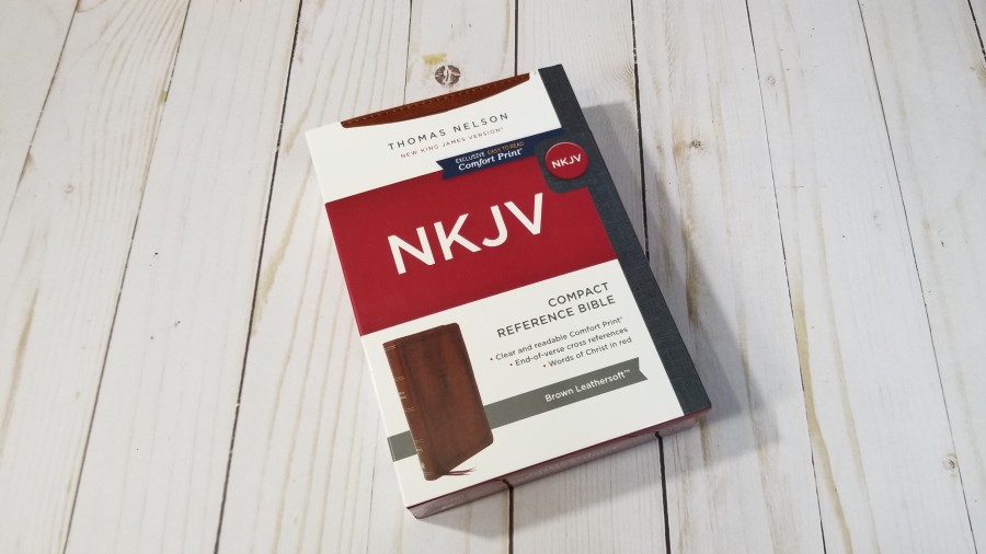
The new NKJV Compact Reference Bible from Thomas Nelson is a verse-by-verse, end-of-verse reference edition that’s designed specifically for daily carry. This is a compact version of the new NKJV Personal Size Large Print Reference Bible. Its small print is highly readable and it’s great for ministry and following along with others. It’s available in lots of imitation leather options at an affordable price. I’m reviewing the imitation leather brown Leathersoft, ISBN:9780785233398, made in China.
Thomas Nelson provided this Bible in exchange for an honest review. I was not required to give a positive review, only an honest one. All opinions are my own.
_________________________________________________________
This Bible is available at (includes some affiliate links)
and many local Bible bookstores
_________________________________________________________
Table of Contents
Video Review
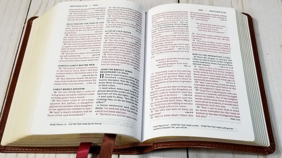
Binding
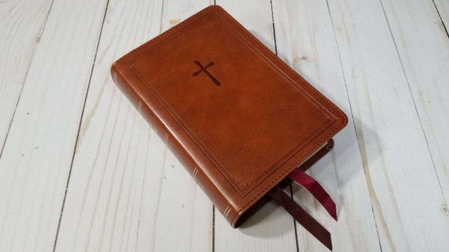
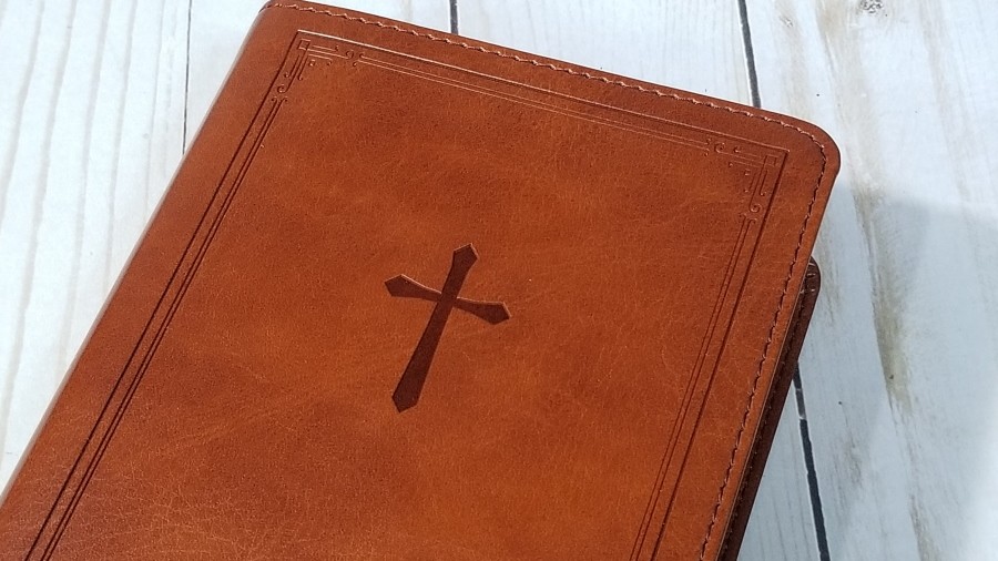
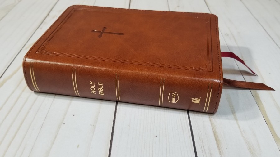
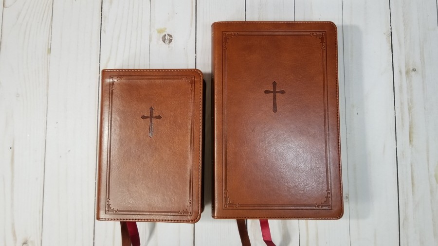
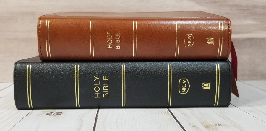
This edition is brown Leathersoft imitation leather. It has a smooth grain with enough color variation to give it some visual texture. It includes perimeter stitching and has a debossed border and a cross on the front. The spine has rib indications, the text, and the logo all printed in gold.
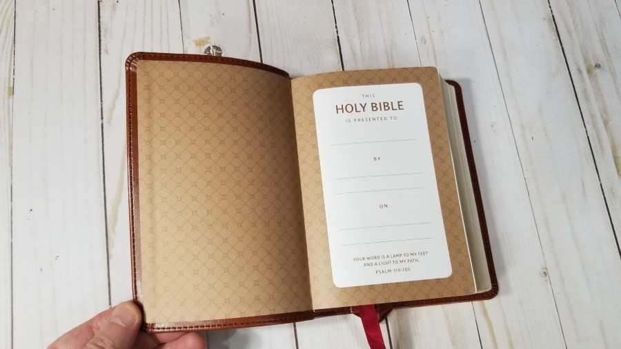
The text-block is sewn. Because of the small size and light weight of the cover, it will need to be used quite a bit in order to stay open in Genesis. The liner is paste-down paper and doubles as the presentation page.
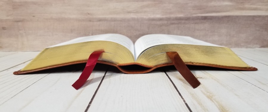
It has one red and one brown 3/8″ ribbon. The ribbons do look large for the size of the Bible, but they don’t get in the way and I like them The overall size is 4 5/8 x 6 5/8 x 1 1/2″. It weighs 1 lb, 2.9 oz.
Paper
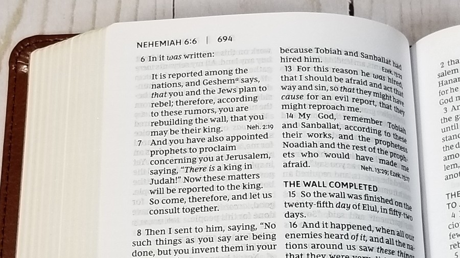
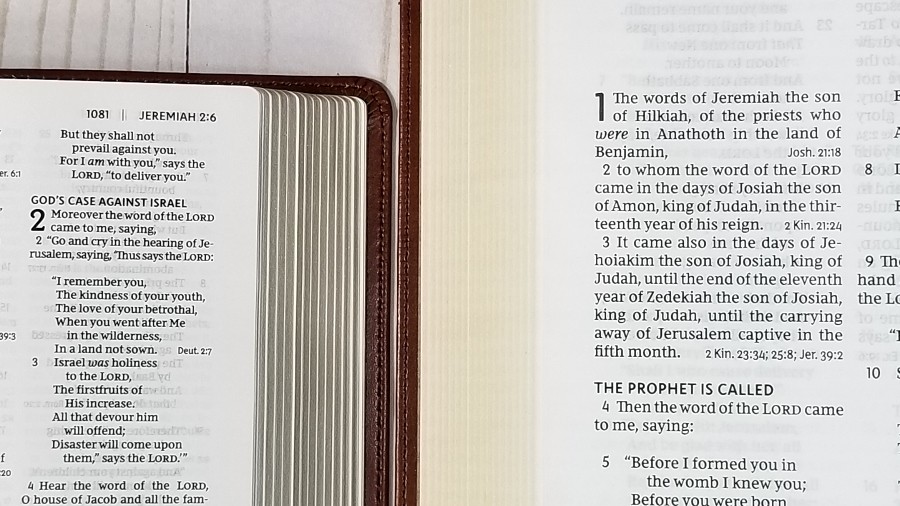
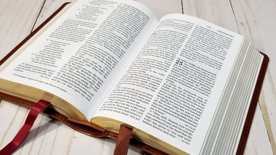
The paper is 30gsm. It’s slightly off-white in color and it’s highly opaque for not being premium paper. It doesn’t glare under direct light. It has a little bit of a rough texture that helps to make the pages easier to turn. Show-through is negligible and I only notice it in poetic settings. The edges are gold gilt. This is an excellent paper for reading and highlighting (especially for this price range).
Typography and Layout
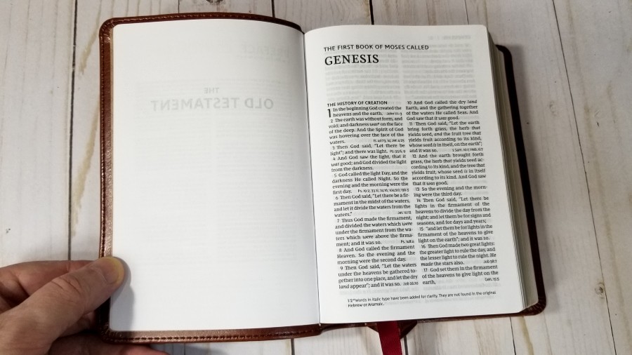
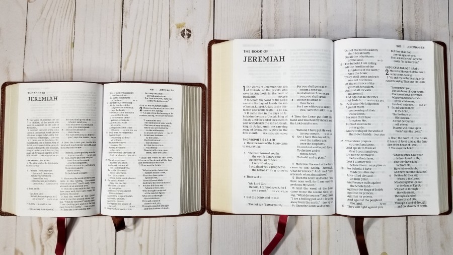
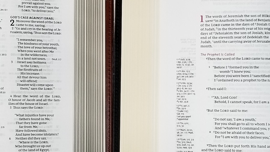
Scripture is placed in a double-column, verse-by-verse format. Poetry set to stanzas and letters are indented. Section headings are printed in all-caps. Cross-references are placed at the end of verses. The header has the book name, chapter number, verse number, and page number in the outer margin. The footer has the translation footnotes across the bottom.
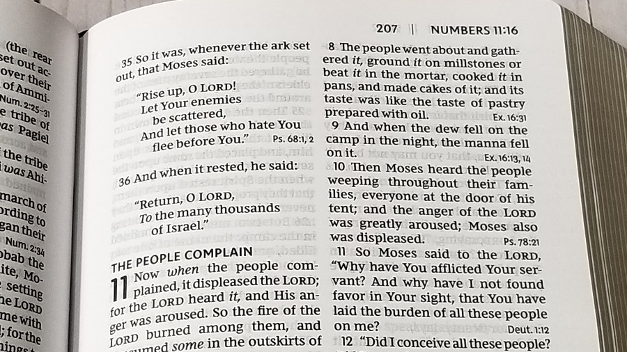
The typeface is a 7.5 Comfort Print. This edition has the words of Christ in red. Both the black and the red are dark and consistent. It has around 8 words per line and extra space between the lines. It’s printed with line-matching, so the lines are printed in the same location on both sides of the page. I find this text easy to read even at this smaller size. It actually looks larger than 7.5 to my eye. Because of the spacing and darkness of the font, I find it easier to read that some Bibles with even larger fonts.
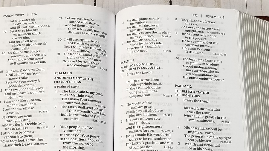
The poetic layout is designed well. The poetic lines are divided in smart places so that it doesn’t have a lot of lines with just one word. Those lines that need to wrap to the next line are indented to it’s easy to know they are a continuation of the line above it.
Cross-references at the end of verses are small enough to ignore for reading, so they don’t become too much of a distraction, but they’re also at the most convenient place possible and still make a readable text. Placing the translation footnotes in the footer keeps them out of the way but they’re still easy to see and use. It has extra margin space, which brings the text out of the inner margin and keeps the text from bending too far into the gutter.
References
Cross-references are placed at the end of verses. They’re printed in a smaller font than the verse, which keeps them from becoming too much of a distraction when reading, but they’re also at your fingertips when you want them. There aren’t a lot of references. Those it does have are helpful for quick study or general reference.
Here are a few example references to help you compare:
- Genesis 1:1 – John 1:1-3
- Deuteronomy 6:4 – 1 Cor 8:4, 6
- Isaiah 9:6 – Matt 28:18; Luke 2:11
- Matthew 28:19 – x
- Mark 12:29 – Deut 6:4, 5
- John 1:1 – 1 John 1:1; Rev 19:13
- John 3:16 – x
- Acts 2:38 – Luke 24:47
- 1 John 1:1 – Luke 24:39; John 1:1, 4, 14
Concordance

The concordance is 42 pages and has 3 columns per page. The reduced size from the large print does make the font a little smaller than I’d like, but it is easy enough to read with glasses. It isn’t a large concordance, but it is a decent concordance for finding the most common words and references. Here are a few entries with their number of references to help you compare:
- Christ – 13
- Christian(s) – 2
- Faith – 40
- Faithful – 20
- Faithfulness – 5
- Faithless – 2
- God – 38
- Goddess – 2
- Godhead – 2
- Godliness – 4
- Godly – 3
- Praise – 25
- Praised – 4
- Praises – 2
- Praiseworthy – 1
- Praising – 3
- Pray – 14
- Prayed – 2
- Prayer – 16
- Prayers – 5
Maps
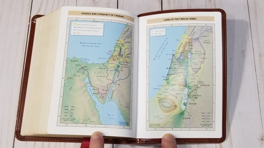

It includes 8 pages of full-color maps. There are 7 full maps. They’re printed in bright colors on glossy paper. They include topography, distance, routes, borders, possible locations of lost places, battles, elevation, cities, and locations for the events of Jesus’ ministry. It doesn’t have an index, but the maps are annotated well. I found them easy to use.
Maps include:
- World of the Patriarchs
- Exodus and Conquest of Canaan
- Land of the Twelve Tribes
- Kingdom of David and Solomon
- Jesus’ Ministry
- Paul’s Missionary Journeys
- Jerusalem in the Time of Jesus
Comparisons
Here’s how the NKJV Compact Reference Bible compares to the Compact Single Column Reference and the Personal Size Large Print NKJV’s from Thomas Nelson.
NKJV Personal Size Large Print Reference Bible
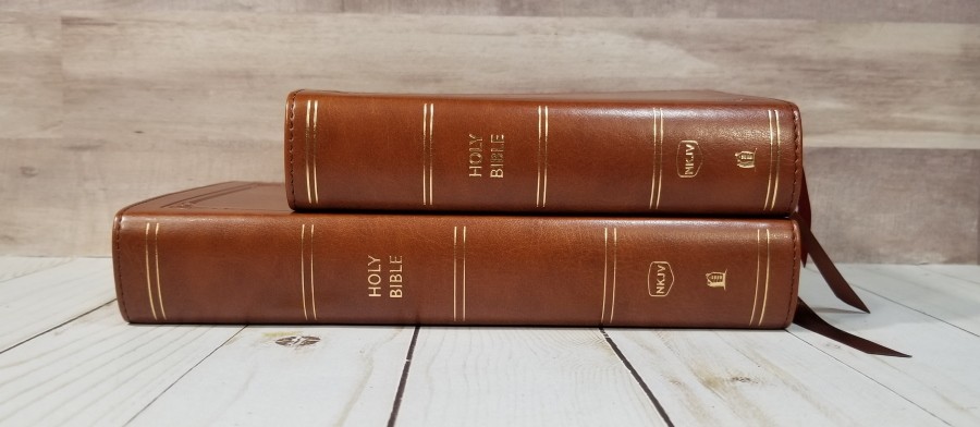
The NKJV Personal Size Large Print Reference Bible is a larger version of the same Bible. The pagination and tools are identical. This makes a great combo if you want one that’s small enough to carry and a matching Bible in a larger print for preaching.
NKJV Compact Single Column Reference Bible
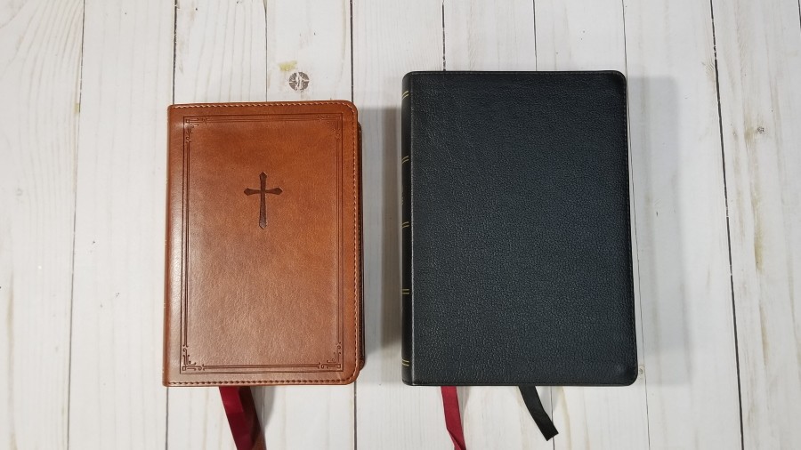
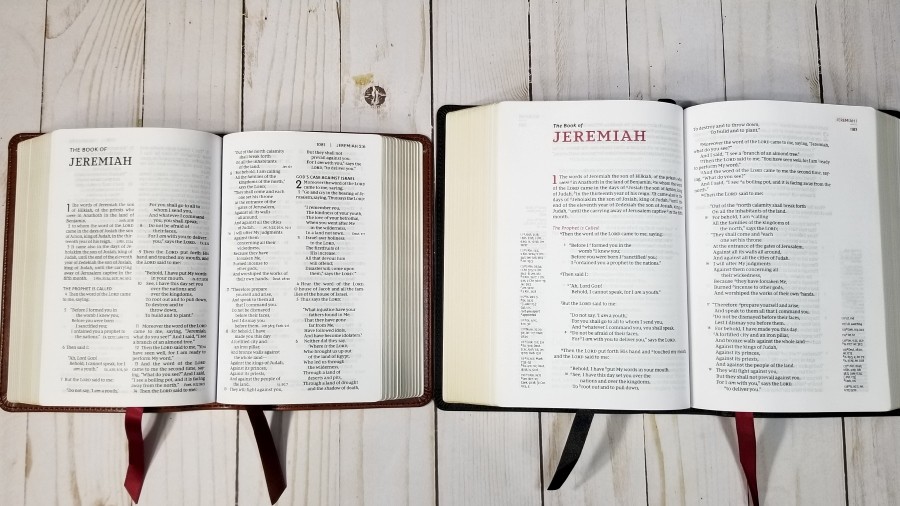
The NKJV Compact Single Column Reference Bible is not a large Bible, but it’s noticeably larger than this one. The font measures about a half-point larger and it has a touch more space between the lines. It’s still hard to tell much difference, though. It includes a lot more references. The main difference is the single-column layout and references in the outer margin.
Conclusion
Thomas Nelson’s new Compact Reference Bible, Comfort Print NKJV’s is an excellent Bible. The overall size is great for carry, making it a great choice for taking it to Church, carrying it on trips, using it for visitations, etc. Even at the smaller size, the typeface and clean design are highly readable. The v-b-v setting makes it easy to use for study and following along with a teacher or preacher. I love that it matches the large print edition. They make a great combo. They don’t have a lot of tools, but those they do have are helpful. If you’re looking for a small NKJV, the Compact Reference Bible is a great choice.
_________________________________________________________
This Bible is available at (includes some affiliate links)
and many local Bible bookstores
_________________________________________________________
Thomas Nelson provided this Bible in exchange for an honest review. I was not required to give a positive review, only an honest one. All opinions are my own.


I recently bought one of these to carry and find the font far easier on my aging eyes than the Pitt Minion. The generous line spacing is good and the paper seems somehow b.
Praise The Lord!
I love your products so much
Give me the procedure of getting them at a wholesale price.
I work under Interfaith Bible Studies Equipment .
Thank you in advance
Your in God’s vineyard
Joseph Gitonga +254722298518
Mombasa
Kenya.
Hi Joseph. We don’t sell anything. You can find where to purcahse the products by clicking the links in the articles.