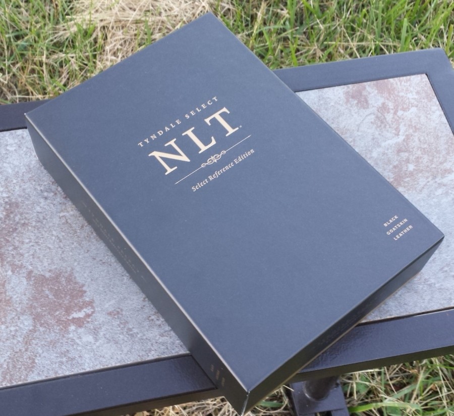
Tyndale has entered the premium and ultra-premium Bible market with its Tyndale Select NLT: Select Reference Edition – a hand-crafted edition printed by Jongbloed. It has the 2015 edition of the NLT and is available in either calfskin or goatskin. Bother covers are available in black or brown, and with or without thumb index. I’ve been using the black goatskin edition for a few weeks now and here are my thoughts about its design and construction.
Binding
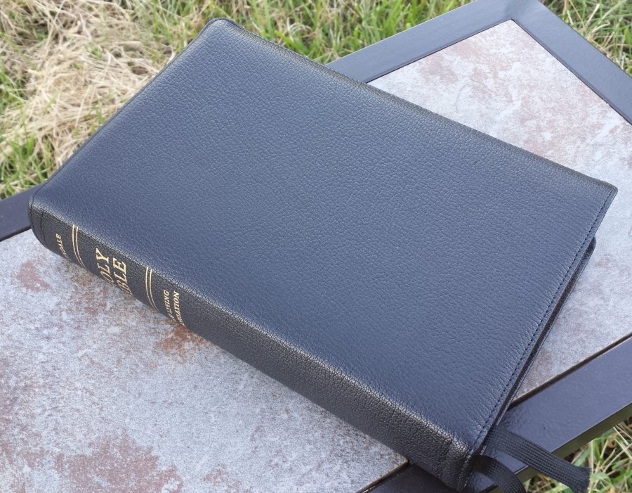
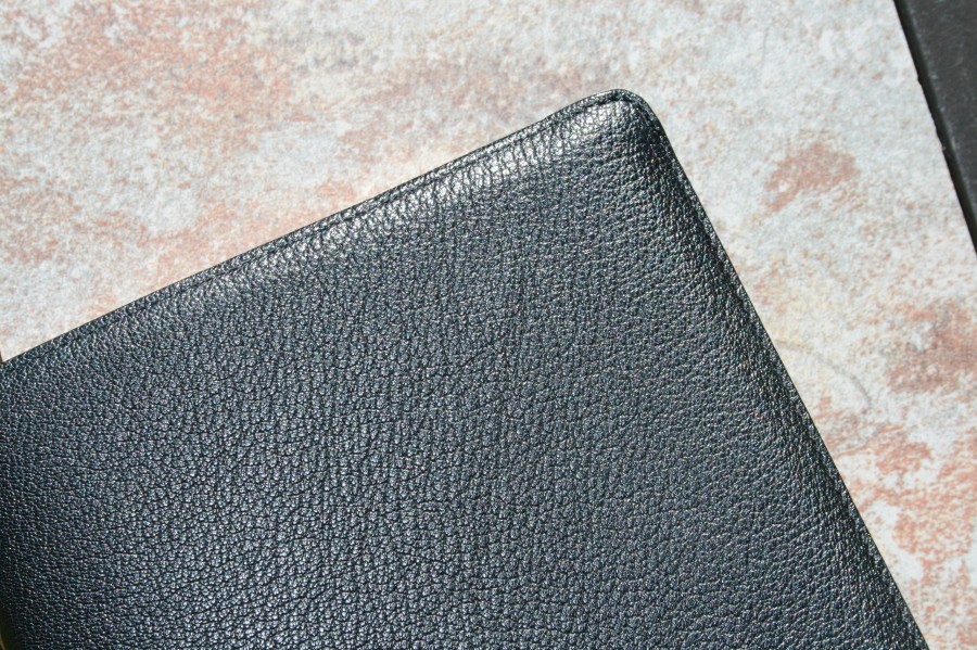
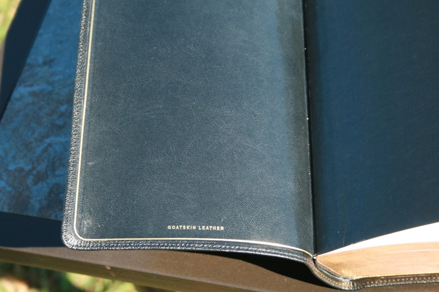
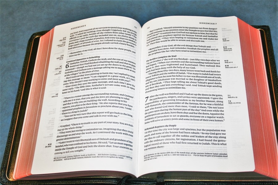
The cover is black goatskin. It’s flexible but not so flexible that I can’t hold it flat with one hand for easy reading. The grain is pebbly and looks and feels elegant. It’s sewn around the perimeter with very tight stitching. It has a synthetic liner with edge-lining. Like other Jongbloed editions, it does have a stiff hinge. It’s Smyth-sewn and has no trouble lying flat once the hinge loosens up.
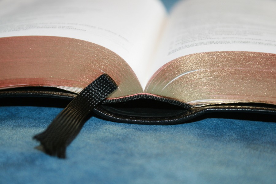
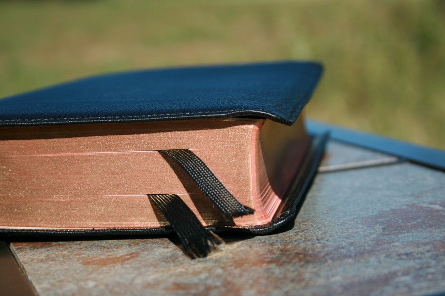
It has a slight yapp (where the leather overhangs over the page-edges). I would call this a semi-yapp, although it isn’t even mentioned on the box or in the product description. It gives the Bible a more elegant look and draws attention to the art-gilted edges. I prefer at least a little bit of yapp because the cover will bend where my hand grasps it anyway. Having a yapp means the cover is already conformed to my hand and is more uniform than just having a bend where I hold it.
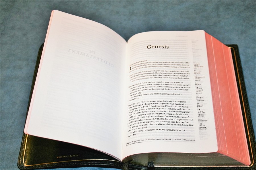
A gold gilt-line on the liner traces where the liner and outer cover meet. This frames the text-block when the Bible is open and gives it some sparkle. This is one of those features that I love when a publisher takes the time and expense to add. It’s the equivalence of adding pearl block inlays to the fretboard, etching a pearl logo into the headstock, or the entire pickguard of a guitar. They don’t affect the sound, but they sure do make a guitar look nice. Seeing that gilt-line adds to the luxury of this Bible. A Bible that’s made to be luxurious should have these special touches.
The overall size is perfect for me. I didn’t really know what the perfect size was, but I had an idea of the range. I knew I would know it when I saw it. Well, now I’ve seen it. The book-block is 5.25 x 8.25 x 1.5. The cover is 6 x 8.75 x 1.625. This size is easy to hold and carry. It looks and feels right. To be honest this is the size I was hoping the Clarion would be.
Paper
The paper is 28 gsm. It has a slight eggshell tint that helps readability. This is my favorite color for paper. Opacity isn’t bad at all. I can see that there are lines on the other side but I can’t read them. In my reading, I didn’t have any issues with distraction.
The page-edges are art-gilt (red under gold). Art-gilt is a must for ultra-premium editions. When opened the pages reveal a red that’s easy on the eyes. It’s dark enough to look great but not too bold to draw attention to itself. I would call it a dark salmon. It’s about halfway between Cambridge and Allan art-gilt. In my book that’s about perfect for red under gold gilting.
Typography
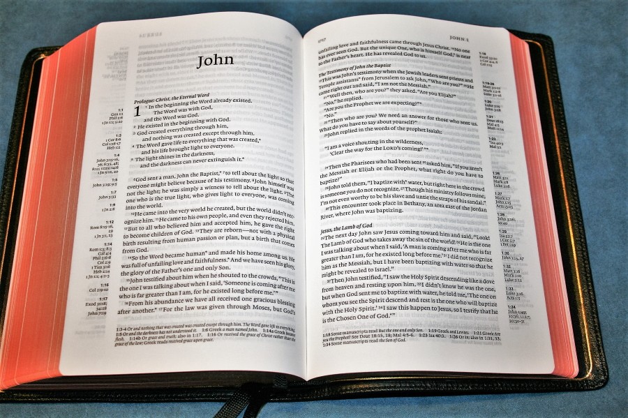
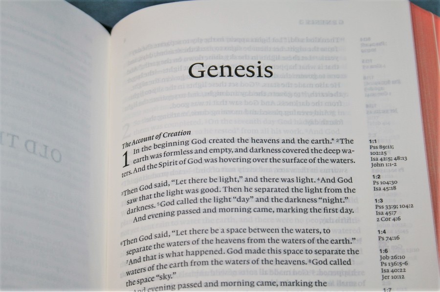
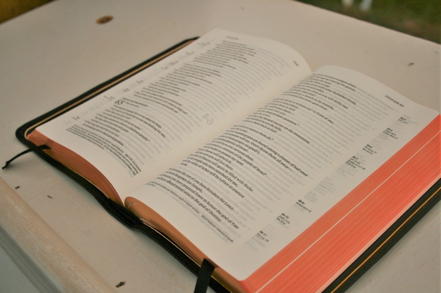
This is a single-column layout in paragraph format. References are placed in the outer margin and footnotes are placed in the footer. The setting has features that I look for:
- Poetry set to stanzas – even in the NT
- Letters indented (Ezra)
- OT quotes identified
Where this setting really shines is in the Psalms. The wide single column allows for enough room to make the poetic setting work perfectly. The only time a line has a single word is when it’s done on purpose.
The font is 8.75 Lexicon in black letter with a generous leading. The boldness is just about perfect for comfortable reading in most lighting conditions. It’s bolder than average but not so bold that it burns your eyes. I would call it a semi-bold. Of course, the print quality is sharp and consistent throughout.
Verse numbers are small and can be a little difficult to find when searching for verses. The designers chose readability over searchability. It’s difficult to excel at both and to be honest, I read more than search, although I would like verse numbers to be a little easier to find when teaching, preaching, or studying.
It has line-matching to improve readability. Line-matching is one of those features that once you have it you don’t go back, and it works well in this edition. It’s like upgrading to good coffee. You can’t go back to bad coffee. You will if you have to but you won’t enjoy it. Line-matching does that for readability. It’s very rare for the lines to not match up perfectly in the Tyndale.
Due to the width of the single column, the text never feels crowded. The column is 3.625” wide and has around 71 characters across. This will give you an average between 12 and 14 words per line.
Section headings are in bold italics. They stand out enough to be helpful but not so much that they become annoying. I find them both easy to use and easy to ignore. The header includes the book name with the chapter that starts on that page and the page number.
The inner margin is .5”. This brings the text out of the gutter so it doesn’t bend. When I’m reading text that bends into the gutter I sometimes have trouble figuring out which line to start on when I go to a new line because the end of the line is vertically in a different place than the beginning of the line. That’s usually why I prefer narrower columns, but this Bible doesn’t have that problem. I found the next line every time without having to think about it.
Another thing that improves readability is the lack of reference keys. I know those keys are handy, but I use references so little that I prefer to have a cleaner text. This places the emphasis on readability rather than study-ability (I put this word on the Internet, so if it wasn’t already a word… it’s a word now).
Some verses have asterisks within the text. These mark some references and all footnotes. If a reference has an asterisk then it shows where something is quoted from. I would prefer to have a different symbol for each since they’re placed in two different locations. This does help keep the test cleaner. The only issue with keying to the footnotes is you have to look for the verse number of the verse you’re in.
References
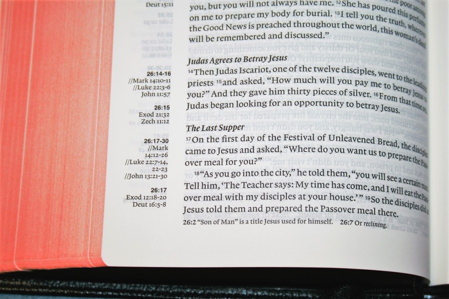
There are over 40,000 cross-references. There are no references keys in the text, but the references in the margin are labeled with the chapter and verse numbers. One thing I like about the way the references are printed is it doesn’t have ch. for references in the same book. It actually gives the book name. To me, this looks cleaner and is easier to follow because it’s more uniform. This is a minor point, but to me that small detail stands out.
Here are a few samples for comparison:
- Genesis 1:1 – Ps 89:11; 102:25; Isa 42:5; 48:13; Jn 1:1-2
- Matthew 17:20 – Mt 21:21; Mk 11:23; Lk 17:6; 1 Cor 13:2
- Mark 11:23 – x
- John 1:1 – Gen 1:1; Phil 2:6; 1 Jn 1:1; 5:20
- 1 John 1:1 – Jn 1:1, 4, 14; 1 Jn 4:14
One feature that I think is brilliant is for parallel references. It gives the chapter and then the range of verses it covers followed by the references. They’ve placed two parallel lines (like this: //) to show when a reference is for a parallel verse. This is a visual queue that lets you know easily what kind of reference it is. It’s easy to understand. I didn’t even have to look it up to figure out what it meant. I love that. This should be standard in Bible publishing.
Here are some examples:
- Matthew 28:16-20 – Lk 24:36-49; Jn 20:19-23
- Mark 16:14-18 – Mt 28:16-20; Lk 24:36-49; Jn 20:19-23; Ac 1:6-8
- Luke 24:36-49 – Mt 28:16-20; Jn 20:19-23
- John 20:19-23 – Mt 28:16-20; Lk 24:36-49
- Acts 1:6-8 – x
Footnotes
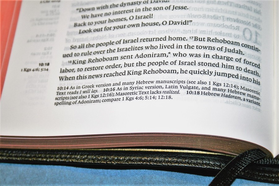
Footnotes appear in the footer of the page and have the chapter and verse number that they correspond to. Textual footnotes show literal renderings and marks them as Hebrew, Aramaic, or Greek. They also show alternate renderings, manuscript variants, where something was quoted from (and identifies if it was quoted from a Greek version of the OT and includes the Greek version), cultural and historical information (for places, things, and people), the meaning of names when it’s relevant to the meaning of the text (used as word-play), and weights and measures. There are a lot of footnotes and they’re helpful in study and improving understanding.
Concordance / Dictionary
It has a 119-page concordance/dictionary combo. It gives the part of speech and a short definition. This is a good tool for research and study.
Here are a few examples with the number of references given:
- Christ (n) Son of God, Messiah, Anointed One, see also Jesus, Messiah – 95
- Faith (n) reliance, loyalty, or complete trust in God; a system of religious beliefs; see also Believe, Trust – 57
- Faithful (adj) firm in adherence, utterly loyal; see also Loyal, Trustworthy – 43
- Faithfulness (n) the quality of steadfast loyalty or firm adherence to promises – 15
- God, Gods (n) eternal, infinite Spirit; Creator, Redeemer, sovereign Lord; impotent pagan deity; image of pagan deity (made of wood, metal, or stone); see also Idols(s) – 89
- God-breathed (KJV) – 1
- Godliness (n) devotion to God; piety; see also Righteousness – 4
- Praise, Praises (n) worship; commendation; value, merit – 18
- Praise, Praised, Praises, Praising (v) to worship, commend, or give honor to – 44
- Pray, Prayed, Praying, Prays (v) to address God with adoration, confession, supplication, or thanksgiving; to intercede – 42
- Prayer, Prayers (n) conversation with God – in praise, thanksgiving, or intercession – 20
Obviously there’s quite a bit here to help in study and sermon or class prep.
Maps
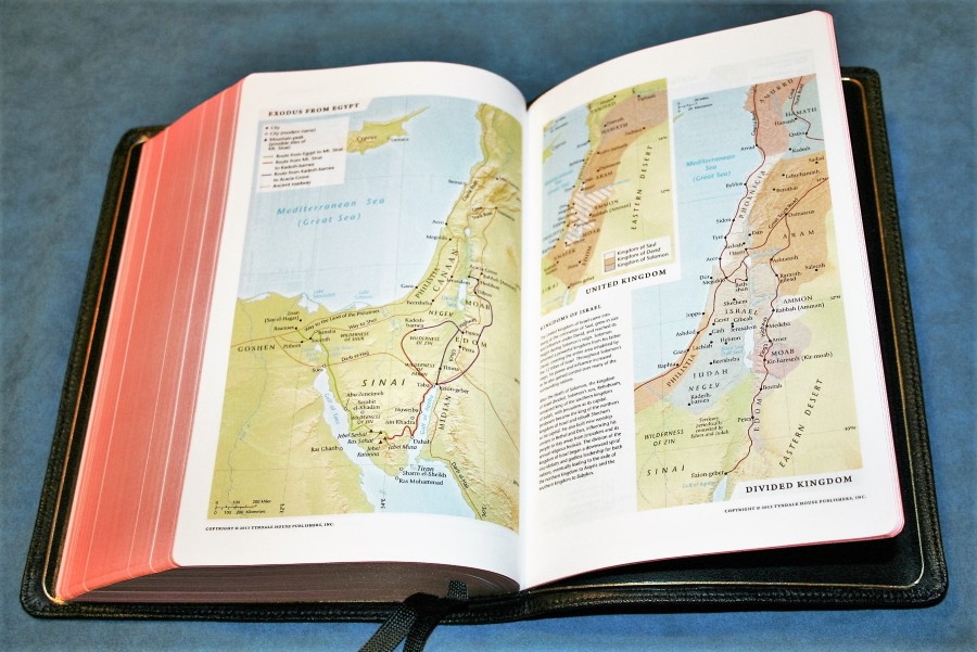
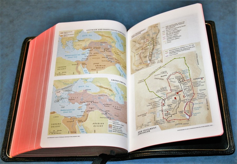
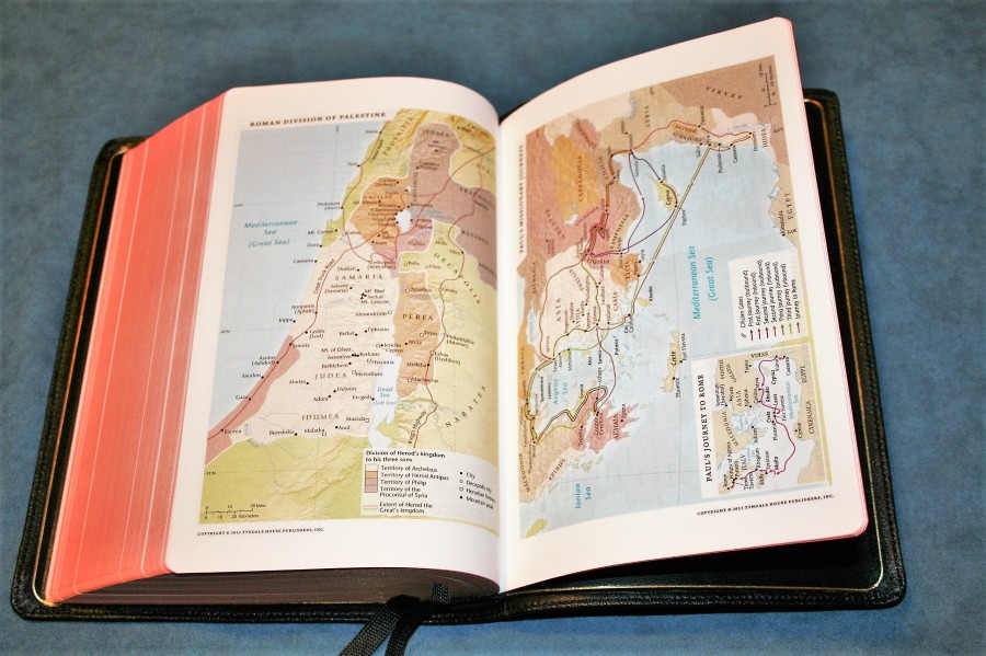
There are 8 pages with 12 full-color maps. They cover routes, land divisions, and topography. They’re printed on thick, non-glossy paper. This is the kind of paper I like for maps because there isn’t glare from the light. There isn’t an index to maps, which would have been helpful since the maps don’t have a lot of annotations.
Maps include:
- World of the Patriarchs
- Exodus from Egypt (does not show any possible Red Sea crossings. Shows multiple possible mountains for Mount Sinai)
- Kingdoms of Israel (United, Divided)
- Assyrian and Babylonian Empires
- Greek Empire
- Old Testament Jerusalem
- New Testament Jerusalem
- Roman Division of Palestine
- Paul’s Missionary Journeys
- Paul’s Journey to Rome
- Roman Empire and the Spread of Christianity
Ribbons
There are two black ribbons. They’re long enough to pull them to the corner to open the page. The ribbons are the one thing that don’t quite feel luxurious to me. I’m not saying they’re not… but they are a lot different than I’m used to. Rather than silky, they’re made with a stretchy fabric. It’s a different approach than I would have taken. They are very flexible and don’t seem to bunch up as bad. Maybe that was the point in using this material. I am concerned about how long they would last because mine started fraying within a few days of use. Put fray-check on them ASAP!
Using the Tyndale Select NLT
I carried this Bible around and found that this is my favorite size for a Bible. It feels right in my hand. The font is smaller than I’ve been looking for lately (I’ve been moving toward 10-12 fonts for reading and preaching) but I didn’t have any issues reading and preaching from this Bible in the pulpit. The font is dark enough to make up for its smaller size. The emphasis is on readability and it excels at that. The goatskin cover is amazing. It’s soft and supple but I can still hold it flat in one hand to read. There are good quality tools to help with reading, study, and sermon/class prep.
If I Could Change One Thing
If I were forced to make a change I would change the ribbons. That’s it. I love the size, paper, print, cover, tools, etc., but I like the more elegant ribbons found in other Jongbloed editions for Allan and Schuyler. These ribbons would not keep me from buying this Bible, but if I could change them I would.
Conclusion
Tyndale has done well with its first ultra-premium edition. It’s hard not to when you get it hand-crafted by Jongbloed. The edge-lined goatskin cover is fantastic, although it will take a little bit of breaking in to loosen the hinge. The overall size is perfect for carry, holding, and reading. The text is clean, readable, and dark just like I prefer. The tools are very useful for study and for class/sermon prep. The paper has the right thickness, feel, and color for my fingers and eyes. I highly recommend the Tyndale Select NLT: Select Reference Edition to anyone that wants a high-quality NLT. I love this setting so much that I want Tyndale to make it in all major translations.
Tyndale House Publishers provided this Bible free for review. I was not required to give a positive review – only an honest review. My opinions are my own.





I’m waiting for mine to review at my blog. Have you seen if lines are matched one another so you cannot appreciate “ghosting”? I have been sent goatskin brown one.
It does have line-matching. I hardly even notice any show-through. It looks worse in my pictures than it does in person.
Does this bible come in red letter print? If it does I will purchase it. Thank you, Ivan
It’s black letter only.
Great review! I am undecided on whether to spring for a Tyndale or one of the upcoming Schuyler NLT Caxtons. The text block looks very similar as does the price point.
This bible looks beautiful!
I was told by someone at Tyndale, that the text block of this edition is identical to the upcoming Caxton edition selling at Evangelical Bible.
It is the same text-block. They made a great choice.
The brown calfskin is on sale for $95 with free shipping at tyndale.com. Use the coupon code EXTRA10 and the price drops to $85.50.
Wow! That’s an amazing price for this Bible. Thanks for sharing.
The brown calfskin is on sale at tyndale.com for $95 and free shipping. If you use the coupon code EXTRA10 then the price is $85.50
Sorry for the duplicate comments.
No problem! That’s a deal that’s worth making sure we know about. I appreciate it!