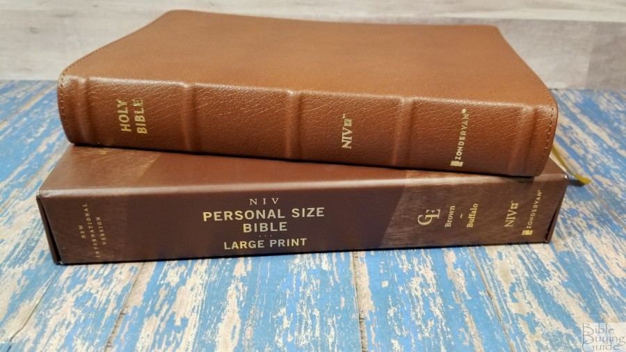
Zondervan’s NIV Large-Print Personal-Size Bible was designed with daily carry in mind. Since it’s a large print, it’s well-suited for those that need or prefer fonts in the 11-point range. Since it’s a personal size, it’s easy to handle while on the go. The materials, edge-lined water buffalo leather, elegant paper, etc., make it ideal for a Bible to use for many years. This is ISBN 9780310455950, printed in China. It comes in a sturdy one-piece box with a textured design.
Zondervan provided this Bible in exchange for an honest review. I was not required to give a positive review, only an honest one. All opinions are my own.
_________________________________________________________
This Bible is available at (includes some affiliate links)
and many local Bible bookstores
_________________________________________________________
Table of Contents
- Video Review
- Binding
- Paper
- Typography and Layout
- Table of Weights and Measures
- Bible Atlas
- Comparisons
- Conclusion
Video Review
Binding
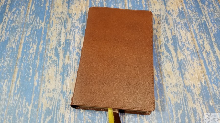
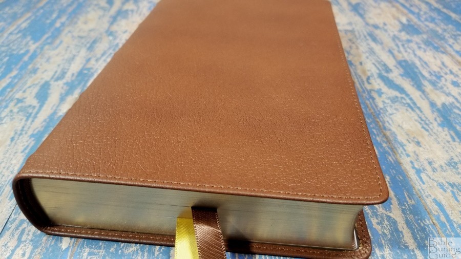
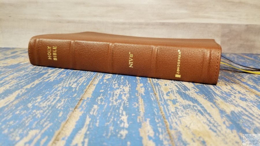
The cover is a rich brown water buffalo leather. It has a pebbly grain that looks and feels elegant. It has perimeter stitching with nothing printed on the front. The spine has 5 raised hubs with HOLY BIBLE, NIV, and the Zondervan logo printed in gold.
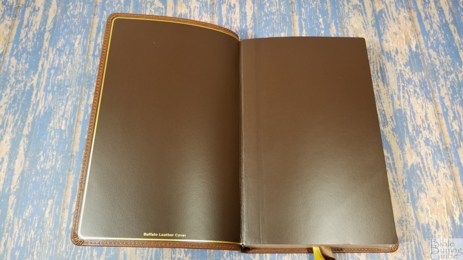
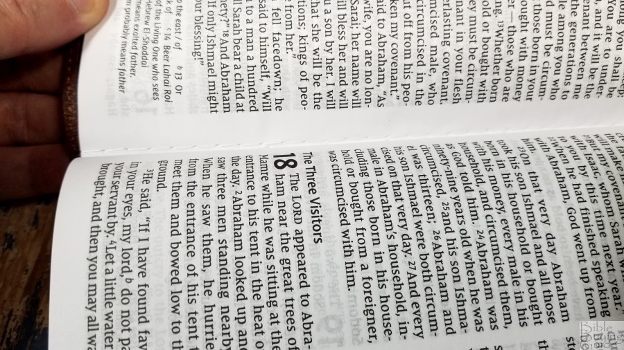
The liner is edge-lined with extra-strength vinyl endsheets. It has a gold gilt line around the perimeter. This gives the cover a finished look. The text block is sewn and it has overcast stitching for the first signature in the front. The edge-lined tab is stiff at first, so it might take some time before it will stay open in Genesis.
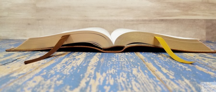
It has 2 3/8″ double-sided statin ribbons – one brown and one gold. They’re extra long and add to the elegance of this Bible. The head/tail bands are dark brown. The overall size is 5 3/4 x 8 7/8 x 1 3/8″. It weighs 1lb, 14 oz.
Paper
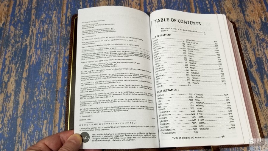
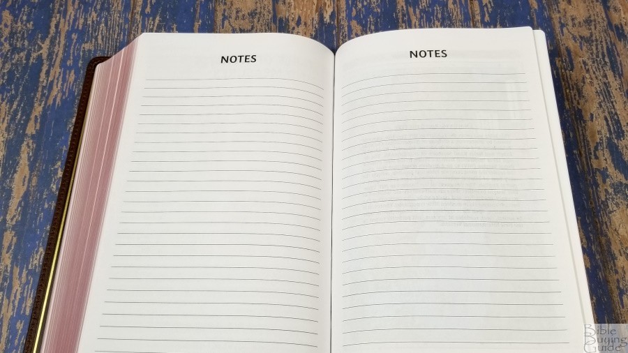
The paper is excellent. It’s 30gsm, but it seems thicker than that to my fingers. It’s white in color and it’s highly opaque. Show-through is more obvious in certain lighting, but in most lighting, it looks great. The texture is just rough enough to make the pages easy to grab and separate with one hand. There is no glare under direct light. The edges are art-gilt. It’s not a deep red, maybe more of a rose color, but it does look good. There are 4 lined pages in the back for notes. These are printed on standard Bible paper.
Typography and Layout
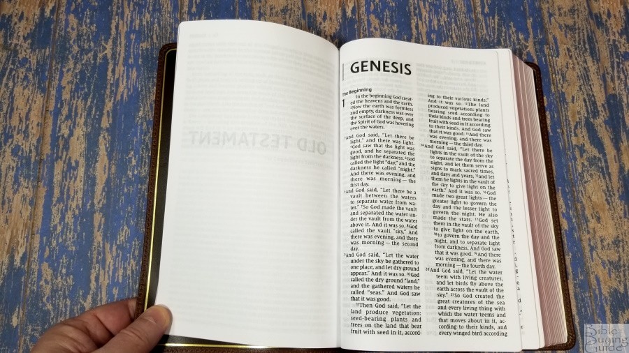
The text is presented in a double-column, paragraph setting with poetry in stanzas, lists in a list format, and letters indented. The header shows the book name, chapter, and verse number, a verticle line, and the page number in the outer margin. Footnotes are placed in the footer in the right column after the last verse on each page.


The Comfort Print typeface is 11.5-point with the words of Christ in red. It’s large and dark. I find it very readable. The red is about a medium darkness. It’s also readable, but I prefer slightly darker red. It has around 6-7 words per line on average. It has plenty of space between the words and the lines to make it comfortable to read or underline. The text is printed into the bend of the gutter, but it has enough inner margin space that it doesn’t go too far. The verse numbers are large enough to see, but they don’t stand out. So it might take an extra second or two to find them when preaching.
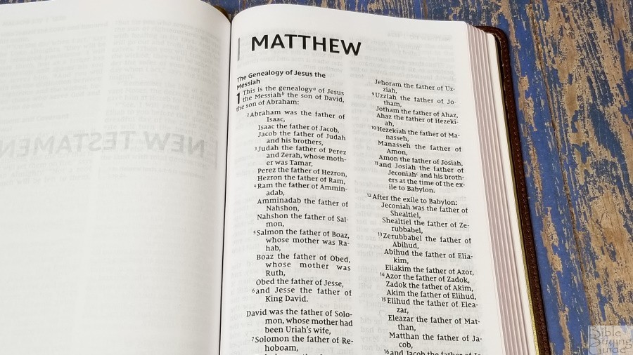
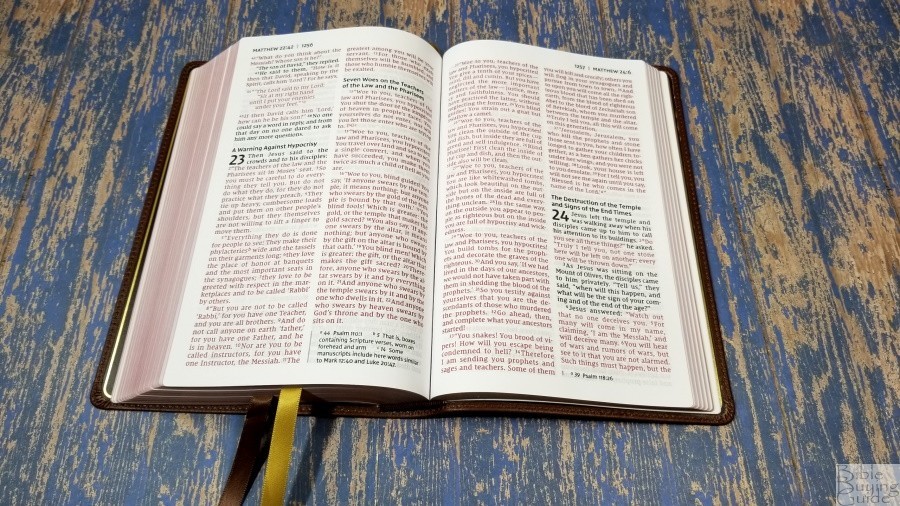
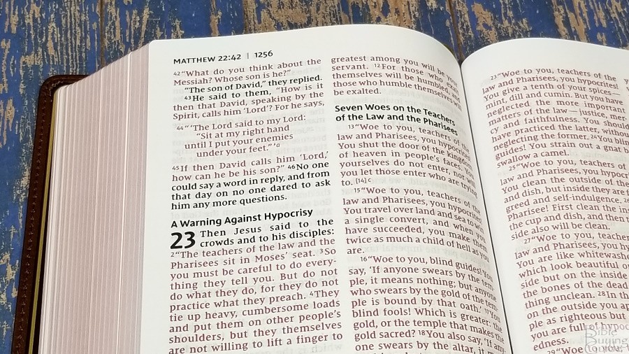
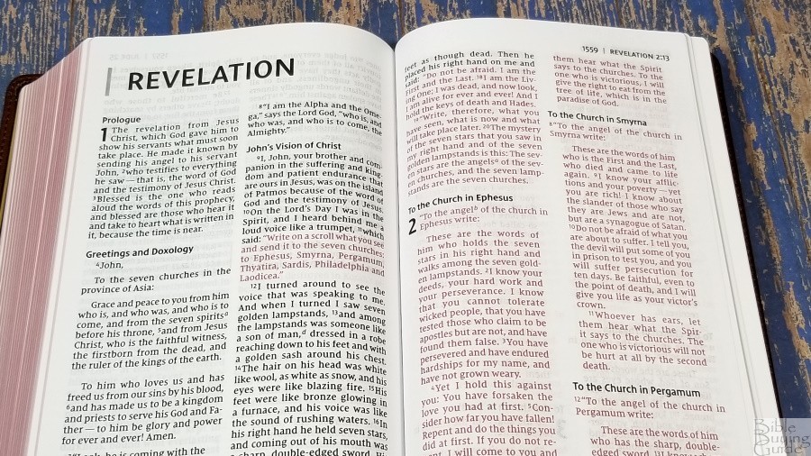
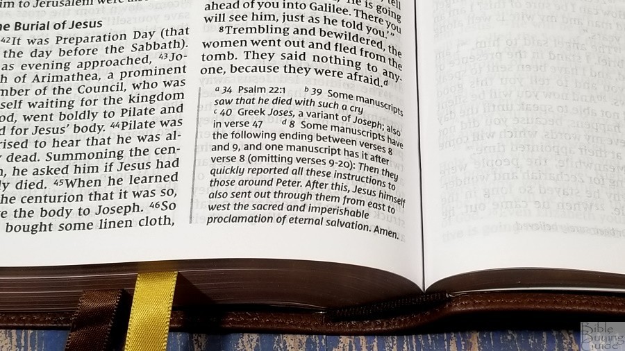
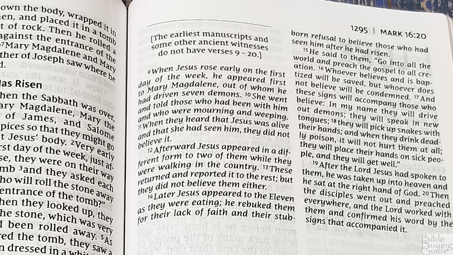
It doesn’t look to be printed with line-matching (where the words on both sides of the page are placed in the same location on the page to improve readability). It’s more noticeable in the poetic settings, but even then it isn’t that bad. With that said, there are a lot of places where the lines do match. In those places, the text looks even better. The larger portions of text that are identified as not in the earliest manuscripts are labeled and placed in italics.
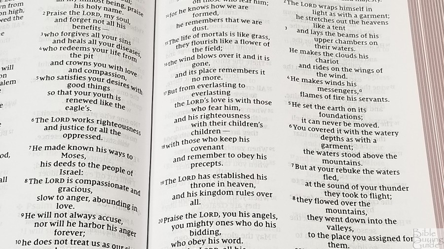
The poetic setting looks a little odd to me. The lines that continue the previous stanza are deeply indented. This amount of indenting stands out and causes lots of lines to have one word. It looks like they want the setting to look different from other translations, but it really needs more words per line to work well. Halving the amount of indention would look much better in my opinion.
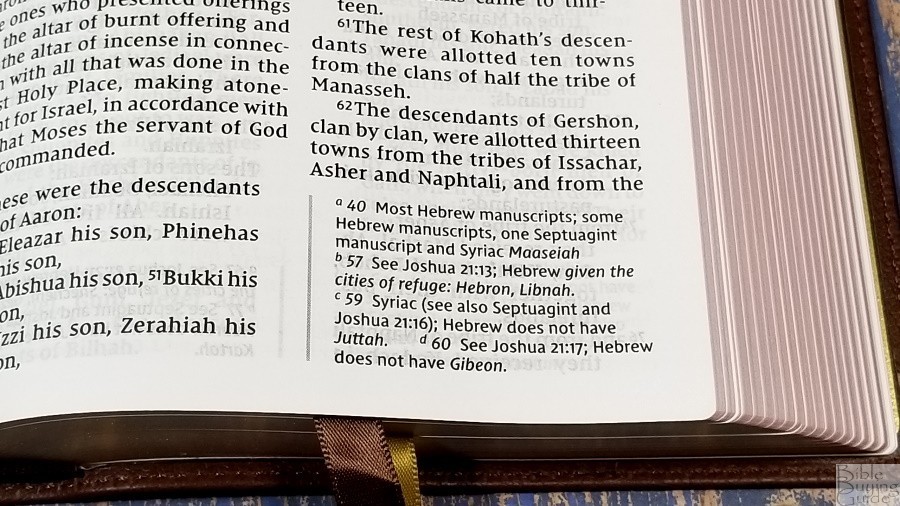
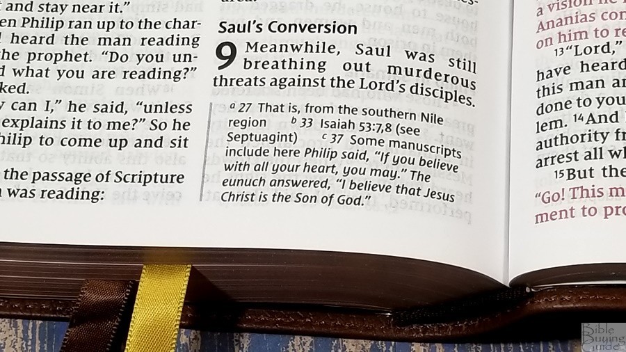
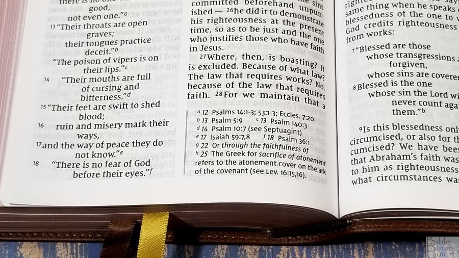
The translation footnotes are placed under the last verse on the page. They stand apart from the text with a gray vertical bar that lines up with the left edge of the column. The font is smaller than the Scriptures. They include explanations on the Greek and Hebrew words, references where something is quoted from, measures, etc.
Table of Weights and Measures

This is the standard one-page table that shows the biblical unit and approximate American and metric equivalents. It includes weights, length, and capacity for both dry and liquid measures. It shows the information about how the calculations were derived. Some of this information is also found in the footnotes.
Bible Atlas
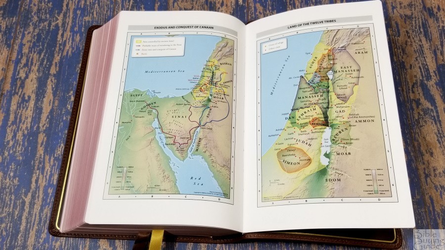
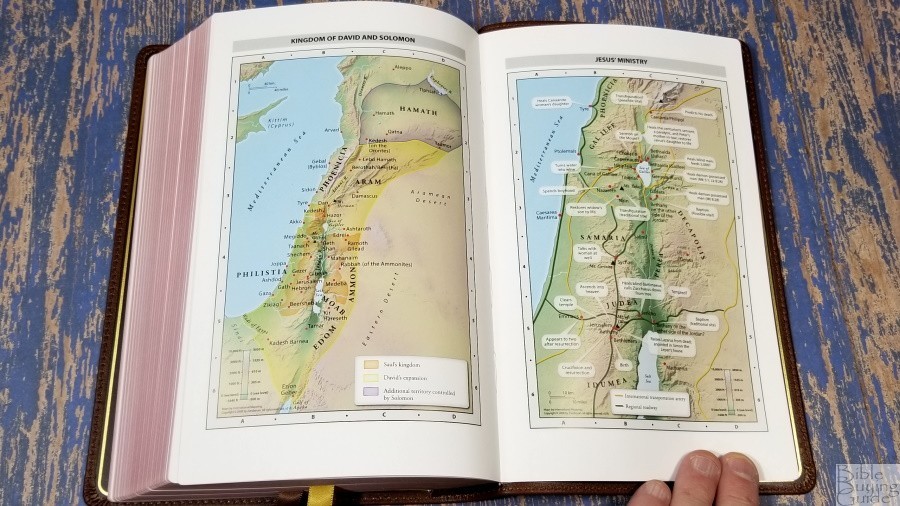
It includes the standard 7 full-color Zondervan maps printed on 8 thick glossy pages. They’re printed with earth-tone colors and include topography, distance, routes, borders, possible locations of lost places, battles, elevation, cities, and locations for the events of Jesus’ ministry. It does not include an index but the maps are annotated well and easy to use. They’re good for personal study.
Maps include:
- World of the Patriarchs
- Exodus and Conquest of Canaan
- Land of the Twelve Tribes
- Kingdom of David and Solomon
- Jesus’ Ministry
- Paul’s Missionary Journeys
- Jerusalem in the Time of Jesus
Comparisons
Here’s how the NIV Large-Print Personal-Size Bible compares to the closest editions I have. These are in the Premier Collection, so they’re in a higher price range, but if you’re familiar with them then you’ll get a better idea of the quality and size of the NIV Large-Print Personal-Size.
Premier Collection NIV Thinline Bible Large Print
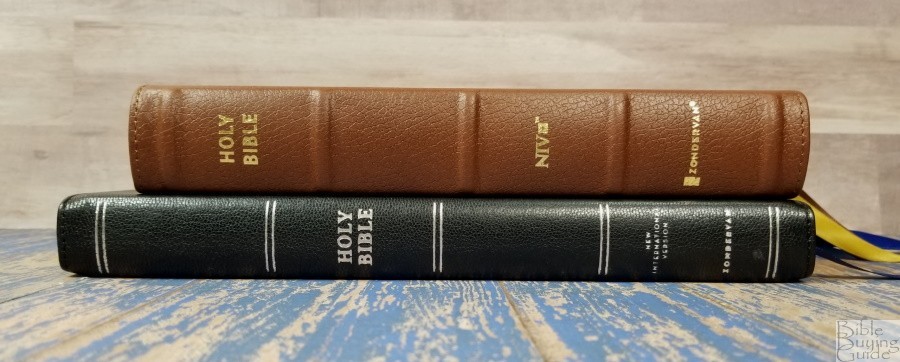


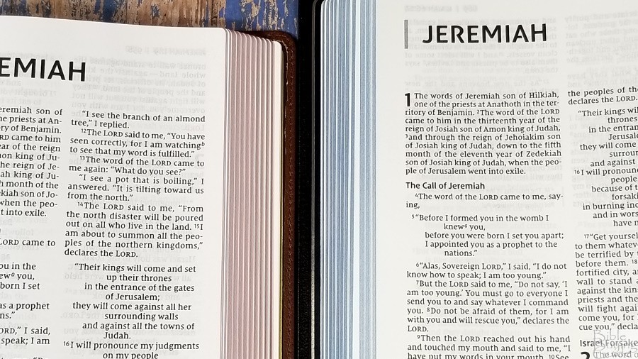
The Premier Collection NIV Thinline Bible Large Print is thinner but has a larger footprint. The font is noticeably smaller but it has the same darkness. It has more words per line, which makes the poetic setting look better, but it’s still indented too far. The paper is more opaque, but that’s to be expected with the premium paper in the Premier Collection.
Premier Collection NIV Heritage
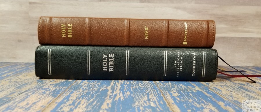
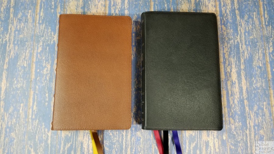


The Premier Collection NIV Heritage has the same footprint, but it’s slightly thicker. The font is lighter and smaller. It’s more like a regular print compared to the semi-bold print of the NIV Large-Print Personal-Size.
Conclusion
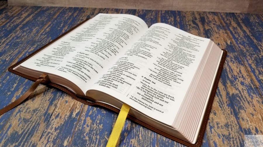
Zondervan’s NIV Large-Print Personal-Size Bible is an excellent edition for carrying and reading. The leather looks and feels elegant. The heavy-duty edge-lined vinyl liner should make it last longer than a paste-down edition. Although, it won’t last as long as one that’s leather lined. The paper and print match the quality of the imitation leather range, which is great by today’s standards. The show-through is there, but it’s only noticeable in the poetic settings or where the lines don’t match. If you’re looking for a handy size edition that’s great for daily use but you want something better than the imitation leather editions, I recommend taking a look at this one.
_________________________________________________________
This Bible is available at (includes some affiliate links)
and many local Bible bookstores
_________________________________________________________
Zondervan provided this Bible in exchange for an honest review. I was not required to give a positive review, only an honest one. All opinions are my own.





Recent Comments