Zondervan’s NIV Heritage Bible is their single column entry into the Premier Collection line of Bibles. These Bibles are designed to find the perfect balance between premium quality and price. The NIV Heritage is unique among the Premier Collection in that, at least so far, it’s the only edition that doesn’t have references. It’s a hand-sized edition, ISBN: 9780310450757, made in China with premium materials.
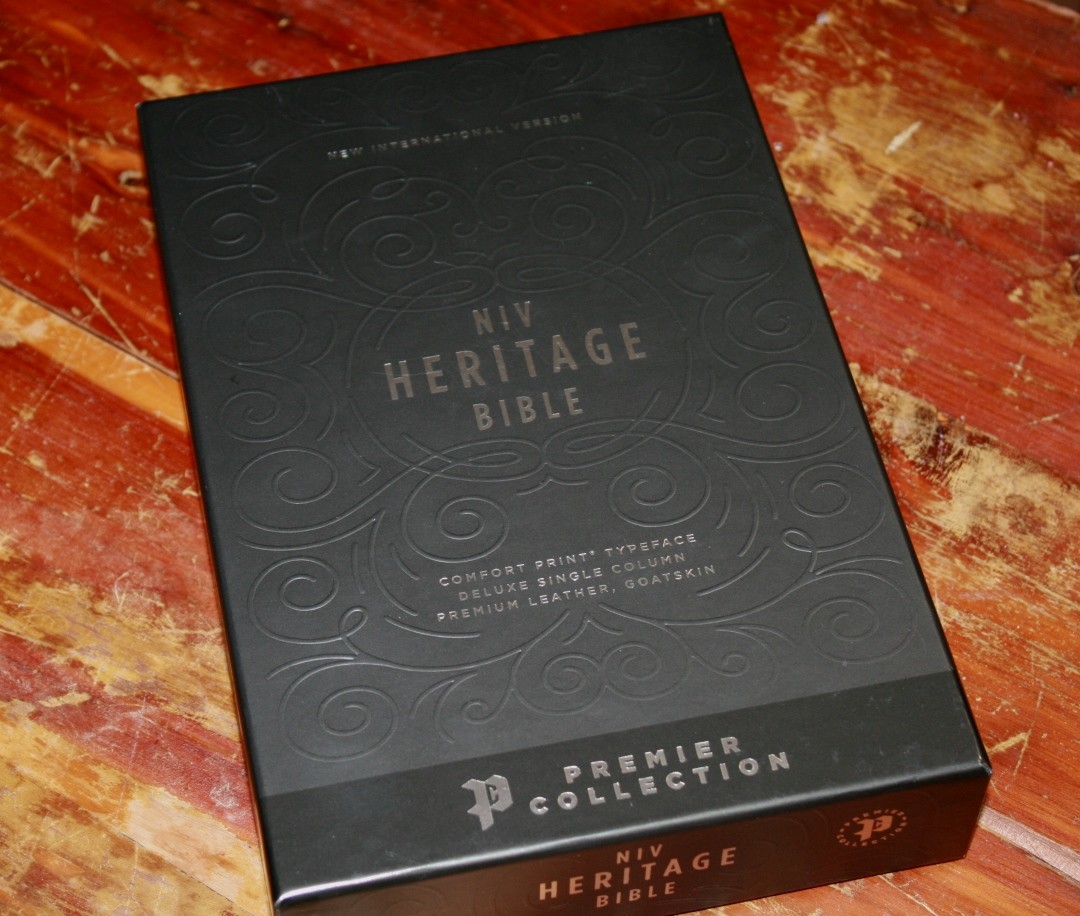
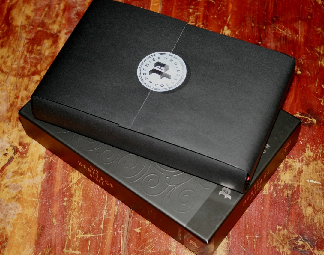
It includes an elegant box and the Bible is wrapped inside. The box has a raised swirly design on the front. It’s the most elegant box of the Premier Collection.
Zondervan provided this Bible in exchange for an honest review. I was not required to give a positive review, only an honest one. All opinions are my own.
_________________________________________________________
This Bible is available at (includes some affiliate links)
and many local Bible bookstores
_________________________________________________________
Video Review
Cover and Binding
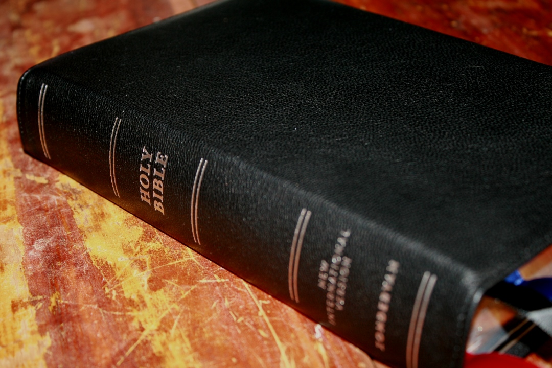
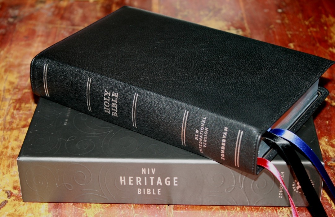
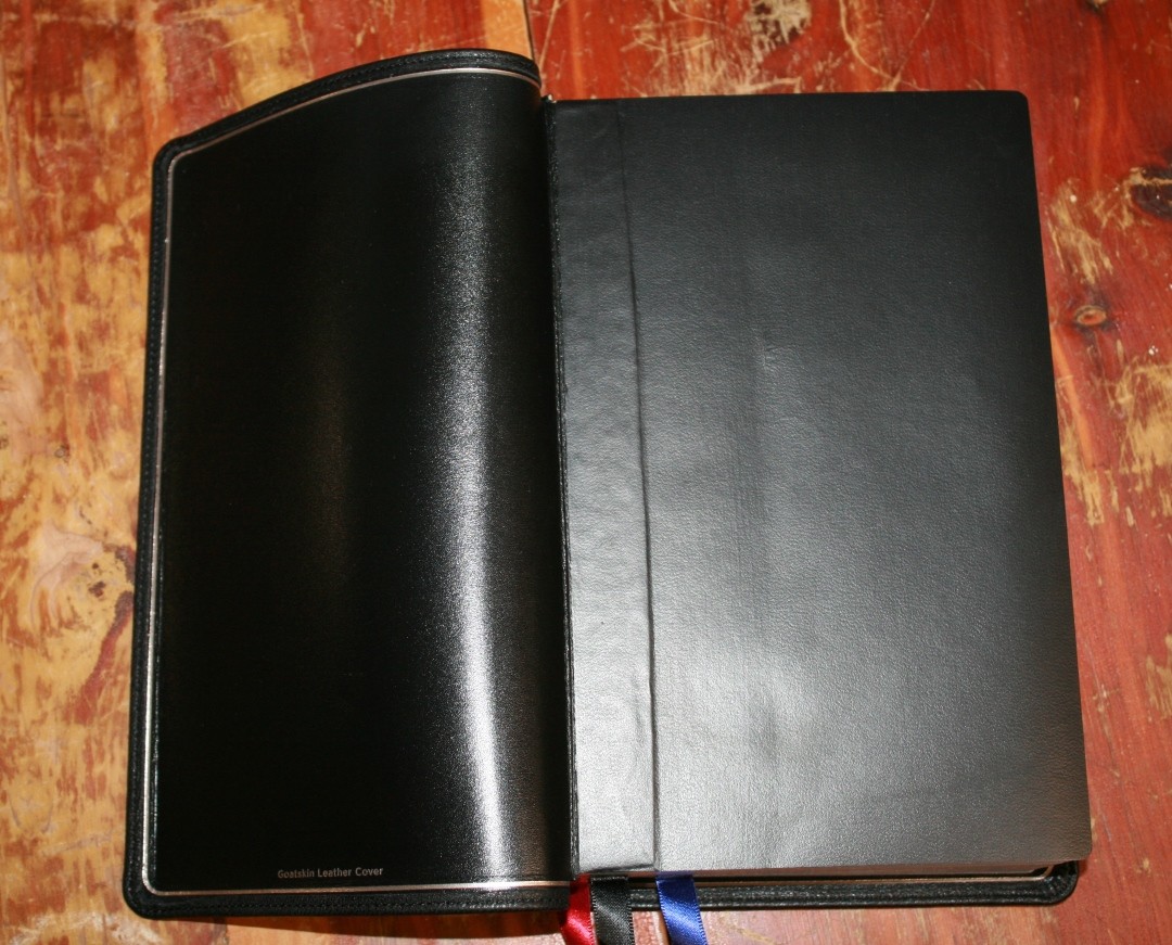
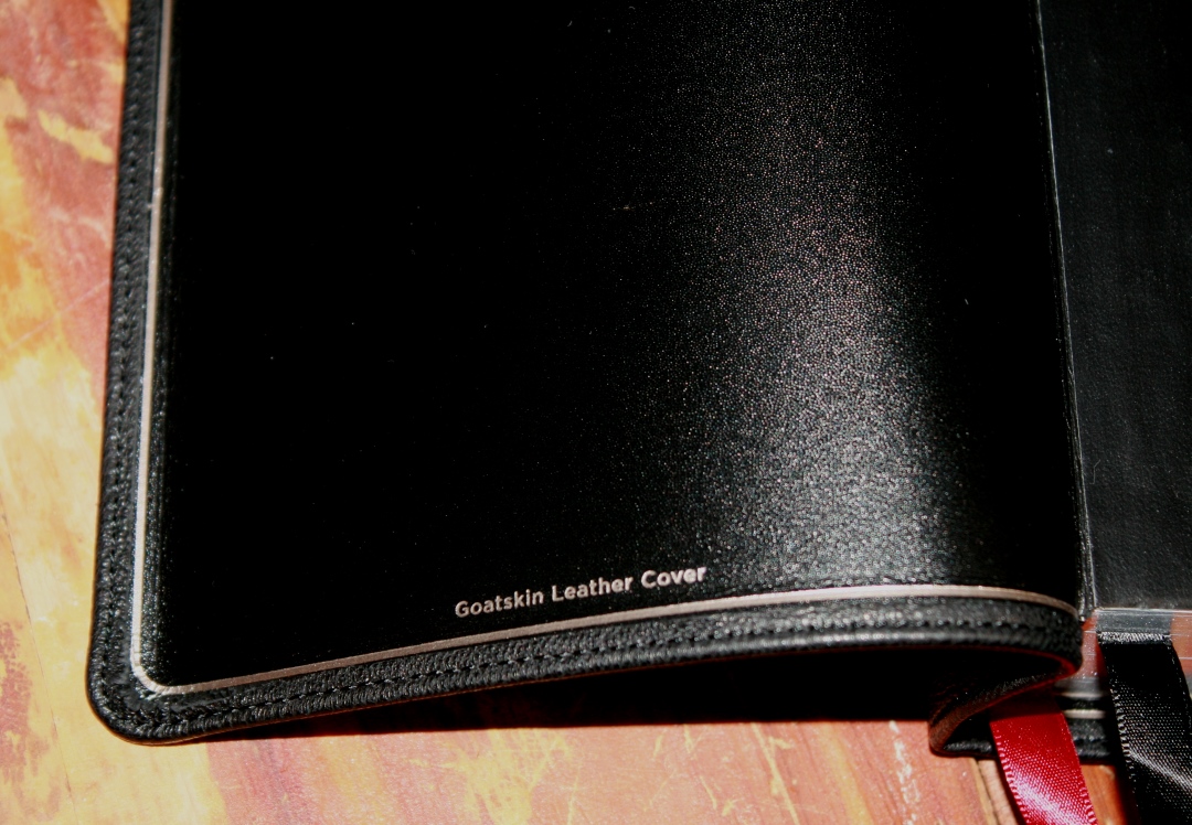
The cover is black goatskin. It’s soft to the touch and has a nice grain. The liner is edge-lined leather. It has perimeter stitching and it includes a silver gilt line. The cover doesn’t feel too thin. It’s flexible without being too floppy. It’s more flexible than the NKJV Single Column.
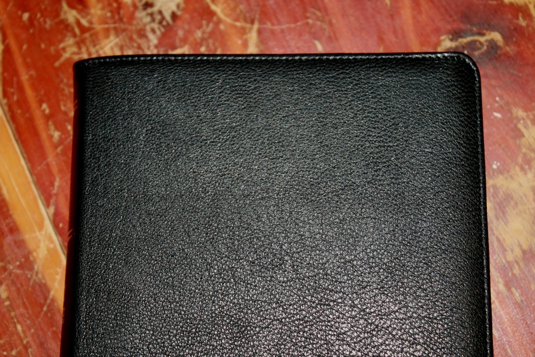
The front has no writing. The spine has HOLY BIBLE, NEW INTERNATIONAL VERSION, and ZONDERVAN printed in silver. It has 5 spine indications stamped in silver. The spine of the cover is flexible, which allows the text block to rise as the Bible is opened. This helps keep the pages flat.
It’s Smyth sewn and has no trouble laying open on the first page. It also lays flat because the text block rises when the Bible is opened. It weighs 2 lbs, 7 oz. The overall size is 9.1 x 6 x 1.75″ at the spine. These dimensions feel well-balanced in the hand. The flexibility is easy to hold. The spine does feel a little flexible when the Bible is laying in my hand. It’s not as heavy or as thick as the NKJV Single Column.
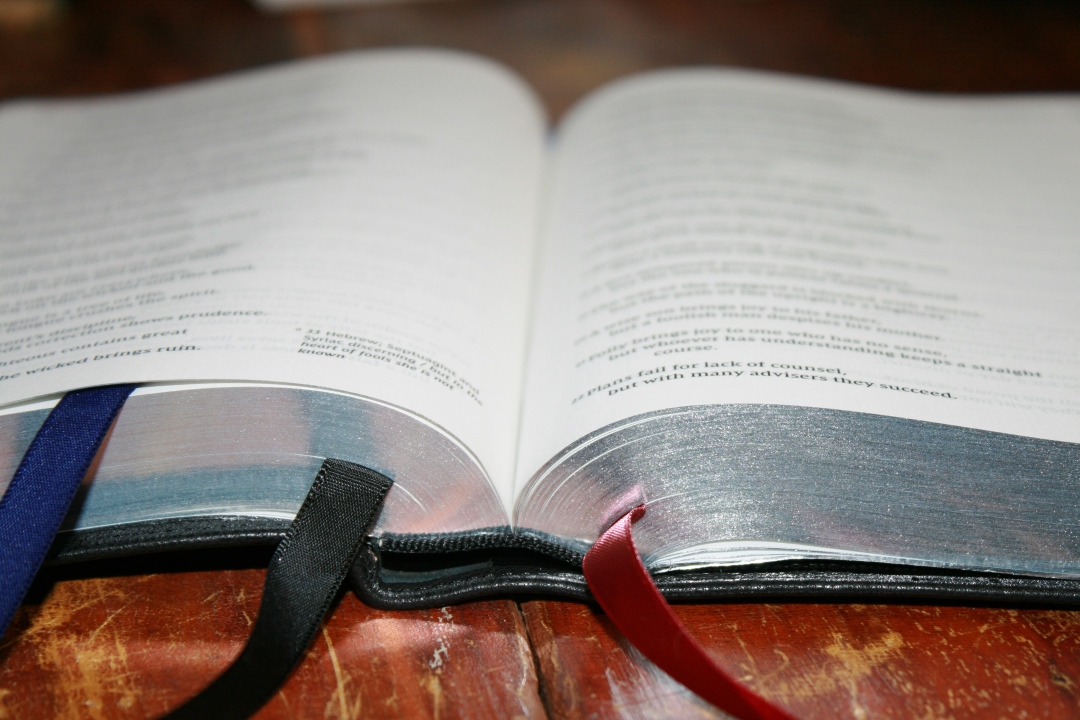
It includes three satin (black and blue for the Old Testament, and red for the New Testament) ribbons at 3/8″ each. They’re extra long and they’re cut straight. I like long ribbons, but these could be a touch too long if you have trouble getting ribbons caught on things.
Paper
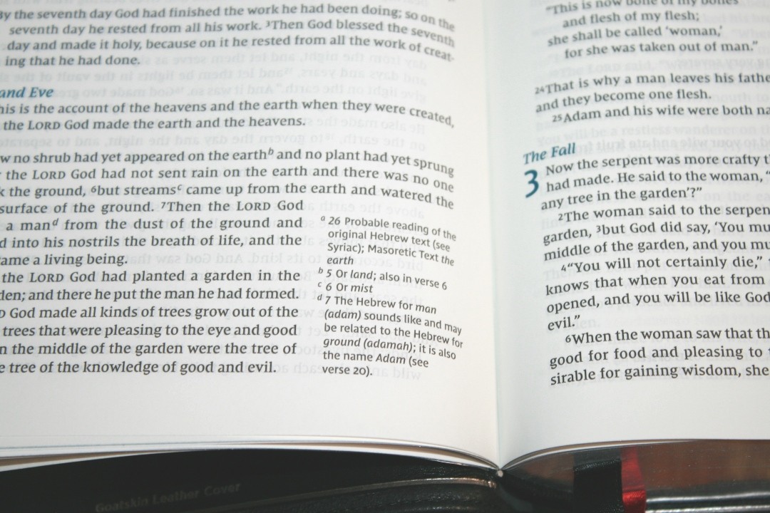
The paper is 36gsm premium European Bible paper. It’s white in color and it’s very opaque. It has a smooth texture that I find to be easier to turn pages than most Bibles. It looks and feels elegant and it’s excellent paper for reading for long periods of time. Page edges are art-gilt with blue under sliver.
Typography
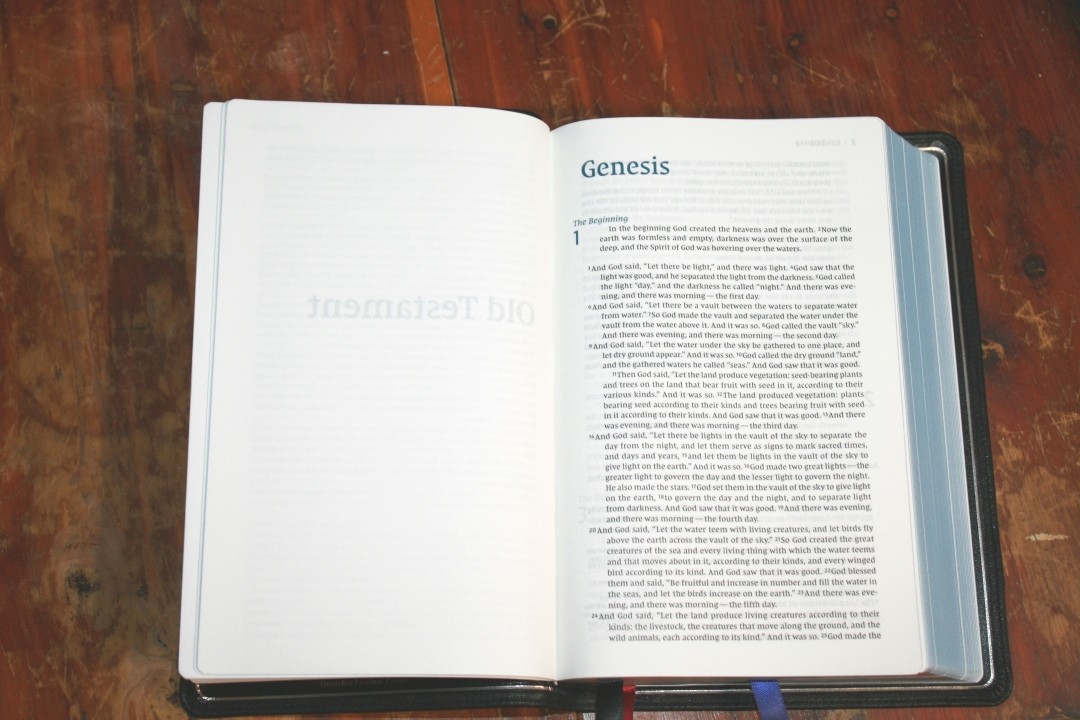
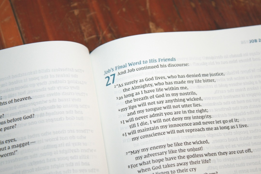
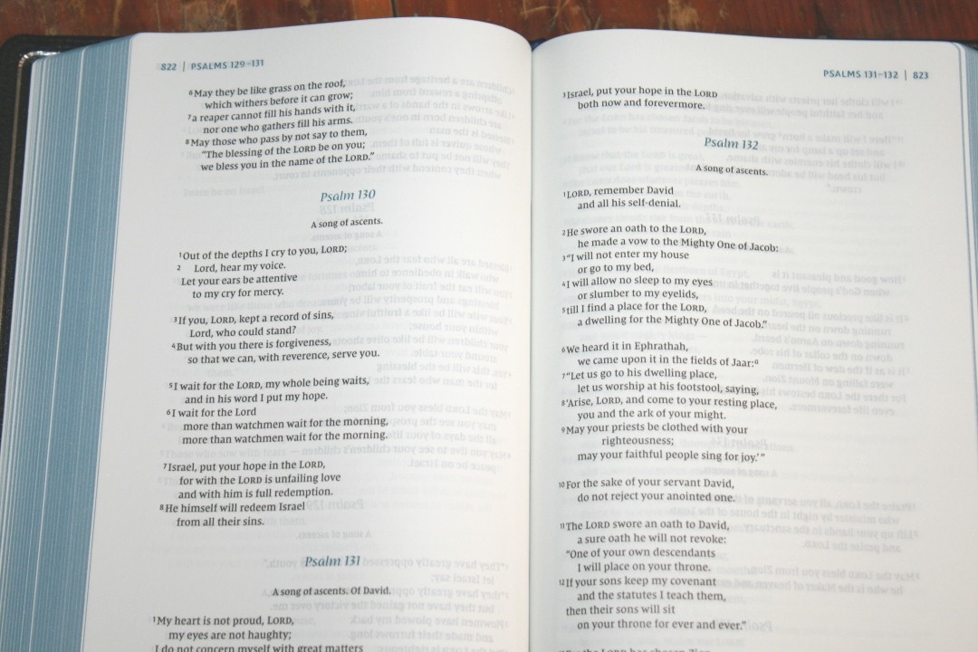
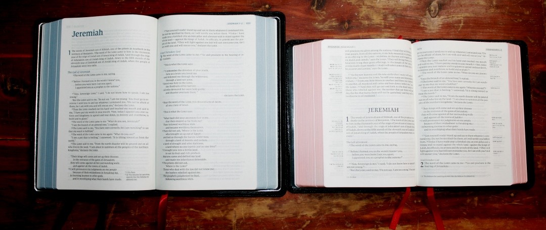
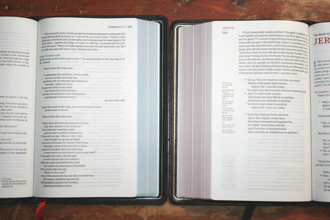
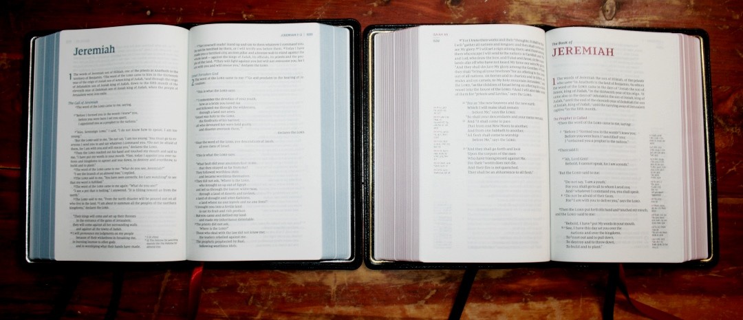
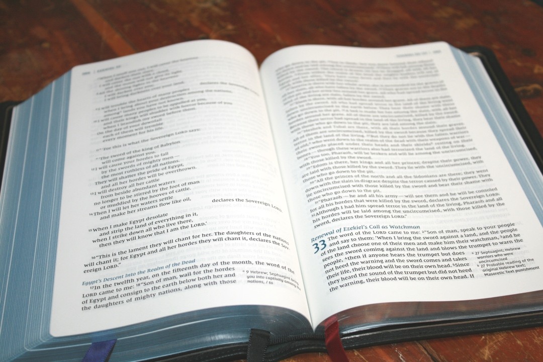
The layout was designed by 2K/Denmark. The text is presented in single-column paragraph format. The header shows the page numbers in the outer corner followed by a vertical line, and then the book name and chapter numbers. Footnotes are placed within the text in the bottom right corner.
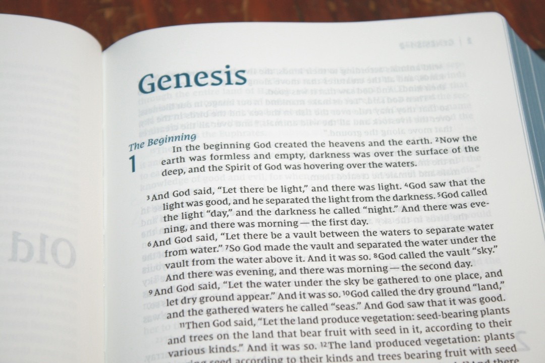
The typeface is the Comfort Print designed specifically for the New International Version by 2K/Denmark. It looks like 8-8.5-point with 10-point leading. It’s a very consistent and dark black-letter text with blue highlights including section headings, drop caps (chapter numbers), and the book name and chapter numbers in the header. I love the blue highlights. It works perfectly with the blue under silver art-gilt edges and silver printing on the cover and gilt-line.
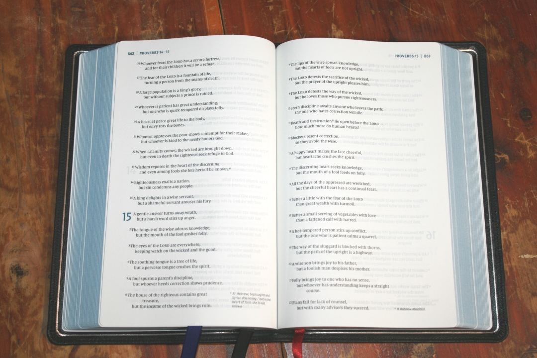
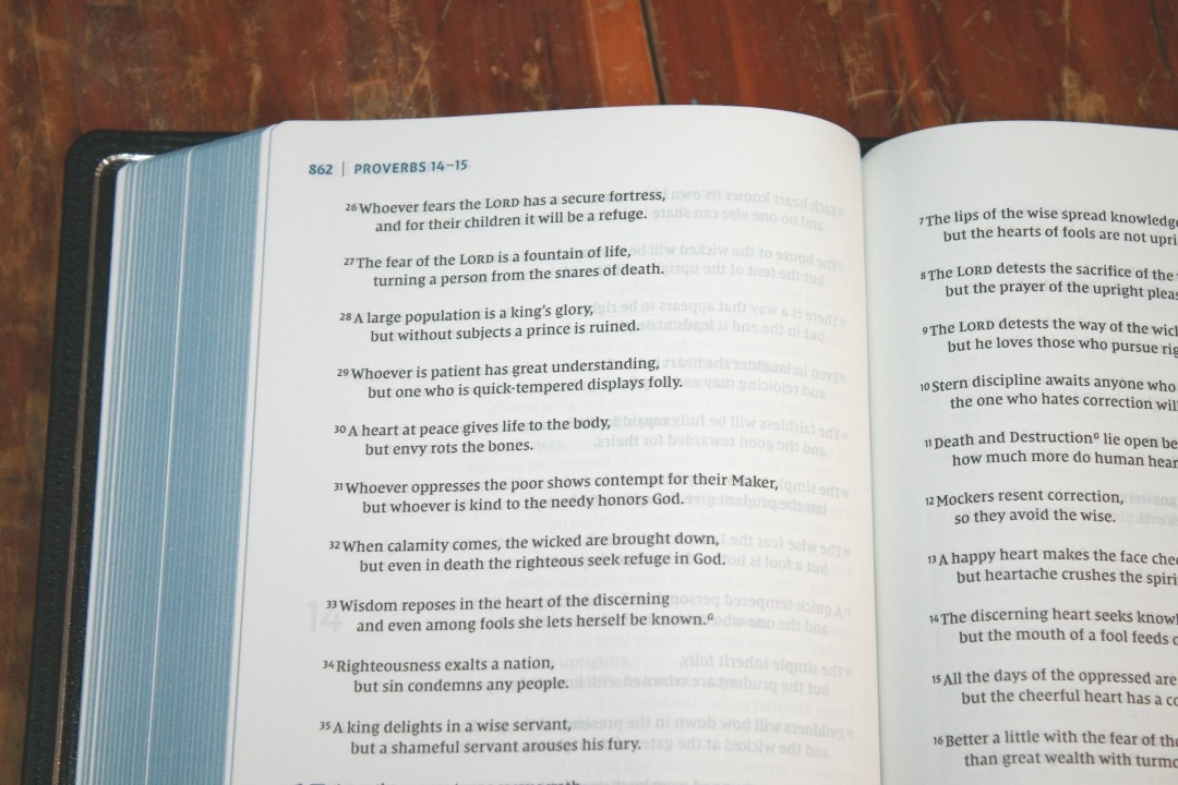
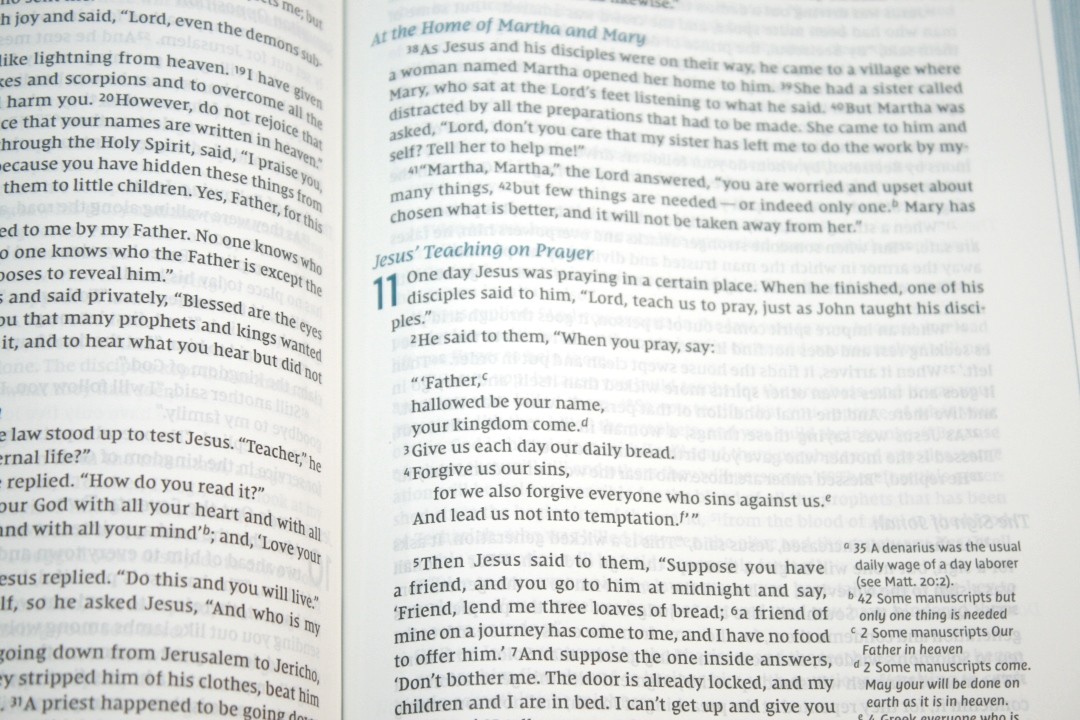
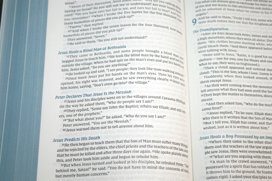
It has around 76 characters across with around 14-16 words per line. This is more than the NKJV (which has my ideal word-count at around 10 words), but this still feels comfortable for reading. I do find the wider columns to be a little more difficult to teach from. The poetic setting looks much better in a wider column. The text never feels crowded and it doesn’t have too much space. It’s printed with line-matching, meaning that the lines are printed in the same location on both sides of the page. The paper is opaque enough that this doesn’t cause any distractions.
There’s enough room in the gutter that it brings the text out to the flat part of the page.
Footnotes

Footnotes have an interesting placement. They’re set within the text in the bottom right corner of the page. They don’t blend with the text, so they’re easy to see. For prose, it creates a boxed-in design. This reduces the width of the text and adds white-space around the footnotes so they don’t blend. I like this design because it solves the readability problem of notes that take the full width of the page. For poetic settings, they don’t interrupt the text because the text doesn’t go that far to the right of the page.
Family Records

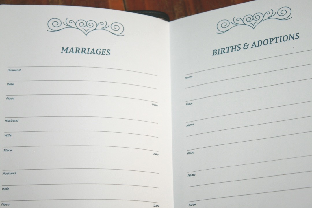
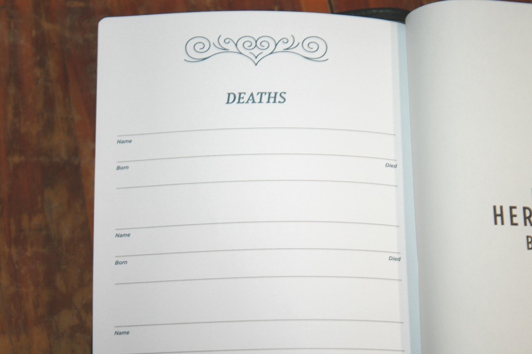
In the front, you’ll find the family pages printed on thick, non-glossy, paper. It includes the presentation page, marriages, births and adoptions, and deaths. The pages include elegant designs at the top and bottom. They’re printed in the same blue highlights that are used throughout the Bible. The first page is glued a little too close to the end-sheet, but it does open with no trouble.
Table of Weights and Measures

This is a one-page table that shows the biblical unit and approximate American and metric equivalents. It includes weights, length, and capacity for both dry and liquid measures. It also includes some information about how the calculations were derived.
Concordance
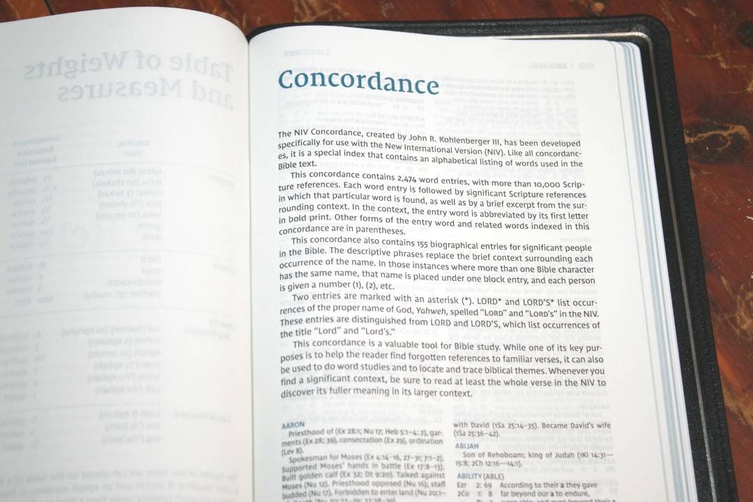
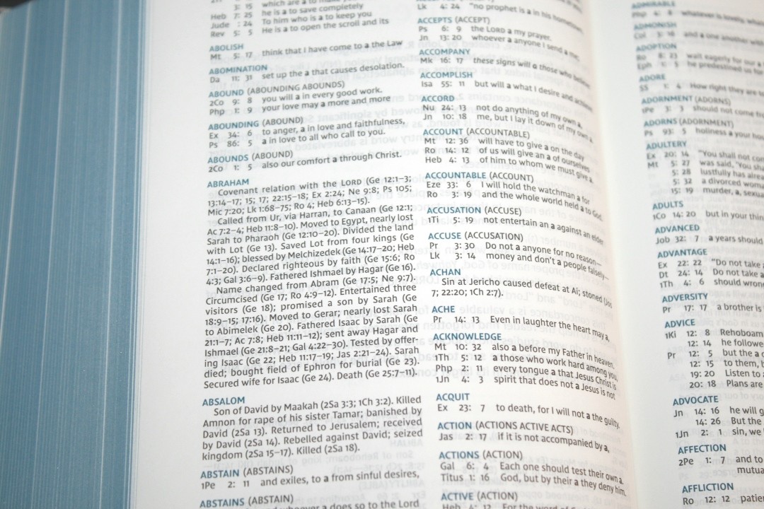
The concordance is 105 pages with 2 columns per page. It has 2474 entries with over 10,000 references, and this does include proper names. They’re actually biographical entries (155 of them). It provides some background information and references to prominent texts. Variations of words are given in parenthesis to give you ideas of other words to search for. This an excellent concordance for study.
- Christ (Christ’s, Christian, Messiah) – 69
- Christ’s (Christ) – 3
- Christian (Christ) – 1
- Faith (Faithful, Faithfully, Faithfulness, Faithless) – 65
- Faithful (Faith) – 31
- Faithfully (Faith) – 3
- Faithfulness (Faith) – 15
- Faithless (Faith) – 3
- God (God’s, Godliness, Godly, Gods) – 4.5 columns
- God-breathed (Breathed) – 1
- Godliness (God) – 4
- Godly (God) – 4
- God’s (God) – 28
- Gods (God) – 2
- Jesus – 5 major topics with multiple sub-topics and many Scripture passages and reference within each one
- Life
- Miracles
- Major Teaching
- Parables
- Disciples
- Praise (Praised, Praises, Praising) – 32
- Praised (Praise) – 5
- Praises (Praise) – 4
- Praising (Praise) – 2
- Pray (Prayed, Prayer, Prayers, Praying) – 17
- Prayed (Pray) – 3
- Prayer (Pray) – 13
- Prayers (Pray) – 4
- Praying (Pray) – 4
Note Pages
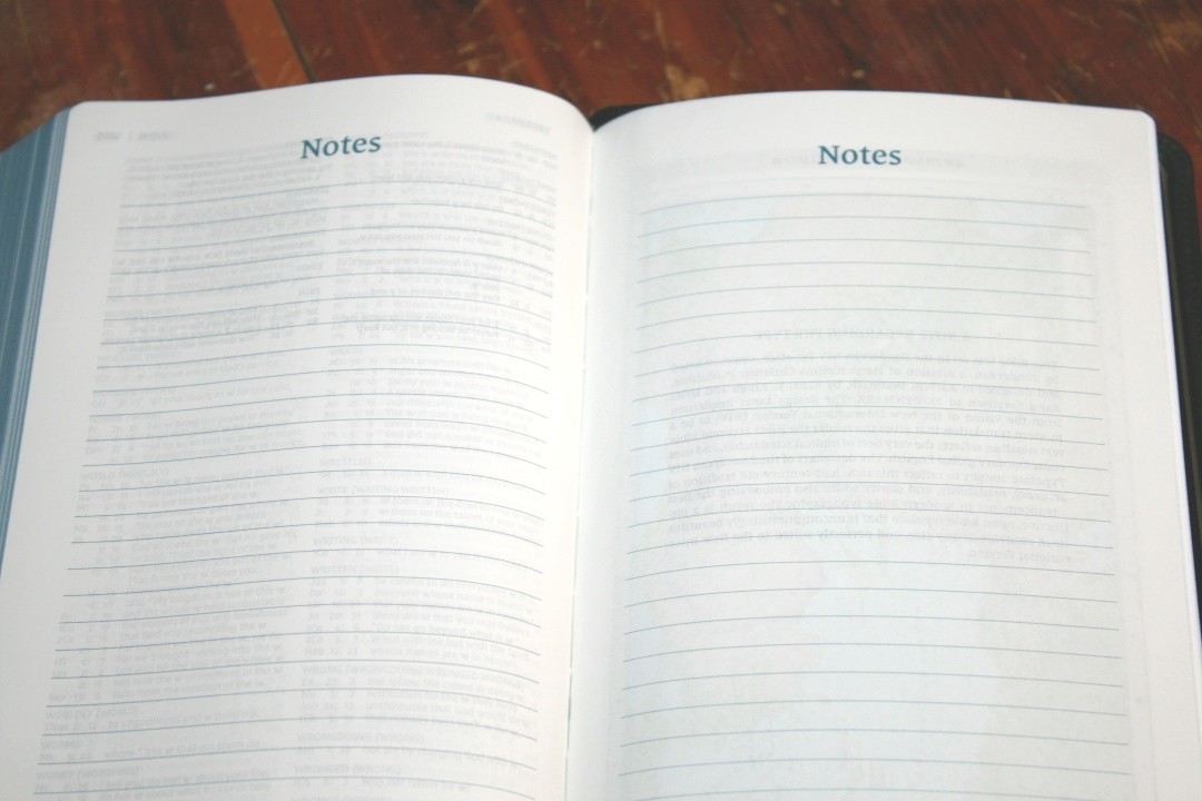
It has two lined pages that are labeld for notes. It uses the regular pages.
Maps
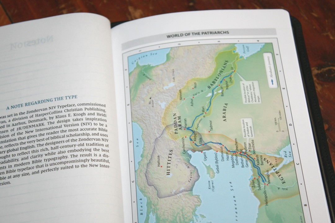
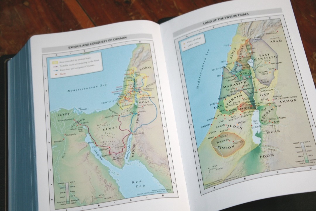
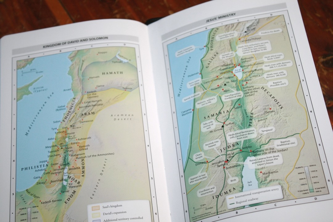

It includes the standard Zondervan maps. This is 7 full-color maps printed on 8 thick glossy pages. There is no index but the maps are annotated well. I love the earth-tone colors. The maps show topography, distance, routes, borders, possible locations of lost places, battles, elevation, cities, and locations for the events of Jesus’ ministry.
Maps include:
- World of the Patriarchs
- Exodus and Conquest of Canaan
- Land of the Twelve Tribes
- Kingdom of David and Solomon
- Jesus’ Ministry
- Paul’s Missionary Journeys
- Jerusalem in the Time of Jesus
Comparison
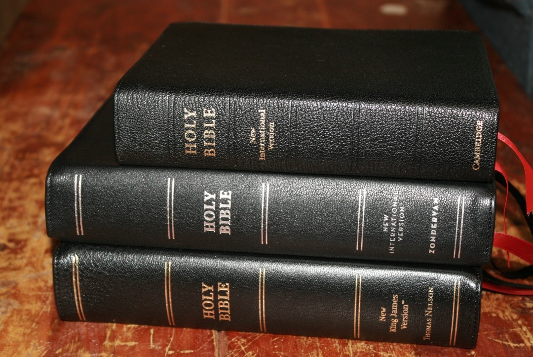
Here’s a look at how the NIV Heritage compares with the NIV Clarion and Premier Collection NKJV.
Clarion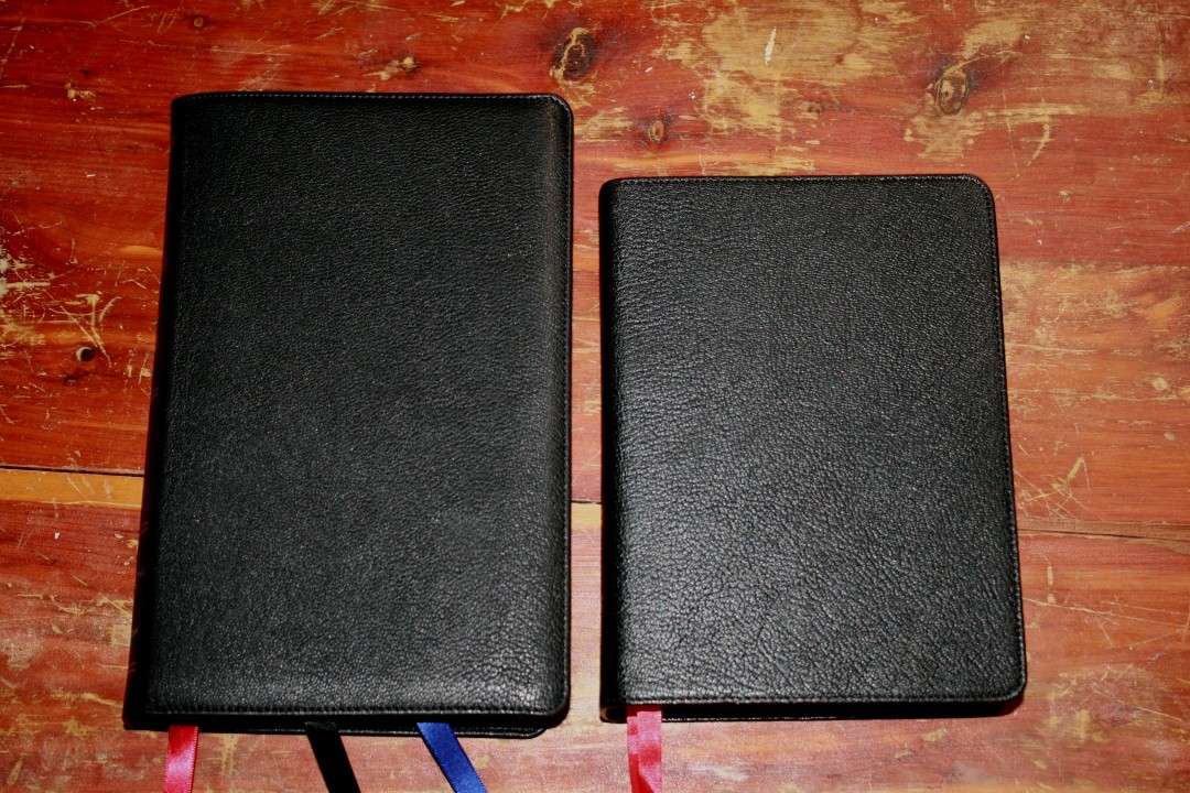
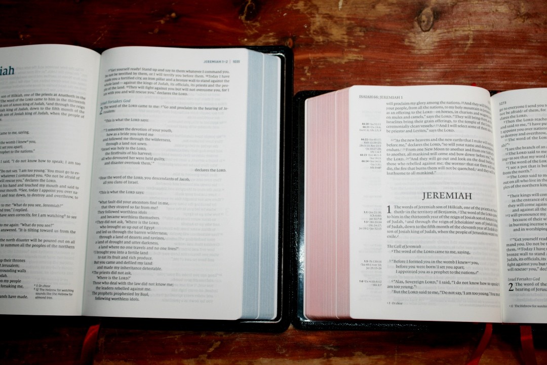
The NIV Clarion’s paper is amazing. It uses 28gsm Indopaque, which has about the same opacity as the 36gsm in the NIV Heritage and has a slightly more coated feel. Both look and feel elegant. The Clarion is about an inch shorter and maybe a touch thicker.
Premier Collection NKJV
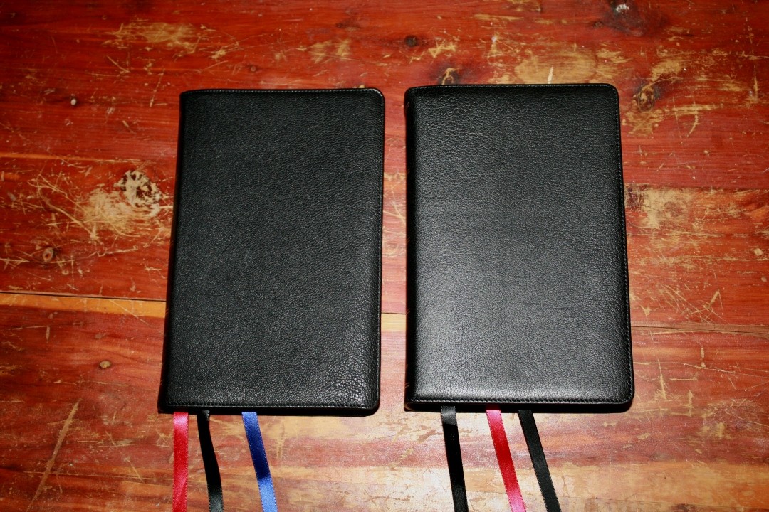
The NIV’s font is noticeably smaller than the NKJV Single Column. The NIV is also thinner and is close to a pound lighter. The materials are the same, but the NIV’s end-sheet is not as stiff which makes the NIV more flexible overall.
Conclusion

The Premier Collection NIV Heritage Bible is the most elegant NIV that I’ve seen. The focus of the design is on the text. It has a minimalistic design with the necessities added to it rather than having to make the Scriptures fit within the extras. I love the layout design and the blue highlights.
This is the kind of Bible I can read for long periods of time. I love that it doesn’t feel too thick and that the focus is on the text. The lack of reference might mean you can’t use this as your only Bible or you’ll need to use external tools. The extra-amazing concordance does help make up for the lack of references. Zondervan has met their goal to produce a high-quality Bible at a lower cost. It doesn’t look or feel like a Bible made in China. The NIV Heritage Bible is easy to recommend to any NIV reader.
_________________________________________________________
This Bible is available at (includes some affiliate links)
and many local Bible bookstores
_________________________________________________________
Zondervan provided this Bible in exchange for an honest review. I was not required to give a positive review, only an honest one. All opinions are my own.


I’ve had my copy for a little while now (I had pre-ordered) and I am beyond happy with it. My only complaint is I’m already noticing wear to the lines and lettering on the spine (especially the lines, which showed wear the first day once the Bible had been opened a few times) I also have the Large Print Thinline version on the way. I think Zondervan/Nelson have done a great job with these. I’m especially happy for NKJV users who have not had many good options for a long while.
The “spine hubs” don’t look like they are properly centered. It looks like they are closer to the right edge of the Bible than the left edge. Can you please verify this for me?
You’re correct. They are 1/16″ closer to the front cover.
The design and quality of this bible are superb. I only wish that it was available in a large print edition since my aging eyes cannot comfortably read the text. Perhaps that will change when I get new reading glasses next week.
I really enjoyed this review. I am a little torn on which one I should get – the heritage Bible or the deluxe reference Bible. I absolutely love the single column. I love the look on these premier edition Bibles. I love the size and the raised hubs on the reference Bible but I also like the more cleaner text of the standard Bible. So that is my dilemma with getting one of these two. I wish they would have come out with a large print heritage Bible in the size and look of the reference bible, that would be my ideal Bible. .
It looks like the clarion font is slightly larger? I’m debating on between the heritage and clarion, and prefer the size of the clarion. If the font is larger, then that seals the deal for me.
Hope I am not too late to the party. Wondering if you can verify if this is an early version of the NIV or a post-2011 version. Thank you.
Hi Wilson. This is a 2011 edition.