This is the 3rd part of me choosing a Bible for preaching. This one includes some thoughts on using the section headings and the glossary in the footnotes of the Thomas Nelson Preaching Bible. I’ve noticed that I lean toward the text if it’s a small font. The larger fonts are easier to preach from. If I use a small font then it needs another benefit such as being my everything Bible, having wide margins, or having a certain type of layout.
Bibles mentioned (includes affiliate links)
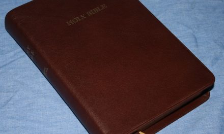
Cambridge Concord
__________________________________
Thomas Nelson KJV Minister’s Bible
__________________________________
Cambridge Clarion
__________________________________
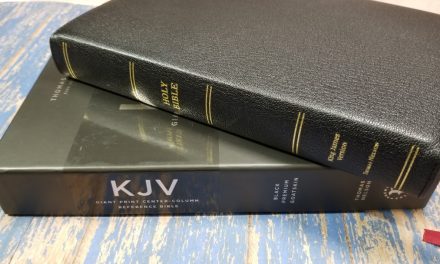
Thomas Nelson KJV Preaching Bible


If maps, glossary and concordance didn’t matter to you,If you had to choose from Thomas Nelson ministers Bible, CBP 180 or tbs Windsor for Carry, preaching and reading on the go, which do you prefer?
Hi John. That’s a tough one. I love all three. I’m not sure which I’d choose overall, but if I wanted a larger print I’d go with the 180. If I wanted a smaller print I’d go with the Minister’s Bible because of the darker font. I’m not sure which I’d choose between them because they’re so different (plain text vs section headings). I like the paper in the Thomas Nelson better than the CBP.
Thank you Randy, I was looking online for a comparison between the three together but didn’t have much success, do you have a video out on them compared to each other at all? I guess either way I can’t go wrong
Hi John. I think this is the only one I have with all three. I did compare the two Thomas Nelson’s in the Preaching Bible review. https://biblebuyingguide.com/thomas-nelson-kjv-preaching-bible-review/
Thank you!