The Bible is filled with connections. Those connections can be difficult to see because there’s often a barrier between the Old and New Testaments. Holman’s NKJV Reader’s Reference Bible was designed to reduce the barrier and show how the testaments correspond through passages that are printed directly on the page. The concept and page design is from 2K/Denmark and the result is a layout that works.
______________________________
Buy from Amazon
______________________________
Binding
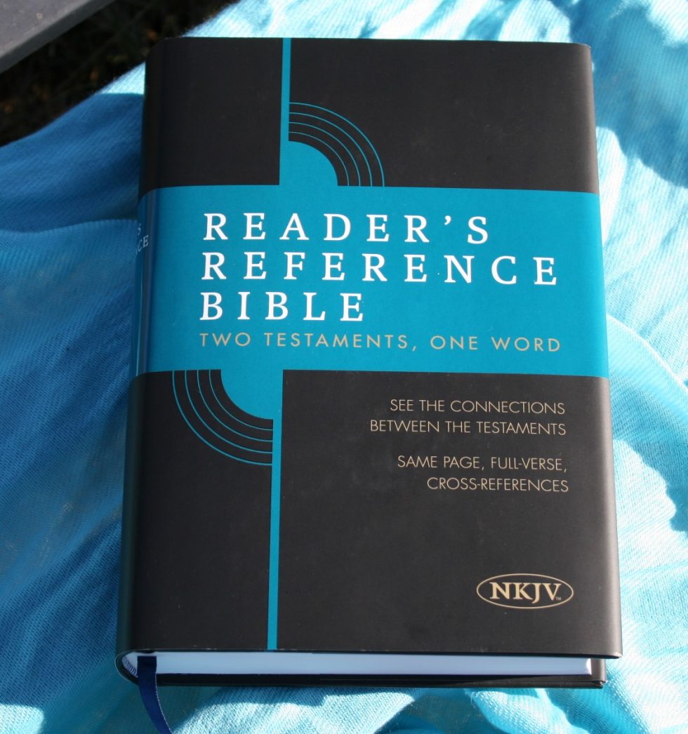
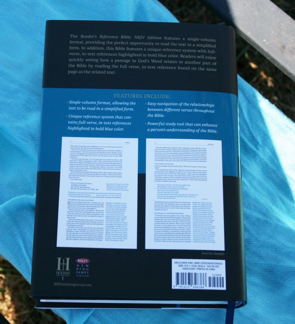
This is a hard cover edition with a dust jacket. I typically remove the dust jacket because I find them difficult to hold on to. The cover is black with a dark teal bar with white and gold lettering. The dust jacket looks the same on the front, but the back includes a description, list of features, images of the layout, etc.
The text-block is sewn and has no trouble staying open to any page. It has a single blue ribbon. It has white and blue head/tail bands. The overall size is 9.25 x 6.5 x 1.6”.
Paper
To my fingers the paper feels the same as the paper in the Holman Study Bible. I’m guessing 30+ for gsm. It’s highly opaque but you can see some show-through. This level of show-through doesn’t distract me. There are even a few pages in the back that can be used for notes. The paper is whiter than what Holman used in the Reader’s Bible.
Typography
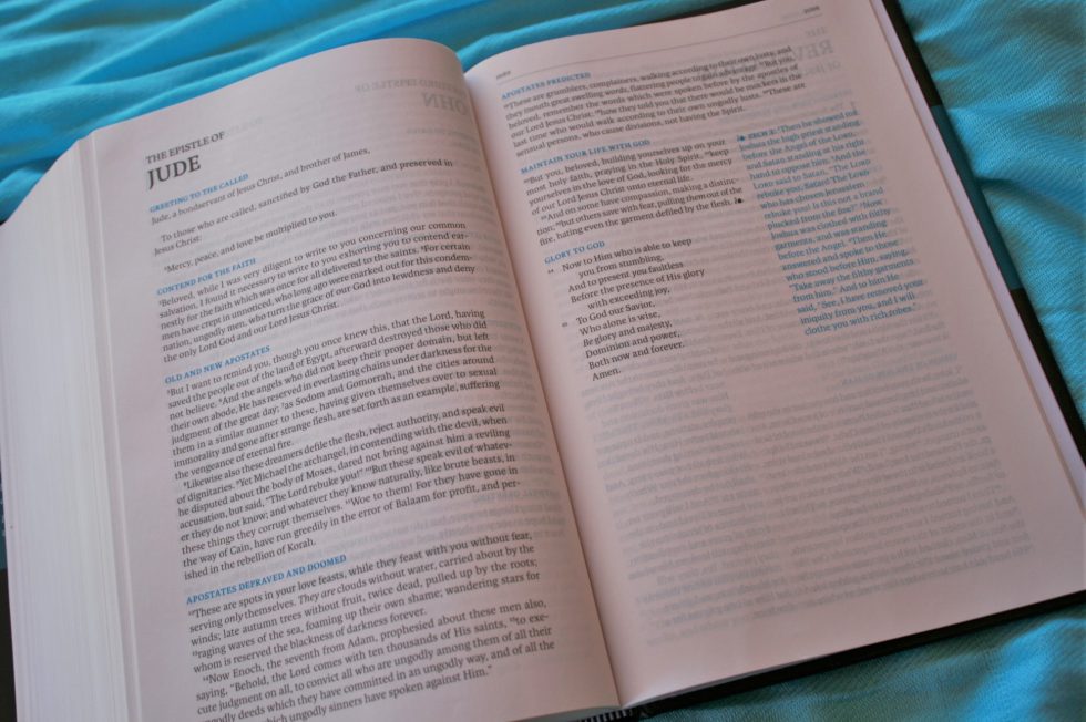
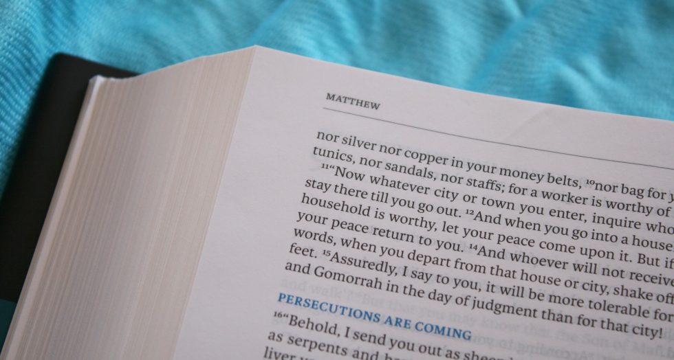
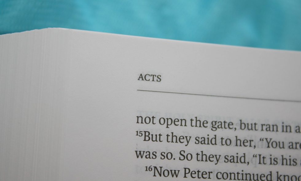
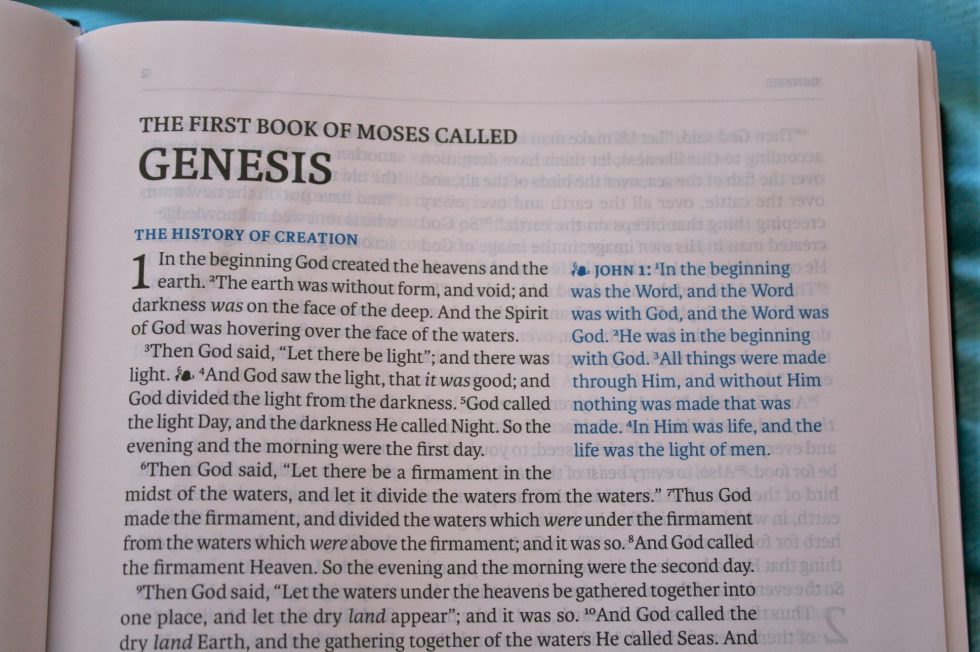
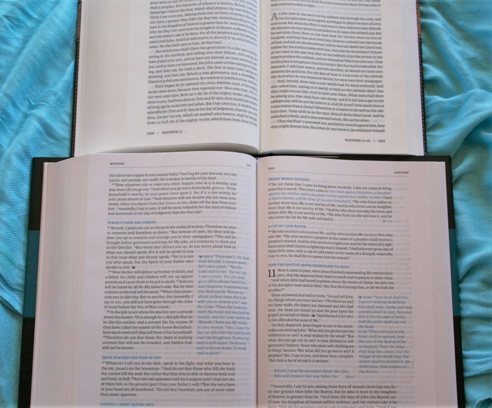
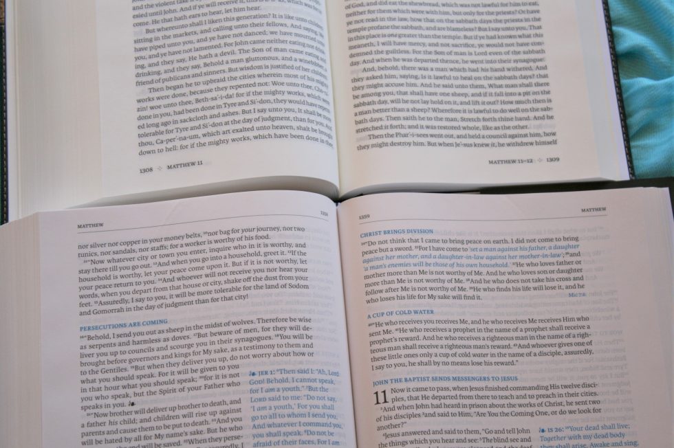
This is mostly a single column paragraph setting. References (not chapter and verse numbers, but complete passages) are printed in the right column, placed within the text making the text wrap around it. They look like call-outs for quotes. The header includes the book name in the outer corner and page number in the inner margin.
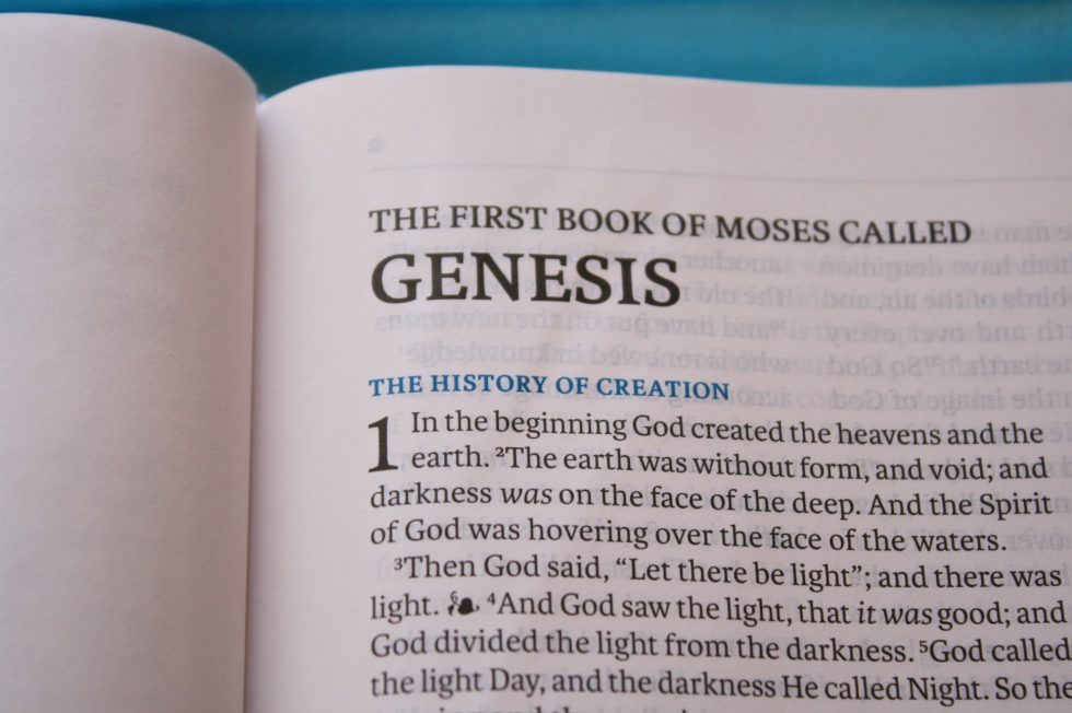
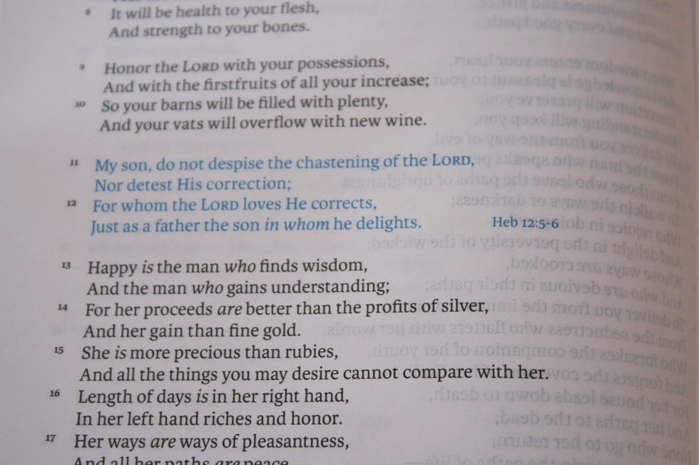
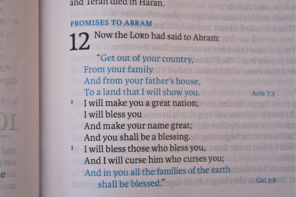
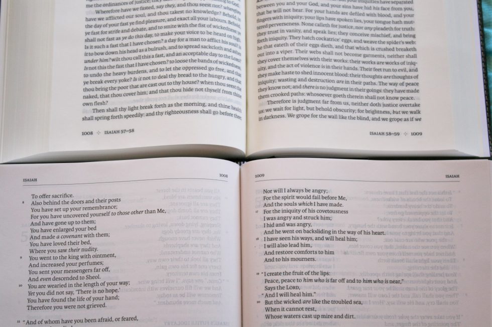
The font is 9-point with generous leading. This is a black letter text with a medium darkness that’s consistent throughout. Section headings and references are in blue. It uses line-matching (the text is printed in the same place on both sides of the page) to improve readability. The opacity of the paper makes the line-matched text look clean. The font isn’t as heavy as the Reader’s Bible, which I think helps it to look cleaner than the Reader’s Bible.
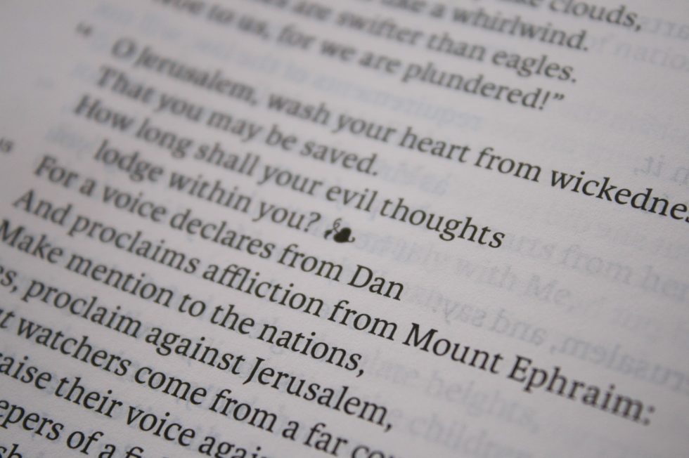
The full columns are 4.18” wide and have around 80 characters with about 16 words per line. It has 50 lines per page. When references are placed within the text, the columns are 2.75” wide with around 52 characters and 12 words, and the reference column is 1.75” wide with around 35 characters with 7 words.
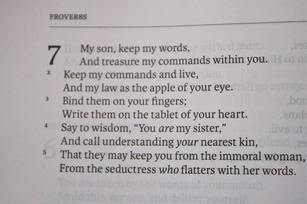
In my experience the references aren’t as distracting as they seem. I found them easy to ignore and the reading experience of the clean text was excellent. The verse number don’t bother me, but I like not having reference and footnote keys in the text.
I’d like to at least have the chapter numbers in the header with the book names. Not having them makes me spend a few extra seconds finding the chapter I’m looking for.
It does look a touch odd to have extra space on the right side where there are no references present, but I’m sure this is better than trying to make it symmetrical.
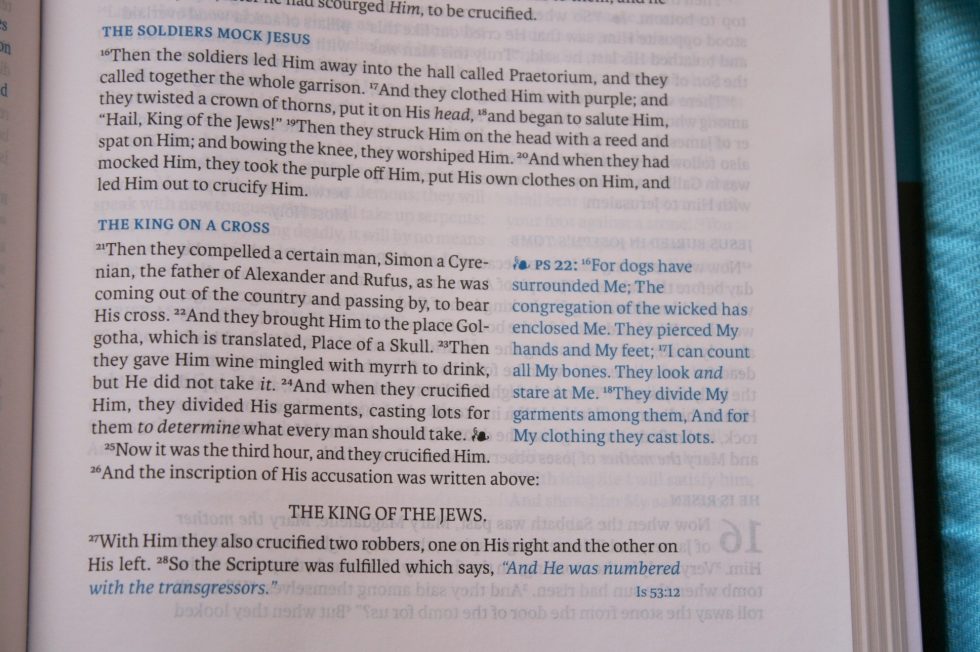
In order to make the layout as clean as possible this edition doesn’t have footnotes. I think the NKJV has some of the best footnotes available but including them would either increase the size of the Bible or reduce the size of the font. I’ll take this Bible without the footnotes.
References
References are printed in blue and are presented on the page in two different ways:
References Next to Verses
The complete full-verse reference is printed on the page next to the verses they correspond to. This includes verses and events that are discussed, prophecies, etc. For example, next to Genesis 3:15 is printed Galatians 4:4, 5. The references themselves are printed in blue. A vine with a leaf is printed at the end of the verse within the text and at the beginning of the verse in the side column.
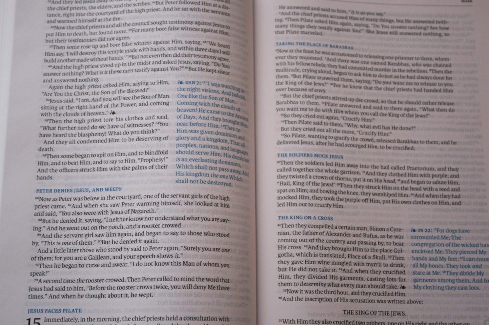

The references do seem to be relevant. It’s amazing how many there are. Printing them on the page helps visualize how much of the Bible is connected through references.
References Within the Text
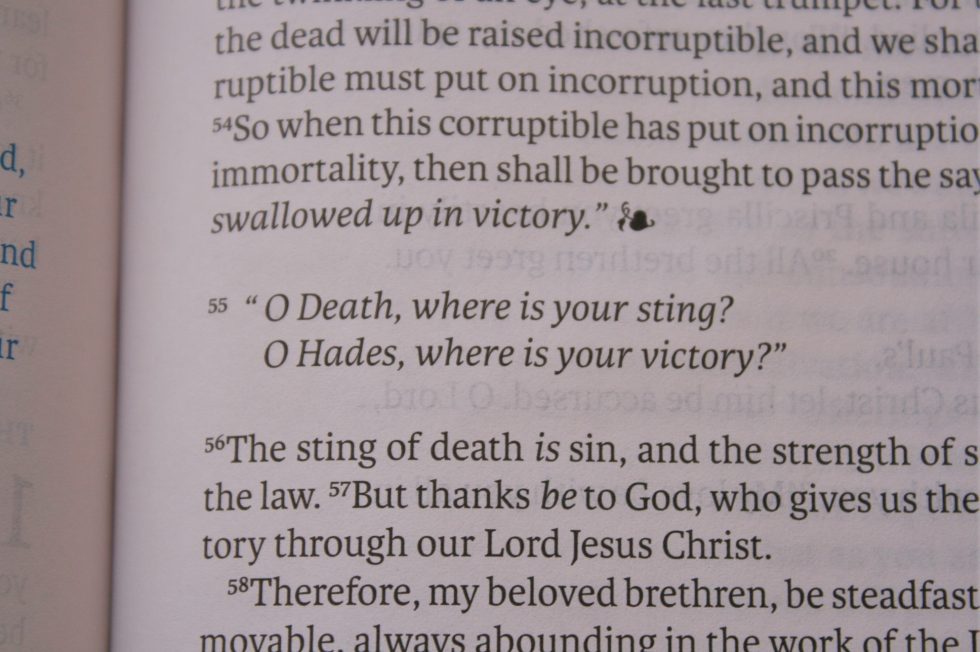
When verses are quotes they are printed in blue and have the chapter and verse number at the end of the paragraph (or out next to the verse if it’s poetry). This goes for both testaments. So Joel 2:28-35 is blue and gives Acts 2:17-21; Rom 10:13 under the paragraph. Both Acts 2:17-21 and Romans 10:13 are in blue and give Joel 2:28-35 as a reference.
The blue within the text helps to see how much of the Bible is directly quoted somewhere else in Scripture.
Maps
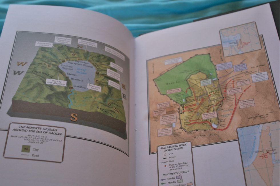
There are 8 full-color maps on thick non-glossy paper. They include topography, distance, Scripture references, borders, water, routes, etc. They’re annotated and easy to use.
Maps include:
- The Migration of Abraham
- The Route of the Exodus
- The Tribal Allotments of Israel
- The Kingdoms of Israel and Judah
- Israel in the Time of Jesus
- The Ministry of Jesus Around the Sea of Galilee
- The Passion Week in Jerusalem
- Paul’s Missionary Journeys
Comparisons
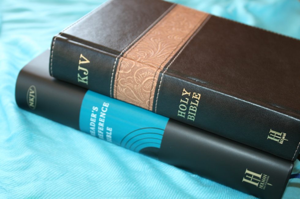
Here’s a look at how the Reader’s Reference Bible looks against the Holman Reader’s Bible. This is the KJV edition, but the NKJV is the same size and has the same font and paper.
Conclusion
I enjoyed reading the Reader’s Reference Edition. Even though it has Scripture printed on the page in blue, a vine with leaf to connect it to the passage, quotes in blue, and references given at the end of verses, I still find this to be an easy text to read. The references are there if you want them and easy enough to ignore.
I like seeing these connections. There are 1800 connections between the testaments. It’s better than having to turn to them and since they take up space they have to choose the most relevant passages. This allows the Bible to interpret itself.
I like the Holman Reader’s Reference Bible. The design is unique and functional. It’s a great choice for reading, preaching, teaching, and study.
______________________________
Buy from
and many local Bible bookstores
______________________________
Photography by hannah C brown
Holman provided this Bible free for review. I was not required to give a positive review – only an honest review. My opinions are my own.









I’ll bet this Bible will be a useful companion to Beale & Carson’s “Commentary on the New Testament Use of the Old Testament.” That particular commentary does not include any kind of index keyed to Old Testament passages that are referenced in the New Testament. Thus, it works as a New Testament resource but not very well as an Old Testamen resource. A Bible like this may solve that missing link in Beale & Carson’s commentary.
Good idea! I think it would make a great companion to Beale & Carson’s commentary.