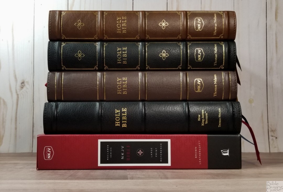
Like the KJV Maclaren, the NKJV Maclaren reworks and replaces the NKJV Preaching Bible. It uses the same text block (but with the Maclaren title instead of the Preaching Bible title) and adds maps. Unlike the Preaching Bible, it’s available in various cover options that range from a low-priced imitation leather to a premium goatskin edition. In this review, I’m looking at the NKJV Maclaren Series in black goatskin, brown genuine leather, black Leathersoft, and brown Leathersoft. All are made in China.
Note – The name Maclaren comes from the Victorian-era preacher Alexander Maclaren. However, this series does not include notes from Maclaren. It only shares his name.
Thomas Nelson provided this Bible in exchange for an honest review. I was not required to give a positive review, only an honest one. All opinions are my own.
_________________________________________________________
This Bible is available at (includes some affiliate links)
and many local Bible bookstores
_________________________________________________________
Table of Contents
- Video Review
- Binding
- Paper
- Typography and Layout
- References
- Footnotes
- Bible Atlas
- Comparisons
- Conclusion
Video Review
Binding
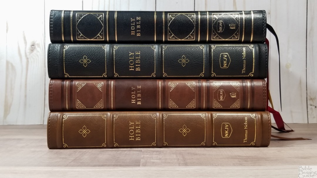
The NKJV Maclaren comes in several covers. I’m reviewing the black goatskin, brown genuine leather, black Leathersoft, and brown Leathersoft. Each edition is Smyth sewn. They’re around the same size and weight (overall size 6.6 x 9.6 x 1.5″, 2lbs, 9.3oz). This is a good for carry and reading.
Black Goatskin
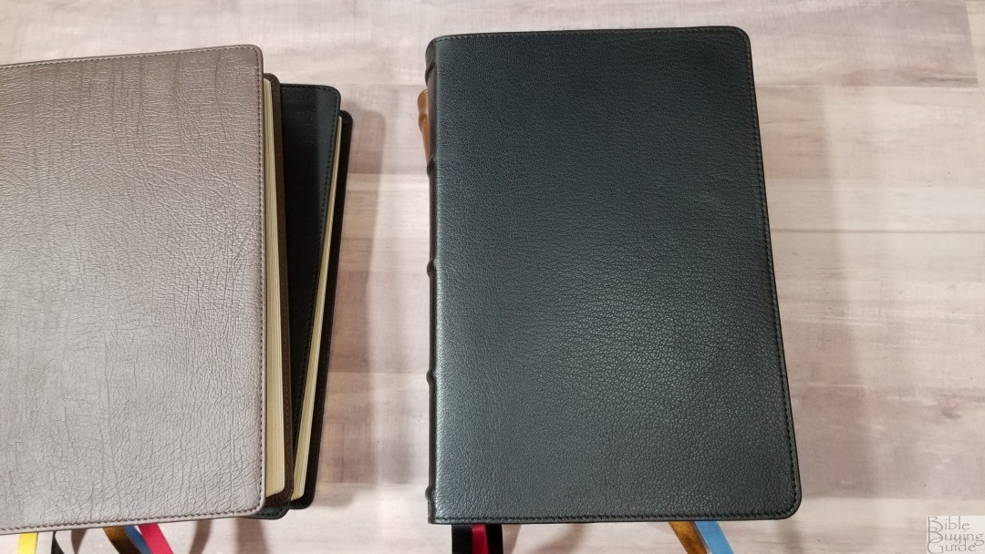
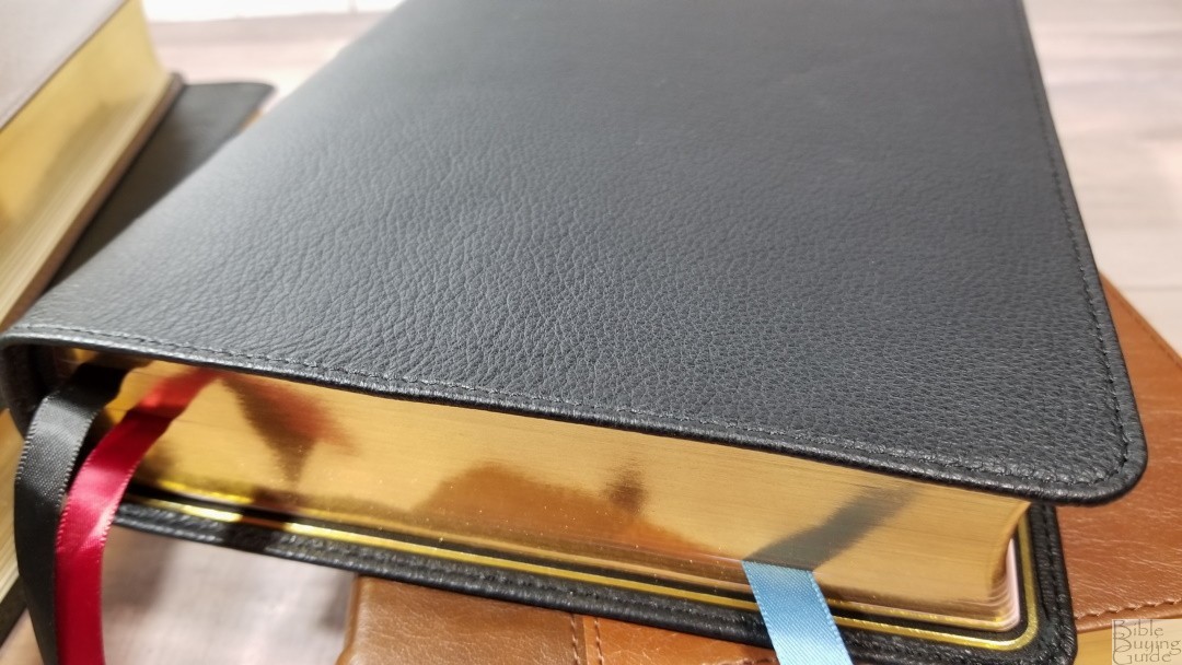
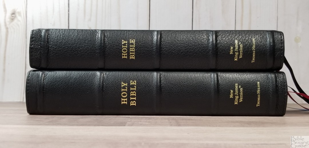
The black goatskin has a natural grain. It’s thick and flexible, and it’s soft to the touch. It does have a leather smell, but it’s not too strong. It includes perimeter stitching and has a small yapp. The font has no printing. The spine has 5 raised hubs and text stamped in gold.
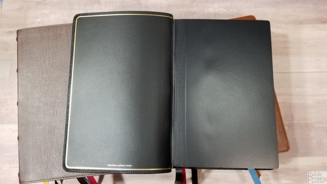
The liner is edge-lined with leather and it has a gold gilt-line next to the stitching on the inside of the cover. The edge-lined tab is slightly stiff at first, but it does stay open around the middle of Genesis. I’m sure it will break in and stay open in Genesis 1 with a little more use. It’s Smyth sewn and includes overcast stitching for the first signature. This is the only one with overcast stitching and it’s only in the front.
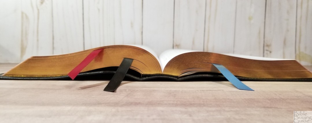
It includes 3 satin ribbons in black, red, and blue, and the head/tail bands are black. The overall size is 6.75 x 9.8 x 1.6″. It weighs 2lbs, 12.7 oz. Page edges are art-gilt.
Brown Genuine Leather
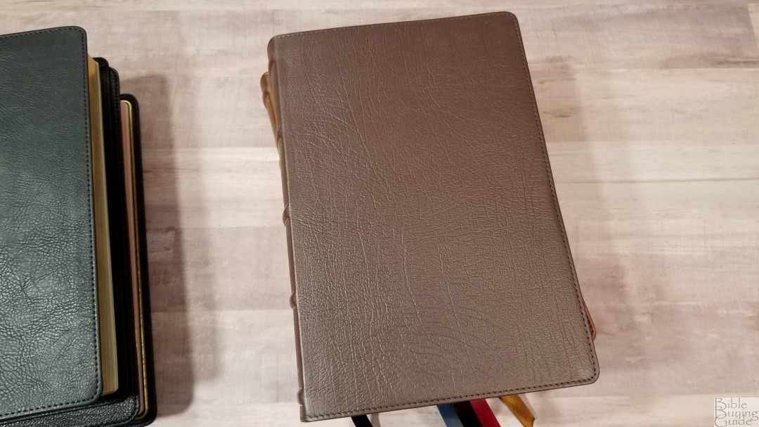
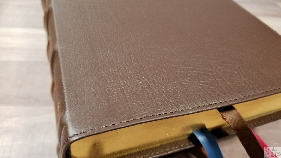
This cover is brown genuine leather. It has a stamped grain that looks natural and has an elegant look and feel. It includes perimeter stitching with nothing printed on the front. The spine has HOLY BIBLE, KJV, and Thomas Nelson printed in gold, and 5 raised hubs outlined in gold.
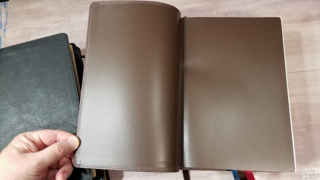
The liner is brown paste-down vinyl. It looks to be reinforced with binder’s tape. It’s Smyth sewn and stays open in Genesis with no trouble. It includes 3 satin ribbons in brown, red, and blue. The overall size is 6.6 x 9.6 x 1.5″. It weighs 2lbs, 11.9 oz.
Brown Leathersoft
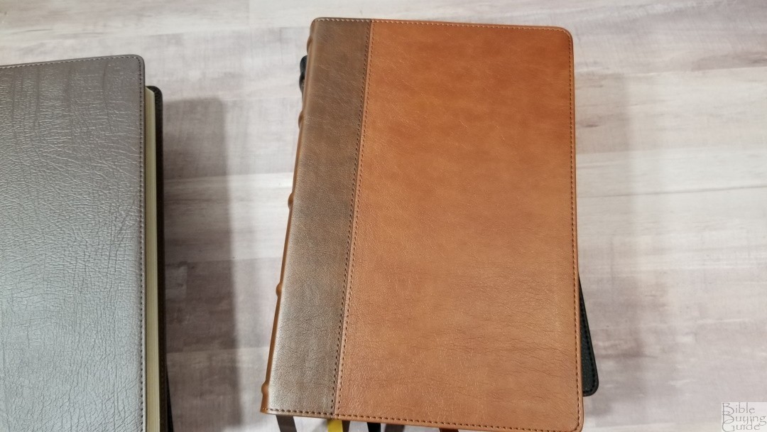
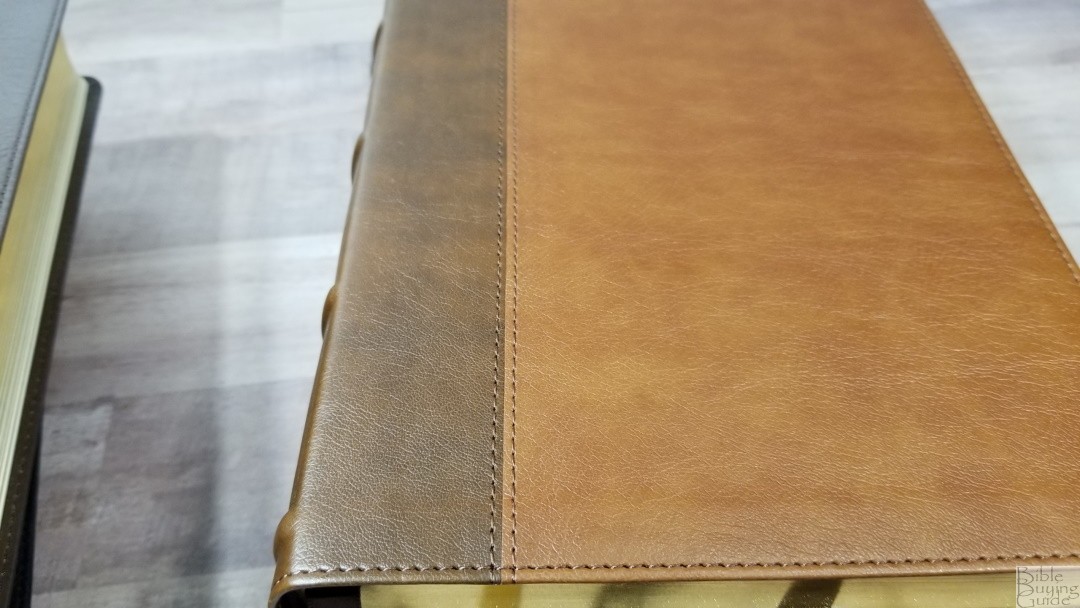
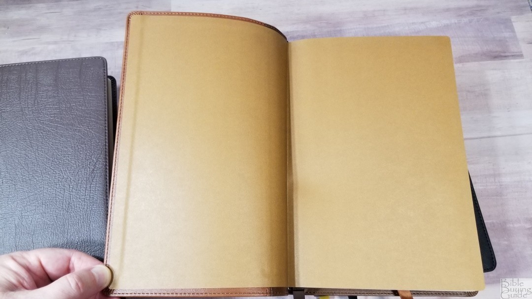
The brown Leathersoft is a two-tone brown with a medium shade of brown for the front and a darker shade of brown sewn to it that covers the spine and back. It has a little bit of grain and color variation, giving it an interesting look and feel. I don’t think of it as imitation leather. It has perimeter-stitching with nothing printed on the front. The spine includes gold text and simplified block decorations, and 5 raised hubs. The liner is a paste-down brown paper. It includes 2 satin ribbons in brown and dark brown. The overall size is 6.6 x 9.6 x 1.5″. It weighs 2lbs, 10.2 oz.
Black Leathersoft
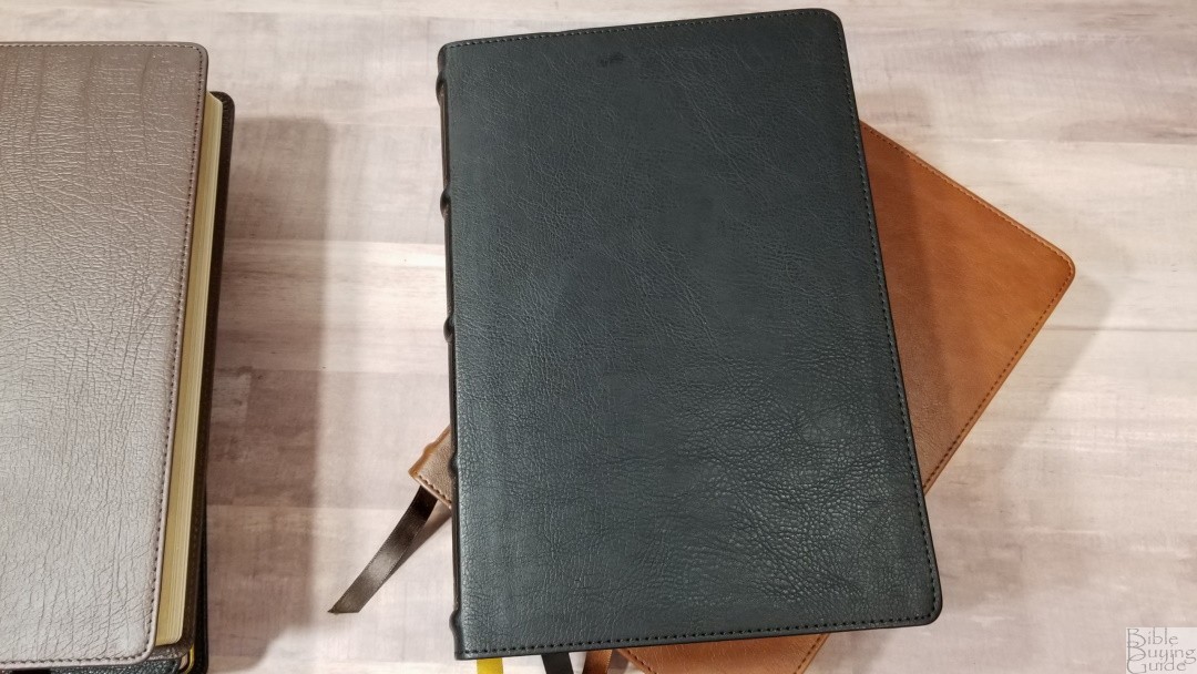
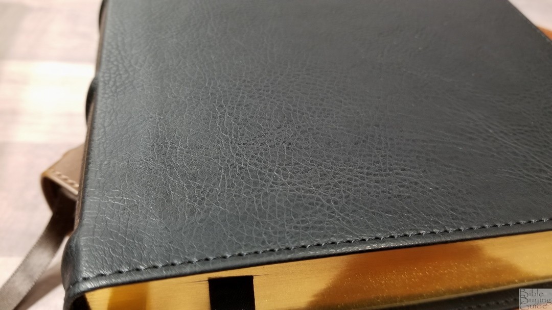
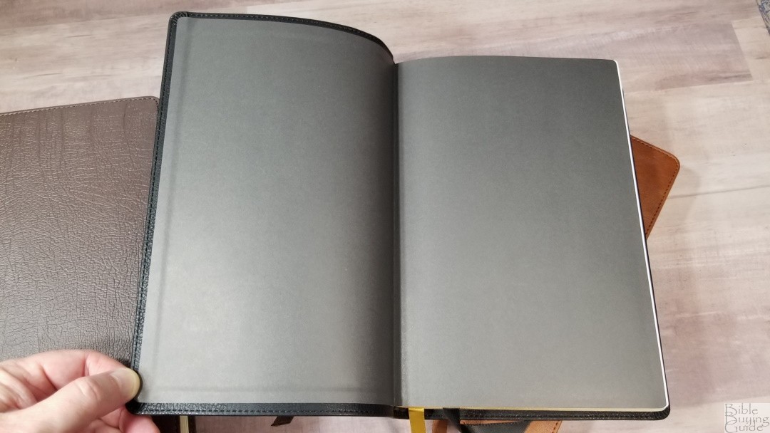
The black Leathersoft has a grain that looks like real goatskin leather. It includes perimeter stitching with nothing printed on the front. The spine has text and decorations printed in gold and 5 raised hubs. The decorations are slightly simpler than the previous Thomas Nelson Bibles. This makes the spine look a little cleaner. The liner is black paste-down paper. It doesn’t stay open as easily as the goatskin or genuine leather editions. It includes 2 satin ribbons in black and gold. The overall size is 6.6 x 9.6 x 1.5″. It weighs 2lbs, 10 oz.
Paper

The paper is 36gsm. It’s white in color and it’s extremely opaque. There is no glare under direct light. It’s easy to grab and separate with my fingers to turn. This paper is great for reading, preaching, and highlighting. The page edges are gold gilt. This is my favorite paper from Thomas Nelson. It’s slightly smoother than the KJV Maclaren and matches the Preaching Bible exactly. This tells me there is a slight difference between lots. That’s normal in manufacturing and is to be expected. Every slight variation of the texture is excellent and feels like high-quality paper.
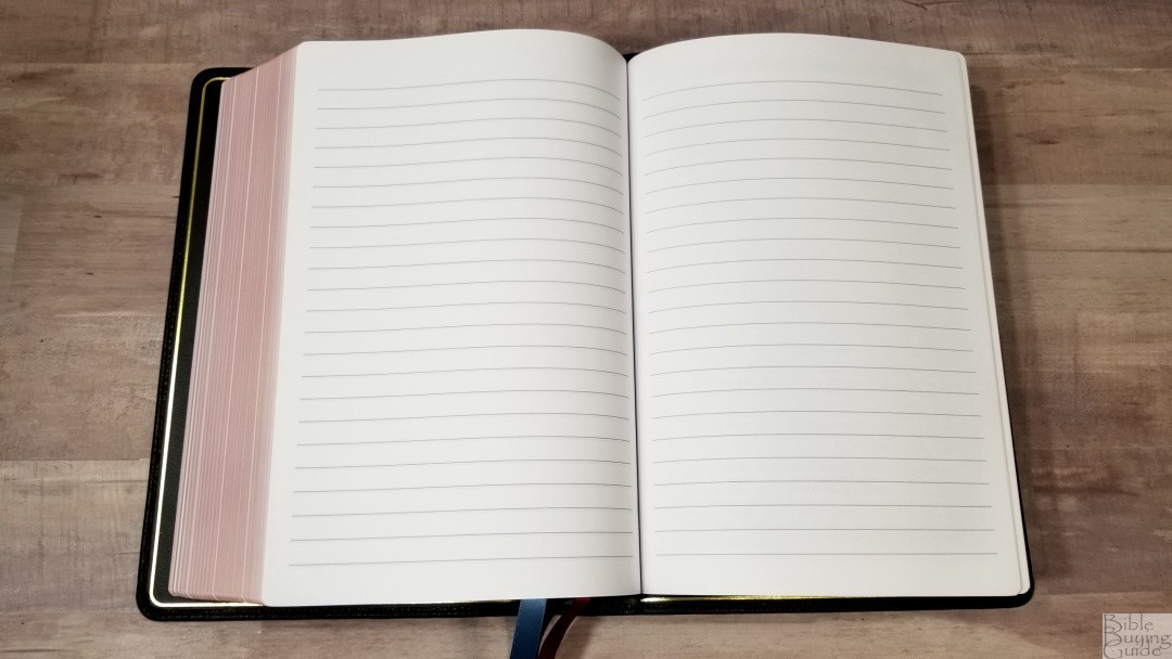
In the back are 8 lined pages for notes. This is great for sermon outlines, word studies, quotes, lists, etc. This is the same paper as the rest of the Bible. I’d like to see even more pages in the back and I’d like to see this added to the KJV Maclaren.
Typography and Layout
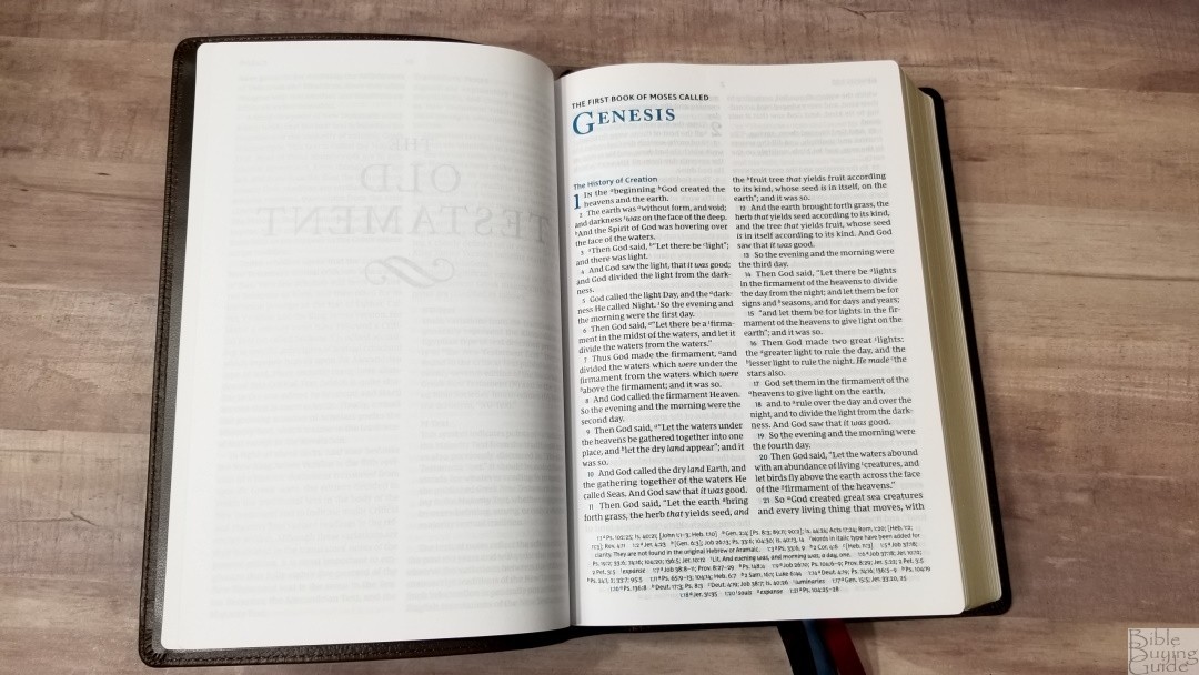
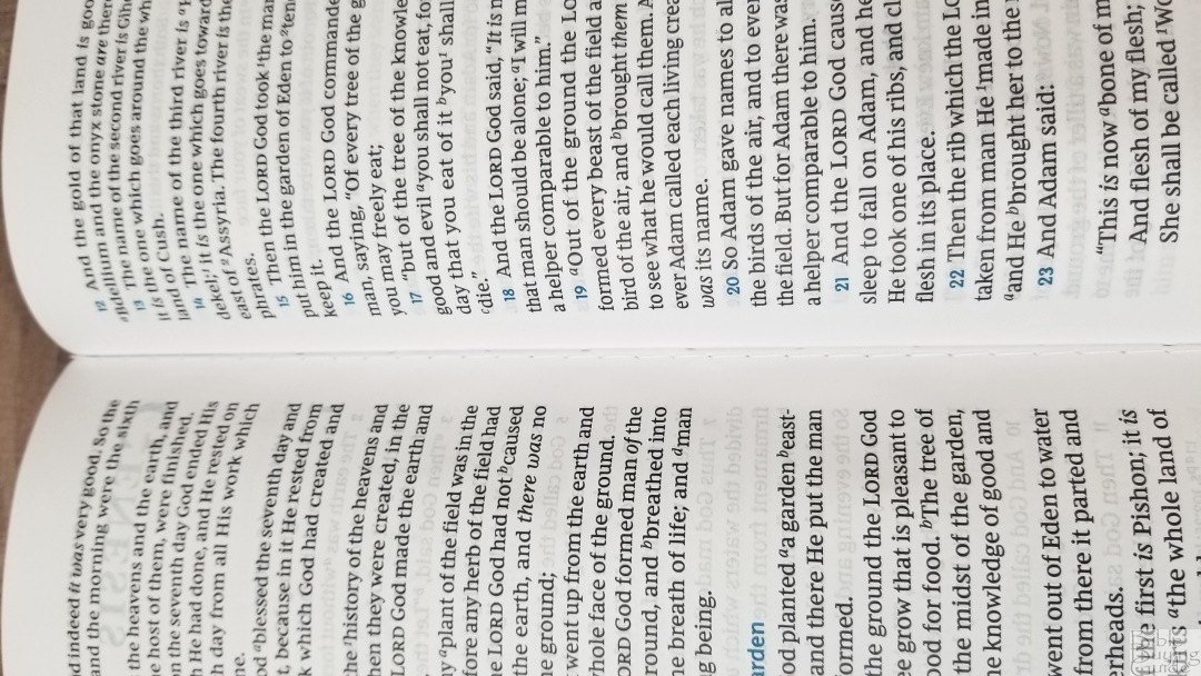
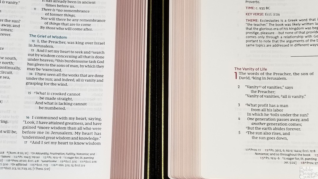
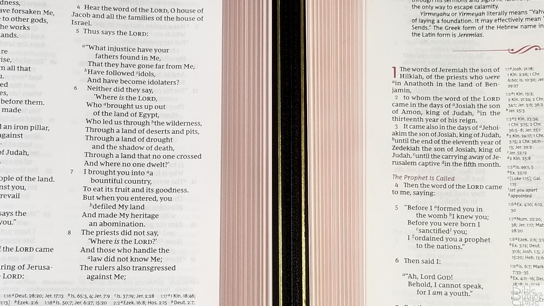
The text is placed in a two-column verse-by-verse format. Poetry is set to stanzas and personal letters are indented. OT quotes are not set apart, but it does use italics for supplied words. The header shows the page number in the center in black and the book name and reference in the outer margin in blue. The footer contains cross-references and footnotes. All highlights are in blue.
Typeface
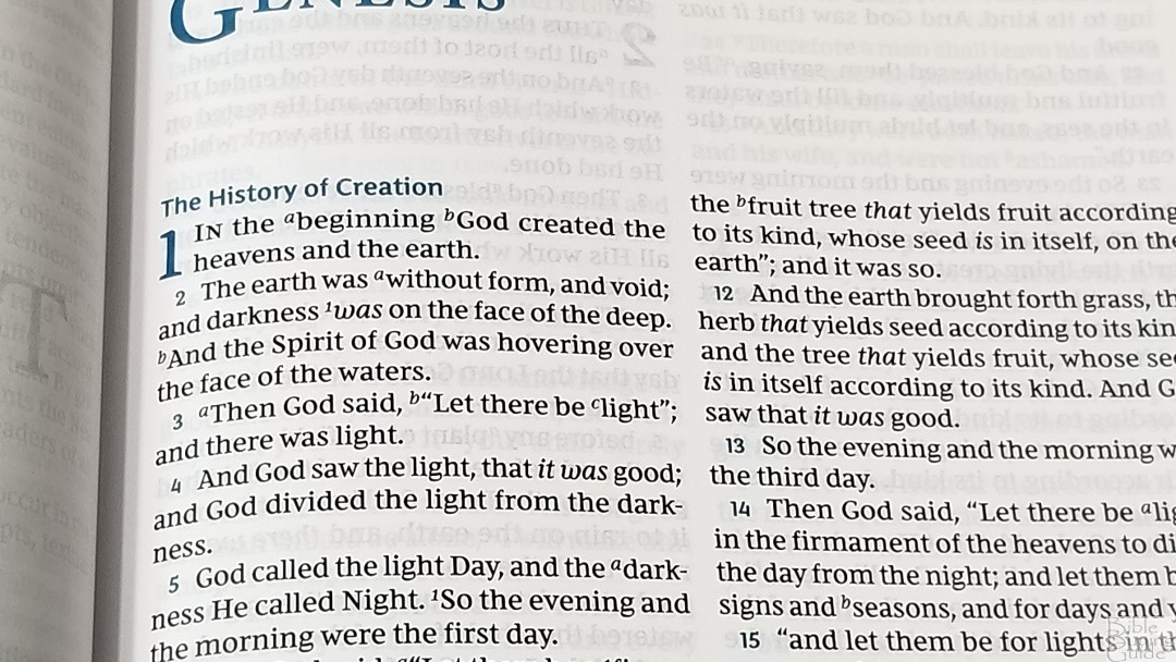
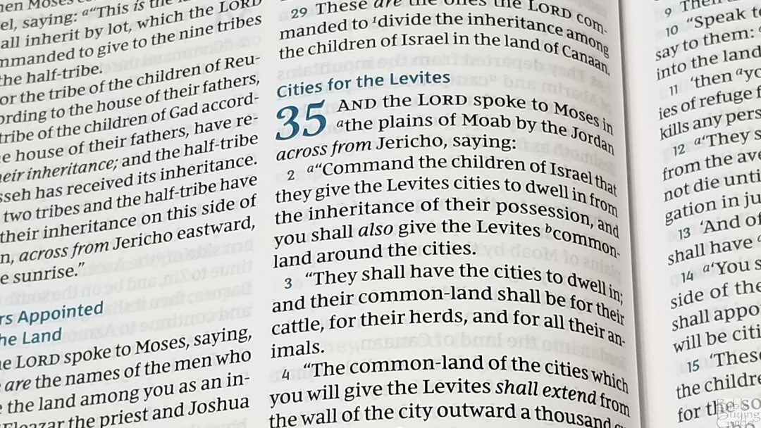
The font is 10.5 Comfort Print designed by 2k/Denmark. This font was labeled as 11.5 in the Preaching Bible. It looked smaller than that, so Thomas Nelson has adjusted their measuring methods and it’s now labeled as 10.5. It’s black letter and it’s sharp and dark. The print quality is consistent throughout the Bible. The typeface is semi-bold, making it the perfect darkness for easy reading. I love the design of this NKJV Comfort Print typeface. The Bible text uses serif. Section headings are sans-serif. It looks like a Bible and nothing stands out as an odd shape. The lower-case letters are tall, making great use of the font’s space and making the font large even for the smaller letters.
Layout
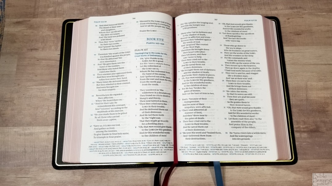
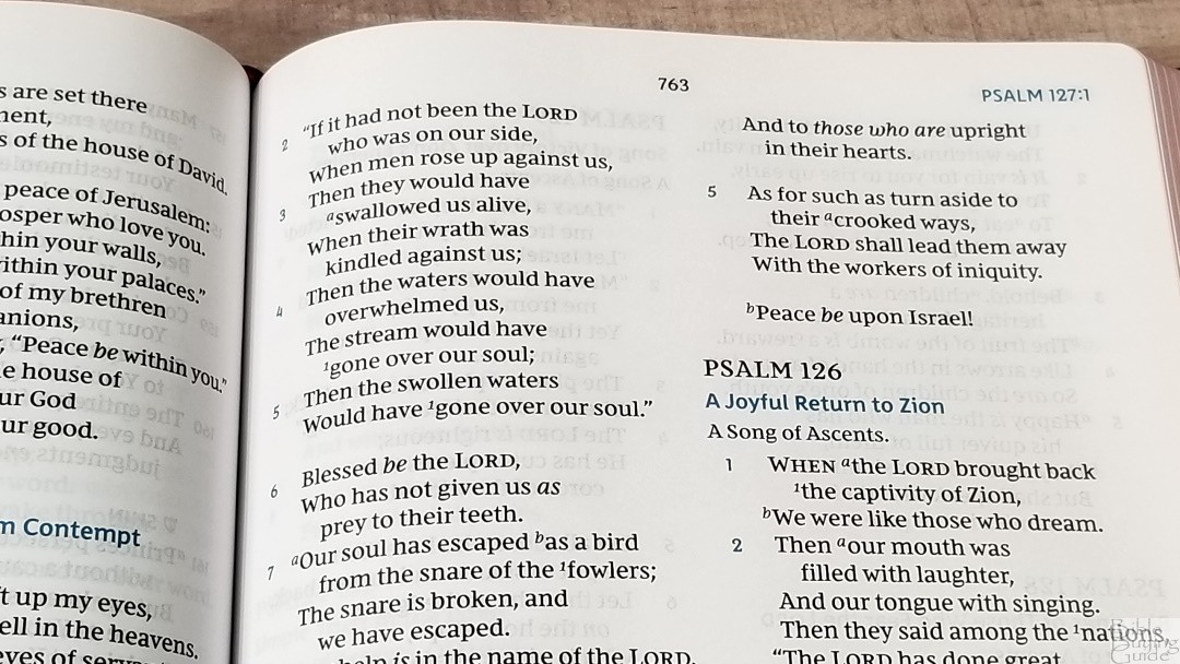
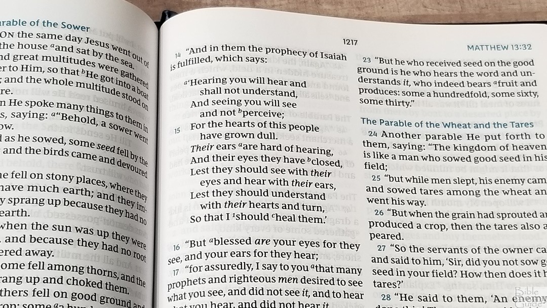
It has between 8-10 words per line. It has plenty of space between the lines to make it easy to read and preach from. The text was printed with line-matching, meaning the lines match in the same locations on both sides of the page. This reduces show-through and improves readability. The paper is so opaque that the line behind the text is still white.
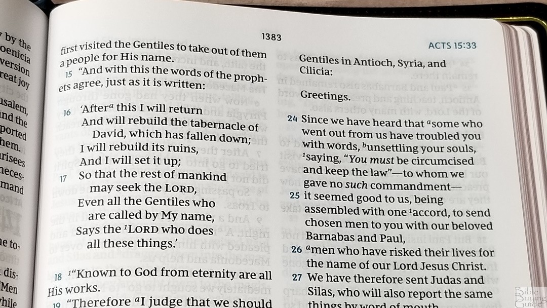
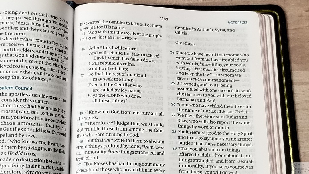
Even in a verse-by-verse layout, the NKJV Maclaren retains the poetic setting. The poetry breaks in the best places possible, making it clean and easy to read. This is my favorite method of presenting poetry in narrow columns and verse-by-verse. Also, the NKJV Maclaren retains the lower-case letters at the beginning of a verse if it continues a sentence. This is my preference. I want a KJV with this layout.
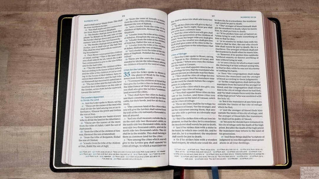
Moving the cross-references and footnotes in the footer gives the text some extra room and makes a cleaner design. It can a few extra seconds to find them. This is only an issue if you need to find them quickly. There are advantages to having them next to the verse and having them out of the way. Placing them out of the way provides the cleanest layout.
References
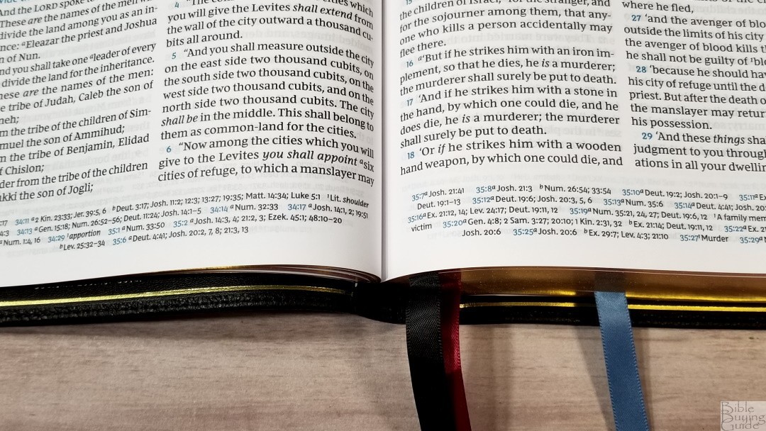
The NKJV Maclaren includes 72,000 cross-references. They’re placed along with the translation footnotes in a single column across the footer. The chapter and verses they go with are in blue. There are plenty of cross-references for a good amount of personal study and sermon prep.
Here are some example references to help you compare:
- Genesis 1:1 – Ps 102:25; Is 40:21; Jn 1:1-3; Heb 1:10; Gen 2:4; Ps 8:3; 89:11; 90:2; Is 44:24; Acts 17:24; Rom 1:20; Heb 1:2; 11:3; Rev 4:11
- Deuteronomy 6:4 – Deut 4:35; Mark 12:29; John 17:3; 1 Cor 8:4, 6
- Isaiah 9:6 – Isa 7:14; Luke 2:11; John 1:45; Luke 2:7; John 3:16; 1 John 4:9; Matt 28:18; 1 Cor 15:25; Rev 12:5; Judg 13:18; Titus 2:13; Eph 2:14
- Matthew 28:19 – Mk 16:15; Is 52:10; Lk 24:47; Acts 2:38, 39; Rom 10:18; Col 1:23
- Mark 12:29 – Deut 6:4, 5; Is 44:8; 45:22; 46:9; 1 Cor 8:6
- John 1:1 – Gen 1:1; Col 1:17; 1 John 1:1; John 1:14; Rev 19:13; John 17:5; 1 John 1:2; 5:20
- John 3:16 – Rom 5:8; Eph 2:4; 2 Thes 2:16; 1 Jn 4:9, 10; Rev 1:5; Isa 9:6
- Acts 2:38 – Luke 24:47
- Romans 10:9 – Mt 10:32; Lk 12:8; Ac 8:37; Rom 14:9; 1 Cor 12:3; Phil 2:11
- 1 John 1:1 – John 1:1; 1 John 2:13, 14; Luke 1:2; John 1:14; 2 Pet 1:16; Luke 24:39; John 2:27; John 1:1, 4, 14
Footnotes
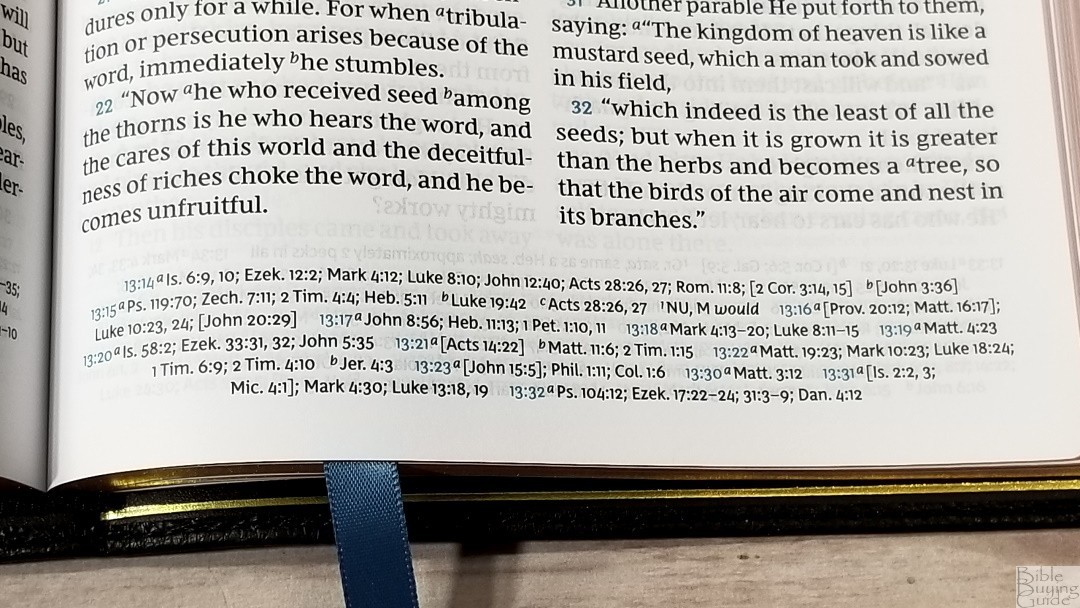
All the standard NKJV translation footnotes are included. In my opinion, the NKJV has some of the best footnotes because they provide manuscript variations and identify the manuscripts. They’re placed at the end of the cross-references for each verse.
Bible Atlas
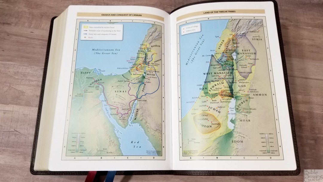
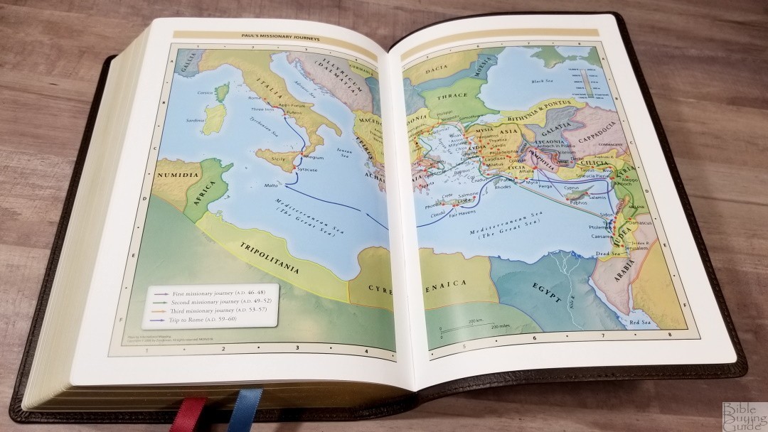
The NKJV Maclaren includes 7 Zondervan maps on 8 thick semi-glossy pages. They’re full-color with bright earth tones. They show topography, distance, routes, borders, possible locations of lost places, battles, elevation, cities, and locations for the events of Jesus’ ministry. It doesn’t include an index but the maps are annotated well. I’m glad to see them included. The Preaching Bible did not have them, and teachers that used them (like me) had to use external resources. I’m grateful they’ve been included.
Maps include:
- World of the Patriarchs
- Exodus and Conquest of Canaan
- Land of the Twelve Tribes
- Kingdom of David and Solomon
- Jesus’ Ministry
- Paul’s Missionary Journeys
- Jerusalem in the Time of Jesus
Comparisons
Here’s a look at how the NKJV Maclaren compares to several other NKJV reference editions.
NKJV Preaching Bible
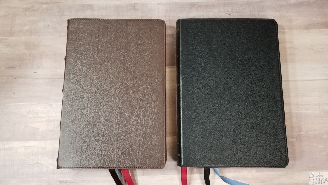

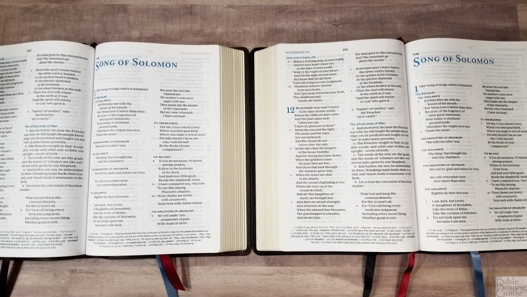

The NKJV Preaching Bible is the same text block but without maps. It’s only available in brown or black calfskin. The liner is edge-lined with heavy-duty vinyl. The liner is stiff because the two sheets that glue onto the edge-lined tab are glued all the way up. This makes the first and last pages try to close. Not having any pages after Revelation makes it difficult to turn to the last few pages.
NKJV Large Print Wide Margin Reference Bible

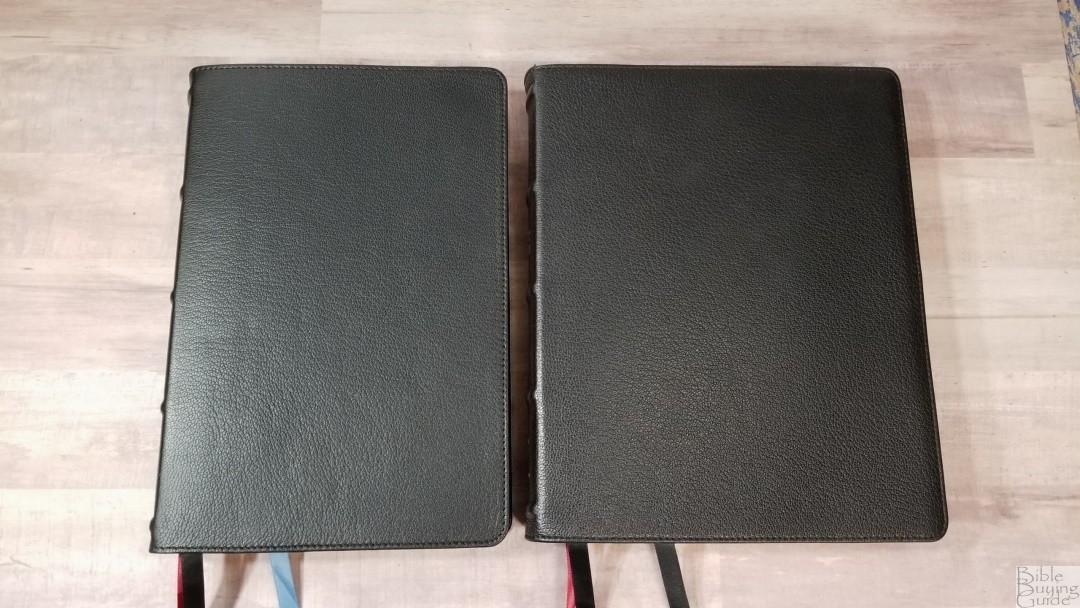

The NKJV Large Print Wide Margin Reference Bible has the same layout and font but with a few tweaks. It adds book introductions and changes the blue highlights to red. The paper is 36 gsm premium European Bible paper. This is a red-letter edition. It includes a reading plan, a concordance, and maps. The outer margin is a little over an inch, giving you some room for small notes without making the text small. It’s also available in Leathersoft.
NKJV Verse-By-Verse Center-Column Reference Bible
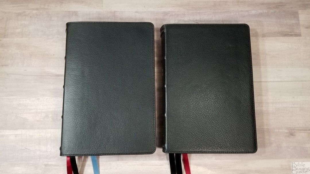
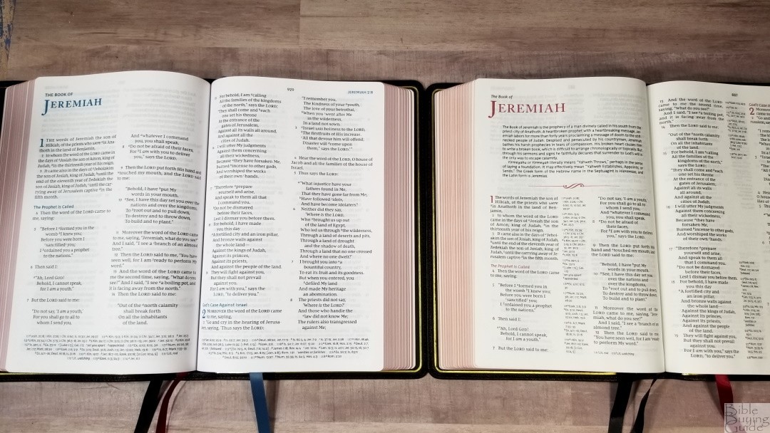
The NKJV Verse-By-Verse Center-Column Reference Bible is available in the Premier Collection and Leathersoft. It includes book introductions, a concordance, and maps. This is a red-letter edition and includes red highlights throughout. The font is slightly smaller. The Premier Collection has the same cover as the NKJV Maclaren. It includes premium European paper.
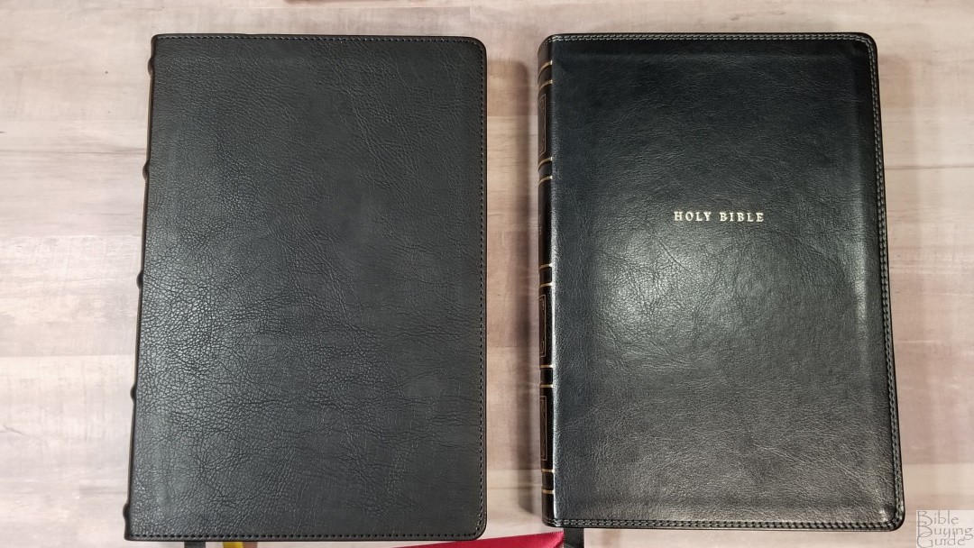
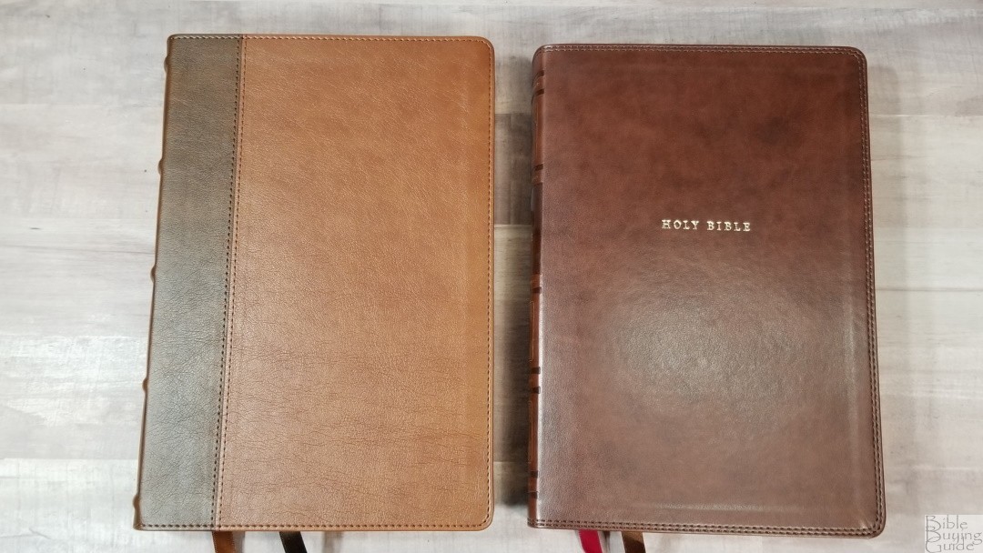
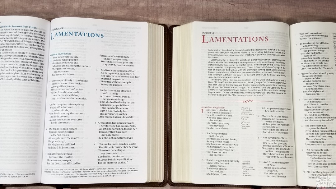
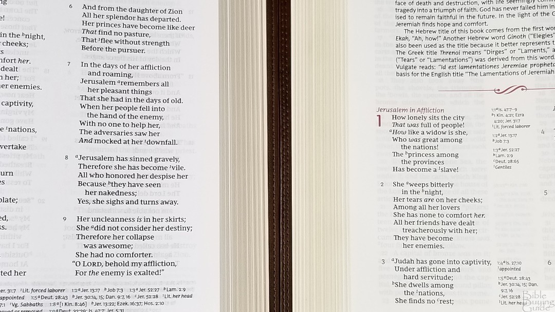
The Leathersoft is available in brown or black. The paper in my editions is very similar to the premium paper in the Premier Collection.
NKJV Topaz
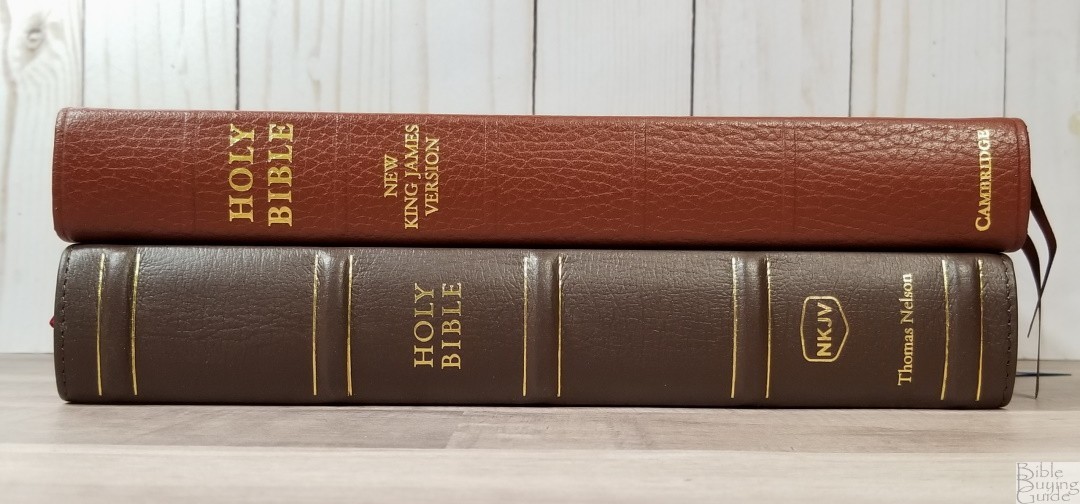
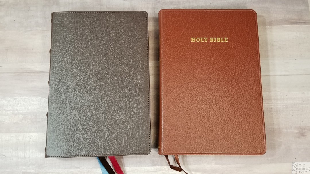
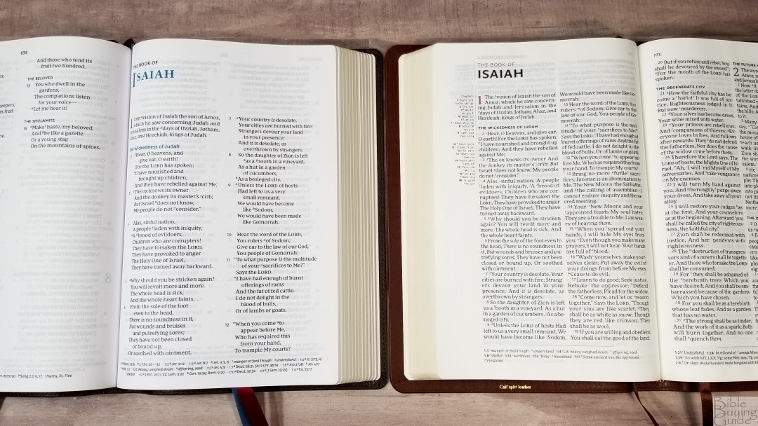

The Cambridge NKJV Topaz is available in goatskin and calf-split. This is the calfsplit edition. It has a paste-down vinyl liner that’s reinforced with binder’s tape. The paper is the expensive premium 28gsm Indopaque. This Bible is much thinner and the font is slightly smaller. It doesn’t have as much space between the words and lines. It doesn’t have a poetic setting or set personal letters apart. This is a red-letter edition. It includes a concordance and maps.
Ending Thoughts on the NKJV Maclaren Series
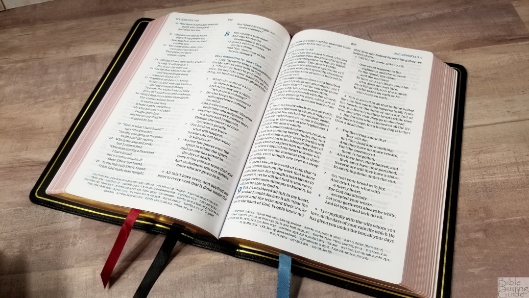
The NKJV Maclaren is a win. It has the best verse-by-verse layout for an NKJV because it retains the settings for poetry and personal letters. The word count gives them more room, so they look better than center-column editions. The dark and large font is great for reading and preaching. The paper is some of the best available in any price range. The maps are a welcome addition for me. If you need a concordance then you’ll want to consider the center-column editions that I compared in this review. I like that it has a range of cover options, so there’s something for any budget. If you’re looking for a v-b-v NKJV, this one should be high on your list.
_________________________________________________________
This Bible is available at (includes some affiliate links)
and local Bible bookstores
_________________________________________________________
Thomas Nelson provided this Bible in exchange for an honest review. I was not required to give a positive review, only an honest one. All opinions are my own.





Hi Randy, Thank you for this detailed review.
I think the Maclaren series is currently the best NKJV implementation by Thomas Nelson. It has the full set of translator notes and cross-references at the bottom. It also has the full preface and the book and special abbreviations page which you need to understand how any of the NKJV reference Bibles work. I’m disappointed to see that several other editions don’t have the abbreviations page any more. For example, their single-column reference Bible doesn’t have it. How else would you know what Bg., Kt., Qr., NU, M stand for in the notes?
The Maclaren verse by verse format makes it very convenient to look up verses. The blue verse numbers really help. In my opinion, it’s easier to use with references than the paragraph formatted Cambridge Clarion, even though that one has the references located right next to each verse.
The thing you lose with the Maclaren typesetting is the paragraph information. Other verse by verse editions often use bold numbers to indicate new paragraphs but this one doesn’t. It also drops the oblique typeface for OT quotations that the NKJV originally had. The translators were proud of this innovation because they felt that bold face and all caps were unaesthetic and gave too much emphasis to OT quotations. Perhaps the Comfort Print typeface doesn’t have an oblique type. I don’t know. Another thing is that the characteristic NKJV formatting for the Ten Commandments in Ex 20 only comes out well in a paragraph format. This just can’t be helped in a verse by verse format.
Lastly, one thing that’s consistently missing from NKJV reference Bibles is a table of weights and measures. They could have easily included one in the Maclaren instead of the lined pages for notes. Crossway and Holman are better at this in their translations. Thomas Nelson only seem to include weights and measures in their study Bibles.
That said, I’m really happy with the Maclaren. It’s a great alternative to the NKJV Clarion for study. It’s bigger, has larger fonts, has thicker pages for easier page turns and great for looking up cross-references. Perhaps one day it’ll have a concordance and a map index with a larger set of maps like the Clarion. The lack of these must be due to its preaching Bible heritage.
It should be noted that the NKJV Cambridge Topaz, which has a similar layout, also lacks the oblique typeface for OT quotations — except for a few spots in Mark. Odd.