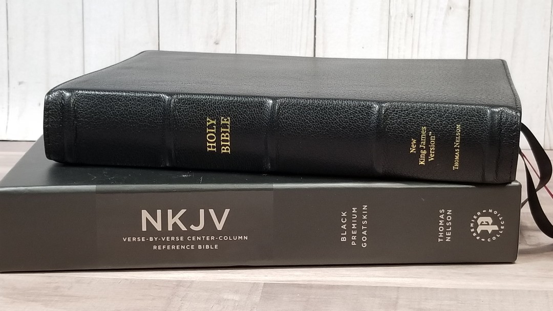
Thomas Nelson’s Premier Collection has been a huge hit. One Bible I’ve seen a lot of desire for is the New King James in a classic verse-by-verse setting. This format has become more popular recently as many preachers, teachers, and students want something that’s easier to use in a modern translation. Thomas Nelson has answered with the NKJV Verse-by-Verse Center-Column Reference Bible Premier Collection edition. It includes black goatskin with raised ribs and a leather liner, European paper, the Comfort Print typeface, and elegant ribbons. ISBN: 9780785231271, printed in China with materials from around the world.
Thomas Nelson provided this Bible in exchange for an honest review. I was not required to give a positive review, only an honest one. All opinions are my own.
_________________________________________________________
This book is available at (includes some affiliate links)
and many local Bible bookstores
_________________________________________________________
Table of Contents
- Video Review
- Cover and Binding
- Paper
- Typography
- References
- Book Introductions
- Concordance
- Maps
- Comparisons
- Conclusion
Video Review
Cover and Binding
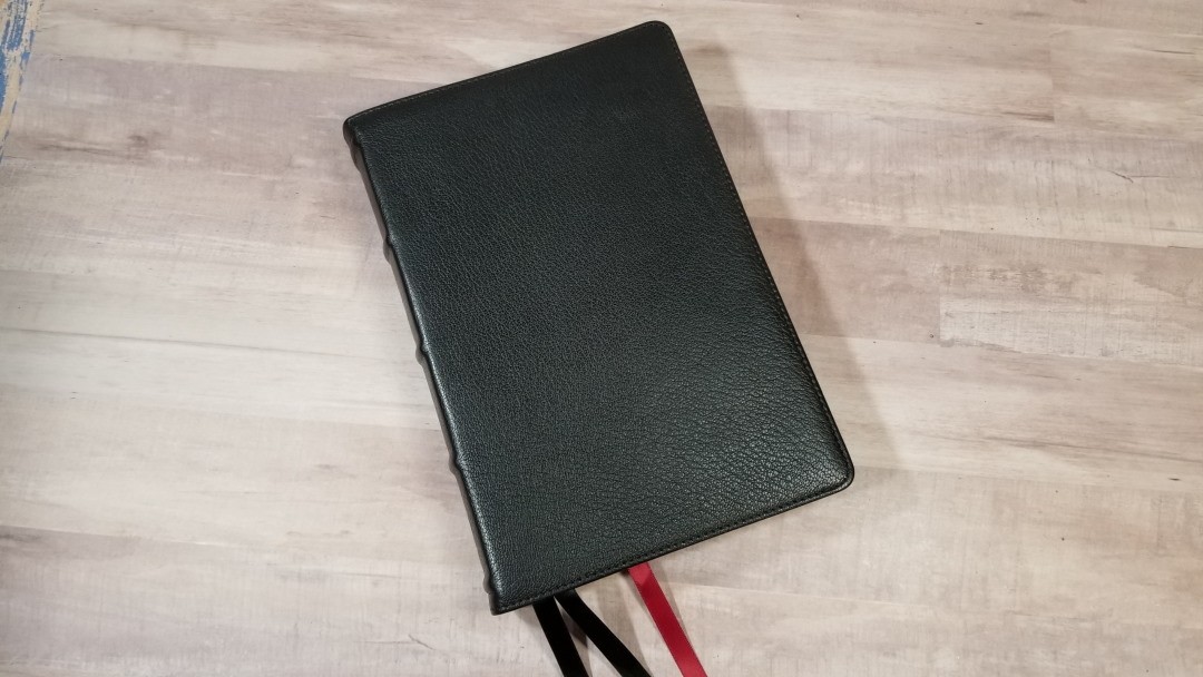
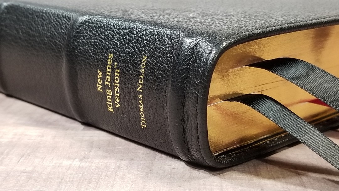
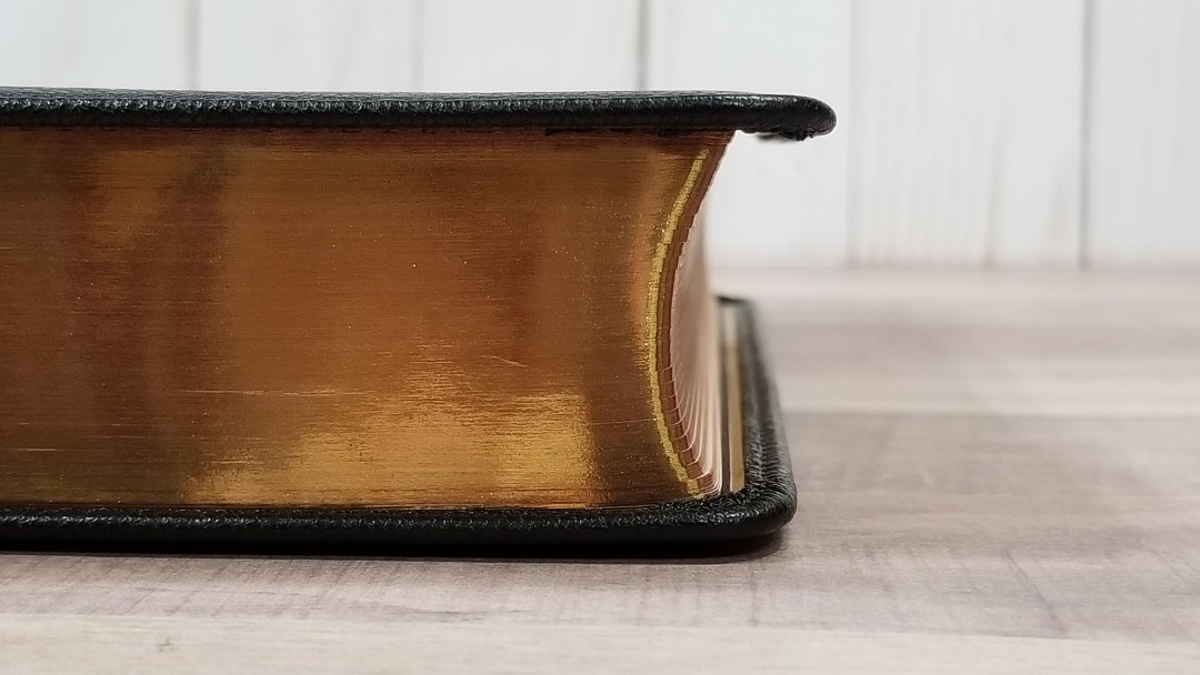
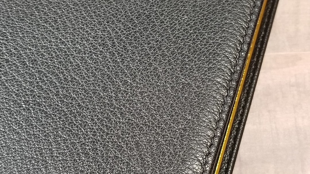
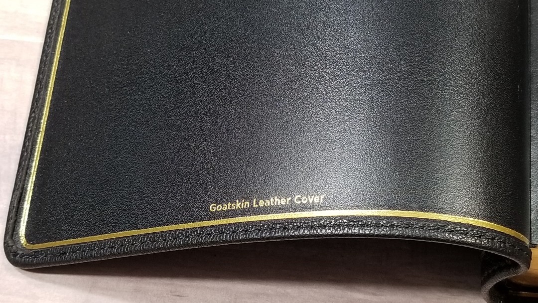
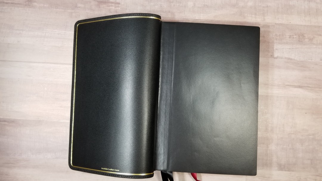
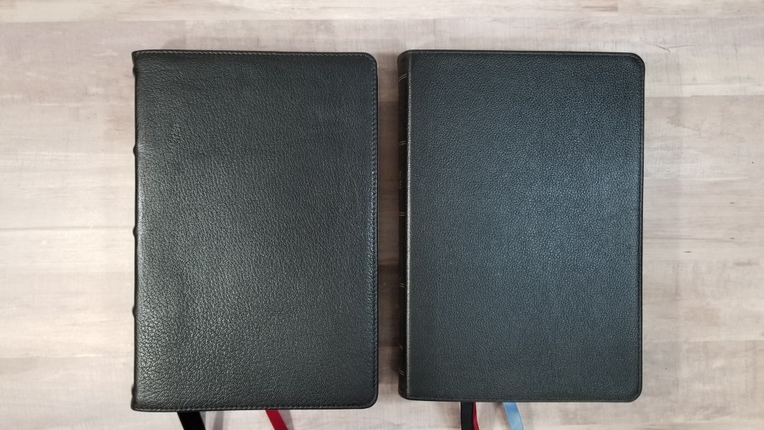
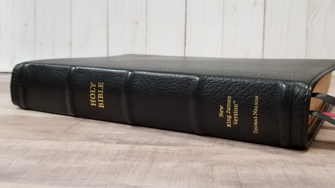
The cover is black goatskin. I love the grain of this leather. It has a natural grain that’s soft to the touch. It’s stitched around the perimeter. It’s edge-lined with a leather liner. The liner includes a gilt line. It does have a yapp, but it isn’t a full yapp so it doesn’t bend over the pages. It’s Smyth sewn and has no trouble laying open on the first page. It also has overcast stitching to strengthen the first signature.
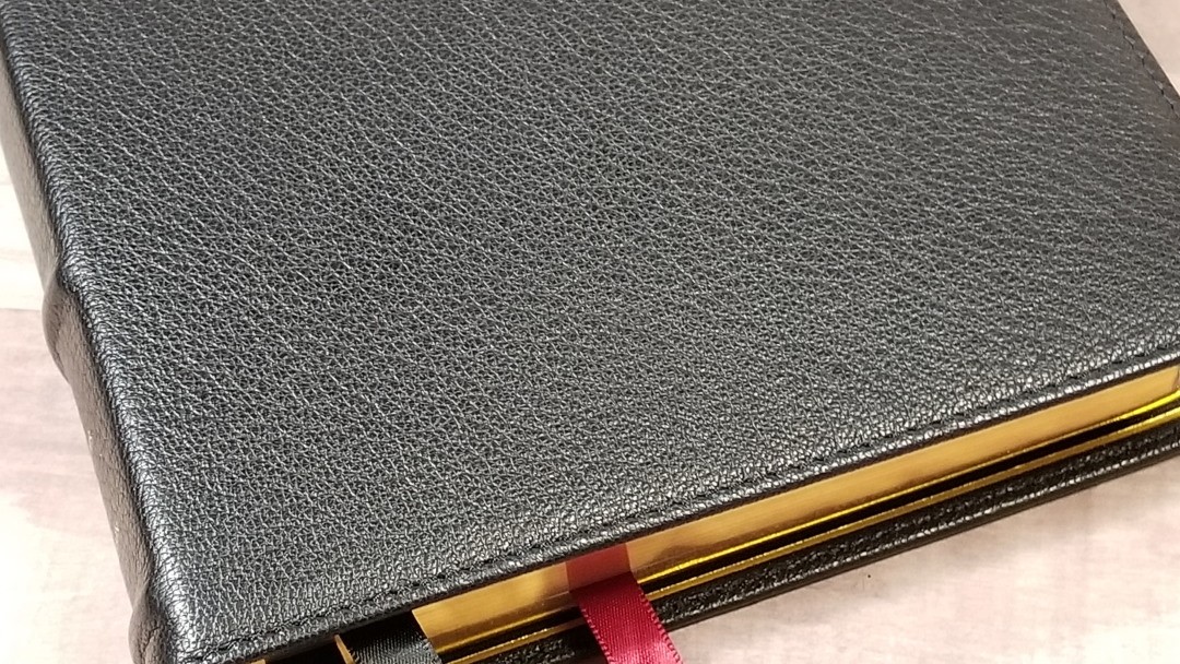
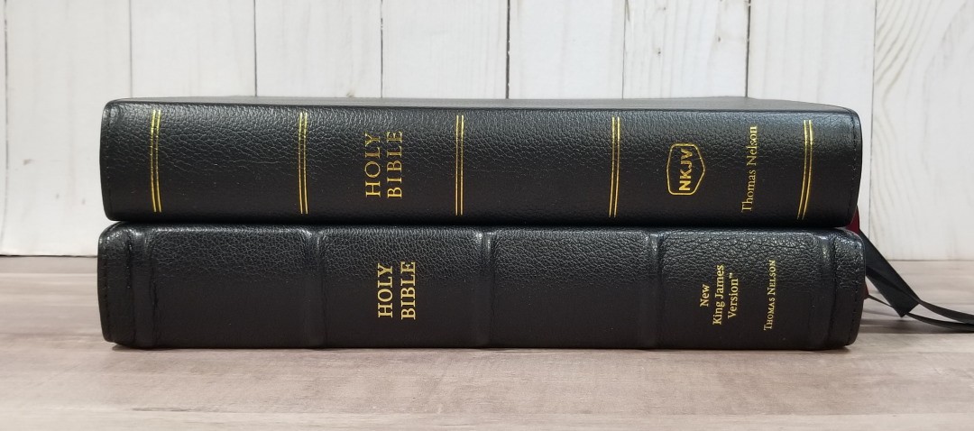
Nothing is written on the front of the cover. The spine has HOLY BIBLE, NEW KING JAMES VERSION, and THOMAS NELSON printed in gold. It has 5 raised spine ribs. The ribs add to the structure. This Bible feels solid without the sloppiness of the first editions of the Premier Collection.
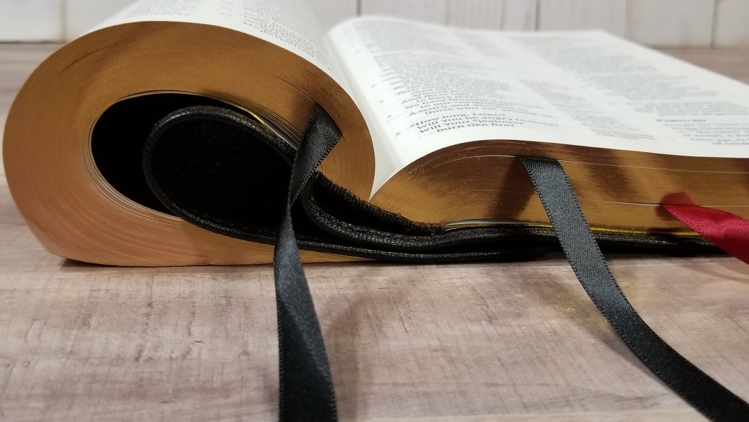
It includes three extra-long satin ribbons at 3/8″ each. They’re double-sided. They look and feel elegant. They’re more than long enough to open the Bible in the corner of the page. The overall size is 6.5 x 9.75 x 1.5″ and it weighs 2lbs, 12.7 oz.
Paper
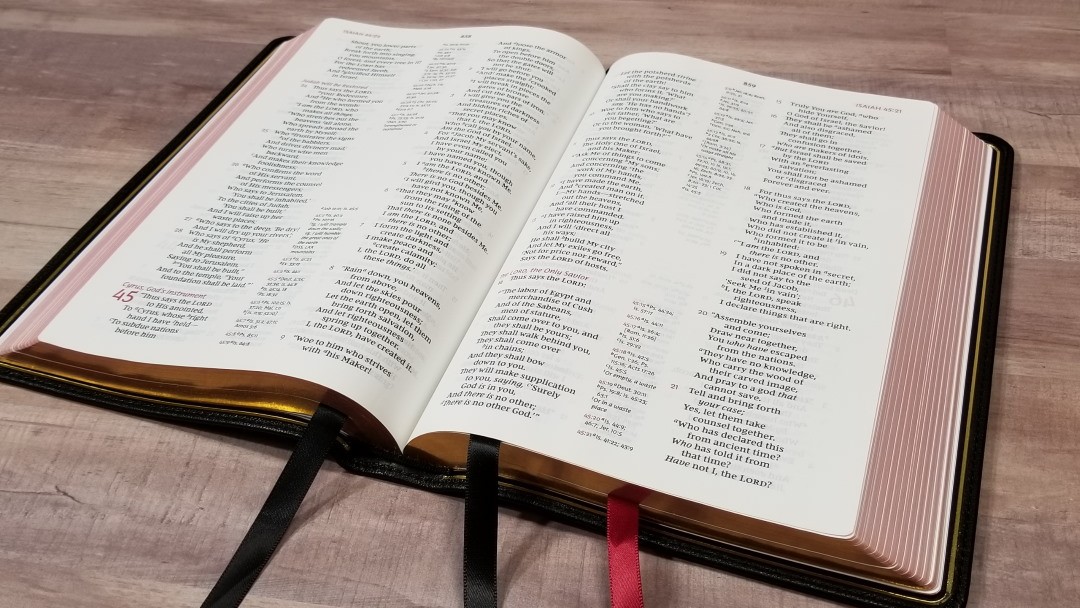
It has 36gsm premium European Bible paper. This paper is white in color and it’s highly opaque. It has no glare under direct light. It’s smooth, but it’s just rough enough that it’s easy to grab and turn. This is an excellent paper for reading and highlighting (using tools made for Bibles). Page edges are art-gilt with red under gold. I like reading with this paper for long periods of time.
Typography
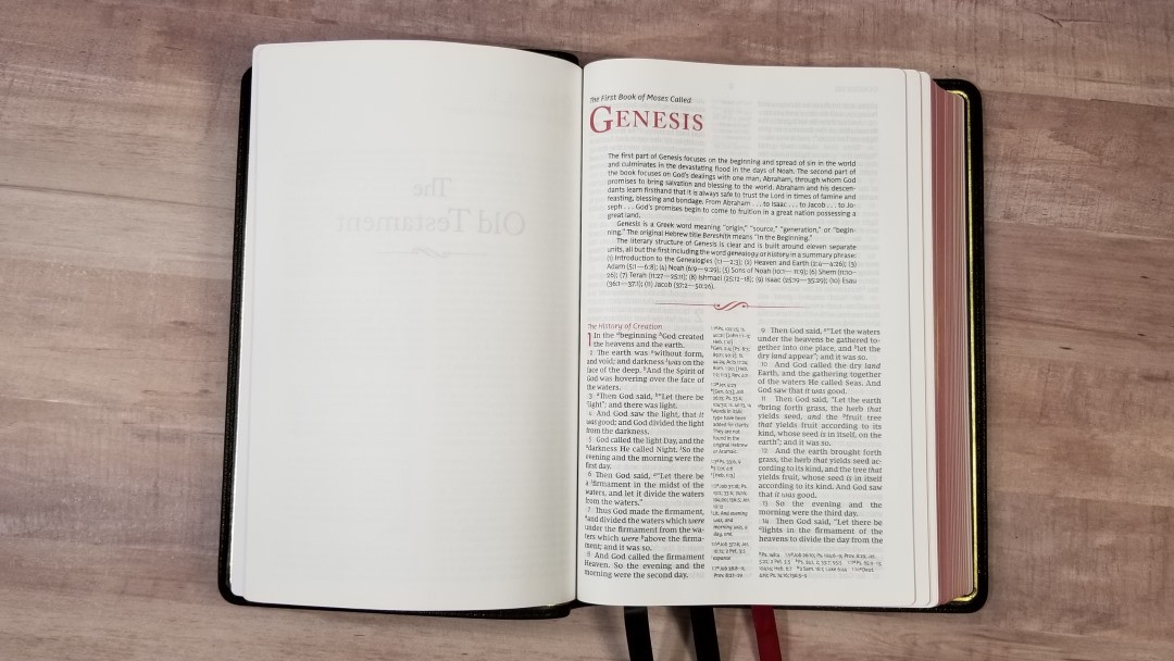
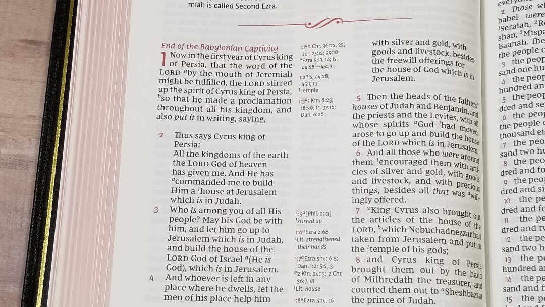
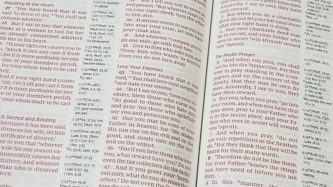
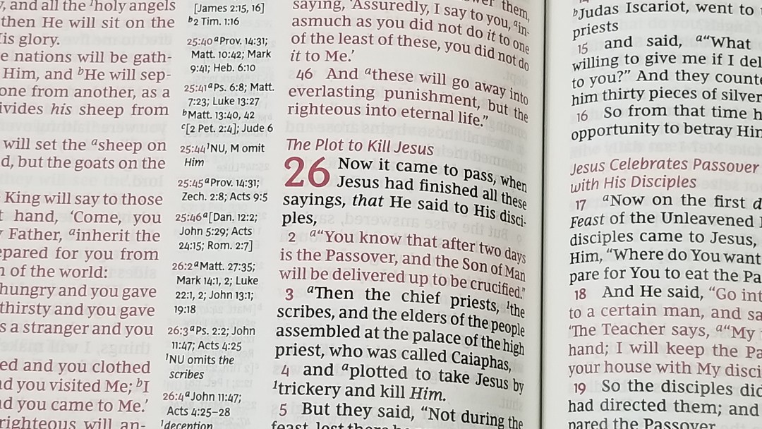
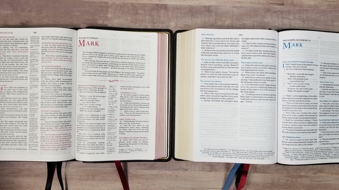
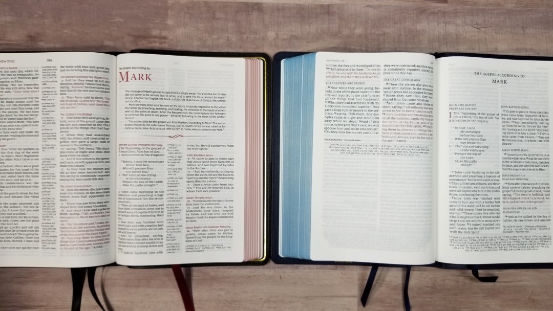
The text is presented in double-column, verse-by-verse format with poetry set to stanzas and letters indented. References are placed in the center column. The header includes the page number in the center and the book name and chapter and verse numbers in the outer margin. All of the highlights are in red. This includes chapter and verse numbers, section headings, book titles, and the decorative line between the book introductions and the text.
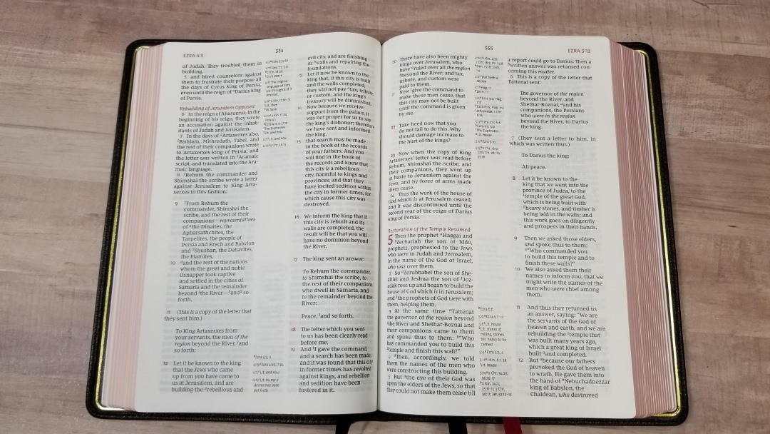
The font is the Comfort Print designed by 2K/Denmark for the NKJV. It’s a true 10-point, and it looks it. It’s dark and readable. This is a red-letter edition. The red is about a medium shade. Both the black and the red are highly consistent throughout the text.
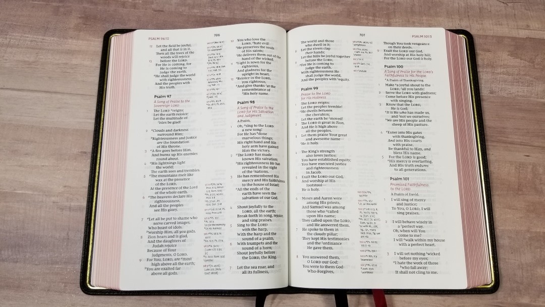
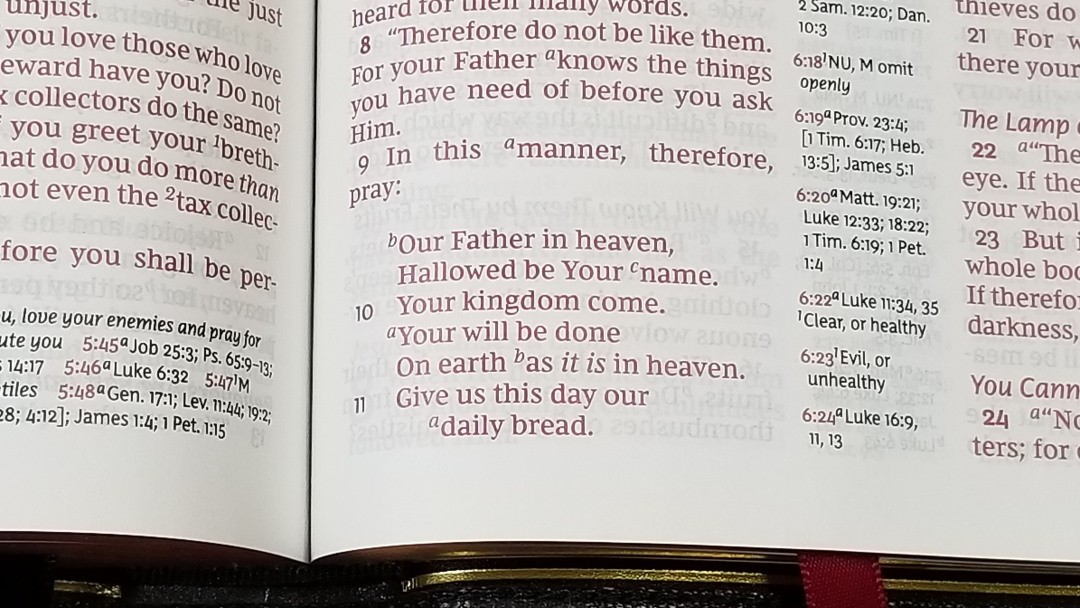


Most lines have 7-8 words. It’s line-matched, meaning the lines are placed in the same location on both sides of the page to improve readability. The paper is opaque enough that show-through isn’t distracting even in poetic settings. The breaks for the poetic lines feel natural. The lines keep a good rhythm, breaking in phrases as much as possible rather than continuing to the end of the line and breaking where they don’t make sense.
References
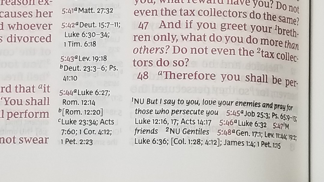
It has 72,000 cross-references. Cross-references and footnotes are placed in the center column and are keyed to the text with letters. The pilot chapter and verse numbers are in red. It shows the references first, and then the footnote for each verse. If there are more than will fit in the center column, the rest are placed under the last verse on the page. This is a lot of references and they’re great for study and sermon prep.
Here are a few example references to help you compare:
- Genesis 1:1 – Ps 102:25; Is 40:21; Jn 1:1-3; Heb 1:10; Gen 2:4; Ps 8:3; 89:11; 90:2; Is 44:24; Acts 17:24; Rom 1:20; Heb 1:2; 11:3; Rev 4:11
- Deuteronomy 6:4 – Deut 4:35; Mark 12:29; John 17:3; 1 Cor 8:4, 6
- Isaiah 9:6 – Isa 7:14; Luke 2:11; John 1:45; Luke 2:7; John 3:16; 1 John 4:9; Matt 28:18; 1 Cor 15:25; Rev 12:5; Judg 13:18; Titus 2:13; Eph 2:14
- Matthew 17:20 – Mat 21:21, Mk 11:23, Lk 17:6, 1 Cor 12:9
- Mark 11:23 – Matt 17:20; 21:21; Luke 17:6
- Mark 12:29 – Deut 6:4, 5; Is 44:8; 45:22; 46:9; 1 Cor 8:6
- John 1:1 – Gen 1:1; Col 1:17; 1 John 1:1; John 1:14; Rev 19:13; John 17:5; 1 John 1:2; 5:20
- John 2:19 – Mat 26:61, 27:40, Mk 14:58, 15:29, Lk 24:46, Acts 6:14, 10:40, 1 Cor 15:4
- Acts 2:38 – Luke 24:47
- 1 John 1:1 – John 1:1; 1 John 2:13, 14; Luke 1:2; John 1:14; 2 Pet 1:16; Luke 24:39; John 20:27; John 1:1, 4, 14
The footnotes are the standard NKJV translation footnotes. These are my favorite footnotes because they provide manuscript variations and identify the manuscripts. They’re great for study and seeing insights on the translation.
Book Introductions
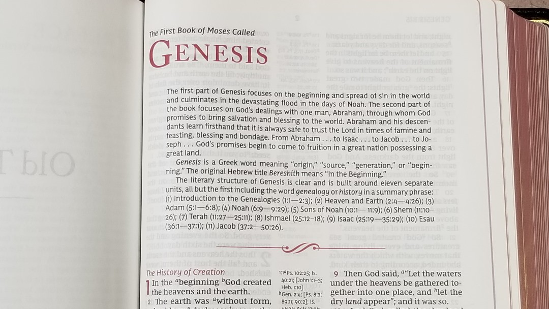
Each book has a short introduction with a few paragraphs. The introductions cover the title, author, themes, setting, major events, major characters, etc. They often highlight unique features of the books or provide insights into what makes the book stand out. They’re short, but they’re interesting and can help in personal study and sermon prep.
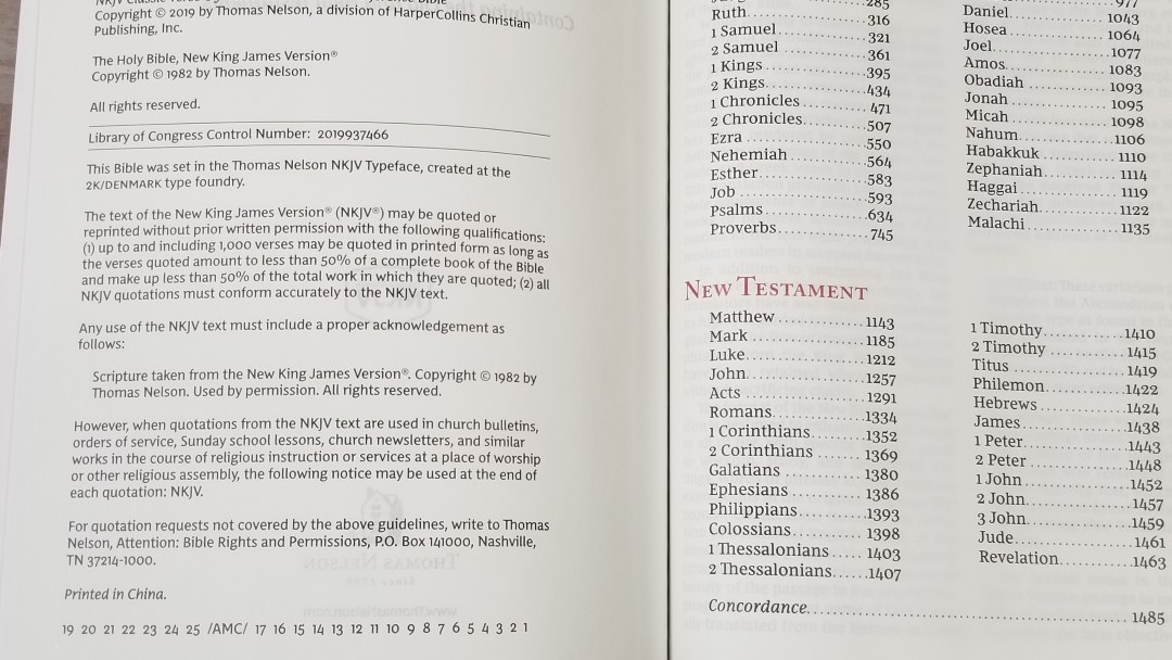
Concordance
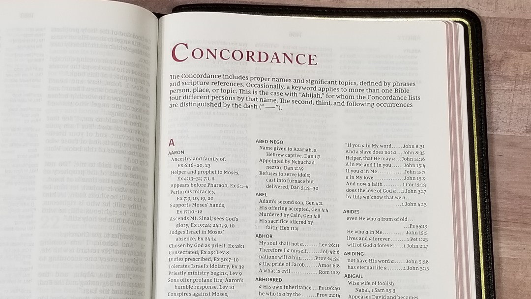
The concordance is 165 pages with 3 columns per page. It’s comprehensive with a lot of entries. It includes names with topical information about people and places. This is an excellent tool for study and sermon prep. This is the same concordance as the MacArthur 2nd ed.
Here are some example entries and the number of references they provide:
- Christ – 33
- Christian – 2
- Christians – 1
- Christs – 1
- Faith – 56
- Faithful – 26
- Faithfulness – 9
- Faithless – 2
- God – 70
- Goddess – 2
- Godhead – 2
- Godliness – 6
- Godly – 6
- Gods – 7
- Praise – 38
- Praised – 6
- Praises – 5
- Praiseworthy – 1
- Praising – 3
- Pray – 23
- Prayed – 3
- Prayer – 21
- Prayers – 9
Maps
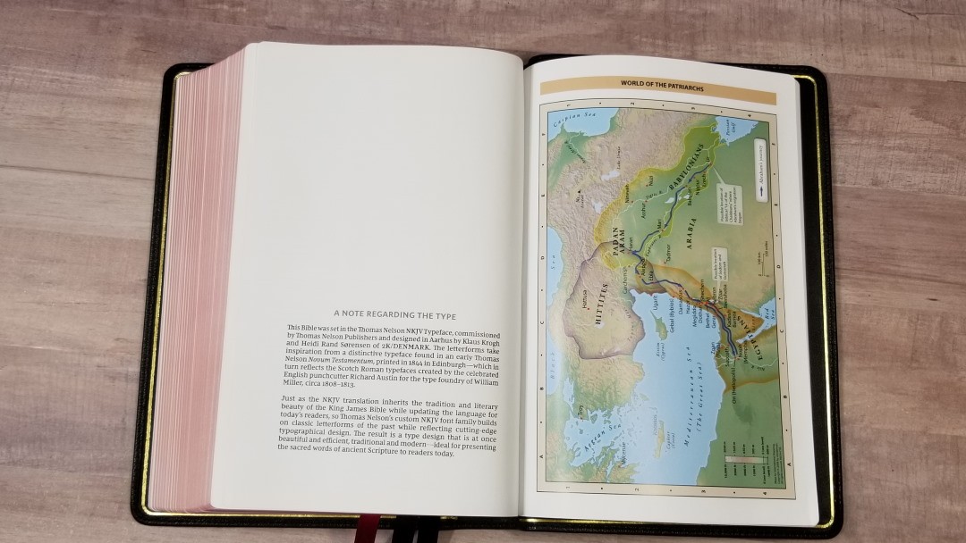

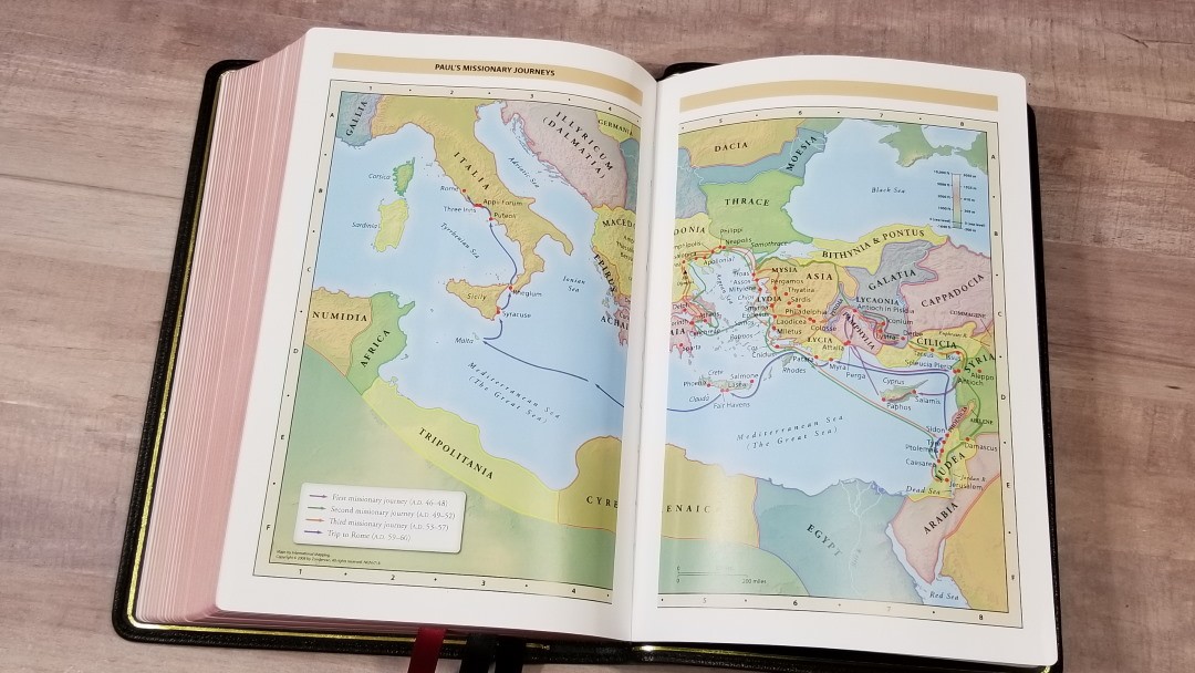
It has the standard 7 full-color Zondervan maps used by Thomas Nelson Bibles. Maps are printed on 8 thick glossy pages. It doesn’t have an index to maps but they are annotated well. I’m a fan of these bright earth-tone colors. They show topography, distance, routes, borders, possible locations of lost places, battles, elevation, cities, and locations for the events of Jesus’ ministry.
Maps include:
- World of the Patriarchs
- Exodus and Conquest of Canaan
- Land of the Twelve Tribes
- Kingdom of David and Solomon
- Jesus’ Ministry
- Paul’s Missionary Journeys
- Jerusalem in the Time of Jesus
Comparisons
Here’s a look at how the NKJV Verse-by-Verse Center-Column Reference Bible Premier Collection compares to the Premier Collection NKJV Large Print Thinline Reference Bible, NKJV Preaching Bible, and the Schuyler thin Quentel,
Premier Collection NKJV Large Print Thinline Reference Bible

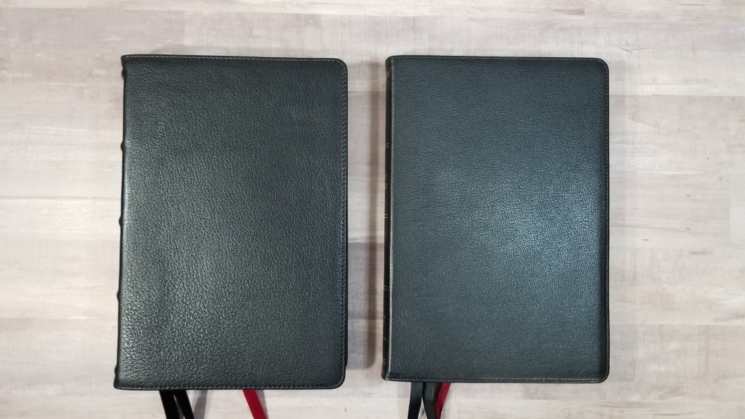

The thinline is much thinner but has the same paper. The grain on the cover isn’t as pronounced, but it’s still nice. It has a smaller font and is in a paragraph format. References are in the footer.
NKJV Preaching Bible
The NKJV Preaching Bible has a slightly larger font and references in the footer. It doesn’t have book introductions, a concordance, or maps. I think both are great for preaching. It also has 36gsm paper, but it’s not the premium European paper that the Premier Collection uses.
Quentel
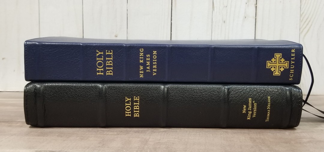
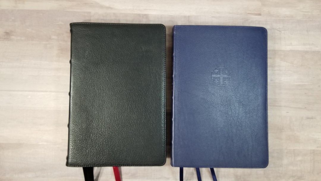
The thin Quentel has 28gsm paper and it’s slightly thinner overall. Its red is darker and its font is slightly larger. Both have the same design for poetic settings.
Conclusion
The NKJV Verse-by-Verse Center-Column Reference Bible Premier Collection is an excellent design. This setting is perfect for preaching, study, or following along with someone. The poetic setting and letters don’t suffer from the v-b-v layout. The materials are of high quality. It’s very much the equivalent of the KJV Premier Collection with a slightly smaller font.
The Premier Collection continues to impress me. Thomas Nelson has done it again with a high-quality Bible at an affordable price. If you’re looking for a high-quality verse-by-verse NKJV, this is easy to recommend. It’s easily the best available.
_________________________________________________________
This book is available at (includes some affiliate links)
and many local Bible bookstores
_________________________________________________________
Thomas Nelson provided this Bible in exchange for an honest review. I was not required to give a positive review, only an honest one. All opinions are my own.


I just got mine. The cover has such a beautiful deep black, with a subtle highlighting sheen. I have the previous KJV giant print version already, which looks almost navy next to it, and quite a bit cheaper*. However, although I’d say the pages are slightly more opaque, they also feel rougher – the KJV has smoother pages which feel much more inviting when handling the bible. They are both stunning to read.
Thank you for helping me make two good decisions here.
(*I do wish the KJV was as beautifully bound as the NKJV, but strangely, it makes me happier, so I can use that to remind myself that beauty isn’t everything.)
Hi Michael. Thanks for sharing. I’m glad you like it!!
Hi Randy, mine does not have overcast stitching on the last signature only on the first. Could you double check your facts on that please. Great review, thank you.
Andy
Hi Andy. Yours is correct. Sorry about that. I’ll update the article.
How big is the difference in font size between this and the Preachers Bible? Which would you recommend?