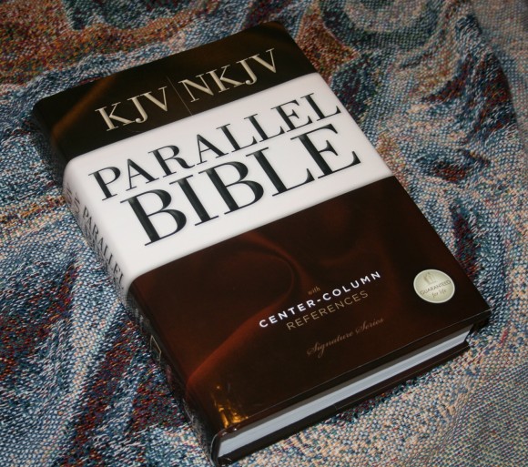
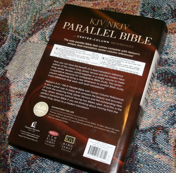
I use the KJV as my primary Bible. Sometimes I want to see a verse or word in a different translation. Parallel Bibles are great for this. You can teach from them and have quick and easy access to a different word that might help you explain the passage. Thomas Nelson’s KJV/NKJV Parallel Bible is an excellent Bible for comparing and using the two translations together.
Pros
- Thick and opaque paper
- Font is sharp and bold
- NKJV notes
Cons
- Small font
Features
- KJV/NKJV in parallel
- Hard cover
- Glued binding
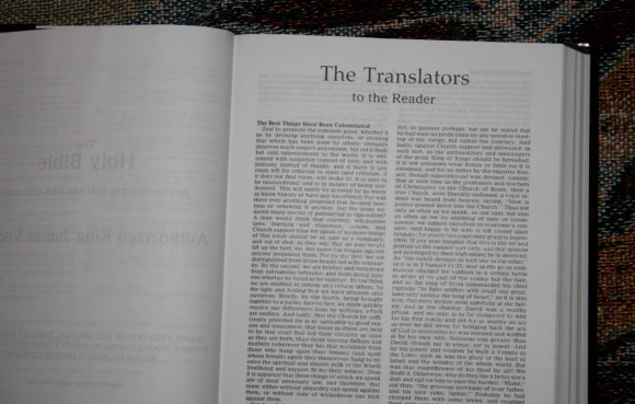
- Translators to the Reader
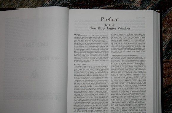
- Preface to the NKJV
- Black letter
- 7 point font
- NKJV translation notes
- Center column references
- Section headings with parallel references
- Verse-by-verse format
- 9.75 x 6.6 x 1.75
- ISBN: 9781418544706
- MSP $39.99, Amazon’s price $14.98
Paper and Print
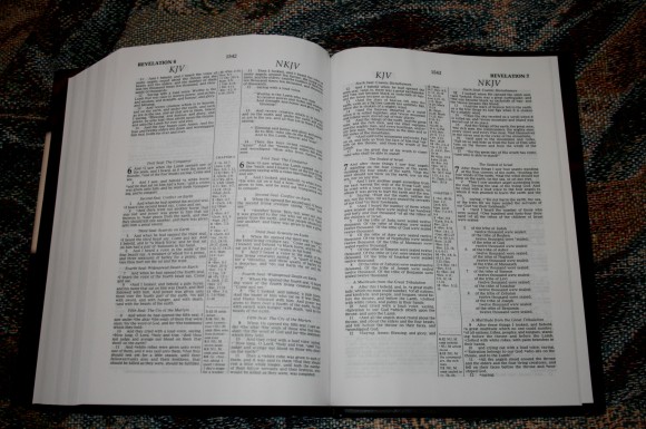
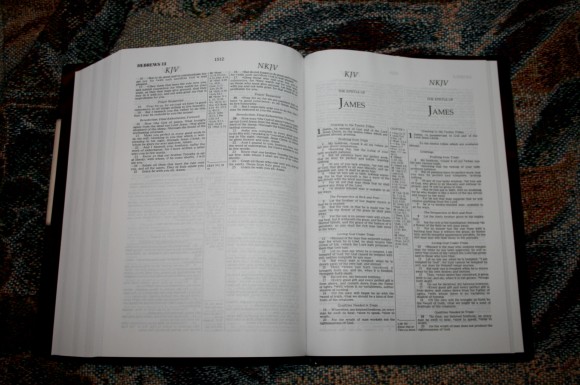
The paper has a white tone and is very thick and opaque. It’s on par with wide margin editions. It’s probably the most opaque paper that I’ve seen in a Bible that not a wide-margin edition.
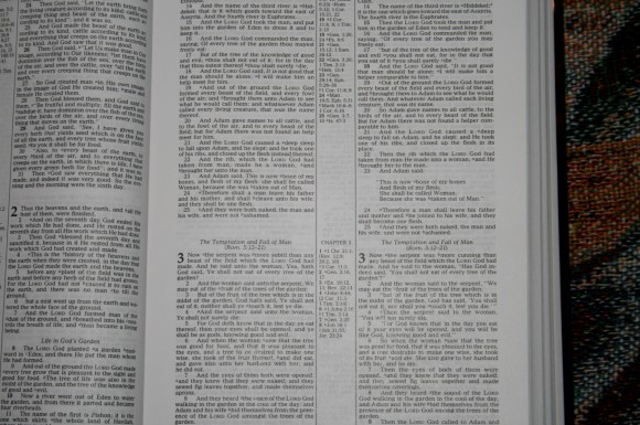
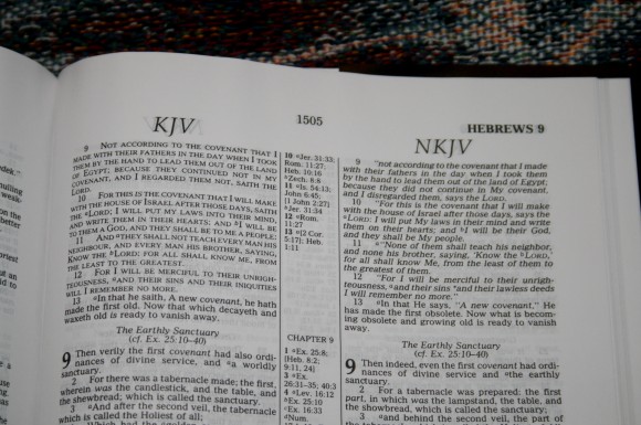
The font is too small for my tastes. I can read it just fine, but for preaching I like to leave the Bible layout on the pulpit and read from a distance. This font won’t let me do this. This is not a deal-breaker for me, though. I like everything else about it more than I don’t like the size of the font. Even though the font is small it is still legible because it is bold and sharp. The paper’s opacity adds to the readability and most of the text looks line-matched. This helps the readability a lot, which makes preaching from it not that difficult that I first thought. It looks like a 7-point with 8-point leading (7/8). I’m guess though, so don’t take that to the bank. It looks just slightly larger than the font in a Pitt Minion. It looks a little bolder than the Pitt. While I was comparing to the Pitt I could really tell much difference in the font style. The print quality is excellent. There are no pronunciation markers of any kind. I used to want them there, now I want them not there. I prefer having a pronunciation guide in the back. Unfortunately this Bible doesn’t have it.
Layout
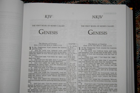
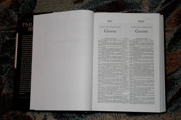
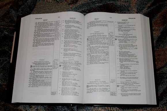
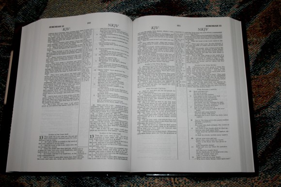
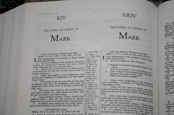
There are two columns of text on each page. The KJV text is presented on the left of every page and the NKJV is presented on the right. Both texts are verse-by-verse format. They have the same section headings and they include references to parallel passages. The NKJV layout includes poetry indented and OT quotes are indented and in italic. The KJV layout shows OT quotes in all caps. The NKJV has bold verse numbers to indicate the start of a new paragraph while the KJV doesn’t have any indicators for paragraphs. Paragraph indicators are nice to have but it’s still difficult for me to think of verse-by-verse in paragraphs even if they’re marked. Verse-by-verse is easy for me to teach and preach from but paragraph format makes more sense for reading. I like to see this available in a paragraph formatted edition. I’ve wanted a KJV with the NKJV layout. It helps to see the two side-by-side because it points out the poetic passages. Seeing it in the NKJV improves readability of the KJV.
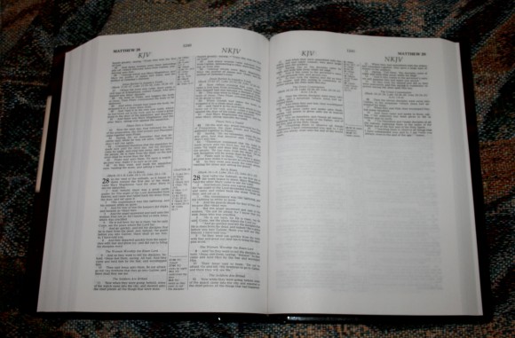
The chapters for both editions start side-by-side. The KJV text takes up less space than the NKJV. This leaves space after the KJV text on most chapters. Books start on a new page. This space is great for taking notes as some of it is a significant amount of room. There are also .5 inch margins for notes, references, or symbols. If nothing else, I can appreciate that the text doesn’t go all the way into the gutter. There are 16 pages in the back for notes. All of this space might be helpful for sermon outlines or personal study.
Center-Column References and Translator’s Notes
There are over 60,000 center-column references. The references work with both translations. Both are keyed to the references with letters. The references in the center column are easy to find because they are labeled with bold chapter numbers and the letters that tie them to the text. The NKJV contains translator’s notes that appear at the bottom of the center column. They are keyed to the text with asterisks. The notes include explanatory notes, literal translations, and language notes. Textual variants are labeled with NU-Text for Nestle-Aland (N) and the United Bible Societies 3rd edition (U), and M-text for the Majority Text.
Conclusion
This is a good Bible for sermon and class prep. It’s also a good choice for study because you can compare the two translations side-by-side. You will need other reference material because there are no other tools such as a concordance, maps, or helps. If you don’t mind the small font it would be a good choice for preaching and teaching. It is a fine choice for those that want to migrate from the KJV to the NKJV but want to do it in steps.







Dear Randy:
This is a good concept, I use it frequently, although with two bibles. My favorite combination for this help in understanding or just getting a different slant on a difficult passage is the Douay-Rheims translation. There is not often significant difference between that and the Authorised, especially in the New Testament, but a different approach that often helps me. It would be nice to have the Douay-Rheims in combination, complete with Apocrypha that was included in the 1611 Authorised. The non-canonical books are useful as long as we understand they are not part of the Word of God.
Yours in Christ
Don Denison
I have this Bible packed away in a box. I never really used it as the font is just too small for me and I’m a guy in my 20’s with perfect vision. I don’t understand why they couldn’t have at least made it an 8 pt font as it’s thinner than many single translation Bibles I have. I use the Classic Comparative parallel Bible published by Zondervan which has NIV2011, KJV, NASB and AMP, and even that Bible despite having 4 translations has a bigger more readable 8 point font. I’d like to see you review that parallel Bible, I don’t think there’s currently a better parallel Bible on the market for combination of translations and layout.
God bless
FD
Thanks. I will add that to my wishlist.
@Fervent Disciple
It’s been nearly 4 years, so I doubt you’ll see this reply. I noticed your comment that you had this packed away in a box. I’ve been hunting for this one to no avail. Is there any chance you’d still have this and want to part with it for a reasonable price?
THIS IS A AWESOME PARRALLEL BIBLE ALL THIS REALLY NEEDS IS TO BE IN A 12 POINT TEXT, A LARGE PRINT VERSION. AND I KNOW THAT IM NOT THE ONLY ONE WHO THINKS SO. THIS BIBLE WILL SELL FOR THAT MUCH MORE. I KMOW THAT THIS CAN BE DONE.
I agree 100%! I’d LOVE to have this in large print!
I started to hunt for this bible also in large print with no luck! How terrible!
Hello am in Ghana how do I get your book
Hi Oliver. We don’t sell Bibles but you can probably find it on eBay or Amazon.
does this bible have anything in the back besides blank pages?
No, just the blank pages.
Thanx for review! Are you aware of any other NKJV with parallel passages in the headings? Preferable not study bible.