The Westminster was the first, and one of the very few, Bibles that my wife loved so much that she claimed it before I could even see it. There’s a good reason for that – updated words in the margins, 200,000 cross-references, elegant setting, etc. The Westminster KJV Reference Bible has been made into a compact edition (33% smaller in overall footprint). Lately, I’ve used smaller Bibles and this one fits the bill just right. My wife isn’t getting this one. This one is mine.
The Compact Westminster was made with missionaries in mind. Those who need to carry a smaller Bible that’s not short on cross-references. In order to reduce the thickness, they removed the Translators to the Reader and concordance. To be clear, this is a reference Bible. It doesn’t include any doctrinal articles or notes.
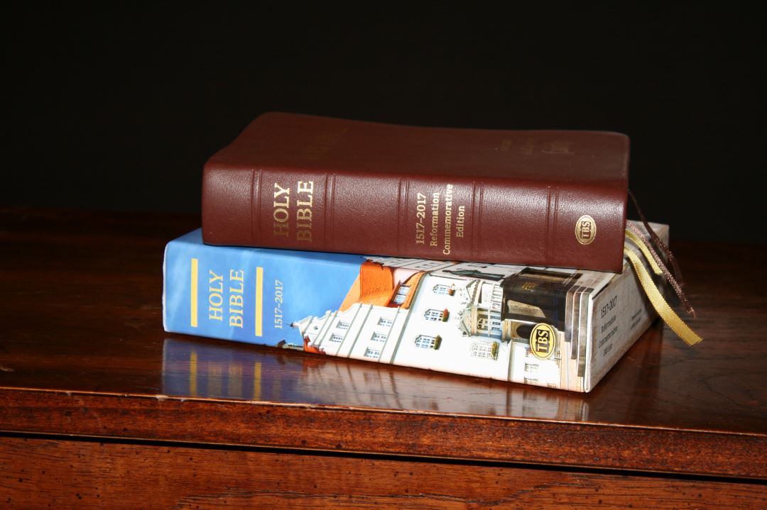
It’s available in softcover, hardcover, and calfskin leather with or without metrical Psalms. It’s also available in two special editions to commemorate the 500th year of the Reformation: one in hardcover and one in calfskin. I’m reviewing the brown calfskin Reformation Commemoration edition.
Features
- KJV
- Brown calfskin
- Sewn binding
- 200,000 cross references
- 3 black letter font
- Updated words in the margins
- Chapter summaries
- Translator’s footnotes
- Tables of weights and measures
- List of words with pronunciation
- Reading plan
- Maps
- Four ribbons
- Gold and brown head/tail bands
- Text-block size 6.5 x 4.6 x 1.2”
- Gift box
- Presentation page
- Information about the Reformation
- Printed and bound by Jongbloed
- Model: 60UCB/BR
- ISBN: 9781862284524
_______________________________________
_______________________________________
Binding
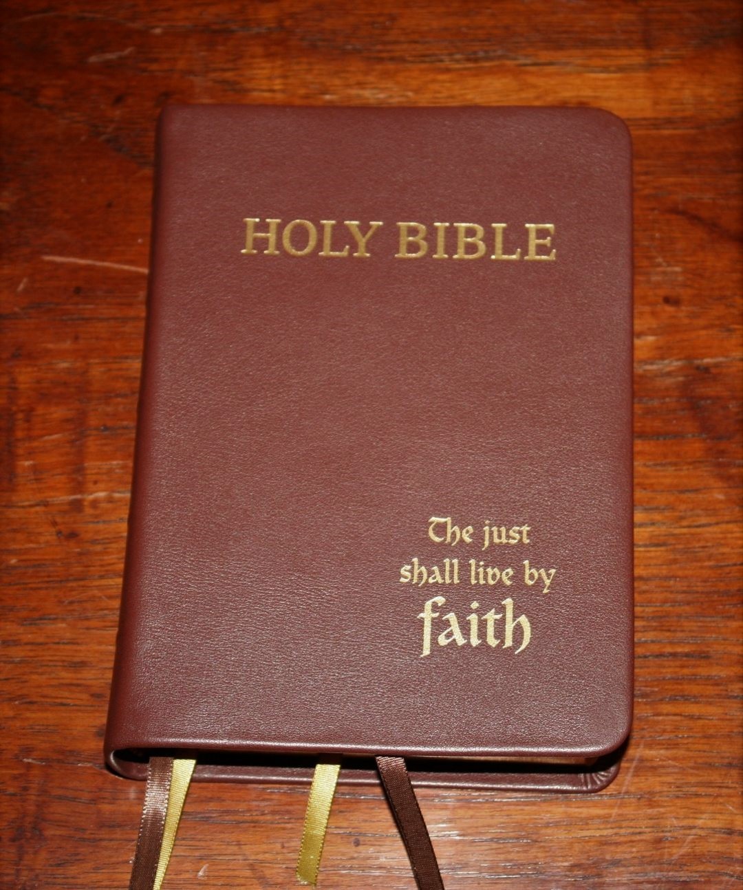
The cover is brown meriva calfskin. It’s soft to the touch and it’s thick and has a grain and texture. It has a past-down liner which keeps the cover from being floppy. On the front is printed Holy Bible and The Just Shall Live by Faith to commemorate the Reformation. The spine has Holy Bible, 1517-2017 Reformation Commemorative Edition, the TBS logo, and five bands to indicate spine ribs (although they’re not raised ribs they look nice).

The leather looks and feels close to the same as the vachetta calfskin on the Brevier Clarendon. I don’t know that it’s vachetta calfskin, but I can’t tell much difference. If you’re a fan of that leather (like I am) then you’ll like this cover. I love the look and feel of this leather.
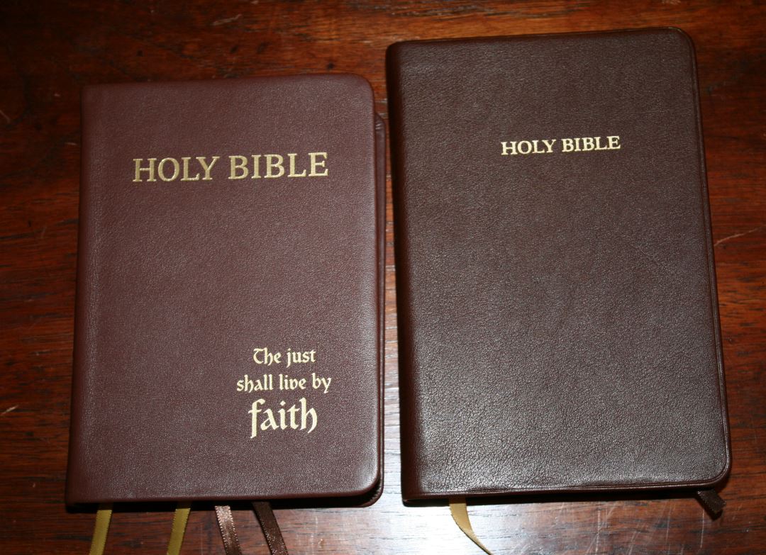

The binding is sewn and has no problems lying open in Genesis 1. It will need to break in a little before it opens completely flat at Genesis 1, but even out of the box it stays open on its own without trying to close.
It includes four ribbon markers: two brown and two gold. They’re different shades but they match the head/tail bands nicely.
The overall size is 7 x 5 x 1.3”. I love the size of this Bible. I’ve recently used smaller Bibles and this on feels right in my hand. The footprint is shorter than a Cameo and the Pitt Minion. It’s a touch thinner than a Clarion. It’s very similar in overall size to a personal size Concord. The footprint and thickness feel balanced.
Paper

The paper is one area that sets this Bible apart. It has PrimaBible NC 32 gsm, a PDL paper produced in France. It has that cream tint that I liked from the original Westminster (some have said their original had white paper, but I’ve only ever seen the cream. Publishers do use different paper from time to time, which is why they don’t like to post the paper specs. I posted this paper spec by permission from the publisher). It’s highly opaque. The edges are gold gilted.
To my fingers, it feels thicker and smoother than the regular Westminster and Windsor. It also seems more opaque. That could be due to the typeface being thinner and placing less ink on the page, but whatever the reason the paper has less show-through to my eye.
This paper has no glare under any light. This is the right time of year for page curl and I am seeing a little, but it isn’t enough to keep me from using it and I’ll take this paper with page-curl over less-opaque paper with glare every time.
There are 22 blank pages in the back that you can use for notes, memory verses, events, studies, lists, etc.
Typography

The text is presented in a double-column verse-by-verse format with cross-references in the inner and outer margins, creating four columns per page. The header shows the book name and chapter numbers in the outer margin and a page summary in the inner margin. The footer shows the page number in the outer margin.
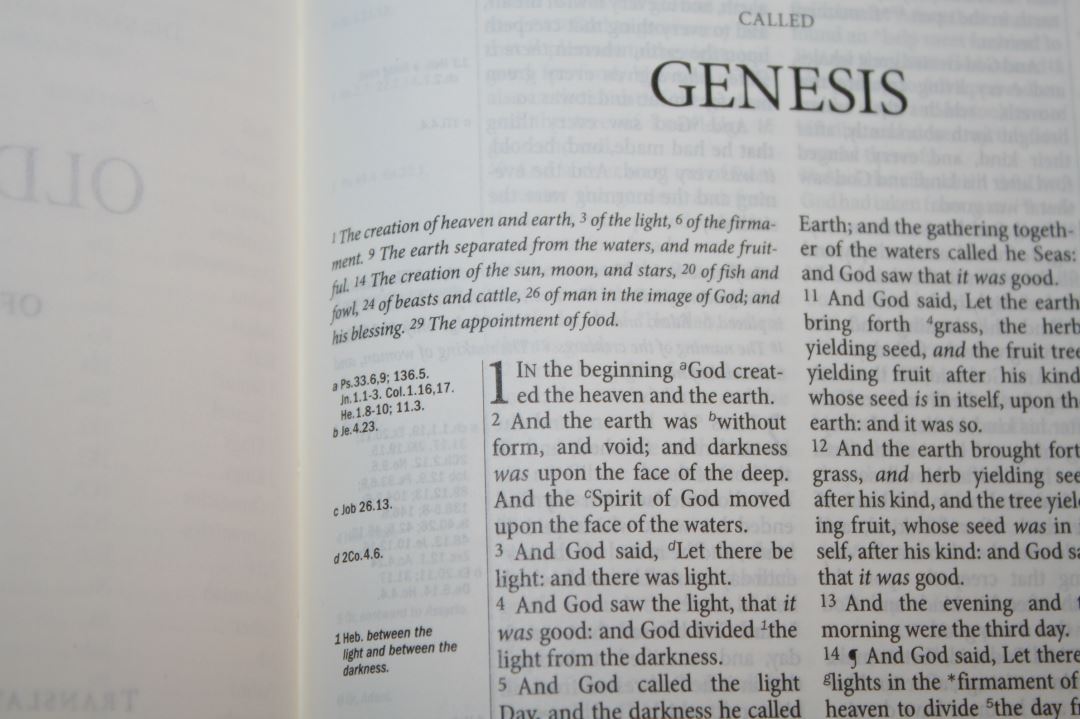
The font is 7.3 black letter with a generous leading. It’s dark and crisp throughout. Even though it’s a small font I find it highly readable. The whitespace within the text, opaque paper, and line matching help with readability.
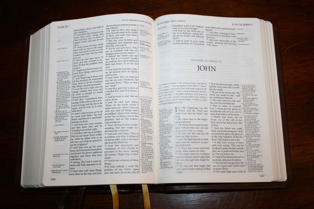
It doesn’t have pronunciation marks within the text. Instead, they’re moved to an appendix. This greatly improves readability and I still have access to them if I want them. It does have italics for supplied words. The cross-references and footnote keys are so small that they’re easy to ignore when reading. The asterisks are harder to ignore, but I don’t have to look at the margin every time I see one.
The references in the inner margins keep the text on the flattest part of the page. Fortunately he references don’t get lost in the gutter.
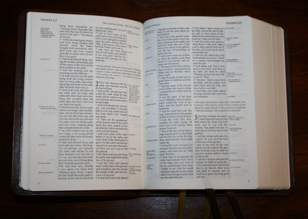
The columns are narrow at 1.25”. Of course, this is required in order to get all of the references in the margins. The text has 32 characters across which allows for 5-7 words per line. Even with so few words per line the text never feels cramped. Lines are more likely to have extra space between the words than not enough. There are 54 lines per page.
Reformation Commemoration Pages
Note – the Reformation pages are only found in the Reformation edition.
2017 marks 500 years after the start of the Reformation. To commemorate this event, the Reformation commemorative edition has several pages about the Reformation and the Bibles that came from it. These pages are printed on the heavy cardstock in the front and take the place of the Scripture pages in the regular edition.
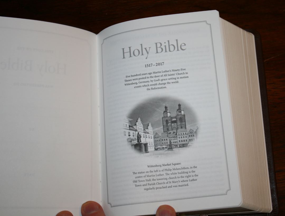
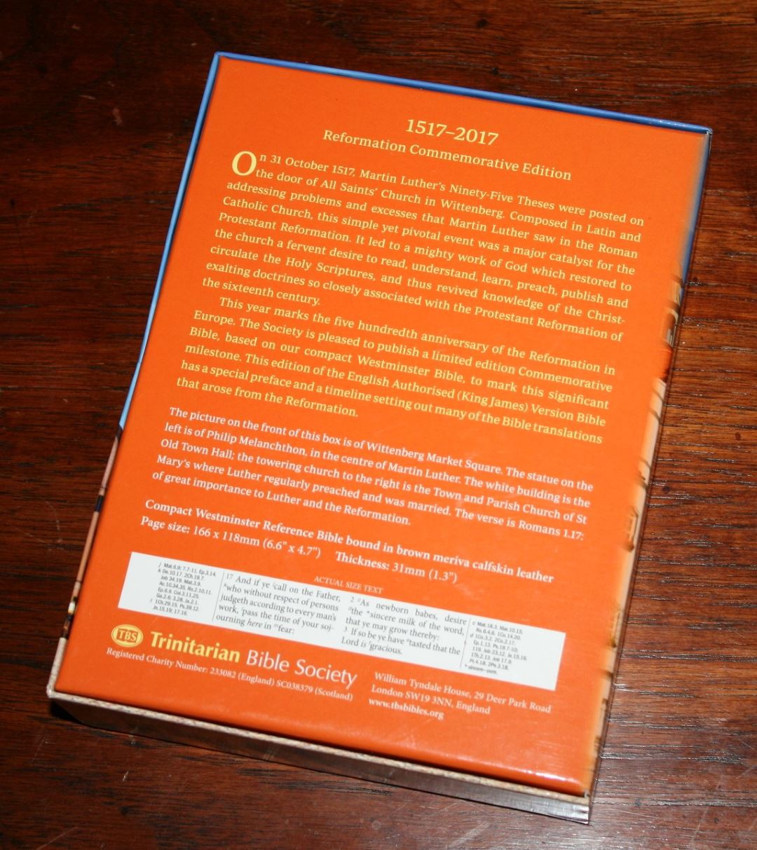
The first is a page that shows the shortened version of the information found on the back of the box and also has the photo from the front of the box.

Next is a 1.5-page essay on the importance of the reformation and the effect it had on Bible translation.


Following this is another page that talks about translations from the reformation and a 2-page timeline of reformation Bibles.
Front-Matter
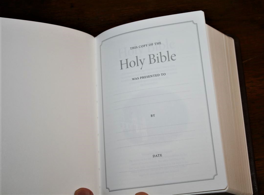
After the Presentation and Reformation commemoration pages, we have the Epistle Dedicatory, characteristics of the Authorized Version, guide to using the Compact Westminster Reference Bible, and a list of books and their abbreviations. In order to help make this edition smaller, it doesn’t have the Translators to the Reader. Here’s a closer look at two of these features. Both of these features help in using this Bible specifically and have information that would help read and understand many KJV’s.
Characteristics of the Authorized Version
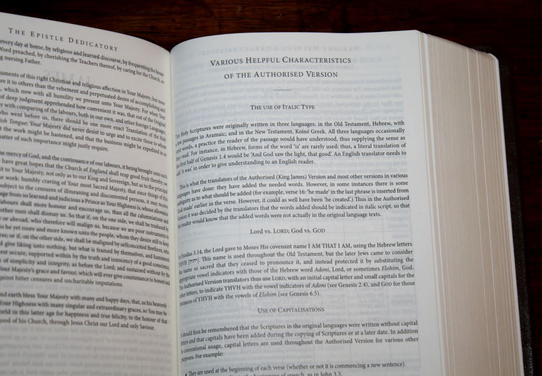

This section covers features that of the KJV such as the use of italics, Lord vs. LORD; God vs. GOD, use of capitalization, the use of OT names in the NT, Thou and Ye (includes thee, thy, and thine), and the pilcrow (paragraph marker). Most of these are explained in detail and give Scripture references as examples.
Guide to Using the Compact Westminster Reference Bible
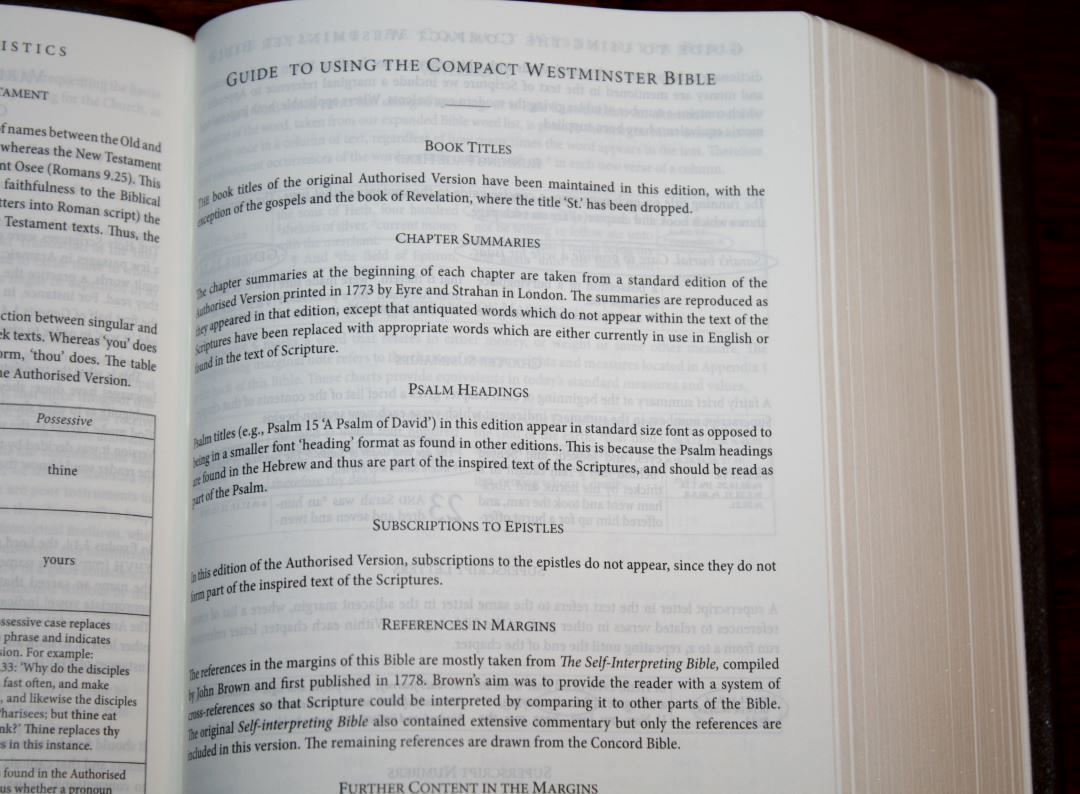
This section covers the features of the Compact Westminster covers book titles, chapter summaries, psalm headings (which are printed full size because they’re found in the Hebrew and should be considered part of the text and read with the Psalms), subscriptions to the epistles (showing that they’re not included because they’re not part of the Scripture text), references in the margins (mostly taken from John Brown’s (probably no relation, but you never know) The Self Interpreting Bible with the rest from the Concord), and further content in the margins (translator’s footnotes and updated words).
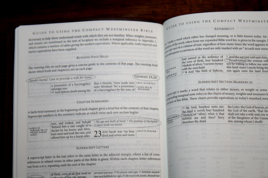
The next page shows a sample page and highlights running page heads, chapter summaries, superscript letters, superscript numbers, asterisks, and superscript section markers, explaining how they work and how to use them.
References
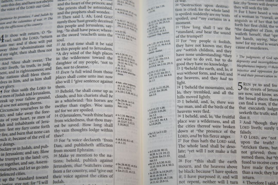
One of the greatest strengths of the Compact Westminster is its 200,000 cross-references (from John Brown of Haddington’s The Self Interpreting Bible and the Concord). They’re placed in the inner and outer columns near the verses they correspond to. They’re keyed to the text with letters.
The references are smaller than the text so if you have trouble seeing the text then you’ll have more trouble seeing the references. References are printed like this 9.6 instead of this 9:6. This helps make the small text easier to see.
The references are excellent for study and sermon prep. They include larger passages so they don’t just correspond to portions of verses. For example, if you’re looking for a reference and there isn’t one where you think there should take a look at the beginning of the passage. Most likely you’ll find the reference there. This is especially true for events, parables, etc. Taken in context this allows Scripture to interpret Scripture. This also means that just showing the references per verse is only part of the story.
Here are a few verses with their references to help you compare. You’ll see some of these references repeated within the same verse. They actually correspond to different places within the verses.
- Genesis 1:1 – Ps 33:6, 9; 136:5; Jn 1:1-3; Col 1:16, 17; He 1:8-10; 11:3
- Deuteronomy 6:4 – 1 Ch 8:6; Mar 12:29; Je 10:6-11; Is 42:8; 45:22; 1 Jn 5:20; Jn 17:3; 1 Co 8:4, 6
- Isaiah 9:6 – ch 7:14; 4:2; Lu 2:11; Mat 15:24; Ro 9:5; 15:8; Jn 1:14; 3:16; 4:10; 6:32, 33; 2 Co 9:15; Mat 11:27; 28:18; Eph 1:22; ch 7:14; 63:1; Jer 31:22; Mat 8:27; Pr 30:4; Ju 13:18; Zec 6:13; ch 28:29; Jn 1:18; 17:8; 15:15; Re 3:18; Lu 7:30; Je 23:6; Ps 45:3-6; Jn 1:1, 2; Ro 9:5; Ti 2:13; ch 45:22; 63:1-4; 1 Jn 5:20; He 1:8; 7:25; Pr 8:23-31; He 5:9; 2:13; Jn 6:39-51; 10:28; 11:25; ch 53:10, 11; Ep 2:10; ch 53:5, 12; Je 23:5, 6; Mi 5:1, 2, 5; Ro 5:1, 10; 2 Co 5:19, Ep 2:14; Jn 16:33; 14:27; Phi 4:7; 2 Th 3:16
- Matthew 17:20 – ch 13:58; 6:3; v 17; He 3:19; Lu 17:6; ch 13:31; 21:21; Mar 11:23; 1 Co 13:2; v 9; ch 21:22; Mar 9:23
- Mark 11:23 – Mat 17:20; 21:21; Lu 17:6; Ja 1:5, 6; Ro 14:19, 20; 1 Co 13:2
- Mark 12:29 – De 6:4, 5; 10:12; 30:6; Pr 23:26; Mat 22:37; Lu 10:27; 1 Co 13; 1 Ti 1:5
- John 1:1 – Ge 1:1; Ps 2:7; Pr 8:22-31; Col 1:16, 17; Re 1:2, 9; 19:11, 13, 16; 1 Jn 1:1, 2; 5:7; He 1:3; 4:12; ch 3:34; v 14; Lu 1:2, Ac 20:32; 2 Pe 3:5; Pr 8:30, ch 17:5; Zec 13:7; ch 10:30, 33; Phi 2:6; He 1:3, 8-13; 1 Jn 5:7, 20; Ti 2:13; Ro 9:5; Is 9:6
- Romans 1:17 – ch 3:21-26; 5:15-21; 1:3, 4; 2 Cor 5:21; Phi 3:9; 2 Pe 1:1; 2 Co 3:9; Ps 84:7; 2 Co 3:18; Re 22:11; Hab 2:4; He 10:38; Ga 3:20; 3:11; ch 5:1, 2; Ac 10:43; 2 Co 1:24; 5:7; He 11:6, 7
- Galatians 3:11 – ch 2:16; Ro 3:20, 28; 1 Ki 8:46; Ec 7:
- Hebrews 10:38
- 1 John 1:1 – Pr 8:23; Mi 5:2; Jn 1:1, 2: Re 1:8; Is 41:4; 44:6; 2 Pe 1:16, 18; Mat 3:16, 17; Lu 24:39; Re 1:2; Jn 1:1, 14; 5:26, ch 5:7; Re 19:13
Footnotes
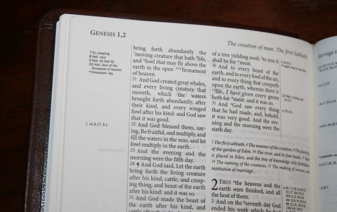
It includes the original translator’s footnotes and updated words in the margins. They’re keyed to the text with numbers. The footnotes include Hebrew and Greek words with explanations, alternate renderings, more literal translations, etc. These are helpful in understanding the text and shedding light on the translation choices.
Marginal Wordlist
TBS and Cambridge both place a glossary in the back of some of their key KJVs: Windsor, Pocket Reference, Concord, Standard Text, etc. Even popular Thompson Chain Reference KJV has a nice glossary. The glossary in those Bibles shows words that are no longer in use or have changed in meaning. They are great for making the old English clearer, but I don’t always know to look for a word (especially a word I already think I know the definition of).
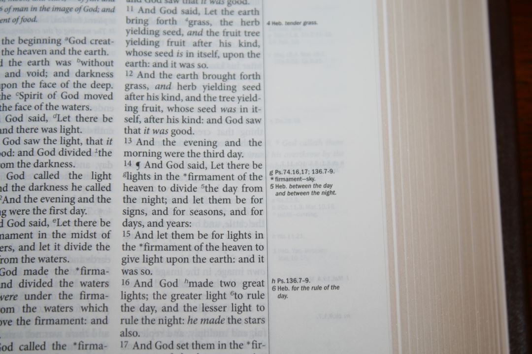
The Westminster handles the glossary differently. Rather than placing that glossary in the back, the updated words are placed in the margin on the page where the word appears. They are keyed to the text with an asterisk. The text places an asterisk next to a word and the margins show an asterisk, the original word, and a short definition.
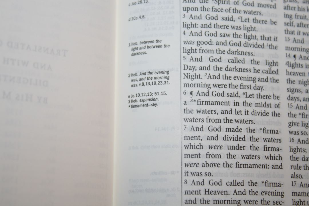
There are some words that I don’t really need the update for. For example, it has an asterisk for every time the word ‘ghost’ appears and has the word ‘spirit’ in the margin. This does get repetitive, but it doesn’t bother me. Just because I don’t need it doesn’t mean someone else doesn’t need it. I’d rather have it and not need it than need it and not have it.
It’s handy having the words in the margin. I find this more useful than having the glossary in the back because I don’t always know to look up a word. For example, I thought I knew the definition of describe and prevent. I heard a preacher preach that the Word of God was fast because of the word quick. He had a Thompson Chain Reference which does have the word quick in the glossary, but he didn’t know to look for it. He thought he knew what quick meant. The Westminster would have alerted him that the word doesn’t mean the same thing today than it meant in 1611 and his sermon would have been more accurate.
Tables of Weights and Measures
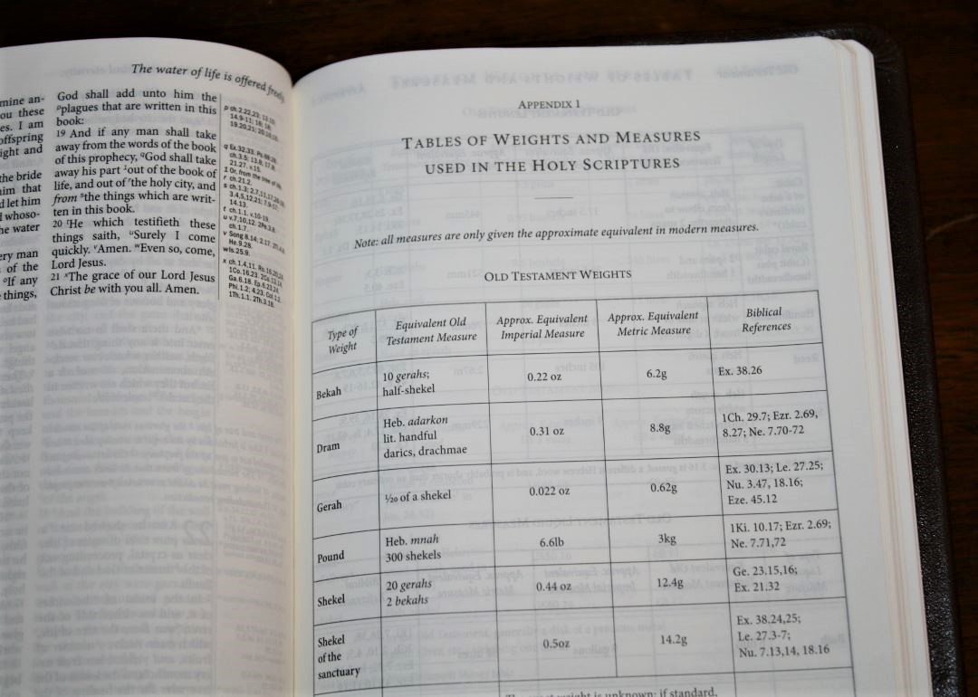
There are 5.5 pages of tables of weights and measures. They show the type of measure, equivalent OT measure, equivalent NT measure Hebrew and Greek words, approximate equivalent Imperial measure, approximate equivalent metric measure, biblical references, and time that’s covered. They’re quite extensive. A symbol in the text, along with a note in the margin, ties the text to these tables.
Tables include:
- Old Testament Weights
- Old Testament Lengths
- Old Testament Liquid Measures
- Old Testament Dry Measures
- Old Testament Money
- Old Testament Time
- New Testament Weights
- New Testament Lengths
- New Testament Liquid Measures
- New Testament Dry Measures
- New Testament Money
- New Testament Time
List of Words and Proper Names

Rather than placing pronunciation marks within the text, the Westminster places words and names in a 15-page list with full self-pronouncing marks. It divides the syllables and shows how to pronounce consonants, blends, and nouns. It includes every name and foreign word along with a chart to show how to read the symbols.
Reading Plan
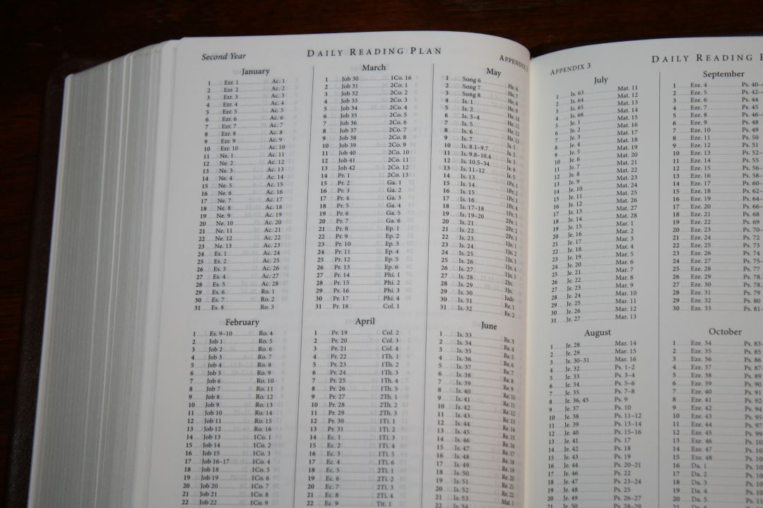
The reading plan is the M’Cheyne plan that takes you through the Old Testament once and the New Testament and Psalms twice. You can read it as a two-year plan or a one-year plan. It’s set up as a two-year reading plan with two readings per day: one from the Old Testament and one from the New Testament or Psalms. To use it as a one-year plan you’ll need to read 4 readings per day. The first year starts with Genesis and Matthew, while the second year starts with Ezra and Acts. If you use it as a one-year plan then all four readings will be from different places in the Bible. This is the plan we’ve used for the past two years and it works great for us.
Maps
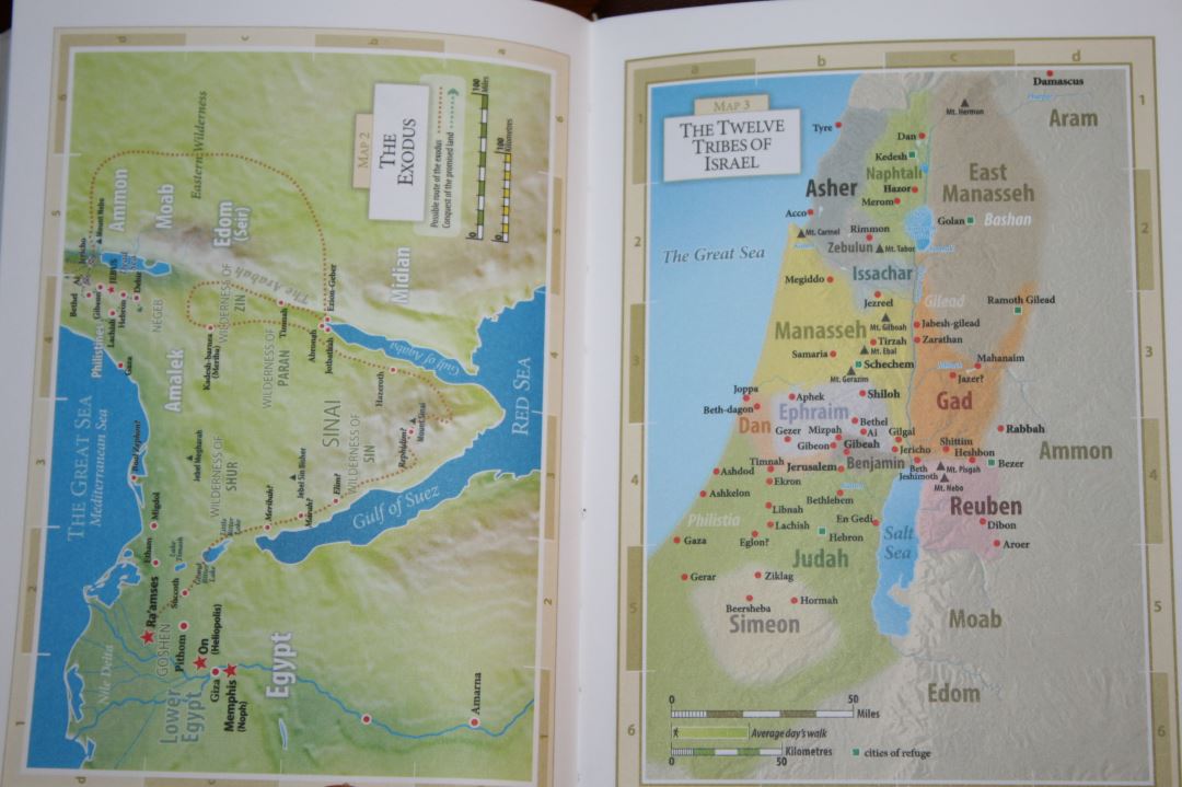
There are 8 colorful maps on thick non-glossy paper. It doesn’t have an index but the maps are annotated well and the names are printed fairly large. I did find map 8 to be difficult to read at the smaller scale when compared to the other seven. It has smaller labels that are printed lighter. Some of its names and routes are harder to see. The Exodus route is slightly different than from my regular Westminster. Where the original shows a possible Red Sea crossing, this one does not.
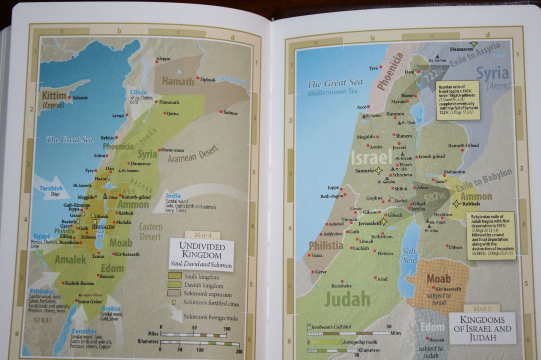
Maps include topography, distance, water, routes, capitals, borders, Scripture references, commodities, trade, subjection, royal residence, fortresses, events, dates, etc.
Maps include:
- Time of the Patriarchs
- The Exodus
- The Twelve Tribes of Israel
- Undivided Kingdom
- Kingdoms of Israel and Judah
- The Persian Empire
- Holy Land in the Time of Christ
- Paul’s Missionary Journeys
Commemorative Box

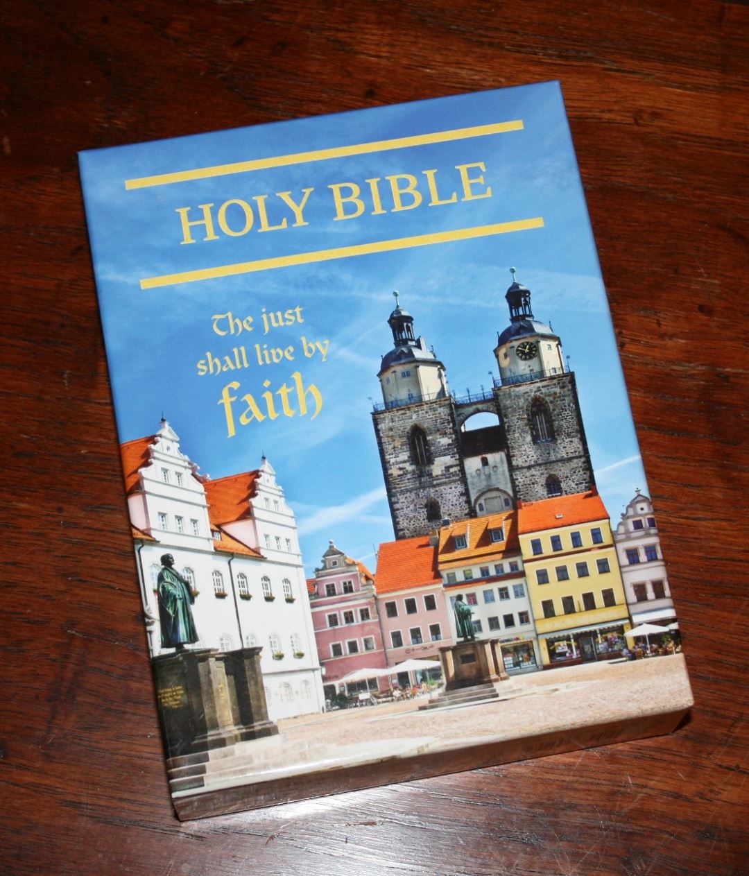
The box has a special design to commemorate the Reformation. The front of the box has a picture of Wittenberg Market Square, Phillip Melanchthon, Martin Luther, the town hall, and the Town and Parish Church of St. Mary’s. The back provides a short summary of what the Reformation is. The top of the box has Romans 1:16, 17. This is a clamshell box that’s great for storing the Bible.
Using the Compact Westminster

Here are some of the ways I’ve used the Compact Westminster and my thoughts on its performance for these uses.
Carry
First I have to say I know a lot of people want the Westminster in large print, but scaling it down to compact size was a brilliant move. The idea behind the compact edition was to provide missionaries (where ever they are in the world) with a complete reference edition that’s easy to carry and use.
The size of this Bible makes it a great choice for carry and reading on the go or while sitting in your favorite chair. I like to hold a Bible in one hand and tilt it toward me for reading and this one works perfectly. I also like to carry smaller Bibles everywhere I go for reading in the car or in a restaurant. I had no problems carrying the Compact Westminster everywhere I went. It always felt easy to handle and read from.
Reading
Even though it has a small text I find it to be highly readable. The color and opacity of the paper, the darkness of the typeface, the leading, and non-cramped text all help improve readability at this smaller scale. Having a verse-by-verse layout I wouldn’t call this a reading Bible. I find paragraph editions to be better for reading because it improves the flow of the text. This is still a good Bible for reading and it works well for my reading method which is to read large portions at a time to keep things in context.
Preaching
I find this one easier to preach and teach from than most compact Bibles. The dark font is easy to see and the extra space between the lines makes it easier to find my place. The reference and footnote keys are small enough that I don’t stumble over them when reading aloud. This makes it a great choice for traveling preachers.
Study
The 200,000 cross-references, updated words, footnotes, tables or weights and measures, and maps offer a lot of information for study. If you rely heavily on a concordance for your sermon, class, or study prep then you will notice that it’s missing in this Bible in order to reduce the size.
I used the cross-references to write my Christmas sermon.
Comparisons

Top to bottom: Compact Westminster, Personal Concord, Pitt Minion, Clarion, Brevier Clarendon, Handy Size Thompson, Westminster.
Thompson
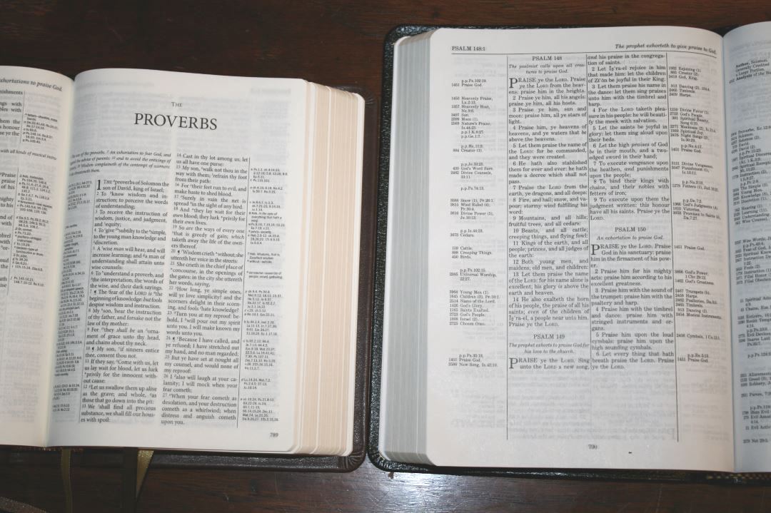
Of the smaller Bibles (under 8 point) that I’ve reviewed, I find this one to be the easiest to read. It has more space between the lines than the Pitt Minion and the paper is more opaque. It is smaller than the Handy Size Thompson Chain Reference but the paper makes up the difference. I prefer the smaller font on opaque paper with no glare to the larger font on paper with glare.
Pitt Minion
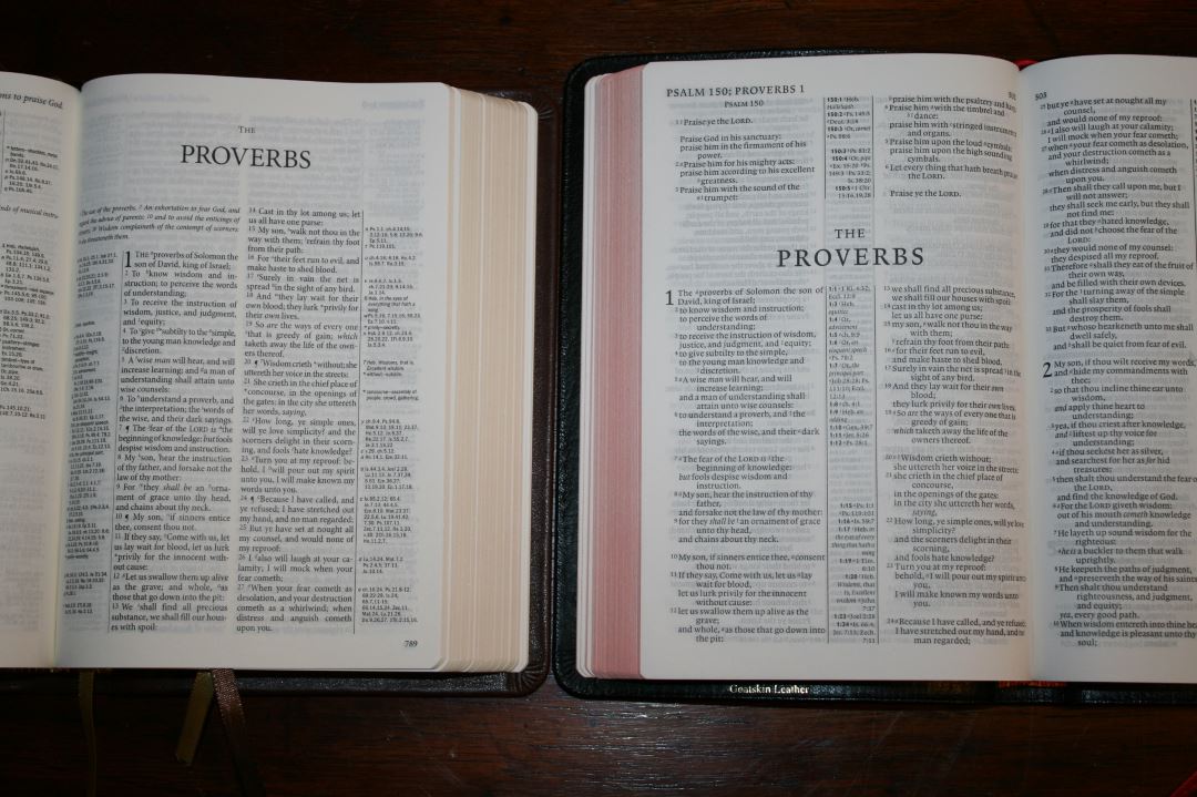
The PM and TCR of course still have their place because they’re great at what they do. Sometimes you want something in paragraph for reading or something thin to fit in your suit pocket. Other times you just have to read a list of all of the verses on healing.
Westminster
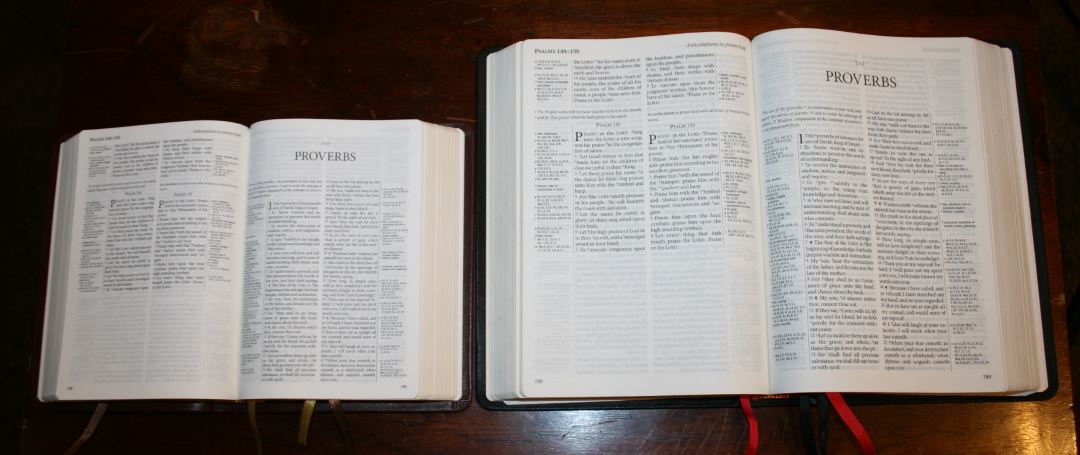
The regular and compact both make a great combo – one for reading and study at home and one for carry.
Conclusion
It’s no secret that I love the KJV. I especially like KJV’s that give you tools in understanding it for today’s readers. I also like to study from Bibles that give me the tools to do my own study and allow Scripture to interpret Scripture. I also love small Bibles that I can carry with me and still be able to read the text. The Compact Westminster excels on all accounts. It has an excellent list of tools, only minus a concordance, is easy to carry, and is made with quality materials.
I highly recommend the Compact Westminster to anyone looking for a quality edition reference KJV that’s both readable and usable.
_______________________________________
_______________________________________
TBS provided this Bible free for review. I was not required to give a positive review – only an honest review. My opinions are my own.






Hello Randy,
thank you for this review! I had never heard about KJV with “updated words”. As English is not my native language, I always put aside the KJV, because of the old forms and words. But I am still interested in having a KJV that would help me to read it. Would you say that the TBS Westminster with these updated words in the margin is the best one for people like me? Or do you have another bible to suggest, with more information about how to read old english? Thank you again!
Hi Sophie. Sorry for the late response. I think the Westminster is the best choice because it retains the KJV text and places updated words in the margins, and in the front is a section that covers words such as thee and thou.
Thank you for the reply! I have found the KJVER and your review as well. What are the differences? Is the TBS really better? Thanks again
The main difference is the Westminster is a reference edition with 200,000 cross references while the Sword Study Bible has topical chains. The Sword does have several chains and some articles in the back but it’s more limited and has theological bias. I like them both but overall I think the Westminster is better for study.
The Compact Westminster is on the way – a red hardback… Thanks again Randy for your advice, I really appreciate. With best wishes for Christmas…!
That’s great to hear Sophie! I know you’ll love it!
Hello Randy,
the TBS arrived today and you’re ABSOLUTELY right! I LOVE it!! How sad that I am a Roman Catholic… 😉 anyway, I will study the KJV (after my work on the ESV of course) and the TBS Compact will be very useful, as you said. And, oh my God, it is so beautiful, even in hardback and at such a low price! Thank you again for your advice.
I enjoy very much to read the Bible in different versions and traditions. Praise to the Lord for the richness of His Word!
Hi Sophie. I’m glad you like it! Thanks for sharing!
I have one TBS Bible, and it is pretty well made for the price. But it is more of a collection piece than something I use, because English is my third language. I can read modern translations, but the KJV really taxes my comprehension. As I am not a native English speaker, I have no real affinity for Shakespearian English.
I think the RSV is more elegant while keeping the archaic thee and thou for references to God. I hope that someone can print a modern Bible with the same quality and price as the TBS. I can even live with the WEB or another public domain translation.
Excellent review Randy. I got the full size version of his Bible for my son when he went to basic training for the Army. I think this is a good Bible for someone young due to the glossary being in the margins to help with difficult words. I had a Thomas Nelson Bible that did this and it helped teach me how to read the KJB when I was young. I currently use a Allan Ruby as my primary compact Bible. However this one may be even better as a compact Bible as its readability will probably be better than the Allan Ruby. I think I will get a copy. Just need to decide if I want to get the brown reformation version or the normal black version.
how would you compare this to the allan 5c? I’m looking for a compact that can also be a daily reader
Hi John. Sorry I didn’t get a chance to respond earlier. The 5c has a larger and darker font but it isn’t as sharp and the paper isn’t as opaque as the Compact Westminster. It’s a great choice if you want a larger font or a cyclopedic index rather than the 200,000 cross references. I’ll try to post some comparison photos soon.
Randy,
I am i the market for a new Bible and love Schuyler. I am looking for a KJV so the Canterbury looks great but I like the smaller Bibles. I spoke with a rep there on the phone and they said that a personal size Canterbury should be out by the end of the year. If you have heard anything about this it would be nice to know.
Anyway, this comment does actually mainly concern the Bible in this article! Lol I am looking for something to tide me over and this compact TBS looks like the perfect fit. But I am concerned about quality. I am a big bargain hunter, but also believe “you get what you pay for.” This would be a general use Bible. I would be carrying it almost anywhere and using it there too! How would this Bible hold up?
Will
Hi Will. I’ve been watching the scene for the personal size Canterbury. I can’t wait for that one. So far my Compact Westminster has held up really well. It isn’t a heavy Bible and it’s built with high quality materials. I think it would easily last as your all-purpose Bible for several years.
Randy,
You are the man! Thanks for the response. I have enjoyed reading your site! Your reviews are right up my alley. Thank you for what you do.
We’ll keep our fingers crossed (in a prayerful manner) about the Personal size Canterbury! And I’ll let you know how this purchase goes.
Will
Thanks Will 🙂 I look forward to hearing your thoughts on the Compact Westminster. It’s one of my favorites.
Randy,
I am digging this Bible! It is very multipurpose. I use it to read, study, listen to messages in church, and speak.
The paper and print is tremendous! The references are pretty nice too, though because I’ve used a Bible without them to study for so long I don’t really use them. But the print even on the size for the notes and references is very legible despite the small text.
Also, it is very readable! To the extent that when I am speaking, it is very easy to find my place in the text! I have other compact Bibles that the opposite is true, so this is a HUGE plus for me. The compact size is very good for the content that you get. I love compact Bibles especially because I don’t like a Bible that makes me look smaller than I already am when I am speaking. I can tell it isn’t a lifetime-type Bible, but it seems to be pretty durable. This is the first Bible I am making a strong effort to protect so we’ll see how it lasts.
On another note, I originally bought the version with the Metrical Psalms. I like reading them that way because of Hebrew parallelism, etc. You read them how they were meant to be read when they are printed that way. But I discovered that rather than replacing the text of the Psalms in the normal placement in the OT, they placed an additional metrical version of the Psalms at the back. I didn’t like this because it adds bulk to an already decently “chubby” Bible. And it would be awkward to turn to the back to read the Psalms for me. I wish they would have written a note about this online but I couldn’t find anything about it on Evangelical Bible’s site. I assume that they did this because they are there for reading in services more than personal study.
Anyway, I returned it for the version without the metrical Psalms.
TBS views themselves as a ministry, which I assume explains their pricing. Another plus was being able to support an organization that prioritizes making quality, very effective copies of the Word of God accessible to His people.
Overall, very pleased with this Bible at the price point at which you can find it right now.
Will
PS, any word on a personal size of the Canterbury? Saving my pennies.
Hi Will. I’m glad you like the Compact Westminster. I think it would be worthy of a rebind if the cover comes apart. I’m sure it will last a while though. It’s unfortunate the way the Metrical Psalms are placed in the back. Thanks for sharing that. I’d love to see poetry set a little differently (like the Super Giant Print Hendrickson).
The Personal Size Canterbury is currently slated for 2018.
Looking for a compact bible. what are your thoughts on this bible vs kjv clarion?
Hi Julie. I love both, but if I could only have one I’d take the Clarion. Here are my thoughts on both:
The Compact Westminster is better study because of the 200,000 cross references and I love the updated words in the margins. The typeface and paper are beautiful. The paper is better than the KJV Clarion’s paper and the overall size is a touch smaller. It doesn’t have a concordance. It also has a much smaller typeface and it can be difficult to read if your eyes are tired. The verse-by-verse format is great for study, but I don’t recommend it for reading.
The Clarion has a much larger font and I can read it even with tired eyes. The single column paragraph solves the broken sentence issues that are caused by verse-by-verse settings. Poetry in single column can’t be beat. The Clarion has a nice dictionary/concordance in the back for updated words. The Clarion is on the large side for a compact Bible, but I haven’t had any issues carrying it around. My main complaint is the thin paper tends to curl on the edges more than most Bibles.
Dear Sir, how would you compare the TBS Compact Westminster against the Cambridge Personal Concord? The thing is, I already have a text-only KJV and the highly acclaimed ESV Study Bible. I usually do my bible (desk) study reading my KJV with the ESV open alongside as an alternative translation to illuminate hard passages, secondly for its cross-references, and lastly to refer to its study notes only when I still find it difficult to grasp (and sometimes for historical context).
Now I wish to buy a reference KJV bible that is ideal for reading at the couch. Been looking at the TBS Westminsters (compact and regular) and the Cambridge Personal Concord.
Your images are broken on this review.
Thanks. They were deleted when our site grew too large for the server. We’re still working on adding them back.
I’ve added them back in. Thanks for mentioning it!