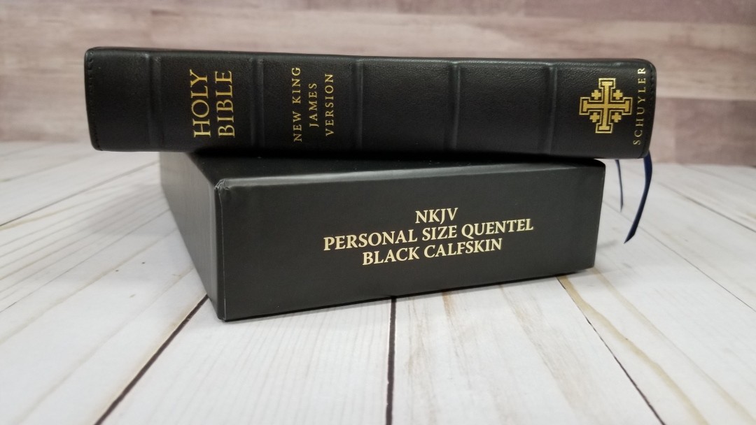
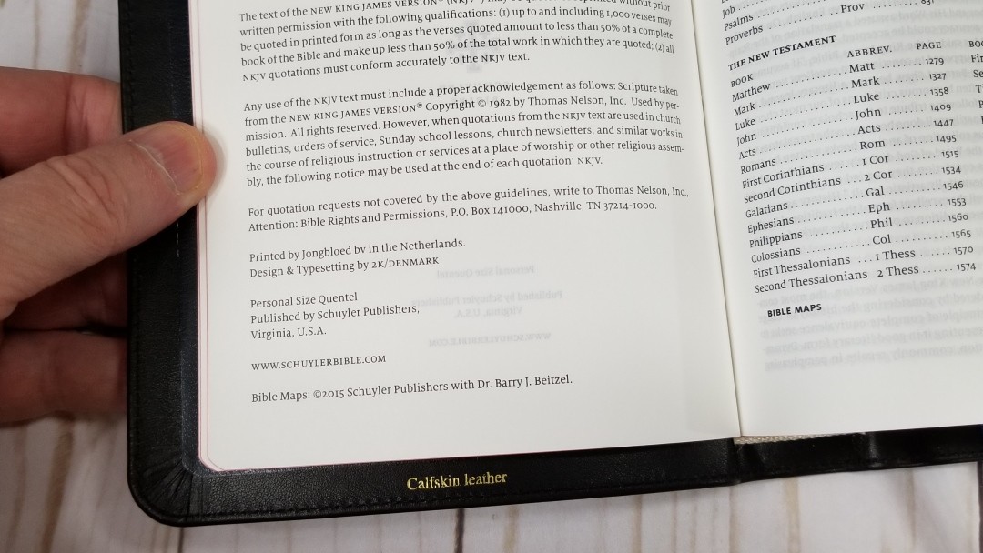
The Schuyler NKJV Personal Size Quentel is a reduced version of their regular size Quentel. It has the same pagination, thinner paper, and pages for notes. Like the other personal size Quentels, it doesn’t have a concordance. It’s available in both goatskin and calfskin in several colors. I’m reviewing the black calfskin edition. It was made in the Netherlands by Jongbloed and typeset by 2K/Denmark.
This Bible was purchased for review.
________________________________________________
Click here to buy from EvangelicalBible
________________________________________________
Table of Contents
Video Review
Cover and Binding
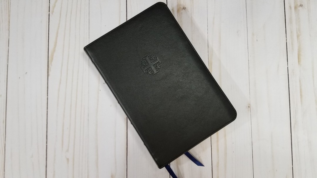
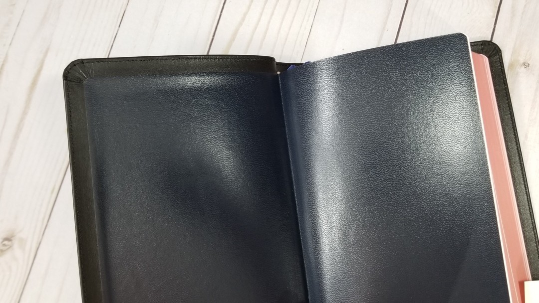
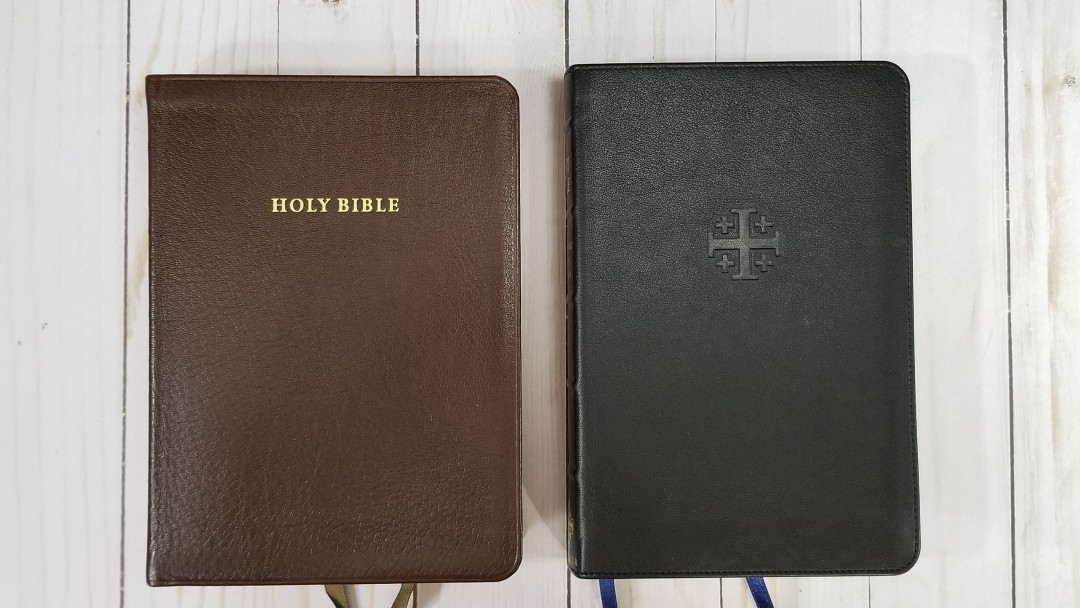
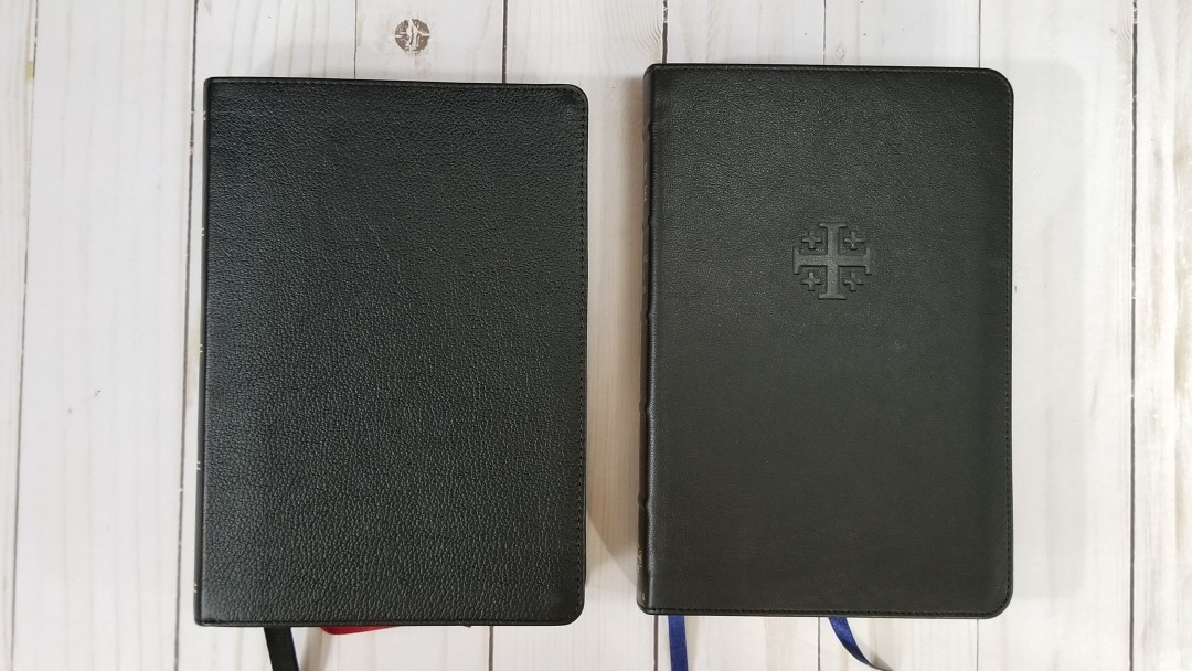
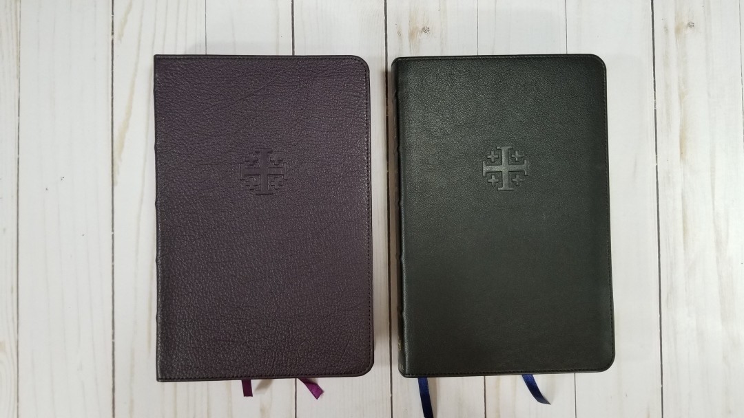
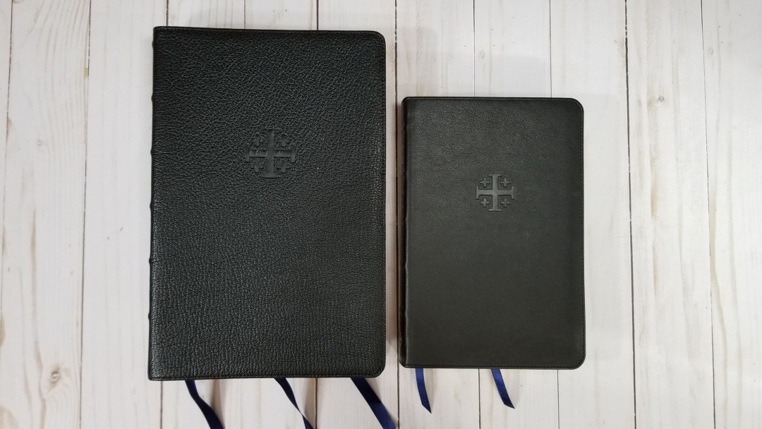
The cover is black calfskin with a dark blue vinyl paste-down liner. The calfskin is smoother than the ESV and NASB. It’s more similar to the KJV Personal Size Canterbury. It’s still soft even though it’s smooth.
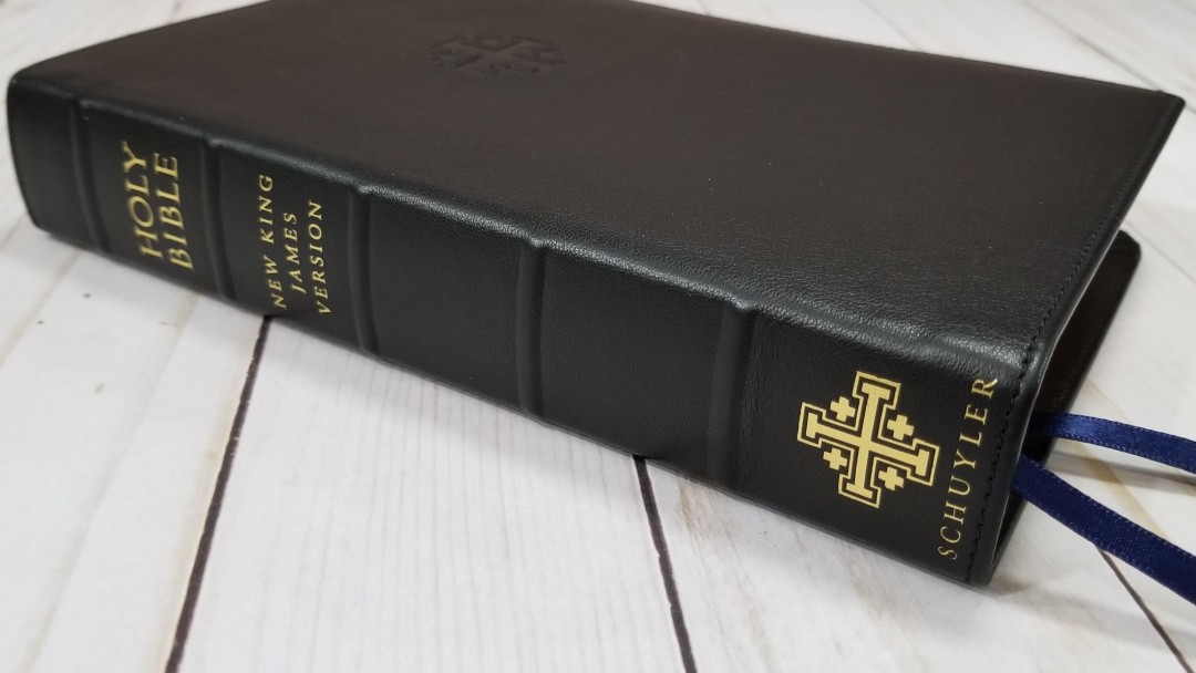
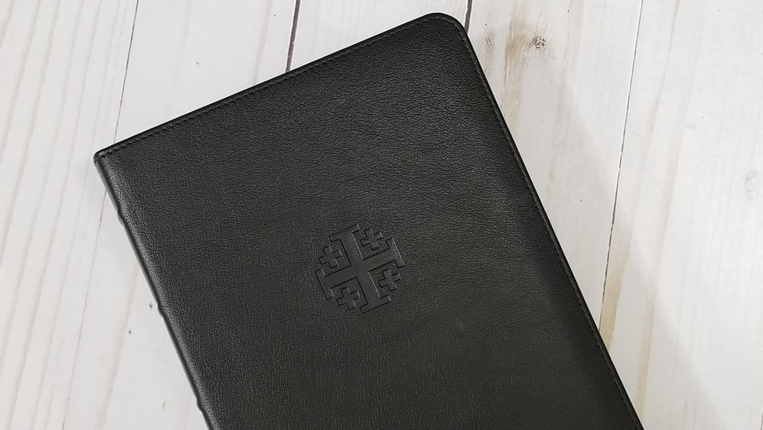
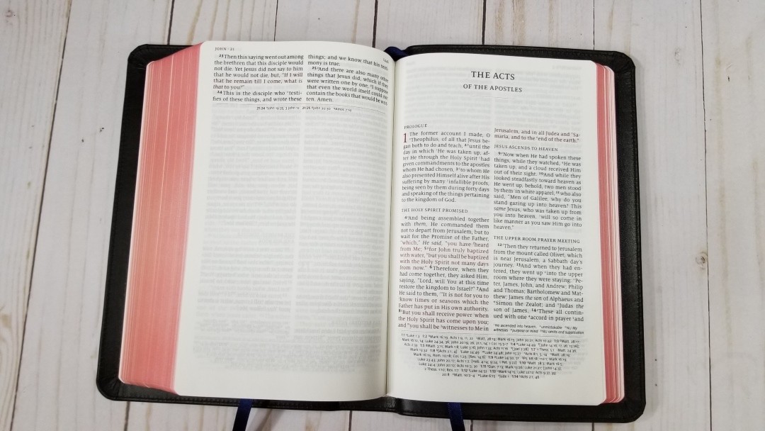
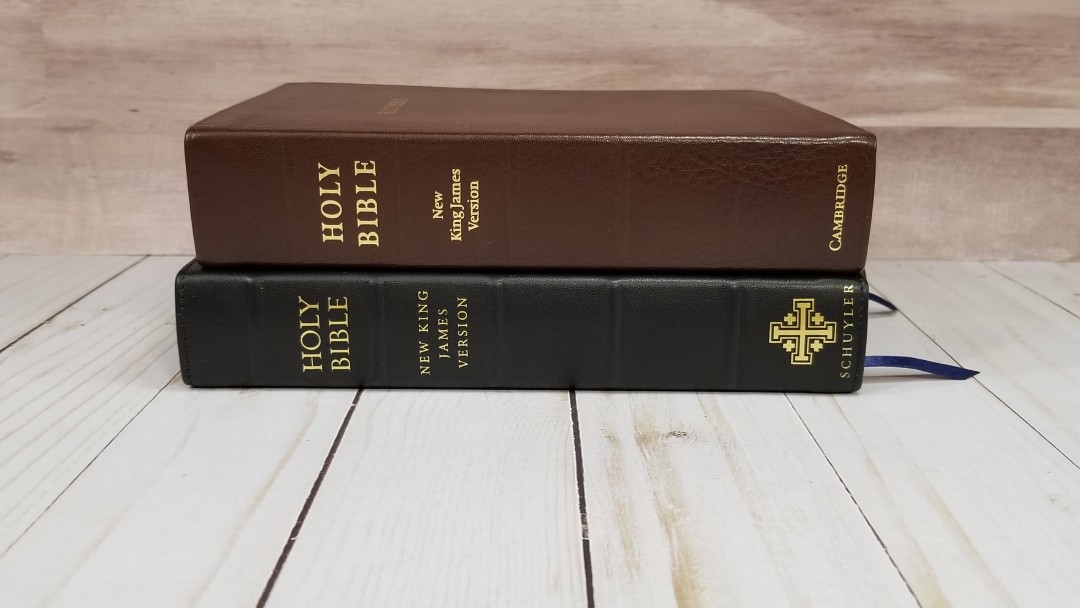
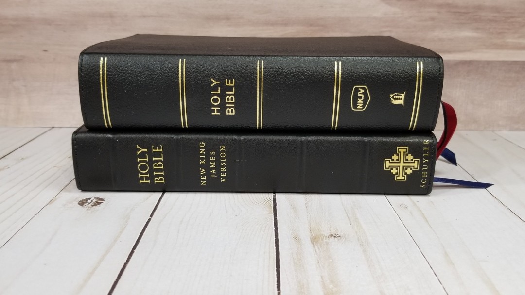
It’s stitched around the perimeter. The front has the Jerusalem cross is debossed. On the spine are 5 raised ridges that separate the various sections. It has Holy Bible, New King James Version, the Jerusalem Cross, and Schuyler printed in gold. It has a 9mm yapp (overhang), which is larger than my other PSQs and the PSC.

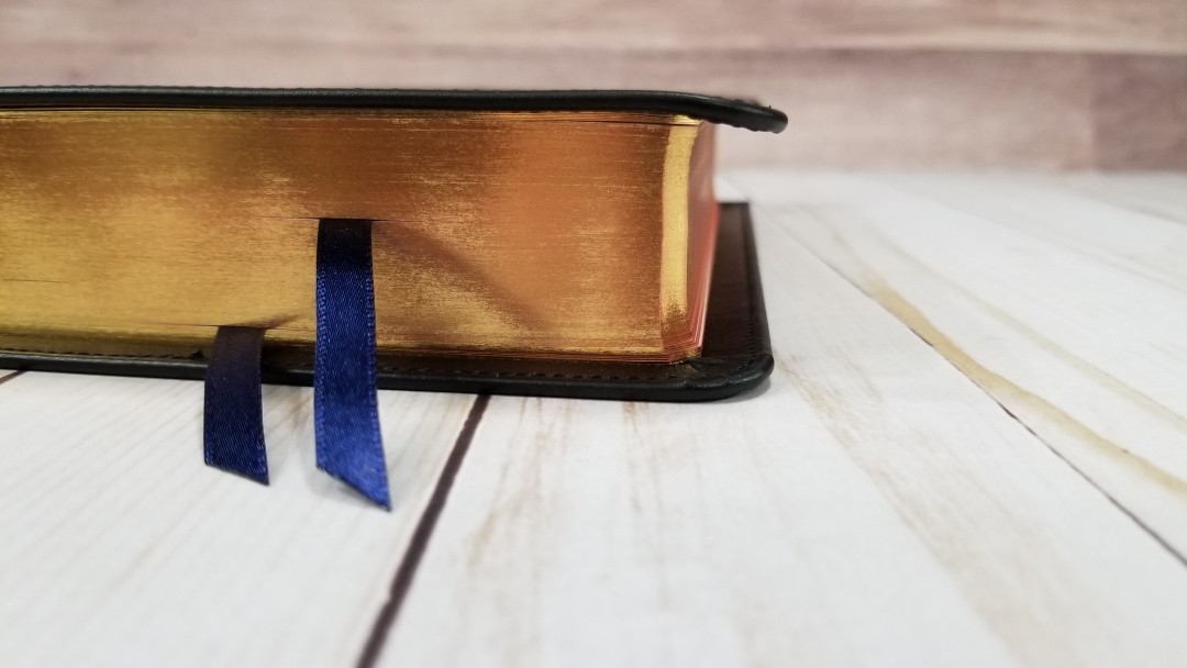
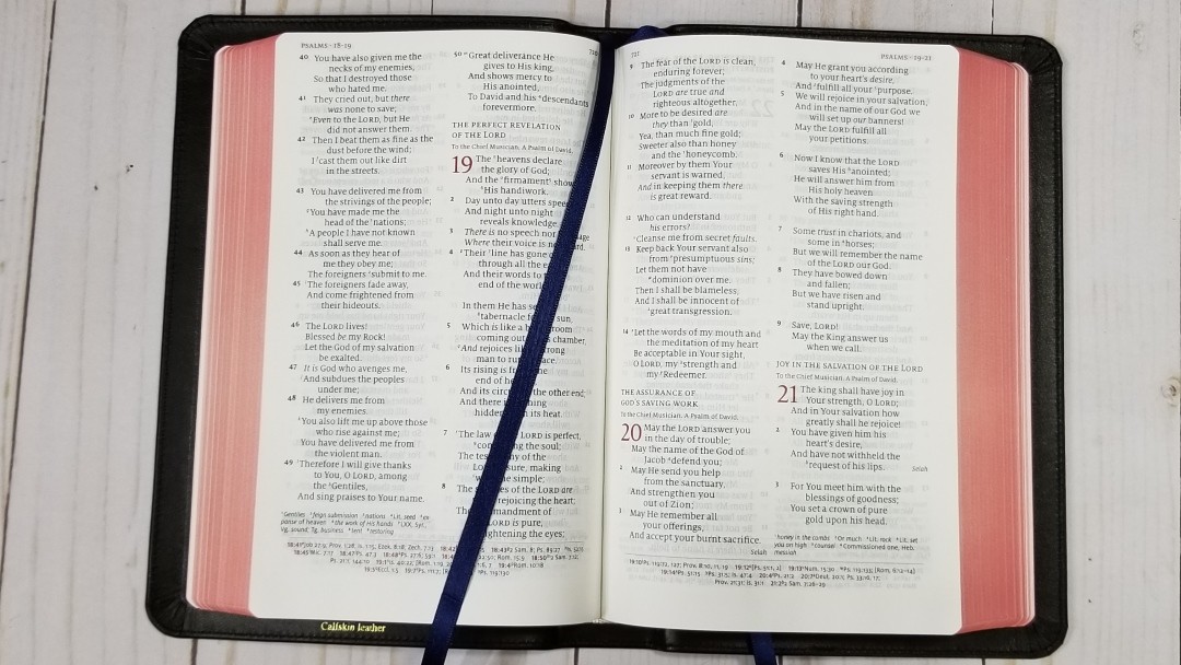
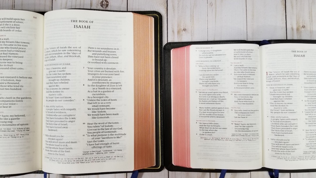
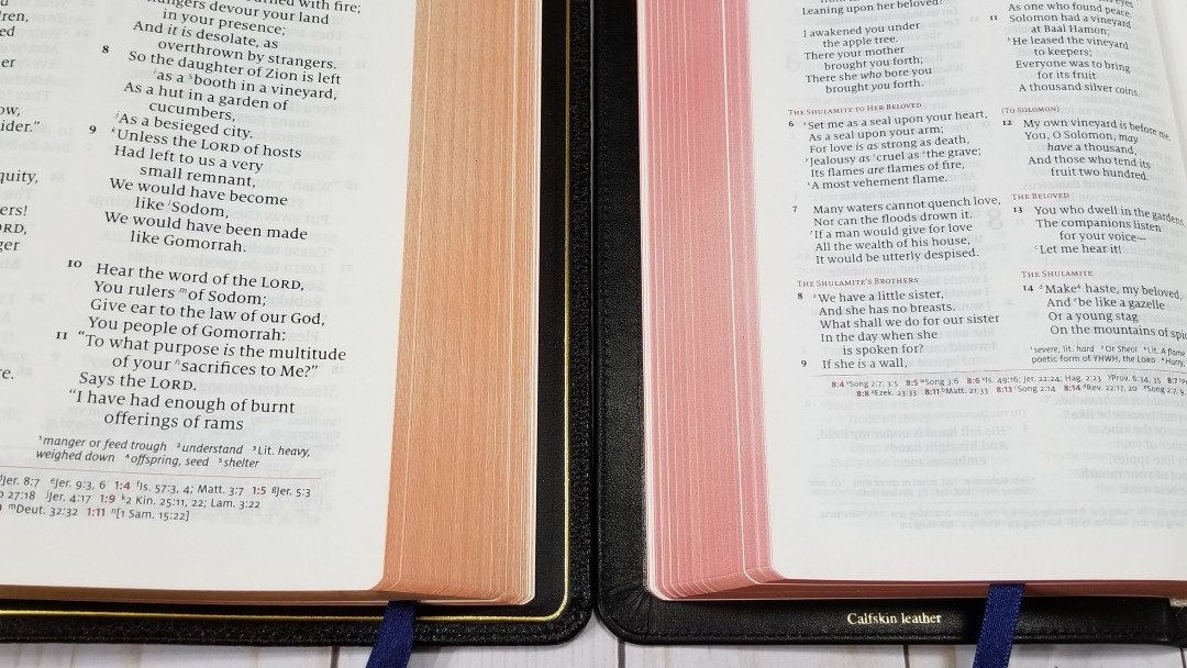
The text-block is Smyth-sewn and stays open anywhere I want it to. It includes white head and tail bands, two 5mm black ribbons, and red art-gilt edges.
The text block size is 7 x 4.7 x 1.1″. The overall size is 7.8 x 5.18 x 1.3″. It weighs 1 lb 6.5 oz. This size is excellent for carry and for holding in one hand to read.
Paper
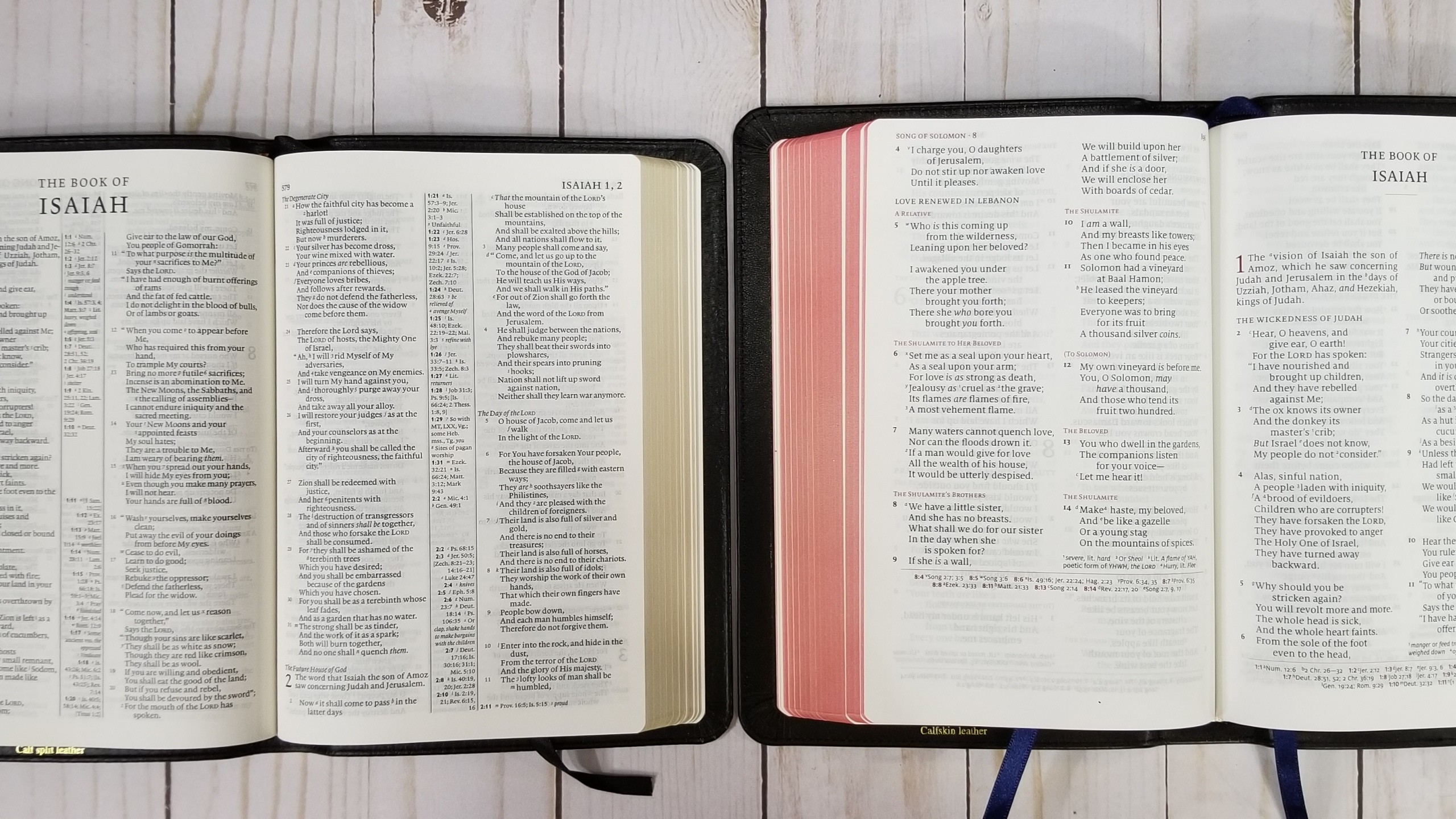
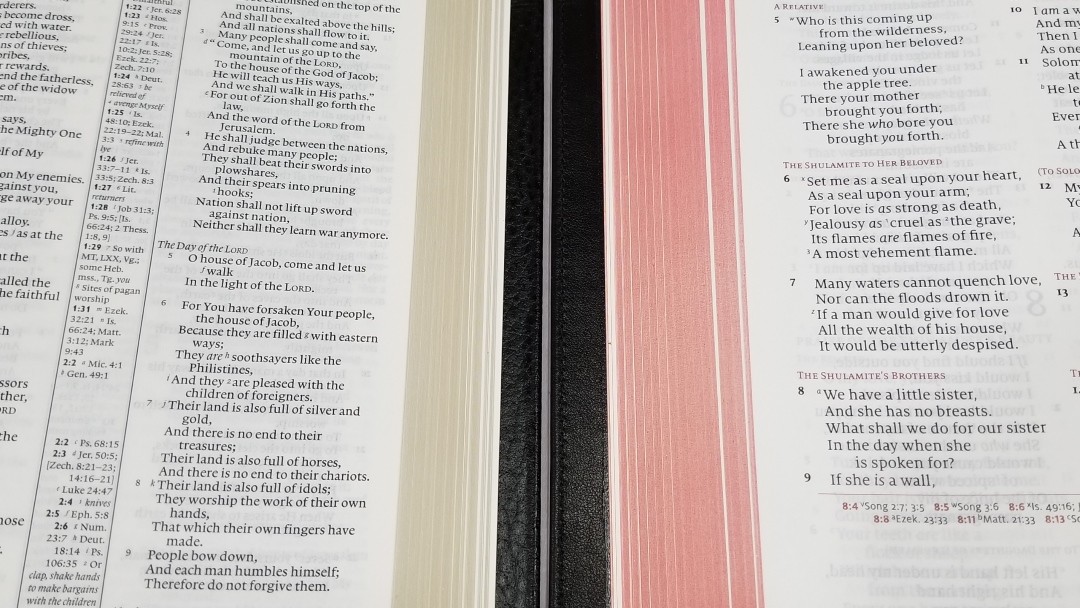
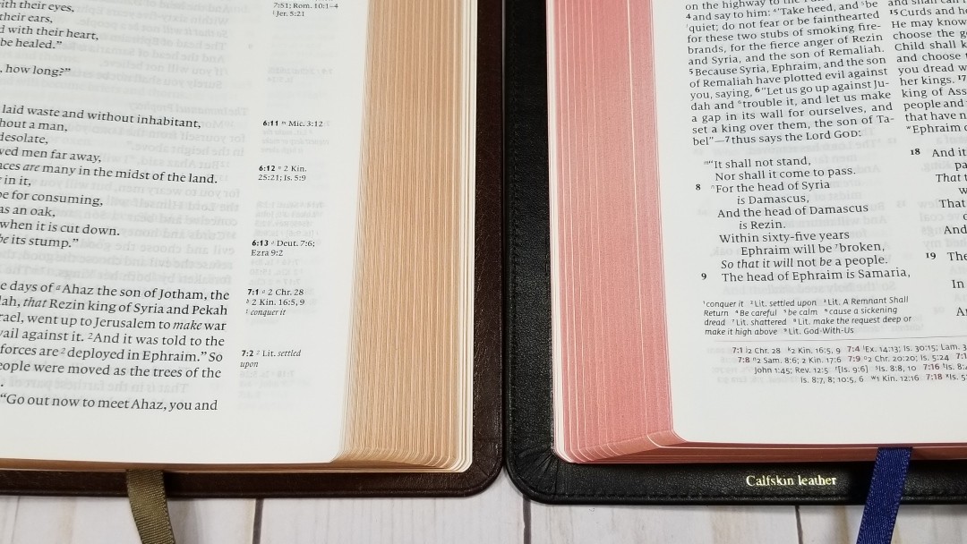
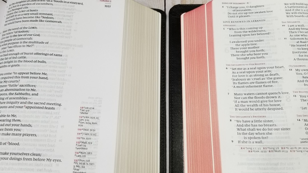
The paper is 28gsm Indopaque, but it feels thicker than that to my fingers. It’s extremely opaque for how thin it is. It’s white in color and feels like it’s coated. I found the pages easy to turn and a joy to read from.
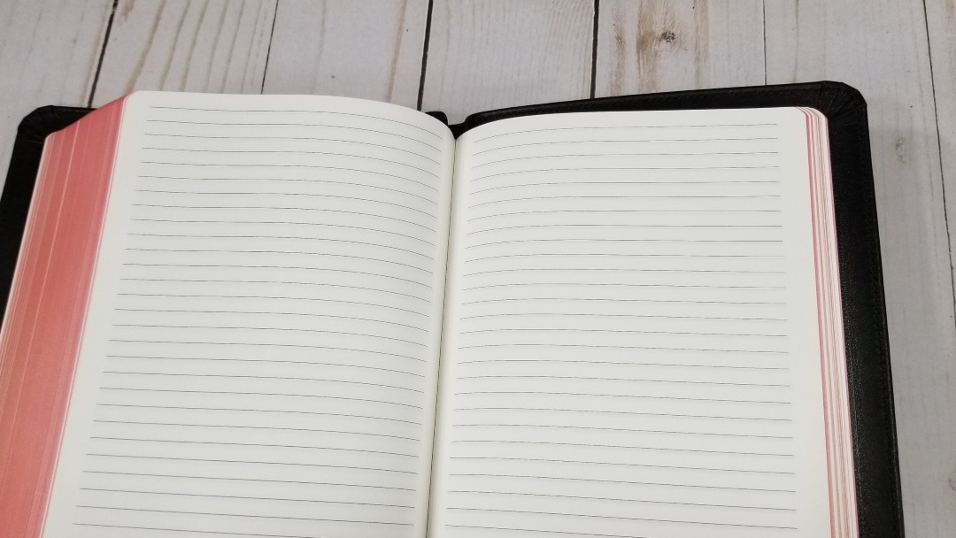
In the back are 26 lined pages in the back for notes. This is great for using the PSQ to teach from on the go. The red under gold art-gilt edges are nice and dark.
Typography
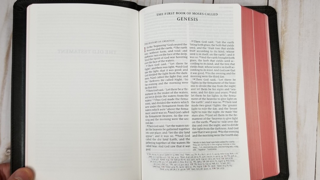
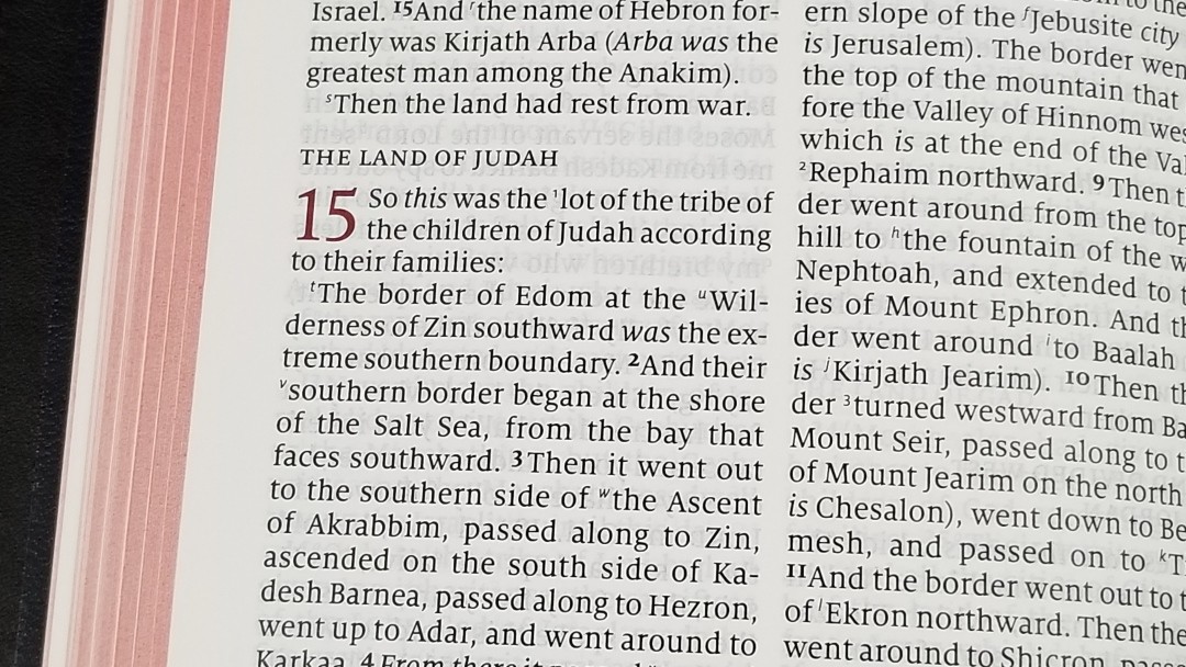
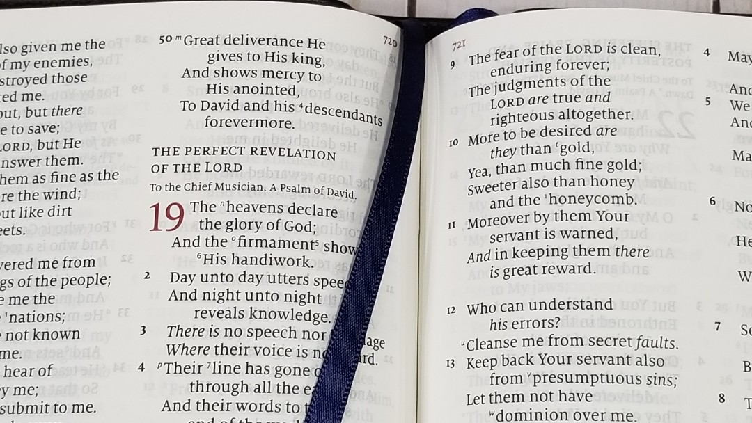
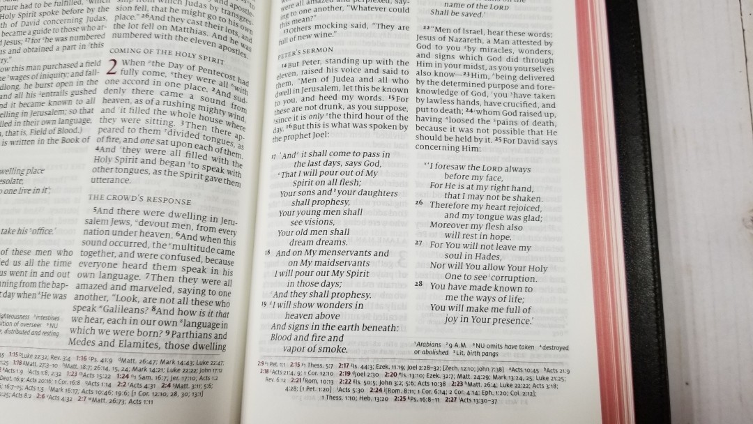
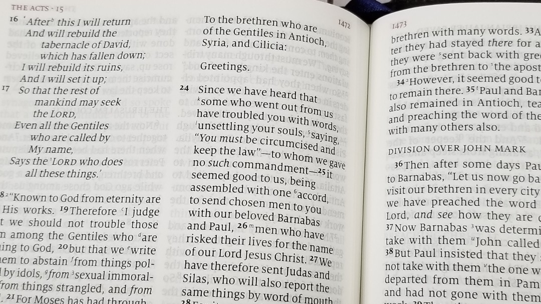
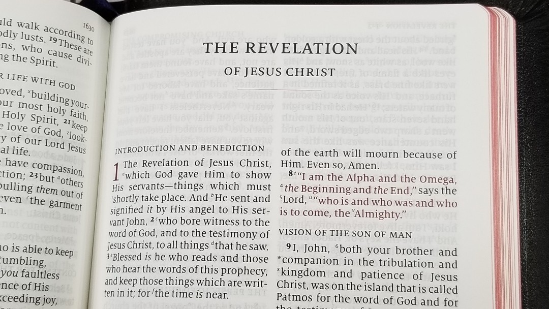
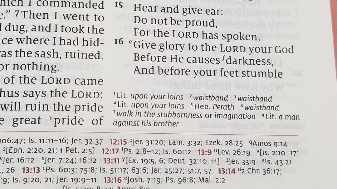
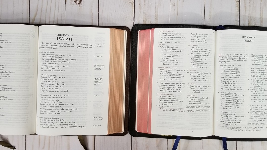
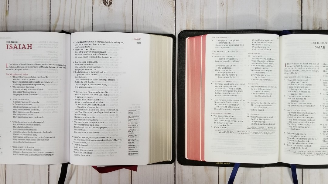
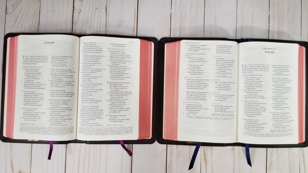
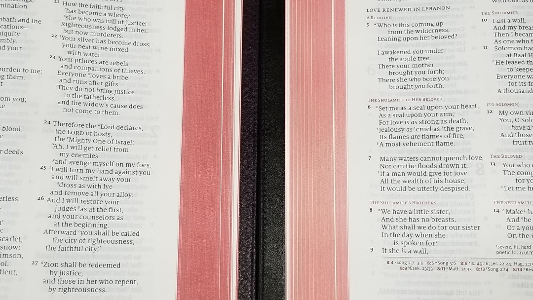
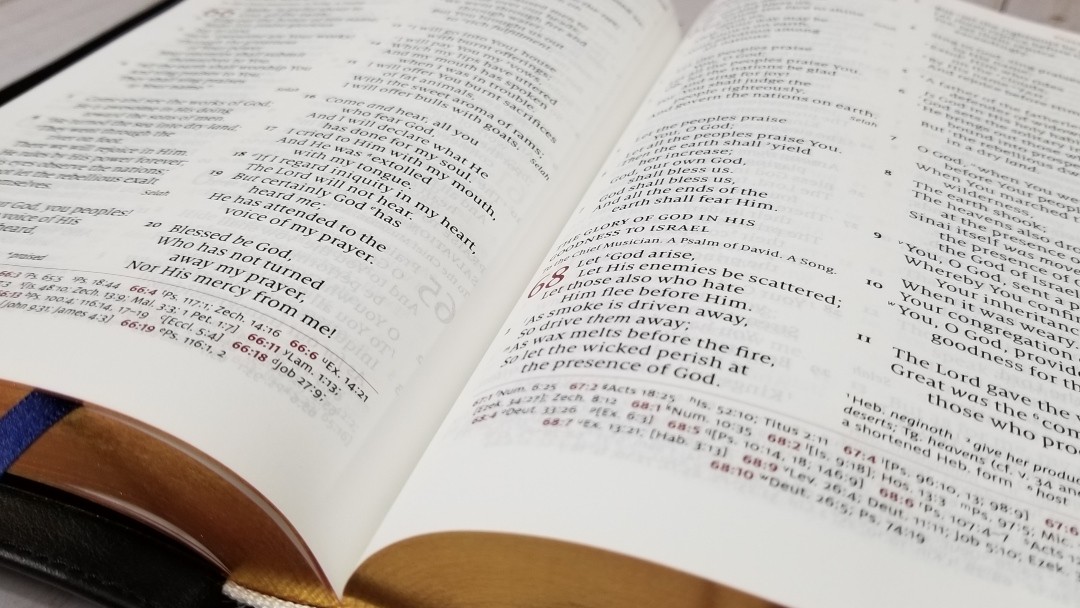
The text is in double-column, paragraph format with poetry is set to stanzas and letter indented. The header shows the book names and chapter numbers and the page number. Translation notes under the last verse in the inner or outer column, and references across the footer. The header text, chapter numbers, and chapter and verse numbers for the references are printed in red. References are separate from the text by a red line.
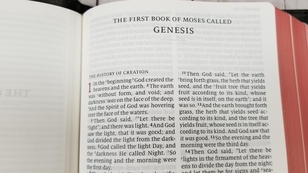
The text is a red-letter 8.5-point Milo serif font. Both the black and the red about medium to dark and they’re highly consistent throughout. The text is printed with line-matching, so the lines on the front and back of the page line up to make the text easier to read. It has around 35 characters with around 7 words per line. The spacing between the words looks natural and it has enough inner margin to keep the text out of the gutter.
The text includes letters and numbers for references and footnotes keys. The keys are small enough to ignore and large enough to use. Verse numbers are larger than the cross-reference and footnote keys and are much darker. They’re easy to ignore for reading and easy to find when searching for verses.
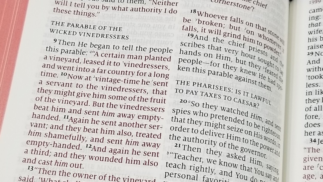
Chapter numbers are in a red drop-cap that makes the chapters stand out. Section headings are in all caps. They stand out from the text but I also find them easy to ignore for reading.
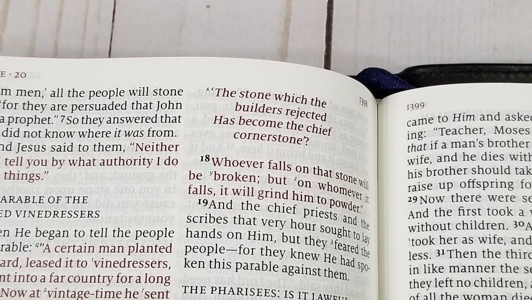
This setting follows the older NKJV design with oblique type for Old Testament quotes. I like this as they’re easy to spot. Oblique type can look too similar to italics though.
Poetry looks amazing in this setting, which is impressive considering how difficult it is to get poetry to look right in double column layouts. Of course, it’s a 2K/Denmark design, and this is something they excel at. The lines are more similar to musical lines and have a poetic feel.
The only that stands out as odd is the text isn’t vertically centered in the page. It has almost no margin at the top and a lot of space at the bottom. It’s consistent all the way through. I did speak with Schuyler Bibles about this and it’s the way the NKJV was printed.
References

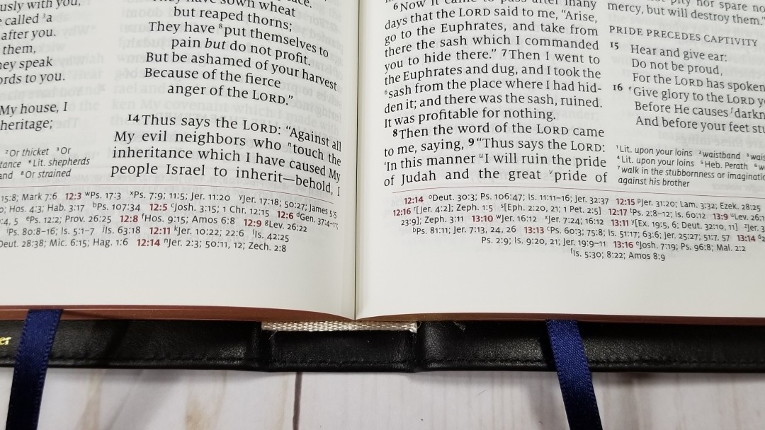
It includes the standard 60,000 NKJV cross-references. They’re printed in the standard Quentel tapered design so the lines get shorter as they get closer to the bottom of the page. This helps ground the page. The chapter and verse numbers printed in red so they’re easy to find.
Here are some examples to help you compare:
- Genesis 1:1 – Ps 102:25; Is 40:21; Jn 1:1-3; Heb 1:10; Gen 2:4; Ps 8:3; 89:11; 90:2; Is 44:24; Acts 17:24; Rom 1:20; Heb 1:2; 11:3; Rev 4:11
- Deuteronomy 6:4 – Deut 4:35; Mark 12:29; John 17:3; 1 Cor 8:4, 6
- Isaiah 9:6 – Isa 7:14; Luke 2:11; John 1:45; Luke 2:7; John 3:16; 1 John 4:9; Matt 28:18; 1 Cor 15:25; Rev 12:5; Judg 13:18; Titus 2:13; Eph 2:14
- Matthew 17:20 – Mat 21:21, Mk 11:23, Lk 17:6, 1 Cor 12:9
- Mark 11:23 – Matt 17:20; 21:21; Luke 17:6
- Mark 12:29 – Deut 6:4, 5; Is 44:8; 45:22; 46:9; 1 Cor 8:6
- John 1:1 – Gen 1:1; Col 1:17; 1 John 1:1; John 1:14; Rev 19:13; John 17:5; 1 John 1:2; 5:20
- John 2:19 – Mat 26:61, 27:40, Mk 14:58, 15:29, Lk 24:46, Acts 6:14, 10:40, 1 Cor 15:4
- Acts 2:38 – Luke 24:47
- 1 John 1:1 – John 1:1; 1 John 2:13, 14; Luke 1:2; John 1:14; 2 Pet 1:16; Luke 24:39; John 2:27; John 1:1, 4, 14
Footnotes
It includes the standard NKJV footnotes. I’m glad they’re included as the NKJV has some of the best footnotes. They provide detailed information about manuscript variances from the Nestle-Aland / United Bible Societies, Majority Text, Septuagint, Targum, Vulgate, and Syriac. They also have the literal renderings from Hebrew and Greek. There may be others, but these are the most prominent. I’ve always found the NKJV footnotes to be interesting and helpful for study. I like that they show the actual manuscript name and you can decide for yourself if they’re the best or not.
Maps
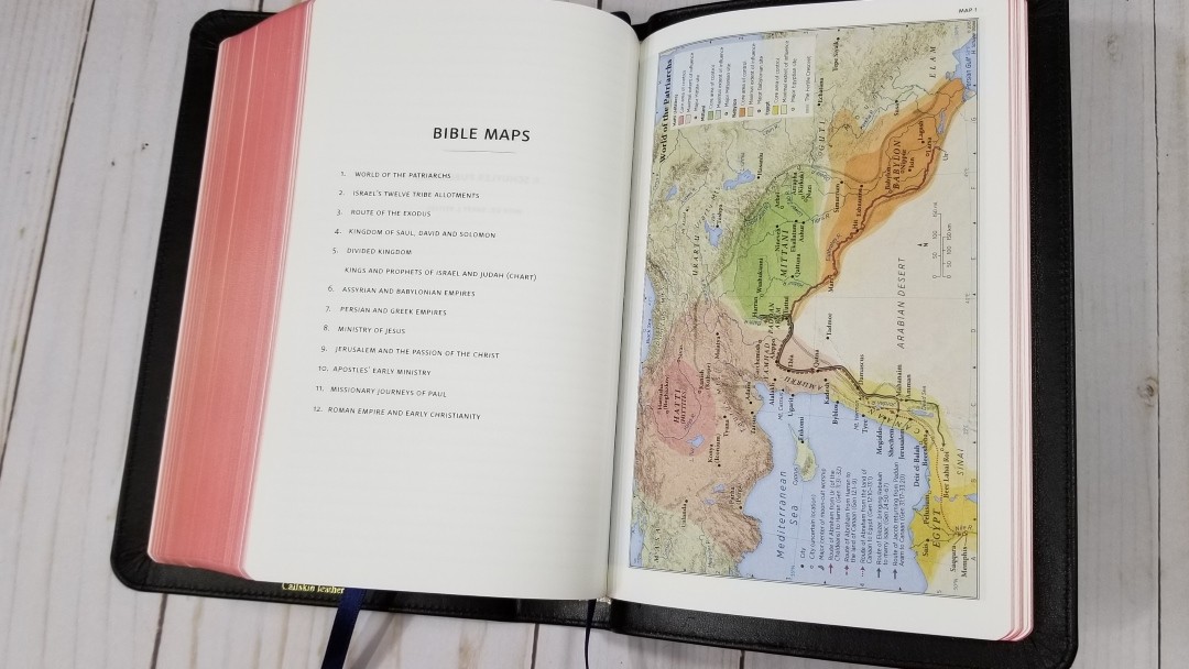
It includes the Schuyler maps designed by Dr. Barry J. Beitzel. They’re printed on thick, non-glossy, paper. They’re printed in earth-tones, which are my personal favorite colors for maps.


They include cities, routes, distance, topography, areas of control (color-coded), capitals, cities of refuge, inheritance, battle sites, Scripture references, travels of Israel, kingdom territories, sites of royal inscriptions, dates, locations of events, locations where Paul wrote letters, lighthouse site, and more. It doesn’t include a map index. I suspect the font was too small to reduce.
Maps include:
- World of the Patriarchs
- Israel’s Twelve Tribe Allotments
- Route of the Exodus
- Kingdom of Saul, David and Solomon
- Divided Kingdom
- Kings and Prophets of Israel and Judah (Chart)
- Assyrian and Babylonian Empires
- Persian and Greek Empires
- Ministry of Jesus
- Jerusalem and the Passion of the Christ
- Apostles’ Early Ministry
- Missionary Journeys of Paul
- Roman Empire and Early Christianity
Comparisons
Here’s how the NKJV Personal Size Quentel compares with the NKJV Pitt Minion, NKJV Cambridge Clarion, Thomas Nelson Compact Single Column NKJV, Schuyler ESV Personal Size Quentel, and the Schuyler NKJV Quentel.
NKJV Pitt Minion


The Pitt Minion has a similar footprint as the Personal Size Quentel, but it’s a lot thinner and has a smaller font (6.75 vs 8.5). It includes a concordance, so it might be better suited for deeper study or sermon prep. I love the Pitt Minion, but I find it more difficult to read. The poetic setting isn’t designed as well as the Quentel. The PM is easier to carry, but the PSQ isn’t difficult to carry.
NKJV Cambridge Clarion
The Clarion also has a similar footprint as the PSQ, but it’s thicker. It has a slightly larger font (8.75 vs 8.5) because of the single-column layout. I find the PSQ easier to handle, but I love the single column layout of the Clarion. It places the references near their verses. I prefer the overall size of the PSQ to the thickness and footprint ratio of the Clarion.
Thomas Nelson Compact Single Column
The Compact Single Column is similar in its footprint, but it’s thicker due to the single column layout and its thicker paper. It’s font is slighly smaller but it’s also darker.
Schuyler ESV Personal Size Quentel

The ESV PSQ has the same design, but its calfskin leather has a more pronounced grain. I like both, but I’m more drawn to the ESV’s grain. I personally won’t base a purchase decision on it.
Schuyler NKJV Quentel
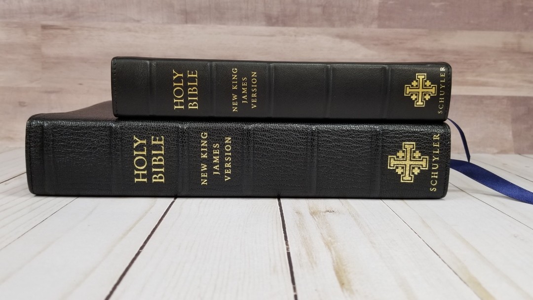
The pagination between the regular size Quentel and the PSQ is the same. The regular size has thicker paper (36gsm vs 28gsm), a larger font (11 vs 8.5), a concordance, map index, no paper for notes, and three ribbons. The two make a great combo. The opacity is about the same.
Conclusion
The Personal Size Quentel is one of my favorite series of Bibles. I love the design, paper, print, and overall size. The double-column design looks great when reduced to personal size. It’s great for reading and the 60,000 references stay out of the way when you don’t need them and they’re easy to use when you do need them. It doesn’t include a concordance or map index, but the 26 ruled pages will be great for notes.
I love that it matches the regular edition, which creates an amazing combo. The is a great size for carry and I find the 8.5 font a joy to read. I’ve preached from it several times with no trouble. It’s a great choice for evangelists and missionaries (unless you need a concordance or larger print).
It’s easy to recommend to anyone wanting a hand-sized NKJV that’s designed and built well, and is great for carry, reading, Bible study, teaching, and preaching. The NKJV Personal Size Quentel is one of my favorite NKJV’s. And, since the NKJV is one of my favorite translations and there have been a lot of amazing editions released lately, that’s saying a lot.
________________________________________________
Click here to buy from EvangelicalBible
________________________________________________
This Bible was purchased for this review.
Do you have a Schuyler NKJV Personal Size Quentel? Let us know what you think about it in the comments below.


Just made a personal transaction for one. Imperial Blue goatskin for 120.00. Can’t wait to get it!
Thanks for the review
That’s great John! Please let us know how you like it.
I assume the calfskin editions are no longer in print? If not, will they be reprinting them? Thank you for your review!
Hi Aaron. The only one they currently have available in blue: https://evangelicalbible.com/product/schuyler-quentel-personal-size-nkjv-navy-blue-calfskin-preorder-copy/. They haven’t released any info of upcoming cover options.
Do you think they’ll eventually move the text down from the top of the page? I am deciding between this and the Cambridge Clarion NKJV. This is my first premium bible purchase. The only issue I have with the Clarion is how far the text goes into the gutter. (Oh and my pages are curling :/) I like the thinner PSQ but not a fan of how far up the text is on the pages. I haven’t decided if double column or single column is that big a deal to me. Thanks for your review.
Hi Debra. I don’t know of any plans to change it. I don’t notice it that much now that I’ve used it for a while.
It seems as though these are impossible to find. Wish I could get my hands on one.
Thanks for the detailed review! : )