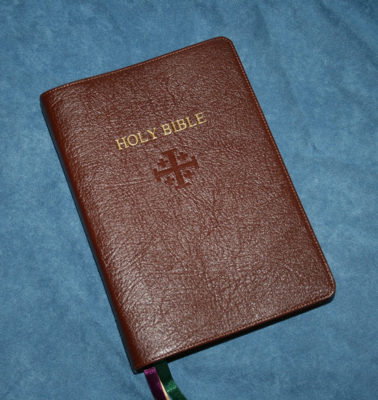
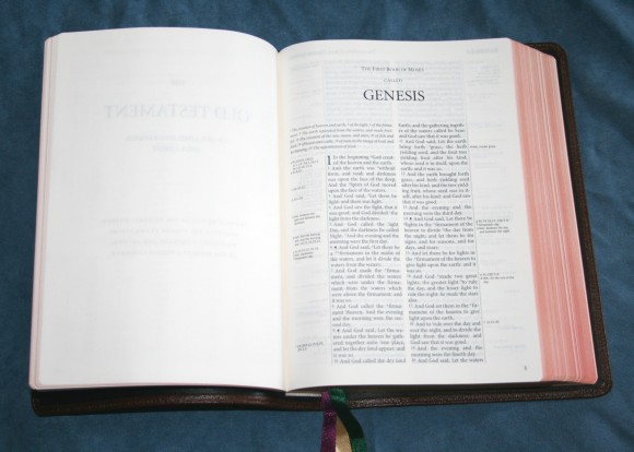
The Schuyler KJV Reference Bible is their edition of one of my favorite KJV’s ever published – the TBS Westminster. Schuyler has produced the Westminster with all the bells and whistles you would expect in a premium edition – goatskin leather, edge-lined, stitched, art-gilt edges, and 4 thick ribbons. This Bible is a winner in every category.
Pros
- Soft leather cover
- Leather lined
- 4 ribbons
- Printed and bound by Jongbleod
Cons
- Leather tends to be noisy when moving
- Paper has more show-through than I like
Features
- KJV
- Goatskin leather (available in 4 colors)
- Edge-lined
- Perimeter stitched
- Leather lined
- 4 ribbons
- Art gilt edges
- 9.6 digital font
- Black letter
- 32 gsm paper
- Verse-by-verse format
- 200,000 cross references
- Translation notes
- Archaic words defined in the margin
- Translators to the Reader
- Epistle Dedicatory
- Pronunciation guide
- 139 page concordance
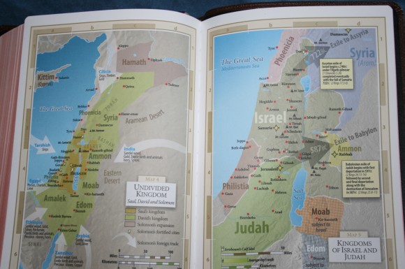
- 8 Maps
- 2 year reading plan
- 32 pages for notes
- 1728 pages
- Printed and bound by Jongbloed
- 9 x 6.8 x 1.5
Where to buy: EvangelicalBible.com – Schuyler KJV Reference Bible
Cover and Binding
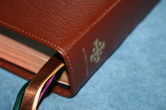
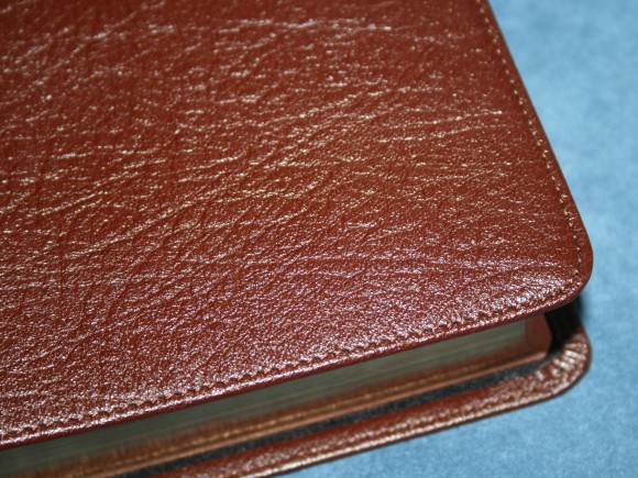
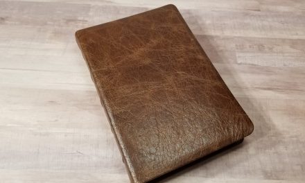
The edition I’m reviewing is the Mahogany Antique Cantara and it’s easily one of the prettiest covers I’ve ever seen on a Bible. I love the textured grain. It is very soft and the grain is pronounced. The cover bends over your hand while holding it. It can be a little difficult to hold open with just one hand, but that’s normal for limp covers. My only complaint with the cover is that it tends to make the leather cracking sounds when moving. I actually like that sound myself, but when I’m in a quiet room it tends to be noticed by everyone. I think that sound will go away with use.
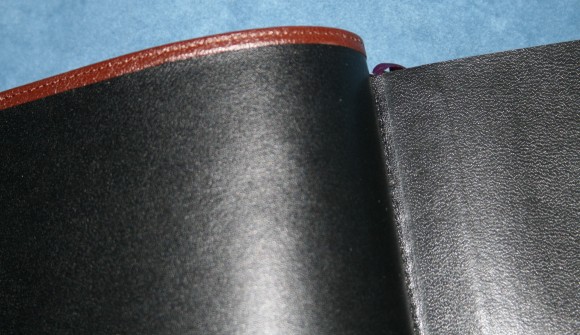
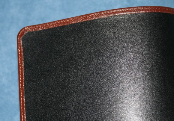
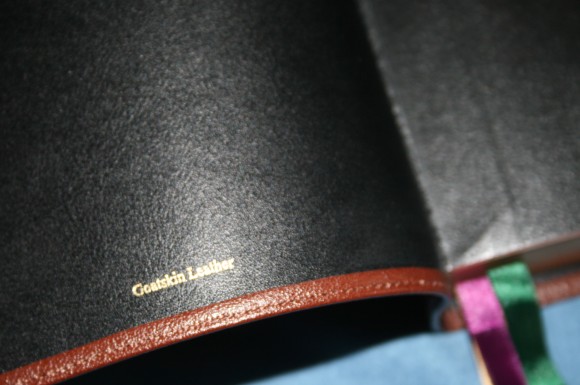
The inside liner is leather. It is edge-lined and perimeter-stitched for the highest quality binding possible. The liner is black, which doesn’t look as nice as it could have if it matched the cover. I would also like to see a decorative trim, like a gold line, around stitching of the liner. This would give it some finishing touches like the Longprimer. But that’s just me being picky.
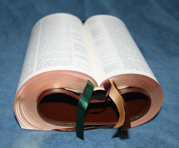
The binding is sewn, so it has no trouble lying flat. There is an overcast line of stitching in the front and the back.
Paper and Print
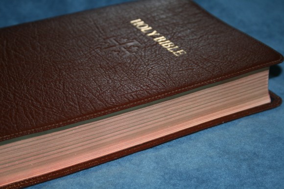
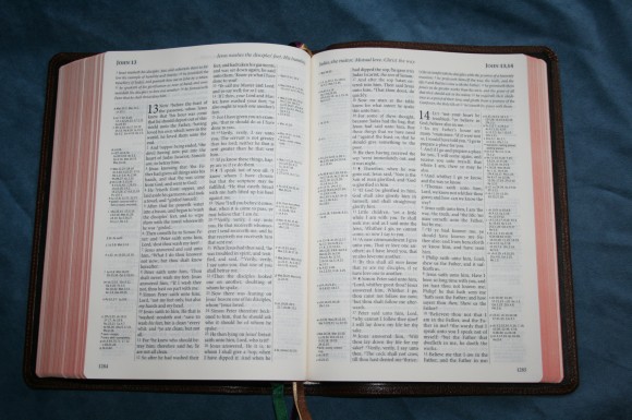
The paper is 32 gsm and has a slight cream tone. I love the cream tone. It makes reading much more enjoyable. There is more show-through than I would like, but it’s only really noticeable in bright lighting.
The text is presented in verse-by-verse format. I find paragraph format to be better for reading, but verse-format is easier for me when using it in Church or study because I can find the verses much faster. This can be solved by printing the verse numbers bolder. Paragraph format with bolder verse numbers would have been nice, but that’s a matter of the layout from TBS and their target audience. For quick reference and easy use, verse format is fine.
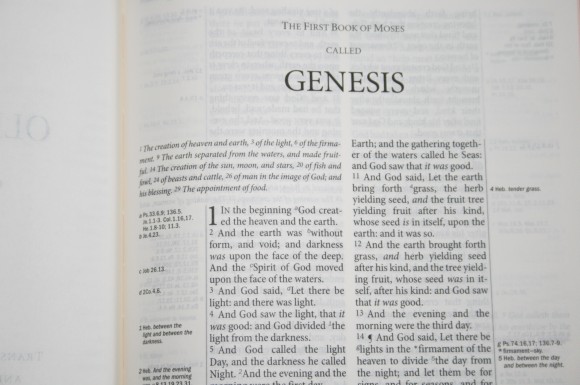
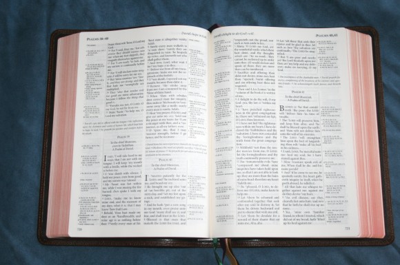
The text is printed with a technique known as line-matching. This makes it very readable. The text is printed in two-column format with references on the outer and inner margins.
There are 32 blank pages in the back for notes. I am glad that more publishers are doing this. I wish this were standard in Bible publishing.
It has a modern digital 9.6 font in black letter and it is one of the best fonts for reading that I’ve seen in a KJV. It has about a medium boldness. The print quality is consistent throughout.
Rather than section headings, the Schuyler KJV Reference Bible has chapter summaries. They are printed much larger than other chapter summaries that I’ve seen (for example, the Thompson Chain Reference, the Dugan/Jubilee Analytical Topical Study Bible, and the Brevier Clarendon). The chapter summaries span the column of text and the references, so they take two columns. This makes them much more readable and usable. Like all chapter summaries in KJV’s you have to be careful with the contents (some place the Church in the OT, etc.).
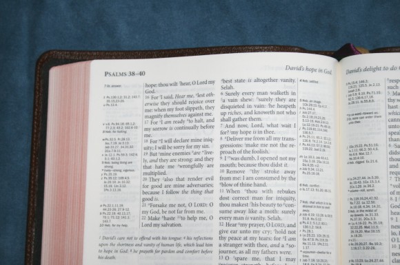
The top of the page contains summaries of the main point of that page. It also contains the books and chapters that appear on that page. One thing I like about this is that it contains the first chapter that appears and not the first chapter that starts on that page. For example, page 720 contains Psalms 38-40. This contains the end of chapter 38 and the first full chapter that starts on that page is chapter 39. Most Bibles would not include chapter 38 at the top of the page. They would only include the chapter that starts on the page, so they would show 39-40. I prefer the method this Bible uses because it makes this Bible easier to use. Verse numbers would be even better, but that could get messy.
References and Notes
The margins contain lots of references and notes, which include alternate translations from Greek and Hebrew, definitions of archaic words or words that have changed meanings, money, etc. There are 200,000 cross-references. They are a combination of John Brown’s Self Interpreting Bible and the Concord. References are keyed to the text with letters. Notes are keyed with numbers. Definitions are keyed with asterisks. Money, weights, and measures are keyed with superscript markers.
The references and notes make the Schuyler KJV Reference Bible a great study Bible by giving you tools to define words and compare Scripture with Scripture.
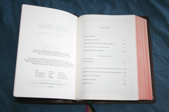
Appendixes
The appendixes include:
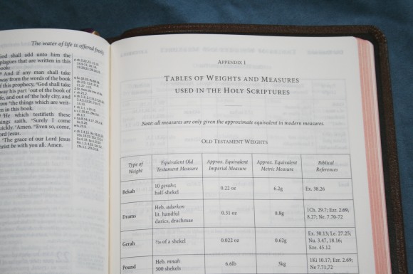
Tables of Weights and Measures – 5.5 pages of the most comprehensive tables I’ve seen in a Bible.
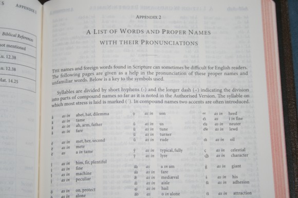
A List of Words and Proper Names with Their Pronunciation – 14.5 pages and contains almost every name in the Bible.
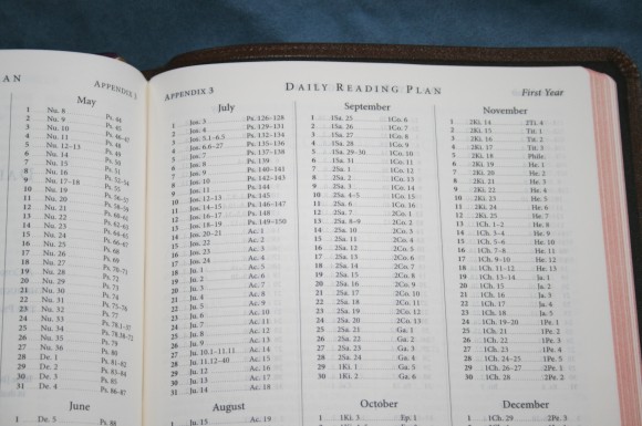
2 year reading plan – has a morning and evening reading from two different sections of the Bible.
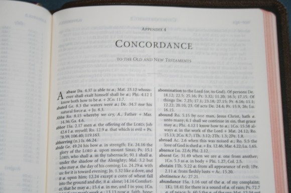
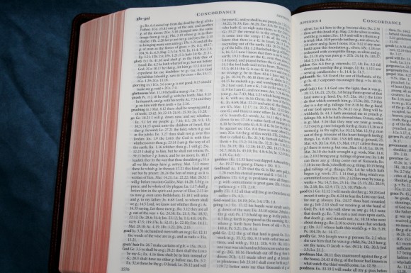
Concordance – This is the same concordance found in the Concord. It is 139 pages and is one of the better concordances available in a Bible. The verses do not appear on a new line. This makes it a little difficult to use but it has more entries for less space, so it’s a good tradeoff.
Maps
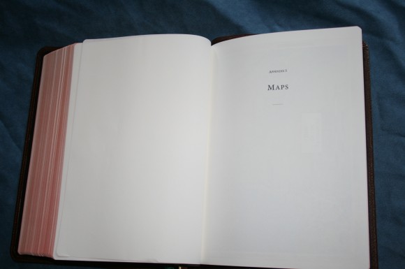
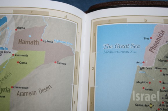
There are 8 pages of very colorful maps. They are printed on thick paper with a dull finish. This is my favorite paper for maps. I prefer paper without a glossy shine. My only complaint is there is no index to maps. Indexes make maps much more usable and I think premium Bible should especially have them. I would have liked an index to maps.
Ribbons
There are four luxurious ribbons in four colors: green, purple, brown, and gold. The ribbons will be different colors than this for the other covers. They are 3/8 wide and plenty long enough to be useable. They’re some of the nicest ribbons I’ve seen in any Bible.
Additional Features
Other features include:
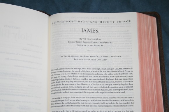
Epistle to James
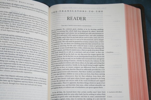
Translators to the Reader – This is my favorite edition of this document. It has notes in the margin. I’m glad to see this document is included. It is very informative of the translators’ thoughts on Bible translation and I highly recommend reading it.
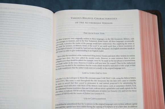
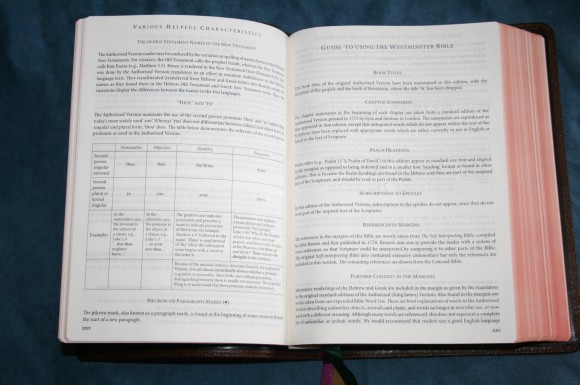
Various Helpful Characteristics of the Authorized Version – This section includes information on the use of italics, Lord vs LORD, capitalizations, use of OT names in the NT, Thou and Ye (very informative).
Guide to Using the Westminster Bible – Covers the features of this Bible and how to use them.
List of Books and Their Abbreviations – Lists all the books in Biblical order.
Conclusion
The Schuyler KJV Reference Bible is easily one of the best KJV’s I’ve ever seen. It is beautiful in every way. It is a great Bible for carry, reading, and study. The Cover and binding are of the highest quality available. The grain of the leather is simply gorgeous. It’s the perfect size – large enough to contain great tools and features, but not too large to carry and hold. I highly recommend the Schuyler KJV Reference Bible to anyone seeking a premium KJV. This one is at the top of my list.
Where to buy: EvangelicalBible.com – Schuyler KJV Reference Bible
Schuyler Publishing provided this Bible free for review. I was not required to give a positive review – only an honest review.














Randy,
I appreciate the review and all the pictures. I ended up with the black because hey it’s a King James Bible, but after looking at your pictures I must admit the Mahogany is a real beaut. However, I’m not at all disappointed with the black, but I would like to see the color Antique Mahogany become a staple in Schuyler’s line. With that said, how would you compare the color Antique Mahogany with the Brown on the Allan Longprimer? I agree with you about the overall size of the Westminster, although I certainly wouldn’t mind if TBS and Schuyler eventually released a large print edition, but this is probably just wishful thinking on my part.
Hi Norm. The Antique Mahogany is a little brighter and has a lot more red. The Longprimer looks darker. I hope to take some comparison photos soon. I’ll make a post that compares the Schuyler, Allan, and maybe the Clarion (but my Clarion is just calfskin, but we can see the brown compared).
I have the Schuyler in Mahogany as well as a 53BR. The Long Primer is definitely a more chocolate brown color. The Mahogany leather of the Schuyler is more of a tan color. The brown leather of my Schuyler is the most unique shade I have ever had, yet it is elegant and thick. I feels more shiny somehow than the matte chocolate highland goatskin of the Allan. I REALLY love both of these Bibles. The beauty of these two browns made selecting which Bible to take with me to church such an ordeal that I picked up a 53NB and a blue Schuyler KJV for my carries. For now, I choose to huff and admire my 53BR and Mahogany KJV Schuyler (although the Schuylers don’t have a scent like the goatskin on Allans IMO). I have also decided to mark (very tastefully and carefully) my Blues too, and ever so slight dings won’t bother me as much as my lovely browns.
Hi Stephanie. I’m having that very same problem. I love them both and I have trouble deciding which one to write in. I haven’t decided yet. I’ve been carrying the Concord, but I’ll change to either the Allan or Schuyler very soon.
Dear Randy:
This looks like a truly beautiful bible! For my own use however I think I will stick to the TBS Westminister version. This bible is not as large as some, but for me and the way I use a bible, I need a stiffer cover that will better protect the bottoms of the pages and the cover while I read. I often find my thumb or pinky finger hooked under the spine while I hold the bible when reading. I found the LCBP Thompson Chain Reference too soft for me as well, that one is going out for re-binding in stiffer calfskin for the reasons I listed. I have adjusted pretty well to the TBS Westminister, and can use it while seated now. The format that TBS has in common with the Schuyler will be wonderful for those who prefer a softer cover. I have found the study helps, the references, the imbedded archaic dictionary, and alternative translations of Hebrew and Greek words very helpful. You have done an excellent job on reviewing this beautiful bible. It is wonderful that it is not only beautiful, but easy to use, read and contains so many helpful features.
Yours In Christ
Don Denison
Hello Don,
Only in the past year have I bought any new bibles. Last time was in the 1986-1988 era! So I decided to try some of the present high end offerings. While there are many nice features on the current crop, I also notice a lack of attention in some aspects of workmanship. I’ve been in various fields of manufacturing for slightly over forty years, so these types of things am geared to notice, looking beyond the glitter of goatskin covers, etc. Even my old, but unused, Holman Master Study Bible (mid 1980s) in hand grained Morocco, made in the USA will rival or exceed the Netherlands entries workmanship. And its text block is only equaled by the Westminster, although it uses a different font.
I have just received my Schuyler KJV and am not enamored over a couple things which I will address with other comments in a new reply later. Suffice to say, my batting average is not doing well lately!
From my standpoint, I’d say stay with the TBS Westminster. There is really only one advantage to the Schuyler aside from the goatskin aesthetics and that is the edge lined construction. The TBS because of the paste off method is more sloppy in the cover hinge area due to the fact that the end pages will lift away some from the cover hinge areas. When hand holding with the spine or tailband horizontal and you tilt or rotate the spine upwards toward a ~45 degree angle, either left or right side, you can feel a “wobbleness” (sic?). This condition is not there with the edge lined goatskin Schuyler. Not that it really means anything, but suspect that the TBS will not prove as durable in its end page hinges? Also, when hand holding the TBS, can insert by big finger between the text block spine and the cover’s spine!!!
The front cover on the Schuyler due to the LARGE hinge radius will not lay as flat against the text block as it will the on TBS, nor as it does as on the Allan Longprimer or Clarendon. Seems they could have preformed a smaller radius there as the hinge radius is somewhat smaller on its bottom side?
Both use the very same text block. I can see not any difference. The Schuyler measures .129-.130 thick per 100 sheets (200 pages) versus .132” similarly for the TBS. No significant difference, just sample variation. Same tint of the paper.
The Schuyler does droop more when single hand holding, but it is not all that bad. A slight movement of the wrist or fingers brings the page view into alignment easily.
Since the text blocks are the same, and the TBS cover is quite adequate other than mentioned above, you can buy three of them for one of the Schuyler; a not insignificant consideration. Have a slight accident (or the cat takes an interest in the bible!) and the pain will be a lot less! And when you are reading, the visual impressions are identical!
I am coming to a tentative conclusion that most real, practical needs can be adequately covered with one’s choice of the TBS Westminster, Windsor, LCBP “Cameo” or one of their hand sized editions and one will not need to feel of having missed anything, but still have a quality choice and variety of good to excellent text blocks and durable covers with the obvious far cheaper prices. I seen elsewhere your recommendation of a 4 book combination and do concur.
Kind Regards.
John
John,
Just some observations: In regards to the paper in the Schuyler, it was brought to my attention that it is not thicker, but heavier or denser, which probably has more to do with not only the weight (gsm), but Opaqueness. But in all fairness I’ve also been informed that when it comes to bibles/books that paper does not really have that big of an impact on the overall cost of production. There also seems to be somewhat of a difference in price between what the customer pays for goatskin vs. calfskin. And, I have been to websites that sell goatskin hides at retail and the hides are not cheap. I have also purchased 23k gold foil by the booklet, which is also expensive. And, from what I understand a minimum print run of books/bibles is somewhere between 500 – 1000 copies. I don’t know how much a publisher pays per bible, but 500-1000 copies might get a little expensive, especially for a small company like Schuyler. Of course all of this makes me wonder how TBS sells their bibles at such a reduced price. In many cases actually cheaper than bibles that were sold in the 80’s. And, I understand that LCBP is a ministry, but in some cases TBS bibles are actually cheaper than the bibles from LCBP. On the other hand, Schuyler is a private business with employees who depend upon their jobs and the success of their bible sales. I think it’s great someone can buy three quality bibles for the price of a Schuyler, but with all due respect I can’t help but question the comparison. For one thing TBS sells the Westminster for $80, while EVBIBLE.COM (Schuyler) sells that same bible for a discounted price of $60, which I can only assume is the reason that someone would be able to buy 3 TBS Westminster’s at the same price as the Schuyler Westminster. And I believe you’ll find that EVBIBLE (Schuyler) consistently sells bibles from various publishers cheaper than most other online retailers.
Norm
Thanks Don. I hold the Bible the same way you do. For this reason I usually like the slightly stiffer covers like the calf-split Concord, the calf-skin Clarion, and the TBS Westminster for holding in one hand to read.
Blessings Mr. Brown. This is the first comment I have ever made but I read the reviews on your site all the time. You do a remarkable job. This is a beautiful bible. The goatskin looks extraordinary from the pictures. That color is marvelous. I actually enjoy that cracking sound you referred to myself. Glad to see I am not the only one. The format of the text is beautiful. I also think the cream tone paper makes the reading experience more enjoyable and easier on the eyes. Wish the liner was the same color as the cover or at least a complimentary color. Great review!
Thanks Charles.
Don,
Yep, for the money the TBS Westminster is very hard to beat. I agree with you on the soft covers, which do not work very well on larger a sized bible, although the Goatskin on the Schuyler is heavier/thicker than the Calfskin on the LCBP. And since you mentioned rebinds, Leonard’s has done some pretty good work for me on a couple of bibles. One was a family bible that I had rebound in imitation leather and the other was a hard bound bible that was rebound partly in goatskin and imitation leather. And let me tell you these bibles were in dire need of a rebind and Leonard’s brought them back to life. I also purchased a fairly large sized Greek/ English NT second hand that had been previously rebound by http://www.AceBookbinding.com . The NT is the same width as the Thompson Chain, but its 3/4” taller, which was rebound in Cowhide, apparently over some thin book boards, which is real nice, but stiff. The appearance of this NT is similar to the calfskin on your TBS Westminster, but stiffer. The endpapers were done in silk moiré I believe it is called, also with multiple lines of imprinting on the spine and the front plus two ribbons. Anyway some great work for $98 shipped according to the receipt I found in the bible when it arrived. You also might want to take note of the listing on LCBP about the Thompsons, I don’t know when or if they’ll be rebinding more anytime soon?
Hello All,
Received my Schuyler KJV today in Navy Blue. Had debated which color to choose since Evangelical Bible posted their picture portfolio of this new line. The only thing that caused hesitation, as I liked the Navy and Mahogany appearances, was the contrasting black liner. Well, thought I just might choose the black with black, but at last moment choose the Navy which caught my first interest initially.
Here are the issues that I had with my particular sample, one of which I feel is quite egregious for a bible line promoting the status of its workmanship and quality:
1. The big issue is the ribbons. I have never seen such a pathetic example of the placement of ribbons in a bible. One pair is located at the left edge of the headband as far as they could be placed. The second pair are placed just a little right to the center of the headband. It gets really worse. Two of the ribbons exit the spine NEARLY FOLDED IN HALF and exit at a quite noticeable angle (crooked, twisted). A third one is pinched some and takes off at an angle. The fourth is just slightly pinched, but exits at an approximate 45 degree angle similar to the first two mentioned. This is totally unacceptable in an $185 bible if the makers of a $30 or so dollar bible can get this right. Wish I could post pictures. THIS is a DEAL BREAKER I think for me. It is to my mind “almost” incomprehensible that anyone could do this careless of a job in ribbon placement.
2. The first bible page has some severe MULTIPLE creases (think accordion) starting from the gutter radiating in a circular path towards the top and bottom edges of the page for a couple inches from the gutter. This without any doubt occurred in its manufacture. While disappointing, I could live with that. All the rest of the bible pages, seem perfect, although it was only spot checked. This single bad page was such it was noticeable from the outside as the creases lifted or supported the pages above it. Never a problem with 3 of the far cheaper TBS Westminster bibles owned. Disappointing yes, but not enough of a deal breaker to bother with a return, maybe?
3. The embossing for the silver coloring on the cover front and spine seems shallow. Don’t think the applied silver will remain whole for very long.
4. The silver gilding on the edges in very lightly applied. The coloring is actually a bluish silver in daylight, a somewhat translucent effect. You can see the blue through the silver and it has a very fine “spotty” pattern. When the bible is opened, the fanned pages show extremely little “blueing” and a lot of white. Maybe a 50-50 line type of appearance. What blue that does show is of a very light coloration. The art blueing could just as well have been not applied.
5. The hinge area of the cover between its front and spine is quite large in radius. The front cover at and near its left side will tend to remain a little raised from the textblock. Don’t expect the front cover to lay down flat even if it is goatskin. Now, the hinge area at the rear of the cover and spine is more tightly formed, i.e. a smaller radius. When the back is laid with it topside the rear cover lays quite flat with the textblock.
From what I can tell, I see no difference between Schuyler’s and TBS’s textblock. Other than that one badly, accordion style, creased page, there seems to be no evidence of any gutter cockling, just as typical as in the TBS Westminster edition.
The goatskin seems flawless in its general pattern. Very pleasing appearance. The Navy color shows some blue in direct sunlight, becoming more darker in shade, and indoors even still darker. A nice shade I think.
By tomorrow I will have either decided to keep it, and chalk it up as a sign of the times, or will call EVB to state its condition and see if they consider this sloppy ribbon placement “unacceptable”. If they do consider it returnable (manufacturing defect) as such, I may indulge upon them for a replacement in black, if I’m feeling lucky tomorrow! Or I may just request a refund. At worse, if they consider this a “normal craftsmanship variation”, most likely will return it regardless of a restocking fee.
Hi John. I’m pretty sure they would replace it for you. I’ve heard good things about their customer service and I know their goal is the highest quality possible. I wouldn’t want my paper scrunched up like that. It’s worth contacting them.
I will add to what has already been said — TBS Westminster is a good deal. I’ve had mine since Xmas and with daily use it still is in good shape. I almost always fold back the covers for handheld reading. I see a number of stress points on the inside pasted covers and expect they will eventually pull away. However this TBS bible is much better than the Windsor or Concord I have from them. After a few months I had to get the tape and glue out.
Has anyone tried the Westminster hardback? I suspect it may last longer than the leather version.
I’ve been tempted to get the hardcover. For the price it would be hard to beat and I wouldn’t mind marking in it.
Dear Norm:
I think that if I had problems as John described that the return of the bible would be the proper action. I have had contact with EV Bible, and found them to be very concerned about customer satisfaction. John has raised some valid points about current quality standards in publishing. I am afraid that is a hazard of living in the times we do rather than a general lack of concern by publishers. Just finding competent people is becoming very difficult in almost every industry. It is a sad commentary on the society we live in. I have written before about the glorious quality of my father’s old bible purchased for him by the family in 1954, I’ve found nothing to compare yet with that quality which was at that time was expected, not an exeption.
Both LCBP and TBS are ministries. They are able to produce relatively good quality bibles at a good price because there are people like me who send them money every month as a tithe. I do this not out of a sense of kindness, though that is there, but out of a sense of Christian Duty after prayerful consideration. What effect this has on small businesses like Schuyler/EV Bible I can’t say as I don’t know how many give one time love offerings or regular tithes to the ministries. Indeed given the economic and political climate, a business like EV or any other like venture that specializes in Christian Literature is akin to a ministry even though it is not specifically stated to be one.
The bibles and the businesses that produce and market them are real assets to the Christian community at large and deserve at least prayer, and in the case of the ministries, support as the Lord leads individuals to give. Criticism is good for all of us, and businesses and ministries should listen to it in order to improve their products. I am just happy that we have access to to the large variety and high quality of God’s Word and related literature we have. There are at the present time, societies wherein one can be imprisoned or even killed for the possession of even a paperback bible. How blessed we are to live in a country where we have the bible in such a range of quality and quantity, easily obtained, often available for free. Let us all pray that the forces that want to suppress the Word of God not be allowed to prosper in this country.
God Bless All!
Yours in Christ
Don Denison
Hello Don,
Thank you for your very well reasoned comments. They are appreciated.
Sent the bible back to EVB today and requested a replacement with the black cover as a result of yesterday’s telephone conversation. Requested the black cover because perhaps there is probably more experience with the application of the gold gild than the silver? I did not find the Navy with black lining to be objectionable.
One thing not mentioned previously was that there was a section of about 2 to 2.5 inches on the cover flange that was narrower than usual. Here the stitching ran right on the border or to say at the flange edge. If the flange is not glued down as well as stitched, I saw a possibility with use that it may lift after the cover had endured a measure of movement or flexing?
Perhaps, it is just vanity, but I really like the Westminster text block, one major reason is that it is not self-pronouncing, and appreciate a nice cover and the edge lined construction. In another sense, there will be some nice books of God’s Word to be passed on, after I cease this earthly existence. So in that sense, it’s not just for me!
EVB’s customer service is outstandingly polite and courteous. I have nothing but the highest praise for them in my two contacts via telephone. The other concerning a very rare manufacturing issue with the Allan Longprimer KJV. If they carry an item, this is where it is bought from.
The only thing I’m curious about is their high shipping rates when an order exceeds the $200 dollar level because in my case all shipments (expedited service) have been by USPS Priority Mail which is a flat rate with a quite high weight allowance. Buy one Schuyler and the shipping (USPS) is $17.50, buy two and the shipping is a whopping $50, even factoring in the modest cost of insurance. The latter is according to their website; as for that reason I confine my order not to exceed the $200 mark.
Yes, good help is difficult to find. Where allowed, and many concerns do allow it on the production floor, music has to be the near constant companion for many, particularly the entry level age up to those in their latter 40s. For safety concerns, earbuds are not permitted and this means that environment can be raised to quite a cacophony of discord in metal, heavy metal type “music”?? for the most part before a supervisor has to order them to tone it down. This I’ve not seen permitted in the offices or engineering areas. A lost society of short attention spans that cannot endure quiet or function without “stimulation”.
Best Regards,
John
Dear John and all:
Amen Brother! I don’t know where things are going, it seems all, workers, management, customers, and clerks cannot bear the prospect of having to listen to their own thoughts. I am though impressed with the quality of bibles as compared to other consumer products. No, they are not as well made as was common 50-80 years ago, but we must remember only the very well made have survived, there was some rather shoddy material and labor used those many years ago as well. I’m just thankful that we have available to us the high quality that we have both in products and in service. Yes it could be better, but it could be a whole lot worse. I wonder how easy or safe it is to get any bible in Iran for instance or if that government would even allow a site/blog like this one. As I stated earlier, everyone can benefit from criticism, that is how we all learn to get better at what we do. I just thank God though for what we have, and hope for whatever improvement that the current environment allows. Thank God for firms like EVB, Alan’s Cambridge, etc.
God Bless All
Don Denison
Hello Don,
Yes, we do have so much to be thankful for and for those that publish the Word of God. I err greatly in not making better use of my time in attending to study of His Word and prayer for He has provided me ample opportunity. I only use the KJV and have no interest in the other versions. I briefly consulted the NIV, NKJV, and the NASB in the distant past. They seemed rather lifeless to me. The KJV, AV, or simply known at one time as “The Holy Bible” is the most reverent language glorifying and honoring God the Father, Our Lord and Saviour Jesus Christ, and The Holy Spirit. That which was to follow was meet for the ever increasing apostasy of Christianity up to the present day. To each of us as hath been given light or delusion. His gift of eternal life and adoption was totally of His mercy and grace. Even the faith or ability to believe. I contributed absolutely nothing, although at one time I believed I did. His Holy Spirit gave me life by regeneration and to be receptive to His Word. For what reason it was His pleasure to give life to this most unworthy and still unworthy sinner I know not. His precious Word showed the error of my ways, the love that Christ had for those His Father gave Him, and by a contrite heart why one should conform to the image of His Son out of love for He loved us first.
Am not forgetful of the immeasurable worth of His Word. Commentary here is simply the tightly focused and measure of physical workmanship. The merits of the container only. Something a visitor might mistake for shallowness. Is it error for this blessing, to exalt His Word in visible beauty by the talents God bestowed upon His instruments that print His wondrous Word for those that are His? Nevertheless, can one imagine the tears of joy and excitement if what we have today in the form of the Old and New Testaments, in the cheapest paperback conceivable, was available to the common saints and martyrs from the time of the first church to that of the printing press and afterwards!! Or even a portion of the bible in the poorest quality print on wrinkled, aged newsprint! Or how precious even a mere scrap of a bible’s page was to many in Russia and Eastern Europe in the communist cold war era. Or the persecution, torture, and murder of Christians in Russia after the 1917 “revolution”. And here, bestowed with great blessing, we are able to elucidate on the minuteness of bible book details.
In Saudi Arabia any bibles from those entering the country are confiscated. There have been collections and burnings of New Testaments in Israel. We have the massacre of Christians in Africa and as the Mideast has purposely been destabilized, countries which did offer a measure of safety for their Christian factions is diminishing in the current civil upheavals.
There are secular forums where there is much “wailing” about the state of the nation and all that we need to do is get back to the principles of the founding fathers, rebellion, etc. to return to the once “golden era?” of hedonism and material accumulations (never repentance and turning to the ways of God). They cannot fathom nor admit that such an idyllic conception as they envision it, is an utter impossibility in this country’s present and declining moral state (rush to wickedness) and certainly the recompense of their ways even considering from a totally secular viewpoint. I believe the nation is experiencing the wrath of a righteous God, as was many times with the chosen nation of Israel, for their idolatries (of which America’s cup is full; the love of money perhaps foremost amongst many idols) and the Satanic blood sacrifice of the most helpless of life in over 53 million abortions of convenience. It just may be for a small number of His faithful saints, His elect, that His wrath has not fully consummated this country, so far.
Yet, history is replete with countless examples where his protection did not extend to the saving of the physical lives of His faithful, even those that sang praises of joy as their lives were extinguished in the most horrible manners and remained steadfast to their final breath. What can we say when we compare our lives to theirs and why we are blessed with so much in our freedom of worship, knowledge of His Word, in the midst of great apostasy and moral depravity? Except His ways are not our ways and in Him is there no unrighteousness and all things are for His pleasure and purpose.
I want to say it has been a blessing to read your comments here and elsewhere, there being more than the mere descriptive analysis coming forth.
Glory and Honour to Our Lord and Saviour,
It is my understanding the Old and New Testaments were written by 40 Jewish men through the inspiration and power of GOD. And when it comes to Bible translations I’ve always found this old quote from a Rabbi interesting: “He who translates literally is a liar, and he who translates liberally is a blasphemer.” A quote from an interesting article found in the link below.
http://ourrabbijesus.com/articles/translation-debates-jewish-view/
Don,
I believe most of my comments were in regards to the price difference of the materials used and not the overall construction of either bible. I don’t have a problem with constructive criticism or an issue with someone comparing similar products manufactured by different companies, but in this case I thought it was unfair to compare the pricing. And this was the reason I brought up the variation of costs of the different materials. Take for instance if you were to purchase a TBS Westminster, but you decided you wanted to have it bound in Goatskin or even a different color binding, your purchase price and the costs of the rebind will exceed the costs of a Schuyler, and happy hunting finding someone to stitch the perimeter of the binding for you. I’ve worked this out different ways and even tried my hand at edge gilding, like it or not these materials and features do add additional costs to the product. In regards to the comments about the thickness of the textblocks and the paper, the measurement (GSM) from what I understand pertains to weight. My point being, is the opacity (lack of ghosting) better in one bible over the other? Now, concerning the whole quality issue of today versus yesteryear, in reality how many companies at present still manufacture their own products in house? For instance, I believe it was Jongbloed in the Netherlands that printed and bound the Schuyler Westminster; they also print and bind Cambridge bibles, the new Omega bible by Crossway and if I’m not mistaken certain bibles from TBS, maybe even the TBS Westminster? And no offense intended, but when it comes to spreading the gospel of GOD, I don’t think TBS or LCBP is the only shop in town. I would also like to repeat, that in comparison with other retailers EVbible.com, for the most part, offers the best prices. And just in case anyone is interested, the article below may shed a little light on the owner of Evangelicalbible.com and Schuyler brand bibles.
http://thefoolishgalatian.wordpress.com/2010/05/06/interview-with-paul-cline-of-evangelicalbible-com/
Dear Norm, John, Randy, and all:
I know that there are other ministries and firms other than those I mentioned, and in the “Christian Publishing” environment, I have yet to encounter a scoundrel though some may exist. I have dealt with EVB and can truly say that they are a fine company, I have purchased bibles from them, and have experienced nothing but top notch service and prices. I think that most printing is indeed done overseas, this is due to the lamentable cost of labor and material here in the United States of America probably more than for any other reason. It is a complex many faceted problem including unions, government regulation, difficulty finding competent people and many other things. Cambridge uses a company in Belarus and for some editions Jongbloed, perhaps others, I don’t know where for sure LCBP gets their textblocks, I don’t think they are printing their own though I may be wrong. The comments I have made are directed not only to the bible publishing and marketing community in this country only, it is directed to the market and labor in general. I don’t want to be a curmudgeon that finds no good thing, but their are definite problems out there for almost every industry. I believe it is directly related to the state of our society in general, and that applies to almost every aspect of it including the family. There are products that have disappeared from the scene to be replaced by some other cheaper, less well designed and made substitute carrying the same brand and model number. This is apparent in almost every product marketed in this country, I’ve in my 72 years witnessed it time and time again. I don’t know what the solution will be, only time and the market will correct the situation. I do know though that regardless of what the source of our bibles, that relative to the quality of other kinds of products, their quality is quite good. Of the firms that are marketing bibles and related literature, the quality of service is quite high, especially among the companies and ministries we have been writing about. I have been grinding no axe for any entity, indeed I am sympathetic to these companies and the problems they encounter while trying to serve us.
It is time to leave for evening services so I’ll cut this short and wish God’s blessings on all of us.
Yours in Christ
Don Denison
Dear Friends:
I don’t know how this thread beginning with an outstanding review by Randy, has turned into a discussion of the merits of various publishers and marketers of God’s Word. Perhaps i wrote something that has offended someone, I hope not. All I wrote was in response to other input and the direction the postings have taken have lead me to believe that at some point someone’s feelings were injured perhaps by me or perhaps by someone else. All of the businesses and ministries we have been discussing are either directly or indirectly doing the Lord’s work and deserve our respect. I think the criticism on this thread has been respectful and should be helpful to all concerned, so where did this feeling that at least one of us is upset about what has been said come from?
I will make my position clear in the hope that it may somehow smooth out any upset if indeed there is any.
I am grateful for the bibles and related publications being produced today. I wish that they were produced here in the US, but that is not a big problem for me. It is distressing to me to see how the direction of our society has taken effects this and other industries but I don’t know what the solutions are. If I had those answers, I would imagine that there would be literally thousands willing to pay to consult with me.
I support LCBP, and TBS because I am sympathetic with their ministries. TBS especially produces on their website scholarly articles directed to the support of the Authorised translation. I agree with their positions which I think are well reasoned and supported. Having said this I am aware of others who disagree. I hold no animosity to those who hold other opinions, what is important to me is that the Bible be read, respected and honored, and most importantly that God’s Word be uplifted throughout the world. Anyone who in any way promotes the Gospel is in my opinion doing a good thing. I hope none of you all take any of my comments as meaning anything other than that. I am especially thankful for Randy and his Bible Buying Guide, he is doing all of us a great service as well as honoring God in doing so. I am also thankful to all of the others who have made comments on this blog. In the interest of keeping the commentary uplifting, I’m going to refrain from further comments on this thread in the hope that the focus returns to the review rather than on opinions that while relevant, are not focused on it directly.
I look forward to commenting and reading all your replies on other reviews, but am going to bow out of this thread for now. If I have done anything to offend any one of you all or if my comments have even made someone uncomfortable, please forgive me. God bless all of you.
Yours in Christ
Don Denison
Don,
Not real sure of who you are referring to specifically, but I have gone back and reread what I had written and I did not see anything specific which would give anybody the idea that I was upset. Although, I do agree with you that the tone that Randy has set on this blog in my opinion has not been followed. For instance, I’ve noted comments such as pathetic and unacceptable in the description of the Schuyler KJV Westminster and later the term lifeless was mentioned in regards to modern bible translations. Randy on the other hand, to the best of my knowledge, has always been respectful of both publishers and translations. And if Randy has an issue with anything I have posted, then in the future I’ll attempt to practice a little more reservation when posting comments, information or links.
Norm
Hello All,
Brother Don, you said nothing that offended me.
Received my replacement Schuyler KJV in black goatskin. The ribbon placement is very nice, not perfect, but quite close to being so. I have no complaints in that department and a vast improvement over the navy blue example. There are no creases on the first bible paper page either. The red art dye with the gold gild looks very good, better than the former example in blue under silver. The cover flanges are pretty uniform and the excellent stitching is well within the flange borders. The rich black cover is beautiful.
The embossing for the gold impressions on the cover and spine are shallow. The cover joint between the spine and front is still of a large radius and the left portion of the front cover stays lifted a little from the textblock. But these two observations are minor. Am very satisfied with this example.
I have the both the hardback and calfskin TBS Westminster. Critically comparing the ghosting in the same areas of both with the Schuyler, I can see absolutely no empirical difference with my eyeball. All three compare identical with each other.
Evangelical Bible’s customer service was exemplary as usual!
Kind Regards,
John
Hello All,
Well, upon a more thorough inspection, things are not that rosy! Firstly, decided to check each page while hand holding the bible. Noticed some slight discoloration?? of the paper in about eight random locations in the same area of page between pages 50 through 630. This in each event would occur in a string of about 5 contiguous pages. I finally concluded it was in the paper itself as part of the paper during manufacture.?? Regardless, the blemish was slight in size and effect. To my knowledge there has been at least 2 runs of the Westminster textblock: 3M/05/12 and 10.5M/01/13 (this one) from examples that I own.
Next noticed the gold imprinting of “Bible” in Holy Bible on the front cover was getting a crazed effect of small cracks in the text characters’ surface. Concluded this was from the flexure while hand holding due to the very light embossing of this text. The thin gold bridges or has to span the “crevasses” in the goat skin texture as a good flat substrate is not provided due to the shallow text imprinting.
Next I wanted to see dimensionally just how much the left portion of the front cover is raised above the textblock when bible is laying down flat. This was mentioned earlier. It looks to be about 3/16” to 7/32”. You can see this condition (not the end view air gap) in some of the pictures posted on EB’s website. It is most prominently shown in a picture of the red cover bible (IMG_2356.jpg). While observing this, noticed a little gap at the head and foot of the textblock where there was a trace of separation between it and the bottom side of the liner “flange” towards the hinge. A toothpick gently showed that there extended inboard an area that was not glued down.
To cut to the quik, decided to try and gently lift the edge of the free endpaper if it was agreeable! and which did separate “surprisingly easy” from the top of the liner flange. This was rolled back about ¾”, at which point it was well secured to the textblock, along its entire length fully revealing the topside of the liner flange. Was able to see the not very well glued down ends of the flange. Was then able to easily separate each end for about 1.5 to 2 inches inboard in a diagonal manner before encountering much resistance at which point no more pulling back of the flange was attemped or even needed. Used what I thought was a suitable glue and firmly pressed down the flanges against the textblock and let it setup. As this glue is rather messy and can be stringy, decided to use a very thin two way tape of high adhesiveness to secure the free endpaper to the top of the flange being most careful the tape did not extend past the edge of the free endpaper (that would make a mess to be removed neatly!). All turned out well with this reconstructive, aesthetic surgery. Noticed just a “wee bit” of the same condition on the bottom attachment, not really requiring treatment, but as a possible preventive measure did the same there so as not to have occasion?? to repeat at a later date. All this was carried out in a skilled and meticulous manner with what was on hand, although my hands-on experience is not of the book binding trade.
Now, before any of this took place, noticed that the “opening” between the liner flanges seem to be a little narrow for the width of the textblock to fit “as it should”. Noticed this on the navy blue sample, but did not realize its implications at the time, just what a poor fit. Everything is in good order on the “bottom” side alignment of the liner/flange cutout and the attachment of the cover liner to textblock is well effected. However, with the opening cut on the narrow, the liner material next to the end of the flanges gets pulled by necessity when the “front” flange is secured to the textblock. As a result, this small area of liner material is pulled away from being secured to the inside of the cover. This is the small area of liner material between the end of the hinge and the inside folded over edge of the cover. You can see the very distinct difference between these areas on the bottom (good) versus the front (poor) if your sample is like mine and am sure this is no exception. Allan gets this done right in my Longprimer and Clarendon KJVs and LCBP does most excellent workmanship in their edge-lined examples that I own in this aspect.
The effect of quality workmanship in this particular concern, as executed properly by Allan and LCBP is that the liner up to the start of the hinge is firmly anchored and is positioned quite close to the adjacent corner of the textblock.
Another thing noticed, before any action was taken, was when hand holding the bible, the front joint of the cover formed a rib- like bulge along its length, but such was completely absent on the bottom joint. What I determined was that the liner is not glued down to the inside of the cover right up to the beginning of the hinge radius of the liner or to say adjacent the beginning of the flange. This longitudinal “bulge” starts to form when the front cover is folded up about 90 degrees from it’s rest position against the textblock (bible laying flat on the table), you can than lightly push against this bulge with your finger and readily ascertain that there is an air pocket or air gap developed on its underside (it’s puffy).
This would indicate that the liner is not glued down to the inside of the cover under the bulge. It seems that there is an area of non-attachment between the two running the entire length of the hinge with a width of perhaps ¼ to 5/16 inch?? away from the start of the liner hinge that is not glued down. This condition does not exist on the back, only the front. I could conceivable make “gizmo nozzle attachment” to inject an adhesive in that area from the end, but just not that energetic for those things anymore!, and it may not pan out that well even with simulated mockup in card paper for trial runs. Be going in blind. Did not realize what was the cause of the bulge until at last.
OK!!, I am disappointed, but somewhat numb to it all, so no big deal, but feel it all merits mentioning. However, I could never be so adventurous as to purchase another Schuyler and it should be obvious that I had no intention of sending this one back (if so it would have been for a refund this time) before meddling into fixing the “irritation”! If high end skin is again desired will send a new TBS Westminster out for a custom rebinding.
Hopefully, but not expectantly, whoever handles this aspect of Schuyler’s bindery, will correct this area of concern that I worked on and will do something about the egregious characteristics of the front joint that causes it to lift so much from the text block before it finally settles against it around 2.5 inches to the right of the joint. I would recommend the examination of Allan’s and LCBP’s craftsmanship as examples to study and emulate. If I had done similarly in my former trades, I would have not lasted two weeks before being shown the door. Just a little more care and observation in the neglected attributes is all that is required, just a little as most is there.
This is not meant to be harsh, but realistic and candid. After all I’m the one eating the faults in keeping this example!!! Unfortunately, the non-discriminating public, won’t get past the “wow” of the beautiful goat skin cover and seems obvious to me the manufacturers understand this well. But as things stand would not recommend these editions to any with a potential interest.
On a more amusing!!! note, and in perfect harmony to the times, I ordered 3 TBS Westminster hardbacks in “BLACK”. And this was the ONLY color advertized on another website (not EB just to clarify) and I get delivered the “COLORED” glossy hardbacks. Well, they are very nice and for $19 each with excellent expedited shipping rates, am not sending them back. Not worth it and they will certainly make nice gifts other than one kept for myself. Even checked their website after receiving and “they” still only offer them in black vinyl covered! Went ahead and ordered two of the black vinyl covered from TBS and am sure they will be delivered correctly and are on their way as this is typed.
Tried to keep this short yet explainable. Apologize for the use of any incorrect bookbindery terminology and grammar or disjointed commentary. In conclusion, don’t think anything more can be added to my Schuyler KJV experience.
Kind Regards to all brothers and sisters in Christ,
John
John,
So appreciate your comments, memory, and care. Integrity of work does matter. And it is a quality that used to exist, but seems forgotten in our time and place.
May God’s blessings be upon Allan, Schuyler/Evangelical Bible, Trinitarian Bible Society, Local Christian Bible Publishers and others who seek to create and distribute the Word in a respectful way. I would hope that the leaders of each of these companies would use the information you’ve provided here to do an even better job.
Ecclesiastes 9.10
With kind thoughts,
Alec
PS Should read, “create printed copies”.
John,
Your technical observations are most appreciated. Like you, I had also noticed the light impression of the imprinting on the outside of the bible, the shortness of the tail bands, and the ribbon markers could certainly do with some repositioning. And since I consider myself more of a textblock and paper guy I’m glad you touched on the opacity issue between the Schuyler and the TBS, which I believe you noted no noticeable difference or improvement in ghosting? However, as many people like to take notes in their bibles, I wonder how do the papers compare with ink bleed through, since the paper in the Schuyler is supposed to be denser? It is Jongbloed who does all the binding and printing for Schuyler and with that being said, it would appear that Schuyler’s biggest issue might be with quality control. And I agree with you that if customers would only look past the goatskin cover and focus more on the details we all might end up with a better product. It would be nice to be able to go to a website, select your translation, text layout, paper, type of binding, etc. and place your order, then after a few weeks find your new bible waiting inside your mailbox. But, apparently technology has yet to advance to that level. So I guess until it does, it is as you so eloquently and humorously put it “in harmony with the times”.
Respectfully,
Norm
i will like to purchase 200 copies of KJV bible bonded leather from your store, let me know the total cost with freight to NIGERIA, looking forward to your reply
Thanks
I do not have a store to sell Bibles. You will have to contact the seller. Here’s is their website: http://evangelicalbible.com/shop/
Well I have waited a few days to give a proper opinion of the Schuyler KJV. I have to say I like it. If someone blended a Clarion with a Thompson Chain, the Schuyler is what they would end up with. The text is extremely easy to read for its size and also seems uninterrupted despite reference numbers being in the text. There is a unique flow to the text. The goatskin cover is of the highest quality. I did get mine for $50 off original price because a name was misprinted. Evangelical bible did cover it with a plate that has my name on it. Im on the fence about the plate, but the money I saved for a new bible makes up for it. I hoghly recommend this bible. I dreamed of having a Longprimer for the longest time, but have to say that I believe the Schuyler is more for me. Thanks and God bless.
Thanks for the update Christopher. I’m glad you like it! I do like the Longprimer, but I find the notes and references in this one to be more useful and the sharp text is amazing – even for the references and notes indicators. I agree that it shares commonality with the Thompson and Clarion with references being next to their verses. This is another feature that I think places this one above the Longprimer. Thanks again for the update. It’s great to hear that you like it.
Yes! I absolutely like it! Between this and my Clarion; I believe my bible needs are met:)
Randy,
I have a question I am hoping you can help me with. I am looking for a new bible and I “think” I have it narrowed down to two or three options. Since I have never held them in my hands I was hoping you could help me.
I currently have a Cambridge Clarion KJV. The bible is beautiful and a wonderful size. However my issue is that the verse numbers are so small that it is difficult to locate them while preaching. It is great for reading but not so great for preaching.
My plan was to get a second bible in verse by verse format to use for preaching and use the Clarion as my daily reading bible. However I have been considering the Prof. Horner Bible Reading plan and I really like his theory of getting very comfortable or “imprinting” one bible to help memorize and access the scripture.
All of that is a long way of bringing me to my question. The three bible options I am considering are as follows:
Schuyler KJV Reference
Cambridge Concord
Schuyler Quentel KJV (when it comes out)
My concerns are font size for the first two options. I am in my upper 30’s in 10-15 years will the font in the Concord or the KJV Reference be too small to preach from? The KJV Reference is listed as a larger font than the Concord but photos make it look like the Concord might be easier to read. What do you think of the font comparison?
The Quentel KJV whenever it comes out will have a larger font but then we get into the other concern. Is it too big to read from daily and carry? Just how much larger in practice is it than the KJV Reference?
Sorry for the long question but I want to ask a couple of people that have actually handled both options.
Thank you.
Hi Trent. I love those choices. Between the Concord and the KJV Reference, I find the Concord font to be more comfortable to read from the pulpit or in dimmer light. The KJV Reference font is prettier because it’s digital and I prefer it for general reading, but I do prefer the bolder fonts. If you have normal lighting then the KJV Reference won’t be difficult to use.
As far as the Quentel, it is a large Bible. It’s perfect for the pulpit, but I do prefer carrying the KJV Reference or Concord. It’s like carrying a large study Bible. The KJV Reference is more comfortable to carry and hold.
There is another Bible coming out that I might recommend in place of the KJV Quentel for your purposes. It’s the Canterbury from Schuyler. It’s still in the planning phase but it will most likely be smaller than the Quentel but still a larger and darker print than the KJV Reference. It has verse by verse in double columns and Psalms set to stanzas in a single column. It has sections headings, references in the footer, and red chapter and verse numbers (that could change, but that’s what the current layout is showing). It doesn’t have footnotes. It should be out next year. It might end up being my preaching and carry Bible.
My current favorite preaching Bible is the TBS version of the Cambridge Large Print Text. It has the same footprint as the Concord (just a little thicker) and the font is more like the Quentel is size and boldness. Unfortunately it’s not edge-lined goatskin, but that can be fixed 🙂
Thanks for the input on the different fonts between the Concord and the KJV Reference. That is exactly what I was seeing from the photos.
The Schuyler Canterbury looks VERY interesting. Are you certain that it will be slightly smaller than the Quentel? If they made a Quentel with 10 point font instead of 11 it seems like that 10% smaller form factor would move it to the top of my list. Any idea when they will release some details about the Canterbury font size and Bible size?
Your Cambridge Large Print suggestion is interesting to me. I had not really considered anything besides a reference addition. If they had something like that with the dictionary and concordance in the back it might work just great for what I wanted.
Thank you very much for your input and your reviews. They are very helpful.
The current train of thought is that it would be thinner, but nothing’s set in stone yet. They haven’t fully decided on sizes and fonts. It might be a while before they know for sure. I’m sure they’ll have to know by the end of the year in order to get everything ready for publication next year. I recommend signing up for the newsletter on that page and they’ll send out updates as they get them.
I love your idea of a large print text with dictionary in the back. That would be an amazing Bible.
I would personally recommend the Allan Longprimer 52i. It doesnt have note pages or goatskin, but it still has great binding, lies flat, and has the best readability for preaching in my opinion. I really like my new 2nd generation Schuyler, but it sounds like youre looking for a longprimer. The Concord is nice bit doesnt open as well in goatskin. Also the verses run together making it good for reading but difficult for locating scriptures. The longprimer has a much better verse separation with big bold print. The buttero calfskin isnt as floppy, but I like it better than Allan gostskin. Just a thought. I own every goatskin kjv available and the Concord is my least favoritr of them all
Also trent….Im about to sell my new first edotion Longprimer 63. Let me know if youre interested. There are no marks or damage. Ill let it go for a hreat deal.
I have signed up for the Canterbury email list. I have decided to hold off on any purchase of a high end bible until they finalize and release a few more details on that one.
I did order a hardback Westminster. I figure I can try out the text block without the expense of the Schuyler. I’m almost certain the font will be smaller or less bold than I want but it is still a very interesting design.
Thanks for the help. I may have to go with your idea and switch to a text only search in order to get the font size and bible size that I am looking for. It would force more of the research into other books or bibles but that usually happens anyways.
I’d like to be sure that the “Schuyler Westminster” includes the 32 pages of writing paper. Your review is the only one I’ve found that lists the writing paper as a feature. I’m hoping it’s true, as this is an important feature for me. I know the TBS one has “thin” writing paper, but I want to be sure about the Schuyler. And the writing paper’s thickness/quality.
Thank you Randy, and I greatly appreciate your reviews!
Hi Mary. It’s the same paper as the TBS. I just meant that it had pages for notes. I should have been more clear. Thanks!
Hi Randy,
Thank you for writing this review. Aesthetics aside, with daily use do you think the Schyuler version of this will last for a significantly longer time than the TBS calfskin? Assuming the book is not abused but used frequently. Thank you Trying to decide if its worth it to make the investment.
Hi J. Typically edge-lined leather will outlast past-down vinyl liners. With that said, my wife has used the calfskin TBS as her daily Bible since I reviewed it in January of 2013. It shows her standard wear – folded pages, scratched gilting, etc., but the liner and cover are as good as new. She’s hard on Bibles and it’s still holding together perfectly. I suspect that someone who is careful wouldn’t have any issues with it for many years. I could be wrong but I don’t think it would be significantly longer. You could always rebind it later if it does give you trouble. Your total cost would be the same as the Schuyler, but you wouldn’t have to pay the bulk of it for many years.
I just received a 2nd generation Schuyler KJV. I have the first generation as well. As you can see in my brief review above. Let me say that they have made these bibles better than the first. Its like an Allan without the yapp, and also with the same Schuyler binding style. Side by side, even new, the 2nd generation opens better too. What they have done with the better blue ribbons, classy cover with gold inlay around the inner edge, and binding changes, has made this to be in my opinion, the best bible you can own. I have a Clarion, Concord, Schuyler, Allan wide margin, longprimer 52, 53, and 63. All in goatsking ecxept the longprimer 52. You really cant beat Schuyler 2nd generation with any bible out there. Im also waiting on the Canterbury
Thanks for sharing Christopher. That’s an impressive list and to place the 2nd ed. Schuyler Westminster at the top says a lot about its quality. I still hold the Westminster as one of the best Bibles ever produced.
I originally bought most of these bibles with the intention of finding the ones that suit me best and selling or giving away the ones that dont. Funny thing is; I found a use for all but the Longprimer 63. If I could keep still behind a pulpit, the 63 would be the keeper, but since I cant keep still, the size of it is too large. My uses are as followed…Cambridge Concord- carrying to church[sometimes private reading. Cambridge Clarion- Always a reader. It doesnt get any better than the Clarion for longterm reading. Schuyler Westminster- personal study, references, and carrying. Longprimer- teaching and preaching. Also a fantastic reader. Allan Oxford wide margin- obviously for writing. After recieving the 2nd edition Scuyler, I am blown away at the steps they took to upgrade a classic to newer standards. Other than for note taking, it can be the “be all” bible.
Hi Randy Brown,
I have the tbs westminster reference bible in calfskin.
Can you tell me if there is any difference between this and the schuyler westminster reference other than the obvious like the goatskin or quality of the ribbons.
Ie is the text block better on the schuyler.
Hi Jason. The text blocks are exactly the same. Same paper, thickness, etc.
I recently received the 2nd generation Schuyler KJV in purple, and I’m totally pleased with it. It’s very readable even with the 4 columns on each page, and the cover is just amazing. Great size as well. (I wish the Quentels were this size!) Thanks for your excellent reviews.
Thanks for this review. I wonder what text version is provided here. Is it the 1611 text?
It’s what TBS uses. It’s most likely 1769. You can see more about that here: http://www.tbsbibles.org/articles
Is it true the Schuyler Westminster is being discontinued?
Hi Seth. It will most likely be discontinued. They don’t have plans to bind them again.
I would love to purchase this Schuyler Westminster kjv bible if it is for sale
(answered in email)