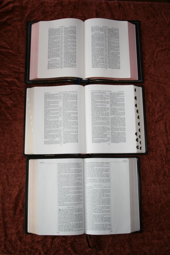
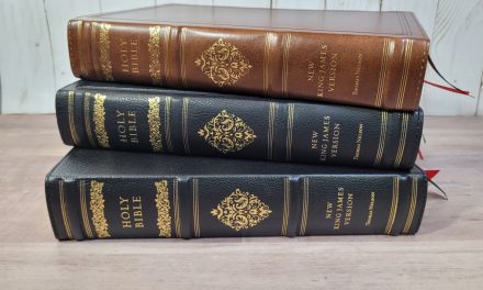
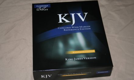
One of the most popular questions that I’ve gotten is to make comparisons between the LCBP Note-Takers, Cambridge Concord Wide Margin, and the RL Allan Brevier Clarendon Wide Margin KJVs. I decided to share my latest response including a few photos. The Bibles are: LCBP 2nd Edition Note-Takers in Ironed Calfskin, Cambridge Concord Wide Margin in French Morocco (with custom thumb-index), and the RL Allan Brevier Clarendon Wide Margin in Highland Goatskin.
The updated Note-Takers is the most readable. It has an 11.5-point font with about a 12.5 leading. The font is sharp and clean, is bold, and has minimal show-through. The Concord and Brevier are slightly bolder and the fonts are a little thicker, but they’re both 8-point with 9-point leading. They’re also highly legible, but I think the Note-Takers looks better in the font category (it’s hard to tell that in these photos because of the flash). The Note-Taker’s paper is not as nice as Allan’s and Cambridge’s. It’s thick and great for writing with Micron markers (I haven’t tried highlighters), but it doesn’t take color from color pencils very well. It’s also a little shiny, so if there’s a light shining on the page I have to move the Bible around to see the text better. It might have slightly more show-through than the other two but I’d say it’s negligible.
The Cambridge and Allan both have similar paper and fonts. For me, the Concord is slightly easier to read because of the font style. They have different paper (Cambridge = ‘Bible’ paper, Allan = Writable India) but they look and feel about the same to me. They have a slight cream tint which I like a lot. They have my favorite paper in any Bible I own. The Clarendon has letters in the text to key the text to the references. It also has chapter summaries. The Concord doesn’t have the letters for the references. The references have verse numbers, so you know what verse they go to, but not what portion of the verse. This makes its text cleaner but it’s also harder to use. The Clarendon and Concord are so close that it’s hard to choose between the two. Overall I like the Concord because I like having a concordance and a glossary in my Bible.


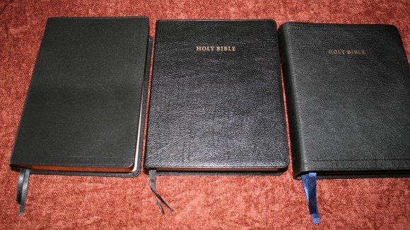
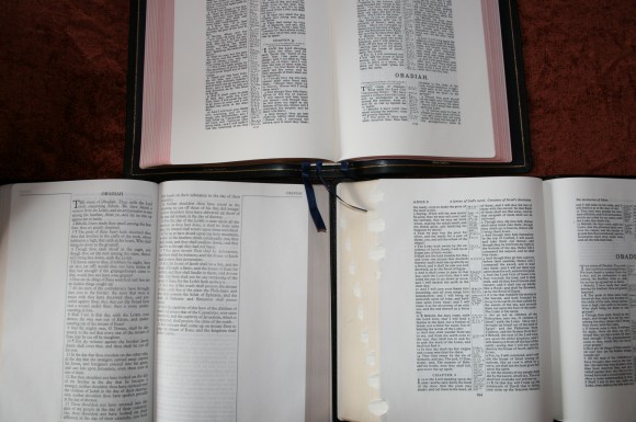
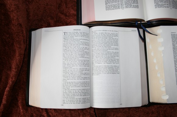
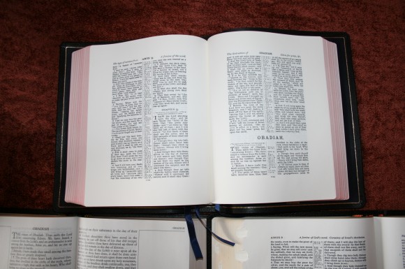
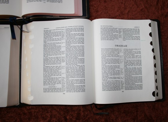
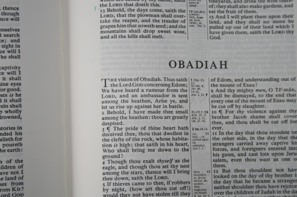
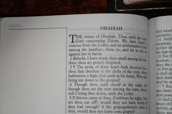
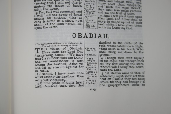




Great shots! I have wondered how these Bibles stacked up to one another. I thought about getting a Notetakers Bible because I love the format. It gives the greatest room for notes and has a single column bible reading effect. I have gotten so attached to goatskin though. Since my wife recently bought me an Allan Longprimer as an early birthday gift, I must say all goatskin covers are not created equal. I thought about getting the Brevier Wide Margin initially but the price tag was a bit steep for me at that time and I noticed that the yapp does not seem to curve around the book block. I have heard nothing but positive things about the Wide Margin Concord. It seems to be the preferred Wide Margin amongst us Bible fanatics.
I was curious about the custom thumb indexing. Who did it? How much did it cost? Would you do it again? What about the gilt?
Hi Justin. It was already done when I got it from Baker Publishing. I’m not sure what it would cost. It looks like it was done by hand and it isn’t very good. The tabs are crooked and the paper isn’t cut well. The gilt is fine. I like that it’s there and I use it a lot. I prefer the thumb-index in the regular size Concord because it has a tab for each book (mostly). I recommend having it done, but make sure it’s done by somebody that knows what they’re doing.
Thank you for the comparison. It is very helpful!