
The NKJV Large-Print Thinline Reference Bible Maclaren Series is the newest addition to the Maclaren series. This one is actually based on the original NKJV Large Print Thinline that I reviewed in the Premier Collection. It has the same blue highlights as the Maclaren and the paper is extremely similar. It adds the words of Christ in blue. The NKJV Large-Print Thinline Reference Bible Maclaren Series is available in several cover options. I’m reviewing the black genuine leather, ISBN: 9780785297932, printed in China.
Thomas Nelson provided this Bible in exchange for an honest review. I was not required to give a positive review, only an honest one. All opinions are my own.
_________________________________________________________
This Bible is available at (includes some affiliate links)
and many local Bible bookstores
_________________________________________________________
Table of Contents
- Video Review
- Binding
- Paper
- Typography and Layout
- References
- Concordance
- Bible Atlas
- Comparisons
- Conclusion
Video Review
Binding

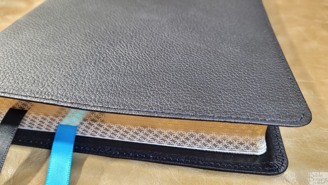
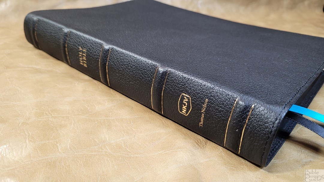
The cover is black genuine leather. It’s soft to the touch and has a fairly deep grain that looks like cowhide. It has perimeter stitching with nothing printed on the front. The spine includes five large raised hubs outlined in gold. The text is small and printed in gold.
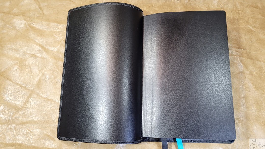
The liner is edge-lined vinyl. This makes the cover feel thin. The edge-lined tab is stiff, but the page is bent where the tab is glued and the tab is short enough that the Bible doesn’t try to close in the front or the back of the Bible. It stays open perfectly on the first page of Genesis. The text block is sewn. It has two 3/8″ ribbons: one black and one blue. The blue matches the highlights in the text. The overall size is 6.75 x 10 x 1.25″. The trim size is 6.25 x 9.25″. It weighs 2 lbs, 2.8 oz.
Paper

The paper seems to be the same (or very similar) 36gsm paper that’s used in the regular Maclaren. It’s white in color and has a very slightly warm tone that’s great for reading. The pages are easy to separate on their edges, but I had trouble separating them with my normal method of rubbing them between my finger and thumb. It feels like new money. I’m sure it will be easier to separate once it’s been used enough. The paper is extremely opaque and has no glare under direct light.
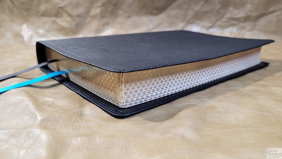
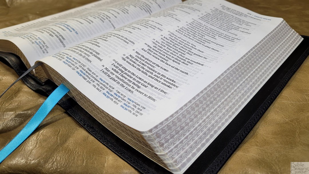
The page edges have a unique gilded pattern that stands out from most Bibles.
Typography and Layout
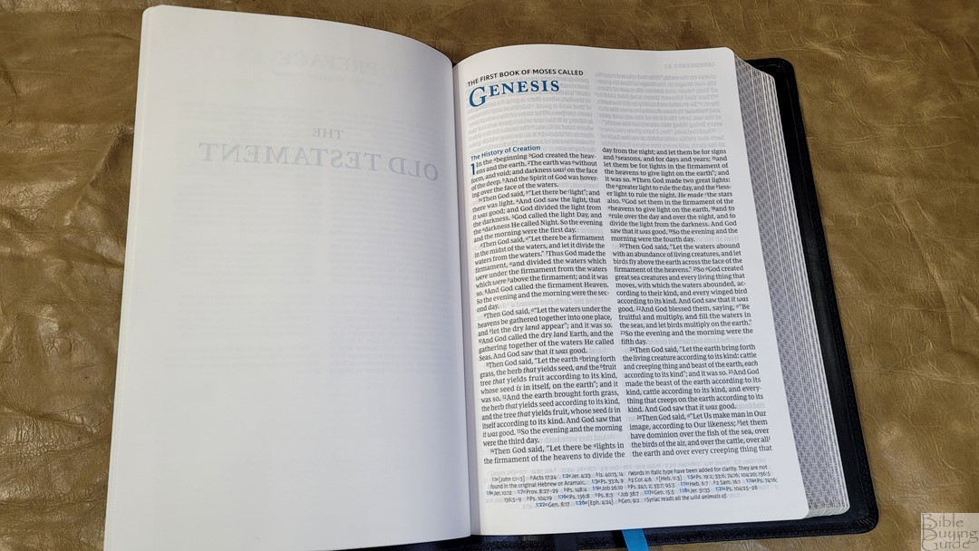
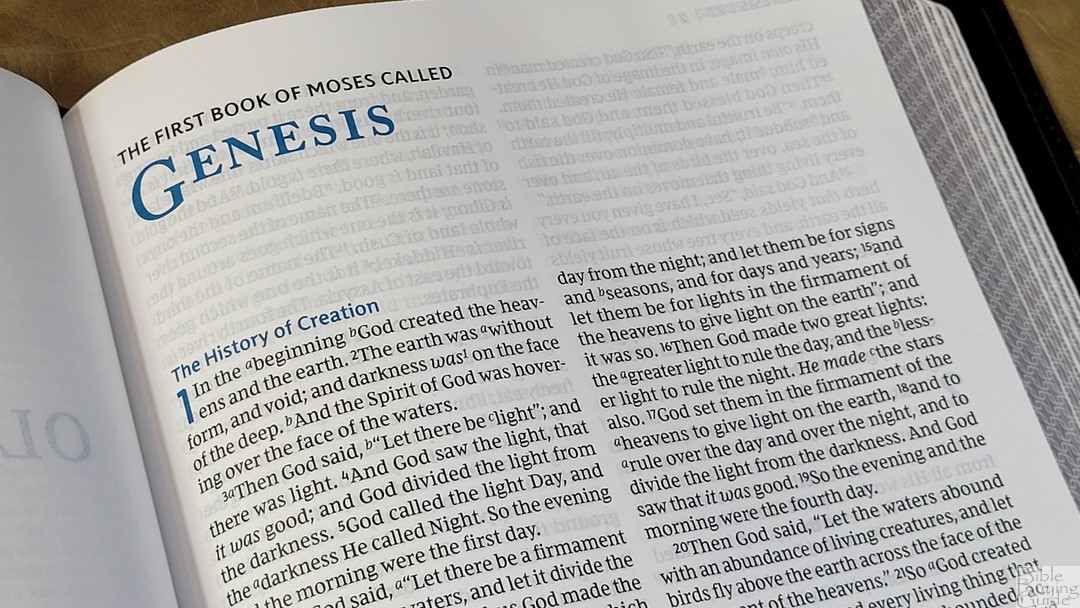
The NKJV text is presented in double-column paragraph format with poetry set to stanzas and personal letters indented with a ragged right edge. The references are placed in the footer in a single column. The header includes the book name and chapter numbers in the outer corner in blue, and the page number in black with a black vertical line separating them. All highlights, including the words of Christ, drop caps, section headings, and the main references in the cross-references, are in the same blue that’s used in the Maclaren series.
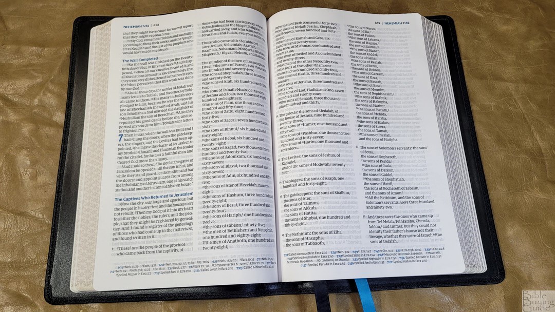
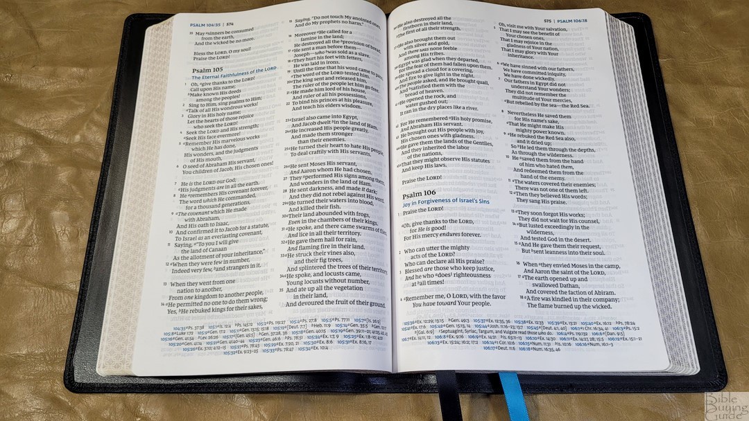
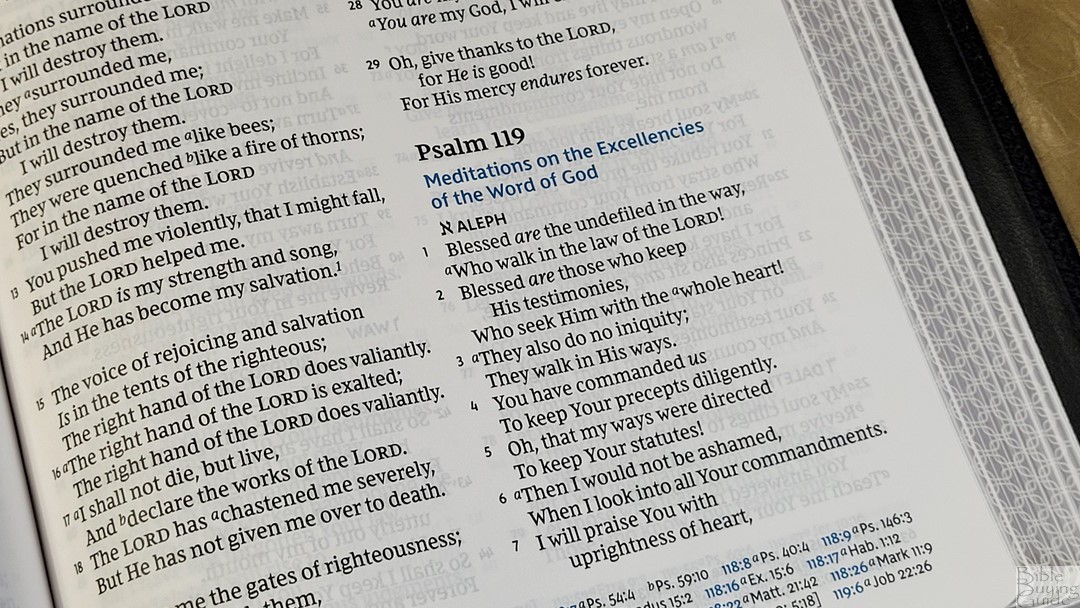
The typeface is the Comfort Print designed specifically for the NKJV by 2K/Denmark. The font is 10-point. This is a blue-letter edition. Both the black letter and the blue letter are dark and consistent throughout. This is the same blue used in the Maclaren series, which really is the only thing it has in common with the Maclaren when it comes to design. I found the words of Christ in blue to be comfortable to read.

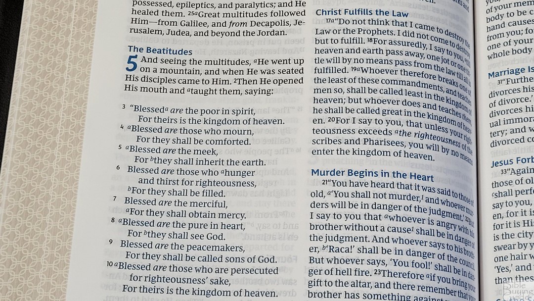
It has around 8-10 words per line, which is ideal for a two-column layout with a poetic setting. The has enough space within the words and lines to be comfortable to read. Poetry is divided well, making the text look balanced and readable. The edge-lined liner does keep the spine flat, so there is a little less space in the inner margin than I’d like. The text was printed with line matching, meaning that the lines are printed in the same location on both sides of the page. This reduces the show-through and improves readability. The show-through is mostly noticeable in the poetic settings, which is normal. Verse numbers are black and don’t stand out. This does take an extra second or two to find the verses, but that’s normal. It didn’t have any trouble preaching from it.
References

It has 43,000 cross-references. The cross-references and footnotes are placed together across the footer in a single column. They’re keyed to the text with letters. The main chapter and verse numbers are in blue. This edition has far fewer cross-references than the regular Maclaren. They match those of the NKJV Sovereign. They’re good for basic study, but you might need other tools for more in-depth study.
Here are some example references to help you compare:
- Genesis 1:1 – Jn 1:1-3; Acts 17:24
- Deuteronomy 6:4 – 1 Cor 8:4, 6
- Isaiah 9:6 – Luke 2:11; John 3:16; Matt 28:18; Judg 13:18; Titus 2:13; Eph 2:14
- Matthew 28:19 – Mk 16:15; Lk 24:47
- Mark 12:29 – Deut 6:4, 5
- John 1:1 – 1 John 1:1; Rev 19:13; John 17:5; 1 John 1:2; 5:20
- John 3:16 – Rom 5:8; Is 9:6
- Acts 2:38 – Luke 24:47
- Romans 10:9 – Lk 12:8
- 1 John 1:1 – John 1:1; John 1:14; 2 Pet 1:16; Luke 24:39; John 1:1, 4, 14

Footnotes are the reduced set of NKJV translation notes. These are the footnotes used in many reference editions. They provide manuscript variations and identify the manuscripts.
Concordance
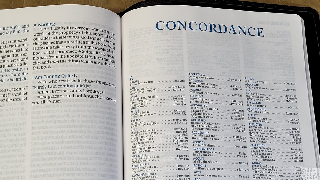
The concordance is 39 pages with 3 columns per page. The entries are in blue. There are a lot of entries, making this a good concordance for study. Other than Jesus, it doesn’t include common names. Here are some example entries and the number of references they provide:
- Christ – 13
- Christian(s) – 2
- Faith – 40
- Faithful – 20
- Faithfulness – 5
- Faithless – 2
- God – 38
- Goddess – 2
- Godhead – 2
- Godliness – 4
- Godly – 3
- Praise – 25
- Praised – 4
- Praises – 2
- Praiseworthy – 1
- Praising – 3
- Pray – 14
- Prayed – 2
- Prayer – 16
- Prayers – 5
Bible Atlas
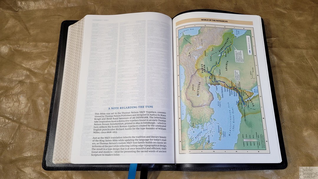
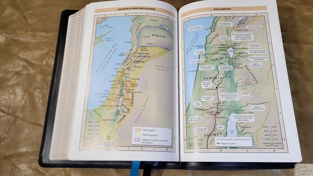
It includes the standard Zondervan maps used in most Thomas Nelson reference Bibles. It has 7 full-color maps printed on 8 pages of thick semi-glossy paper. It does not include an index but the maps are annotated well. I like the bright colors. They include topography, distance, routes, borders, possible locations of lost places, battles, elevation, cities, and locations for the events of Jesus’ ministry.
Maps include:
- World of the Patriarchs
- Exodus and Conquest of Canaan
- Land of the Twelve Tribes
- Kingdom of David and Solomon
- Jesus’ Ministry
- Paul’s Missionary Journeys
- Jerusalem in the Time of Jesus
Comparisons
Here’s how the Large Print Thinline Maclaren compares to a few similar Bibles and the original Maclaren.
NKJV Large Print Thinline Premier Collection
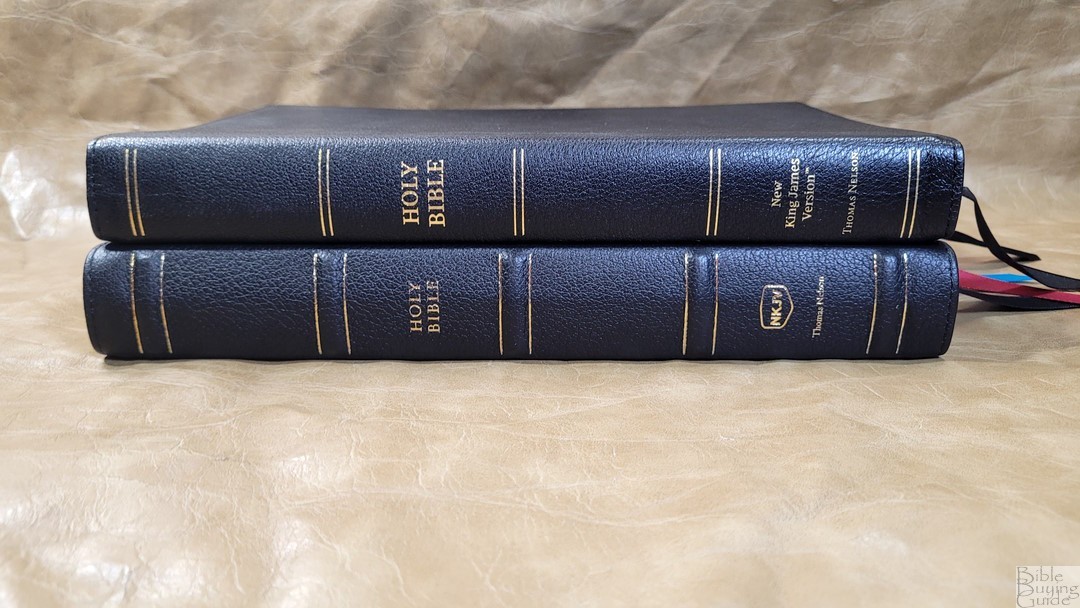
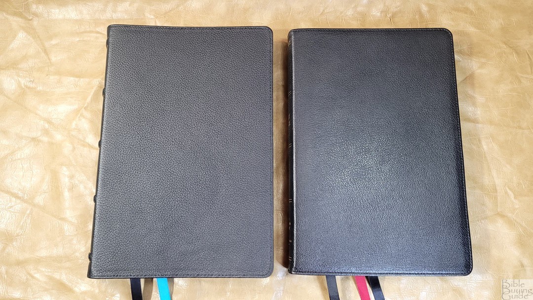


The Large Print Thinline Maclaren is a version of the NKJV Large Print Thinline Premier Collection. It has the same layout, with the exception of the highlights in red and different paper. Both are 10-point and have the same concordance and maps. The original in the Premier Collection is black letter.
NKJV Maclaren

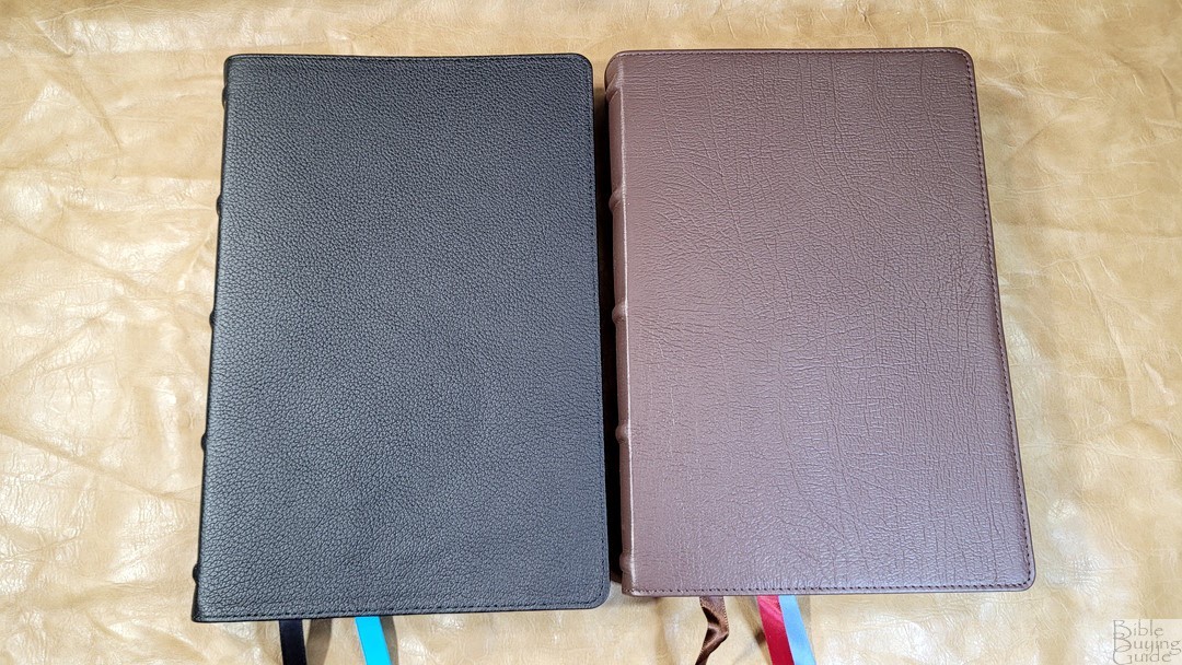


The NKJV Maclaren has a large print double-column setting in a verse-by-verse format. It also includes the same blue highlights throughout. It has more cross-references and the same maps. The footprint is about the same, but the original Maclaren is a lot thinner. Its font is larger and it has more space between the lines.
NKJV Quentel

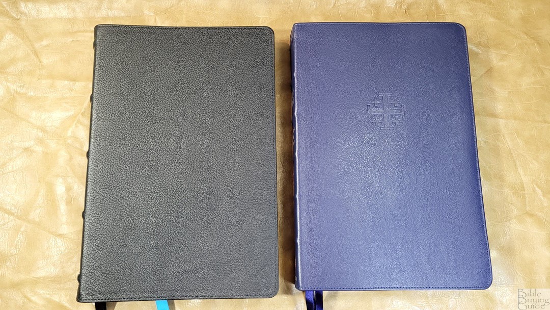
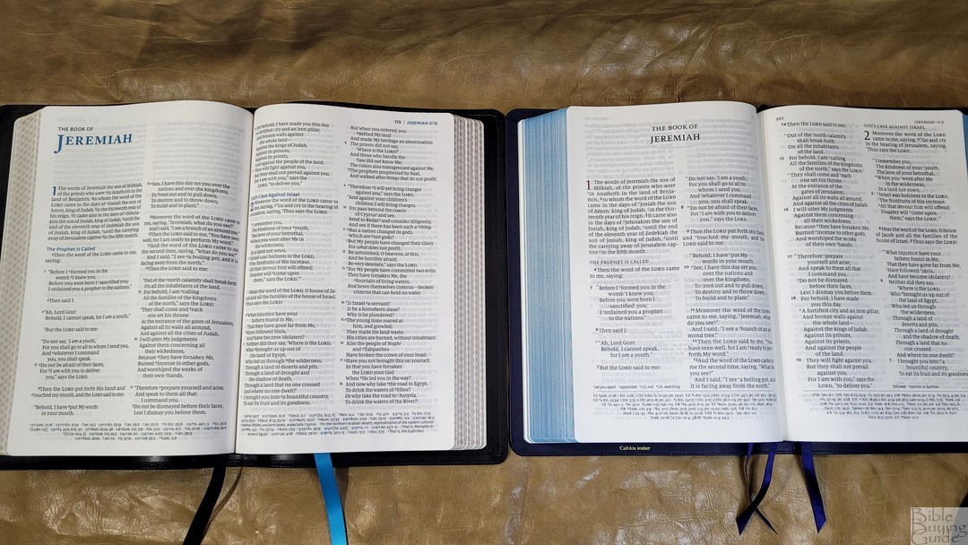


The NKJV Quentel is the Bible the TN is based on. The Quentel has a double-column, paragraph setting with a larger font and bolder verse numbers. It includes the full set of NKJV footnotes and lots more cross-references. It has 28gsm premium paper with a coating and titanium pigment to increase opacity. It has more maps and a map index. The concordance seems to be the same.
Conclusion
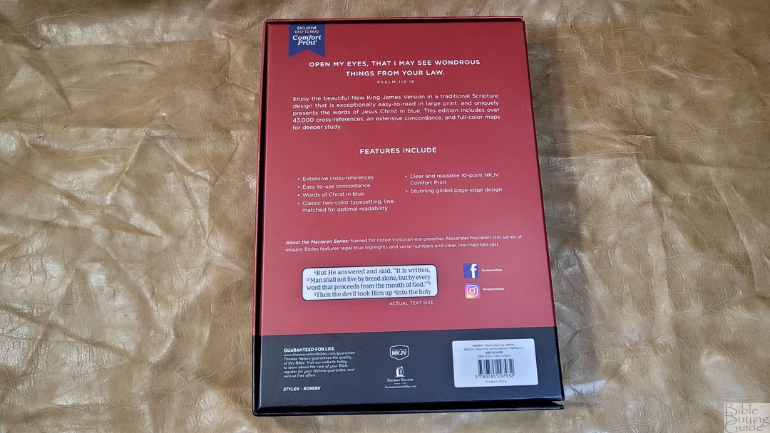
The NKJV Large-Print Thinline Reference Bible is an excellent addition to the Maclaren Series. It’s not as thin as the original Thinline Large Print in the Premier Collection, but it does feel like a thin Bible. It does have fewer references than the original Maclaren, but it’s excellent if you don’t need a lot of them. I love the layout, the print quality, and the look and feel of the paper. The layout is one of the most readable NKJVs I’ve seen. The blue highlights and the words of Christ in blue make it stand out.
_________________________________________________________
This Bible is available at (includes some affiliate links)
and many local Bible bookstores
_________________________________________________________
Thomas Nelson provided this Bible in exchange for an honest review. I was not required to give a positive review, only an honest one. All opinions are my own.



Hello, Randy
I enjoy your written reviews as well as YouTube reviews.
I don’t buy bibles so often but your reviews give some information and in-depth thoughts helping me study bible alone and I thank you for that.
Well, do you think Thomas Nelson publish KJV of this version?
I would love to read the words of Jesus in blue but I’m not NKJV person…