
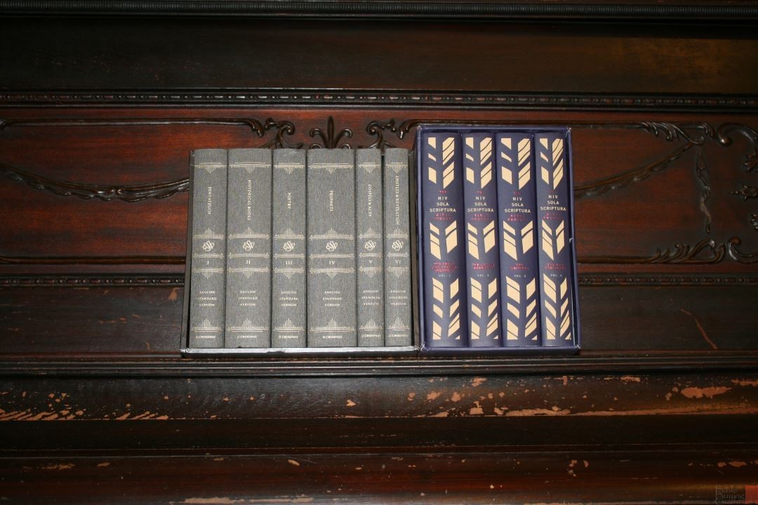
One of the first reader’s editions in modern Bible publishing was the NIV Books of the Bible. This Bible helped start the reader’s edition trend by removing chapter and verse numbers and pointing out the value of a reader’s edition while showing problems of modern day Bible design. Zondervan’s NIV Sola Scriptura brings the NIV Books of the Bible to the next level by producing it in a new setting as a 4-volume set with even fewer distractions.
In this review we’ll take a look at this 4 volume set, ISBN: 9780310448129, made in China, and compare it to several other reader’s editions that have been produced since the NIV Books of the Bible was originally released in 2011.
Zondervan provided this Bible free for review. I was not required to give a positive review, only an honest one. All opinions are my own.
_________________________________________________________
This book is available at (includes some affiliate links)
and many local Bible bookstores
_________________________________________________________
THE FOUR VOLUMES
The books of the Bible are not presented in the normal order that we’re used to. Instead, they follow the order in The Books of the Bible. The internal divisions are based on what scholars feel are more natural. This gives us the Bible in 4 volumes.
The four volumes are:
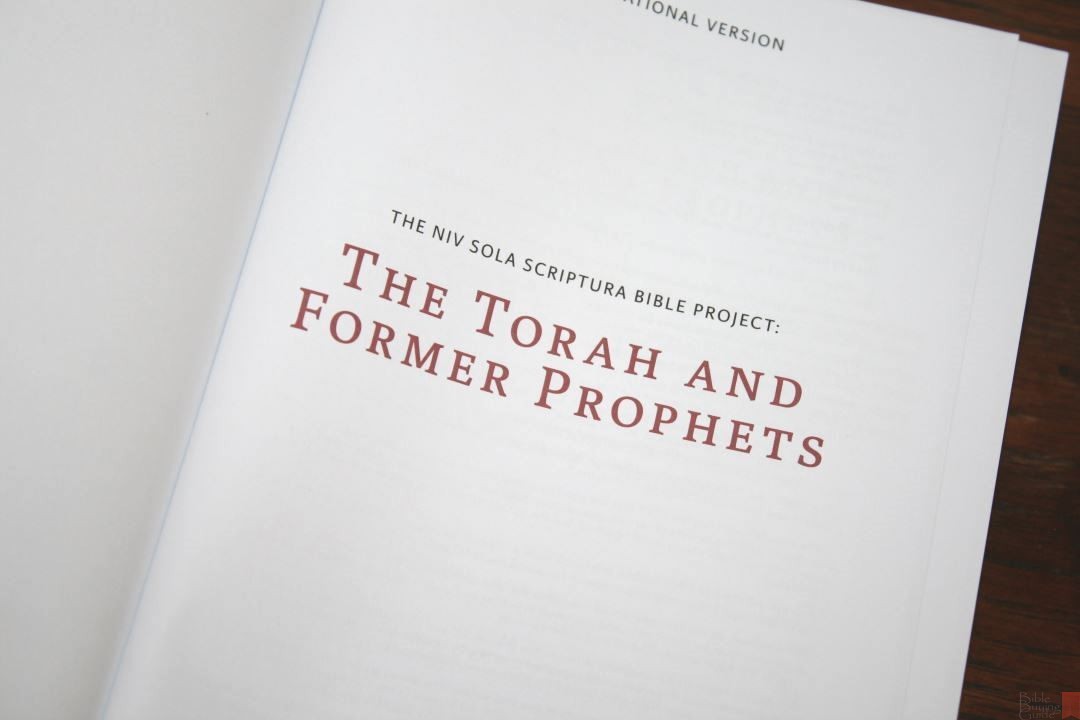
- The Torah and the Former Prophets
- The Latter Prophets
- The Writings
- The New Testament
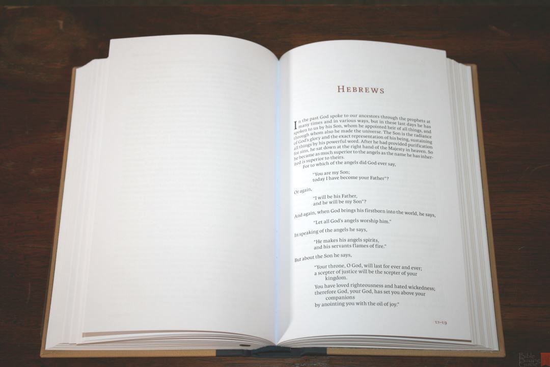
The Old Testament follows the Hebrew organization of the Torah, the Former and Latter Prophets, and the Writings. The New Testament places each of the four Gospels at the head of four groupings that work best together. This keeps Luke and Acts together, John’s writings together, Paul’s letters in historical order rather than from largest to smallest and placed with Luke’s writings, which makes sense considering that Luke traveled with Paul.
COVER AND BINDING
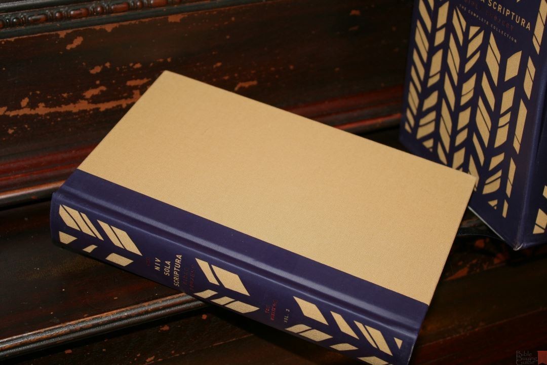
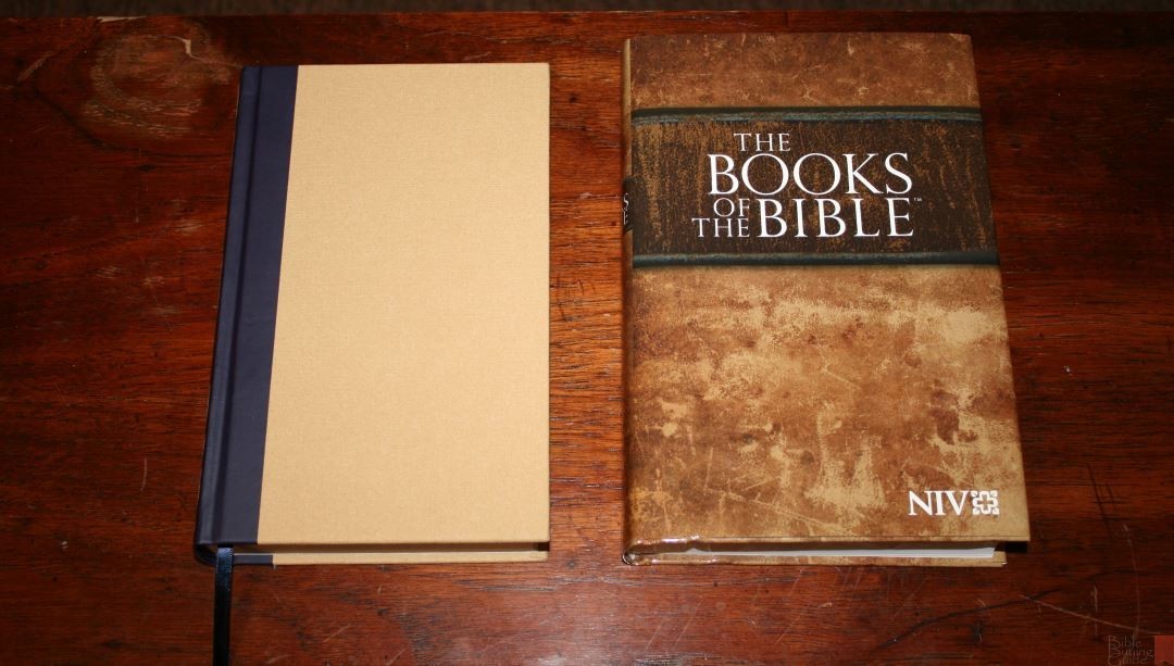
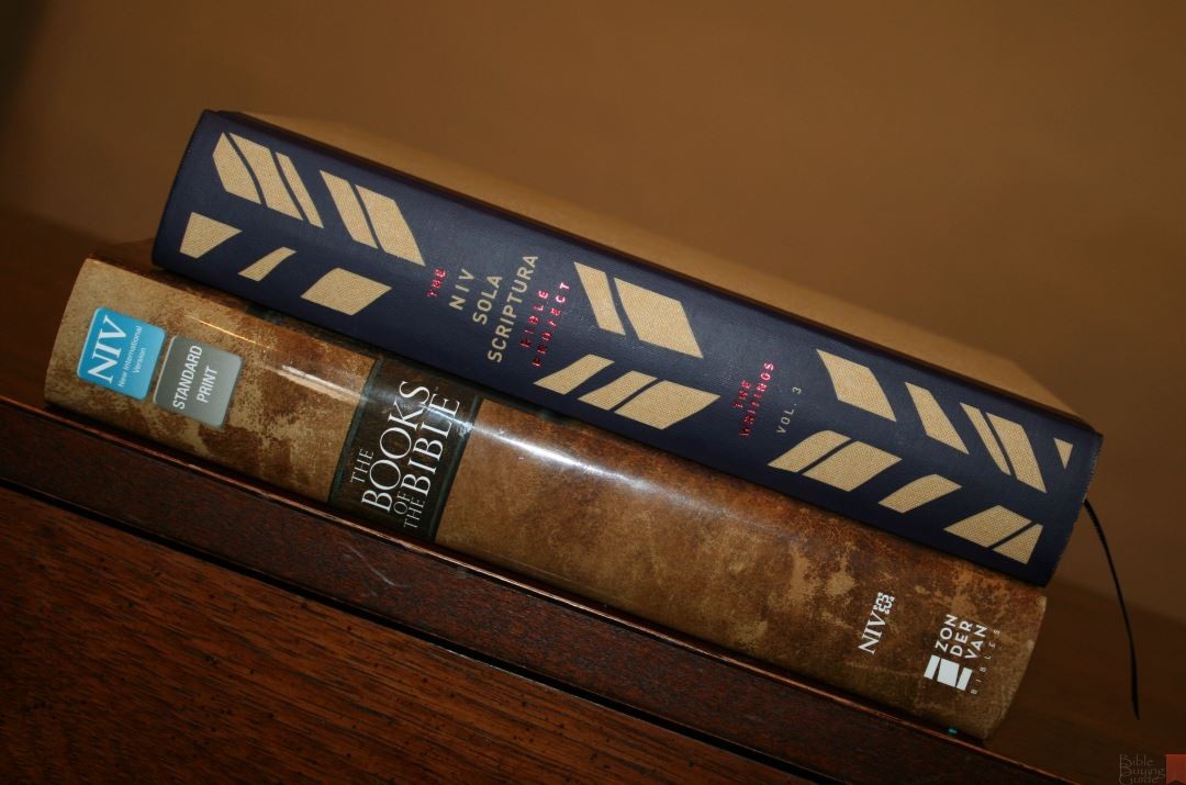
The four volumes are cloth over board and are 8.75″ x 5.5″ and average in thickness around 1.5″. The cover is dark shades of tan on the front and back and blue for the spine. The spine includes some of the text in a shiny red and the rest in tan along with a stylized artwork of wheat.

The liner is a thick paper with a beautiful design with a feathered pattern of dark reds, browns, etc. I love the dark colors.
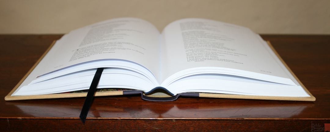
It’s Smyth sewn. The spine of the text-block (not the cover) rises up when the book is opened to make the pages lie flat. The spine of the cover remains flat. Each book includes a thin ribbon marker.
PAPER
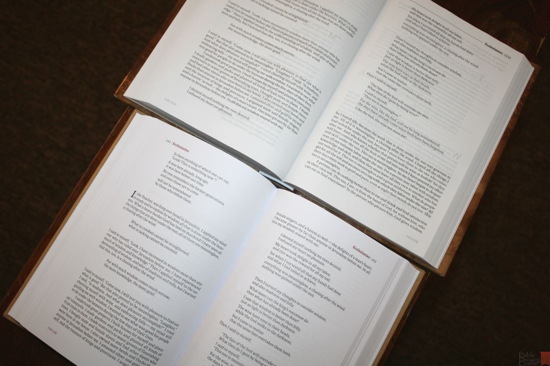
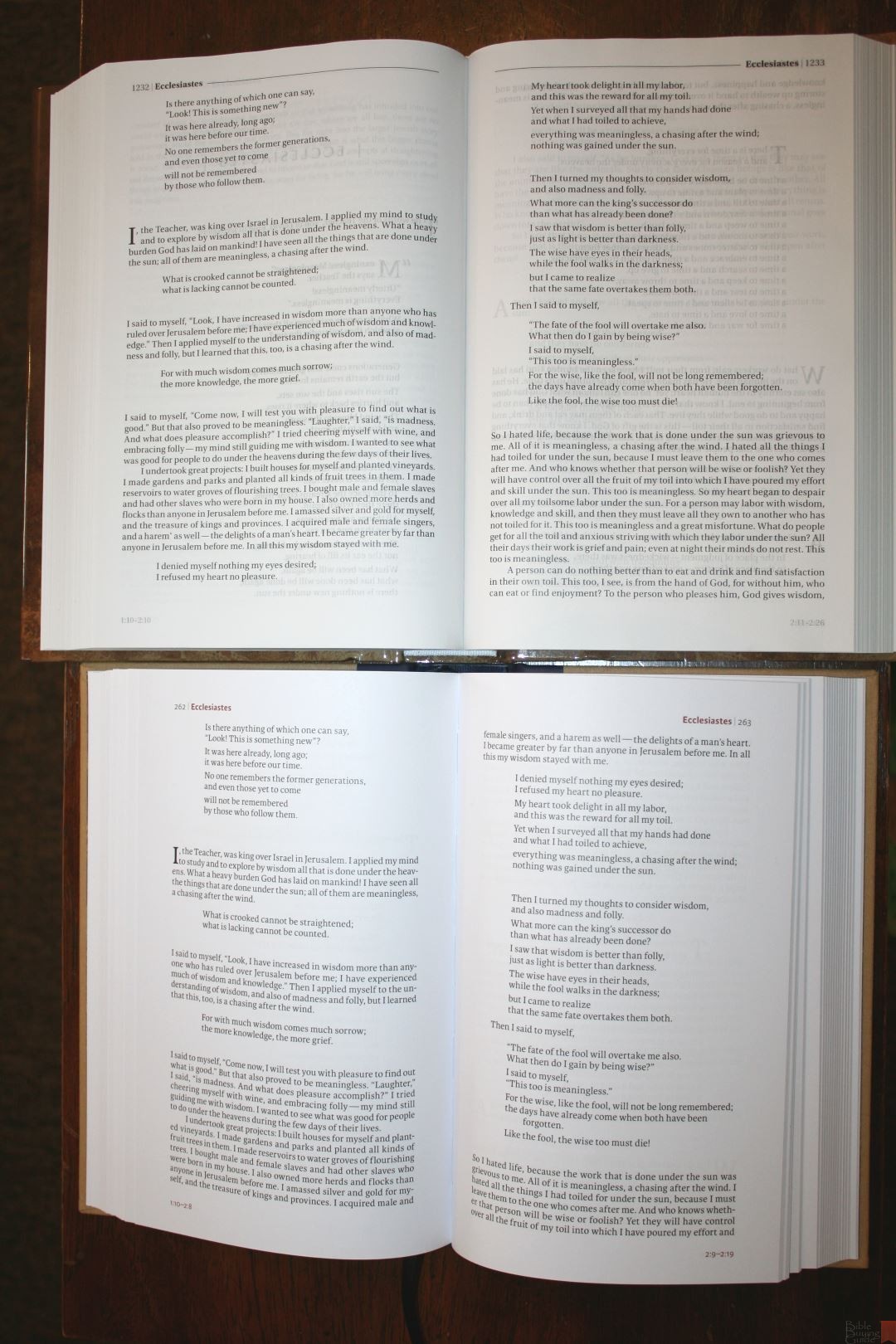
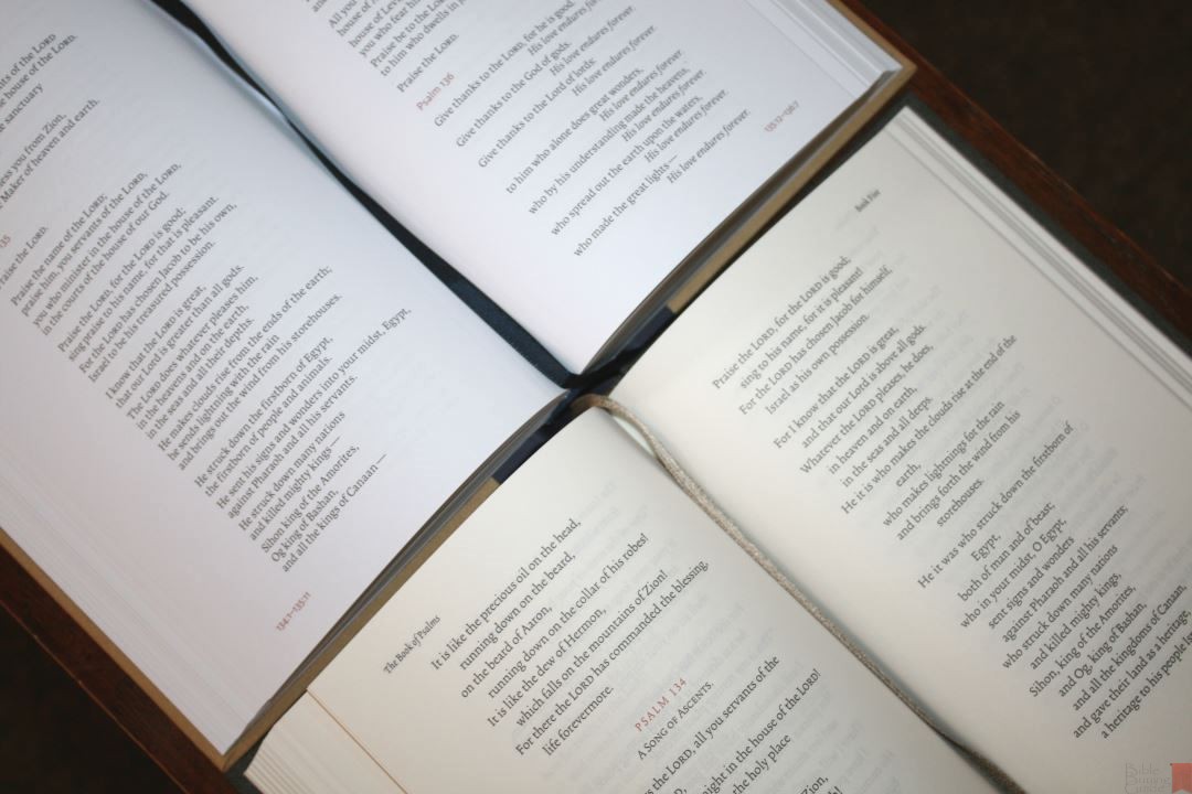
The paper is extremely thick and opaque. I could only see show-through in the poetic settings and then only if I looked for it. Even then I had to have the right lighting to see it. There is no glare even under direct light.
The paper is white in color and has a smooth texture. It has a nice contrast. I had no issues turning pages or reading for long periods of time. Under fluorescent lighting I can see some blue in the gutter, but not on the flat part of the page, and not under any other lighting that I used. This doesn’t bother me in the least, but I wanted to mention it just in case. You’ll see some blue in our photos because they’re under fluorescent lights.
TYPOGRAPHY
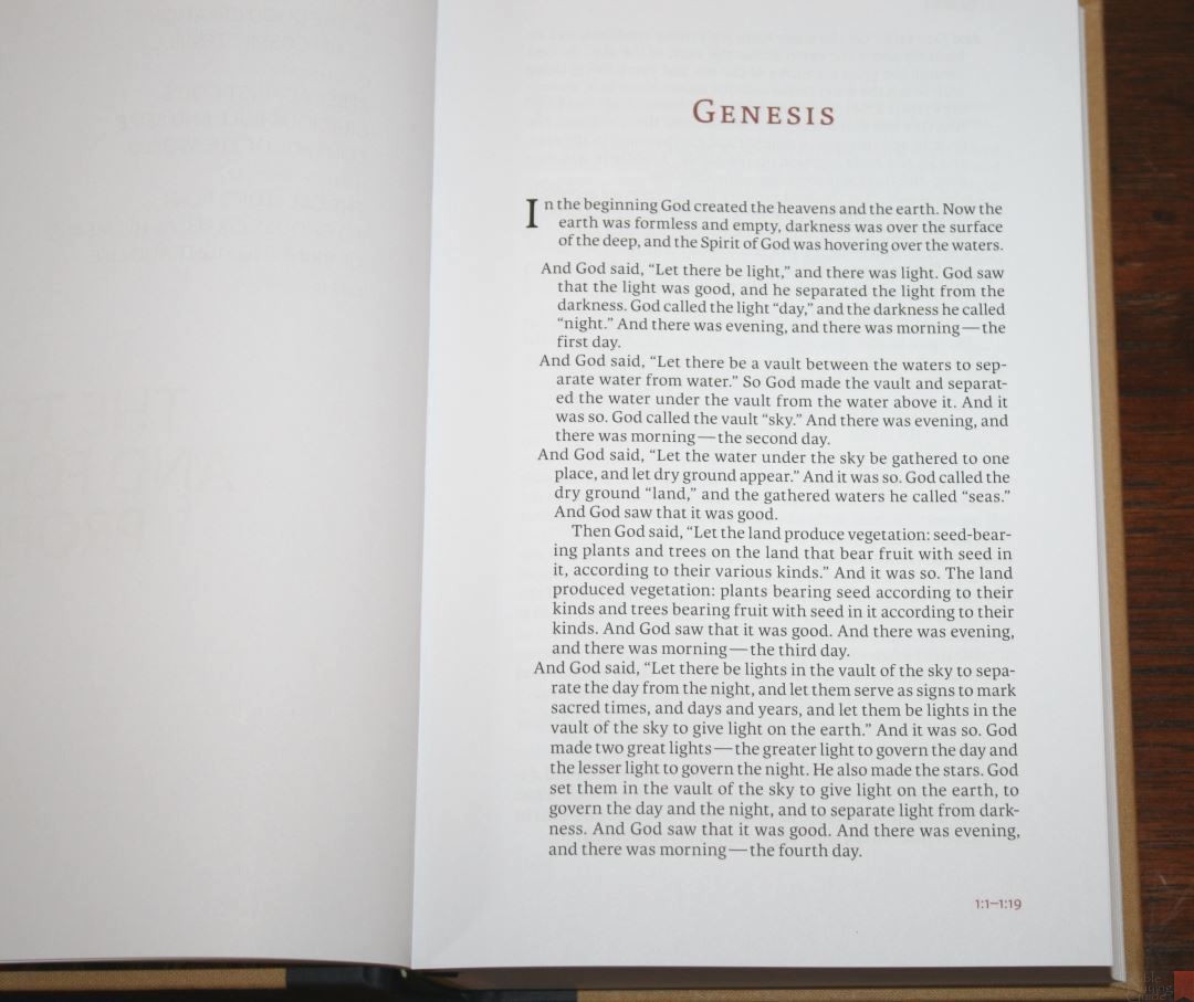
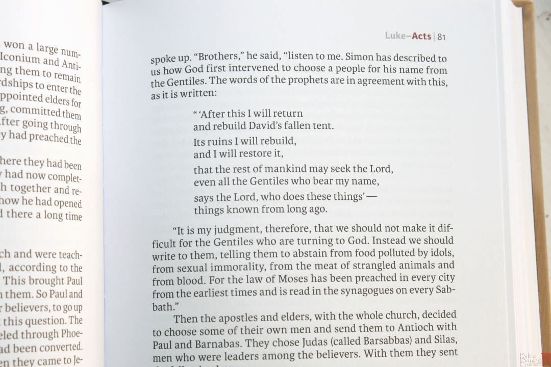
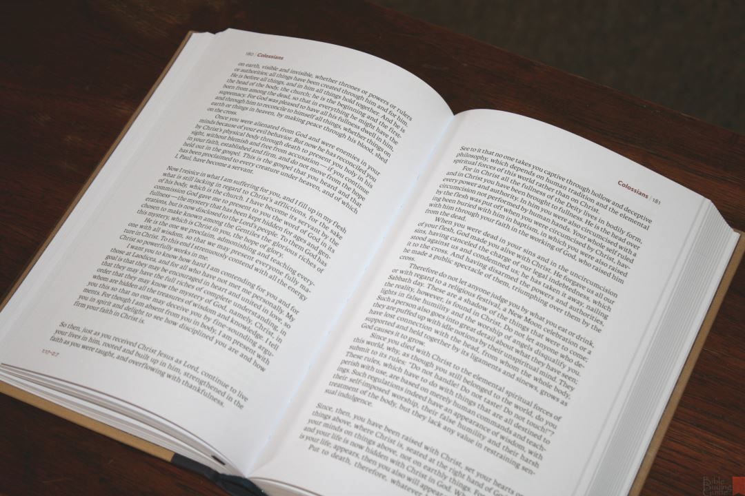
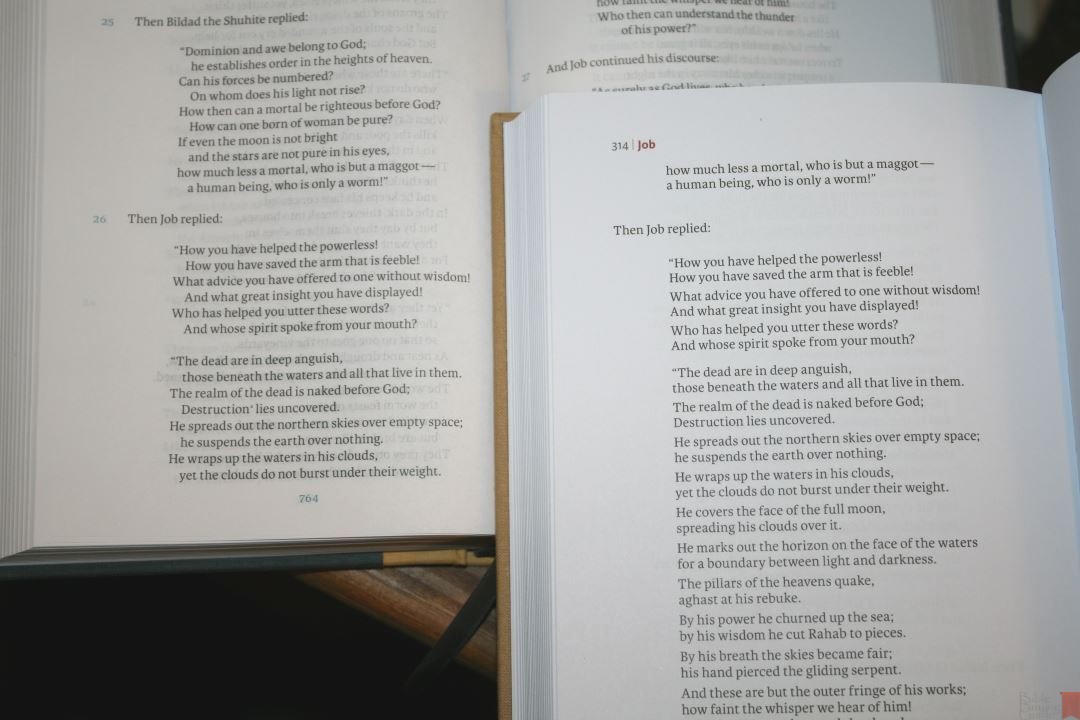
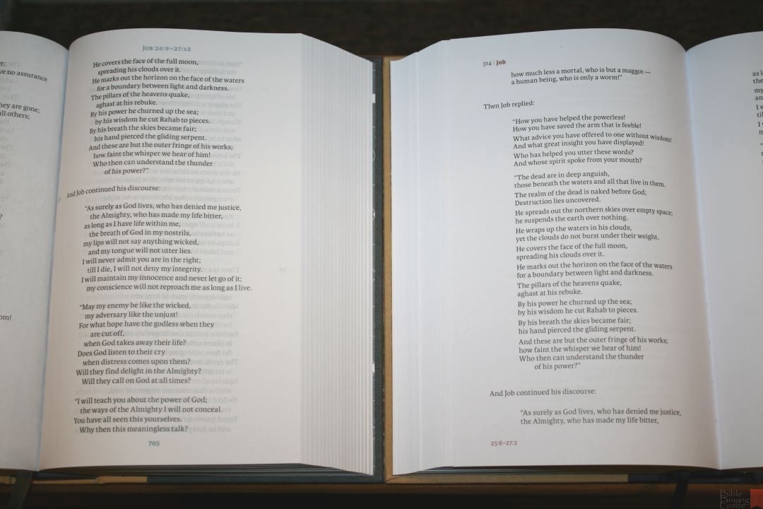
The text is presented in a single-column paragraph layout. Dialog is placed on its own line, poetry is set in stanzas, and letters are indented. The header shows the page number in the outer margin and the book name, or range of names (some books are combined), next to the page number. The current book is in a gorgeous dark red and in bold. The footer shows the book name and range of chapters and verse numbers on that page in the outer margin. This is printed in the same red but not in bold.

The typeface uses a 10.3-point black letter Karmina font with a good leading. The font is dark, sharp, and consistent throughout. I’m not 100% sure if it has line-matching. This paper is so opaque that I can’t tell. The text is highly readable. I enjoyed reading it for long periods of time.
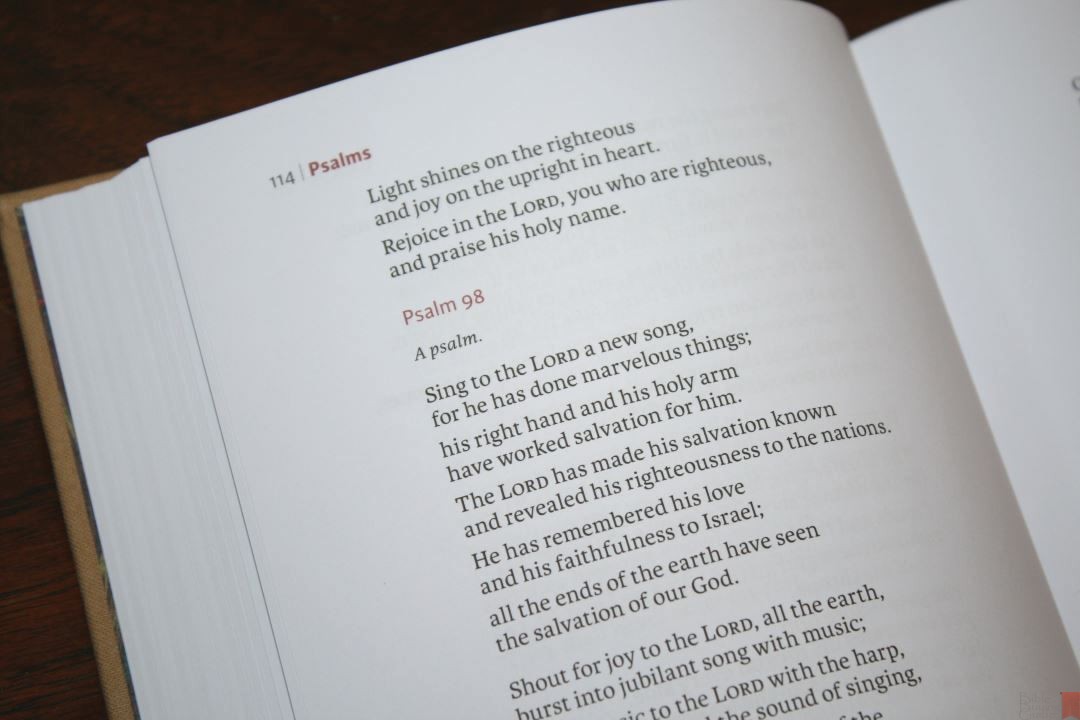
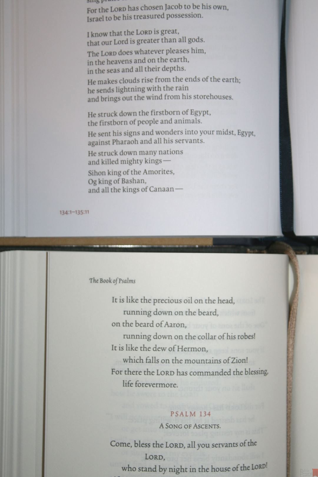
There are no chapter numbers or verse numbers. There are no distractions within the text anywhere. This means there are no section headings, footnotes, cross references, etc., to distract from reading. Where there is a break in the topic or thought, it has spaces to separate the paragraphs.
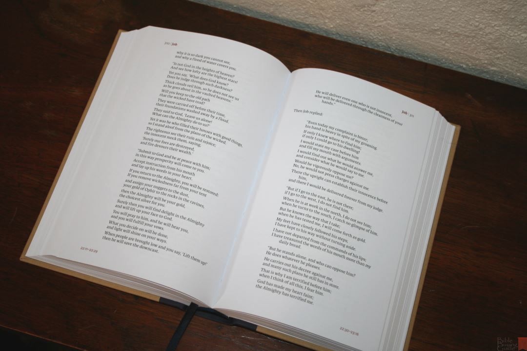
Some chapters have drop cap letters while others are normal letters but without an indention for the paragraph. The drop caps show where there’s a major change in thought or location. Where there’s a smaller change there is a single line between paragraphs. The larger the change the larger the space between the paragraphs. This helps give the reader a visual representation of a change without providing a section heading. These are more natural breaks than what we would see as chapter or verse breaks.
It has a 3/4″ inner margin to keep the text from bending into the gutter. The outer margin is 5/8″. It has around 62 characters per line with around 12 words per line. It has 45 lines per page.
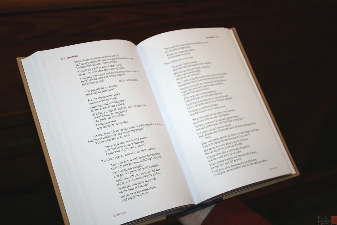
It’s hard to imagine poetry looking better than this. The 62 characters per line give it enough room for most lines and those very few that need to wrap to the next line are indented so it’s easy to follow. The Psalms are numbered – as they should be. The Psalm number is printed in the same weight and color as the footer.
This isn’t the NIV Books of the Bible reprinted in 4 volumes. It’s a new setting with a narrower column, fewer words per page, and no footnotes.
GUIDE AND INVITATION TO EACH VOLUME

A guide appears at the front of each volume and explains the book order and benefits of the order. It also provides an index to the extra material (Preface, Invitation, and about the NIV), and includes an index to the biblical books with their order and page numbers.
The invitation is an introduction to the books within each volume. These do not cover the books individually, but instead cover them as a unit. They provide a summary of the content, discuss key characters, key events, purpose of writing, genres of writing, who the authors were, who the audience was, etc. They also discuss the benefits of reading the books in the order presented.
PREFACE TO THE NIV SOLA SCRIPTURA BIBLE PROJECT

Each edition contains the Preface, which explains the purpose of the reader’s edition and the reason for the order of the biblical books. This is the preface from the NIV Books of the Bible that released in 2011.
It covers the problems of reading the Bible with distractions such as chapter and verse numbers and the benefits of having a visual presentation of the text so the reader can easily see what portions of text is poetry, a letter, a story, etc. I highly recommend reading this preface as it explains the value of all reader’s editions and this one specifically.
A WORD ABOUT THE NIV
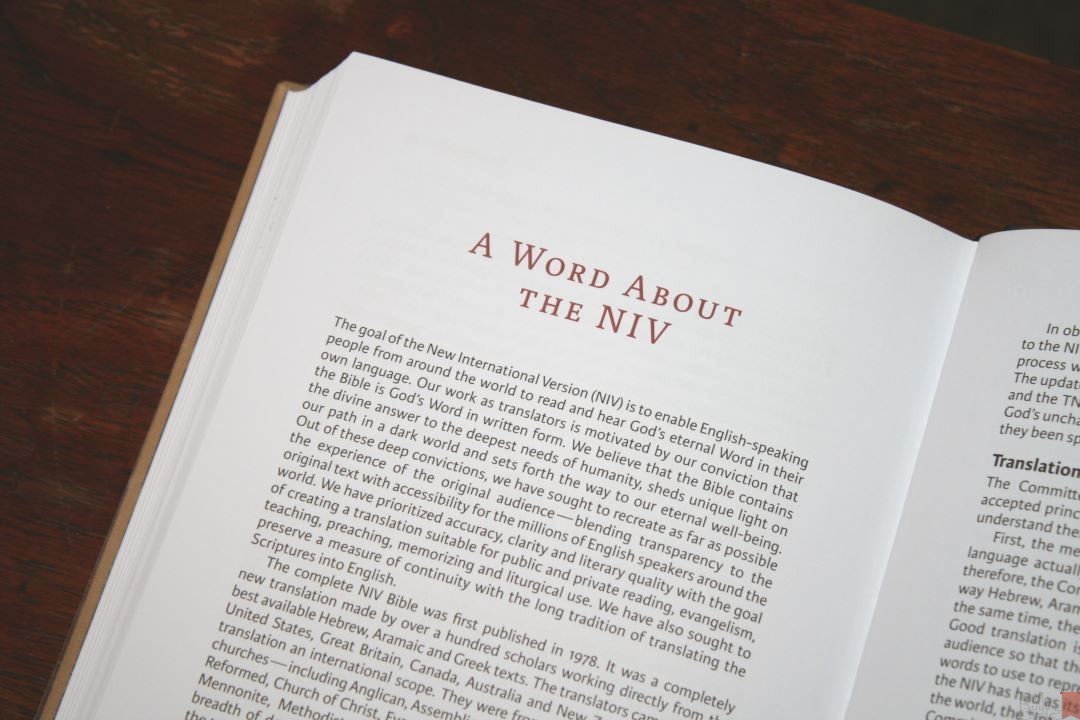
This is the introduction to the NIV and appears at the end of each volume. It covers the need and purpose for the NIV, translation philosophy, textual basis, footnotes, and formatting, and information about the underlying manuscripts. This is the official note from the Committee on Bible Translation.
SLIPCASE
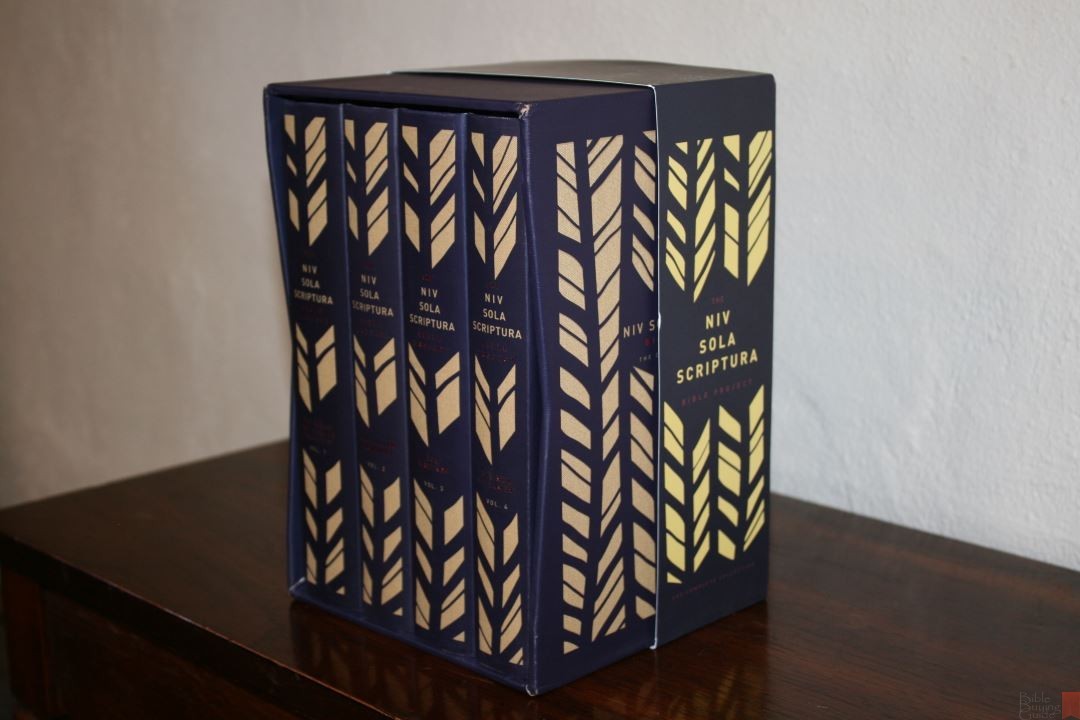
NIV Sola Scriptura comes in a thick cardboard slipcase to hold all four volumes. The case is the same dark blue as the spines of the books and includes the same tan wheat design. It can be a little difficult to pull the books from the case. They fit tightly and there’re no cutouts where you can grab the books.
I ended up leaving the books out of the case while I was still using them. I left one on the top of the case so I could grab any book easily. Another option would be to not push the books all the way into the case. I left the one I was using out of the case by a couple of inches and it was much easier to grab.
COMPARISONS
Here’s a look at how Sola Scriptura compares with the recently released NIV Reader’s Bible, the NIV Books of the Bible that this set is based on, and the ESV 6-Volume Readers Set.
NIV Books of the Bible

NIV Reader’s Bible

ESV 6-Volume Reader’s Set
FINAL THOUGHTS ON THE NIV SOLA SCRIPTURA BIBLE PROJECT
I love reading the Bible in a reader’s edition. Reading is what we should be doing with God’s Word and we don’t need numbers, letters, and bad formatting getting in the way of our comprehension of the Bible. NIV Sola Scriptura presents the Bible in an elegant readable format and stands apart from other reader’s editions in the way it presents the order of the biblical books. It presents them in a way that makes sense when you consider literary forms. The books are made well.
I’m grateful that more translations are being presented in both single and multi-volume reader’s editions. I hope to see even more Bibles in this format – especially the KJV, which is often the most difficult to read because of it’s archaic formatting. This is an excellent set for sitting and reading. I highly recommend the NIV Sola Scriptura 4 volume set for any fan of the NIV.
_________________________________________________________
This book is available at (includes some affiliate links)
and many local Bible bookstores
_________________________________________________________
Photography by hannah C brown
Zondervan provided this Bible free for review. I was not required to give a positive review, only an honest one. All opinions are my own.


Is there not a slight irony that the “Sola Scriptura Bible Project” would include guides and introductions in addition to the Bible itself?
😉
Hi Rick! Very true!
Are there any plans for a leather covered version?
Good question. I haven’t heard. I’ll ask my contact at Zondervan.
Why is the book of Ruth included in with the Torah and Former Prophets? I always thought it was part of the Writings.
This is true, however, I am guessing the committee on publication order likely attempted to place Ruth in the historical genre that more closely fits the historical setting og Ruth.
Hello,
I have been searching for the right Holy Bible and recently bought ‘My Creative Bible’ which is really beautiful. But I find it really depressing that all in the whole of the book, God is referred by he (small letter h) and not He (capital letter H) except when only it is the beginning of a sentence. I take this personally and will not use the Bible. So my search continues for the right Bible that refers to God correctly as He is. God is not man nor mortal and should not be referred to as man.
Gen 1:27 And God created man in his image rather than… And God Created man in His image, and a whole lot of others.
I know it’s alot of work but God deserves all the respect and glory.
Thank you.
Thank you.
Hi Francesca. That’s normal for Bibles in KJV. The NKJV does have this, but I’m not sure if there’s one with drawings and journaling paper. I’ll see what I can find.