
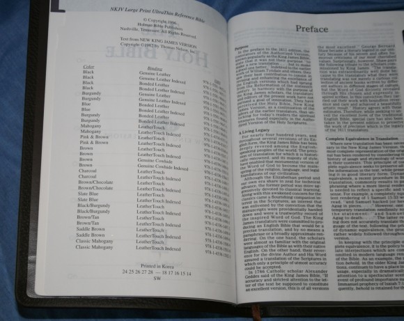
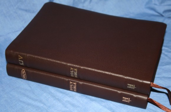
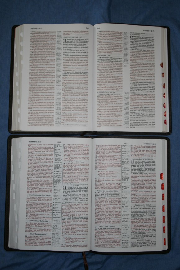
Last year I reviewed the R. L. Allan NKJV in black highland goatskin. This year I decided to review the Holman edition that the Allan is based on – the Holman NKJV Large Print Ultrathin Bible. It is the same text-block but this edition is much more affordable. I have to say I like it better at this price-point. Where Allan’s edition is goatskin, Holman’s highest quality cover is genuine cowhide. The edition I’m reviewing is brown genuine cowhide with thumb-index.
Pros
- Cowhide
- Sewn binding
- 9-point font
- Light weight
Cons
- No index to maps
Features
- NKJV
- Sewn binding
- Brown cowhide
- Presentation and family pages
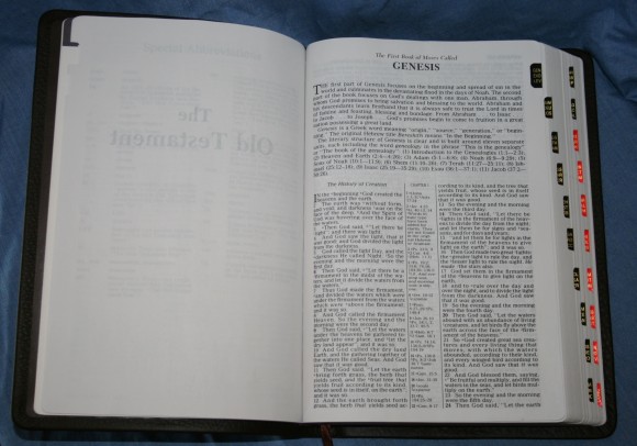
- Thumb-index
- Verse format
- 9-point font
- Red letter
- Center-column references
- Translation notes
- Section headings
- Book introductions
- Harmony of the Gospels
- 66 page Concordance
- 8 Maps
- 1 ribbon
- 9.25 x 6.5 x 1
- ISBN: 9781433615047
- MSP $69.99
- Made in Korea
- Lifetime guarantee
Cover and Binding
The cover is a soft genuine cowhide with a coated paper liner. It has 6 raised hubs on the spin that give it an extra flare. It is not completely stiff, but it does lay flat in one hand. I like this because it’s easier for reading and preaching. It is so light that I don’t mind holding it in one hand for reading. The binding is sewn and it has no problem lying flat. I made a trip to Lifeway and looked at the imitation leather edition of this Bible. I loved the feel of it about as much as I like the genuine cowhide. I don’t know how long the imitation leather would last but I don’t think you could go wrong with either one.
Paper
The paper is this edition has a white tone. The Allan edition had a blue tone. When I looked through the other editions of this Bible at Lifeway I saw some with a blue tone and some with a white tone. I prefer the white tone over the blue. That’s just my personal preference. The white tone seems to be a little more opaque. I like the paper better than the Allan edition. The paper is not shiny and it has a good feel to it. I do wish it was a little more opaque but it’s really not that bad.
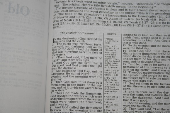
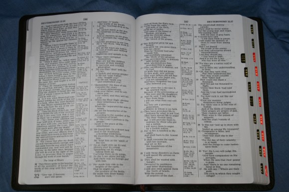
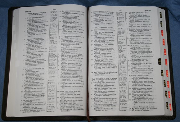
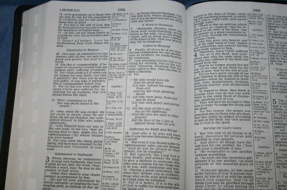
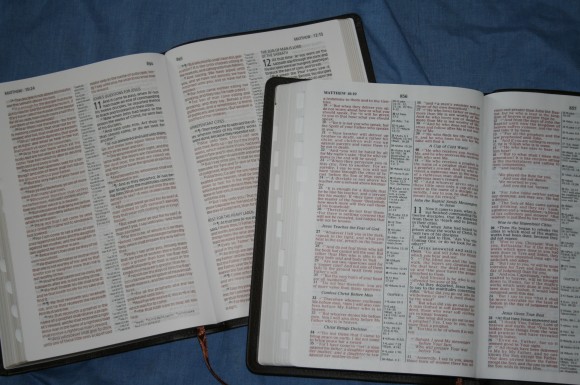
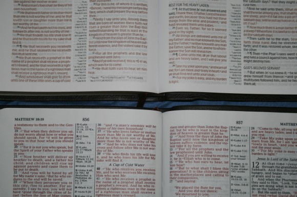
The font is a 9-point with a 10-point leading (9/10). It’s about a semi-bold and is fairly consistent throughout. The red-letter does have some slight variation but it’s not bad at all. It’s not enough to stop me from buying this Bible. The text is a joy to read. It’s bold enough for marking and there is enough room for underlining.
Layout
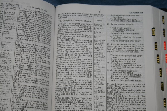
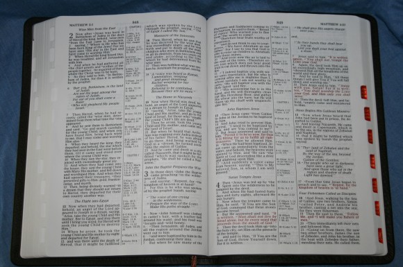
The text is presented in two-column, verse-by-verse format. Poetry is set to verse, letters are indented, and OT quotes in the NT are in oblique type. Paragraphs are marked with bold verse numbers. References and notes appear in the center column. The header shows the first verse that appears on the left page and the last verse that appears on the right page. Section headings are in italics. There is a little bit of space in both the inner and outer margins. This is useful for small notes and making your own chain references. Also, the inner margin keeps the text out of the gutter. This is a good layout for preaching and teaching.
Book Introductions
Book introductions are about two paragraphs long and cover information about the author, setting, overall theme of the book, audience, purpose, etc. There is usually something interesting that can be used as a teaching point or for information purposes.
References and Notes
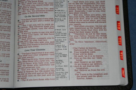
The references and notes are the standard that comes with the NKJV. There in the center column and are labeled well. They are keyed to the text with letters for references and numbers for notes. They are larger than most, making them easier to read. The notes include variations in the Nestle-Aland text, United Bible Societies 3rd edition, and the Majority text, as well as variant readings from the Critical text, the Vulgate, and the Septuagint. Noting these variations is one of the things I like the most about the NKJV’s notes (and is one of the reason I like using an NKJV).
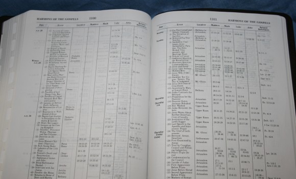
Harmony of the Gospels
The Harmony of the Gospels takes up 6 pages. The harmony includes the date, the event, and the location where it took place. They are presented in chronological sequence under headings that are group by a date-range.
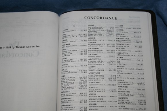
Concordance
The concordance is 66 pages and has 3 columns per page. There are 38 entries for God. Like concordances in most Bibles it works as a decent basic concordance. For serious study you would need a separate concordance.
Maps
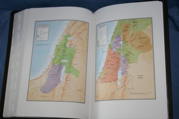
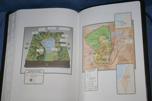
The standard 8 Holman maps are here. They are very colorful and are labeled well, making them easy to use. They are printed on thick matte paper. This is my favorite paper for maps. I’m not a fan of glossy paper. I wish they would include an index to maps to make them more usable, but this is not as important for only 8 maps.
Thumb-index
The thumb-index is cut in squares rather than circles. This doesn’t cut as deep into the page and allows the print of the book-names to be larger. There are three books per tab. Tabs for OT books are black while tabs for NT books are red.
Comparison’s to the Holman Large Print Ultrathin KJV
Both have the same cover and binding, and both have references and section headings, but the NKJV edition has translation notes and I like the font better than the modern font of the KJV. The NKJV’s font is much bolder. However, the KJV has the better paper and print quality. The KJV has more references but doesn’t have notes.
Conclusion
Holman’s NKJV Large Print Ultrathin in brown genuine cowhide is one of my favorite NKJV’s. There are a few things I would like to add – like an index to maps and a reading plan- but overall it is well-worth the money. It’s lightweight, making it good for carry. It has a good text, making it good for study and preaching or teaching. If I preached from NKJV this would be the Bible I used. I can recommend it in cowhide or imitation leather.
Holman provided this Bible free for review. I was not required to give a positive review- only an honest review.







A major “con” imo is that the lines are too close together which causes reader’s fatigue. Compared to Crossway’s Bibles, which have excellent line-spacing, Holman’s NKJV needs to be redone before I would ever buy another one.
Is this the same size as the Allan?
The text-block is the same size. Allan’s has a yapp, so its cover is slightly larger. It looks like I misprinted the size. I fixed it.
I got this bible in a cheap version but same book block and the book tabs IMO are horrible, the square design instead of round is a defective flaw. Cutting the tabs square like they did causes the pages to get dog ears and sometimes rip cause it leaves a tiny little square of paper. I highly recommend the regular version of this bible the print is great and would also make a great rebind;) Thanks for your reviews brother, I know exactly where to go before I pull the lever on my purchases, I just wish I could pull the lever more often LOL.
I just got this same bible in a trade and I’m pretty sure mine is a glued binding. Apparently they had a few runs of these with glued bindings a few years back. Mine is in the brown cowhide without thumb-index.
Randy,
What kind of thin NKJV’s are out there that you know of?
Hi William. Mostly this Holman and the Thoman Nelson Comfort Print line (both regular size and large print). We’re hosting a giveaway for the Comfort Print here: https://biblebuyingguide.com/thinline-comfort-print-bible-givaway/
Thier Premier Collection releases later this year, which will have a few in goatskin.
Would you happen to know if this particular text-block is available anywhere else? Or, who owns this text-block (holman/thomas nelson)? I love this particular format.