
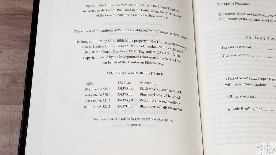
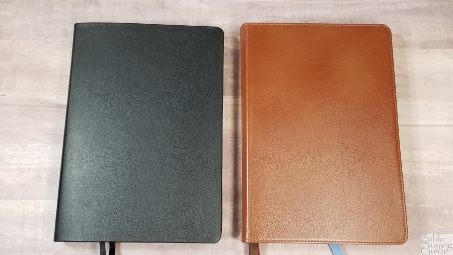
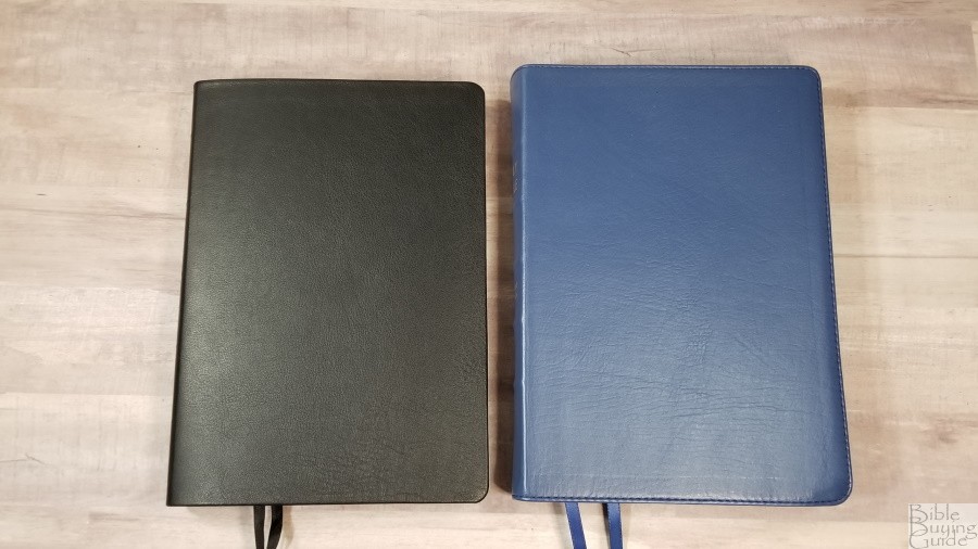
The Trinitarian Bible Society has replaced their Family Bible that was made from the Cambridge Large Print Text with a large print version of the Windsor. It’s called, well, um, Large Print Windsor. Actually, it’s called Large Print Windsor Family Bible. The one word I’d use to describe this Bible is elegant. It’s available in hardcover in black, blue, or red, and in black calfskin. I’m reviewing the black calfskin edition, model 35LP/UBK, ISBN 9781862285224, printed in Belarus by Printcorp/World Wide Printing.
Trinitarian Bible Society provided this Bible in exchange for an honest review. I was not required to give a positive review, only an honest one. All opinions are my own.
_________________________________________________________
This Bible is available
_________________________________________________________
Table of Contents
- Video Review
- Binding
- Paper
- Typography and Layout
- List of Pronunciations
- Bible Word List
- Bible Atlas
- Daily Reading Plan
- Comparisons
- Conclusion
Video Review
Binding

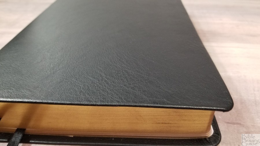
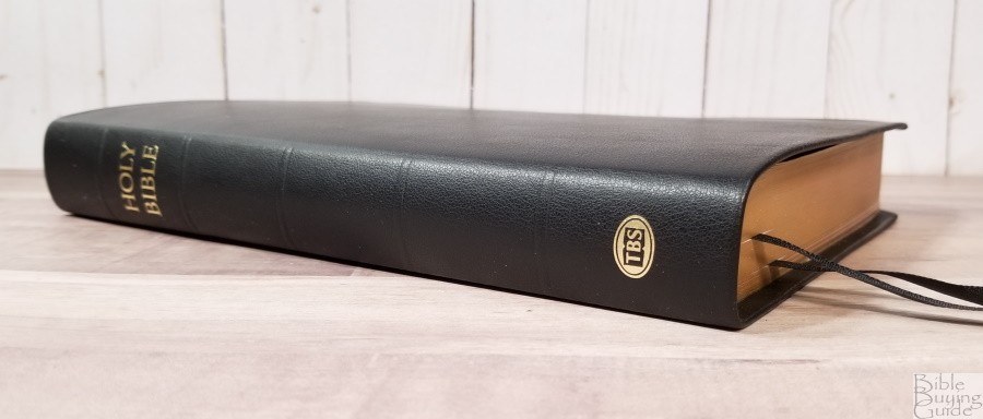
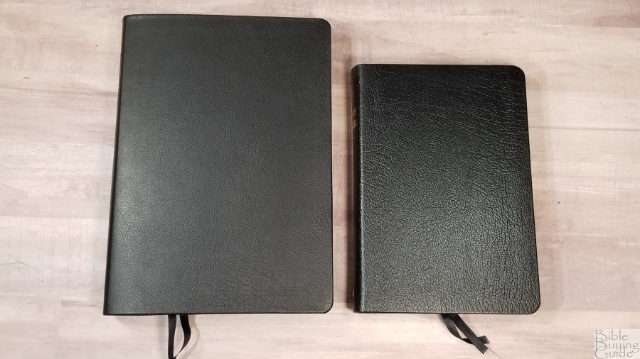
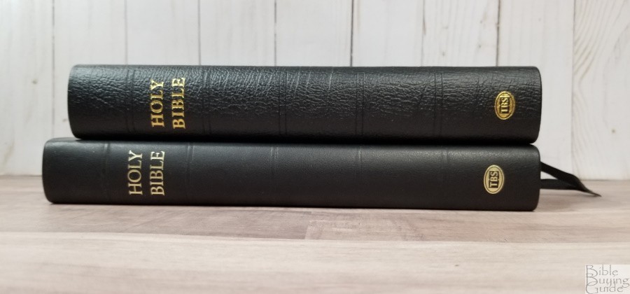
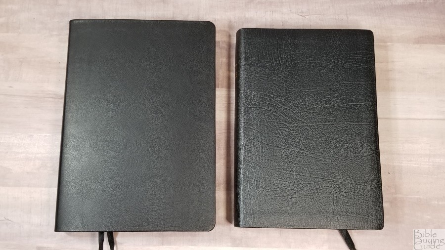
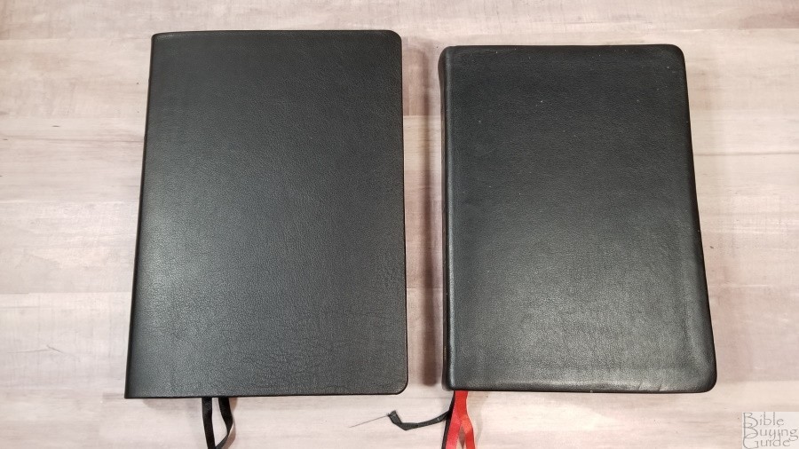
The cover is black Meriva calfskin. It’s soft to the touch and flexible. Even though it’s flexible, it’s not floppy. It’s easy to hold open in one hand. The grain isn’t pronounced, but it is there. This is the same leather that they use on the Westminster Reference Bible. There’s nothing printed on the front. The spine has HOLY BIBLE and the TBS logo printed in gold. The spine also includes 5 very slightly raised rib indications. The front cover is a little bowed, keeping it from laying flat against the text block. This could be due to the reinforced binder’s tape. This isn’t a problem, but I wanted to mention it since it stood out to me. I’m sure it will wear in with no trouble.
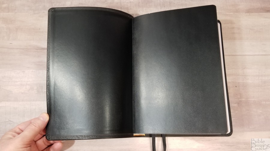
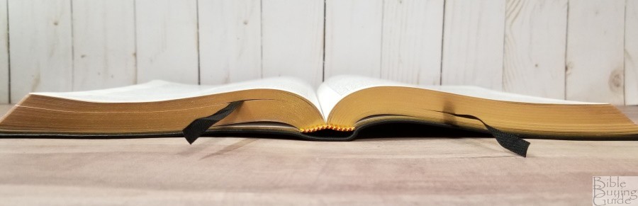
The liner is paste-down black vinyl with extra-thick end sheets. The text-block is Smyth sewn. It stays open in Genesis with no trouble. The cover doesn’t open all the way at first, but it doesn’t try to close. Like the other calfskin editions that I’ve seen, the spine does push slightly to one side when opened. This is normal. The leather has to go somewhere and it doesn’t have rigid spine ribs to keep it in place. The spine is tighter than some goatskin editions I’ve seen.
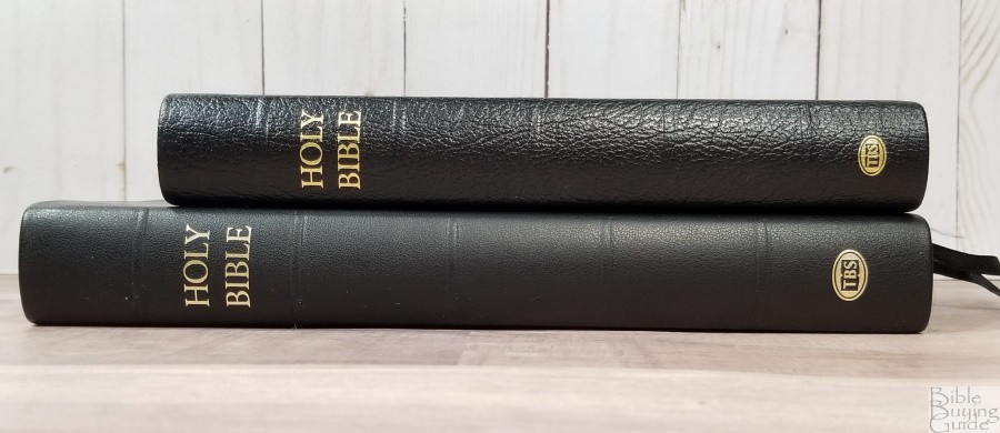
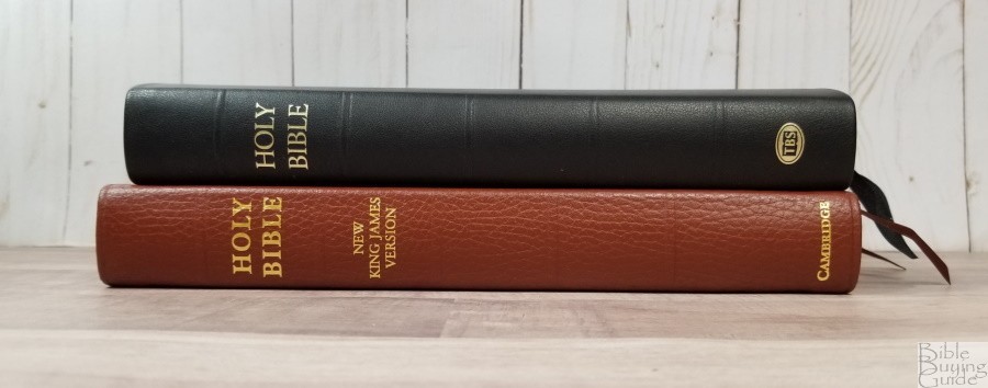
It has 2 black double-sided satin ribbons. They’re 1/4″ and long enough to pull to the corners to open the Bible easily. Mine were crinkled more than normal and took some extra effort to straighten out. It also has red and gold head/tail bands. the bottom one comes down too far and shows the white portion that’s normally glued into the spine. The top one is set perfectly. The overall size is 6 3/4 x 9 1/2 x 1 1/4″. It weighs 2lbs, 2.4oz. This size and weight are excellent for carrying, holding, reading, and preaching.
Paper
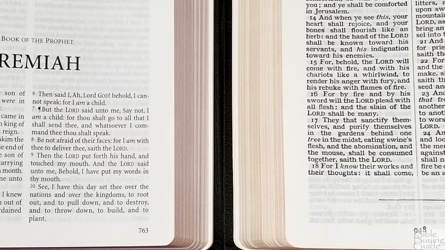
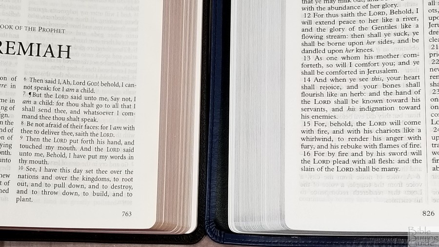
The paper is 32gsm. It’s off-white in color and it’s highly opaque. My eyes are drawn to this color of paper the most. It has a slightly rough texture that I find makes it easier to turn the pages. It has no glare under direct light. The page edges are art-gilded with a light red. The page edges have a little curve to them and the corners of the text-block bend upward when the Bible is opened. I’ve seen this before from Printcorp. I think it has something to do with the way they cut the pages. It’s not a major problem, but it does make the pages more difficult to turn than the TBS editions from Royal Jongbloed. It makes the pages hold on to each other a little bit, even though I’ve turned every page to separate them (which is part of my normal reviewing process).

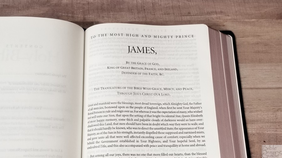
There are 8 regular pages in the back that can be used for notes. In the front are the family and presentation pages and the Epistle Dedicatory. This edition does not include the Translators to the Reader.
Typography and Layout
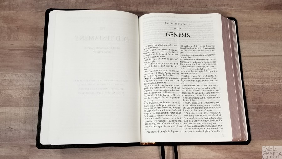
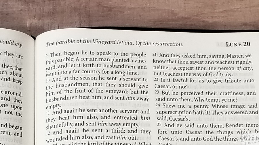
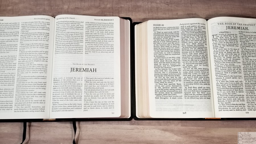
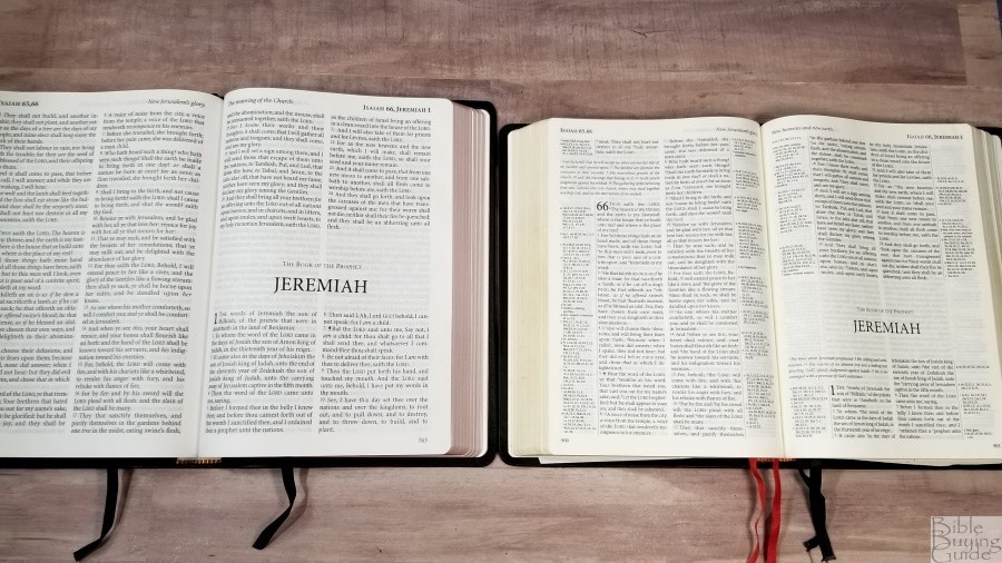
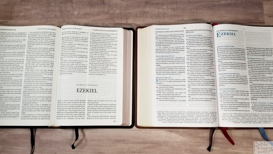
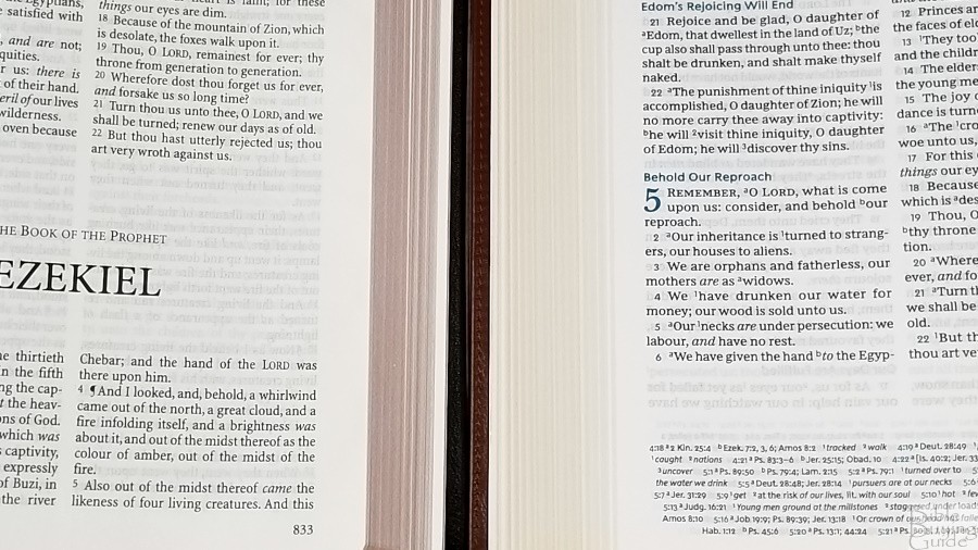
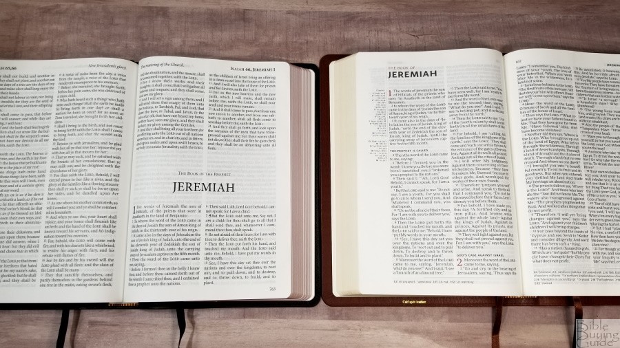
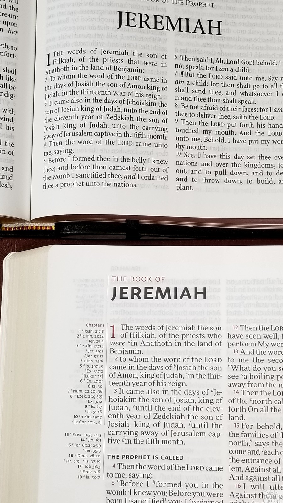
The text is placed in a double-column, verse-by-verse layout. The header shows the book name and chapter numbers in the outer margin and the page summary in the inner margin. The footer shows the page number in the outer margin.

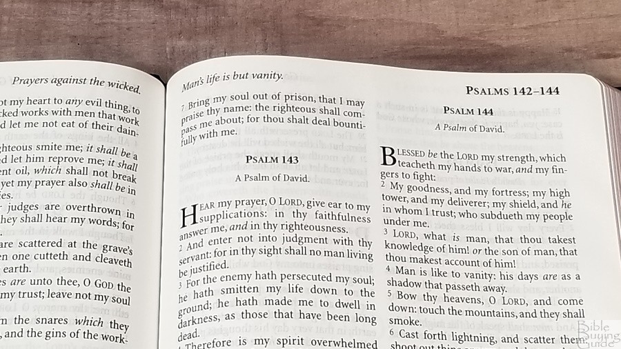
The typeface is 11.8, black letter. It has around 8-10 words per line and was printed with line-matching so the words on both sides of the page line up. This greatly improves readability. This is a black letter text. It’s around a semi-bold in darkness and it’s highly consistent throughout. The words never feel too close and it has enough line-spacing for comfortable reading and underlining.

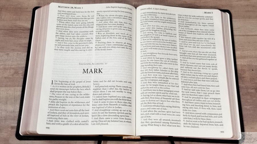
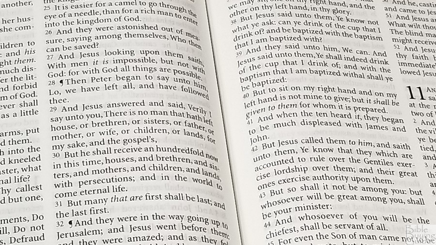
The verses are indented while the verse numbers are not. Verse numbers are large and easy to see. Paragraphs are marked with pilcrows through Acts 20. Supplied words are marked with italics. The outer margins are 1/2″, while the inner margin is larger at 3/8″. This brings the text out of the gutter onto the flat part of the page.
This is an excellent text for reading in all kinds of light and for long periods of time. It’s also excellent for preaching and teaching. I prefer to preach with a clean text, and this one is perfect for it.
List of Pronunciations

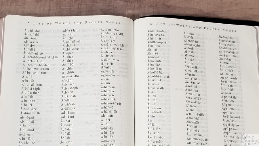
This is a 25-page list of words and names with markings of how to pronounce them. It includes a key of how to pronounce the markings. I like that they’ve included this in the back rather than placing the markings in the text. This keeps the text cleaner and once I’ve learned the pronunciation I don’t need to see it in the text anyway. This is my preferred method of printed a self-pronouncing text in the Bible.
Bible Word List
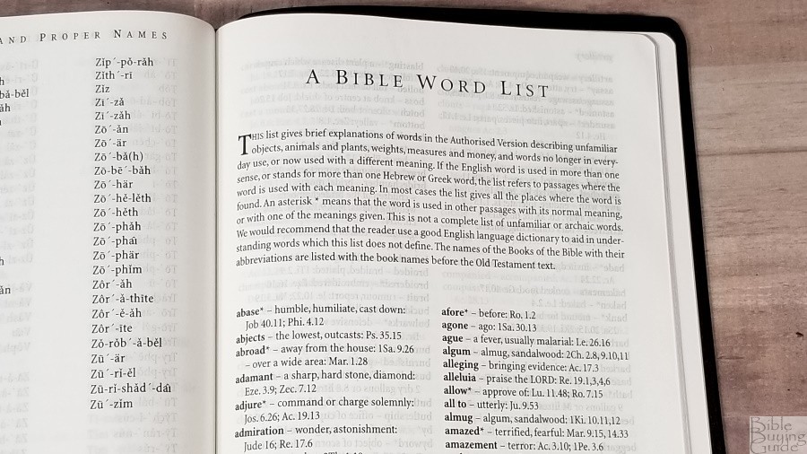
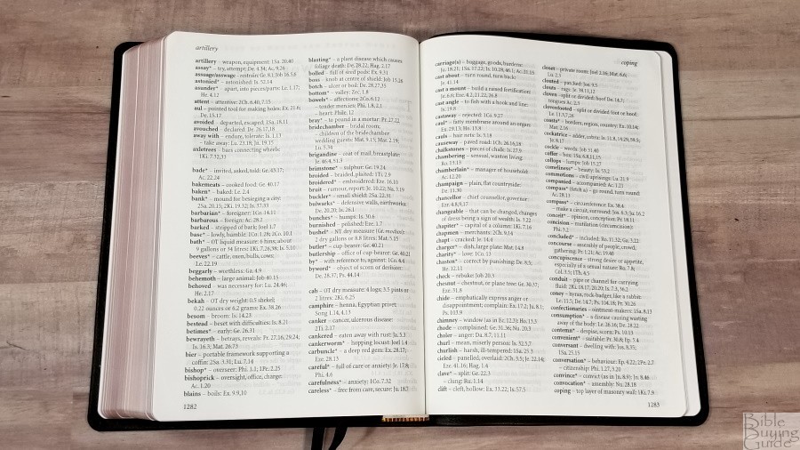
This is a 14-page glossary that describes unfamiliar objects, animals, plants, measures, money, and words that are archaic or have changed in meaning. It shows the words, a short definition, and Scripture references of where they’re used. Some have an asterisk. This indicates that a word is used in different passages with different meanings. This isn’t an exhaustive list, but it does include many of the most popular words. There aren’t any indications in the text that there’s a definition in the glossary, so I recommend browsing through this glossary from time to time to see what’s here. I always appreciate it when publishers include a glossary in the KJV.
Daily Reading Plan
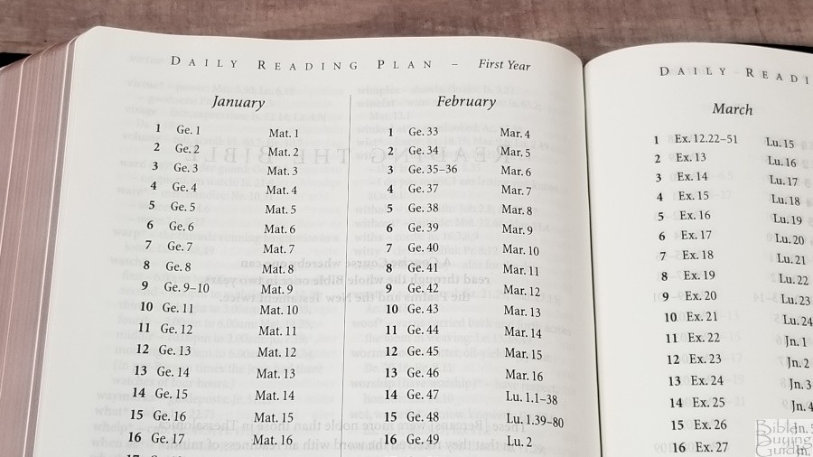
This is the M’Cheyne reading plan with the secret reading being used for year 2. It takes you through the Old Testament once, and the New Testament and Psalms twice in two years. It gives you a morning and evening reading. The readings are from two different places in the Bible. The first year starts with Genesis 1 and Matthew 1. The second year’s reading starts with Ezra 1 and Acts 1. This provides around 2 chapters per day on average.

I’ve used this as a one-year plan, reading both years at the same time, which provides readings from four places in the Bible. I like this plan a lot and I plan to go back through it as a two-year plan as it is intended. The slower pace will be interesting. I’ll get to read from the NT and Psalms more often and I’ll get to slow down and reflect on fewer passages at a time.
Bible Atlas
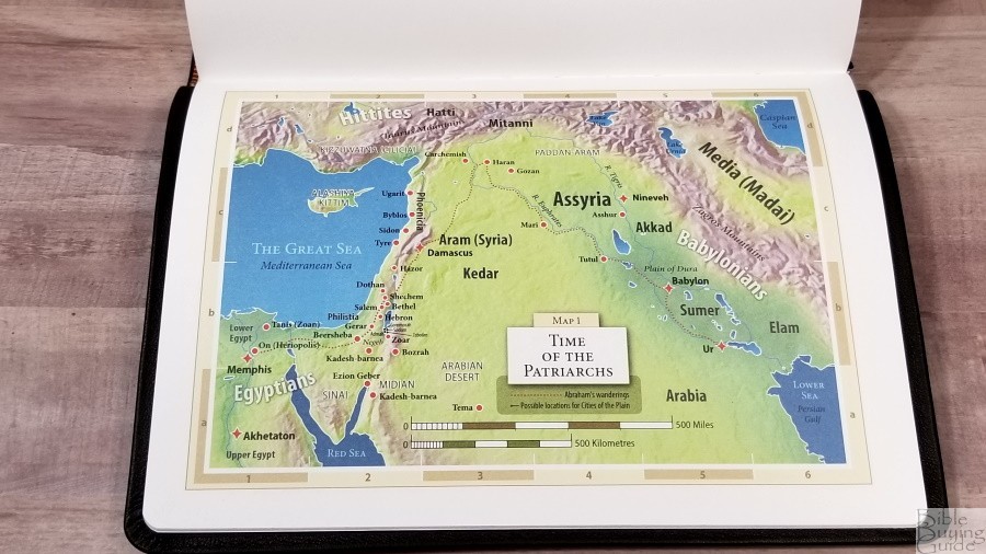
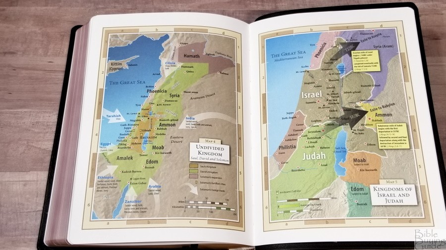
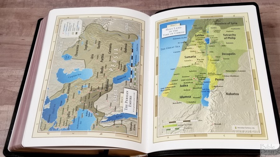
The atlas has 8 maps on thick, non-glossy, pages. This is my favorite paper for maps. The maps are well-drawn and they’re printed in bold colors. The topography for hills and mountains is especially detailed. Maps include distance, routes, cities, seas, rivers, mountains, wildernesses, cities of refuge, kingdoms, expansions, arrows for trade, annotations, locations of idols, dates, Scripture references, fortress cities, borders, color-coding for territories, etc. I like these maps a lot. I would prefer to have an index, but locations are printed large enough to find easily.
- Time of the Patriarchs
- The Exodus
- The Twelve Tribes of Israel
- Undivided Kingdom
- Kingdoms of Israel and Judah
- The Persian Empire
- Holy Land in the Time of Christ
- Paul’s Missionary Journeys
Comparisons
Here’s how the Large Print Windsor compares to the regular size edition, and the regular and large print Westminster Reference Bibles from TBS.
Windsor


The current model of the Windsor is made by Printcorp. Mine is the older edition from Royal Jongbloed. I’m sure the paper and leather are different now, but the size will be the same as mine. The size difference between the regular and large editions is huge. The paper in my older regular size is cream. It doesn’t include maps, paper in the back, or a presentation and family pages. The lack of family pages makes sense, considering the Large Print Windsor is marketed as a family Bible and the regular size is not. The regular size also includes the Translators to the Reader, which I’d like to see added to the Large Print Windsor. The two make a great combo.
TBS Family Bible
The Large Print Windsor replaces this Bible. The TBS Family Bible is their version of the Cambridge Large Print Text, printed by Cambridge under their printing program. It includes the family pages in the front. The footprint is smaller. The font is darker and thicker, which can be harder on the eyes after long periods of reading. I’ve hard it to hurt my eyes from reading too much. The text isn’t as clean because of the self-pronouncing text and some of the words are cramped. It’s an excellent Bible, but the Large Print Windsor is a cleaner design.
Westminster
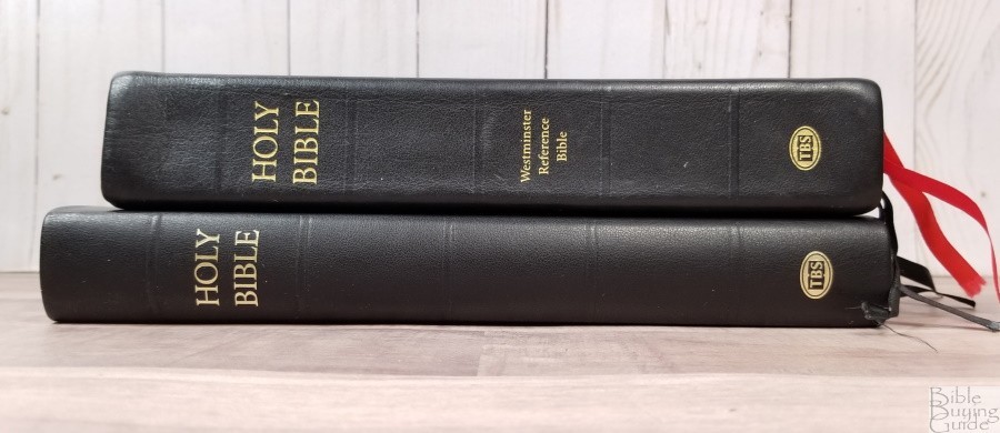
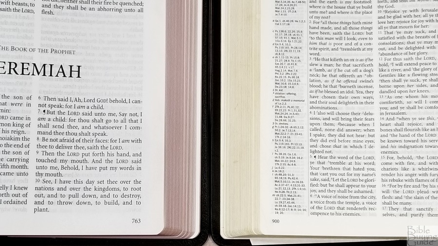
The cover is the same as the Large Print Windsor. The footprint is smaller and it’s 1/4″ thicker. The regular size Westminster is still made by Royal Jongbloed. I think the quality is a notch above Printcorp. The paper on this first edition has a slightly cream color. The whiter paper and larger font in the Large Print Windsor comes across as darker.
Large Print Westminster
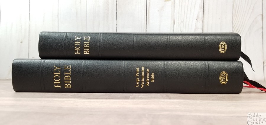

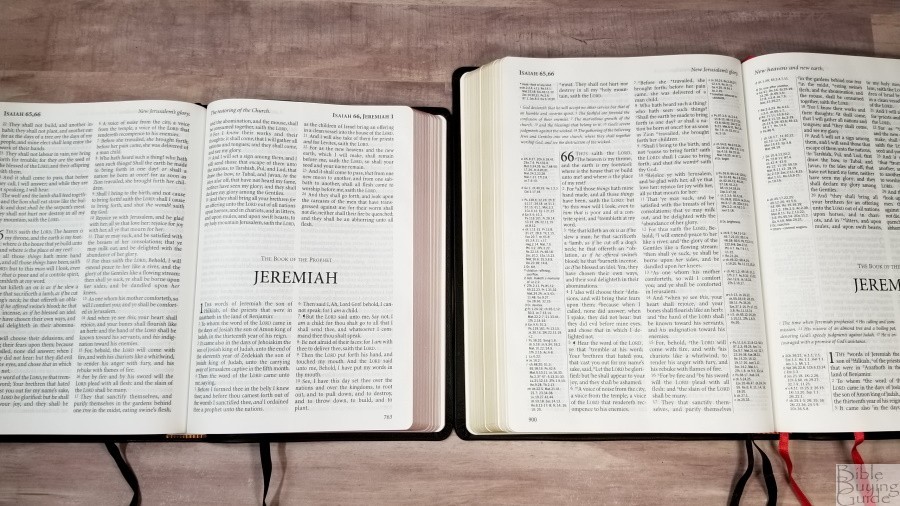

The Large Print Westminster is similar to the Large Print Windsor. The materials, construction quality, and font are the same. The footprint is about an inch smaller for both height and width.
Thomas Nelson KJV Preaching Bible

There are several reference Bibles I’d like to compare, but probably the closest is the KJV Preaching Bible from Thomas Nelson. The size is about the same, the font size is about the same, the number of words per line is the same, and the cover is similar. This one has thicker and brighter paper. The font is darker (bold vs semi-bold). While comparing the two, my eyes are more drawn to the semi-bold font and the off-white paper of the Large Print Windsor.
CBP Large Print Text


The text-only edition that it’s closest to is the Large Print Text from Church Bible Publishers. The footprint is about the same. It’s around 3/8″ thicker. The paper has more show-through and it’s slightly brighter. The font is about the same. It does look a touch darker. This is partially due to the whiter paper. It doesn’t have as much inner margin space. Its calfskin cover is smoother and scratches easier. Overall, it doesn’t look or feel as elegant at the Windsor.
Cambridge NKJV Topaz


The Topaz is similar in size. It’s made in the Netherlands with higher quality materials. The font isn’t quite as dark. It has thinner (but more expensive) paper. This is a reference edition with a concordance. The text isn’t as clean because of the references and footnotes.
Conclusion

The Large Print Windsor is one of my favorite Bibles that I’ve reviewed. The quality is one notch under the Westminster Reference Bible, but it’s still good enough to make my favorites list. My only complaint, the page edges have a slight curve, is minor, and won’t keep me from using it. I consider it to be the text-only equivalent to the Large Print Westminster, and it’s a lot easier to carry and use. The print is clean and sharp. The leather is soft to the touch, but it’s still easy to carry and hold. It’s a joy to preach and read from. If you’re interested in a large print text-only KJV, the Large Print Windsor should be high on your list.
_________________________________________________________
This Bible is available at
_________________________________________________________
Trinitarian Bible Society provided this Bible in exchange for an honest review. I was not required to give a positive review, only an honest one. All opinions are my own.


Wow, looks like another nice one from TBS. Thanks for the great review, Randy! It looks like this LP Windsor has slightly more words per line than the Westminster LP. If that’s the case it’s another bonus for this lovely bible. I read from the Westminster LP this morning and the very narrow columns were a little uncomfortable, especially after having spent some time in wider column bibles. It’s hard to find anything not to like about this new TBS LP Windsor!
Thank you for the review! Given that their “Extra Large Print Bible” has disappeared from the store if you select the UK or Australian branches (and, while still not out of order in the Canadian branch, its “sample page” is gone there), maybe a Windsor Bible in an even bigger font size is on its way? Who knows? It seems possible…
Link to the review of that bible: https://biblebuyingguide.com/tbs-large-print-bible-review/
Hi Ralph. I love that idea!
I thought the stock of “TBS Extra Large Print” Bibles in the U.S. branch store would be the last one to go, but it is now “out of stock” in ALL branches except for the Canadian:
https://us.tbsbibles.org/store/viewproduct.aspx?id=9347445
It looks like we will soon know whether the new “Extra Large Print” TBS Bible will be “Windsor text” or not.
P.S. The “Comfort Text” ones are disappearing too, which I would think it is due to the Large Print Windsor being their substitute.
About the same time I was advised to study from a plain text Bible is when I came across the video review on YouTube. I’m holding my hardback copy which arrived today. If I were allowed to give input before settling on the final product, here’s what I would have suggested: slightly darker text, more spacing above and below verses, starting a book on a new page even if it would’ve caused this Bible to stand taller and weight just a tad more. I’ll keep and use it but I’m not sure if I would’ve purchased it if I had the chance to browse first. I might have preferred a large print wide margin journaling Bible instead.