
Holman’s newest KJV Large Print Ultrathin Reference Bible is a no-nonsense Bible that is strong on references and has some of the best paper I’ve seen in a reference Bible. It doesn’t have the features of other reference Bibles (including the features that some online retailers are claiming), but its paper, references, size, binding, are enough to make this a great choice for a carry Bible.
Pros
- Awesome paper
- Lots of references
- Section headings
- Sewn binding
Cons
- Does not have translators notes
Features
- KJV
- Family information pages
- Thumb-index
- Red-letter
- Brown Cowhide
- Sewn binding
- Brown ribbon
- 48 page concordance
- 8 pages of maps
- Gilted edges
- Designed by 2Krogh
- 9.5 x 6.5 x 1
- ISBN: 9781586404260
Buy from Amazon: Holman KJV Large Print Ultrathin Reference Bible
Cover and Binding
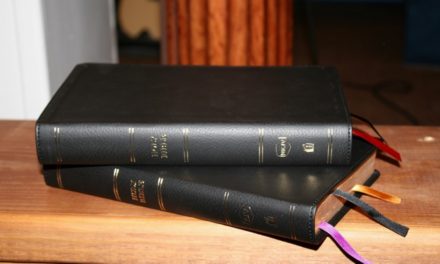
The edition I’m reviewing is brown cowhide. It has six spinal hubs that give it that extra flare. It looks and feels nice. It’s soft and has a beautiful grain. The liner is brown card stock. This is my favorite cover from Holman. The binding is sewn and it stays open in Genesis right out of the box.
Paper and Print
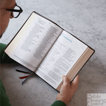
I’m not sure of the gsm, but this is some of the best paper I’ve seen in a reference Bible. It is more opaque than most Bibles. It has a white tone and a slightly rough texture that I love. I think it would be great for marking and taking notes.
The font is around a 9/10 with about a medium-dark boldness. I’m not overly fond of the style of font, but it won’t stop me from using or recommending it. It looks like Arial or similar. I like it overall- it’s just not my first choice. This is a red-letter edition. The red is about a medium darkness. The print quality seems consistent throughout for the black-letter. The red-letter does have some variation but it’s not too bad. There are accent marks and hyphens within certain words to help with pronunciation.
There are section-headings within the text. They are in all-caps and look like the same font as the text.
References
The center-column references are some of the best available and one of the strengths of this Bible. There are 21 references for Genesis 1:1. They are keyed to the text with letters. There are not a lot of translation notes. There are a few here and there, but they’re few and far between. They also use letters to key to the text. The references at the top of the column are for the verses on the left of the page and the verses at the bottom are for the verses on the right of the page. If there are more than will fit in the center column they are placed under the last verse on the page. They are still separated to make it easy to know which side of the page they are for.
Concordance
The concordance is 48 pages with three columns per page. There are 37 entries for God. One thing I thought was interesting is that for people there are a couple of paragraphs telling their background and it gives some key verses of some of the more important events surrounding them. This can serve as a short introduction to the key people in Scripture.
Maps
There are 8 pages of maps. They are printed on thick paper but it’s not glossy paper that has a glare. I like this paper better. It has a matte finish and looks awesome. They are very colorful and they even have shading to indicate topography.
Thumb Index
This edition is thumb-index. On average there are three books for each tab. The tabs for the OT books are black and the tabs for the NT books are red. I prefer to have a tab for each book, especially for the more popular books. At least this will get you in the ball-park.
Conclusion
Although the Holman KJV Large Print Ultrathin Reference Bible has a basic set of features, the references, cover, binding, paper, and size make this one of my favorite reference Bibles. It could benefit from some charts, footnotes, and a reading plan, but it stands on its own as it is and these features would just add to the thickness. It’s a great choice for a carry Bible that’s not overly large and still has a large print and great set of references.
Buy from Amazon: Holman KJV Large Print Ultrathin Reference Bible
Holman Publishing provided this Bible free for review. I was not required to give a positive review- only an honest review. My opinions are my own.






I wish they’d do their NKJV with this layout/font.
Even the NKJV is Satans tool to undermine the Word of God. By the way, the KJV is grade level reading 5.4 while newer versions are 8th grade plus! Read a KJV, read it out loud with your family and your kids, they will soon get used to it. It is worth it. After all, Satan swayed Eve by simply casting doubt on Gods Word: “Yeah, Hath God said…?”
I’ve compared this to the previous edition that this replaced, so my opinion is slightly different. The old edition was better – better font, better paper, and had the marginal translator’s notes. The most frustrating and disappointing thing Holman decided to do was to remove the highly enlightening KJV marginal translator’s notes and reduce it to a plain reference bible. It’s such a shame they don’t know what makes a good KJV reference bible these days and they seem to be going in the opposite direction. I also wish they would get rid of the syllabification of common 2-syllable words like “Ma’-ry, Pe’-ter” etc.. I find it very annoying when reading. I have Holmans NKJV ultrathin large print bible and the reference system used in it is superior to this. No need for double superscripts like “as”, “au”, “av” etc.. Why didn’t the publisher use the better reference system in this bible? Holman continues to disappoint.
Great review. I agree with you about the font. It is not very appeasing to me. I love thin line Bibles. They occupy a nice sweet spot. Portability of a compact due to thinness while maintaining a nice size reading font due to length and width of page.
The layout looks very similar to Holman’s HCSB UT LP Reference and even looks like the same font, paper, and maps. Randy, any indication on who designed the layout? 2 Krogh in the Netherlands designed the current layout in the HCSB and the layout of the references even looks the same. Well, looks like a decent modern layout of the King James translation, also if constructed like the HCSB LP UT Ref., it should make for a durable Bible. Although, I do agree with the previous poster that the translators Notes to the Reader and the marginal translator notes should have been kept. This shows that the Old Translators were working it out, just like modern translators.
Hi Norm. It was designed by 2Krogh. I’ll add the info. Thanks for the reminder.