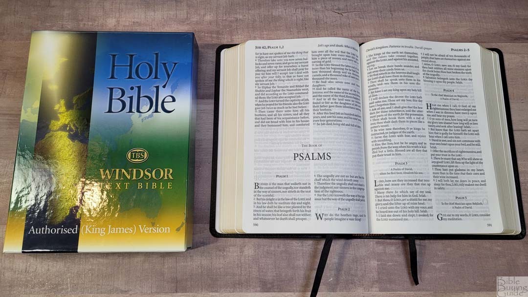
The Trinitarian Bible Society’s Windsor has been a popular Bible for many years. It was the first TBS Bible that I reviewed way back in 2013. That edition was printed by Royal Jongbloed. Printing has since moved to Belarus by PrintCorp, and it does have several differences from the previous edition. In this review, I’ll look at the current edition of the Windsor and compare it to the original. I’m reviewing the black calfskin edition, model 25/UBK, ISBN 9781862283367, printed in Belarus by Printcorp/World Wide Printing.
Trinitarian Bible Society provided this Bible in exchange for an honest review. I was not required to give a positive review, only an honest one. All opinions are my own.
_________________________
This Bible is available
_________________________
Table of Contents
- Video Review
- Binding
- Paper
- Typography and Layout
- List of Pronunciations
- Bible Word List
- Bible Atlas
- Daily Reading Plan
- Comparisons
- Conclusion
Video Review
Binding
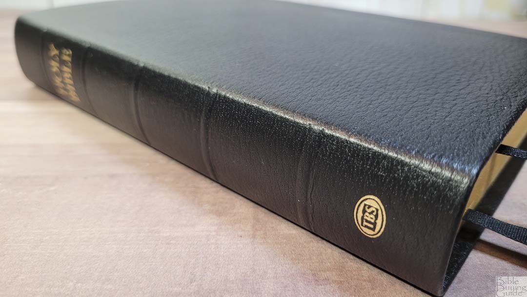
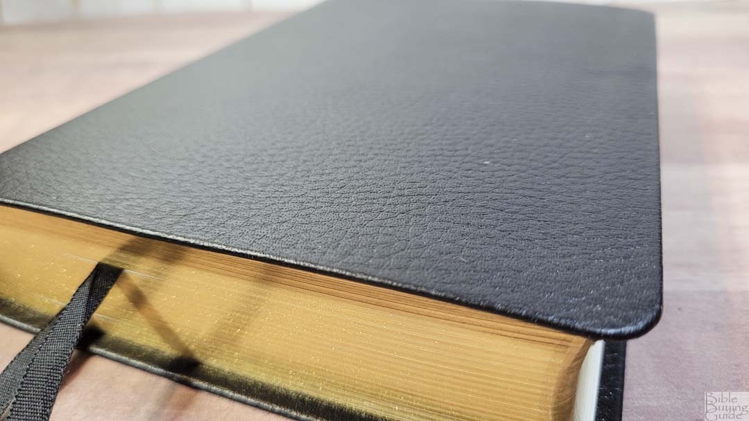
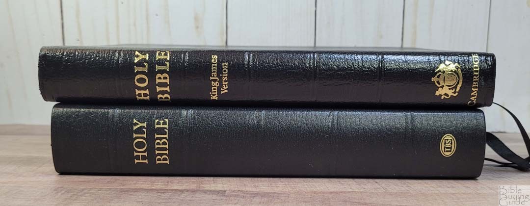
The cover is black calfskin. It’s soft to the touch, and it’s flexible but not floppy. I find it easy to hold open in one hand. It has a more pebbly grain than the Westminster Reference Bible. There’s nothing printed on the front. The spine has HOLY BIBLE and the TBS logo printed in gold, and 5 slightly raised rib indications. Like the other TBS editions I’ve reviewed, it doesn’t have perimeter stitching.

The liner is paste-down black vinyl with several extra-thick end sheets that include key Scriptures printed on them. The text block is Smyth sewn. The cover is a touch stiff, so it will need to be broken in for a while before it will stay completely open in Genesis.

It has red and gold head/tail bands and 2 1/4″ black double-sided satin ribbons. They’re long enough to pull to the corners to open the Bible easily. Mine were crinkled more than normal and took some extra effort to straighten them. The overall size is 5 1/5 x 7 3/4 x 1 1/4″. It weighs 1lb, 6.9oz. This size and weight are excellent for carrying, holding, and reading. It’s great for preaching if you don’t need a larger font.
Paper
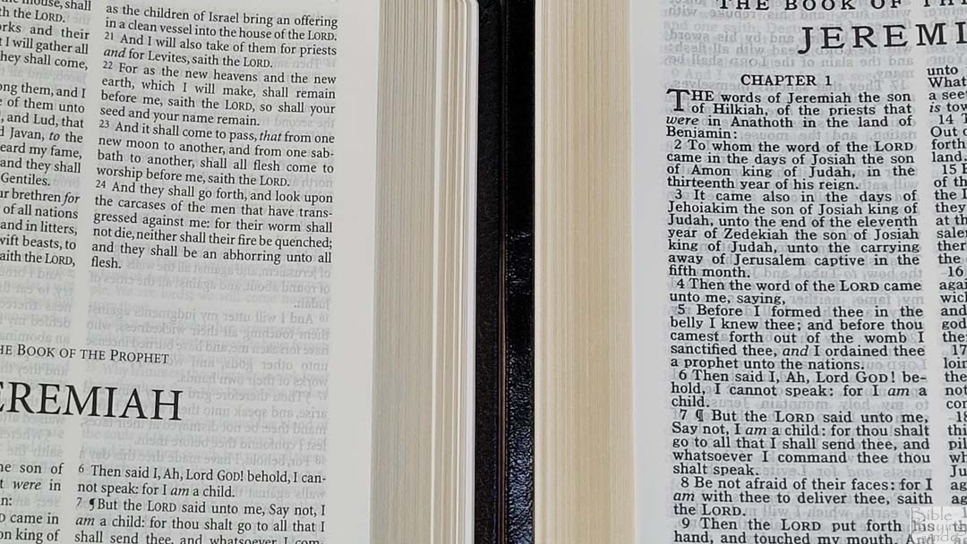
The paper is 32gsm. It’s off-white in color and it’s highly opaque. It has a slightly rough texture that I find easy to separate and turn the pages between my fingers. There is no glare under direct light. The page edges are gold. I found this paper to be great for reading.
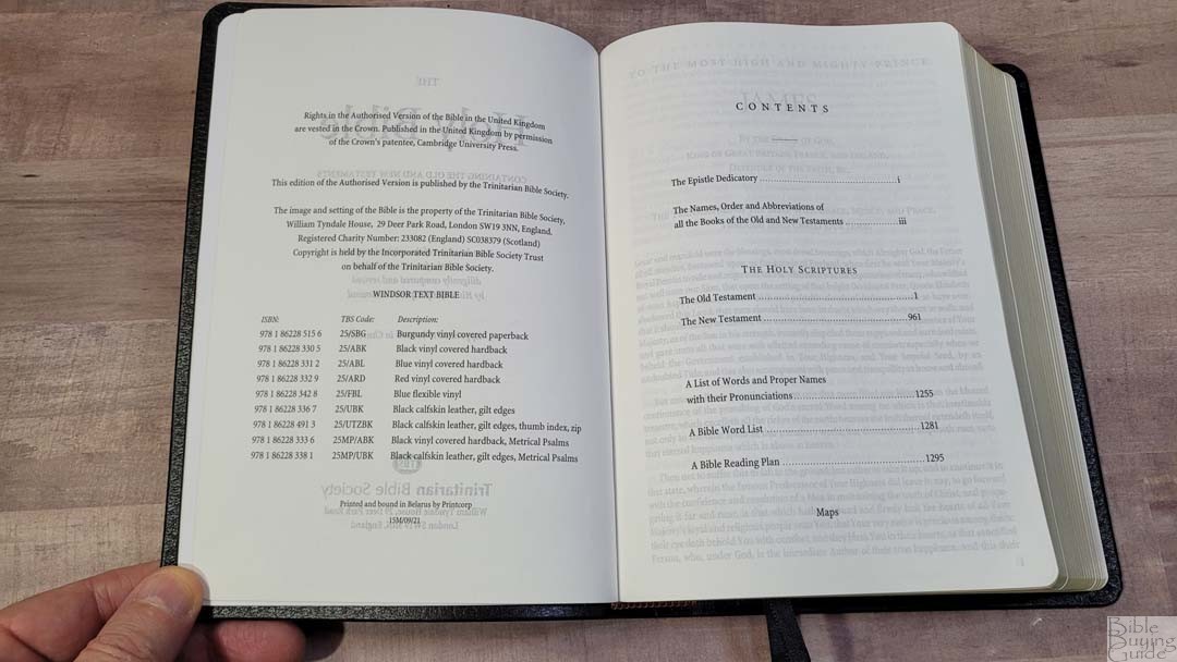
There are 8 pages in the back for notes. In the front are the family and presentation pages and the Epistle Dedicatory. It does not include the Translators to the Reader.
Typography and Layout
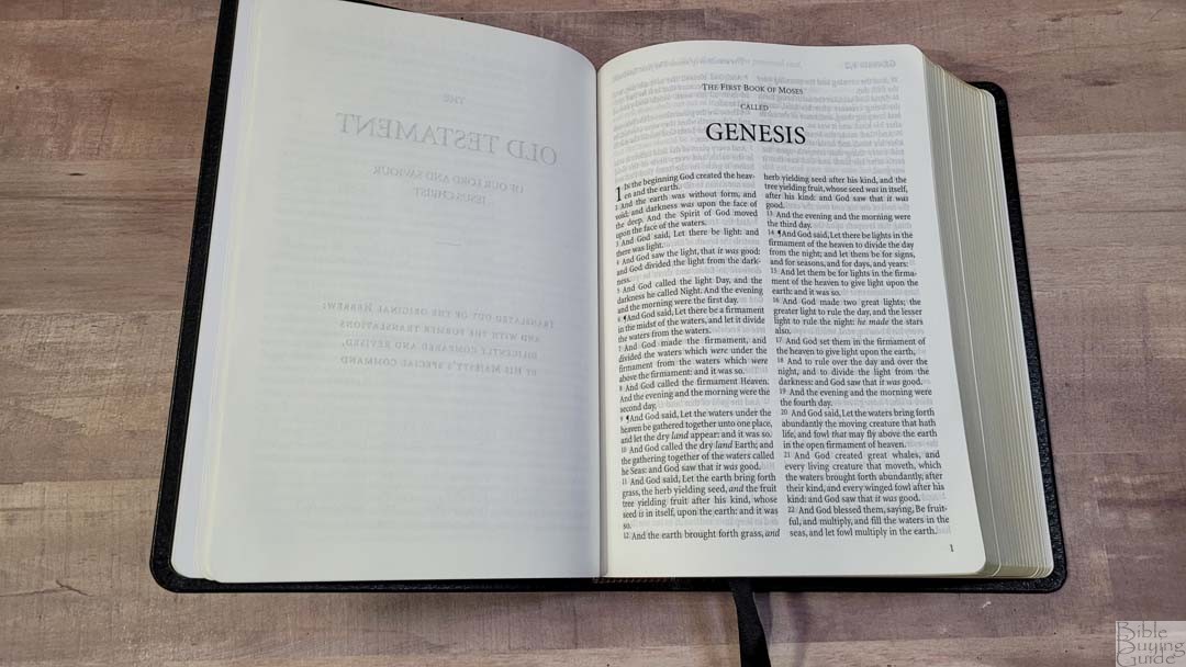
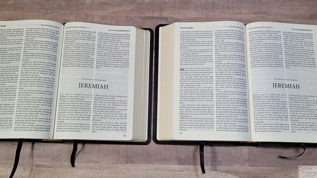
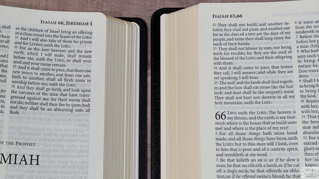
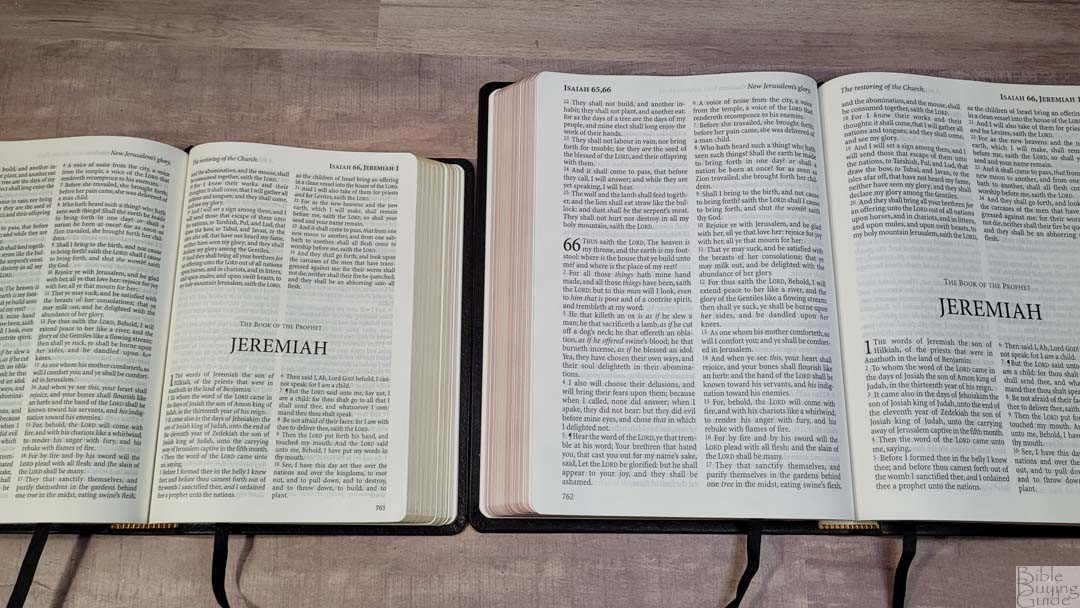
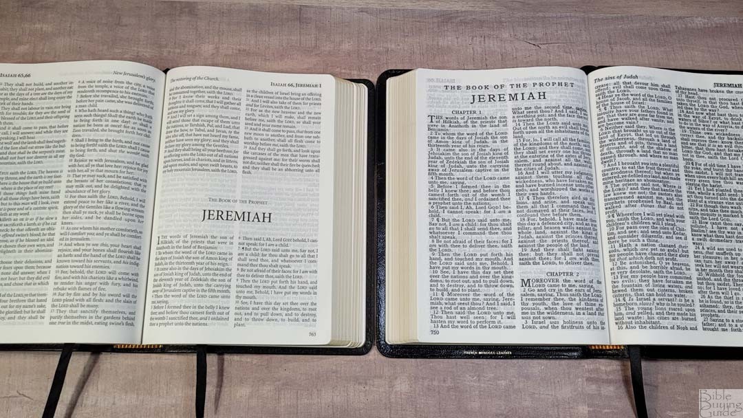
The KJV text is placed in a double-column, verse-by-verse layout with no other formatting. The header shows the book name and chapter numbers in the outer margin and the page summary in the inner margin. The footer shows the page number in the outer margin.

The typeface is 9.6 and printed in black letter. It has around 8-10 words per line and the text is line-matched so the words on both sides of the page line up to improve readability. This is a black letter text. It’s around a medium in darkness and it’s highly consistent throughout. The words never feel too close and it has enough line spacing for comfortable reading.
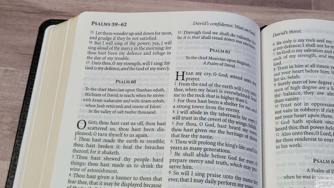
The verses are indented and the verse numbers are not. Verse numbers are large and easy to see. Paragraphs are marked with pilcrows through Acts 20. Supplied words are marked with italics. It includes extra space in the inner margin to bring the text out of the gutter onto the flat part of the page.

This is an excellent text for reading in all kinds of light and for long periods of time. It’s also excellent for preaching and teaching if you don’t need a large print. If you do need a large print, the Large Print Windsor is a great option.
List of Pronunciations

In the back is a 25-page list of words and names with pronunciation marks and a key to how to pronounce them. I like that they’ve included this in the back rather than placing the self-pronouncing marks in the text. This keeps the text cleaner and once I’ve learned the pronunciation I don’t need to see it in the text anyway. This is my preferred method of printing self-pronouncing text.
Bible Word List
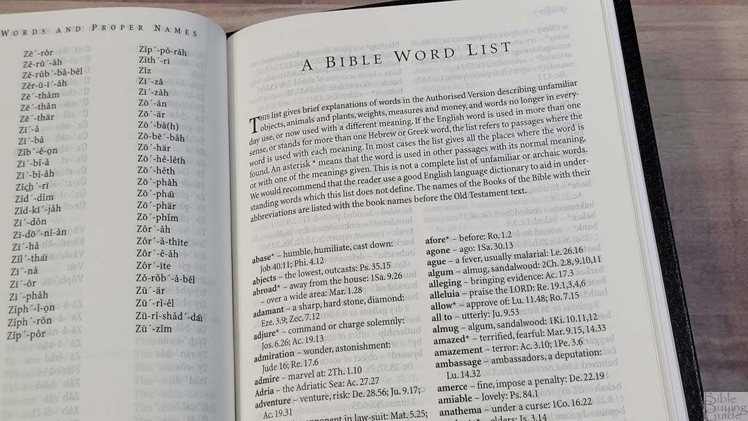
The Bible Word List is a 14-page glossary that includes unfamiliar objects, animals, plants, measures, money, and words that are archaic or have changed in meaning. It shows the word, a definition, and Scripture references of where they’re used. Some have an asterisk to indicate that a word is used in different passages with different meanings. This isn’t an exhaustive glossary, but it does include the most popular words. There aren’t any indications in the text that there’s a definition in the glossary. I recommend browsing through this glossary to see what’s there. I always appreciate a glossary in a KJV and I’m glad to see it’s included.
Daily Reading Plan

the Windsor includes the M’Cheyne 2-year reading plan. It takes you through the Old Testament once, and the New Testament and Psalms twice in two years. It lists both a morning and an evening reading from two different places in the Bible. The first year starts with Genesis 1 and Matthew 1. The second year starts with Ezra 1 and Acts 1. This provides around 2 chapters of reading per day on average.
I’ve used this as a one-year plan, reading both years at the same time, which provides four readings from various places in the Bible. It worked well, but I plan to read it as a two-year plan as it is intended. The slower pace will be interesting. I’ll get to read from the NT and Psalms more often and I’ll get to slow down and reflect on fewer passages at a time.
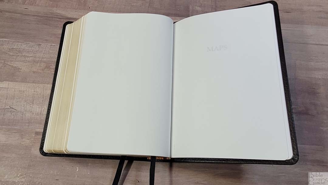
Bible Atlas
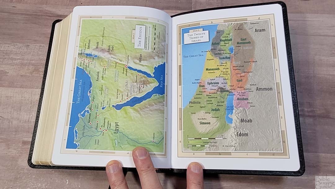
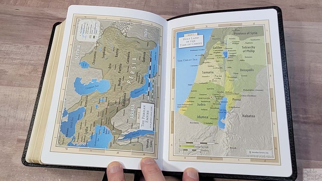
In the back are 8 maps on thick, non-glossy, pages. This is my favorite paper for maps. They are well-drawn and printed in bold colors. The topography for hills and mountains is especially detailed. Maps include distance, routes, cities, seas, rivers, mountains, wildernesses, cities of refuge, kingdoms, expansions, arrows for trade, annotations, locations of idols, dates, Scripture references, fortress cities, borders, color-coding for territories, etc. I like these maps a lot. I would prefer to have an index, but locations are printed large enough to find easily.
- Time of the Patriarchs
- The Exodus
- The Twelve Tribes of Israel
- Undivided Kingdom
- Kingdoms of Israel and Judah
- The Persian Empire
- Holy Land in the Time of Christ
- Paul’s Missionary Journeys
Comparisons
Here’s how the TBS Windsor compares to the original edition, the large print edition, and a few others.
Windsor
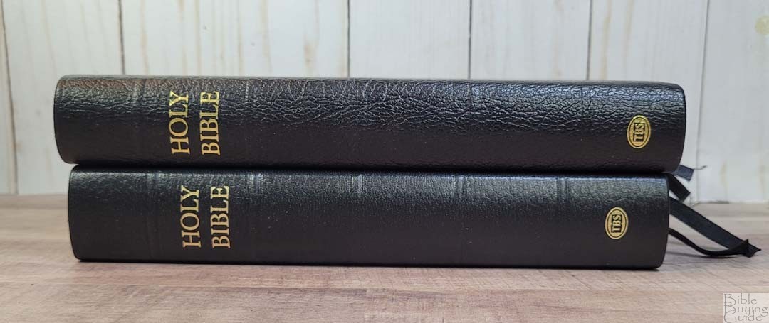
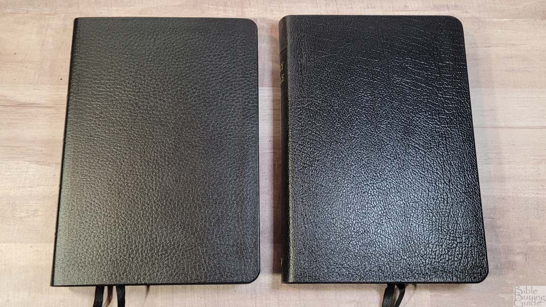
The current model of the Windsor is made by Printcorp. Here’s how it compares to my older edition from Royal Jongbloed. The paper in the older edition is slightly cream in color and is a touch more opaque. It doesn’t include maps, paper in the back, or a presentation and family pages. The regular size also includes the Translators to the Reader, which I’d like to see added to the current Windsor. The cover of the original edition is much stiffer. Rather than a one-piece box like the current model, it had a slipcase.
TBS Large Print Windsor
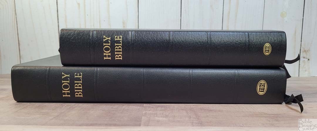
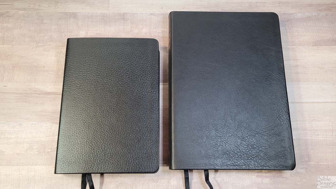

The Large Print Windsor is almost identical, just larger. The main difference is the grain on the leather. All the features are the same and the paper is the same. The two work great as a combo- one for carrying and one for preaching.
Cambridge Standard Text

The Cambridge Standard Text is the most similar Bible to the Windsor. Mine’s an older edition, so it could be different now, but the footprint is almost the same. The Cambridge is much thinner. It has an older font that’s darker. The paper is similar, but the darker font has a touch more show-through. It’s available in black and red letter. It includes a Bible word list and a reading plan. The dark font looks a little too bold after reading the Windsor.
Westminster
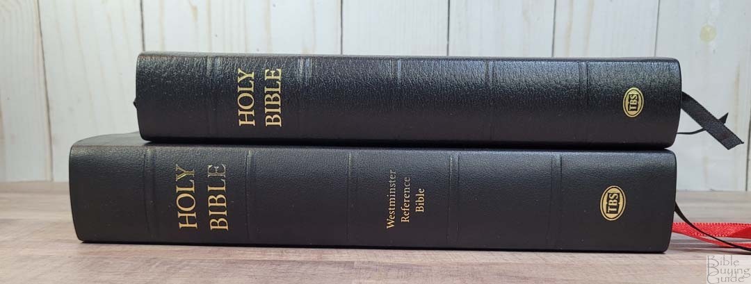


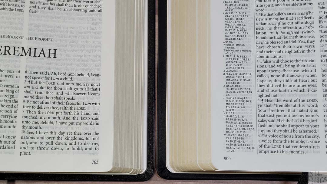
The Westminster Reference Bible is the reference equivalent to the text-only Windsor. They have the same paper, font, proper names, reading plan, and maps. Rather than a word list, the Westminster has the words on the pages. The Westminster is larger.
Conclusion
The TBS Windsor is one of my favorite text-only KJV’s. It’s a great companion to the Westminster Reference Bible, and it’s easier to carry and use. The print is clean and sharp. The leather is soft to the touch and it’s easy to carry and hold. If you’re interested in a text-only KJV, the Windsor is an excellent choice.
_____________________________
This Bible is available at
_____________________________
Trinitarian Bible Society provided this Bible in exchange for an honest review. I was not required to give a positive review, only an honest one. All opinions are my own.


I’ve thought about getting this Bible along with the Large Print Windsor