God’s Word Deluxe Wide-Margin Bible is a single-column large print edition with a wide outer margin. Although it has an imitation leather cover, the text-block feels like a premium Bible that’s just as nice for reading as it is for writing and highlighting. This is ISBN: 9780998447742, printed in China by RRD Communications.
Godsword.org provided this Bible in exchange for an honest review. I was not required to give a positive review, only an honest one. All opinions are my own.
_________________________________________________________
This book is available at (includes some affiliate links)
and many local Bible bookstores
_________________________________________________________
Table of Contents
Video Review
Binding
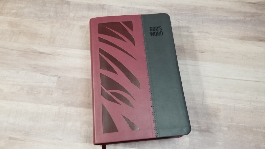
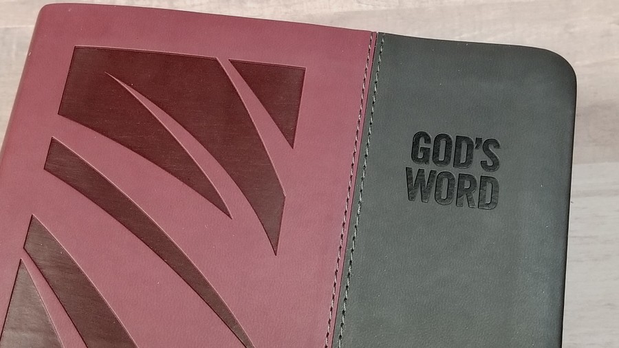
The cover is Duravella (imitation leather) with a two-tone matte finish in burgundy and gray. The gray is on the outside edges of the front, and the rest is burgundy. The front has a debossed abstract oat stalk design in the burgundy portion and the translation name in the upper right corner. The spine has all of the text and logo debossed. I love the visual look of this design.
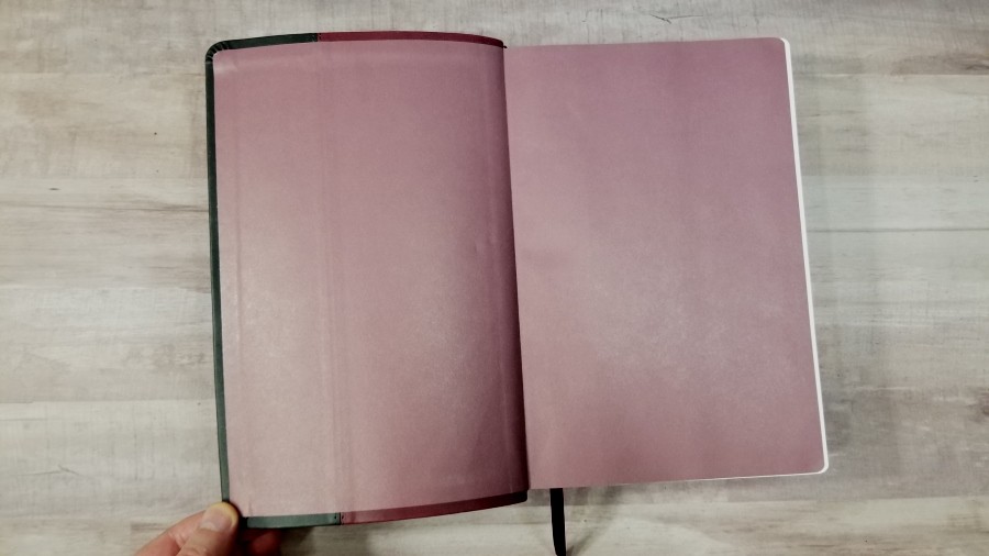
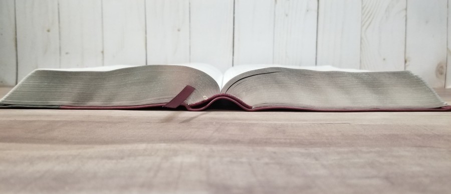
The liner is pasted-down paper in burgundy. The text-block is Smyth sewn. The spine rises upward when opened, allowing the pages to stay almost completely flat. There isn’t much of a gutter for the pages to bend into.
It has a burgundy ribbon. The overall size is 6 1/4 x 9 3/8 x 2″. It weighs 3 lbs, 6.6 oz. It does feel like a thick Bible, but the footprint is much smaller than the typical wide margin edition. It feels more balanced than a large print journaling Bible. I like this size a lot.
Paper
The paper is 39gsm. It’s bright white and extremely opaque. It has no glare under direct light. The thick pages are easy to grab and turn. I love this Bible paper. It’s a joy to read from and use. The page edges are silver gilt.
Typography
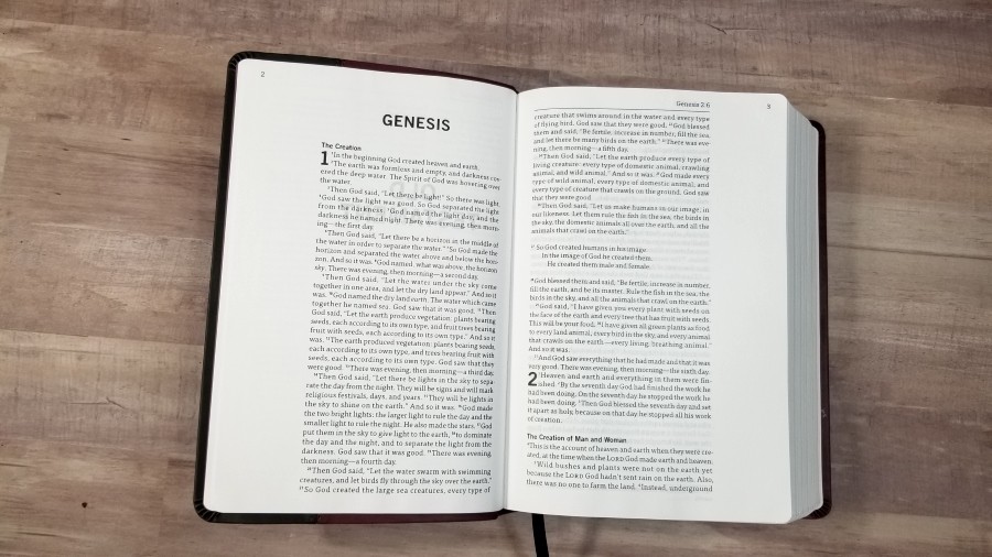
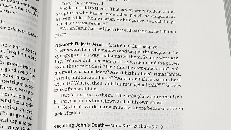
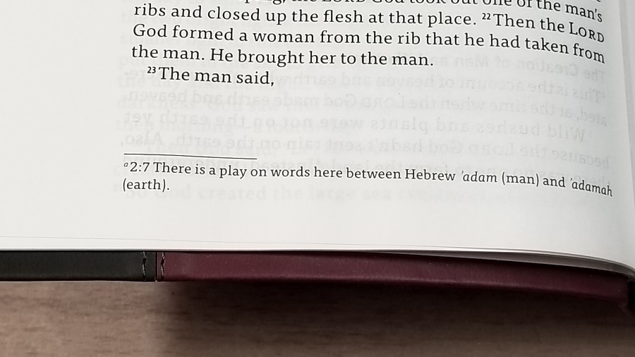
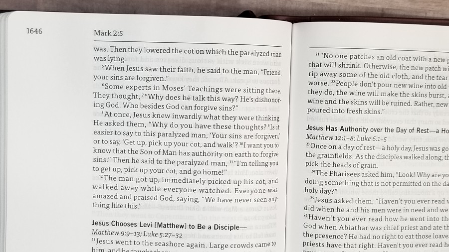
The text is presented in a single-column paragraph layout. The header shows the page number in the outer corner. Just over the corner of the text is the book name with chapter and verse number. The header is separated from the text with a horizontal line. Footnotes are placed in the footer in a smaller text which is separated from the text with a small line. Section headings are in bold.
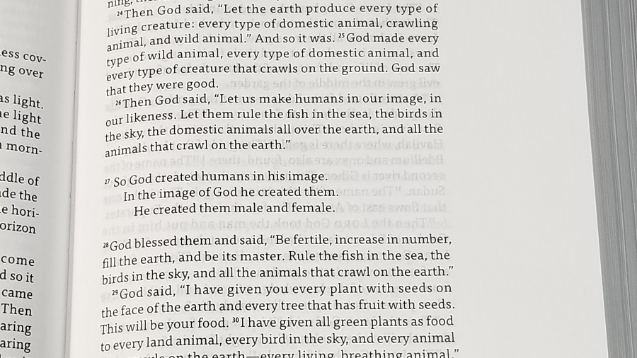
The typeface is Tisa Pro Regular. It’s 10.5-point with 13-point leading. This adds a lot of extra space between the lines, making it comfortable to read and easier to use. It’s black letter, dark, and sharp. The print quality is highly consistent. The text has more room between the words and lines than most Bibles. I love the design of this font. I especially like the J and G. It also uses a sans serif typeface called Trade Gothic Bold in various sizes for supporting text.
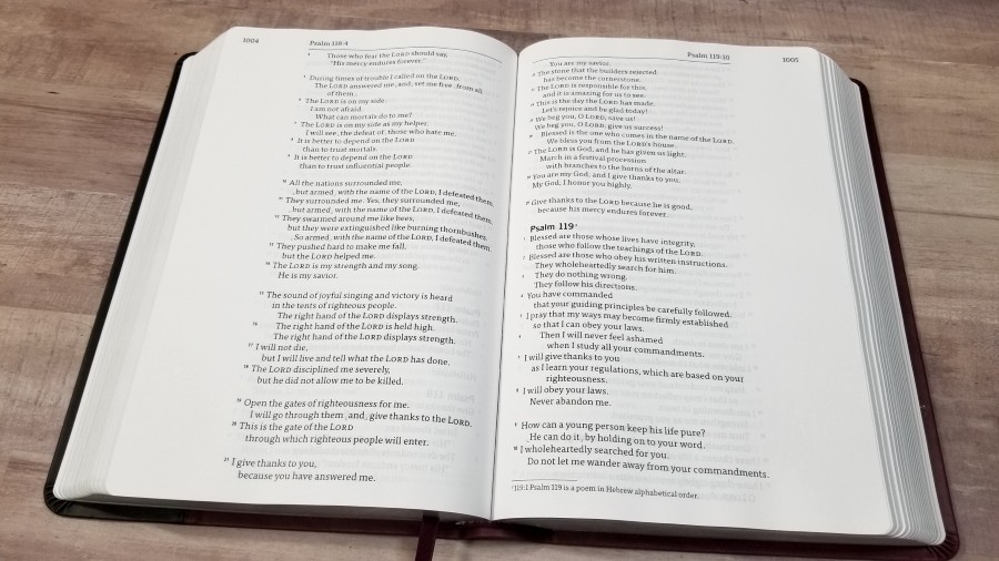
Most lines have around 10-11 words. This is my personal favorite word-count for a single-column edition. This makes prose easy to read and follow, and it gives poetry enough space to look amazing. Poetic lines keep indenting until the start of a new stanza. This creates nested (or cascading) poetry, which is easy to read and follow. It also makes poetry look beautiful.
It’s printed with line-matching, meaning that the text on both sides of the page is printed in the same location. The opacity of the paper keeps it from having a gray background behind the text. The show-through is barely visible in the poetic settings.
Verse numbers are dark and have a little bit of space that makes them easy to see. I had no trouble finding verses easily, and I had no trouble ignoring them for reading. Section headings include references to parallel passages. They’re in italics and are not bold.
The footnotes in the footer are in a smaller font, but not a small font. Even they have plenty of room between the lines and words to be easy to read.
The outer margin is 1 5/8″. I like having a wide margin on the outside because it’s easier to write in. This is enough space for bullet points, references, word studies, thoughts, prayers, outlines, etc.
Extras
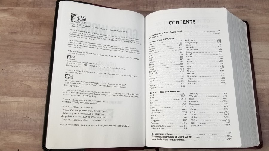
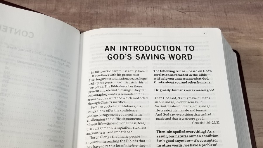
There are three helps (2 in the front and 1 in the back). They include:
Introduction to God’s Saving Word – This is an introduction to God’s love, sin, and God’s solution to sin. It covers major topics that show we have sinned, the penalty for sin, and that God provided a solution to that penalty. It ends with a prayer. This section does include theology the sinner’s prayer.
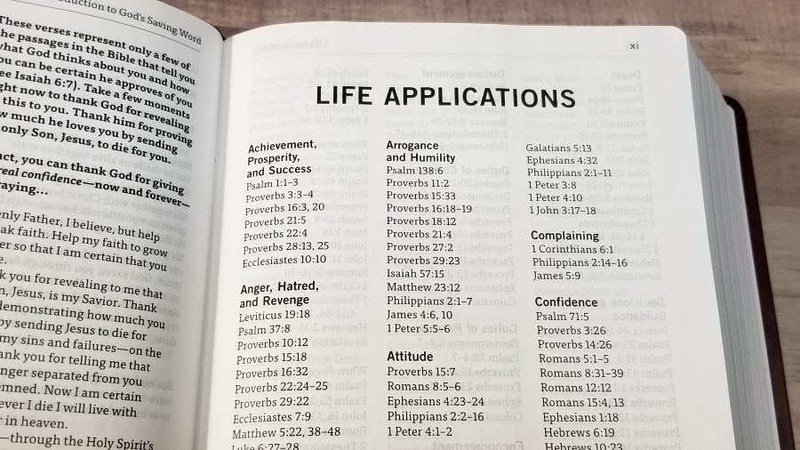
Life Applications – This is a 5-page index to topics for personal application. They include the topic and Scripture references. They’re excellent for personal growth and devotions.
Teachings of Jesus – This is a 9-page index that covers the major topics that Jesus taught on. It provides subtopics and Scripture references.
Conclusion
God’s Word Deluxe Wide-Margin Bible is an excellent design. I love the paper and print quality. I’d love to see a higher quality cover, but this text-block is worthy of rebinding when the cover wears out and the price is unbeatable for this quality of paper. I’d also like to see at least one more ribbon. It doesn’t have a lot of helps, but I like what it does have. The application section is especially good for personal study and devotions. This is my favorite design for wide margin layouts. I recommend this Bible even if you don’t want to write in your Bible. This is a fine edition for notes, readying, and carry.
_________________________________________________________
This book is available at (includes some affiliate links)
and many local Bible bookstores
_________________________________________________________
Godsword.org provided this Bible in exchange for an honest review. I was not required to give a positive review, only an honest one. All opinions are my own.







Wow, I’m so frustrated now… What a gorgeous layout! But I need it in a more literal translation. I sure wish Allan or Cambridge or someone like that would see this and produce something similar in KJV. It really is a great looking text! Thanks again for your reviews, Randy. Appreciate your labors.
This may be the only Bible I’ve ever seen that has Genesis beginning on the left page of the book. I wonder why they did this?