image from https://evangelicalbible.com/schuyler-treveris/
-Updated 1-16-2019
Schuyler Bibles has revealed their latest design: the Schuyler Treveris Series. Unlike the Quentel/Canterbury series which focuses on referencing (like most Bibles on the market), the Treveris Series is designed with reading as the primary focus. The series will complement the Quentel/Canterbury series, so they’ll have one for reference, preaching, and study, and one for reading. This series takes a different approach to Bible design by taking the verse numbers out of the text and placing them in the left margin. It also removes all of the added features such as references, footnotes, and section headings. The series will start with the KJV.

image from https://evangelicalbible.com/schuyler-treveris/
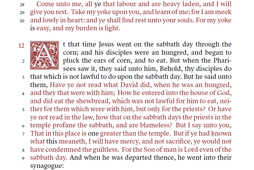
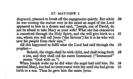
For the KJV, this is a major change from the common verse-by-verse layout. It takes a text-first approach. The text is presented in single column paragraph format while at the same time reuniting sentences that have been divided by verse numbers. The verses have traditionally printed the first letter as a capital even if it continues the sentence. This continues that feature, which helps in finding where the verses begin and end.
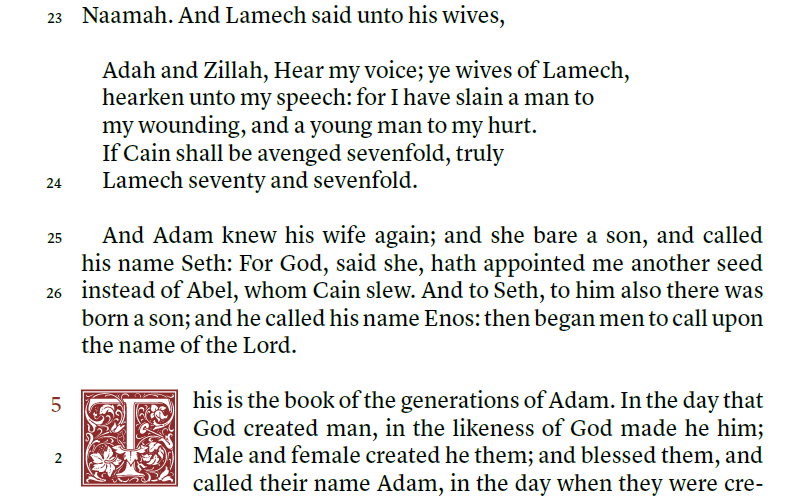
image from https://evangelicalbible.com/schuyler-treveris/
Poetry and letters are usually not identified in the KJV. The Treveris will print poetry to look like poetry, letters to look like letters, and prose to look like prose. This includes all poetry the New Testament. Until now, the Cambridge Clarion, Pitt Minion, and New Cambridge Paragraph Bible are the only Bibles that solve those issues, but they still add the verse numbers within the text and have very little poetry in the NT.
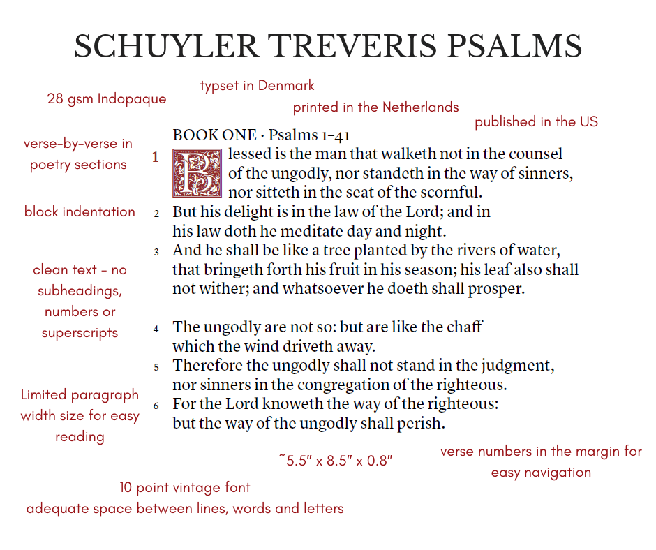
image from https://evangelicalbible.com/schuyler-treveris/
Here’s a look at the specs they’ve published so far.
- Trim Size: 5.5″ x 8.5″ x 0.8″ (140mm x 215mm x 22mm)
- 28 GSM Paper, Font: 10 pt.
- Single Column Paragraph format.
- Single Column, Verse-by-Verse format for Psalms, Proverbs, Song of Solomon, Poetry and Quotations.
- Ornamental Drop Caps
- Red letter (for King James Version)
- Italics for supplied words
- Epistle Dedicatory & Translators to the Readers
- Line Matching to avoid “see through”
- Art Gilt Edging
- Schuyler Bible Maps
Thoughts on Design

image from https://evangelicalbible.com/schuyler-treveris/
This sounds like it will be a large print thin-line edition with the footprint of the Concord. The 28gsm paper is the same that’s used in other editions such as the Omega, Legacy, Turquoise, the NIV Clarion, Personal Size Quentel, and the Personal Size Canterbury. This paper is highly opaque and even more expensive than the 36gsm used in other Schuyler editions. I’m glad they’re using this premium paper as it brings the size down and makes a Bible that’s great for carry to read, to visit other Churches, hospital and home visits, and anything I’d need a Bible for on the go. I’m more likely to carry a Bible in the 1″ range than the 1.5-1.75″ range.
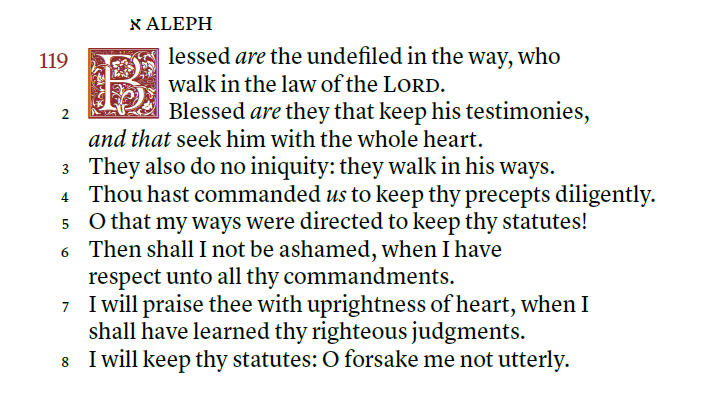
image from https://evangelicalbible.com/schuyler-treveris/
The ornamental drop caps from the Canterbury are here, but they take four lines of prose instead of five. It will include italics for supplied words. Italics is great to identify added words, but they’re not complete and they can be confusing to today’s reader because they’re often seen as emphasis. I personally still like having them, so I’m glad to see they’ll be included. It won’t have self-pronouncing marks. This will help improve readability.
The word-count per line is around 14 words. This brings the text in line with the ESV Legacy. This is on the high side for me (I personally prefer 10-12 words), but it is within the range of ideal.
image from https://evangelicalbible.com/schuyler-treveris/
The emphasis is on readability. This is a good thing. We have hundreds of Bibles available that emphasize study and include references, footnotes, and verse-by-verse layouts that are designed for use with concordances and commentaries. This is why I’m glad they’re starting with the King James Version. The numbers are here if you need them, but the text isn’t a slave to the man-made verse divisions.
I know it’s designed for reading, but I plan to use it for preaching and teaching. I think it will be better for preaching in context. I prefer no distractions and I usually back up to the beginning of the sentence or paragraph anyway. The verse numbers in the margins will get me to the line I want, just like I do now with the Clarion. ‘Most’ of the time a verse starts at the beginning of the sentence or after punctuation, so it won’t be that difficult to figure out where a verse starts. It still has the capital letters, so it shouldn’t be difficult to find the verses.
The Schuyler Treveris isn’t the first design to ever move verse numbers to the margins. Here’s a look at just a few…
Other Editions with Verse Numbers in the Margin
The original Cambridge Paragraph Bible, the 1873 Scrivener, presented the KJV in double column paragraph with verse numbers removed from the text and placed in the margins, but it still included cross-reference and footnote keys in the text.
It’s also been done for Hebrew and Greek Bibles. I mentioned in this review that I wanted an edition in English. PubAssist has discussed the advantages of the design for readability. I even mentioned wanting this design in my LCBP Paragraph Bible review.
The New Testament in Modern English uses this design.
The New Jerusalem Bible uses this design.
Ending Thoughts
I’m looking forward to the Treveris series. Not every Bible needs to have references, footnotes, and focus on study. I read more than anything else and this looks like a good series for reading. Verse numbers are accessible, just in case you need them, but they’re not in the way when you don’t need them. It makes sense for Schuyler to complement the already popular Quentel/Canterbury series rather than compete with it.
I’m glad to see a KJV with reading in mind. The layout will match modern designs, making the most poetic translation have the most poetic layout.
You can see more about the Treveris series at Evangelical Bible.
Do you think the Teveris series will make a good edition for reading?


I’m looking forward to the Schuyler KJV Teveris being printed. I read a lot more than I study, and I am all for a reader Bible that removes all study aids and other distractions. I was never a fan of single-column paragraph format ONLY because finding the verse numbers was like an Easter-egg hunt. But this…! The verse numbers are staged outside of the text — perfect solution.
The 28 gsm paper of my Turquoise gave me some trouble at the first — the pages were so thin that they clung together. But I found out that the longer I used it, the pages became much easier to turn, and I am appreciating it more all along. If the Teveris has similar paper, I welcome it!
Great ideas and layout, the 28 gsm is a deal breaker for me, that’s why the Canterbury is a great buy, 28 gsm paper on the turquoise is nice but make sure you don’t have sweaty hands or turn a page to quickly, it will basically dissolve or tear, I wish Bible makers went back to the old school Bible paper from the 1950s.
Fortunately, I haven’t had any issues with my 28gsm editions. I love that old paper. Unfortunately, the process of making some of the best Bible paper caused cancer.
I find the slickness of the 28.gsm paper very hard to turn. I have the thin line NASB and have tried getting used to using it several times. Drives me crazy.
For me, it depends on the paper’s coating. I have more trouble with some 36gsm than I do with some 28-32gsm papers.
Looks really nice; but the 28gsm paper and red letter are deal breakers for me. TBS Large Print Westminster Reference Bible and Thomas Nelson Preaching Bible are my main reading bibles.
Looking forward to this. Wish they would have left out the red letter for the words of Christ. . Seems
Counter productive if they are going for readability.
Randy, Thank you for this review. This Bible’s font is attractive, but this Bible would not be for me : I can easily read a Bible with cross-references, which I would greatly miss; the red-letter fad is highly questionable; and the unintelligent line division in the poetic passages is quite shocking – it is a glaring fault that could and should have been very easily avoided, and it should be rectified forthwith.
I like to see poetry broken into lines like a song.
As a KJV Clarion reader this Bible would be near perfect for me. I find the clutter around the text of the Clarion to be very distracting, so this would take that all out of the way. One thing I dislike about the Treveris is how close the verse numbers are to the text. I feel a pull to read every new verse number. I would rather the verses were further away or that they weren’t there at all. That’s just my opinion anyway. It definitely wouldn’t stop me from purchasing this Bible.
Thank you for the review, Randy. Excited to see this on the horizon – this format is exactly what I’ve been looking for.
Give me an NASB Treveris *Credo* (no red letter text, please), and I’d pre-order now. Maybe someday? Guess I’ll just have to be patient.
I’m glad you liked it! I have a feeling the Treveris will be my Bible.
I tend to agree with Mark regarding the verse numbers. Would like to see those more out of the way, possibly even relegated to the top of the page. But I guess you can’t have it all.
Same for me. I want a beautiful format without the distractions getting in the way.
This looks like it might be the last Bible I purchase – (well….maybe). A CSB in this format would be (almost) the perfect marriage of form and function and translation. For me anyway. I emailed evangelicalbible.com and they stated that the CSB Treveris is a definite possibility in the future. Will wait and see. Scott D., RN/Pastor
This edition really looks interesting. I have several Schuyler Bibles, and I think they’ve moved to the number one spot in overall quality. I enjoy my Crossway Readers set, so I don’t have a problem with the verse numbers being to the side. (Verse numbers were added centuries after the Bible was written.) I agree they are a little too close to the text. I have mixed emotions about retaining the beginning capital of a verse in order to make locating it easier. It’s still a bit confusing and the “misplaced” capitals are a bit distracting, but I don’t have a better solution. The most negative thing that jumps out at me is that there doesn’t seem to be quite enough space between the lines. But that’s being picky, and this looks like a very readable Bible in a nice size. I’m glad they’re going with 10-pt. type, and it seems to be very bold. I probably won’t buy it in the KJV (I have their beautiful Canterbury), but probably will in either the NKJV or perhaps the NASB if/when those are published.
I enjoy your reviews; thanks.
Randy is basically just a greedy merchant. All he says is ‘great’ ‘the best’ ‘my favourite’ then counters anyones criticisms. The guy is a plank – not to be trusted
I only use those words if I mean them. Also, I’m not a merchant. I produce reviews that you can use free of charge. I tried to help you by providing a link to a store in the UK. You repaid me by insulting me.
Paul, If you do not like Randy’s reviews, and/or (especially) if you cannot disagree more graciously, I suggest that you do us all a service by not reading, and/or (especially) not commenting on, his reviews. Thank you.
I picked up a Cambridge Clarion for the paragraph format. However, i have been very disappointed in its like of poetry formatting.
This bible looks like it will in similar in size to the TBS Windsor (no references, verse-by-verse), which I like very much. Since the TBS is 9.7 font, they should be similar in size. It will be a very reasonable trade off of print size vs physical size. And glad they are going with the 28 GSM paper
As one posted noted on the sample, I too tend to want to read the verse number. 🙂 I suspect overtime I will adjust for the ability to “find” a verse and ignore otherwise.
I look forward to the finished product and highly anticipated I will purchase one to replace the Clarion and to compliment my Canterbury.
Randy, do you know the target pub date? Thanks for your reviews.
Thanks Gar. The only date I’ve heard is early 2020. The Windsor is an excellent comparison. The overall size will be more similar to the Windsor, which is about the perfect size for me.
I’ve been patiently waiting for a single-column, black letter Bible, in a readable font and a nice leather. I’ll wait for the NASB or NIV. Cambridge had an 11-point that fit the bill, but it’s OP and I like the NIV(2011) better anyway. It sounds like I’ll be waiting a couple of more years.
I cannot WAIT for the NASB Treveris. Even though it’s not a pure reader format (no verse and chapter numbers), this will be the closest us NASB fans will have for a reader. Thank you Schuyler for this edition. I’m excited to see what the future holds for Schuyler, the king of Premiums in my opinion.
I’ve been waiting for a NASB like this for a long time too. It checks nearly every box on my bible feature list: Paragraph form, single column, good sized font, not too big or too small in size, choice of edge lined calf or goatskin, more yapp than the quentel has, reader format with no references or notes, and verse numbers so I can still find a verse quickly at church. There are plenty of options for reference and verse-by-verse bibles out there, but not so much for reader’s type bibles… So the Treveris is a very welcome option for me!
The only downside I see is the big blocks of red print used for the words of Christ, if not for that I’d be very interested in the Treveris. I’d recommend to people to print out pages of text and experiment using different colors for comparison, I think they’d find there are better more readable options other than red print.
I want to get a Treveris when it comes out. I can’t wait to see what they look like and what colors they start with. The line spacing looks like it will be a lot easier to read than the Clarion. I didn’t like the Clarion for that reason. I love that it is red letter too.
In the sample page for Gen 4, why is v. 24 showing on the second line of the verse? It seems like it should be one line up. I love the layout, and I love the no self-pronouncing proper names. But the red letter is a deal breaker for me. The Canterbury had self-pronouncing, and now the Treveris fixes that flaw but they’re using red letter. Why? Does Schuyler have a premium KJV without self-pronouncing, and with black letters?
These images were taken while they were still working on it. They’ve fixed it. You can download a detailed sample PDF on the Treveris page at the EB website. The regular size Canterbury is black-letter, but it does have self-pronouncing marks.
I wonder if the Treveris will have textual notes? I think not having textual notes would be a huge mistake.
I have the Schuyler Canterbury KJV and love it, but I wish it were single column like this one. I love the way this one looks, but the red-letter is a deal breaker for me. Do they plan to make one without the red letters?
The KJV will only be available in red-letter. They’ll decide on the other translations as they produce them.
I heard from Beth that the ESV Treveris will be out in the spring 2021and have, wait for it, black letter text! Colours not decided yet
I’ve been looking all over to find a KJV formatted for reading, so this looks quite promising. The only thing that really bothers me is the use of italics for supplied words. Using italics like that is so contrary to how italics are used in everything else that I read, that it makes it very challenging to immerse myself in the text. Each time I hit an italicized word, it sounds unnatural in my head, and it kicks me up out of the narrative.
For me, the primary value of the KJV is the rich history and tradition of its language. It’s a translation begging for a good, reader-friendly edition, but yet it’s so hard to find one. Any scholarly activities or other serious study of the bible should be carried out with a more modern translation, so I see no reason to encumber the KJV text with any sort of scholarly apparatus or anything that detracts from readability (I’d also completely lose the red-letter text and chapter/verse numbers, but the way they shuffled them off to the margin seems like a reasonable compromise, even if it isn’t my favorite).
I’m curious, is this a Cambridge or the Oxford KJV?
If I were to guess, I’d say it was neither the 1769 Oxford nor the 1873 Cambridge. It’s probably the PCE, the same as the Canterbury.