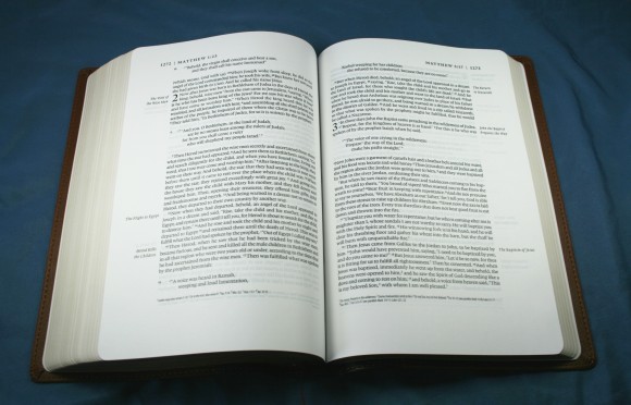
Crossway’s ESV Single Column Legacy Bible has a beautiful layout with the design philosophy of the perfect page. It has wide margins, thick paper, and a large font. Made with readers in mind, Crossway has set a new standard in page layout.
Pros
- Layout designed to improve readability
- Wide margins
- 9-point font
- Sewn binding
Cons
- No references
Features
- 2011 ESV
- Presentation pages
- Single-column paragraph format
- 9/10.75 font
- 1.25” wide margins
- 36 gsm Thincoat Plus paper
- Marginal headings
- Translation notes
- Brown/Cordovan TruTone
- Sewn binding
- 1680 pages
- Concordance
- 8 maps
- Ribbon marker
- Gilted edges
- Printed by Legatoria Editoriale Giovanni Olivotto, Vicenza, Italy
- 9 x 6 x 1.5
- ISBN: 978-1-4335-3087-6
Where to buy
Christianbook: ESV Single Column Legacy Bible, Pocket Cover, TruTone, Brown/Cordovan, Portfolio Design
Amazon: ESV Single Column Legacy Bible (TruTone, Brown/Saddle, Timeless Design) (Esv Bibles)
Cover and Binding
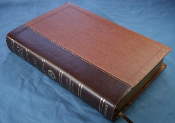
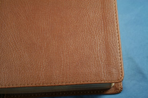
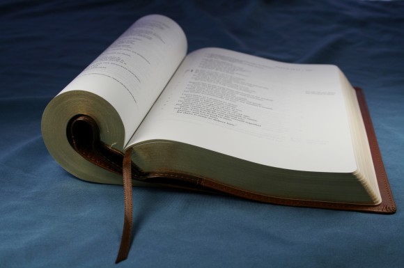
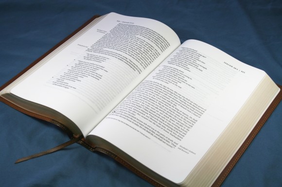
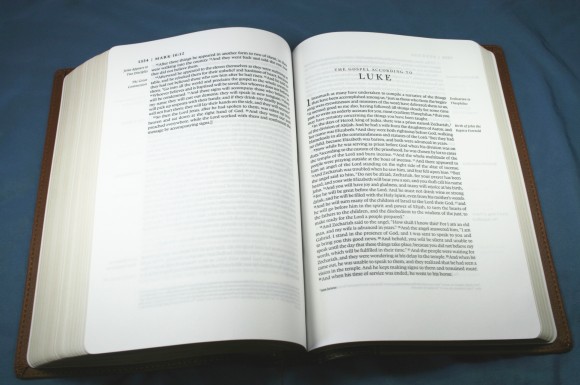
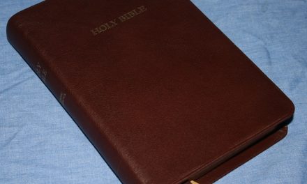
The cover a two-tone brown TruTone (a soft imitation leather) with a paper liner. I was able to curl it around in any shape I wanted and it went back to lying flat. To me, it feels like calfskin. I love the look and feel of the grain. The cover is sewn around the edges, adding strength. The cover is very flexible. The binding is Smyth sewn, so it lays flat. It does take some breaking in before it will lay flat in Genesis.
Paper
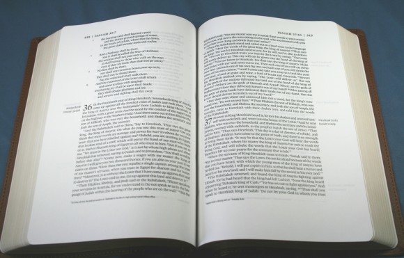
The paper is 36 gsm (grams per square meter) Thincoat Plus. It feels very thick. I kept trying to separate the pages, thinking I had two pages when I actually just had one. It is smooth and not at all shiny. Although it is opaque it does have more show-through than I expected for the page thickness. The paper is very white.
Text and Layout
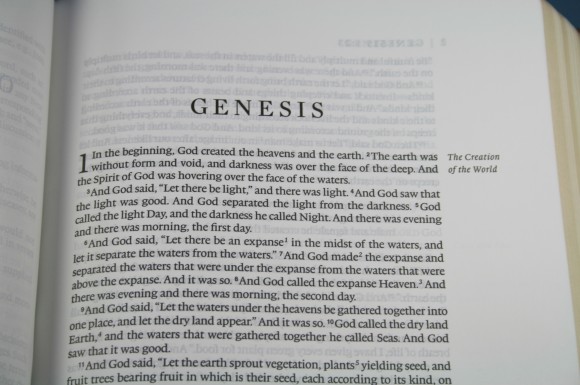
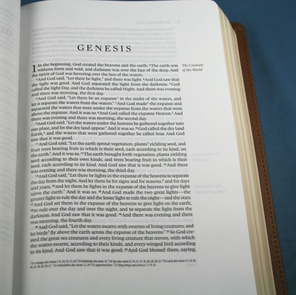
The font is 9-point Lexicon with a 10.75 leading, giving lots of space between the lines. It is a black-letter text and is sharp and readable. The text is printed with line-matching, so the lines of text line up with the text on the backside of the page. This improves contrast which greatly helps readability because there is no text showing through between the lines of text. The print is consistently dark.
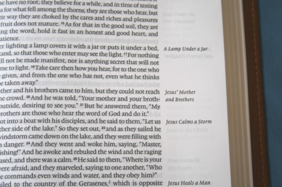
The layout is the real star of the show. It follows the renaissance concept of the perfect page, with roughly a 2:3 ratio page geometry, and looks great. It is unique for a Bible with section headings. This is a wide-margin edition, but instead of the section headings placed within the text, they are placed in the margins. This helps in readability. I was able to read without any distractions or disruptions between paragraphs. Since they are in the margin, they do take up some of the writing space. Moving the headings to the margins in order to improve readability was the purpose of the wider margin. The margins are great for writing, but they’re also great for leaving clean.
This is my favorite layout for wide-margin editions. I like the writing space on the outside margin because inner margins are too difficult to use. I badly want Crossway to make a KJV edition of this Bible.
The top outer corner of each page shows the page number, book name, chapter number, and verse number of the first verse that starts on that page.
Notes
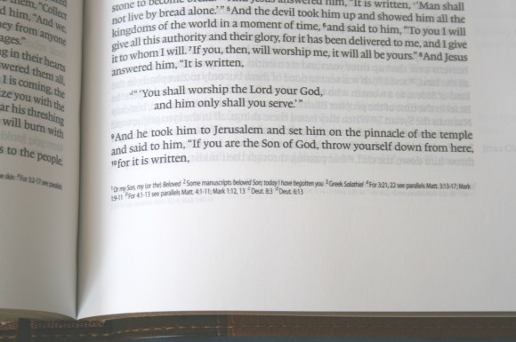
This edition doesn’t have cross-references, but it does have translation notes. The notes are located at the bottom of the page and are keyed to the text with numbers. This works, but I could also see a benefit of the notes being in the margin next to the verse. I think that would make the headings blend in too much though. The text for the notes is small. I’m guessing it’s a 5-point font.
Concordance
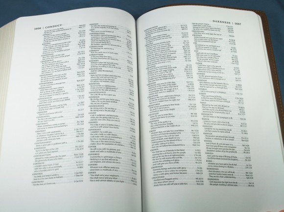
The concordance is 72 pages and in double column. The text is small but readable, so there are lots of entries. The primary word is in bold and the verses are offset with each verse on its own line. I found it easy to use.
Maps
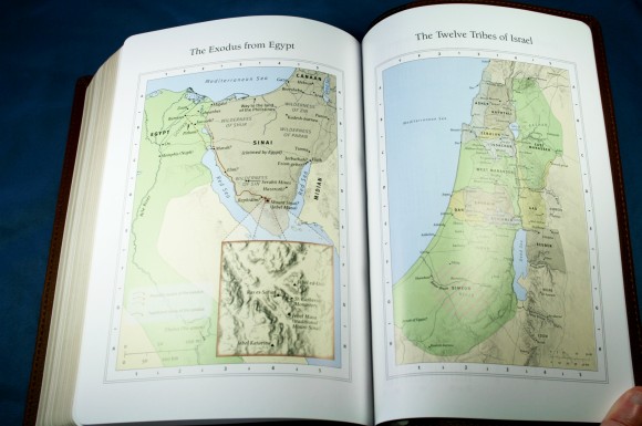
There are 8 color maps. These are the same maps that are standard in other Crossway editions. My only complaint or suggestion is there needs to be an index to the maps. This would make the maps much easier and faster to use. The maps are labeled well, so they’re not hard to use. I just think an index would be nice.
Ribbon
This edition has one ribbon. It’s brown and very long. I think it’s too thin, but making it wider would increase the cost. For its price it’s fine.
Conclusion
This is one of the most readable layouts I’ve seen in any Bible. Moving the headings to the margin and the overall page design makes this a Bible I want to read for long periods of time. The size feels right too- not too big or too small. The wide margins are great for taking notes and adding references or just leaving blank. The paper is nice and the print is amazing. Crossway seeks to set new standards with the Legacy. They’ve done a great job. I highly recommend Crossway’s ESV Single Column Legacy Bible.
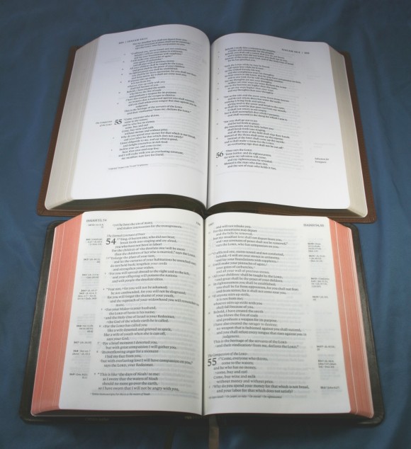
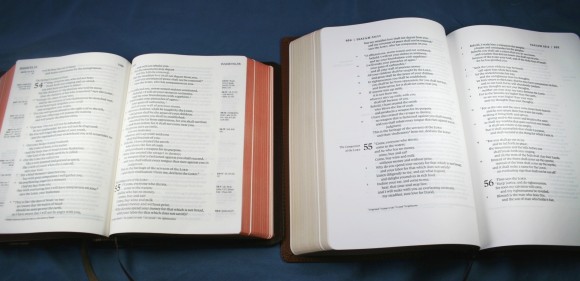
Wanna know how it compares to the Clarion? Yes? Then it’s a good thing I took Clarion/Legacy comparison photos…
Where to buy
Christianbook: ESV Single Column Legacy Bible, Pocket Cover, TruTone, Brown/Cordovan, Portfolio Design
Amazon: ESV Single Column Legacy Bible (TruTone, Brown/Saddle, Timeless Design) (Esv Bibles)
Crossway Publishers provided this Bible free for review. I was not required to give a positive review- only an honest review.

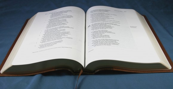



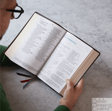


It looks like there is plenty of room in the margins to add your own notes. I would like to see cross references but do not know where you would put them and maintain the look and the generous space on the pages.
I also like the headings placed in the margins as well. Leaves the text with a clean look.
Thanks for the review.
I’ve been using this one for a while and it makes for very easy reading–love it. In my mind this is what the R.L. Allan’s Reader’s edition should have been–a Bible scientifically designed for the best reading experience possible. Bravo to Crossway for the work they are doing–I’m glad I’m an ESV user!
I have and love the legacy, wonderful reading experience. It is a little big for carrying, though being able to read it in my lap without lifting it has made it worth it. I just noticed the new ESV Heritage Bible and am dying to see a side by side comparison of the two. It has two basic reviews on Amazon that don’t offer much detail. I’m especially curious about the gutter on the Heritage, is it the same as the Legacy? How does the paper quality compare?
Hi Rachel. I haven’t seen the Heritage yet. I hope to get a review copy soon. If I do, I’ll be sure to post some comparison photos.
Would love to hear your thoughts on a comparison of the legacy and the single column journaling Bible. I’m torn between the two! I’m looking for a good daily study Bible with room for lots of notes, but want to be cautious of the text size. I’m not keen on the lines in the journaling edition – but perhaps they’re light enough that they could be ignored and written over? Thoughts?
Hi Brenda. That’s a tough one because I like them both. The Single Column Legacy has thick enough paper for writing, 1.25″ margins, and a 9-point font. The Single Column Journaling has even thicker paper for writing (and has a cream tint that I like), a 2″ margin, and a bolder 7.5 font. The Legacy has a concordance and maps (if you don’t use them then it doesn’t matter). The Journaling doesn’t have either. Their other features are about the same: section headings (Legacy – in the margin, Journaling – in the text), and translation notes. Neither have references. If your primary goal is writing I think the Journaling would be a better choice. It has wider margins and the paper is made for writing. The lines are light enough that they could possibly be ignored, but I think that might be different from one person to another. I think I might have a hard time ignoring them. I think the Legacy is better for general use. It has nice margins (but part of it is taken up by the section headings), a larger font, a concordance, and maps. There is also more space between the lines, so it’s better for underlining. They’re both nice and it’s hard to go wrong with either one. For me it would be Journaling for heavy writing and Legacy for general use with some writing. It’s still a hard choice.
Thanks for tackling it! I like asking the hard questions. (smile) They sound neck-and-neck; perhaps price may be the deciding factor then.
I am looking at your review. I am trying to find the best notetaking study bible in NIV. I don’t care how heavy it is. I just want both combined with thick pages where writing doesn’t bleed through. Font size is not a problem as this is for my son when he graduates. Any recommendations? Do combined study and notetaking bibles exist?
Hi Heather. If you just want writing space, here’s the NIV Note-Taker’s: https://biblebuyingguide.com/niv-note-takers-bible-review/
If you want a study Bible, there’s the Hebrew Greek Keyword Study Bible. It has smaller margins, but it’s worth considering (but its paper is thinner than you’re looking for I think): http://www.christianbook.com/niv-hebrew-bible-bonded-leather-black/9780899577562/pd/577562?item_code=WW&netp_id=626950&event=HPT&view=details
The one with the paper you’re looking for is the Loose-Leaf from Zondervan: http://www.christianbook.com/zondervan-niv-loose-leaf-edition-binder/9781565639867/pd/639863?item_code=WW&netp_id=323024&event=HPT&view=details
If you can find one I recommend the Cambridge wide margin. I sometimes see them on eBay. Here’s one, but it has writing and a torn page: http://www.ebay.com/itm/Holy-Bible-NIV-Cambridge-Wide-Margin-New-International-Version-Calfskin-Leather-/301158665986?pt=LH_DefaultDomain_0&hash=item461e748f02
Here’s a good one in hard cover: http://www.amazon.com/Wide-Margin-Bible-Black-Baker-Publishing/dp/052160334X/ref=sr_1_3?s=books&ie=UTF8&qid=1398119988&sr=1-3&keywords=niv+wide+margin+bible
I’m looking for a Journaling or note taker, larger than 9 font bible, other than KJV and bendable. Any recommendations? I’m hoping the Women of Faith will publish one soon.
Hi Cathy. The only Bible I’m aware of in that size that’t not KJV is the Writer’s Bible. It’s not available in a complete volume, so you have to buy it in sections. They currently has NASB. I’ll keep looking to see what else I can find in large print.
The layout of this bible is wonderful. I like the fact that there are no references. The margin space is wonderful for notes.
Thanks for this review and your website in general. It helped me to narrow down my options for purchasing a new Bible, and this is the one I chose.
Kudos!
Thanks for the feedback and kind words T.J.! I know you’ll enjoy the Single Column Legacy. It’s one of my all-time favorites.
Randy