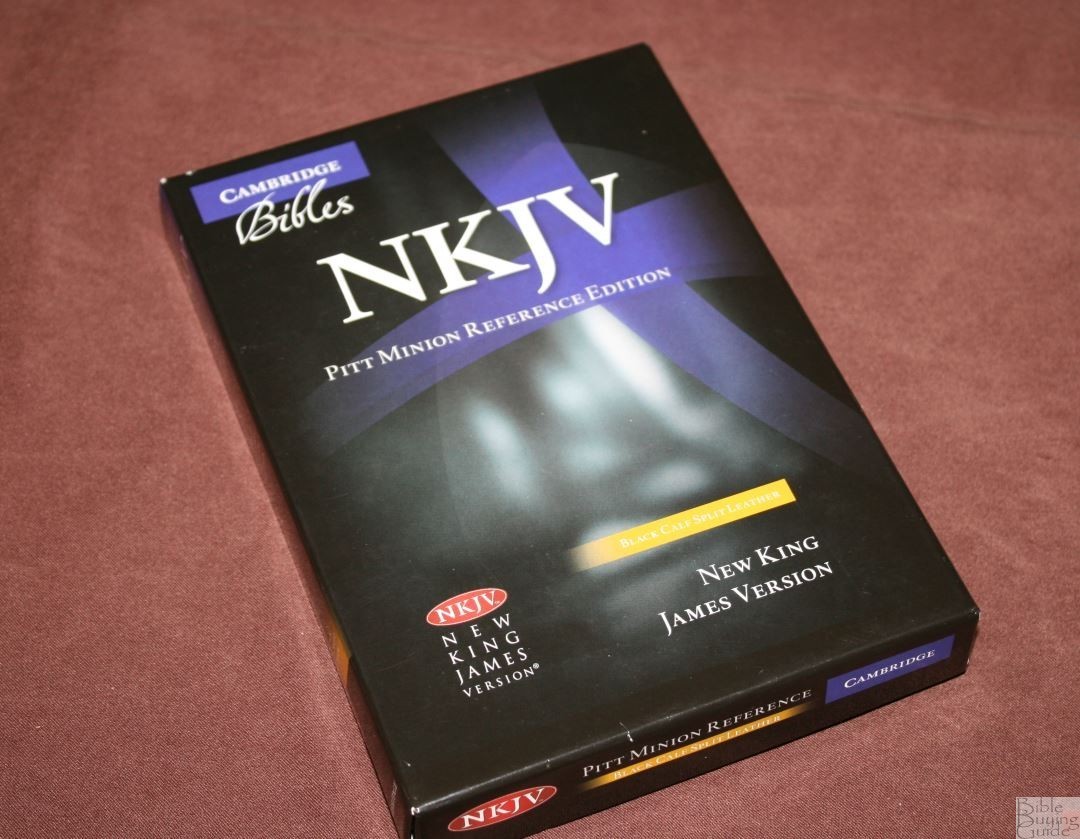
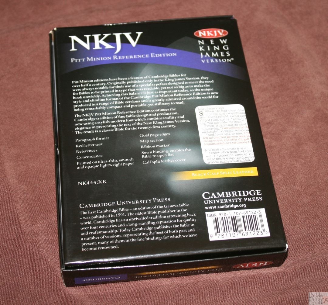
The Cambridge NKJV Pitt Minion Reference Bible is a nice little reference Bible in the popular Pitt Minion setting from Cambridge. It’s easy to see why this setting is so popular: it’s a full reference edition with concordance and maps, all within a thin Smyth sewn book-block that’s easy to carry, and wrapped in a high-quality leather cover. It is available in calf split and goatskin. Both are excellent editions. In this review, I’m taking a look at the black calf split leather.
This Bible was purchased for review. I was not in any way influenced by the publisher to give a positive review. My opinions are my own.
Pros
- Easy to carry
- Complete reference edition
Cons
- Font small for many readers
Features
- NKJV
- Calf split leather
- Sewn
- 6.75 font
- Red-letter
- 2 column
- Paragraph
- Center-column references
- Translation footnotes
- Concordance
- Maps with index
- 1 ribbon
- Overall size = 7 3/8 x 5 1/8 x 15/16″
- Textblock size = 6 15/16 x 4 7/8 x 3/4″
- ISBN: 9781107691223
- Model NK444:XR
- MSRP $120
- Printed and Bound by Royal Jongbloed in the Netherlands.
____________________________
Buy from Amazon
____________________________
Cover

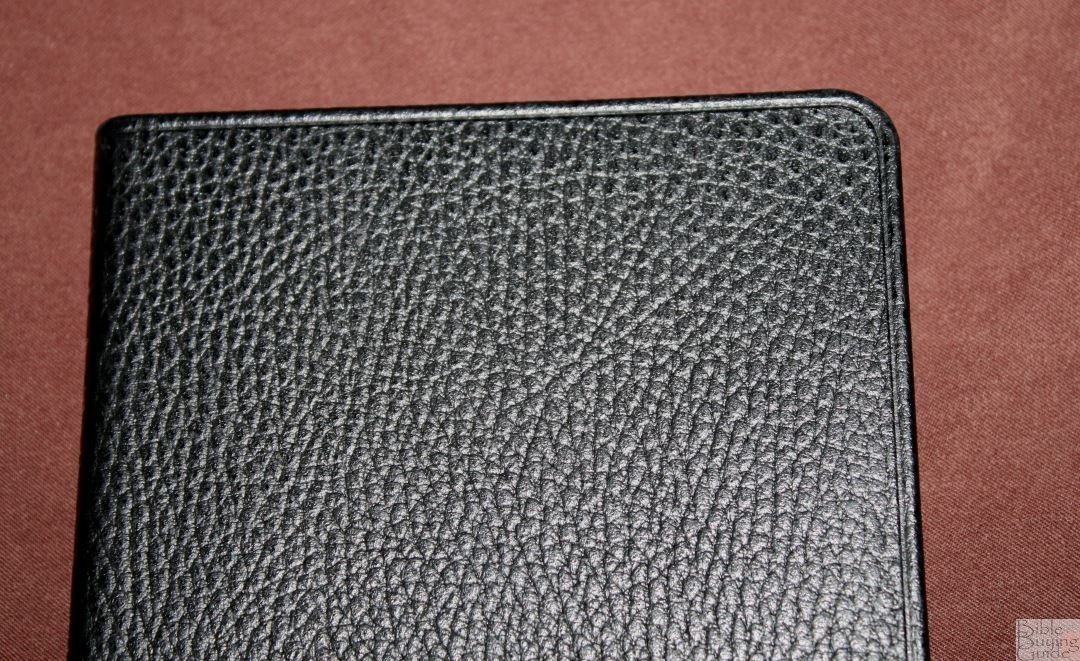
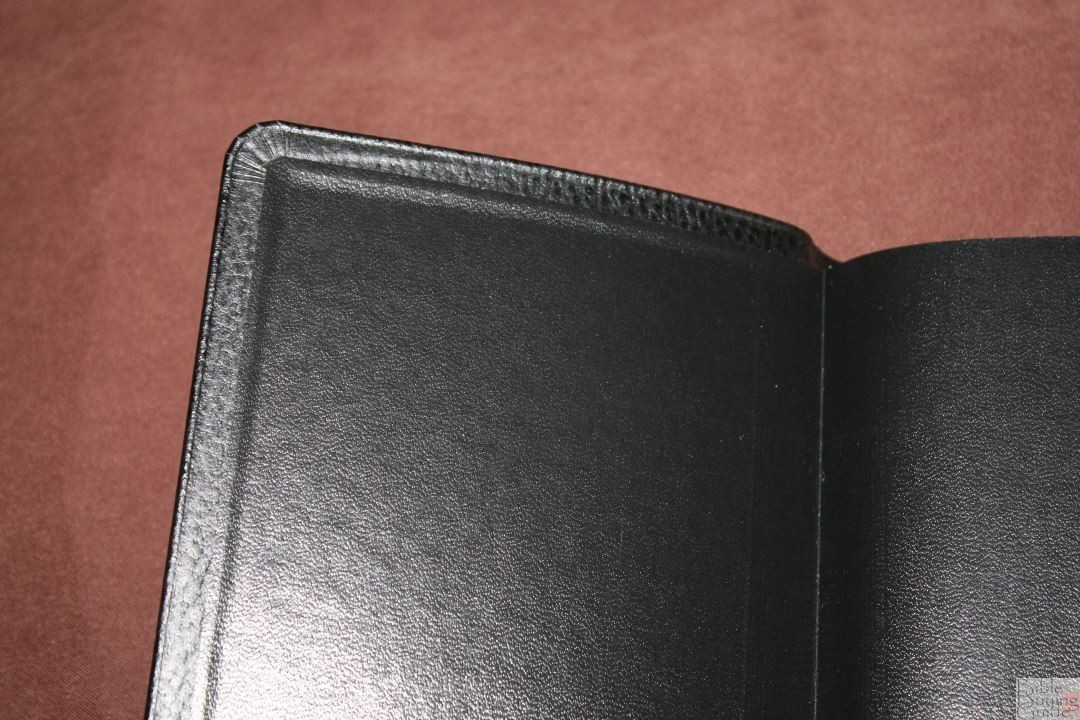
This edition is calf split. It’s not as soft and has a duller finish than the goatskin covers. Like the goatskin editions, it has a paste-down vinyl liner and is almost as flexible. It has a pebbly grain that looks great. The front of the cover has no writing. The spine has Holy Bible, New King James Version, and Cambridge in gold. It has five tooled ribs.
The text-block is sewn and has no trouble lying flat or open to any page. It has a black ribbon and red and gold head/tail bands.
I love the size of this Bible. It’s easy to carry and hold for long periods of time. It’s great for trips, visitations, etc.
Paper
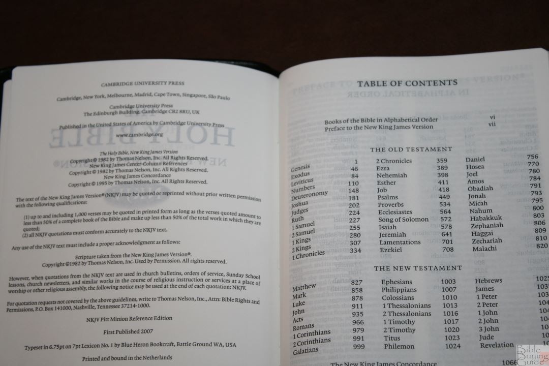
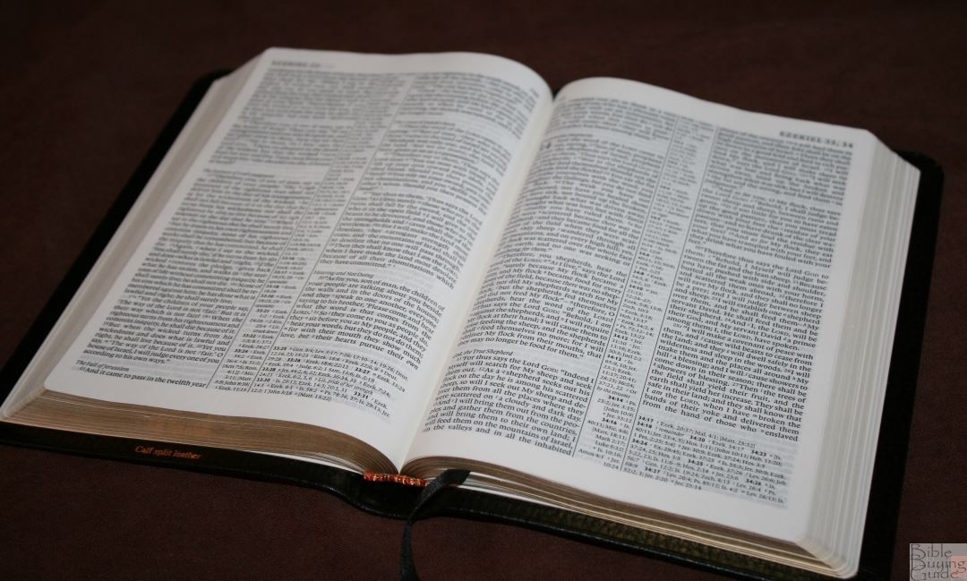
The paper is India Paper, which makes it around 28gsm. It’s highly opaque for how thin it is. It has a slight cream color and no glare under direct light. The calf-split edition has gold gilt (the goatskin has art-gilt). I had no issues turning pages. It has 1147 pages not counting maps and front materials. Depending on your location you might get some page-curl during certain weather conditions. Here in TN I get page-curl during the winter months (heat rising, air-flow, and all of that).

I’ve heard some complaints about 28gsm paper, but in order to get 1150 pages in 3/4″ you have to use thin paper. In my opinion the size of the Pitt Minion is part of its value. I’ll take the 28gsm paper. The issue isn’t how thin the paper is. It actually goes deeper than that. It includes texture, opacity, color, sheen, how well it takes print, how easy it is to turn, etc. The paper in the NKJV Pitt Minion satisfies on all accounts regardless of how thin it is. The thickness of the Pitt Minion is one of its strengths.
Typography

The text is presented in double-column paragraph with poetry in stanzas (even in the NT), letters are indented, and OT quotes in oblique type. References and footnotes are placed in the center column. The header has the book name and chapter number over the outer margin and the page number over the inner margin.
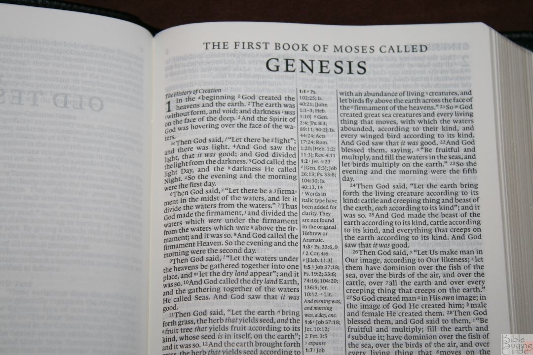
The font is Lexicon Number 1. from Blue Heron Bookcraft and measures 6.75-point with 7-point leading. The font is sharp and clear and is printed with line-matching to improve readability. It’s semi-bold, which seems to be the perfect boldness for this font. The sharpness of the font helps make up for how small it is. The red letter is about a medium/dark red and is one of my favorite reds for a red-letter edition. Red continues through Revelation. Both the black and red-letter are consistent throughout. The columns have 38 characters across with around 8-10 words per line. The spine is thin enough that the text doesn’t bend into the gutter.
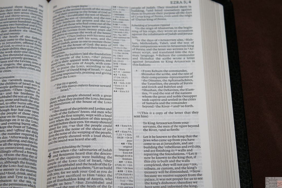
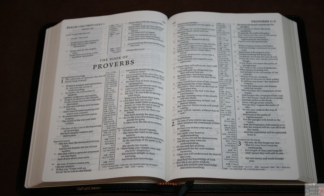
This is a small font and many will have trouble reading it. It isn’t for everyone. Even though the font is small I love reading from it. I wear bifocals and write for a living, so I’m always staring at a screen. I have no issues reading this typeface unless my eyes are tired from writing all day. The lines are close together, so it does take more concentration than normal to focus on the text. Increasing the leading would help readability but that would disrupt the perfect portions of the text-block.
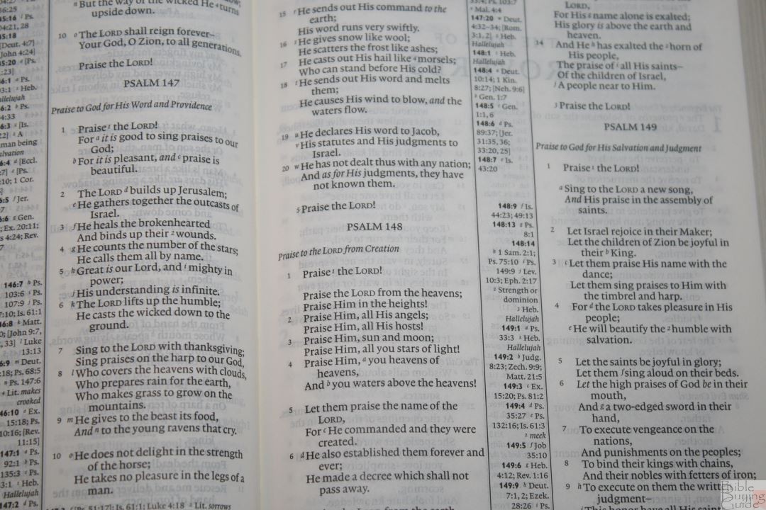

Section headings are in italics. There are lots of them throughout the text. They stand out just enough to not be a distraction and still be useful. Verse numbers are small and can be difficult to find. The footnote and reference keys are also small. This helps me ignore them if I just want to read.
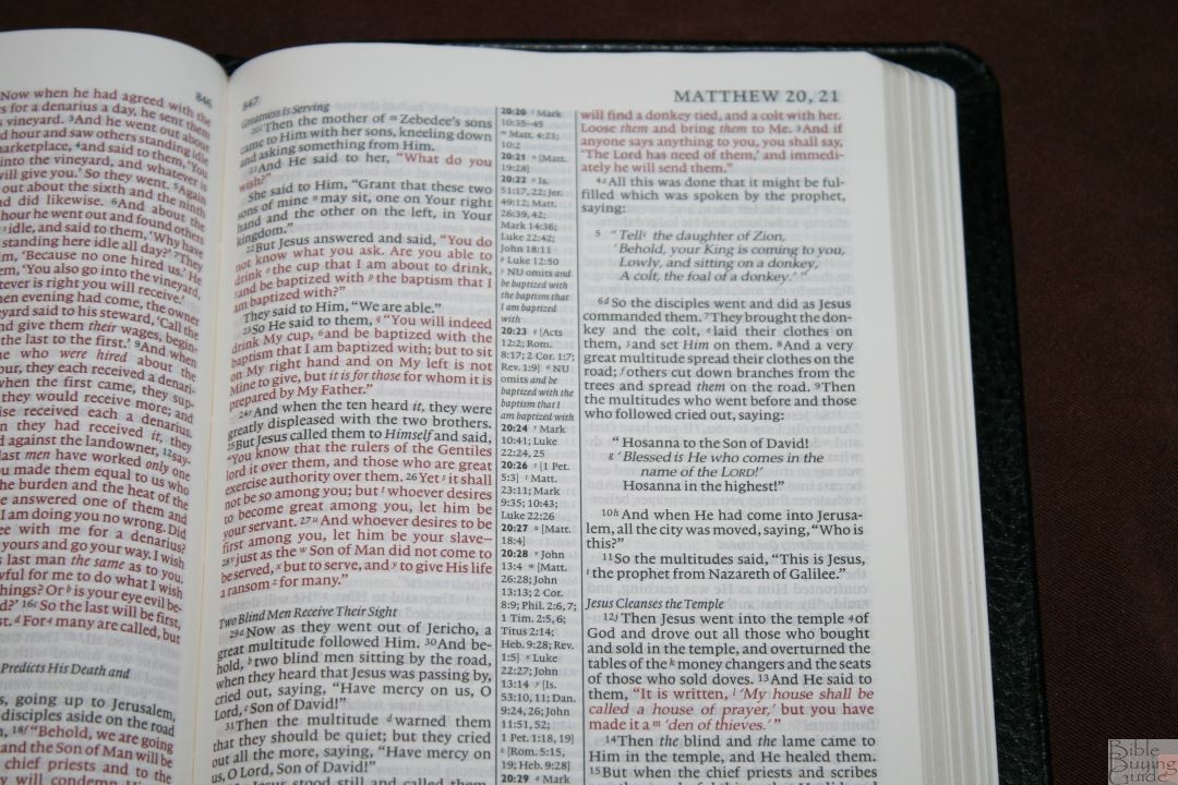
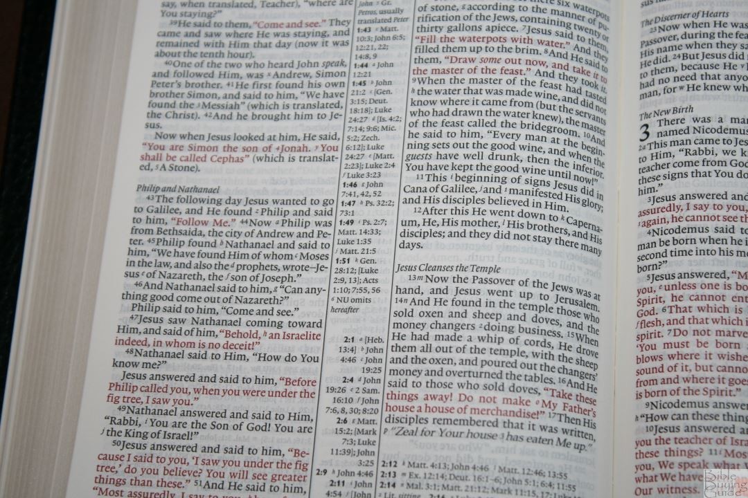
Poetry is a difficult setting to design in double-column formats. The poetry in the NKJV Pitt Minion indents the line if it continues from the previous poetic line. The narrow column causes a lot of lines to have a single word. I don’t have any issues reading this to myself but it can be difficult for reading aloud. I think it would look better if the lines were cut where the pacing of the thought breaks (like a song) rather than continuing the line all the way to the end. I only say this because there is enough room on the lines that have a single word to do this. As it is it’s still readable and does the job.
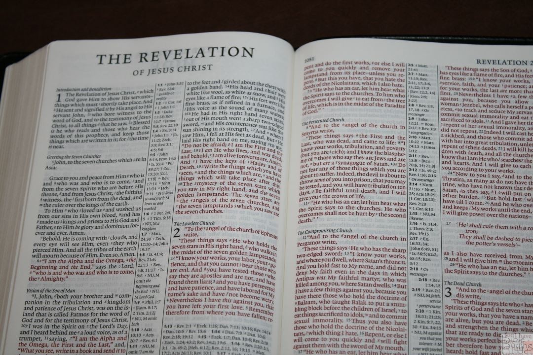
I’d love to see the entire Pitt Minion line available in large print. I think the NKJV would especially benefit from a large print edition as there are only a small handful of quality NKJV’s available. If it’s one or the other though, I’ll take it in KJV as there isn’t a Large print reference KJV in paragraph.
References and Footnotes
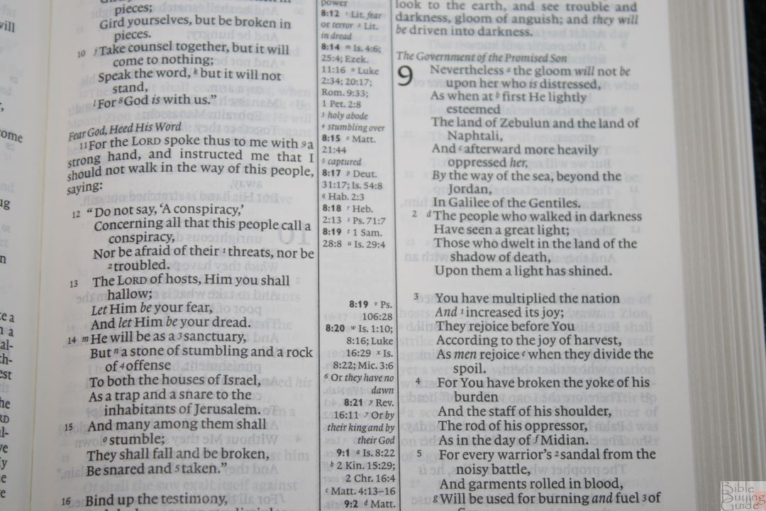
These are the standard references and footnotes for the NKJV. They’re placed in the center column, but if there are too many to fit the rest are placed under the last verse on the page. The only problem is this means there are two places to look for them. It’s not that bad though and they are easy enough to find. The references and footnotes for the left column are placed at the top and are left-justified, while those for the right are at the bottom and are right-justified. Verse numbers are in bold to help you find them easier.
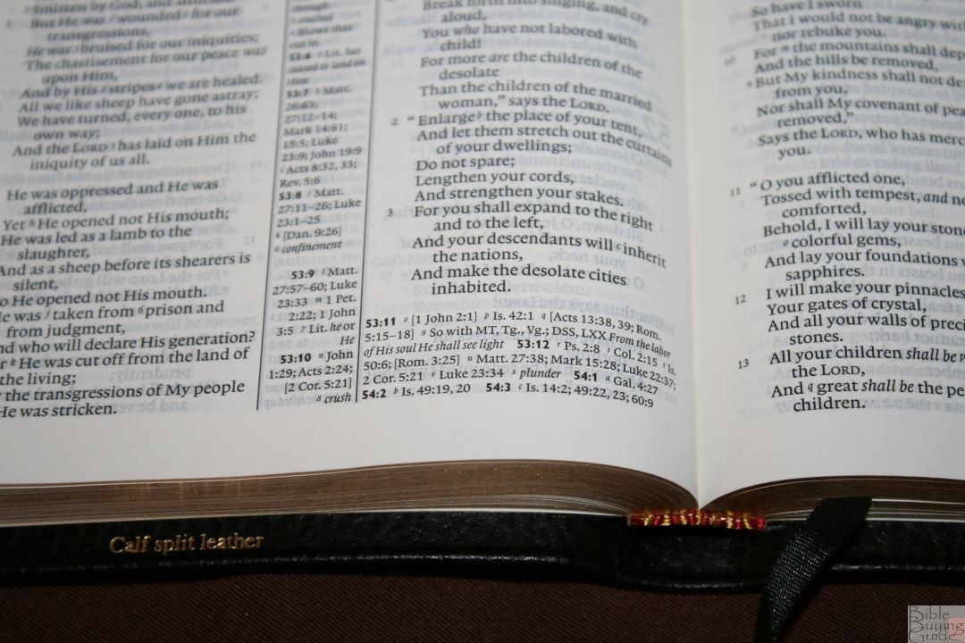
Cross references are keyed to the text with letters. Here are some example references to help you compare:
- Genesis 1:1 – Ps 102:25; Is 40:21; Jn 1:1-3; Heb 1:10; Gen 2:4; Ps 8:3; 89:11; 90:2; Is 44:24; Acts 17:24; Rom 1:20; Heb 1:2; 11:3; Rev 4:11
- Deuteronomy 6:4 – Deut 4:35; Mark 12:29; John 17:3; 1 Cor 8:4, 6
- Isaiah 9:6 – Isa 7:14; Luke 2:11; John 1:45; Luke 2:7; John 3:16; 1 John 4:9; Matt 28:18; 1 Cor 15:25; Rev 12:5; Judg 13:18; Titus 2:13; Eph 2:14
- Matthew 17:20 – Mat 21:21, Mk 11:23, Lk 17:6, 1 Cor 12:9
- Mark 11:23 – Matt 17:20; 21:21; Luke 17:6
- Mark 12:29 – Deut 6:4, 5; Is 44:8; 45:22; 46:9; 1 Cor 8:6
- John 1:1 – Gen 1:1; Col 1:17; 1 John 1:1; John 1:14; Rev 19:13; John 17:5; 1 John 1:2; 5:20
- John 2:19 – Mat 26:61, 27:40, Mk 14:58, 15:29, Lk 24:46, Acts 6:14, 10:40, 1 Cor 15:4
- Acts 2:38 – Luke 24:47
- 1 John 1:1 – John 1:1; 1 John 2:13, 14; Luke 1:2; John 1:14; 2 Pet 1:16; Luke 24:39; John 2:27; John 1:1, 4, 14
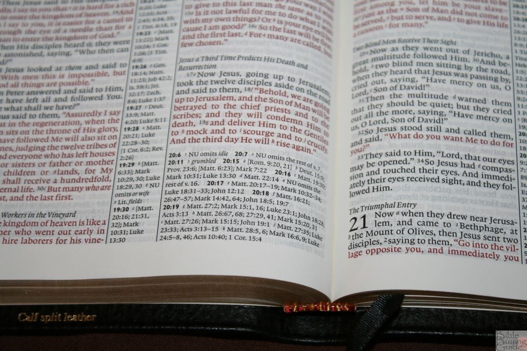
Footnotes are keyed to the text with italic numbers. The numbers are small and since they’re in italics I don’t confuse them with verse numbers.
They are the standard NKJV footnotes. They include literal renderings from Hebrew and Greek. I’ve always found the NKJV footnotes to be interesting and helpful for study. One of the strengths of the NKJV is that it includes manuscript variances from the Nestle-Aland / United Bible Societies, Majority Text, Septuagint, Targum, Vulgate, and Syriac. There may be others, but these are the most prominent.
Concordance
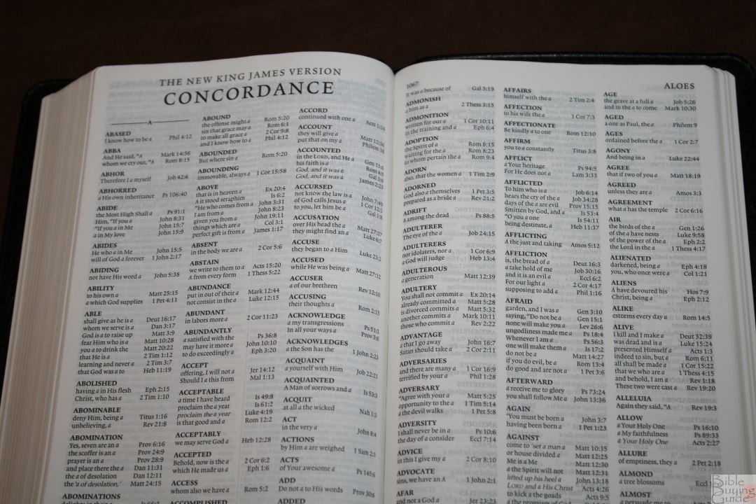
The concordance is 82 pages with 3 columns per page. It has a decent amount of entries to help in study. Here are some example entries and the number of references they provide:
- Christ – 13
- Christian – 1
- Christians – 1
- Christs – 1
- Faith – 56
- Faithful – 26
- Faithfulness – 9
- Faithless – 2
- God – 70
- Goddess – 2
- Godhead – 2
- Godliness – 6
- Godly – 6
- Gods – 7
- Praise – 38
- Praised – 6
- Praises – 5
- Praiseworthy – 1
- Praising – 3
- Pray – 22
- Prayed – 3
- Prayer – 21
- Prayers – 8
Maps

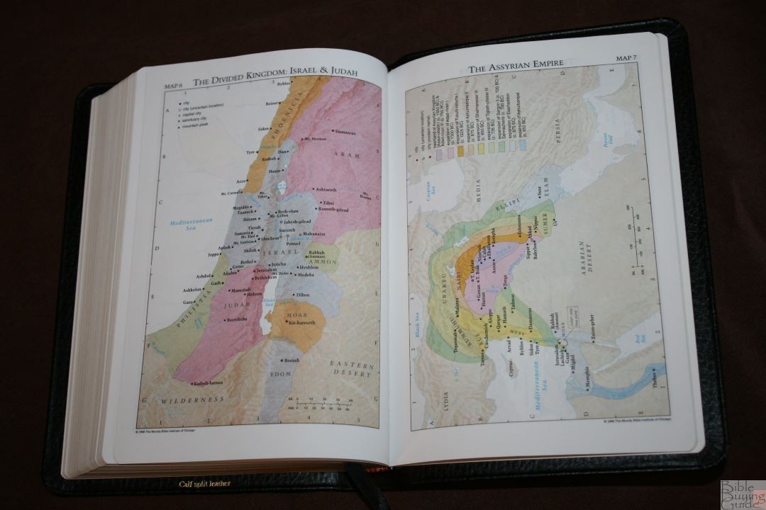
There are 15 colorful maps printed in thick, non-shiny paper. They include cities, routes, Scripture references, distance, topography, water, heartlands, locations for events, fortresses, mountain peaks, dates, where forces clash, location of sermons, etc.
Maps include:
- The Biblical World of the Patriarchs
- Palestine: Political Regions
- The Route of the Exodus
- The Twelve Tribes of Israel
- Kingdoms of Saul, David & Solomon
- The Divided Kingdom: Israel & Judah
- The Assyrian Empire
- The Babylonian Empire
- The Greek Empire
- Old Testament Jerusalem
- New Testament Jerusalem
- The Ministry of Jesus
- The Missionary Journeys of Paul
- The Spread of Christianity
- Modern Israel
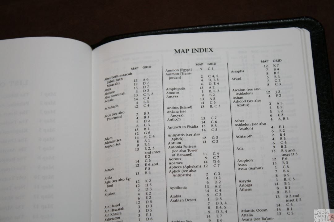
There is an 8 page index to maps to help in your searches. I’m always glad to see the index included.
Using It
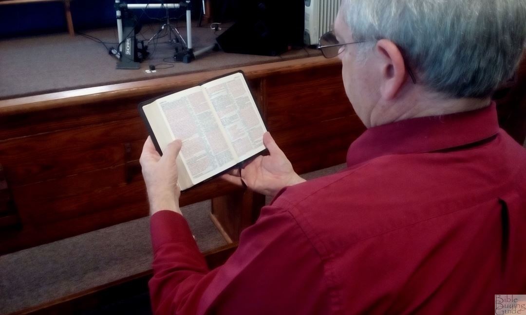
You can’t tell from the photos, but I’ve used this Bible quite a lot. Here are some of the ways I’ve put it to use.
Reading
The NKJV Pitt Minion is a joy to read. I like holding it in one hand out in front of me so I don’t have to look down to read. It’s so lightweight that I can hold it for long periods of time with no problems. The font does become more difficult to focus on if my eyes are tired – especially if I’ve stared at a screen all day. Other than that I can read it all day.
Carry
This is a small Bible that’s lightweight, making is great for carry. It fits perfectly inside my suit coat pocket. I’ve used it for hospital visitations, carrying to Churches, funerals, and travel. As long as I don’t feel the need for larger print it’s the Bible I grab.
Study
It’s a complete reference edition with cross references, translation footnotes, a large concordance, and maps with an index, so it does have a good bit of material to help with study.
Preaching
I typically preach from larger fonts, but I’ve preached from it a couple of times with no issues. The verse numbers are hard to find quickly, so for me this is better for carry and reading than preaching. If I needed to preach from it I would without hesitation, but if I had a Bible with a larger font I would probably choose it instead.
The Wide Margin and Pitt Minion Combo
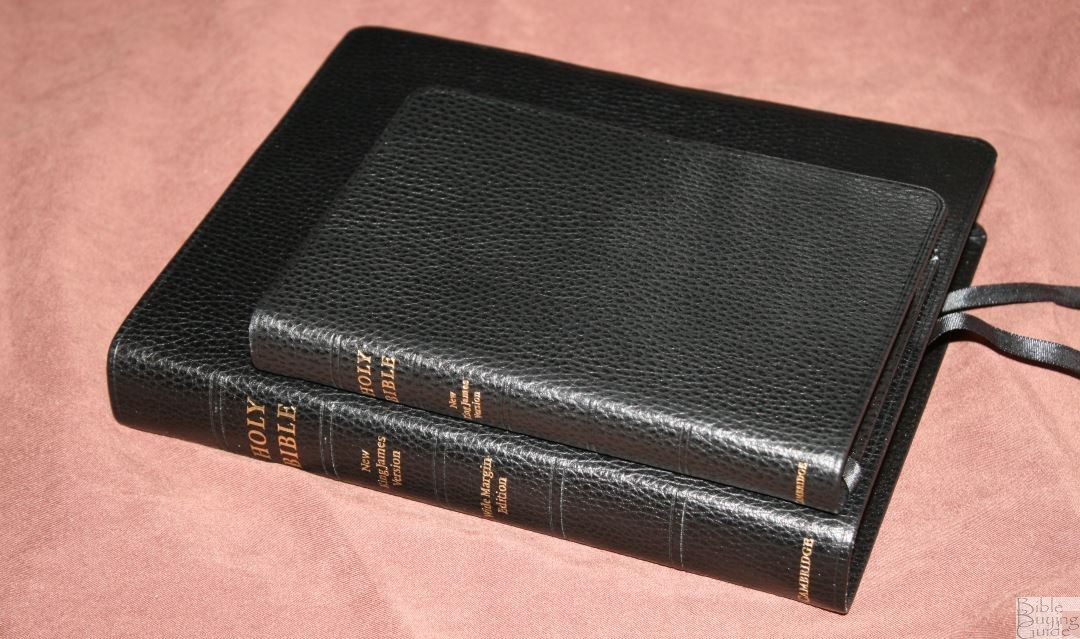

The Cambridge wide margin NKJV uses the exact same layout, which makes a great combo (the NKJV, NASB, and ESV having matching Pitt Minion/wide margin editions, and the Concord wide margin has both the regular and personal size editions.). This means you can use a single layout and pagination and have a wide margin edition to match. For the wide margin review, see the article Cambridge NKJV Wide Margin.
Other Editions
I’ve also reviewed the Pitt Minion in other translations. Here are links to the other Pitt Minion reviews:
Conclusion
I love the size of the Cambridge NKJV Pitt Minion Reference Bible. Even though it’s small, nothing is missing. It has enough tools to make it an excellent Bible for personal study, reading, and carry. It’s great for preaching if you’re used to preaching from smaller fonts. If you’re interested in a small Bible that’s easy to carry, designed well, and made to last without having to sacrifice features, the Cambridge NKJV Pitt Minion is the best choice. You can’t go wrong with either calf-split or goatskin. Both are high quality and should last for many years.
____________________________
Buy from Amazon
____________________________
This Bible was purchased for review. I was not in any way influenced by the publisher to give a positive review. My opinions are my own.




Recent Comments