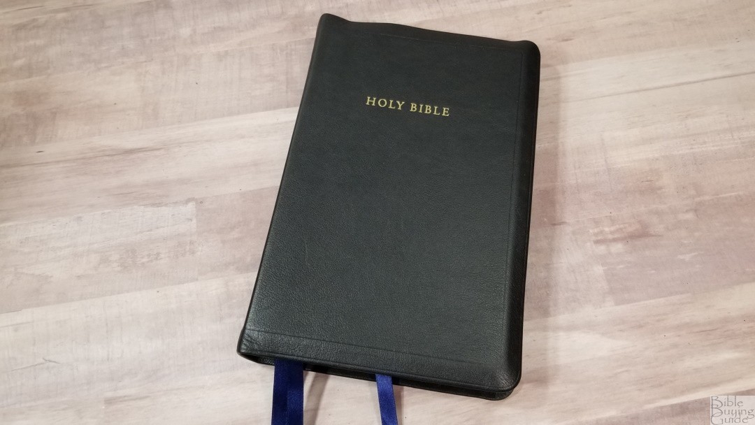
The R.L. Allan Longprimer is a reprint of the old Oxford Long Primer. It was named for the font (Long Primer). It’s been R.L. Allan’s flagship Bible for many years. It was updated several years ago with a cleaner scan and is now available with different paper options. I reviewed the previous edition several years ago, but I finally got an updated edition to see how it compares. I’m reviewing the 36gsm Allan Longprimer 52 in Black Meriva Calfskin. The “52” in the title refers to calfskin. It was printed and bound by Royal Jongbloed.
This Bible was purchased for review. My approach and opinions are the same regardless.
_________________________________________________________
This Bible is available at
_________________________________________________________
Table of Contents
- Video Review
- Binding
- Paper
- Typography and Layout
- References
- Footnotes
- Presentation and Family Pages
- Dictionary of Scripture Proper Names
- Subject Index
- Concordance
- Bible Atlas
- Comparisons
- Conclusion
Video Review
Binding
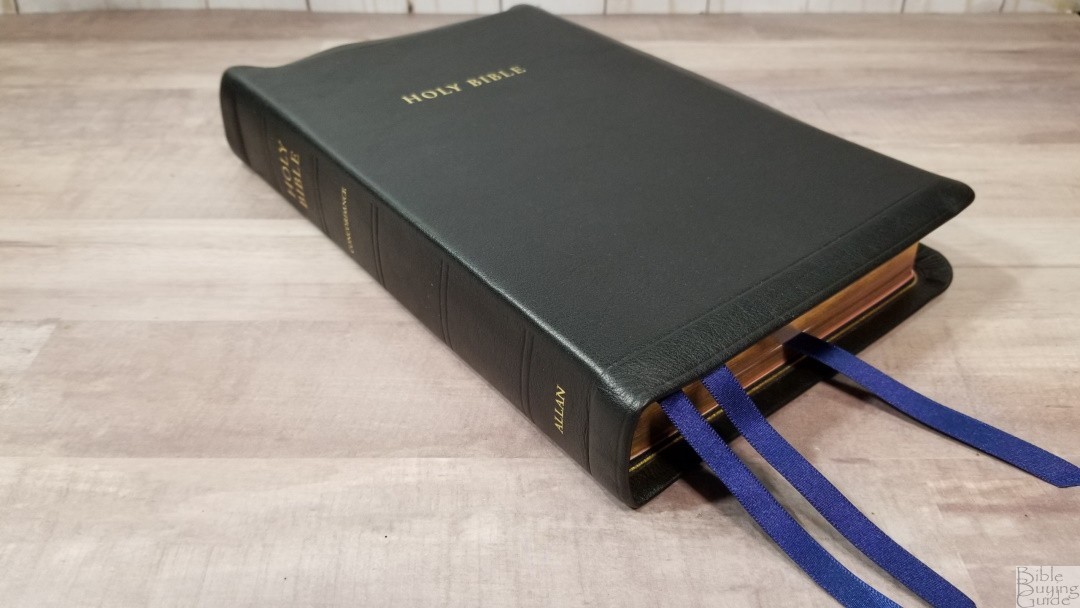
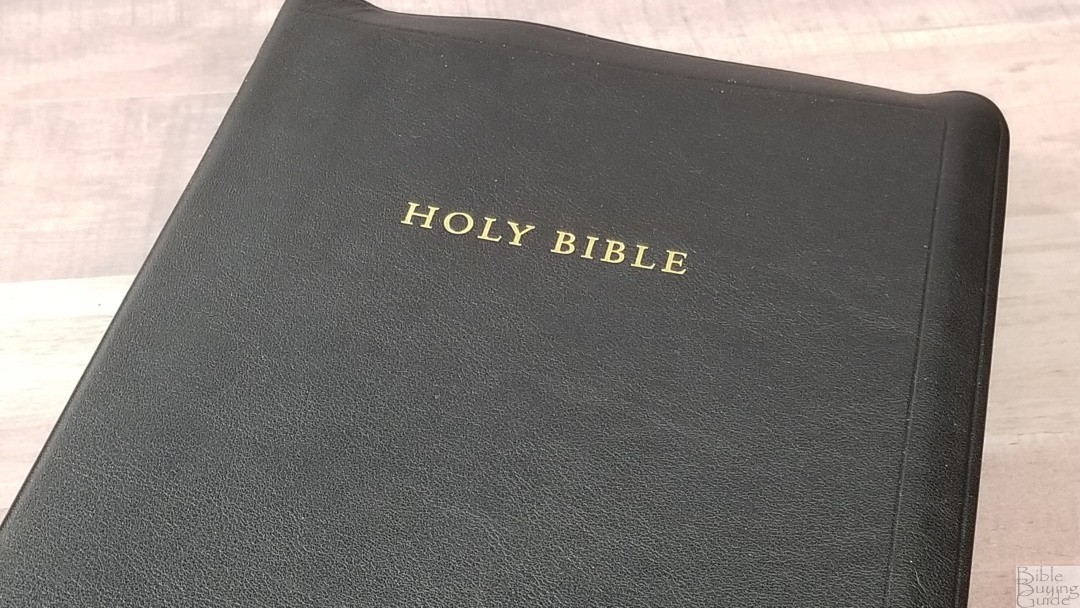
The cover of this Longprimer 52 is black meriva calfskin. It has a natural grain. This is some of the best calfskin I’ve seen. It’s smoother than goatskin, but that’s about the only difference. It has Holy Bible printed in gold on the front. A tooled line traces the edges of the page. The cover has a semi-yapp to help protect the page edges. The spine has Holy Bible, Concordance, and Allan printed in gold. It has 5 tooled (non-raised) spine hub indications.
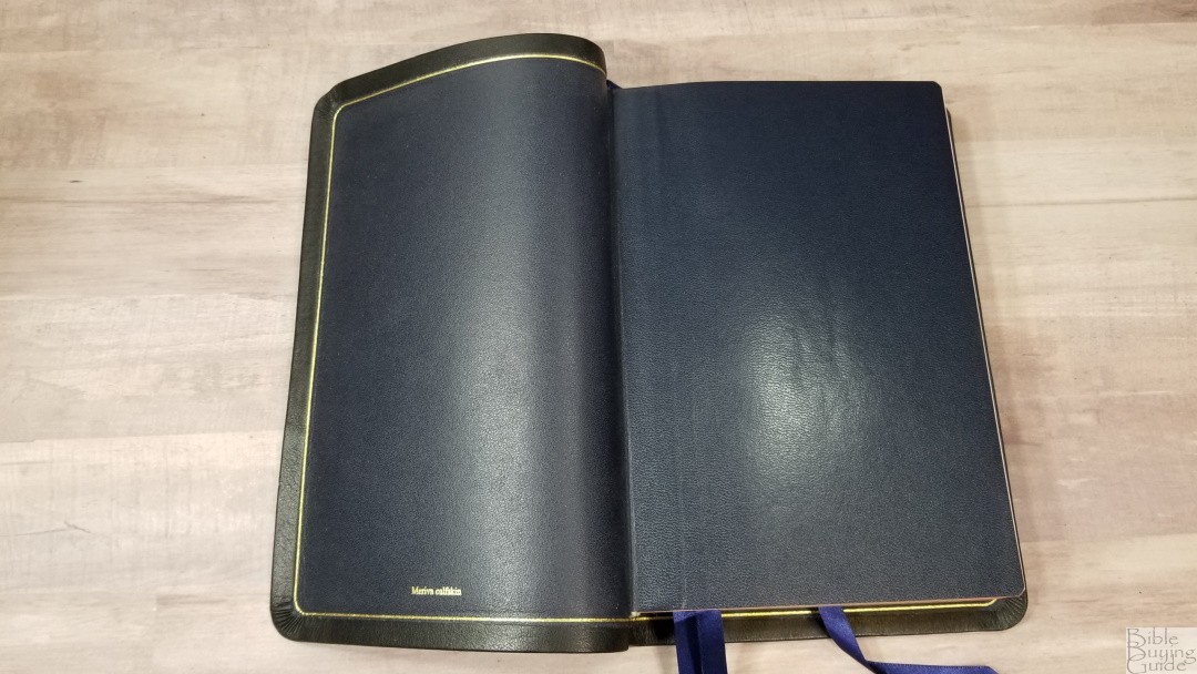
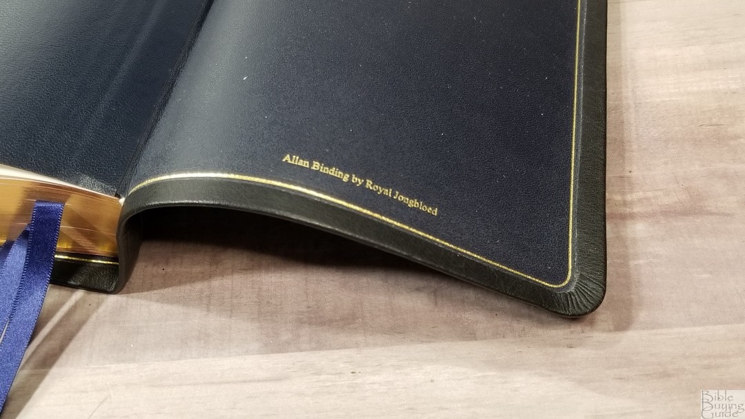
The liner is navy blue calfskin. It looks and feels the same as the outer shell, but in a dark blue. The outer shell folds over onto the liner with a generous amount of overlap. It isn’t perimeter-stitched, but this is the amount of overlap that I prefer. A gold gilt-line traces around the edge of the overlap. The edge-lined tab isn’t overly stiff. This keeps it from having a hump in the first few pages of Genesis. It has several thick end sheets in the front and back to give it structure. It doesn’t lay open perfectly, but it does lay almost completely open and it doesn’t try to close. I’m sure it will lay completely open once it gets enough use. The block is Smyth sewn.

It has 3 navy blue Berisfords ribbons. They’re extra long so you can pull them to the corner to open the Bible. Not counting the yapp, the overall size is 6 x 9 x 1 5/8″. It weighs 2 lbs, 8.5 oz.
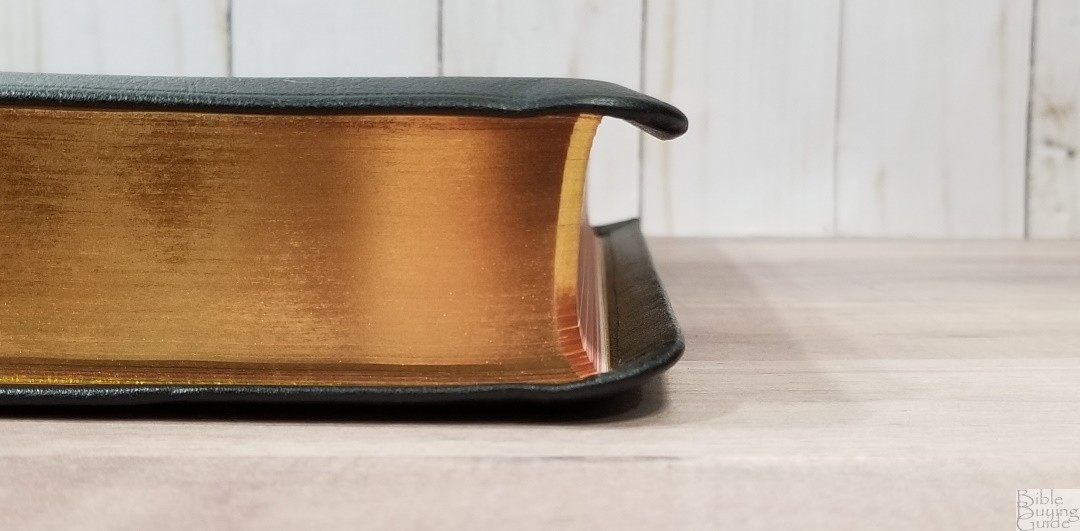
The size and weight feel well-balanced. I find this edition to be ideal for carrying, holding, reading, and preaching. Also, I love this color combination. The dark blue works perfectly with the black.
Paper
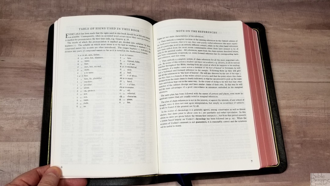
The paper is a 36gsm acid-free premium Bible paper. It has a slight cream tint that’s just noticeable when you look in the gutter. This is my favorite color for Bible paper. It’s highly opaque and has a slightly rough texture that makes it easy to grab and turn. The opacity, color, and texture make this some of the best, if not the best, paper I’ve seen in a Bible. This is excellent paper for highlighting and marking with dry highlighters, Pigma Microns, and similar marking tools.

In the back are 32 pages of college-ruled notebook paper for notes. This is actual notebook paper, which is my preferred paper in the back of a Bible. This paper is perfect for sermon outlines, personal study notes, songs, etc.
Typography and Layout
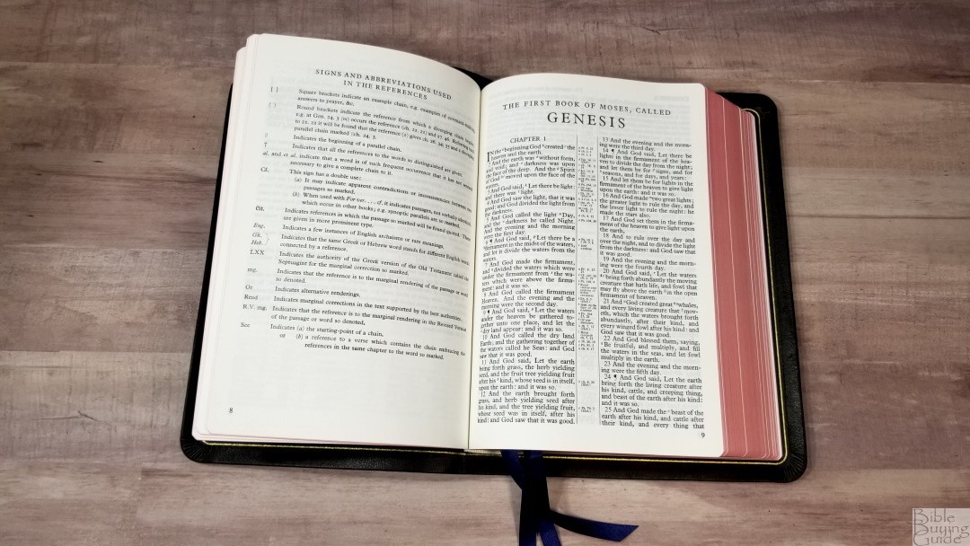
The text is presented in the classic KJV double-column, verse-by-verse format. The header shows the book name and chapter in the outer margin and a page summary in the inner margin. In the footer is the page number in the outer margin. Cross-references and footnotes are placed in the center column.
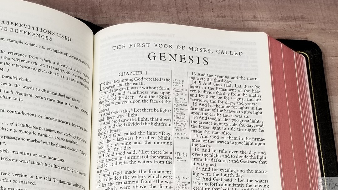
The typeface is Long Primer. This is an old 10-point font well known for being easy to read. It was typeset by hand and published in 1952 by Oxford University Press. It was designed before line-matching was needed. This is a newer scan of an older edition from 1952-1958. It’s clean and sharp, and it looks better than my older 53br, which is a scan of a newer edition. This is a black-letter text. It’s dark and sharp.
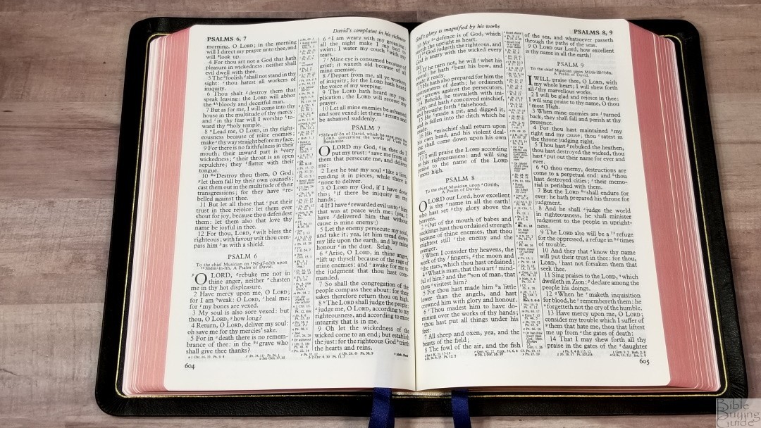
It averages around 7 words per line. Even though it’s typeset by hand, there are never too many words on a line to fit well. They’re more likely to have extra space between the words than not enough.
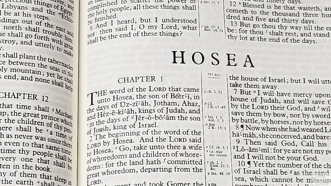
Paragraphs are marked with pilcrows through Acts 20. It does not include italics for supplied words. This is a self-pronouncing text. Each verse is indented to make them easy to find. Books start on the page after the last book ended. The text does bend into the gutter a little further than I’d like. It’s still highly useable as it is, but a little more inner margin space would help. Actually, all of the margins are smaller than the older 53 that I have.
References

It includes 100,000 center-column references. They include both cross-references and chain-references. Cross-references are contextual, so they don’t link to verses just because they use the same word. Forward references have corresponding back-references. Chain references are topical and they also indicate where chains diverge from the main chain.
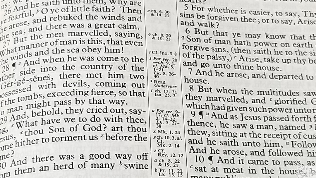
They’re placed as close to the verse as possible. They’re keyed to the text with letters. References use the old style of labeling, which goes from left to right, top to bottom. This means the reference labeled a might go to the column on the right, b, might go to the left, d and e, to the right, f to the left, etc. This means there might be references for different verses mixed in the column. They’re labeled, but you might have to skip down to see them all. If the date of the events is known, the top of each center column includes the date. It doesn’t include dates before the 21 century BC. From 2000 BC onward, it mostly follows Usher’s chronology.
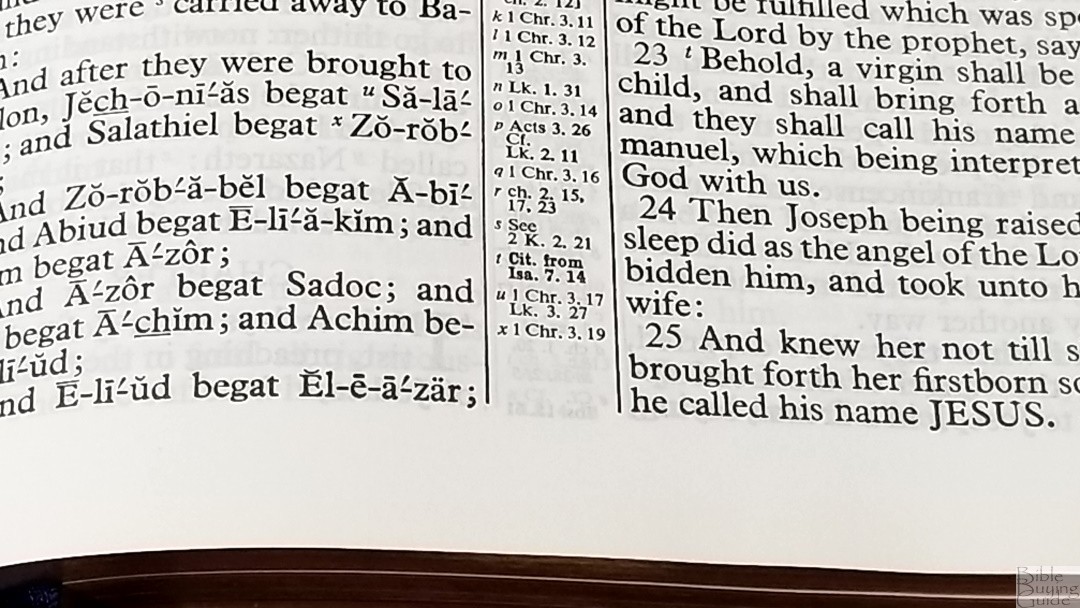
Verses are labeled as Cit. show where something is quoted and Cit. from show’s where it’s quoted from. These references are in bold so they stand out from the rest. I like this. Seeing quotes easily is one of the things I look for in references. If the verse seems to contradict another verse (note: I contend that Scripture does not contradict itself), they’re marked with Cf. and then the reference.
I find the references a little difficult to use. They’re keyed to the text with letters, but they’re not always near the verses they correspond to. When there are more than 24, they start over at the letter a. Also, when there are too many to fit in the center column, the rest are placed across the footer. This means there can be multiple locations to find the references you’re looking for. It’s not common, but there are a few pages where it’s difficult to know which reference goes with which verse.
Examples
Here are a few example references to help you compare:
- Genesis 1:1 – Pr 8:22; ch 2:3; ch 2:4
- Deuteronomy 6:4 – Zech 14:9; Cit Mk 12:29
- Isaiah 9:6 – see ch 7:14
- Matthew 28:19 – Mk 16:15, 16; Ac 2:38, 41; Cf 2 Cor 13:14
- Mark 12:29 – Cit. from Dt 6:4
- John 1:1 – Pr 8:22; Rev 3:14; 1 Jn 1:1; ch 17:5; Cf. Phil 2:6
- John 3:16 – Hos 11:1; Ro 5:8; Ro 8:32; ch 1:18; 1 Jn 4:9; ch 10:28
- Acts 2:38 – ch 3:19; Lk 24:47; ver 41; Mt 28:19; ch 5:31; Lk 24:47
- Romans 10:9 – Ct. Mt 10:32; ch 8:11 & 14:9
- 1 John 1:1 – ch 2:13; ch 4:14; 2 Pet 1:16; lk 24:39; Jn 1:1; Rev 19:13
Footnotes
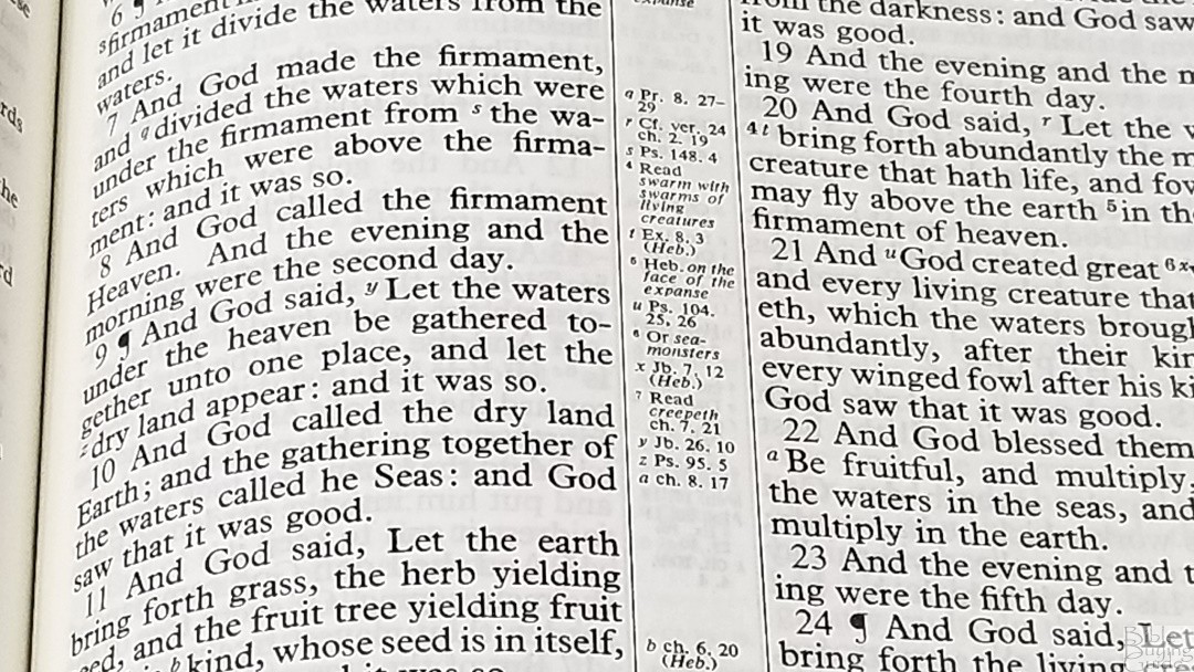


The footnotes are not those from the translator’s. They’re often critical of the text. They include some from the Revised Version, corrections to the text, updates to archaic words, corrections from the LXX, the best mss to identify manuscript variations, etc. Those that mention the best mss do not mention what those manuscripts are. This makes them less useful than those from the NKJV, which identifies the manuscripts rather than calling them the best.
Presentation and Family Pages
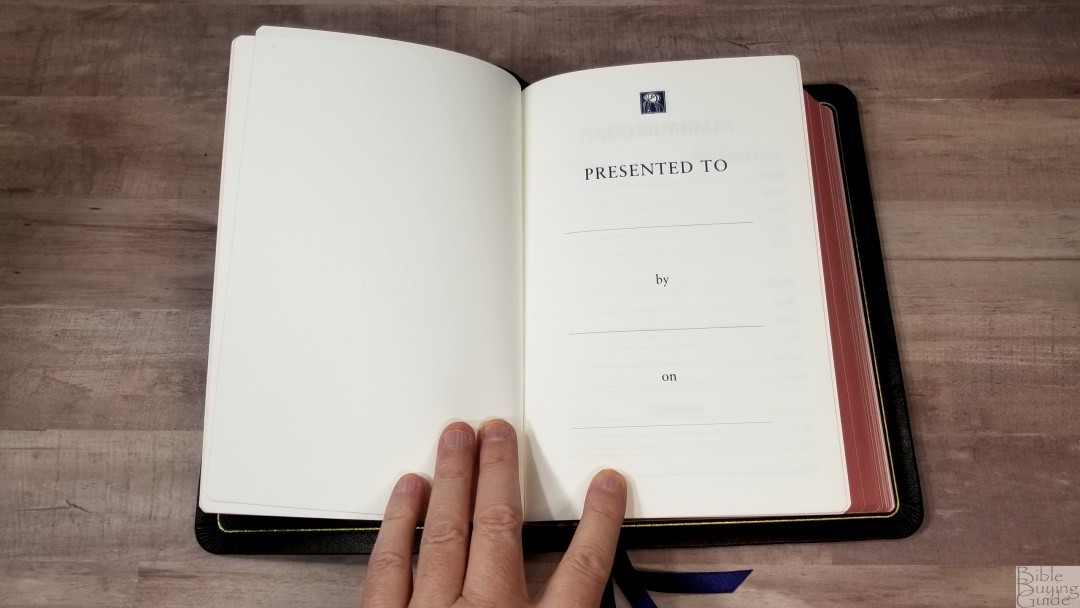

In the front are the presentation and family pages printed on thick, non-glossy, pages. The family records include the husband and wife family trees and information about their wedding. Other pages include 1 for children, 2 for marriages, 2 for grandchildren, and 1 for deaths. They include an interesting icon at the top of the page. Each page has blue lines to write the information.
Dictionary of Scripture Proper Names
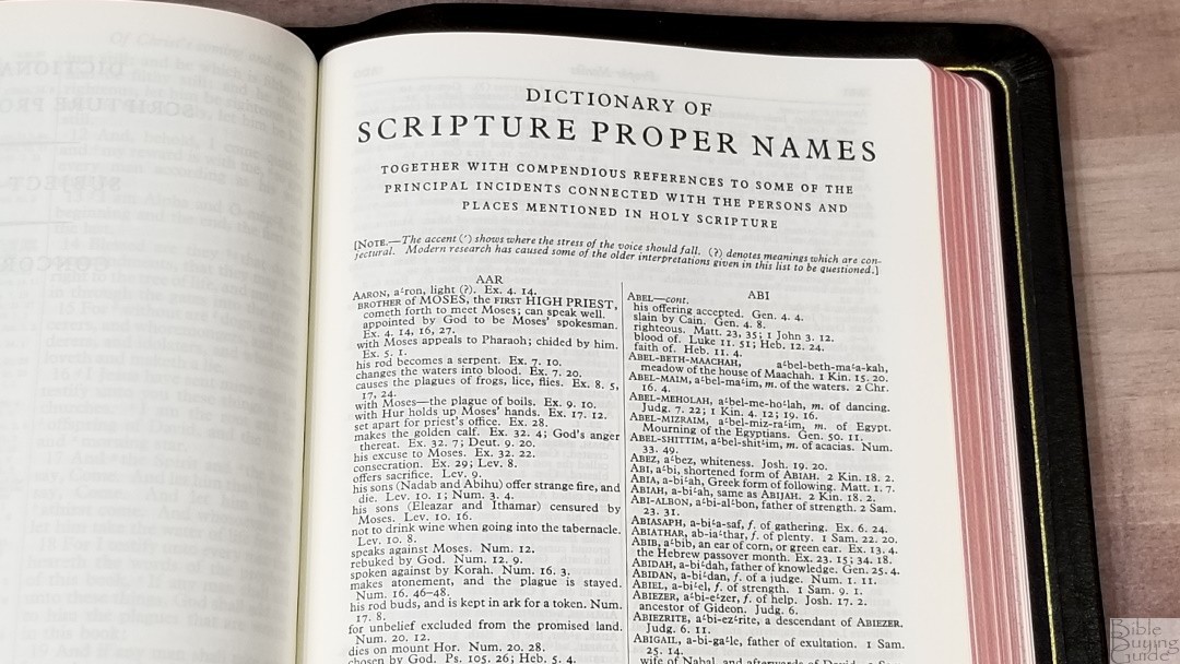
This is a 44-page dictionary that provides names of people and places. It includes a pronunciation guide, a definition, and key verses. If they’re not sure about the definition, it’s labeled with a question mark. It also includes a list of references with a short description of key events. The pronunciation guide uses the simplified style that provides a stress mark and breaks the names into syllables.
It doesn’t provide details about people and places like you’d see in a standard Bible dictionary, but it does have enough information for basic study and sermon prep. The list of references provides an excellent resource that makes it easy to find information.
Subject Index
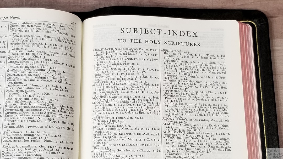
This is a 38-page index of the major subjects in the Bible. It provides the topic name and a list of descriptions with references for each description. Many are listed in a paragraph format, which can make it difficult to search quickly. It has a lot of entries and they seem to be factual rather than interpretive, making it relevant to any denomination. It doesn’t include every possible topic, but it does have enough topics for sermon prep and personal study. This is one of my favorite resources for study.
Concordance
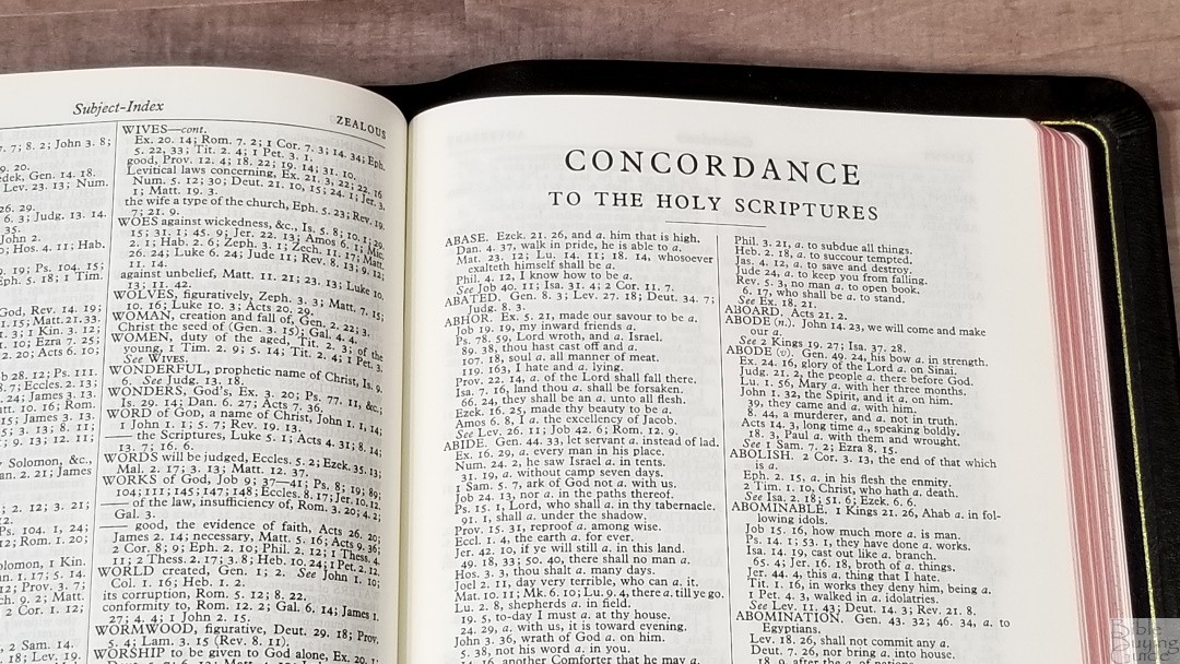
The concordance is 162 pages with two columns per page. It doesn’t include names or places, but you’ll find those in the Subject Index, so it isn’t as important for them to be in the concordance. The keywords are in all caps. Some will have more references at the end of the list, and some will only list references rather than including an excerpt from the verse. When a verse is repeated in multiple locations, it provides references to all of them using the same excerpt.
It’s a little confusing at first because of the way it indents. It lists a book with a chapter and verse. If the next reference is in the same book, it just provides the chapter and verse, or just the verse if it’s in the same chapter. Those in the same book are indented, which sets them apart from the others. Since those that are indented do not include the book name, you have to look above it until you find the book. It’s not too difficult to use, but it does take a few minutes to get used to it.
Here are a few examples to help you compare. They include a combination of fully listed with excerpts and just a list of references.
- Christ – 13
- Christian – 3
- Faith – 124
- Faithful – 58
- Faithfully – 4
- Faithfulness – 11
- Faithless – 4
- God – 57
- God (an idol) – 20
- Goddess – 4
- Godhead – 3
- Godliness – 14
- Godly – 14
- God save the king – 1
- Praise (n) – 41
- Praise (v) – 27
- Pray – 45
- Prayer – 38
Bible Atlas
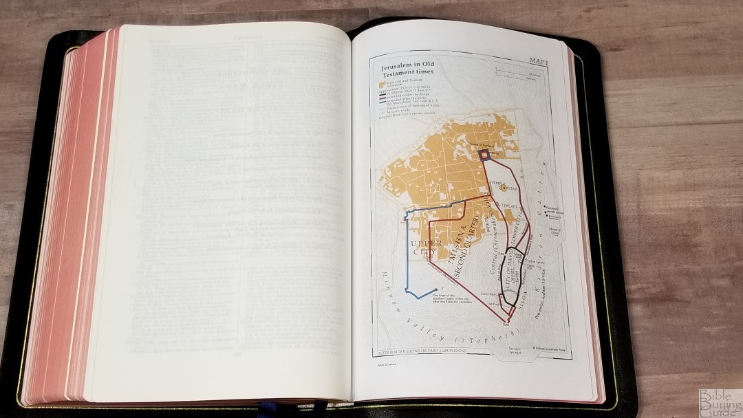


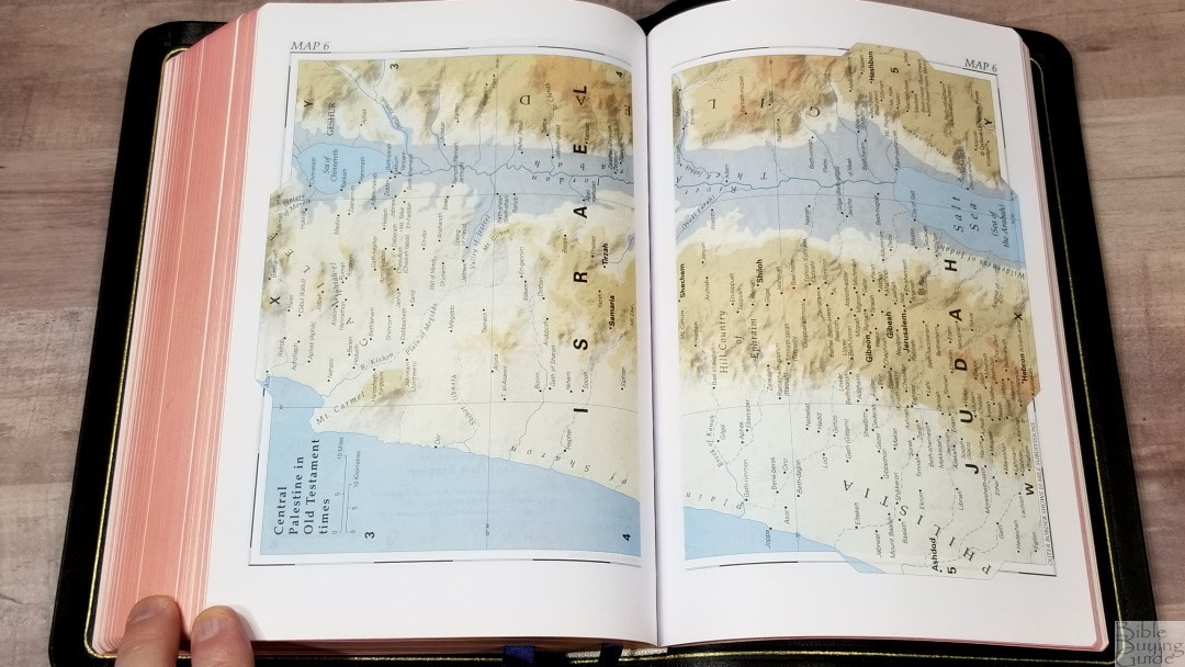

The Bible atlas contains 9 maps printed in 16 thick non-glossy pages. 7 of the maps take 2 pages. They’re from Oxford University Press and are printed with earth tones that stand out and look great. Maps include distance, topography, walls, routes, Scripture references, borders, tribes, districts, fortified places, dates, seas, rivers, boundaries, etc. Lots of locations are identified. Fortunately, it has a 3-page index that makes it easy to find all of the locations.
- Jerusalem in Old Testament Times
- The Background of the Exodus
- Israel in Canaan
- The United Monarchy
- The Near East in the Time of the Assyrian Empire
- Central Palestine in Old Testament Times
- Palestine Under the Herods
- The Background of the New Testament
- Jerusalem in New Testament Times
Comparisons
Here’s how the Longprimer 52 compares with the main contenders.
53 BR Longprimer with 32gsm
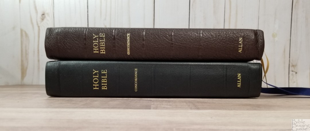
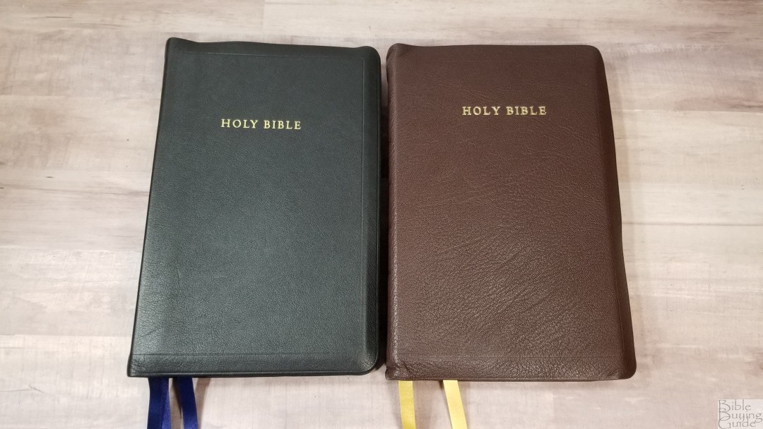

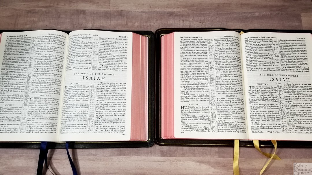
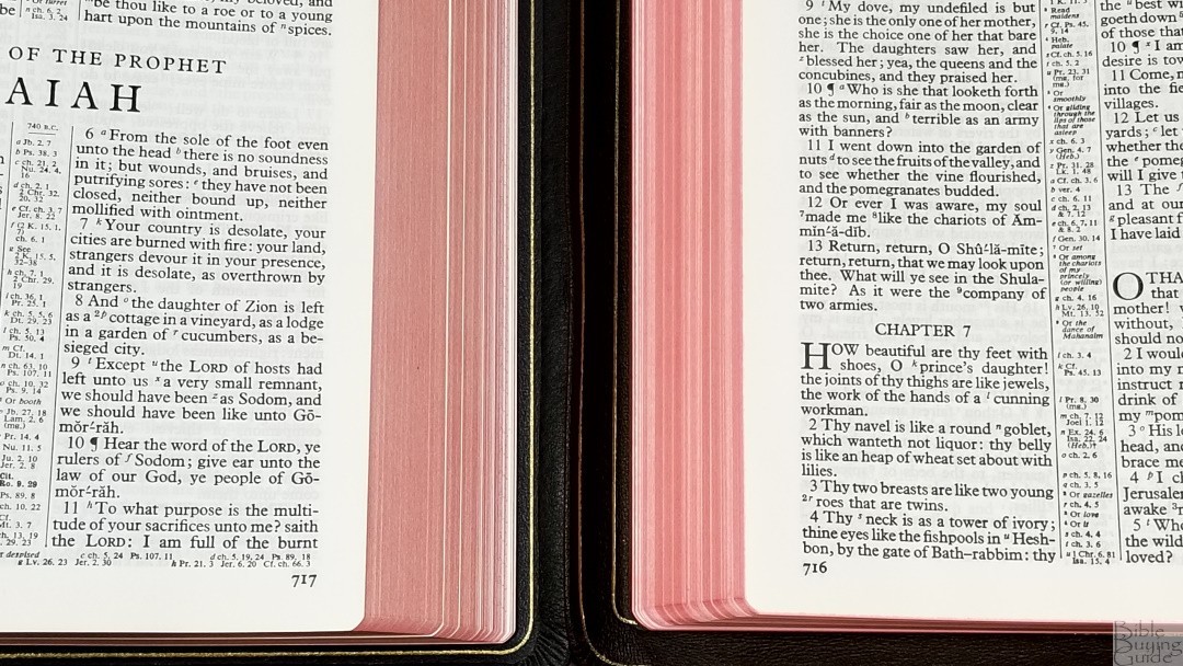
The previous edition of the Longprimer had 32gsm paper and was printed from a scan of a newer copy. That newer copy was from film, which included smears, spread, and breaks in the fonts. The 32gsm is thinner, but the paper is slightly more difficult to turn because of the smooth texture. The print does look a touch darker, but the current edition is easily dark enough. The tools are the same. I very much prefer the Longprimer 52 to the older edition.
Cambridge Concord
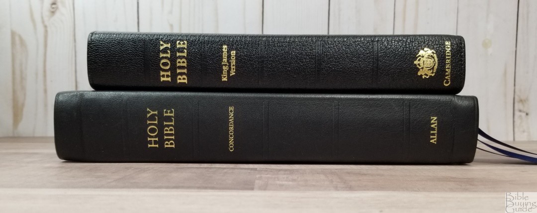

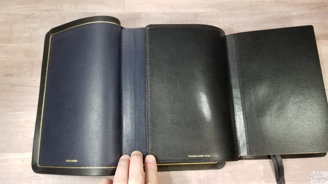
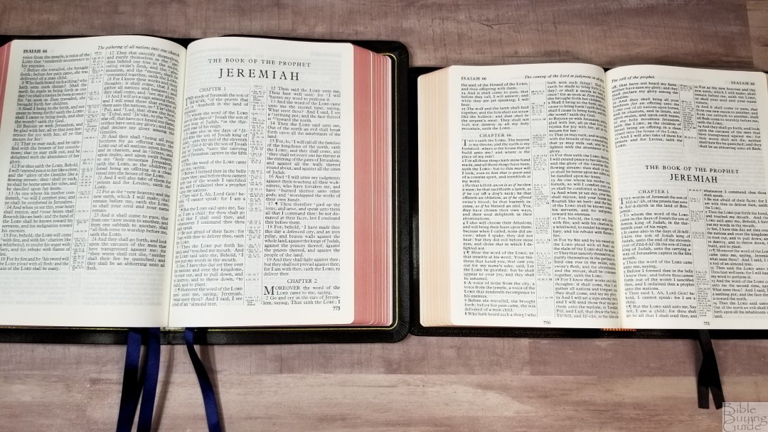

The Cambridge Concord is one of my favorite Bibles for carry and all-around use. It has a smaller footprint than the Longprimer 52 and it’s a lot thinner. The goatskin Concord has 28gsm paper and a smaller font, a glossary, dictionary, concordance, and maps. It’s also an excellent preacher’s Bible. It’s better for carry, but the smaller font is more difficult to read and preach from for older eyes.
Cambridge Turquoise


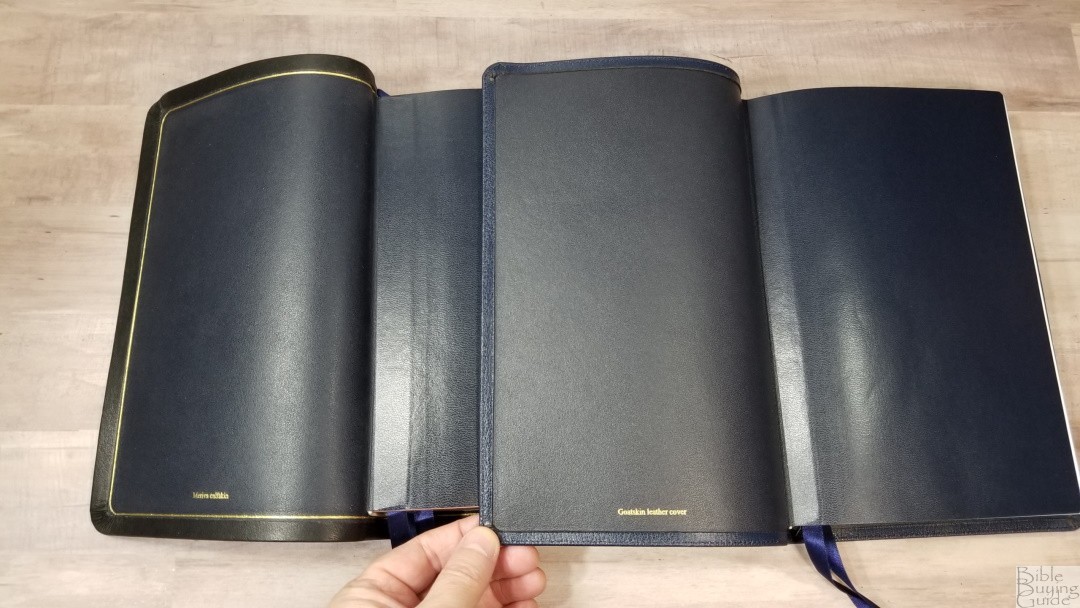


The Cambridge Turquoise was also typeset by hand in the 1920s. This design is even older than the Longprimer 52. The font is larger in the Turquoise and it has more space between the lines. However, it has lots of lines with words that are so close that theylooklikeoneword. It has thinner paper (28gsm), a concordance, and maps. It’s excellent for preaching or for anyone that wants a large print reference KJV.
Schuyler Canterbury
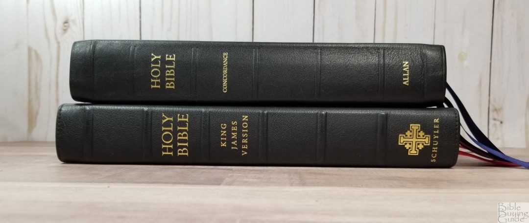


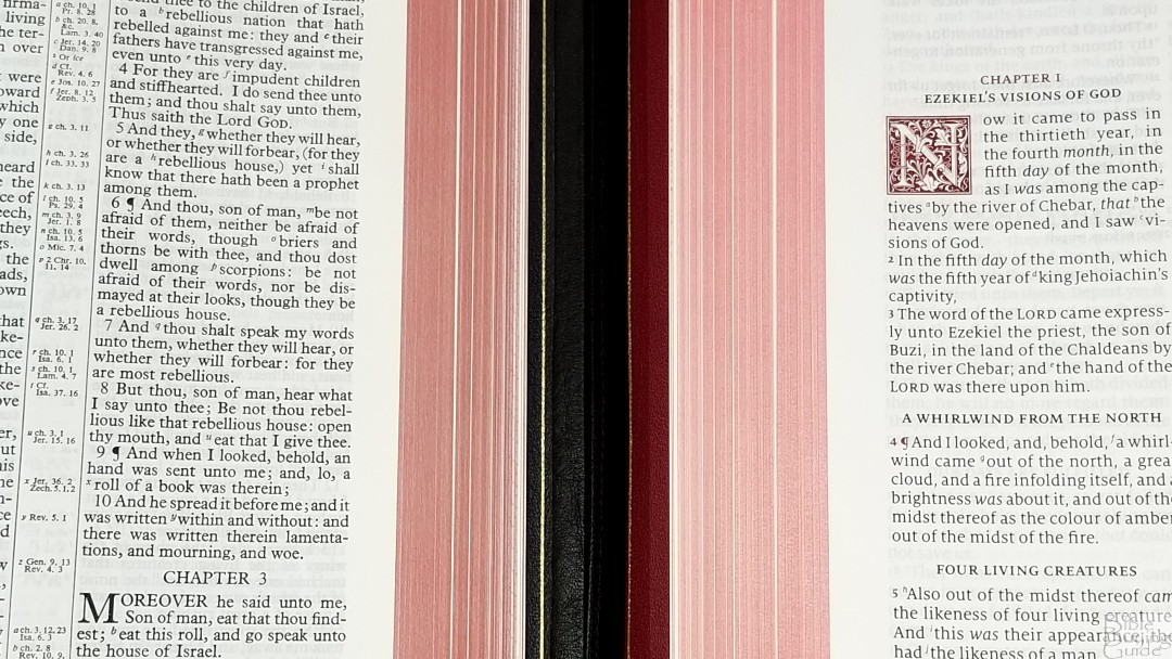
The Schuyler Canterbury has a larger footprint. It’s a modern setting with red highlights throughout. The paper is the same 28gsm used in many other premium editions. The font is larger and it has more whitespace in the text. It’s not as dark as the Longprimer 52. This is a red letter edition. It has a glossary and section headings but does not include footnotes.
Thomas Nelson Giant Print Center-Column Reference Bible Premier Collection
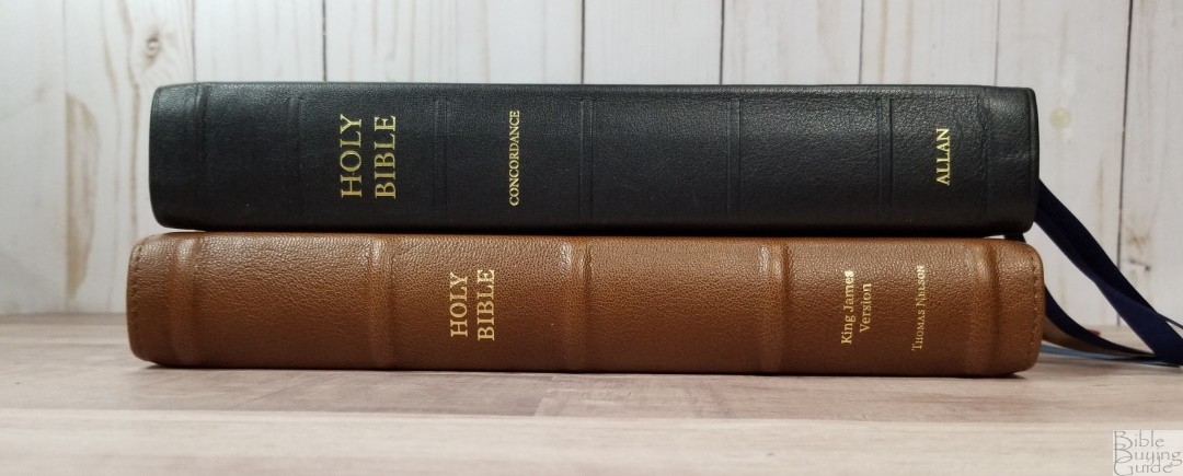


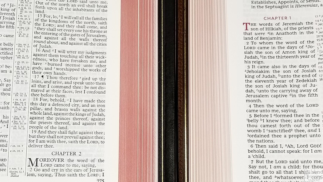
The Thomas Nelson KJV Giant Print Reference has a larger font with more whitespace in the text. It also has 36gsm premium paper. It has book introductions, a glossary on the page, and red highlights throughout. There aren’t as many references as the Longprimer 52. It’s an excellent choice for anyone that want’s a great quality KJV at a lower price-point.
TBS Westminster
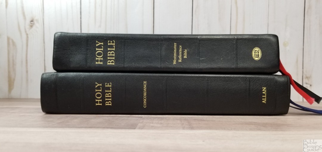


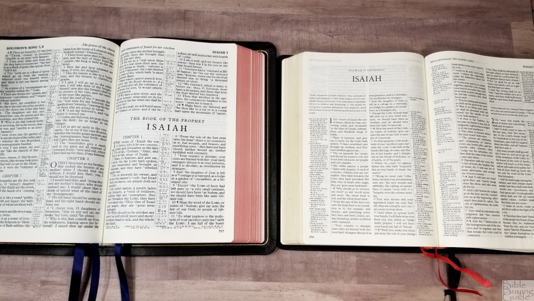
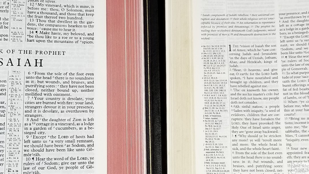
The TBS Westminster is the best cross-reference Bible available. There are 200,000 cross-references placed next to the verses they go to. It also includes the translator’s footnotes and a glossary on the page. It has 32gsm paper and was made in the Netherlands by Royal Jongbloed. The print is smaller than the Longprimer 52 and it’s not as dark as the Longprimer.
Conclusion
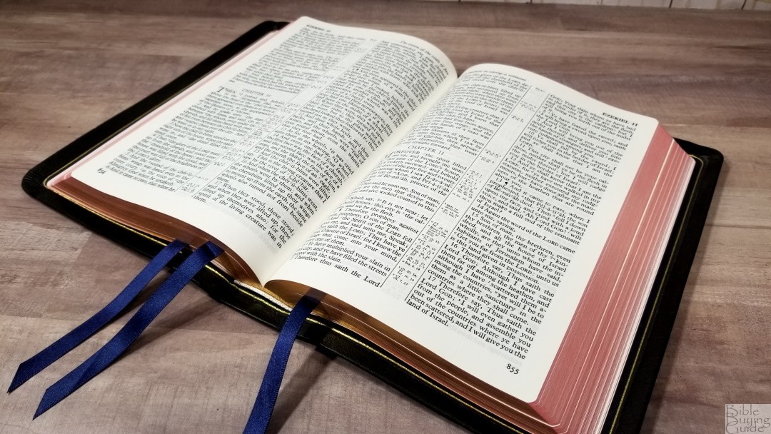
The Longprimer, and especially the 52/53 with its paper and overall size, is an excellent KJV for anyone looking for a quality reference edition that doesn’t feel like a large Bible. The size is excellent for all-around use. It’s very much a preacher’s Bible. The darkness and size of the print are excellent for reading and preaching. The thickness and opacity of the paper are perfect for turning. All the tools are handy for study and sermon prep. A preacher could cover a lot of topics before needing external resources. I prefer paragraphs for reading, but for a v-b-v, this one is highly readable. I like the calfskin every bit as much as the goatskin. The few complaints I have are minor and are easy to overlook. The Longprimer 52 in black Meriva calfskin is easy to recommend.
_________________________________________________________
This Bible is available at
_________________________________________________________
This Bible was purchased for review. My approach and opinions are the same regardless.




I got one in red meriva last year and love it. So easy to read and without too many extras. It’s one of my go-to KJVs.
Interesting review. No insult intended but with the number of criticisms in your review and blog how are you able to “highly recommend” this Bible ?
Thanks Frank. I consider those criticisms to be minor. Most Longprimer users that I’ve talked to don’t really care about the footnotes. I’d still like to have italics, but that’s not critical for me. It still has the best paper and print quality, and the references, tools, and overall size are excellent.
Thank you for sharing such an exhaustive presentation and comparison analysis; all in one article.
I have been jumping from site to site and comparing descriptions and photographs, while trying to remember all of the details for around a month now… changing my mind about what I really wanted in a ‘practical’ heirloom KJV each time I changed sites. Yes, it has been a disorganised endeavour on my part, but after viewing your presentation, I was able to make up my mind almost instantaneously.
Cambridge, Allan, Schuyler, Nelson… etc? All beautiful in their own right… BUT!?
If only Allen or Cambridge had attained the rights to the Thompson notes, – musing here.
Having first purchased the Schuyler Wide Margin bible; as beautiful as it is, it is too beautiful to spoil with study notes; etc and not a practical size to carry around. The creators of the Allan, on the other hand, seems to have struck a nice balance regarding everything that should go into presenting a durable bible that can be carried and read regularly, without fear of spoiling or falling apart.
BRAVO… and thanks again.
Thanks David! I’m sure you’ll love it. It’s one of those Bibles that just begs to be used.
Hi Randy !!
Thank you for the wonderful work you do with Bible reviews. I enjoy watching your videos on YouTube. I especially like all the comparisons you do at the end, and so give your honest opinions, not everything is rosy all the time 🙂 So I sure do appreciate your honesty!
There is one question for which I haven’t been able to find an answer anywhere…. I’m hoping that you can help 😉 Would you know if the Meriva Calfskin is as durable and scratch/scuff resistant as the Goat skin ?
Thank you so much for your time !!
Best,
Kevin.
Hi, Randy! I have my first Longprimer on its way to me at this moment. I’m looking forward to using it. I think the 52 you have was printed and bound by Royal Jongbloed. I think Chant was only used for the goatskin bindings on the 53. Now, they use Charfleet.
If I could have one or two things in the Longprimer as wish fulfillment, it would be removing the pronunciation marks, and the placement of the Preface of the Translators to the Reader after the Epistle Dedicatory.
All the best.
Thanks! Those would be my two also.
Hi Randy, sorry for replying to an older article. I had several of the older Allan Longprimers that used the newer scans and didn’t care for them as the text in their earlier copies was just not sharp at all, especially compared to the old-school Oxford editions. Do you have any of the older Oxford editions that would allow you to compare the text sharpness between them? I hate to buy another Allan only to be disappointed with the text block itself.
Thanks!
Hi Lance. Unfortunatley, I don’t have one. Sorry.