There are several methods that have been used over the years to provide writing space in a Bible. Each method has advantages and disadvantages. One of those methods is to place a blank page between every printed page. This is known as interleaf. It hasn’t been as popular in the past decade or so. Crossway means to fix that with the ESV Journaling Bible Interleaved Edition. In this Bible review I take a look at the cloth over board edition.
Binding
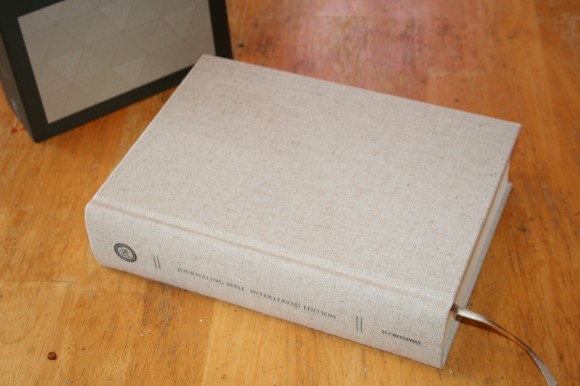
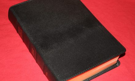
My review copy is cloth over board with a thick slipcase. The slipcase has an elegant look and feel. It has a dark brown and medium brown color pallet with several triangle patterns within the lighter brown. It’s simple and clean – not overdone. Just elegant. The cloth is tan. The only writing is on the spine, where the expected ESV and Crossway logos are placed with Journaling Bible Interleaved Edition across the middle. It’s sewn and has a medium brown ribbon and head/tail bands. The overall size is 9.5 x 7 x 2 5/8.
I’m a fan of Crossway’s cloth over board hard covers. I like the way they look and feel. I also like how it lays flat in one hand for easy reading. I like that they include a ribbon.
Paper
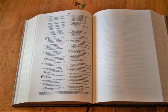
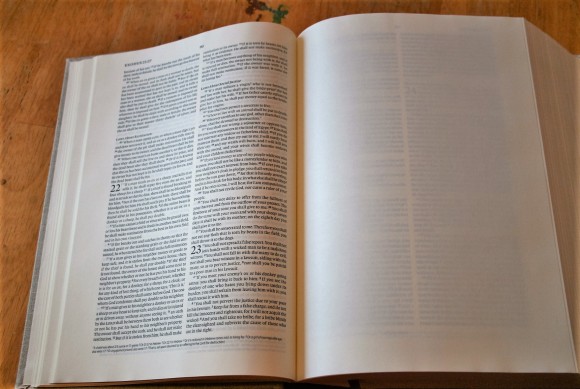
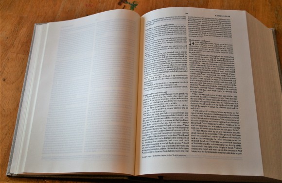
The paper is an amazing 50gsm, which is far thicker than the typical 38 found in many journaling and wide margin editions. It has the typical cream color that you find in most journaling Bibles. I am a fan of the creamy color-tone. It’s easy on the eye and it helps with opacity. It has the right contrast against the black font. The page edges are not gilted, leaving the edges clean for decoration. The thick pages are very easy to turn. This is especially helpful behind the pulpit.
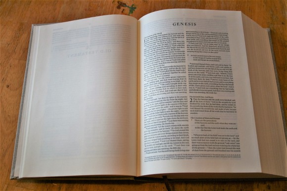
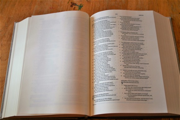
Between every page of Bible text is a blank page for writing (in other words, blank pages are interleaved within the text). This means there are around 780 pages to write and draw on. The paper is perfect for both sermon notes and art journaling.
Typography
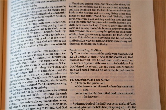
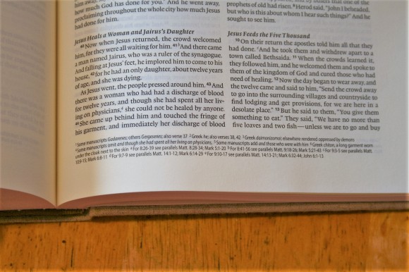
This is a double-column paragraph edition. The font is 7 point black letter that has a medium/dark boldness. It is printed with line-matching. The columns are 2 3/8 wide. It has around 58-60 characters across. This width and font ratio typically makes a nice poetic setting.
The header includes the book name, chapter, and first or last verse that starts on that page. The page numbers are centered. One thing I found interesting is the page numbering. The interleaved pages are counted, just not numbered. Section headings are in italics. They stand out without being a distraction. Books start on a new page, so you have a little space at the end of most books for notes. It also has some margin space for notes. The outer margin has 15/16” (this will be smaller in TruTone and leather editions that have been trimmed) and ½” for the inner margin.
There are a lot of verses on a page. For example, page one has 38 verses. The first blank page has to share note-space for 38 verses of Genesis 1:1-2:7.
For older eyes (like mine) the small font might be difficult for preaching, but if you don’t have issues reading small print from the pulpit then it will be hard to find a better preaching Bible.
Footnotes and Cross References
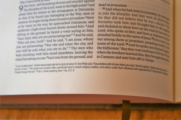
The footnotes appear in the footer and are keyed to the text with numbers. The note includes the number. Footnotes include alternate renderings, Hebrew and Greek explanations, clarification of meanings, grammar, weights and measures, technical translation notes, manuscript variances, and cross references to OT quotes and parallel passages. References are marked with letters. Verses that are missing from the text are placed in the footnotes with info that some manuscripts include them.
Table of Weights and Measures
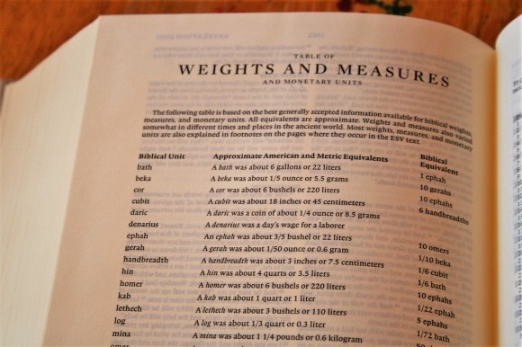
This is a one-page table that covers 22 different measurements (including monetary units). It includes the biblical unit, approximate American and metric equivalents, and a biblical equivalent. This information is also covered in the footnotes.
Reading Plan
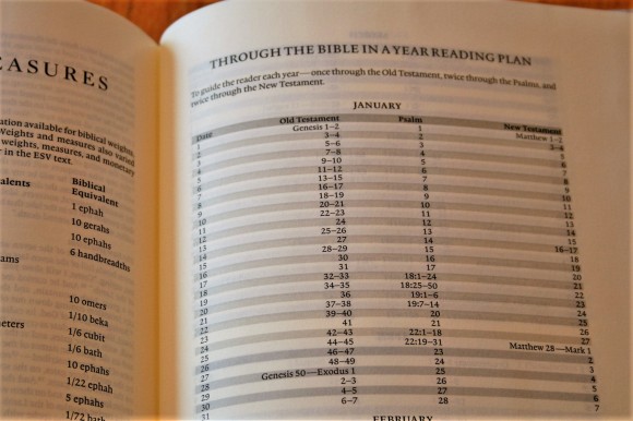
The reading plan takes you through the Old Testament once and the New Testament and Psalms twice in one year. It has three readings per day: OT, Psalms, and NT. The readings are dated so you don’t have to worry about checking them off as you go. If you want to mark them there is enough space next to the verses to make a mark.
If I Could Change One Thing
I get lots of comments from readers that want red-letter and large print journaling editions. Since large print is not possible for this particular text block, I’d like to see this also available in red-letter. I can see having both because there is a strong customer-base for both.
Tips on Using It
The advantage of interleaf is it has full pages, not just 2” margin space. This means you can write more on the page and draw larger drawings. Here are some of the things you can do with it:
- Create outlines for sermons – there are around 780 pages for outlines. Sermon notebooks don’t have that many pages. That makes this a notebook/Bible combo. This is by far the best option for writing sermon outlines in your Bible.
- Art journaling – the paper is thicker than other journaling Bibles that are used for artwork. Also, having a full page to draw on opens up a lot of opportunities that wasn’t possible in a 2 inch margin. There’s still a small margin and the paper is perfect for drawing over the text.
- Personal journaling – it’s a great Bible for writing down your thoughts and insights. I recommend writing the chapter and verse number that the note corresponds to, followed by the note.
- Creating your own study Bible
- Charts for preaching and teaching
Tools
My favorite Bible writing and marking tools include:
Conclusion
This is a note-taker’s dream Bible. It’s a great choice for creating your own study Bible or for any type of journaling. The thick paper is perfect for artwork. The font will be too small for some, but if it were larger then this Bible would be massive. It’s already the size of a study Bible, so I imagine a larger font would make it the size of a large print study Bible. In my opinion there’s a market for that too. For anyone looking for a journaling or wide margin Bible, the ESV Journaling Bible Interleaved Edition is the perfect choice.
Crossway provided this Bible free for review. I was not required to give a positive review – only an honest review. My opinions are my own.








Thank-you Randy for your reviews! Kudos to Crossway for continuing quality and innovation. This would be a great pulpit Bible–with a lot of space to consult your notes, however with a 7 pt font– unless you’re under 30 or consume a lot of carrots–you’ll probably be squinting through that sermon. A 10 or 12 pt font option would also be good, and yes I know that would make for a much bigger Bible. Local Church Bible Publishers does it with the KJV (Notetakers Bible) so it’s not out of the realm of possibility for Crossway with the ESV. Thanks again!
Thanks Richard. I would love to see this in large print. I agree it would be large, but I don’t mind. It would sit on my desk or on the pulpit.
Combining features from 5 type of bibles Crossway publishes my dream bible would feature:
1. Single Column
2. Line matched
3. Interleaved Journaling (preferred method, but side margin or a style that follows each reading would be OK too.)
4. M’Cheyne reading plan arrangement (like the ESV Daily Reading Bible)
5. ESV Readers Bible format (no verse numbers, translation notes, section headings)
6. Heirloom edition available
I consider/name it The Ultimate Devotional Bible
What is the best pen/ink combo for this paper? I noticed you say it is thicker than the other journaling Bibles, but does the writing bleed through or ghost onto the other side?
Thanks,
t
Randy, I’m a bookseller…crossway’s product pictures aren’t very good, is there any chance you’d give me permission to use one or two photos from this post to give my customers a better idea of what this edition looks like?
Hi Courtney. Sure. Thanks for asking. If possible please give a link back to this page.
Randy, I’m a pastor who’s trying to decide on a Bible that will be like my personal reference/study/answers Bible. I’ve kinda narrowed it down between this and the ESV large print journaling. Which would you prefer between those two? Any chance Crossway comes out with a leather bound (with pen holder) version for this one?
Hi Chris. I can check with my contact at Crossway on a leather bound edition with pen holder. I like that idea. Choosing between the two is a tough one because they both have strengths and would make a great choice for this. I personally prefer larger print, so for my own use I would go with the large print journaling edition (9 point vs 7). However, if font size is not an issue, the interleaved would probably be my choice because it has much thicker paper (50gsm vs 38), has wide margins, and far more writing space. You could easily get your references in the margins and your notes and outlines on the blank pages. Either way though, you can’t make a bad choice between these two.
I just compared the Interleaved to the Large Print Single Column. The verses the Interleaved shows on ONE page are spread across TWO pages of the Large Print version. I compared a mid-section of John and also the first chapters of John -> The Interleaved had John 1:1 – 2:2 whereas the Large Print had John 1: 1 – 2:3 across two pages.
In the middle of John I didn’t take the time to do accurate math but the same general impression was there.
On the Large Print bible, the 2″ margins are about the same width as the text of the Interleaved. So the one blank page and one text page of the interleaved seem to be spread out over two pages on the Large Print.
I think that with the Interleaved you get a bit more space due to the some margin and gutter (?) space.
The interleaved Bible, in my opinion, misses one important detail–it should be single, not double column. yes, a full blank page is great, but how can one clearly identify if the notes refer to the inner or the outer column???
Good point. Single column would be a great choice for this.
Would you recommend for a study/preaching Bible the Crossway Interleaved or the Cambridge WM
Hi Nathaniel. That’s a tough one. Both are great for preaching. The Crossway has lots more pages to write sermons and notes on but the Cambridge has a lot in the back and it might be enough for most preachers. The Crossway has thicker paper. Both have wide margins for notes. The Cambridge is better for study because of the references, concordance, and maps. I find the Cambridge easier to carry. If study was part of the goal I’d choose Cambridge. If preaching was the goal and I wanted more pages for sermon outlines I’d choose the Crossway.