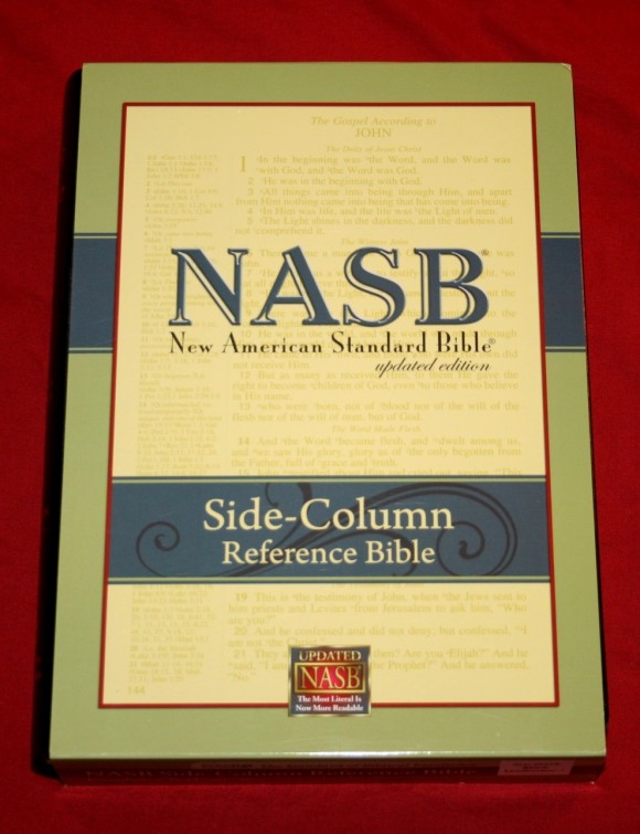
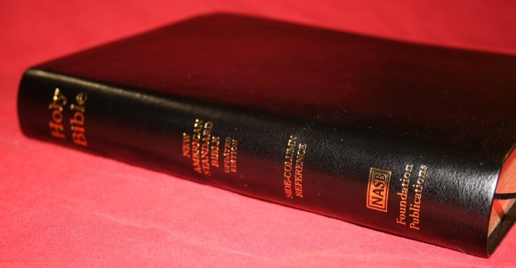
Foundation’s Side Column Reference Bible in NASB is a single-column, wide-margin edition at an amazing price-point. It has the features you’d expect in a Bible for personal study and preaching/teaching.
Pros
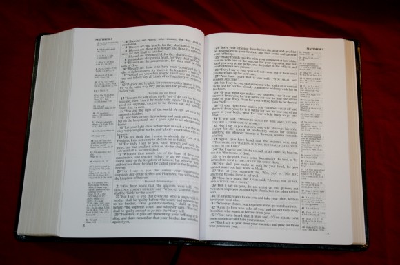
- Wide margins
- Large font
Cons
- Paper is thin for writing
Features
- Updated NASB
- Black Leathertex
- Sewn binding
- Presentation page
- Family records
- 10/11-point font
- Black letter
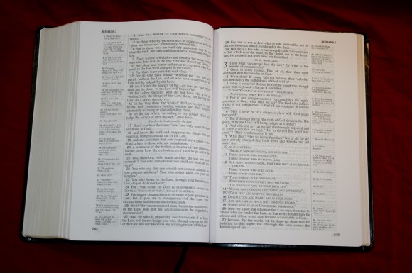
- 1 inch margin
- Side-column references
- Single-column text
- Verse-by-verse format
- Poetry set to verse
- OT quotes in all-caps
- Section headings
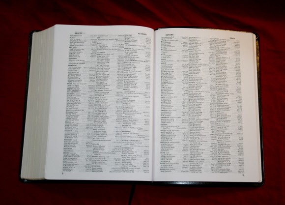
- 82 page concordance/dictionary
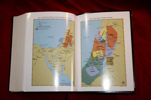
- 8 Maps
- Gilted edges
- 1 ribbon marker
- 9.75 x 7 x 1.5
- Suggested retail price $36.95
- ISBN: 9781581351583
Click here to buy from Amazon: Foundation Side Column Reference Bible, NASB
Cover and Binding
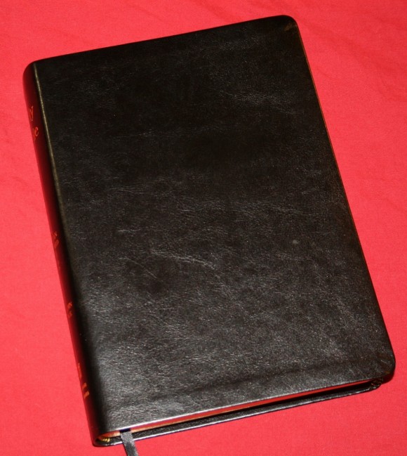
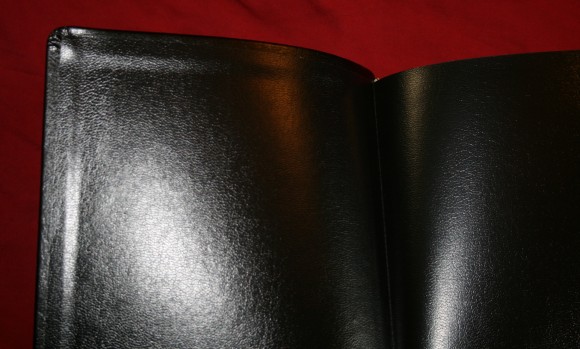
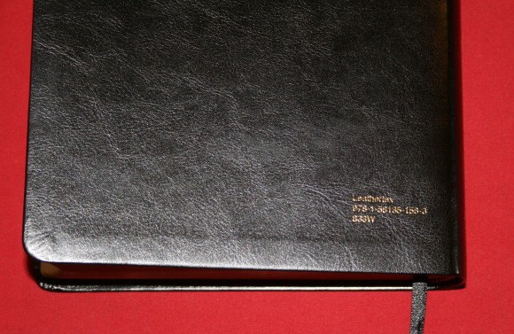
The cover is an imitation leather called Leathertex. At first I thought it was genuine leather. I still keep feeling of it to see if I can tell the difference, but it still looks and feels like leather to me. This is the closest to leather that I’ve seen in imitation leather. It feels and looks great. Only time will tell how it holds up. The liner looks like vinyl-coated card-stock. The binding is sewn and it has no problem lying flat.
Paper and Print
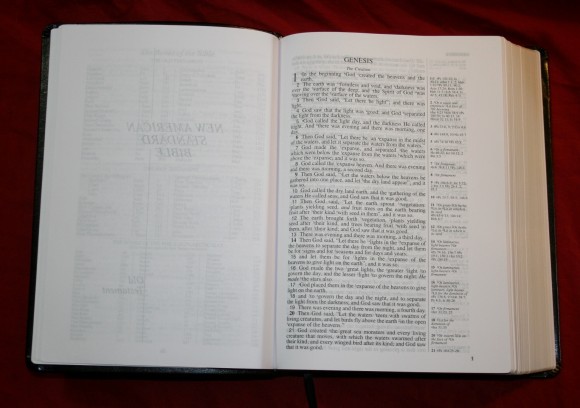
The paper is my only complaint about this Bible. It is thinner and less opaque than I like- especially for a wide margin Bible. This may be why it isn’t promoted as a wide-margin Bible. Line-matching would improve its readability, but I would rather have more opacity. This is only a minor complaint at this price. It wouldn’t stop me from buying or recommending it at this price. Given the choice I would pay more for a more opaque paper, especially for a Bible that I’m writing notes in. The font is sharp and at 10/11 it is the perfect size for me. The print quality is consistent throughout. The back of the sleeve it came in says it’s a red-letter edition, but it’s actually black-letter.
Layout
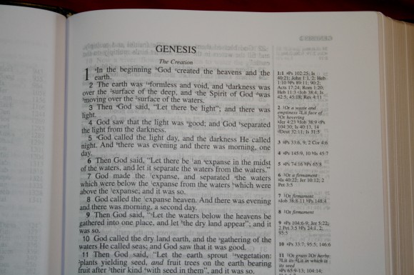
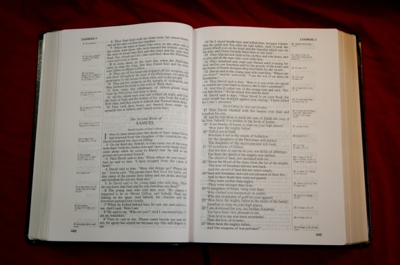
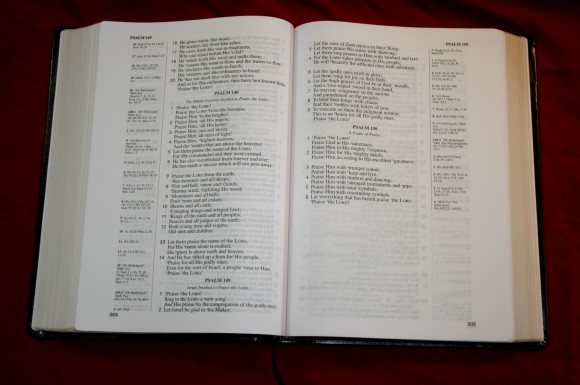
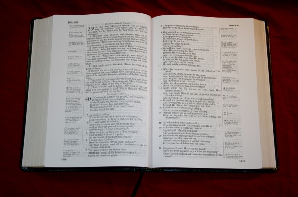
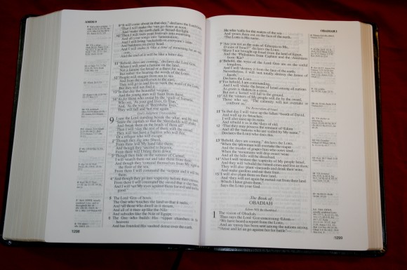
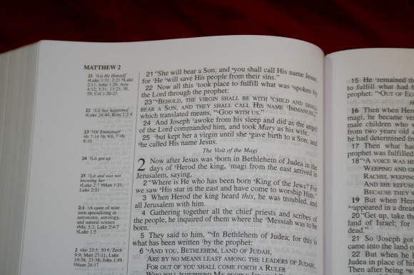
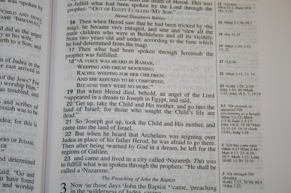
The text is presented in single-column, verse format. Paragraphs are indicated with bold verse numbers. Poetry is set to verse (poetic verses are printed to the right of the verse numbers) and OT quotes are in all-caps. Section headings are centered and printed in a smaller italic font. References and notes are placed on the outside margins, next to their verses. There is a one-inch margin on the outside for writing.
One quirk I noticed is some books start on a new page while others do not. There doesn’t seem to be any reason that I can see for this.
References and Notes
I think it has 95,000 cross-references, although the sleeve says it has 13,000 references. I think this is a misprint. The references are the same as the Large Print and Topical editions. They both say 95,000, and after using them I believe it. There are 14 cross-references given for Genesis 1:1. There are also translation notes that give alternate renderings (the same notes from the Large Print and Topical editions). References are keyed to the text with letters and notes are keyed with letters. The references and notes are some of the strengths of this Bible. A star is used to show a verb that in Greek is a historical present tense, but in English is in past tense for modern vocabulary usage.
Concordance/Dictionary
The concordance includes a dictionary and is 82 pages with three columns per page. 82 pages seems small but having three columns per page makes up for it- there are still plenty of entries for good Bible study and sermon prep. There are 37 entries for God (Deity, Eternal One), and 8 entries for God (false deity, idols). The entries include synonyms. This is a great feature for research and study. I wish all concordances were made this way.
Book Introductions
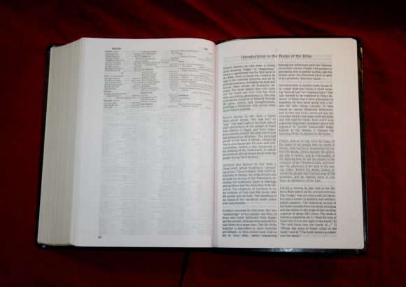
Rather than placing book-introductions in the text, they are placed in the back of the Bible. Each introduction is about a paragraph long and provides an overview of the books’ content, teaching, or major theme. They provide useful insights so I’m glad they’re included. It doesn’t matter to me where they’re placed, since I will probably only read them a few times.
Maps
There are 8 full-color maps printed on heavy card stock. There is no index to maps but they are annotated and labeled well. An index would improve usability.
Conclusion
This is my favorite Bible from Foundation Publishers. With its references and concordance/dictionary it has enough useful tools for study, and its wide margins are great for note-taking and personal devotions. My only complaint is the paper could be more opaque, but at this price-point I have no problem recommending Foundation’s Side Column Reference Bible. It’s a great choice for daily reading and study.
Click here to buy from Amazon: Foundation Side Column Reference Bible, NASB
Foundation Publications provided this Bible free for review. I was not required to give a positive review- only an honest review. My opinions are my own.




Good review. Today I looked at a friends new Allan which uses the same book block. I was able to compare it to my USA printed 1996 copy. Very similar opacity. The new SCR is slightly bolder. The USA paper is nicer. Why Lockman won’t do their calfskin (and printing) at Jongbloed is a question I have asked them. The genuine/bonded/synthetic/hardback versions could still be done in China (to bring down price-point for Christian bookstores). But a genuine leather SCR is a Bible I would strongly recommend to the average Christian. Value for $!
I’m curious Randy what is the date of this textblock? And the paper, is it not the same paper that’s in Lockman’s Ultrathin Large Print Reference you reviewed earlier?
Hi Norm. The textblock doesn’t show the publication date. I think the paper is the same as the large print. The paper is fine for a reference Bible; I just prefer thicker or more opaque paper for writing in wide margins.
Hey Randy,
You may already be aware of this, but typically Lockman prints two series of numbers divided by a forward slash at the very bottom of the copyright page underneath the country where it was printed. For the year look to the far right of the forward slash at the first number read right to left and for the printing look over at the far left of the slash at the first number read left to right.
I do agree with you about the paper and I don’t believe using a better paper would have created a huge increase in price. Lockman at one time was way ahead of the field, as they had the best paper ever used in a bible, past and present. Also, I mentioned this elsewhere, but how difficult would it be for Lockman to remove the references for a text only edition and even better if it was in paragraph format. Now, that would make for a great reader!
Thanks Norm. I didn’t know this. The numbers in mine are:
10 11 12 13 14 / 18 17 16 15 14 13
Is this the 10th printing 2013?
Yes sir, that is if I understood Mr. Dave Bush correctly.
This is what I wish the ESV verse by verse layout had been. I love the size of the print in this bible. It is great for reading and study, also having room to place some notes and includes usable and readable references.
Crossway just can’t bear, it seems, to make a good study edition with larger than an 8 or 9 point text, Also the references almost require a magnifying glass in their existing one. It has much smaller print and is actually to me less comfortable to hold and use than this one.
Oh for an ESV just like this!
I know about the new personal size large print they have out and will probably get one for the ease it will give me in reading it. I just wish they had one to match this layout.
Kudos to Foundation on this layout. It is really great for study of the Bible.
Hi Mike. I agree. This is probably my favorite layout, and the size of the text and textblock is just right.
Dear Friends:
Good review Randy, this looks to be a good bible for those who prefer this translation. If I still read the NASB this would be a good choice for me as well. I do though really prefer the layout and the paper and printing of the Westminister reference bible with about twice the cross references, and its notes, imbedded dictionary other helps, and the translation I prefer. I have a NASB which I bought I believe in the early 70’s, the first edition from Lockman when the NASB was introduced. I read it for about 4 years, but found I prefer the Authorised. I do think that Foundation is on the right track with side column references, too bad they didn’t have enough references to use both edges of the page like the Westminister, or use a better grade of paper. The NASB is not a bad translation, but not for me. Again this is a great review of appears to be a good bible.
Yours in Christ
Don Denison
Oh that someone would publish this in the KJV/NKJV. I know, I’m asking for a lot.
Dear RCAL:
We do have several very fine bibles in the Authorised (KJV). My favorite is the Westminister Reference Bible, it has a huge number of cross references, appendices containing charts and tables, an imbedded dictionary on the pages for archaic words, translators notes also on the page, and many other helps. If you are in the market for an Authorised/KJV study bible check out Randy’s review on this blog. It is listed under Popular Reviews.
Yours in Christ
Don Denison
Thanks Randy,
I decided on the genuine leather, I figured 4 dollars more why not go with the real deal. The paper is awesome in my opinion although it is thin for a wide margin. This bible makes 0 noise it has no crinkling in the gutter and I love it more and more each day. The paper is brite white and the font blew me away, this bible is so nice to read from. Yes its not all decked out like the big brand names but for the money this can’t be beat. I posted a video on YT under Airik1111 for anyone who is looking to buy this bible, thanks again for your reviews, your spot on every time.
Hi Eric. Thanks for the update. I’m glad you like it. Thanks for the heads-up on the video. Nicely done!
Great review! I, personally, think that Lockman’s only failure over the years has been going away from the text block they used from 1999-2002 (US Printing). Though, from what I understand, a few years into the Chinese printings, the same text block was used.
I don’t know if this is allowed or not but I have a 2002 Edition of the NASB Side Column Reference Bible that I had rebound by Mechling in Dark Green Goatskin that it is currently listed on Ebay. It turned out beautifully. Here is the address if anyone is interested : http://www.ebay.com/itm/161776043724
I tried listing it on Bible Exchange first, but they are having security certificate issues. I just want someone who appreciates a nice Bible when they see one to end up with it.
Yes, another belated comment – but thanks for an excellent review! The NASB SCR is an EXCELLENT Bible to recommend to SERIOUS believing and unbelieving students alike. The hardback edition was the ideal for purchase to give away, for groups, as a second Bible, etc. , as it cost only £15/$20.Alas, this wonderful evangelistic and teaching tool has been DISCONTINUED!! Why, o why??