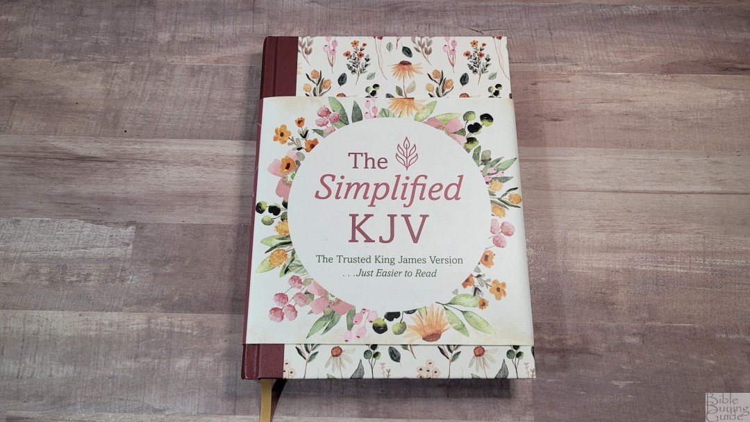
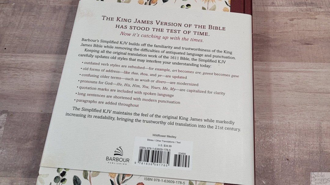
Barbour’s Simplified King James Version is a modern update to the KJV. Their first Bible with this new update is a single-column journaling edition in hardcover. It’s available in several hardcover options. I’m reviewing the Wildflower Medley, ISBN 9781636091785, printed in China.
Barbour provided this Bible in exchange for an honest review. I was not required to give a positive review, only an honest one. All opinions are my own.
_________________________________________________________
This Bible is available at (includes some affiliate links)
and many local Bible bookstores
_________________________________________________________
Table of Contents
- Video Review
- Simplified King James Version
- Binding
- Paper
- Typography and Layout
- Book Introductions
- The Simplified KJV Revision Process
- Dictionary/Concordance
- Bible Atlas
- Conclusion
Video Review
Simplified King James Version
Rather than being a KJV that’s been made easier to read, the SKJV is a full update to the KJV. The goal was to remove the antiquated language and punctuation. It doesn’t make substantive changes to the KJV’s text, but it’s more similar to the NKJV and MEV than the KJV. Long sentences were shortend by replacing colons and semicolons with periods. Not all have been shortened, though. Some were replaced with commas to create smoother sentences. For example, Ephesians 3:1-7 is still one sentence, but it now has commas instead of semicolons. Each verse that continues a sentence starts with a lower-case letter.
The word changes varied by context and not every instance of a word was changed. All this is explained in the back. This edition does not provide translation footnotes on the page. It does have information in the back about the update and each word choice. I’ve only read small portions, but I like it so far. I find it easy to follow along with the KJV, NKJV, and MEV.
Binding
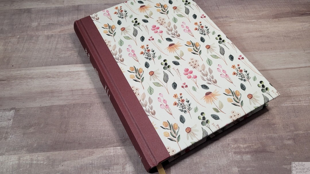
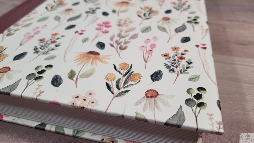
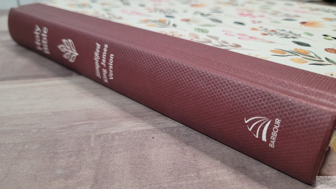
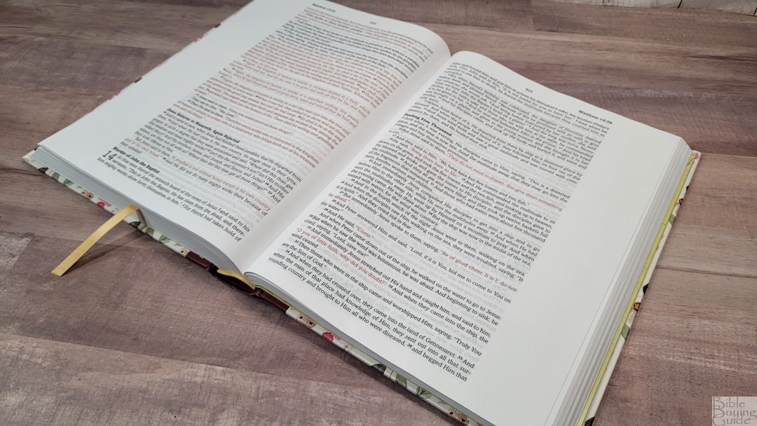
The hardcover looks to be reinforced. I think it would last a long time. The cover has lots of watercolor flowers on the front and back. The spine is a textured dark red that wraps around to the front and back. The spine is rounded, which is my favorite design.
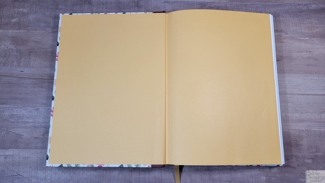
The liner is paste-down paper. It’s reinforced so it should last for a while. It stays open perfectly on any page, and the spine design rises upward when opened to keep the pages flat.

It has one .25″ gold ribbon that’s just long enough to pull to the corner to open the Bible. The overall size is 7 x 9.25 x 1.18″ and it weighs 2 lbs, 1.3 oz. This is a good size for carrying and using anywhere.
Paper
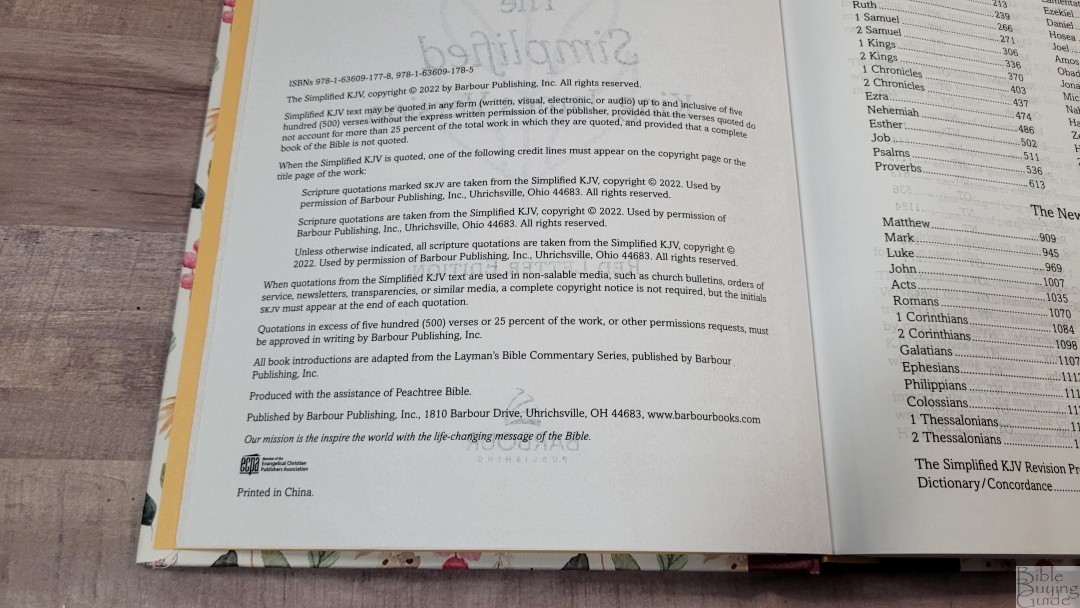
The paper is 30 GSM. It’s smooth to the touch and feels like a premium paper. It’s slightly off-white, making it easy on the eyes for reading, and it has no glare under direct light. I found the pages easy to separate to turn with one hand. Show-through isn’t bad, but it is more noticeable where the lines of text don’t match.
Typography and Layout

The SKJV text is presented in a single-column paragraph setting. Poetry is set in verse-by-verse. Personal letters (like those in Ezra) are indented and have a ragged right edge so they stand out. Section headings and the chapter number drop-caps are in bold. The header shows the book name and reference in the outer margin (above the text) and the page number in the center. It does not include translation footnotes. The outer margins are 1.5″. This is great for note-takers.
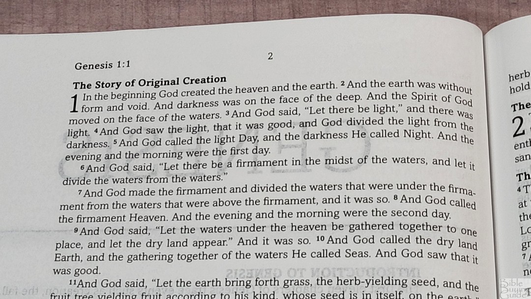
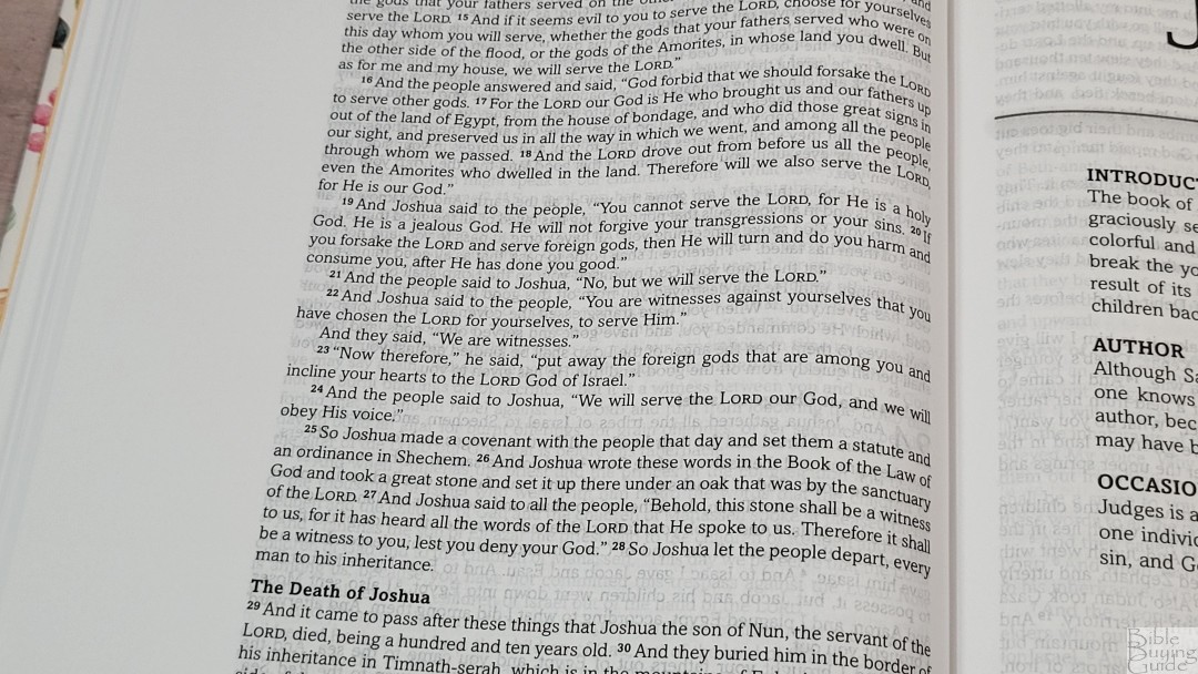
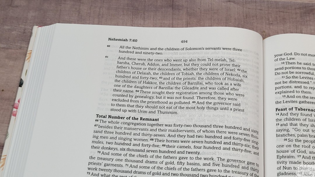
The font is a 9-point in a regular weight, making the print about a medium darkness. The red is even lighter due to the font-weight. Unfortunately, the print quality is a little inconsistent, especially the red letter. The text was not printed with line-matching. Many pages do line up, though. Those pages are much easier to read. The show-through would be a bigger problem if the fonts were darker. Verse numbers are bold and have a little extra space around them. This helps make them stand out enough to find them easily. They’re not too difficult to find, but the wide column does take an extra few seconds. It does not include italics for supplied words. Dialog is placed within quotation marks.
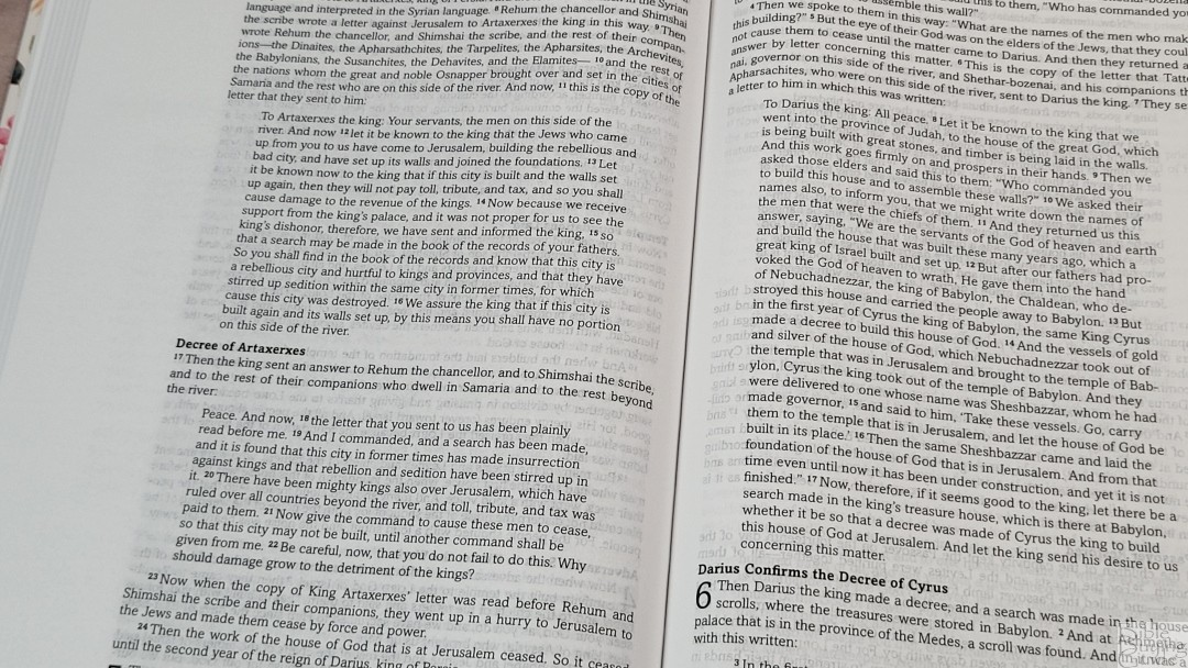


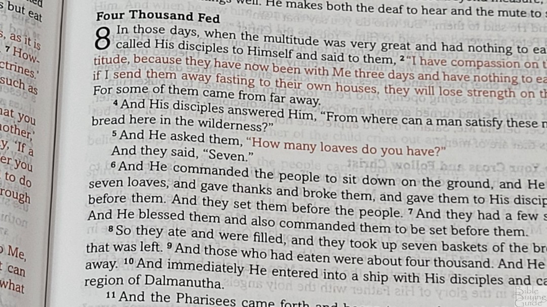
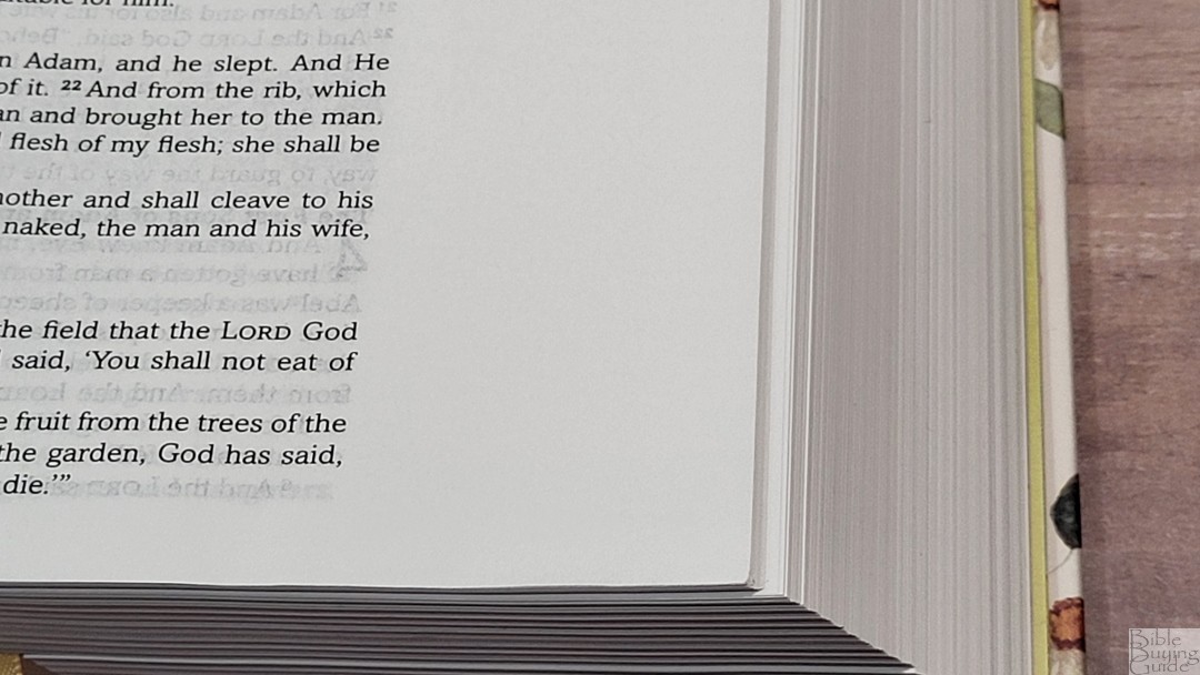
It has around 16 words per line. This is more than I personally prefer, but it has enough gutter space to keep the text on the flat part of the page. This ensures the lines of text are straight. It also has extra space between the lines and there is a large amount of inner margin space to bring the page out onto the foot part of the page. Both of these features help improve the readability. Fewer words or a larger font would be nice, but they would also make the Bible thicker, so it would be a trade-off.
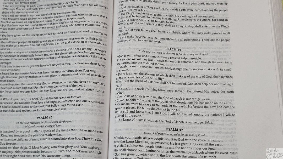
The poetic setting is verse-by-verse. Other than that, it has no formatting for the poetry. Some text that’s normally considered poetic by other translations, such as Job, is placed in paragraph format.
Book Introductions
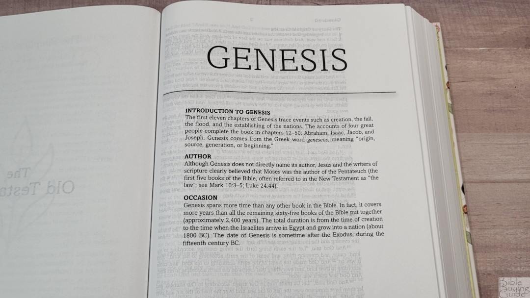
Books include a short introduction that covers the basics of the book. They include information about the author and the occasion of writing. They’re short, but they’re good for basic information. I find them helpful for understanding the context of the book.
The Simplified KJV Revision Process
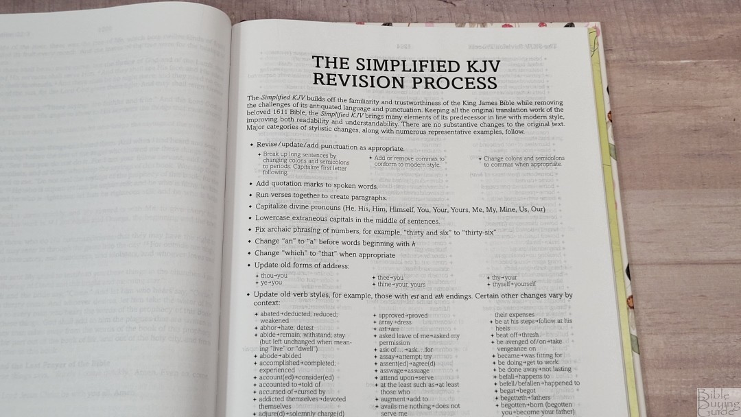
This is a 19-page section that discusses the revision process and lists the types of changes that were made. It then lists examples of words that were changed and provides the words they were replaced with.
Dictionary/Concordance
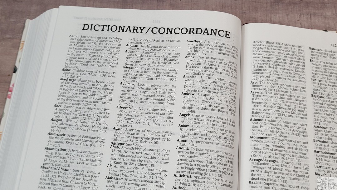
The dictionary/concordance is 16 pages with three columns per page. It covers people, places, things, and a few theological words such as adoption and atonement. The theological words are defined with as little theological slant as possible. It covers quite a lot of words and each one includes Scripture references. This is good for basic study, which is helpful considering this edition doesn’t include references or footnotes.
Bible Atlas
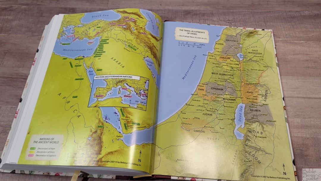
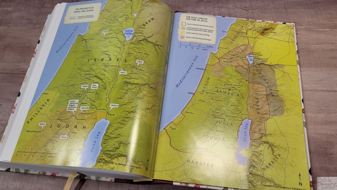
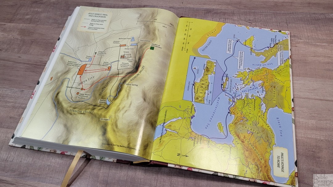
In the back are 8 pages of full-color maps printed in thick semi-glossy pages.
- The Holy Land Today
- The Nations of the Ancient World
- The Tribal Allotments of Israel
- The Prophets of Israel and Judah
- The Holy Land in the Time of Jesus
- Jesus’ Arrest, Trial, and Crucifixion
- Paul’s Voyage to Rome
- The Churches of Revelation
Conclusion
Barbour’s SKJV is an interesting update to the KJV. It’s highly readable and it’s easy to follow along with the KJV and its other updates- the NKJV and MEV. I like the size of this Bible. Overall, I think the Simplified KJV Bible design is good. To improve it, I’d recommend a darker and more consistent print quality and line-matching to improve readability. It’s good to see the first SKJV is a wide-margin edition that’s easy to carry and use. If you’re interested in an update to the KJV, the SKJV is a good choice.
_________________________________________________________
This Bible is available at (includes some affiliate links)
and many local Bible bookstores
_________________________________________________________
Barbour provided this Bible in exchange for an honest review. I was not required to give a positive review, only an honest one. All opinions are my own.



Randy, Another excellent review! And thanks for bringing this version to our attention. I’ll get one for trial by myself and a couple of others, and then perhaps come back to you? Can I order from Amazon UK here, as US to UK postage is getting ridiculous.
I’d love to hear your thoughts on this! The UK version of Amazon does have it.
This was very helpful, I’ve only seen this Bible online and most retailers don’t have many interior pictures. It looks like there are two additional color options coming out soon, and both seem to have more devotional and study features. Will you be doing a review of these as well?
Thanks! I hope to review them.