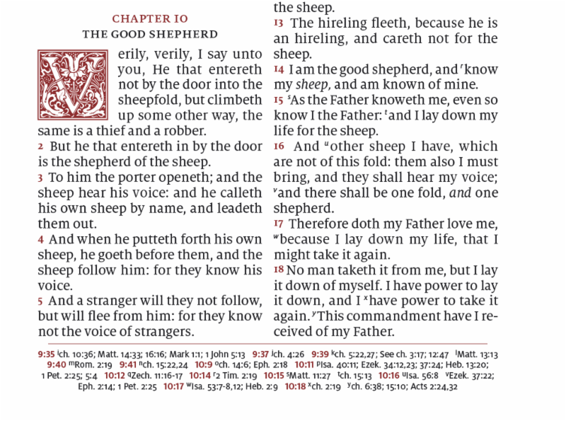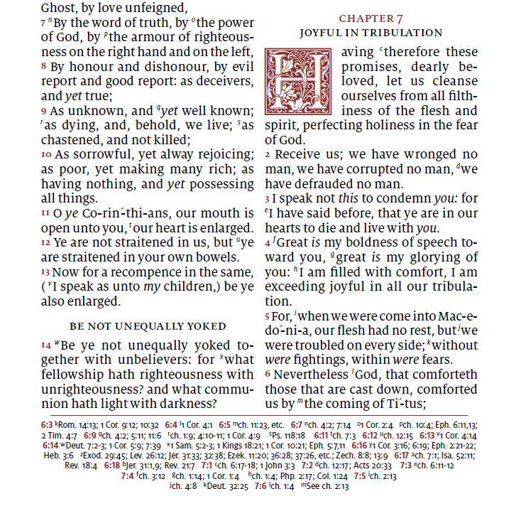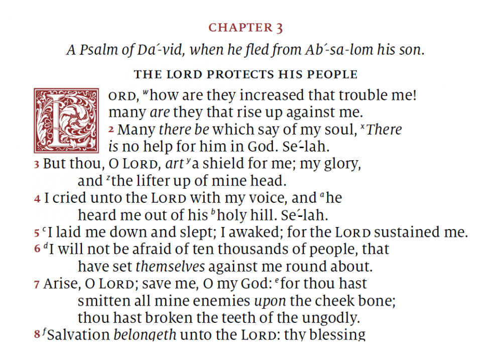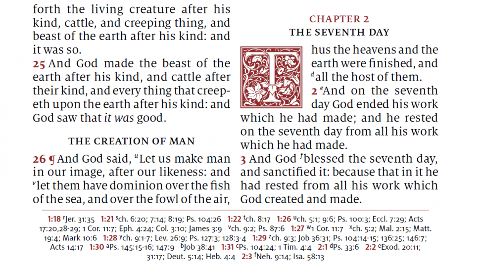
The Schuyler Canterbury KJV is now at the printers and pre-orders will start soon after Labor Day (September 5th). The leather over board edition will be black with gold foil embossing, art-gilt edges, and will release a few months after the goatskin and calfskin editions. The Canterbury will have a darker art-gilting than the Quentel series. It will use the same 11-point Milo font and 36gsm paper.
You can see more information at EvangelicalBible.com’s Canterbury page: Schuyler Canterbury
Here’s a quick look inside:


Call the printers and cancel the print job. This is a poor, poor attempt by Schuyler. They foolishly left out the KJV translator’s notes, and the excessive self-pronouncing text on common two-syllable words is ridiculous. Whoever decided to go with this design should be fired.
I agree that the amount of self-pronouncing text is overboard. Do we need it for David or Titus? This stops me from even considering this version despite the excellent layout and font size.
I’m tired of Schuyler’s emails touting this as a “ground-breaking design” and “long awaited.” They don’t know what makes a good KJV reference bible.
News coming soon to Schuyler – “We regret to inform you that sales of the Canterbury have greatly fallen short of projected earnings on account of decision makers being stupid.”
To all the folks who don’t like this Canterbury edition, I suggest that you don’t buy one. There are many good alternative King James editions out there, and the pound is at a very low place at the moment. Don’t worry be happy.
I don’t work for Schuyler, and I won’t be buying or recommending this either. I thought they were smarter than this.
Dear Randy,
I want to thank you for your in depth bible reviews covering all of the latest features-good and bad. I find myself frequently visiting your site when I want to find out about specific details of a bible. I enjoy reading your informative reviews. Thank you, again!
Thanks Jeffery! I appreciate it!