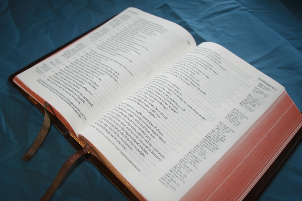
There are plenty of Bibles to choose from with many features including various papers, fonts, formats, translations, covers, references, notes, etc. If I were able to ‘Build-a-Bible’ I know what my Bible would look like. It would be my dream Bible. Here’s what features I would choose:
Size:
About the size of a Cambridge Concord Wide-margin would suit me just fine at 7.25×9. Slightly larger would be fine. With everything I would like to add, the Bible would end up being from 2-2.5 inches thick. That would be perfect.
Translation:
I’m used to KJV, so I’ll stick with that.
Margin:
I want a wide-margin, but not a standard wide-margin. I don’t like writing on the inside margin. My favorite margin is the Note-takers from LCBP. It has one column of text on the inside of the page and a 2.5 inch margin on the outside of every page. That will do just nicely.
Paper:
I want the paper from the Cambridge Concord Wide-margin. It is the perfect thickness and opacity. It doesn’t have a shine or glare and has a slight cream tone, making it easier on the eyes. The paper from the Archaeological Study Bible is nice too. I like the texture in the background and on the edges of the hard-cover edition.
Font:
I want a 10 to 12 point font. As far as style of font I just want it easy to read. Also, I don’t want the letters to be crammed together. I’d like some white-space. I like my fonts bold. Not ultra-bold, but bold like the Cambridge Concord Wide-margin. Take the Concord font and make it two points larger and that would be perfect. I’m used to red-letter, but I’ve not decided if I need it or not. The advantage in not having it is that my color-code only has to look good over black. If I have red-letter I want it to be a slightly dark red and I want it to go all the way through Revelation. I want a self-pronouncing text.
References:
The more the better, but I need to know what portion of the text the reference refers to. I use Genesis 1:1 as my benchmark. My favorite is probably the reference system in the NIV Archaeological Study Bible. I prefer center-column references. I like the center column to also include translation notes. The Cambridge Concord Wide-margin does this nicely, but I would add some letters to the text to know what the references go with. Since I want a single column of text and a single column for my own notes, the references would have to be on one side of the text. I don’t know which side would be better. Chain references are nice too.
Concordance:
I like the Cruden’s Concordance in my Dugan Topical Analytical Study Bible, but it’s not realistic to expect that concordance in a Bible with thicker paper. I use the entry for ‘God’ to compare concordances. As long as it has a couple of dozen entries it should be OK. I like the margin of the concordance to be wide. This way I can write definitions in the margin next to the word (this is where I write Greek and Hebrew definitions in my Cambridge wide-margin).
Maps:
I want lots of pretty maps in bold earth-tone colors.
Study Notes:
I don’t really want someone else’s commentary. I’m not interested in notes with a theological bias. I like translation notes, charts, graphs, etc. I would like to have a few charts such as Bible time-lines, prophecy, etc., in the back where I can find them. 20 pages or so should be enough.
Headings:
I’m torn on headings. Headings in the text could include theological bias, but they can also alert you to something you’re looking for. There are several options: I could have the headings included, I could have a blank space between each paragraph to write my own headings, or I could just use the margin. I think I will just use the margin and write them in a different color. That way I can tell the heading from notes (that’s what I do with my Concord). This would allow me to read the text without being interrupted by the headings.
Glossary:
The Cambridge Concord and the Thompson both have a glossary and I find it can be helpful. I’m more likely to look up the original word in Greek or Hebrew than the English word, but it still nice to have it.
Edges:
Gilted and Art-gilted edges are pretty. My favorite is Art-gilt, but regular gilting if fine. I just don’t want plain white that gets dirty.
Thumb-index:
I used to not care for thumb-index, but I’ve started using it more often. I like the thumb-index to include the concordance, maps, glossary, charts- all of the extras.
Writing Paper:
I want writing paper. The Cambridge Concord Wide-margin has nice writing paper. I would just add a few more pages. I would like to have about 100 pages in the back and a page or two between each book. I would like a combination of ruled and blank.
Cover:
Here I have several choices: the ironed calfskin from LCBP, the goatskin covers from Cambridge, or the soft imitation leathers available on the Life Application Study Bible, the NIV Archaeological Study Bible, ESV Study Bible, NLT Study Bible, etc. For ironed calfskin or goatskin, I want either black or brown. For imitation leather, I want earth-tones: browns, reds, deep blues, greens, etc. I don’t want too many colors on there, but a cover with two or three sewn together would be nice. The cover must be soft and flexible.
Binding:
Smyth sewn- nothing else will do. The Bible must lay flat when opened, even to Genesis 1:1.
Ribbons:
I want three or more wide ribbons in various earth-tones. Each ribbon would be for a different purpose.
Format:
I’m not sure if I want verse-by-verse of paragraph format. Verse-by-verse is better for me for writing notes in the margin. Paragraph is better for reading. They both have their merits. I like the text to be formatted according to genre: where poetry and Old Testament quotes are set in a different style than the regular text. The NKJV, ESV, NIV, NLT, and others have this. Why not KJV?
Well that’s the beginnings of my dream Bible. I could keep going (I could add a Greek and Hebrew dictionary), but I’ll stop there. What is your dream Bible? If you could ‘Build-a-Bible’, what would it look like? Would it be paper or electronic? What features would it have?


Well. . . I could go on and on, and I would probably change my mind every few minutes, but one of my many dream Bibles would be an interleaved KJV/Amplified paralell Bible with one column of the KJV and one Column of the Amplified side by side on one page verse per line format with a center column of references and a blank page on the opposite side. This Bible would be a brick, but I appreciate a thick spine. The rest of the features would be negotiable, but I love thick calfskin with spine bands and a nice thick, cream colored paper.
Hmm…my dream Bible. I’d like an ESV/Amp or ESV/NKJV parallel with the translations on alternating pages instead of in two columns. Black letter, single column paragraphed text in a readable font (9 pt or up) with a reference column done like in the ESV reference Bible. I want margins large enough that the text neither runs into the gutter nor looks like it is falling off the page. I don’t want any maps, but I want a good concordance in the back with a Hebrew/Greek dictionary. I want study notes from a conservative, reformed background, similar to the ESV study Bible/Spirit of the Reformation Bible/MacArthur study Bible. I’d want the paper to be thick enough to have minimal ghosting. Smyth-sewn binding, thumb indexed, silver gild with a soft, dark chocolate brown cover and bands on the spine. Teal or dark pink ribbon.
Dear Randy:
I’ve been looking over some of the older articles and have enjoyed reading this one. You stated that the bible must lay flat when opened. I’ve found that for relatively small bibles that this is only sometimes possible. Certainly one must expect that a great deal of effort should not be necessary to keep the bible open, but for a bible that is going to be used held in one hand while seated, structure enough to support the text block is more important than flexibility. Bibles that do well in the size/flexibility comparison are: Alan’s Brevier, and their Ruby reference bibles. Cambridge does well with the Personal Concord, and their Cameo offerings. I think that the flexibility/ lay flat requirement is more important in a bible that will be read while at a table or desk where other reference books etc., will be consulted back and forth from the bible while doing serious research. Having said all that, we all like the bible to remain opened to the page we are reading, but more important to me is its ability to protect the textblock and the bottom margins while I read it either seated or standing.
In Christ
Don Denison
I would like a gap at the bottom of ebery page to write my own notes. If I buy a study bible the notes are at the bottom of the page but if I get a bible with sdpace for my notes I’m expected to cram them into a margin. Why? I can put letters in the margin to index my notes at the bottom. So quarter page blank at the bottom of each page please. I would also like a small NKJV with a decent size readable font (9.5pt+). Very few bibles have this. RL Allen’s Brevier Clarendon KJV is perfect but not NKJV.
If someone even had a program where you could choose the version, font and font size, red letter or not, capitalize pronouns of the Lord’s names or not, center column or two column…..I’d print it out and have it bound. I could even carry in a loose leaf notebook. I’d do this! I want center column shifted to the center so the margin is to the outside of the page. I want red letter, NASB or NKJV. I want color maps, lots of maps. I like the study notes at the bottom and reference scriptures on the inside of the page. Dictionary and concordance. Thick enough paper that my marking doesn’t bleed through. Font 10. Though I love leather bound, if it has all my wants inside, it could be in a three ring binder.
Hi, my dream bible is Cambridge text KJV with centre column cross references, thumb index and interleaved on every page. I would prefer 8 – 10 point text and I don’t care if it’s hard or soft cover. I would like lots of colour maps in the back with an overlay of Israel in the time of Moses and Israel now as well as a good concordance. I would like to create my own study bible with pictures I can insert and I don’t like other people’s opinions permanently in my bible… God wants us to reason with him using his words, not someone’ else’s. I don’t agree with every wind of doctrine out there and so no commentaries please. This would be my dream bible.
Hi Lisamarie. I love it! I want one of those in 10 point!