Zondervan has worked with 2K/Denmark to design a new layout, called the Passaggio Setting, that will place prose in a single-column layout and poetry in a double-column layout. The name comes from classical singing where a vocalist has the ability to skillfully change from one register to another. Like a skilled classical vocalist, the Passaggio Setting skillfully changes its layout between prose and poetry- even if it’s just one line. This creates a highly readable layout that’s beautiful, easy to read, and saves space.
The Passaggio Setting Bibles will be available in 4 lines:
- NIV Heritage Bible
- NASB Heritage Bible
- NIV Thinline Bible
- NASB Thinline Bible
The prose setting looks very much like the original NIV Heritage Bible in the Premier Collection but with a few tweaks that make it stand out. The text in the Heritage is blue and has yellow highlights for the section headings, page numbers, dividing line between the text and footnotes, and the book name and chapter in the header. The header content is placed vertically along the side of the page at the top. The footnotes are placed in a single column with the notes spread apart to make them as easy to find as possible. The Thinline editions will have black text.
The prose in the Heritage edition has around 14 words per line. Poetry has around 8 words per line. All poetry is placed in a single column regardless of the number of verses or lines. This makes the literary structure of each passage is easy to identify at a glance. This enhances readability and makes more efficient use of space since doesn’t waste whitespace that’s normally seen with single-column poetic settings.
I’ve only shown a portion of the sample they sent me. I love seeing prose and poetry in a different setting, but the traditional single-column does take a lot of space. Switching poetry to double-column makes it stand out even more than normal and it doesn’t have awkward spaces on the page. Switching between the two while reading is smooth. The large verse numbers helps to make them easier to find.
The Passaggio Setting Bibles will be available in October. I’m looking forward to seeing them. What do you think about the Passaggio Setting?


Finally. Love it!
Thanks for the review, Randy. This is like a NRSV that HarperCollins brought out a few years ago. But as with that Bible, so with this one – it would be better to have it the other way round (i.e. the prose in two columns and the poetry in one).
Unfortunately they have it the other way around: prose should be in double column format to help break the long sentences, and poetry should be in single column otherwise you have excess line breaks. The Roman Catholic Jerusalem Bible (original version) had an edition like that and it worked beautifully. I have sent emails with pictures to several publishers (Crossway, Thomas Nelson, Hollman) with this suggestion, the only one that replied with feedback was Crossway, but they had no firm idea whether or not they would pursue that design. I named it “equipoise” because it balances the text in a more harmonious fashion.
Thanks Randy, love the idea of this edition and looking forward to getting one in the NASB95.
Appreciate what you do for Bible enthusiasts everywhere!
Russ
Thanks, Randy. As you probably know this is not a new setting. Harper used this format in the NRSV 10 years ago. Looking forward to seeing the format in different translations.
Randy,
Thanks for this review.
For some reason, this sample shows up to me the fault lines in modern Bible production.
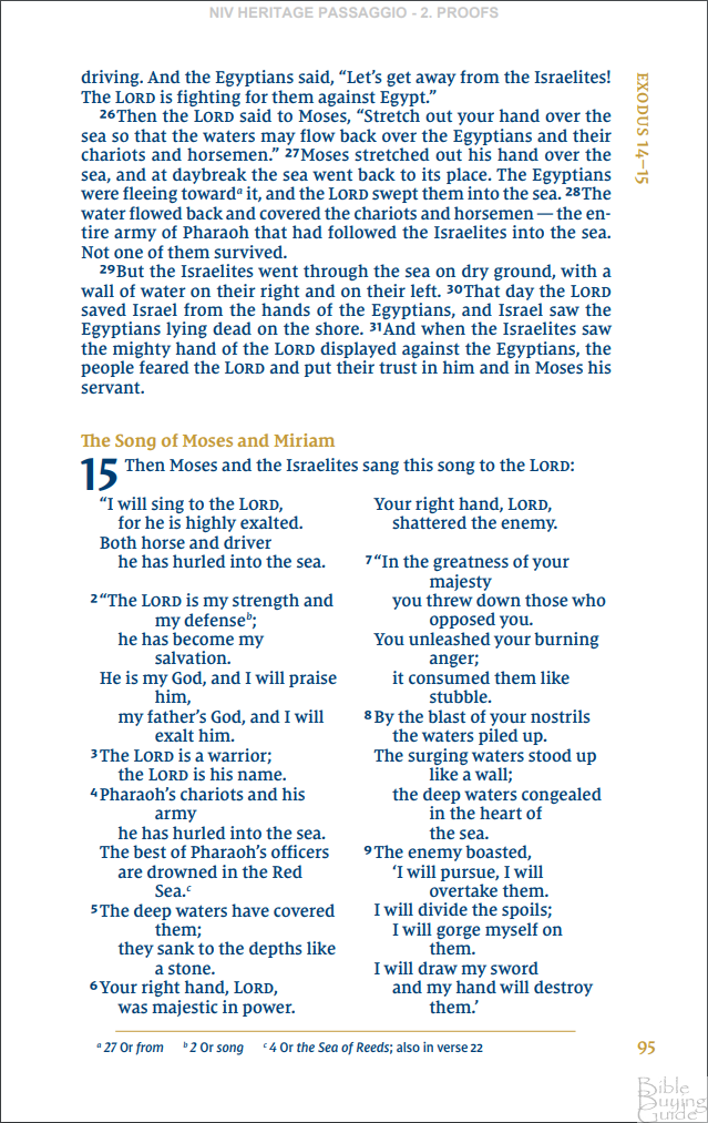
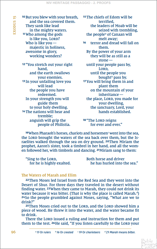
As to the prose, note how the first page of the sample begins with “..driving” – the last and lost word of a sentence begun on the previous page. In fact, the paragraph continues with two lines that belong to the paragraph begun in the previous page. and, at the end of the second sample page, the last words are “…to the LORD your..”, and “God” will be deferred to the next page. This sort of layout was inherited from mediaeval manuscripts and continued on the invention of printing, because of cost pressures; and we seem also to be stuck with the printing convention of a uniform block on every page. Almost all, if not all, prose in the Bible can be presented in discrete paragraph blocks, either verses run together or verse-by-verse, separated by larger spacing: and no paragraph need be run into the following page.
As to poetry, no poetic line, and certainly no poetic half-line, should be printed over two lines. To take the example in the first sample, to which you alluded : the English printing should follow the Hebrew division, and printed thus : line 1 – “he is my god…space…and I will praise him”; and line 2 – “my father’s god”…space…”and I will exalt him”. Proper layout also very much reduces the necessity of unnecessary punctuation, to make a less cluttered page.
[And I haven’t begun about cross-references, etc.! Please, publishers, give us a proper desk/study Bible with rational layout, proper spacing, less punctuation, translators’ notes, other necessary notes, and full cross-references!]