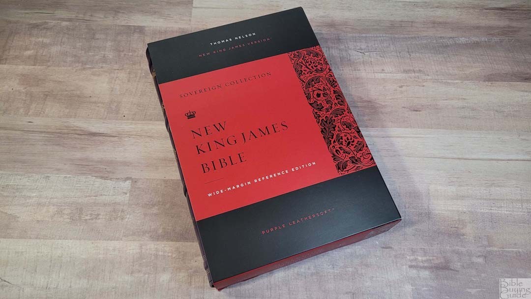
Thomas Nelson’s NKJV Wide Margin Sovereign adds wide margins to the NKJV Sovereign Collection, creating one of the most elegant verse-by-verse New King James Version wide-margin Bibles available. The design is similar to the KJV Wide Margin Sovereign, but like the regular NKJV Sovereign, it also has a few differences. The NKJV Wide Margin Sovereign is available in several covers. In this review, I’m looking at purple Leathersoft, ISBN 9780785294870, printed in India.
Thomas Nelson provided this Bible in exchange for an honest review. I was not required to give a positive review, only an honest one. All opinions are my own.
_________________________________________________________
This Bible is available at (includes some affiliate links)
and many local Bible bookstores
_________________________________________________________
Table of Contents
- Video Review
- Binding
- Paper
- Typography and Layout
- References
- Book Introductions
- Concordance
- Maps
- Comparisons
- Conclusion
NKJV Wide Margin Sovereign Video Review
NKJV Wide Margin Sovereign Binding
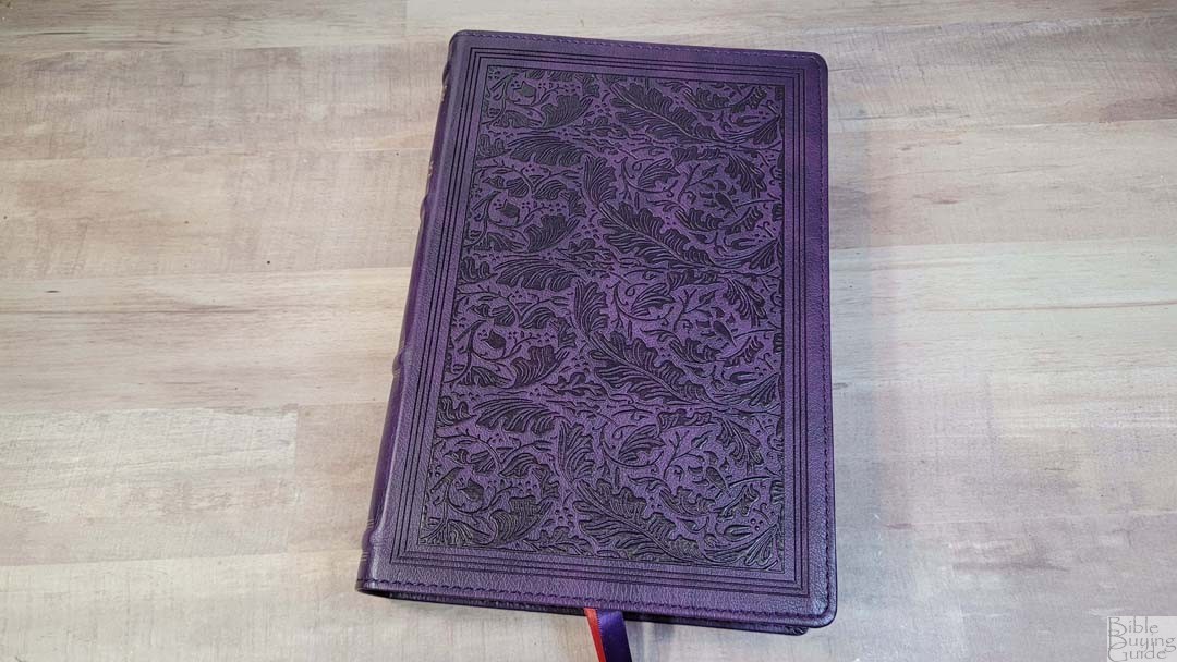
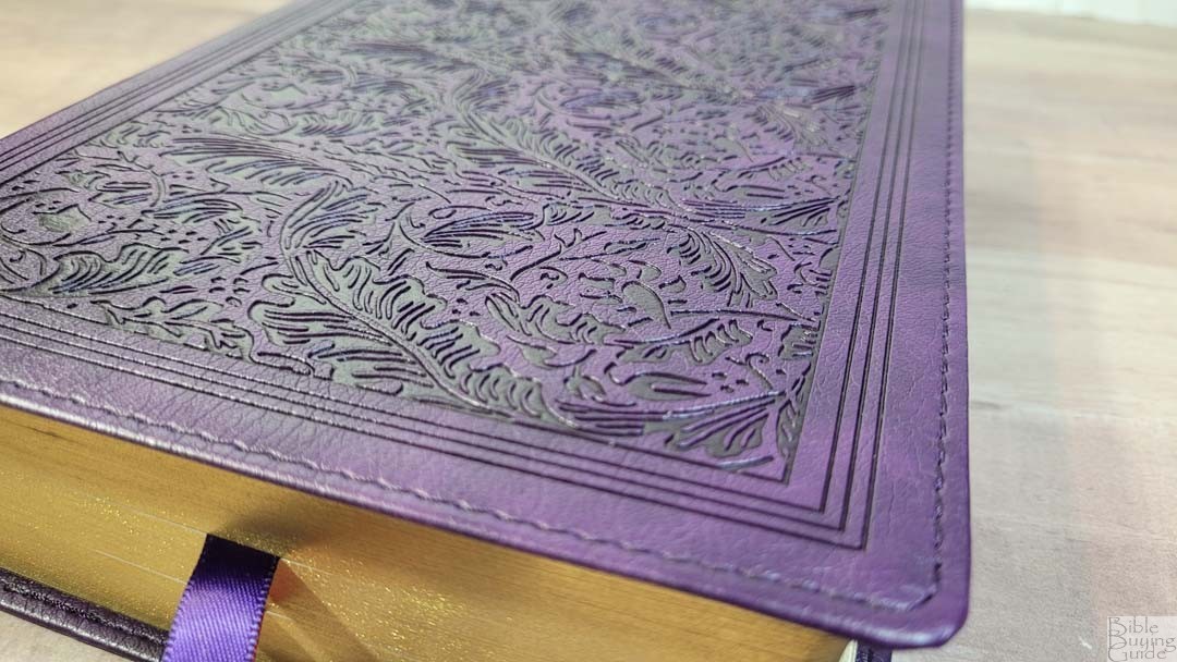
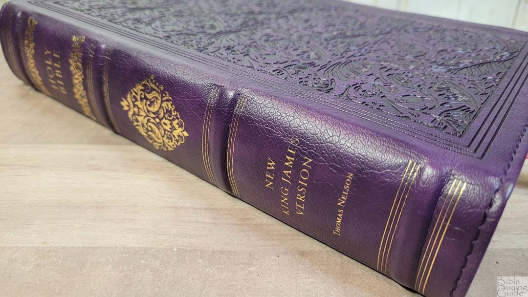
The NKJV Wide Margin Sovereign is available in genuine leather and Leathersoft. I’m reviewing the purple Leathersoft. The purple is dark and it has a grain that looks like real leather. A fancy floral design inside a frame is debossed onto the front and back. It includes perimeter stitching. The spine includes 4 thick raised hubs with gold lines printed on both sides of each hub. It also includes a fancy decoration above and below Holy Bible and a diamond decoration in the center in gold.
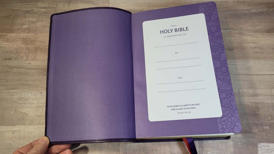
It includes a purple paste-down paper liner that doubles as the presentation page. The back end sheet has a floral decoration down the outer edge. The text block is sewn, but the cover is stiff so it will need to be broken in before it will stay open at the beginning of Genesis. It has minor cockling.
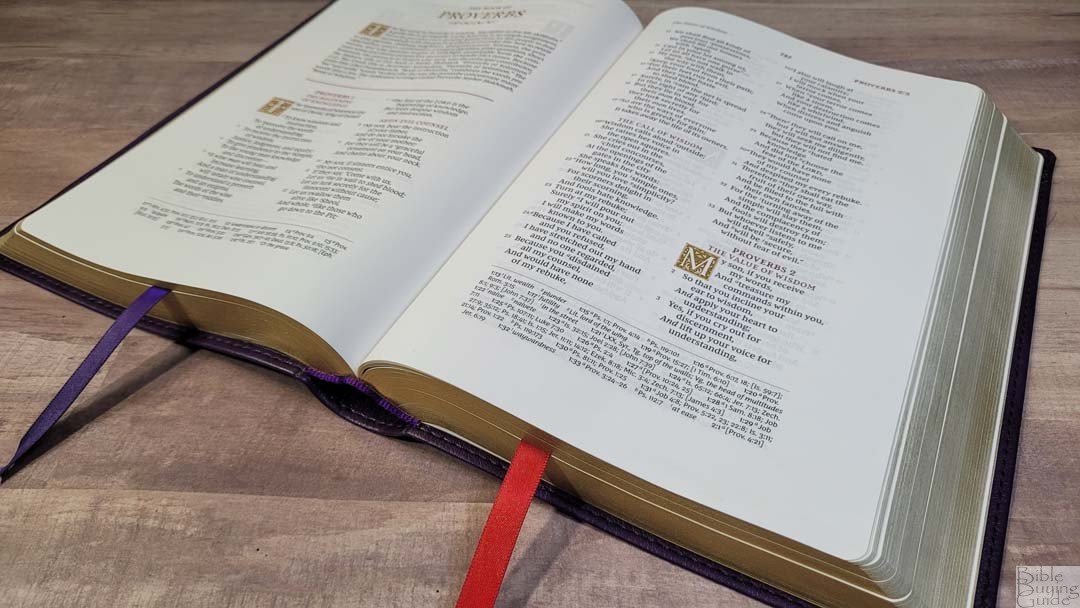
It has purple head/tail bands and two thick double-sided ribbons: 1 purple and 1 red. The purple ribbon in my review copy is cut abnormally, but I’m sure this isn’t the norm for this series. The overall size is 6 3/4 x 9 5/8 x 1 3/4″ and it weighs 2 lbs, 15.2 oz.
Paper
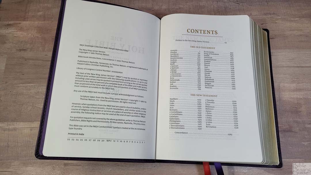
The paper is 39gsm. It’s white with a slight eggshell tint and it’s highly opaque. It has a rough texture that makes the pages easy to turn. It has no glare under direct light. I prefer this paper to the regular edition.
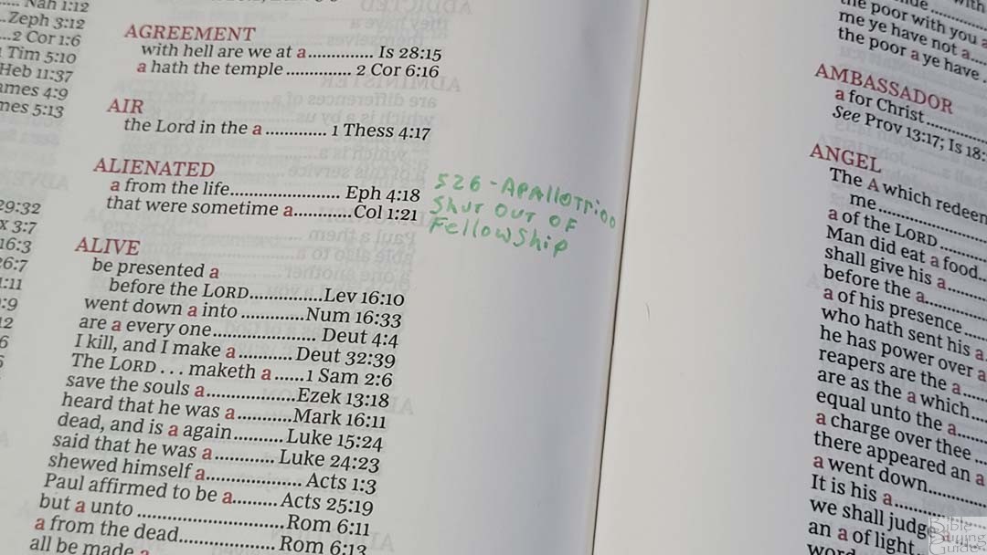
This is good paper for note-taking. I haven’t written in this edition (Lucinda claimed it, so I’ll let her write in it when she’s ready), but it has the same paper as the KJV which I did add notes using a Pigma Micron. The show-through is noticeable but this is normal.
NKJV Wide Margin Sovereign Typography and Layout
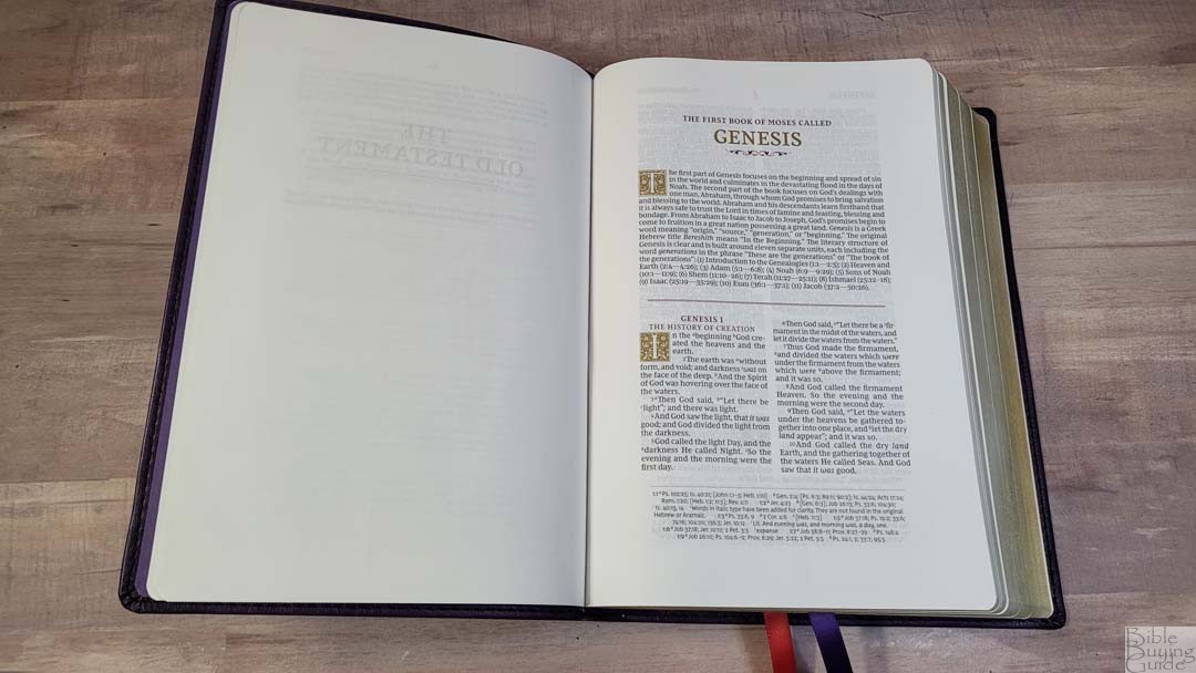
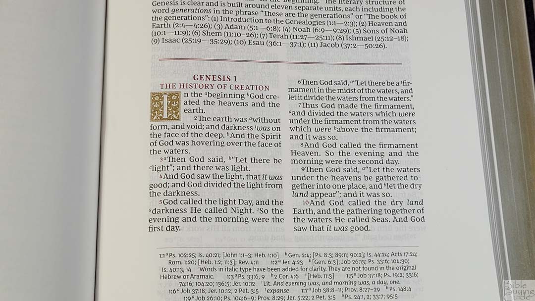
The layout in the NKJV Sovereign Collection mostly follows the KJV Sovereign. Unlike the KJV Wide Margin Sovereign, it includes the standard double-column layout for Psalms and Proverbs instead of a single-column. The text is presented in a double-column, verse-by-verse format with poetry set in stanzas. Cross-references and footnotes are placed in a single column across the footer. The header shows the book name, chapter, and verse number in the outer margin, the page number in the center, and a page summary in the inner margin. The book name in the header, chapter title, verse numbers, and section headings are in red. Decorative drop-caps are printed in gold and take four lines. Books start on a new page. Italics are used for supplied words. Personal letters are indented.
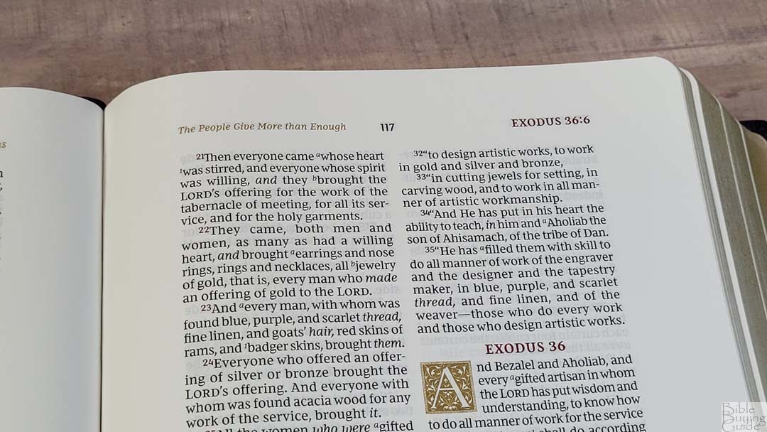
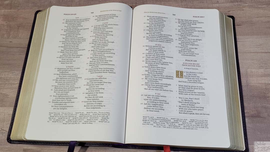
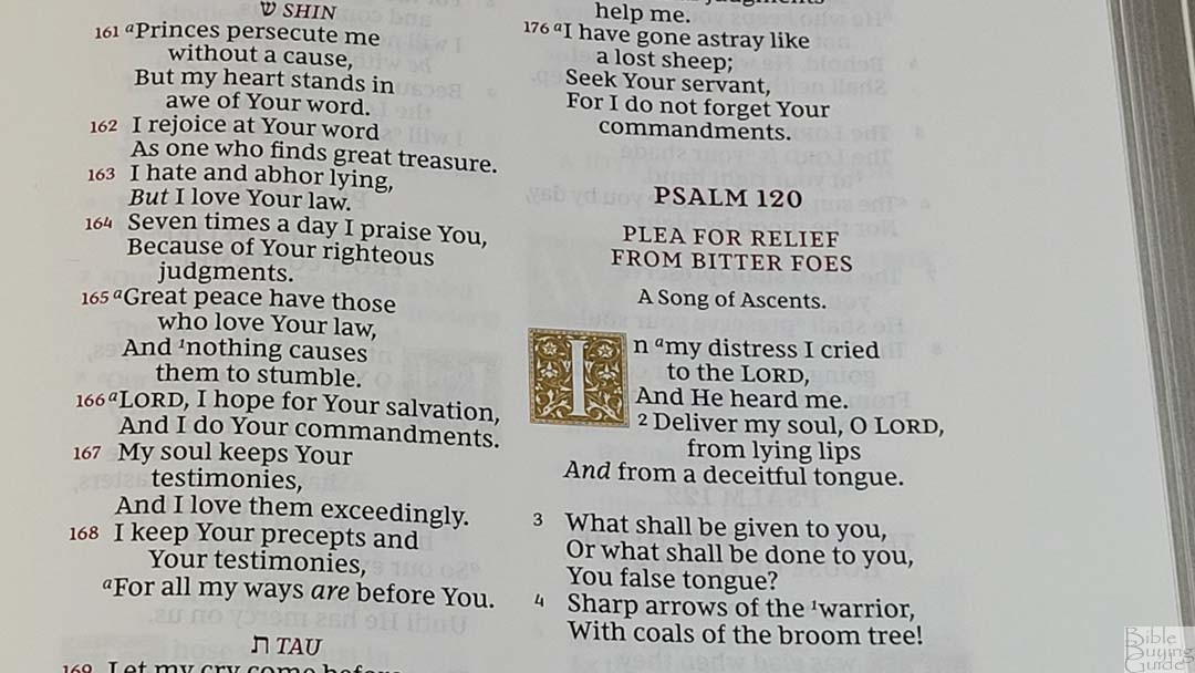
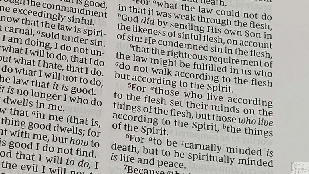
The font is a 9-point Comfort Print designed for the Thomas Nelson NKJV by 2K/Denmark. This is a red-letter edition. The black and red are dark and consistent throughout. It’s printed with line-matching so the lines of text are printed in the same location on both sides of the page to improve readability. Paragraphs are marked with bold verse numbers. It has between 6-8 words per line. Several pages have verse numbers that either touch or overlap the text. They’re still readable, but it doesn’t look good.
Wide Margins
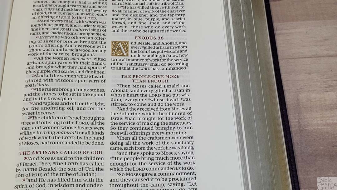
The margins are 1 inch on the sides, 7/8″ on the bottom, and 5/8″ on the top. The 1″ of the inner margin is usable. It looks to have extra space in the inner margin to give the page the right balance. This size is excellent for those that just want to add some notes but don’t need extensive notes. I like this because it doesn’t make the notes the main focus of the page and I don’t feel like I’m carrying around empty space that I won’t use. Books start on a new page, so this also provides some writing space.
NKJV Wide Margin Sovereign References and Footnotes
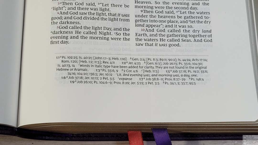
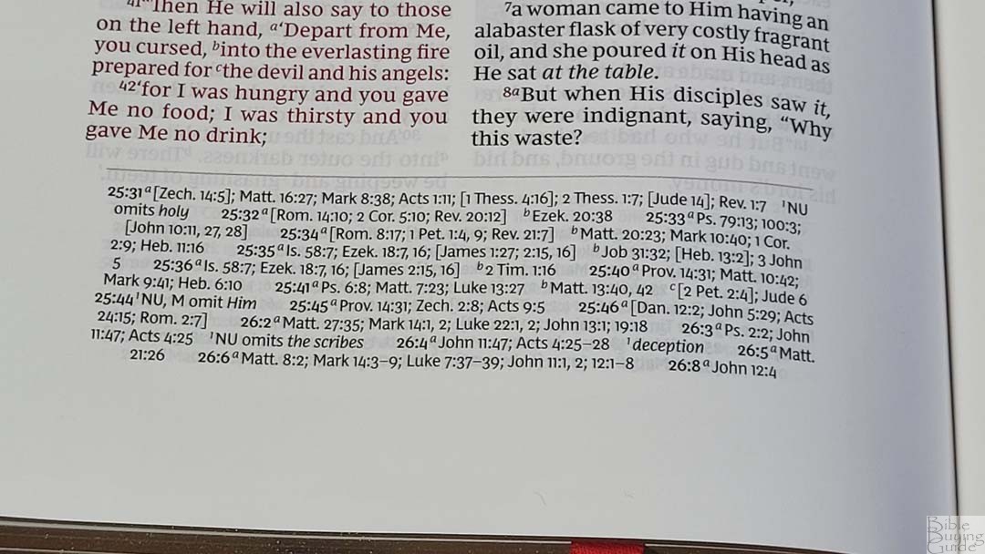
Cross-references and footnotes are placed in a single column in the footer. They include the chapter and verse numbers they correspond to and the callers to identify them. It’s all printed in black text. This does make them a little difficult to find quickly, but they do have space between the references and the next verse which helps a lot. The footnotes are the standard full set of NKJV translation footnotes, which provide manuscript variations and identify the manuscripts.
Here are some example references to help you compare:
- Genesis 1:1 – Ps 102:25; Is 40:21; Jn 1:1-3; Heb 1:10; Gen 2:4; Ps 8:3; 89:11; 90:2; Is 44:24; Acts 17:24; Rom 1:20; Heb 1:2; 11:3; Rev 4:11
- Deuteronomy 6:4 – Deut 4:35; Mark 12:29; John 17:3; 1 Cor 8:4, 6
- Isaiah 9:6 – Isa 7:14; Luke 2:11; John 1:45; Luke 2:7; John 3:16; 1 John 4:9; Matt 28:18; 1 Cor 15:25; Rev 12:5; Judg 13:18; Titus 2:13; Eph 2:14
- Matthew 28:19 – Mk 16:15; Is 52:10; Lk 24:47; Acts 2:38, 39; Rom 10:18; Col 1:23
- Mark 12:29 – Deut 6:4, 5; Is 44:8; 45:22; 46:9; 1 Cor 8:6
- John 1:1 – Gen 1:1; Col 1:17; 1 John 1:1; John 1:14; Rev 19:13; John 17:5; 1 John 1:2; 5:20
- John 3:16 – Rom 5:8; Eph 2:4; 2 Thes 2:16; 1 Jn 4:9, 10; Rev 1:5; Isa 9:6
- Acts 2:38 – Luke 24:47
- Romans 10:9 – Mt 10:32; Lk 12:8; Ac 8:37; Rom 14:9; 1 Cor 12:3; Phil 2:11
- 1 John 1:1 – John 1:1; 1 John 2:13, 14; Luke 1:2; John 1:14; 2 Pet 1:16; Luke 24:39; John 2:27; John 1:1, 4, 14
Book Introductions
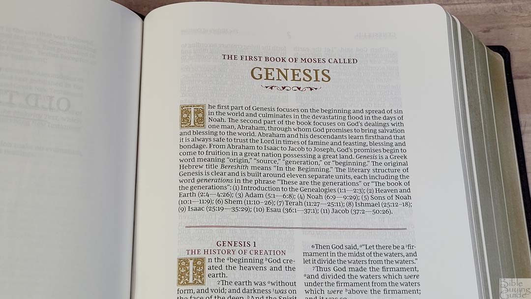
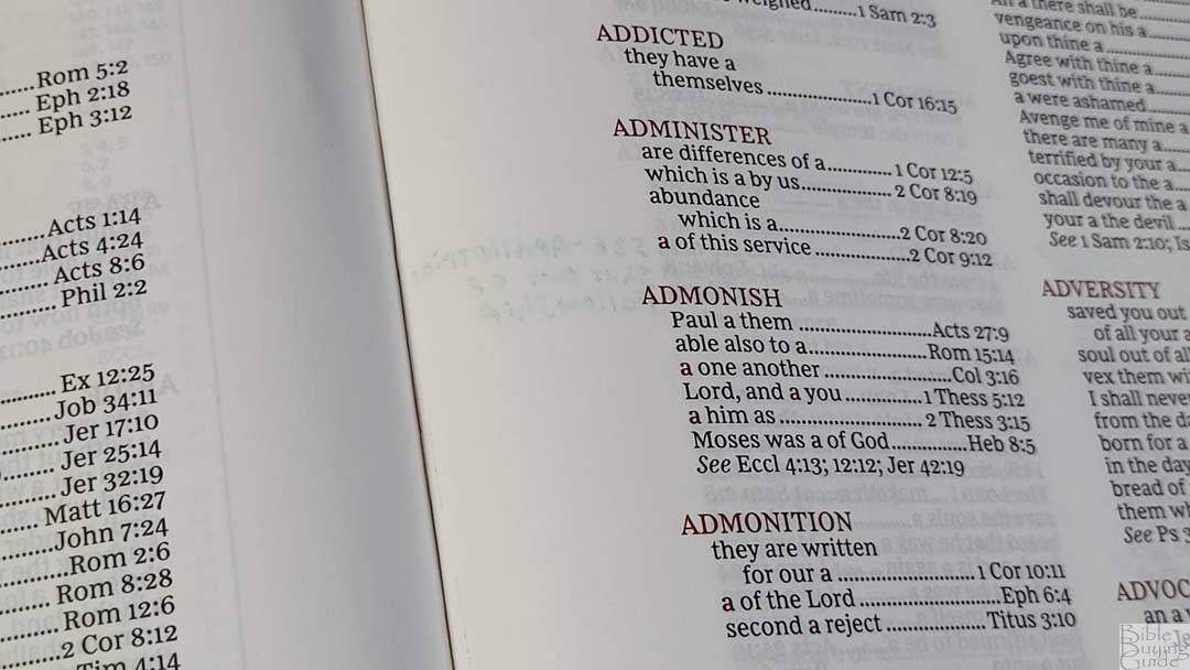
Each book has a 2-3 paragraph introduction. They include an overview and discuss the main characters, and provide insights into the book’s name in Greek. Some have a sentence about the author or other features of the book. Book introductions are simple but they’re informative. The decorative drop cap is gold.
Concordance
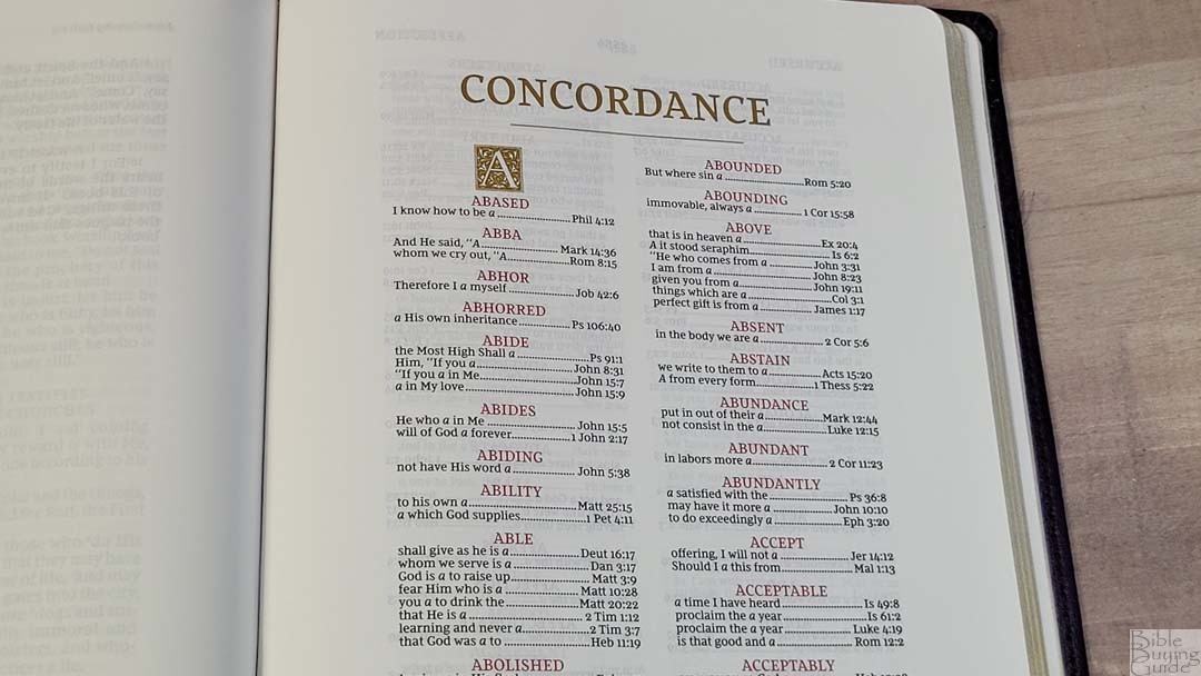
The concordance is 104 pages and it has 2 columns per page. The letter uses the gold drop cap and the entries are in red. This is about a medium-sized concordance which is enough entries for basic study. It’s not ideal for extensive study or sermon prep.
Here are some example entries and the number of references they provide:
- Christ – 13
- Christian – 1
- Christian(s) – 1
- Christs – 1
- Faith – 40
- Faithful – 20
- Faithfulness – 5
- Faithless – 2
- God – 38
- Goddess – 2
- Godhead – 2
- Godliness – 4
- Godly – 3
- Gods – 5
- Praise – 25
- Praised – 4
- Praises – 2
- Praiseworthy – 1
- Praising – 3
- Pray – 14
- Prayed – 2
- Prayer – 16
- Prayers – 5
Maps
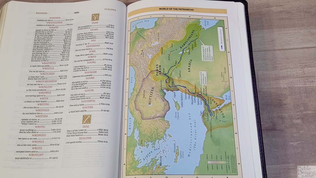
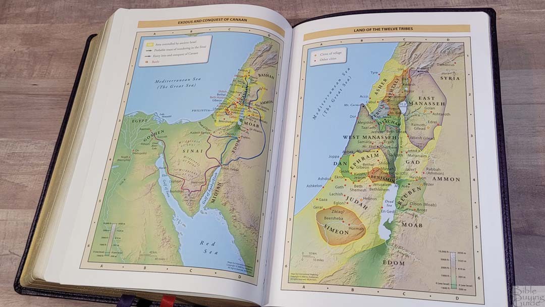
In the back are 7 full-color maps on 8 thick, semi-glossy pages. These are the standard Zondervan maps that Thomas Nelson uses. The maps do not include an index, but they are annotated well. They include distance, elevation, topography, ancient cities, journeys, battles, events, dates, and Scripture references. They’re bright and colorful without being cartoonish.
Maps include:
- World of the Patriarchs
- Exodus and Conquest of Canaan
- Land of the Twelve Tribes
- Kingdom of David and Solomon
- Jesus’ Ministry
- Paul’s Missionary Journeys
- Jerusalem in the Time of Jesus
NKJV Wide Margin Sovereign Comparisons
Here’s how the Sovereign Collection compares with the KJV Sovereign Series, the NKJV Maclaren, and the Single Column Reference Bible.
NKJV Sovereign Collection
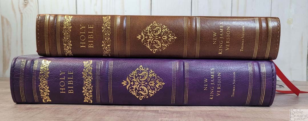
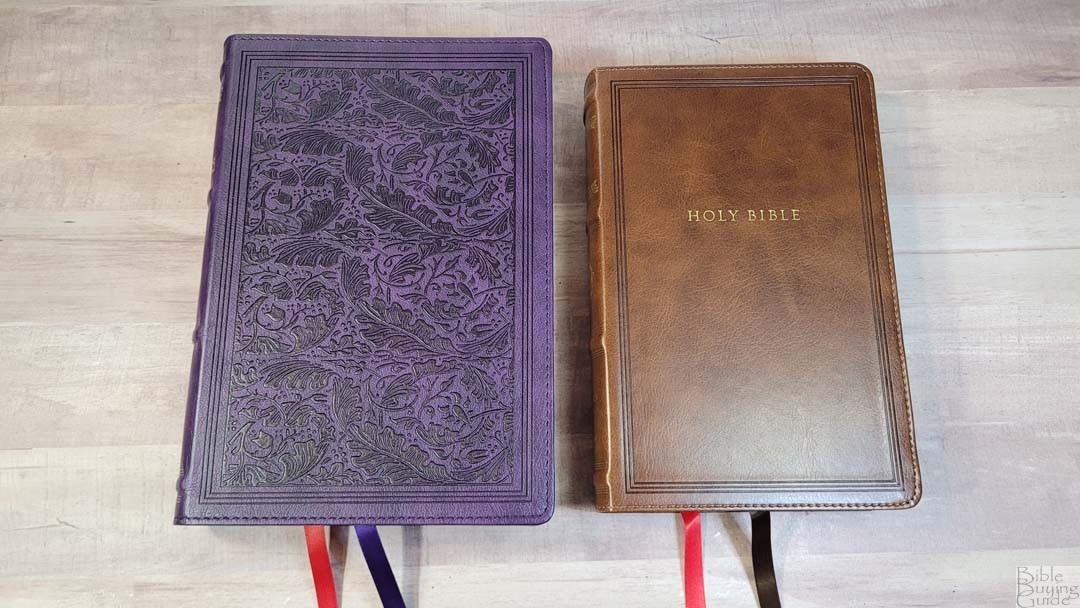
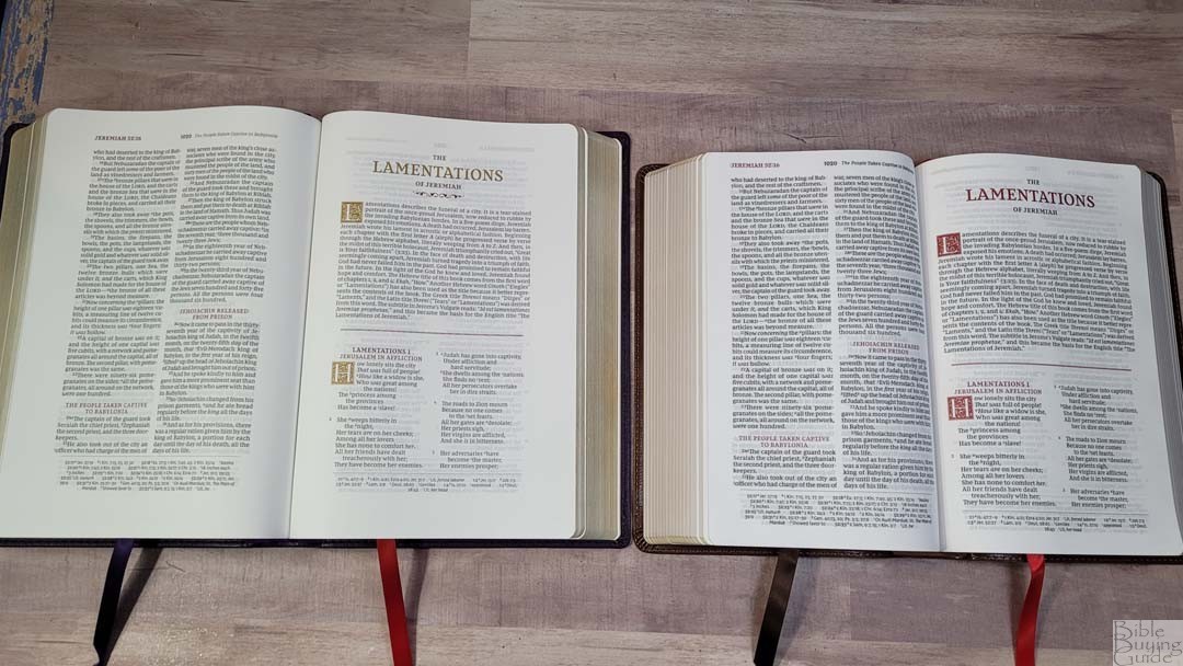
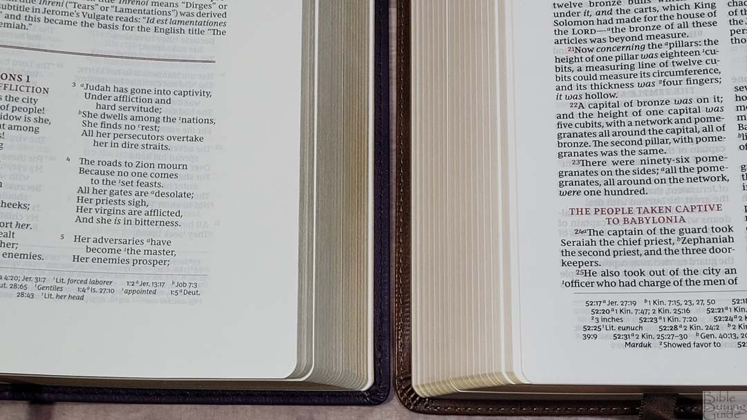
The NKJV Sovereign Collection is the design this NKJV series is based on. It includes the same layout and all the same tools, just with red highlights and no wide margins. The font is 9.5, so it is .5 larger and it’s slightly darker. The paper seems to be the same thickness, but it’s slightly whiter and less opaque. This is probably due to the darker font.
NKJV Large Print Wide Margin
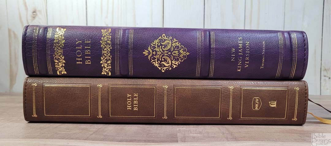
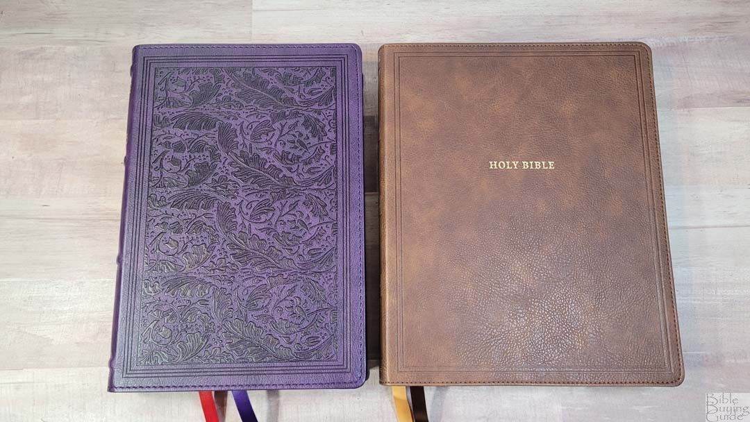
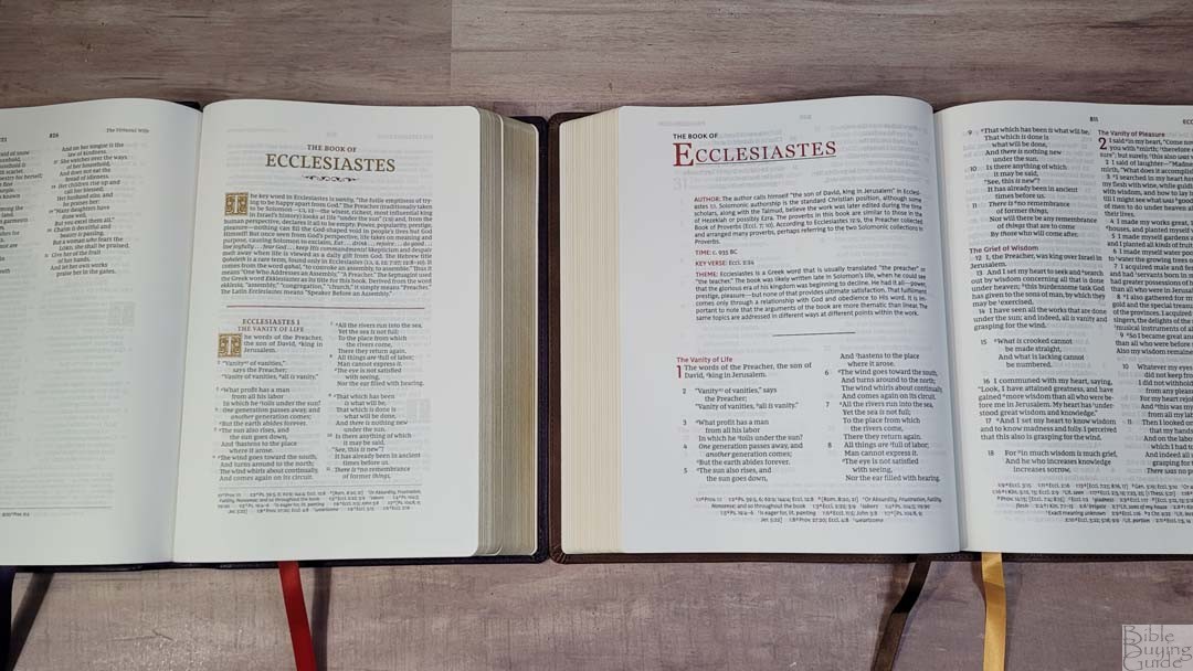
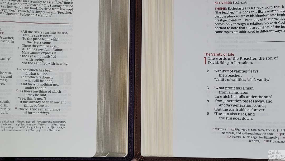
Thomas Nelson’s NKJV Large Print Wide Margin has a wider footprint and a larger font. It also has a double-column v-b-v layout but doesn’t include decorative drop caps. It has different book introductions, the same cross-references, and a larger concordance. The paper feels slightly thicker to my fingers and it’s a touch more opaque. Its wide margins are only in the outer margin, so it doesn’t have as much writing room.
Cambridge Wide Margin Reference Bible
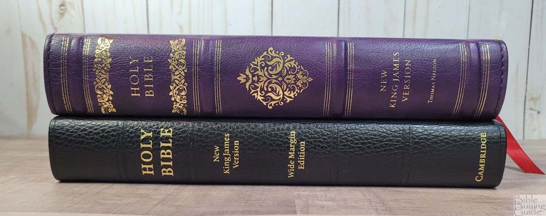
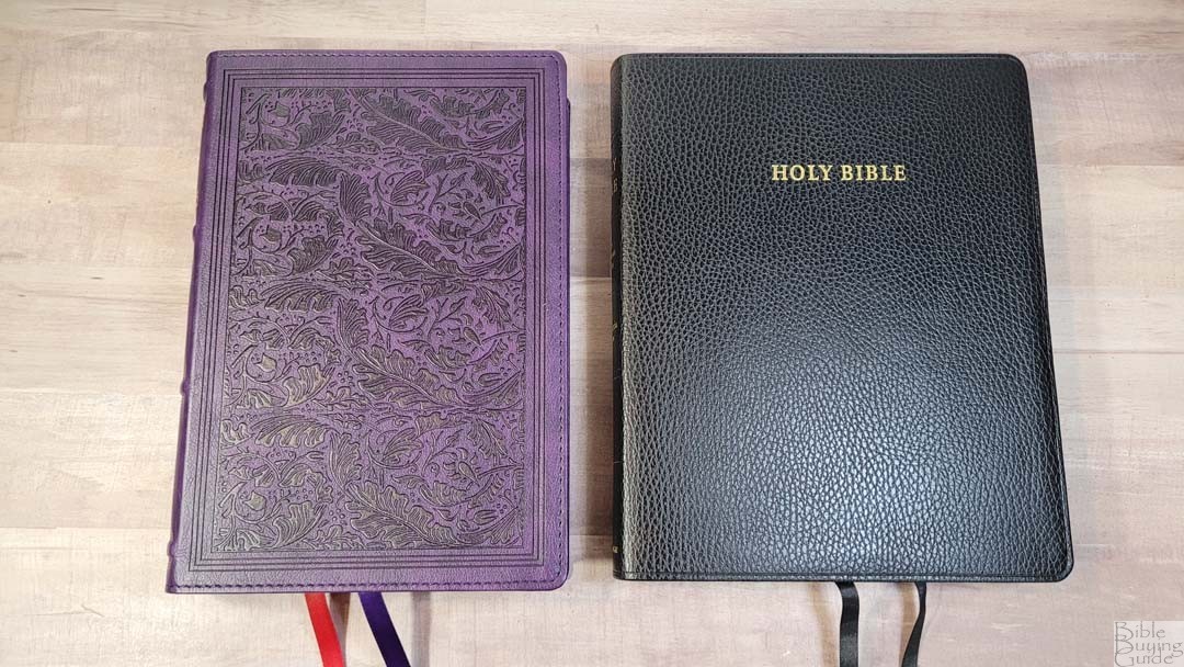
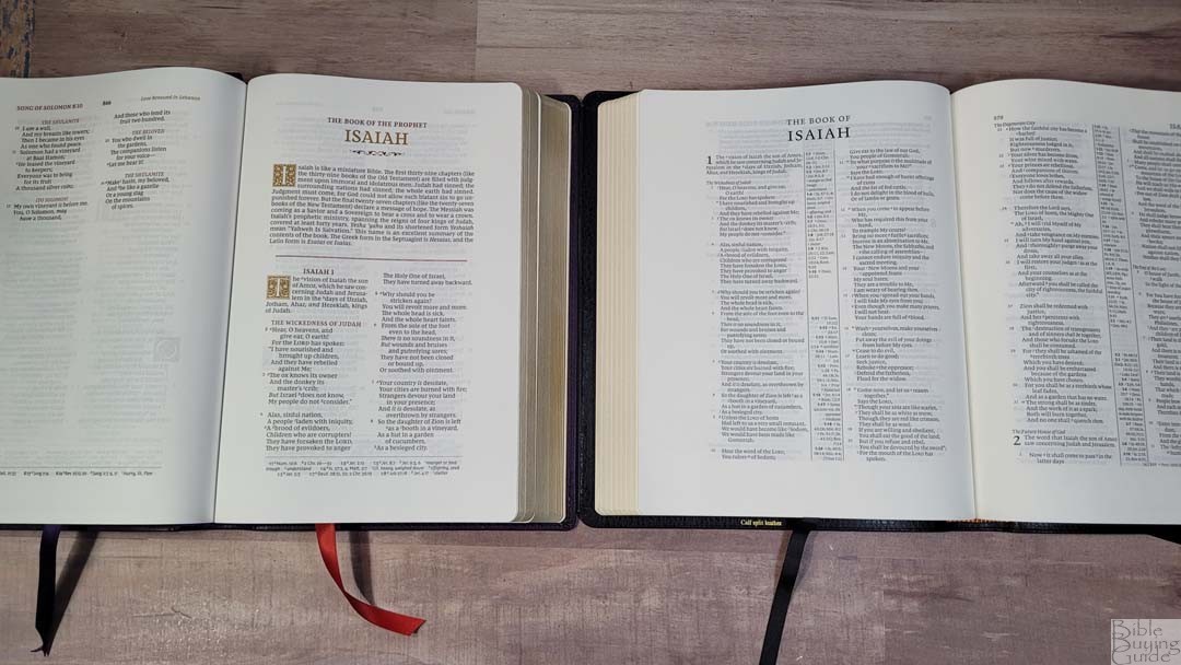
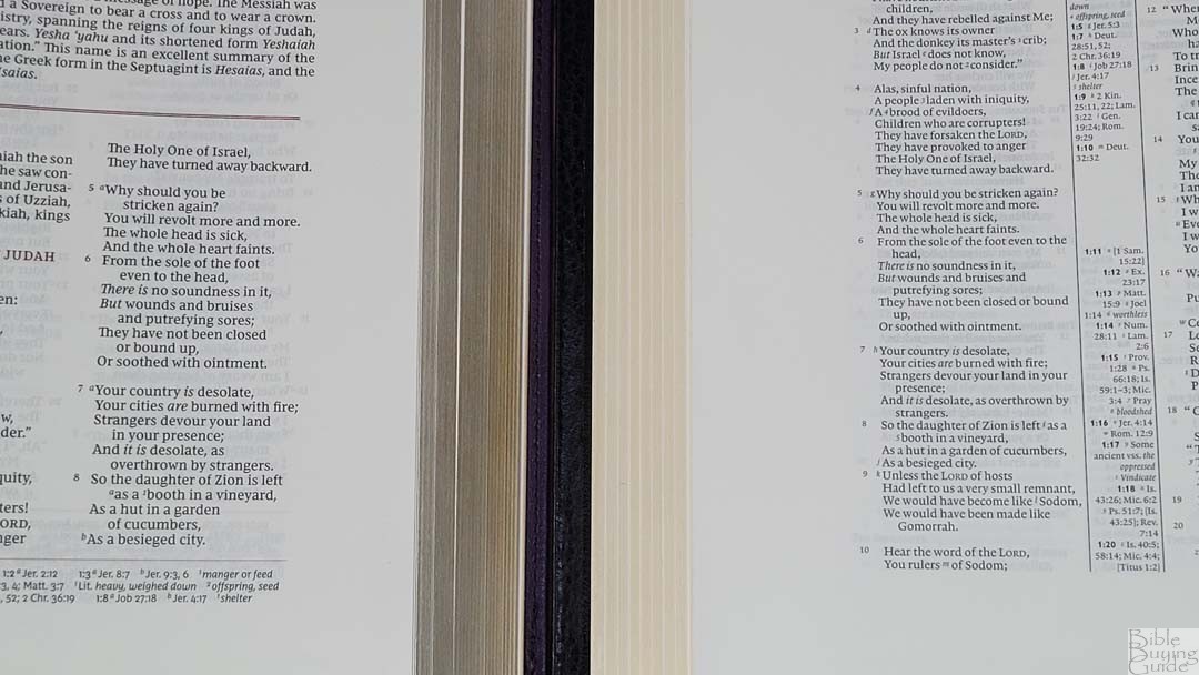
The Cambridge Wide Margin NKJV is a version of the Pitt Minion. It’s in a different price category and its materials reflect that. It has a 7.8 font in paragraph format, 38gsm paper, ruled notebook paper in the back, and pages for an index to notes. The spine is thinner but it has a wider footprint.
NKJV Wide Margin Sovereign Conclusion
The Thomas Nelson NKJV Wide Margin Sovereign is an excellent wide-margin NKJV. The size feels balanced, so it’s great for almost any use. The imitation leather cover will take some time to break, but it’s also available in genuine leather. The paper and print are of excellent quality. The design follows the KJV Wide Margin Sovereign with the red and gold highlights and decorative drop caps, but it follows the traditional v-b-v NKJV setting rather than the single-column Psalms and Proverbs that the KJV edition uses. Its references, full set of footnotes, book introductions, maps, and concordance are great for study. Anyone looking for a wide-margin NKJV at a good price would like the Thomas Nelson Wide Margin Sovereign.
_________________________________________________________
This Bible is available at (includes some affiliate links)
and many local Bible bookstores
_________________________________________________________
Thomas Nelson provided these Bibles in exchange for an honest review. I was not required to give a positive review, only an honest one. All opinions are my own.




Thank you Randy for your hard work, I have been waiting for years for a decent wide margin NKJV to come out and thought this was it. Upon receiving my genuine leather edition and looking it over, I was very disappointed. First the good points. The size is great and the 9 point black font is highly readable. Sadly, it goes downhill from there. The overall quality control of my Bible is very poor. The color of the red letters is the most inconsistent I have seen in a red letter Bible. Some print is so light it is unpleasant to read while other letters are a nice dark Crimson color. The difference is striking on many pages. In my Bible on pages 1368 and 1369 some words are raised 1/2 a line above words next to them, almost touching words in the line above, This occurs elsewhere as well. Some pages are wrinkled, especially in the center as you mentioned. On 30 or so pages a bit of the art gild showed up on the pages. Maybe the one I received is an anomaly. I have seen prices drop on these though, shortly after they came on the market, Thanks again. I love your site! God Bless.
I ordered this bible from thomas nelson and i had issues with the spine bulging out. not sure if the glue came loose or if it was glued at all. got a replacement and had same issue. did you have any issues with the spine.
Hi Casey. This is the first I’ve heard of issues with the spine, but I’ve only seen the Leathersoft for this one. Which cover did you get? Thanks for letting me know. I recommend contacting them again.
Thanks Randy for all your reviews. I contacted Thomas Nelson about all the egregious typographical errors in this bible and they said, “it is within the manufacturing variance standards,” and “they have a margin of error that they can stay in before its considered a defect and this is still inside those margins.” Maybe this is acceptable to them, but not for me and many other people. How does the regular size NKJV Sovereign compare?
Does it have the same problem with verse numbers overlapping?
Does it have misaligned text, for example, at Matthew 13:31 and 13:51?
Does it have verse numbers clearly below the line in chapter 14?
Hi Ethan. The regular NKJV Sovereign doesn’t have overlapping or misaligned verse numbers. Acts 8 and 9, and Hebrews 3 have a few verse numbers that are closer to the text than normal, but they don’t overlap. I haven’t noticed any others.