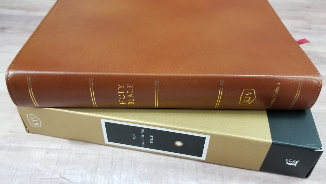
The KJV Preaching Bible is Thomas Nelson’s KJV entry into the preaching Bible arena. It competes with other preaching Bible designs such as single-column verse-by-verse with a wide outer margin, a single-column paragraph with a small margin, the standard double-column verse-by-verse, text-only with no distractions, etc. This one stands apart from other KJV’s with its thick paper and highlighted verse numbers. It comes in black or mahogany calfskin. I’m reviewing both editions, but in this review, I’m looking at the KJV Preaching Bible in brown calfskin, ISBN: 9780785222835, made in China.
Thomas Nelson provided this Bible in exchange for an honest review. I was not required to give a positive review, only an honest one. All opinions are my own.
_________________________________________________________
This Bible is available at (includes some affiliate links)
and many local Bible bookstores
_________________________________________________________
Video
Cover and Binding
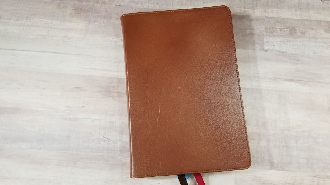
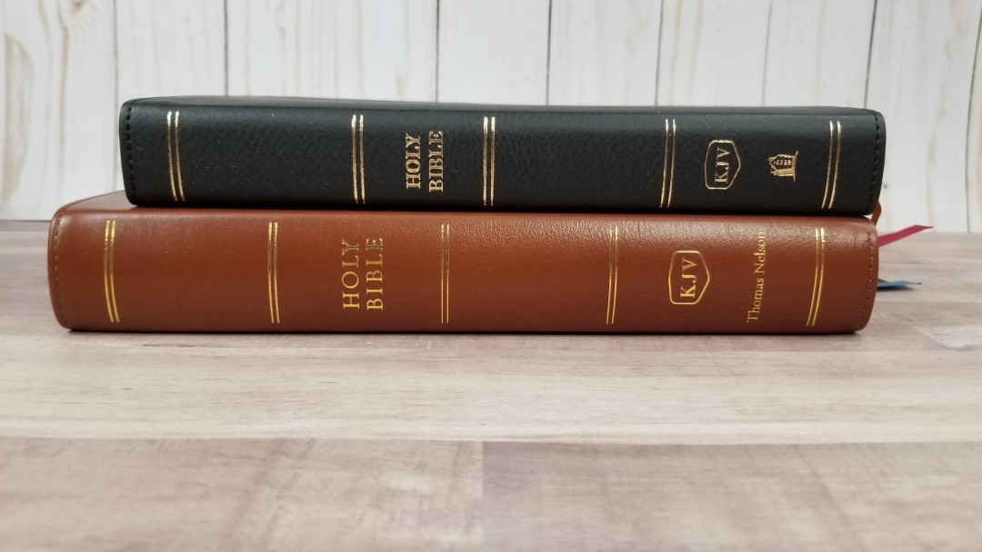
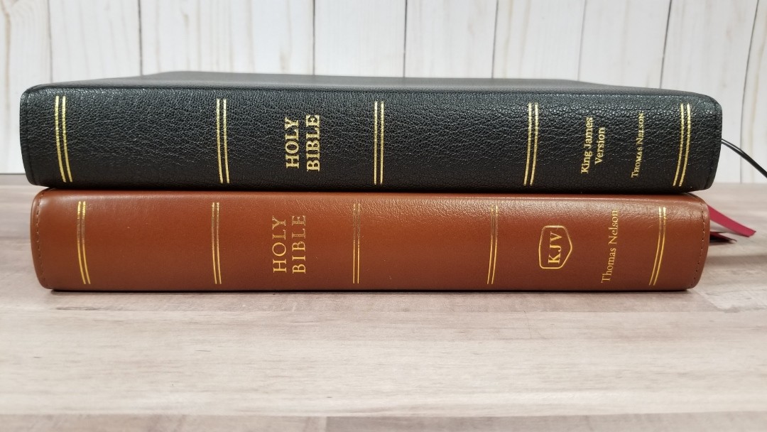
The cover is brown calfskin. It’s soft to the touch and has an almost smooth grain that looks and feels elegant. It isn’t overly floppy, but it’s floppy enough to bend a little as you hold it. It has perimeter stitching. Nothing is printed on the front. The spine includes HOLY BIBLE, KJV, Thomas Nelson, and 5 non-raised spine rib indications printed in gold.
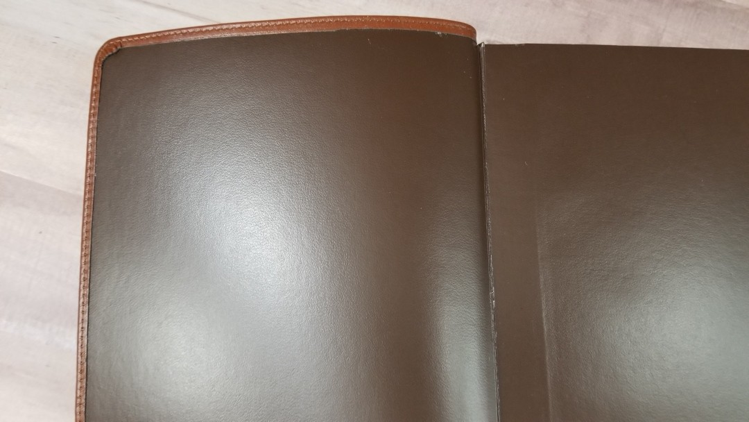
It has a brown edge-lined synthetic liner that feels like real leather. It’s Smyth sewn. Mine stayed open in Genesis just after a couple of uses. The pages do come close to the folded-over leather in the liner, but I haven’t had any issues with the paper catching on the leather.
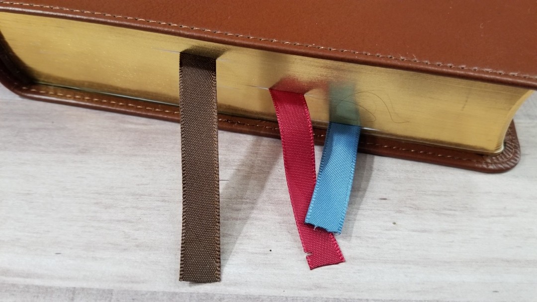
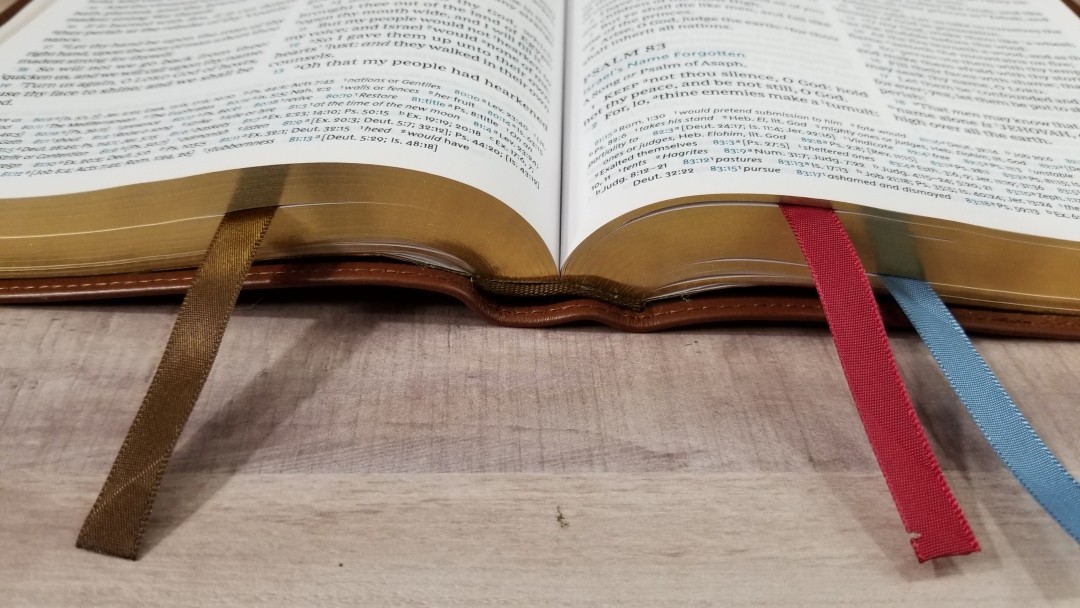
It includes 3 satin ribbons in brown, red, and blue. It weighs 2lbs, 8oz. The overall size is 6.75 x 9.75 x 1.5″. I think this is a good size and weight for carry.
Paper
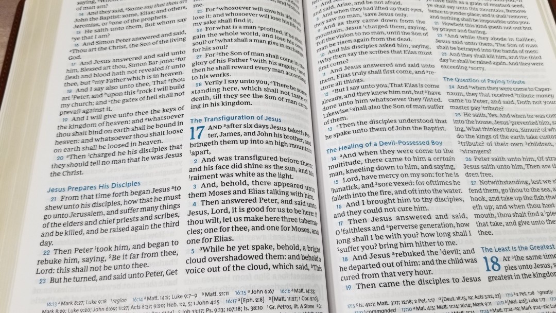
The paper is 36gsm (it was originally reported as 39, and it does feel thicker than the 36gsm of the Premier Collection). This is a premium paper. It’s white in color and it’s extremely opaque. The slightly rough texture makes it easy to turn pages. The edges are gold gilt. I like this paper for reading and preaching. It would also be great for highlighting. Unlike the NKJV Preaching Bible, this one doesn’t have any pages in the back for notes. It would be awesome if they could add a few pages since there isn’t much room for notes in the text.
Typography
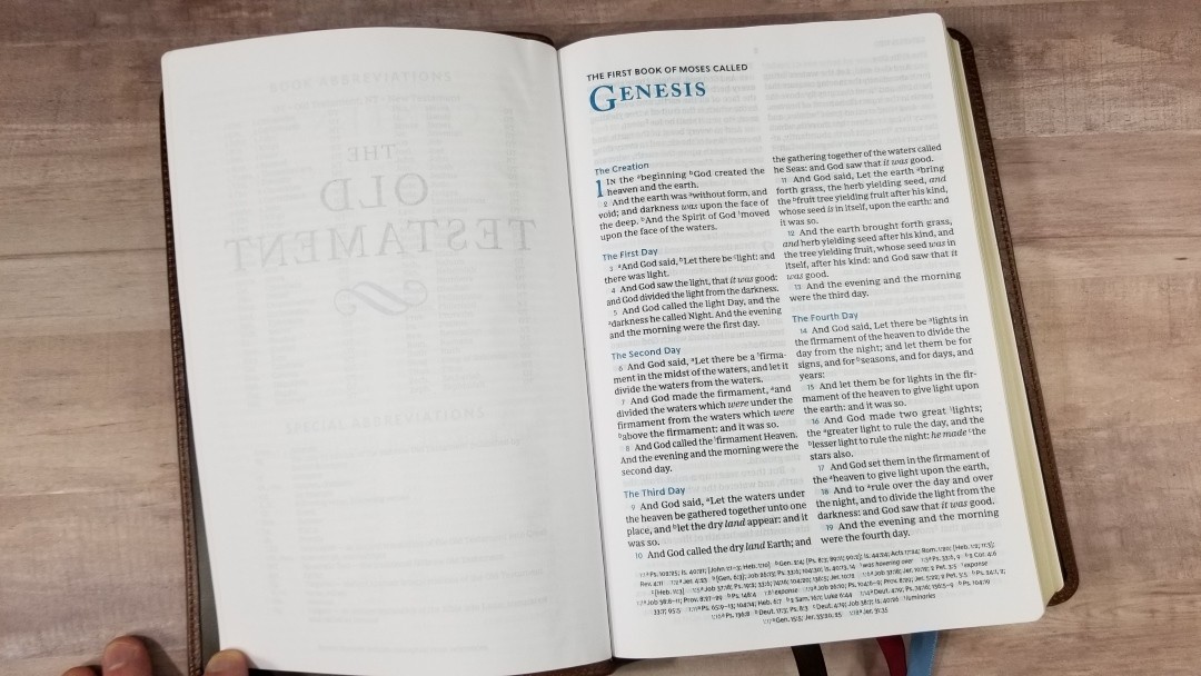
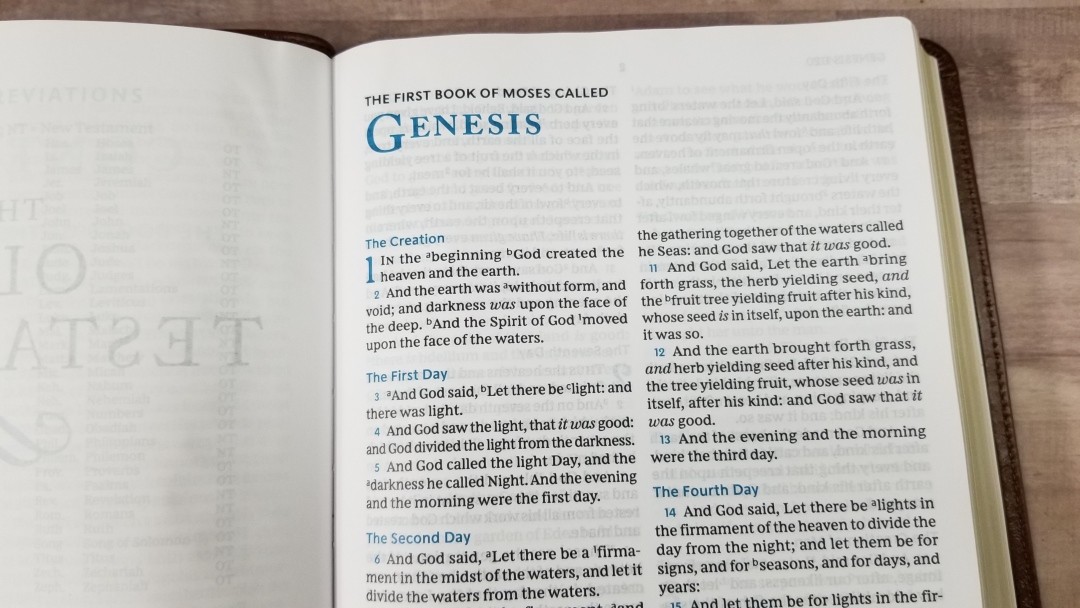
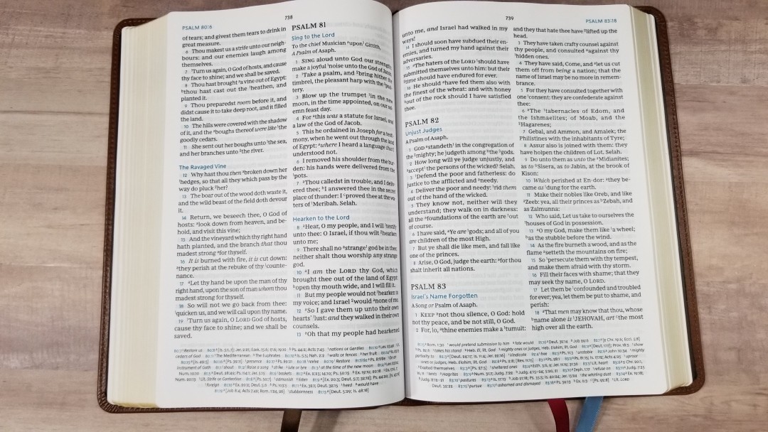
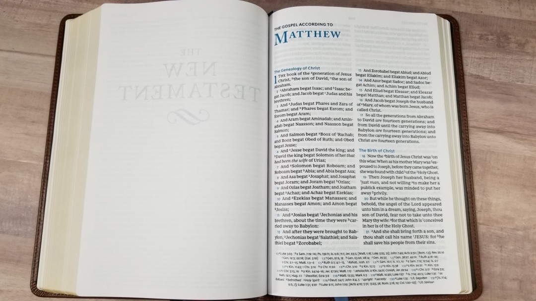
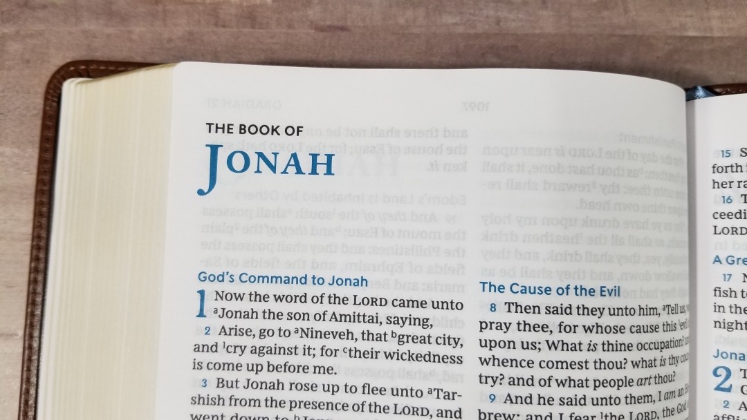
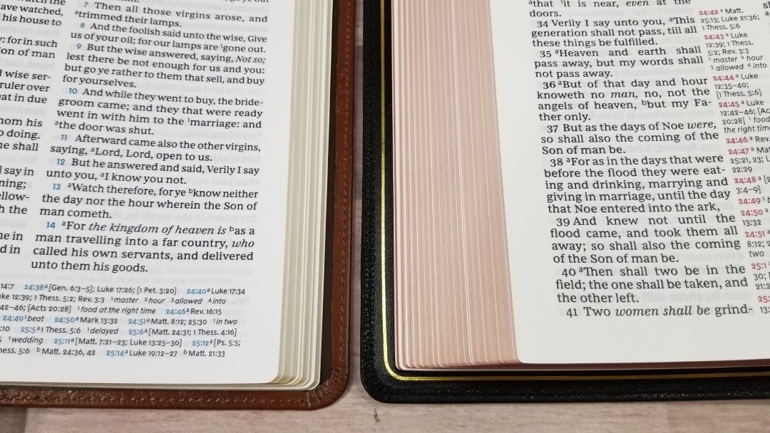
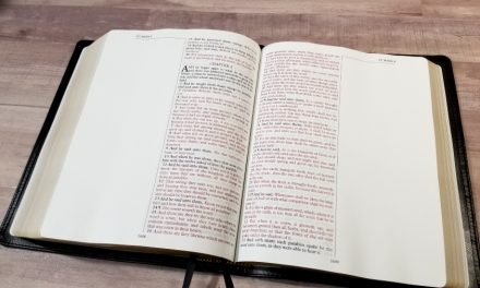
The text is presented in the traditional two-column verse-by-verse layout with no additional formatting. The header includes the page number in the center and the book name and reference in the outer margin. The footer contains the cross-references and footnotes in a single column. The header, footer, section headings, and chapter and verse numbers are in blue.
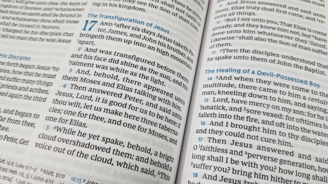
The font is 11.5 Comfort Print, designed by 2K/Denmark. To my eye, it looks slightly smaller than this when compared to other editions, but it’s still a large print and it’s great for reading from the pulpit. The text is black-letter and it’s dark and highly consistent throughout. I have no trouble reading this in poor lighting.
The point of this being a preaching Bible, even though it follows close to the traditional KJV design, is to place the text in a setting that easy to navigate quickly and get the cross-references out of the way of the text. It’s still the traditional verse-by-verse setting, but the verses have been indented and the verse numbers are printed in blue so they stand out. Unlike the NKJV Preaching Bible, the KJV uses upper-case letters at the beginning of a verse, even if it continues a sentence. I’d love to see this with the poetic setting of the NKJV Preaching Bible.
It averages between 8-10 words per line, which is excellent for preaching. The text is line-matched and the lines match perfectly throughout the Bible. Since the paper has a high opacity, the lines behind the text are white, which keeps the text from looking gray.
Placing verses and footnotes in the footer gets them out of the way of the text, so the text doesn’t look as crowded. Of course, this takes an extra step to find them. That’s usually not a problem for me most of the time, but I do sometimes use the glossary in the footnotes while preaching. They’re not that difficult to find and it actually keeps me from becoming too distracted by them.
References and Footnotes
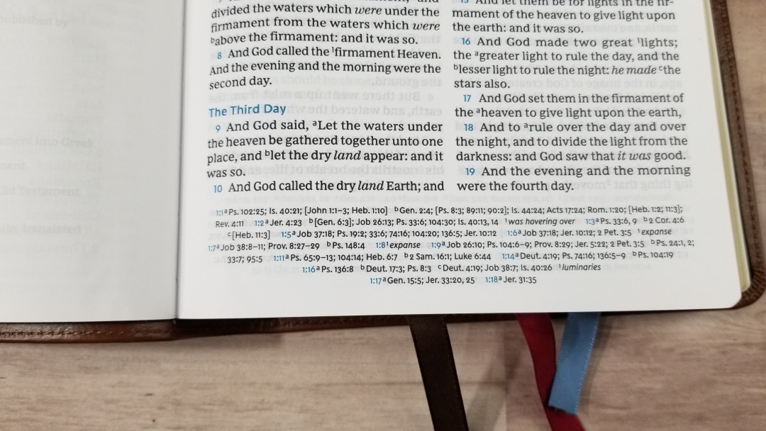
The 72,000 Cross-references and translator’s footnotes appear in the footer. This is a lot of references and they’re excellent for study or sermon prep. These are the same references used in the King James Study Bible. Here are a few examples to help you compare:
- Genesis 1:1 – Ps. 102:25; Is. 40:21; John 1:1-3; Heb. 1:10; Gen. 2:4; Ps. 8:3; 89:11; 90:2; Is. 44:24; Acts 17:24; Rom. 1:20; Heb. 1:2; 11:3; Rev. 4:11
- Deuteronomy 6:4 – Deut. 4:35; Mark 12:29; John 17:3; 1 Cor. 8:4,6
- Isaiah 9:6 – Is. 7:14; Luke 2:11; John 1:45; Luke 2:7; John 3:16; I John 4:9; Matt. 28:18; I Cor. 15:25; Rev 12:5; Judg. 13:18; Titus 2:13; Eph. 2:14;
- Matthew 17:20 – Matt. 21:21; Mark 11:23; Luke 17:6; I Cor. 12:9
- Mark 11:23 – Matt. 17:20; 21:21; Luke 17:6
- Mark 12:29 – Deut. 6:4, 5; Is 44:8; 45:22; 46:9; I Cor. 8:6
- John 1:1 – Gen 1:1; Col 1:17; 1 John 1:1; I John 1:14; Rev. 19:13; John 17:5; John 1:2; 1 John 5:20
- Acts 2:38 – Luke 24:47
- 1 John 1:1 – John 1:1; I John 2:13,14; Luke 1:2; John 1:14; 2 Pet. 1:16; Luke 24:39; John 20:27; John 1:1, 4, 14
The translation footnotes include a glossary supplied by Thomas Nelson. They provide modern equivalents to many of the archaic words right on the page where you need them.
Using it in the Pulpit
I love preaching from this Bible. The font size and darkness are perfect for me. The verse numbers and section headings are great for finding verses and the context quickly. The section headings helped me find the beginning of the context so I could read the passage rather than just a verse. It stayed open at the beginning of Genesis with no trouble.
The paper was easy to turn and the opacity and color are perfect to my eyes. The gold edges keep me from worrying about spitting as I preach (not that I spit that much, but my Canterbury and KJV Pitt Minion do have a few spots in the art-gilt).
I’ve preached a lot from both verse and paragraph settings. I like both and I see the advantages of each. My main concern is being able to find the verses. This is easy with the blue verse numbers. I’d love to see them in a paragraph layout. They would make the verses extra easy to find.
Comparisons
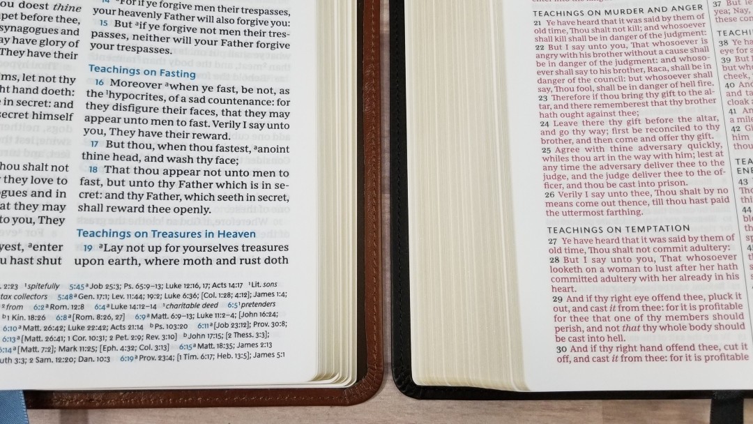
Here’s how the KJV Preaching Bible looks next to the Minister’s Bible and the Premier Collection Giant Print Reference KJV.
Ministers Bible
The Thomas Nelson Minister’s Bible was made for anyone that does any type of ministry away from home, such as a funeral, weddings, etc. It’s a good choice if you travel and need something small but with ministerial resources. It doesn’t include references or a concordance. It does have maps and a reading plan. Although the pagination is different, it has the same paper as the Preaching Bible and works well as a companion to this one.
Premier Collection Giant Print Reference KJV
The Premier Collection Giant Print Reference KJV is a premium edition with a goatskin cover and leather liner. It has a slightly larger font and a more narrow column with center-column references. The paper is 36gsm and has a coated feel. I love the red highlights. The main advantage is it has a concordance and maps. The paper in the Preaching Bible is easier to turn and looks nicer under the lighting on my pulpit. Both are great choices.
Conclusion
The KJV Preacher’s Bible isn’t that unique in its layout since most KJV’s are set in verse-by-verse format, but it improves readability for preaching by having a wider column and verse numbers in color. The font size and darkness, and paper make this an excellent choice for preaching. The paper is thicker than most wide margin Bibles, but it doesn’t have much writing space. It has cross-references and footnotes with a glossary, but since it doesn’t include a concordance or maps it might not be the Bible you need as your only Bible. It shines for what it’s designed for: preaching.
It’s not to the level of the Premier Collection in the quality of its materials, but it is a premium edition. Even then, it feels like the kind of Bible that I could use without worrying about it. It’s made to be used and it’s easy to use. I’ll be preaching from this Bible for a while. Of course, it’s not just for preachers. This is an excellent Bible for anyone that wants a KJV with large print, references, and thick paper.
_________________________________________________________
This Bible is available at (includes some affiliate links)
and many local Bible bookstores
_________________________________________________________
Thomas Nelson provided this Bible in exchange for an honest review. I was not required to give a positive review, only an honest one. All opinions are my own.















Thomas Nelson has corrected themselves on the paper, they thought it was a 39 GSM paper, but it’s actually a 36 GSM paper from another source. You can confirm that with them as well if you would like. Production got the numbers mixed up.
Thanks. I’ll check with them. It feels more like 40gsm to my fingers. It definitely feels thicker than the Premier Collection’s 36gsm, but that could be due to other factors in the process.
https://youtu.be/BJ-nWJ_wlEY
@ 26:44 Nikki from Thomas Nelson in a live chat confirms it . Either way it’s great paper, I prefer Schuylers 36 GSM personally to it, but still better then most.
Thanks!
If you had to pick between a goatskin Canterbury or the preachers Bible KJV brown calfskin, which would you choose?
Hi Heath. I wasn’t sure if your question was for me of Jon, but for me… I’m actually trying to decide that. I love both for different reasons. If I’m only preaching from it then I kind of prefer the Preaching Bible over other Bibles because of the paper, but the Canterbury has nice paper. If I want to use it for study, then I like that the Canterbury has a concordance and maps. For slightly less money, the Preaching Bible has an edge-lined cover and it’s smaller. I still don’t know which I would choose.
First, I just want to say that I love your reviews! I always come here when I am considering a new bible for my collection.
Question: Are there any paragraph markers in this bible? For instance, bold verse numbers or pilcrows?
Thanks Russell! I appreciate it. It does have pilcrows through Acts 28. I haven’t seen any past that.
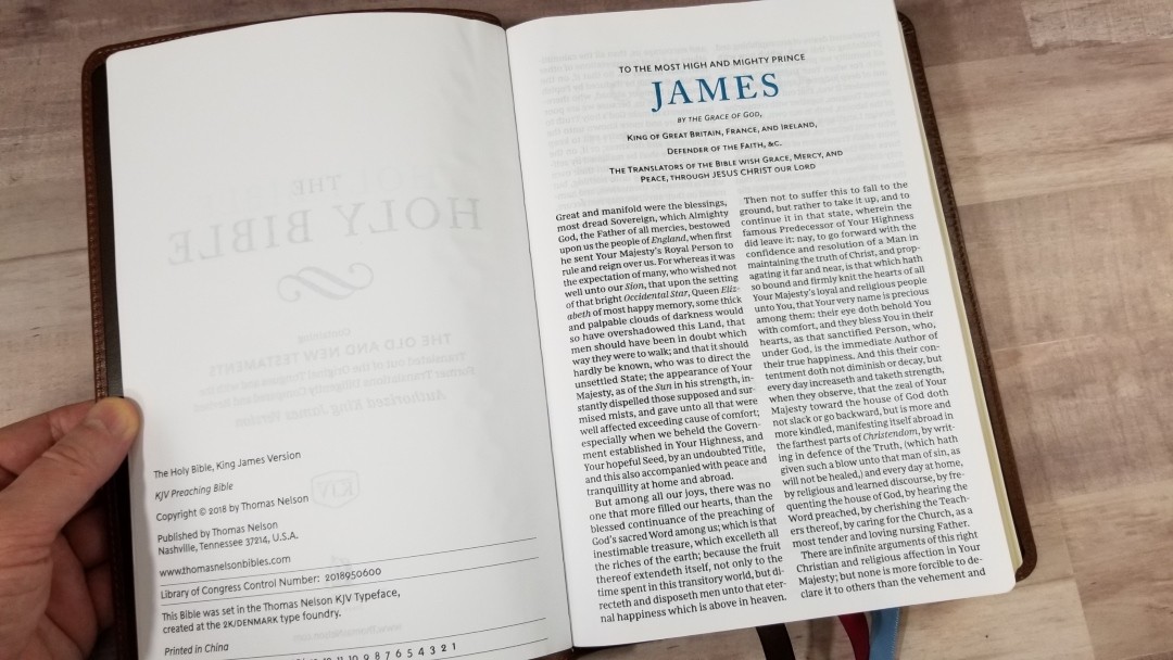
Does this Bible have the same old Nelson KJV text with Americanized spelling (e.g. heretic instead of heretick in Titus 3:10) and slight word changes (e.g. “thoroughly” in 2 Tim. 3:16)?
Hi David. It has the old British spellings. Titus 3:10 has heretick. 2 Tim 3:17 has throughly.
is it just me, or is the text basically in the gutter in the inner margins?