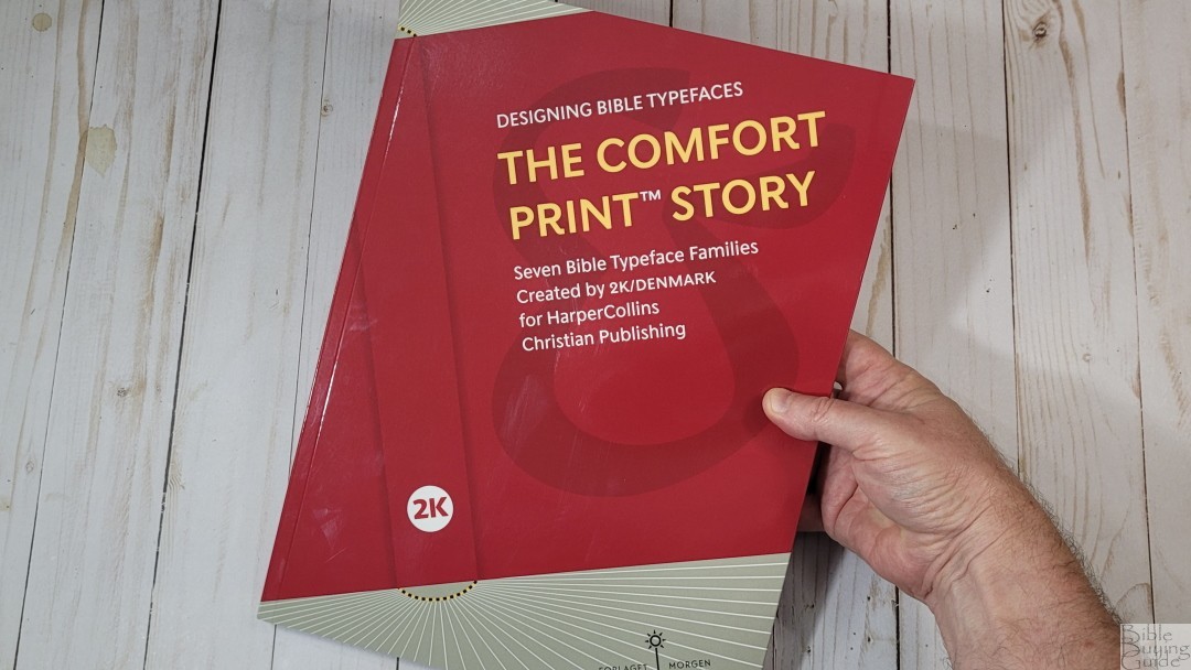
For the past several years, 2K/Denmark has worked with Thomas Nelson and Zondervan to create unique typefaces for their translations. This was a collaboration that resulted in custom typefaces for the KJV, NKJV NASB, NIV, NRSV, NET, and the Catholic edition. Altogether, this project produced 56 custom fonts. The Comfort Print Story is a book from 2K/Denmark that covers their HarperCollins typeface projects. 2K/Denmark sent me a review copy of this interesting book, and I’m grateful they did.
Let’s take a look.
Book Design
At 9.5 x 12.5, the book’s footprint is what the US market would consider oversized. This gives them lots of room to develop the design of each page, and, aside from an unrelated photo or two, they make excellent use of every one of them. The paper and print quality are as good as it gets, and the book is sewn, so it should hold together well.
Content

The book covers the unique approach to designing each of the fonts, but it goes a lot further than that. It also covers the unique history of each translation and brings in lots of historical facts about typeface design and publishing as it relates to the current typeface. Lots of typeface design insights are provided along the way using real-world examples from books, signs, and much more. It also covers lots of history including the Dead Sea Scrolls.


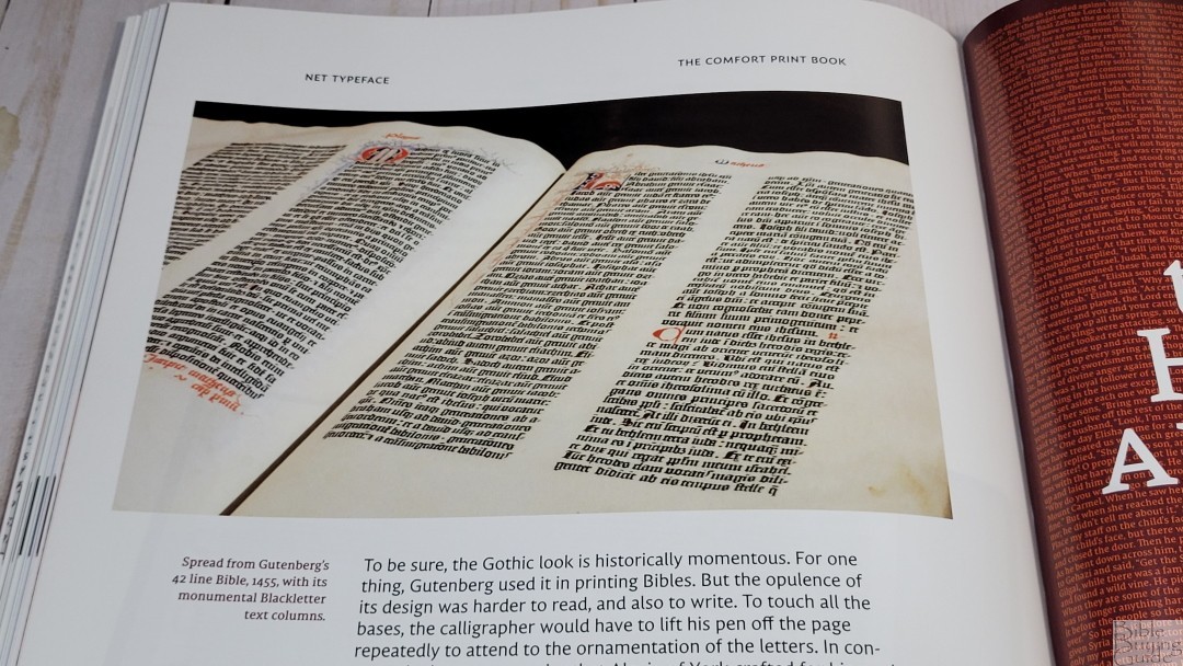
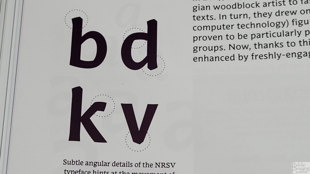
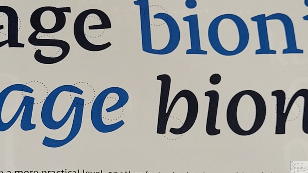
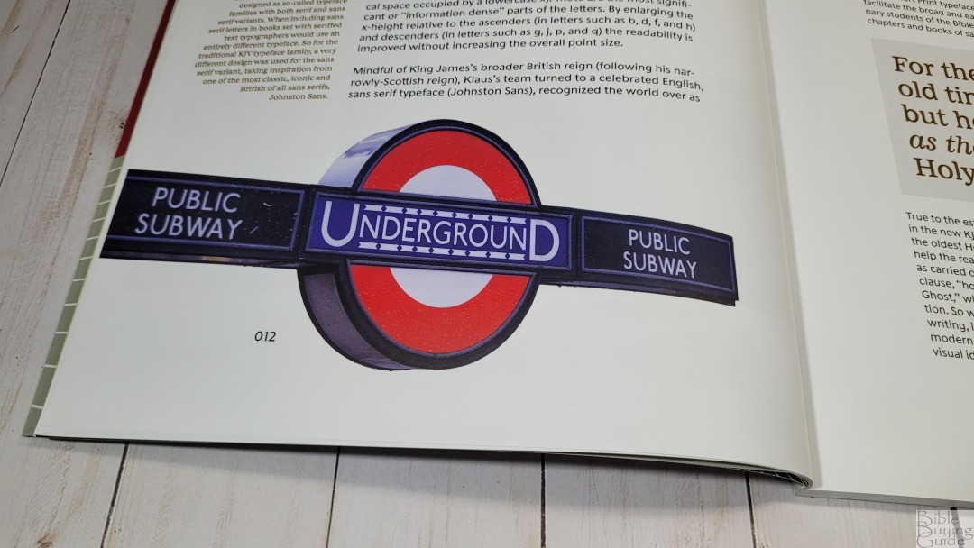
Every chapter covers one translation and uses the typeface for that translation. All the information is excellent and enjoyable to read. I did want to see more information about the NKJV. That chapter covered a lot more about the KJV. The chapters highlight the unique elements of each typeface.
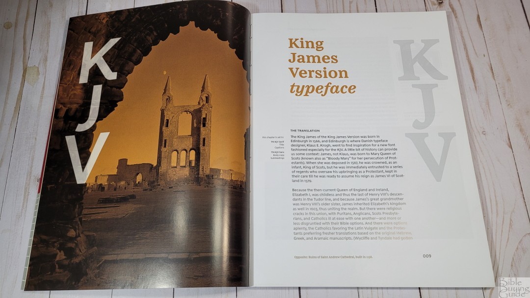
The introductory page for each translation includes a photo of a significant location, such as an old city, buildings, or ancient ruins.
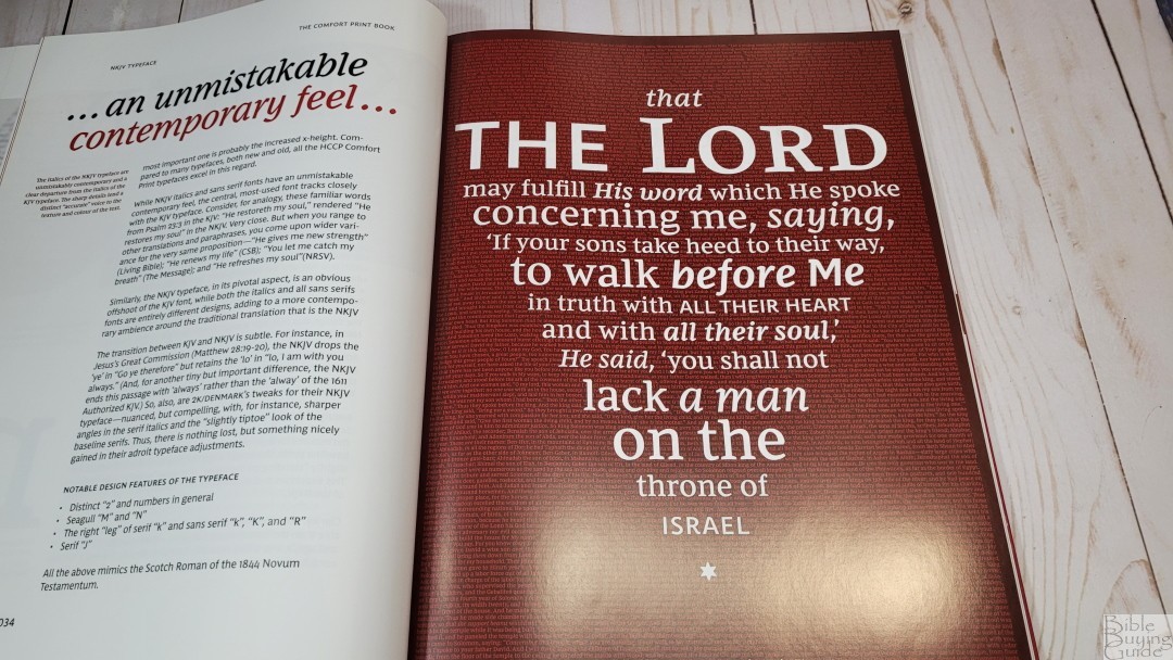
Each chapter includes a verse styled with a visual shape to create a design. These use different size fonts, and the reference in the footer and the background are made up of Scripture.
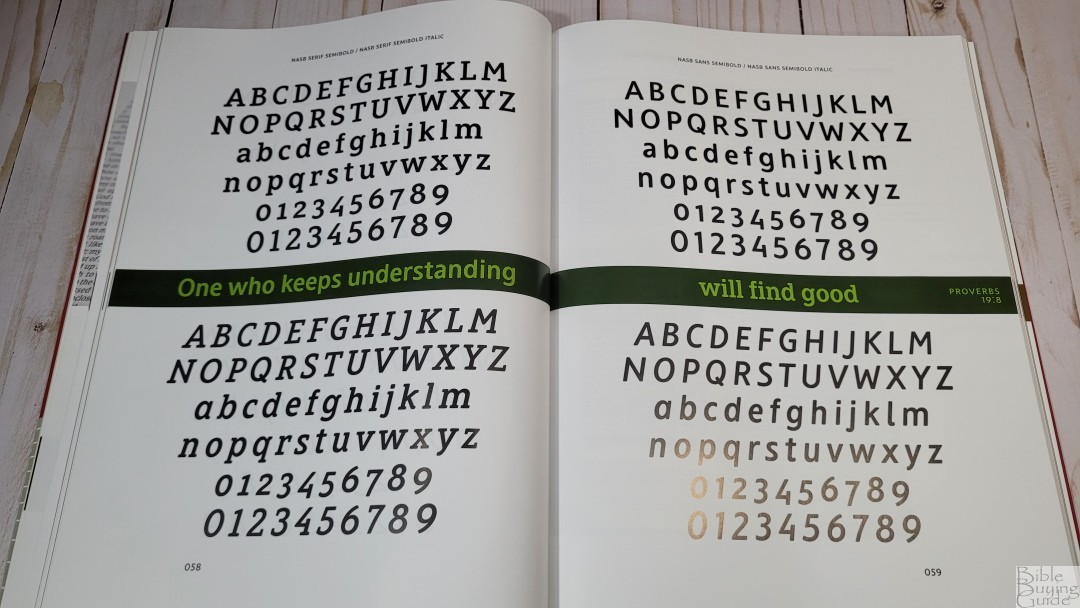
Each chapter includes samples of the typefaces. They include the serif, sans0serif, bold, italics, etc, and they’re labeled so they’re easy to understand.

Every chapter includes layout examples that use the center of the pages to create a realistic layout on paper. They include specs about the design such as the number of columns, justification style, the type of Bibles, etc. Some are real layouts while others are mockups. The mockups are gorgeous, but they’re not labeled, so you can’t tell that they’re not real Bibles that are available for purchase.
Ending Thoughts
The Comfort Print Story is a fun and informative book on Bible typeface design. The inspiration for each translation’s typeface is fascinating. There is a lot more information here than I expected. It was interesting seeing how the typefaces relate to other typefaces throughout history. The story of how these typefaces were designed is a story that needs to be told. The Comfort Print Story is easy to recommend for anyone interested in Bible typography or typefaces in general.
Purchase
You can purchase The Comfort Print Story from 2K/Denmark’s website.
2k/Denmark provided this book in exchange for an honest review. I was not asked to give a positive review. My opinions are my own.




I tried twice to order The Comfort Print Story book online from 2K after submitting MasterCard data twice, but the transaction brings me back to the original order page each time. Unable to order this book unless there is a glitch in the 2K software which duplicated the order. No email confirmation or signs that this order has been completed.
All submitted MasterCard data had green check marks as valid.
Has anyone else had problems ordering this book online directly from 2K in Denmark?
Hello Randy,
Thank you for this wonderful review.
Could you please advise me of the book you mentioned about the NKJV?
The authors first name was Arthur. I couldn’t catch his surname.
Blessings from Australia
Hi! It’s The New King James Version: In the Great Tradition by Arthur L. Farstad. I highly recommend it. It’s currently available on Kindle at Amazon, but you can also find it in print.