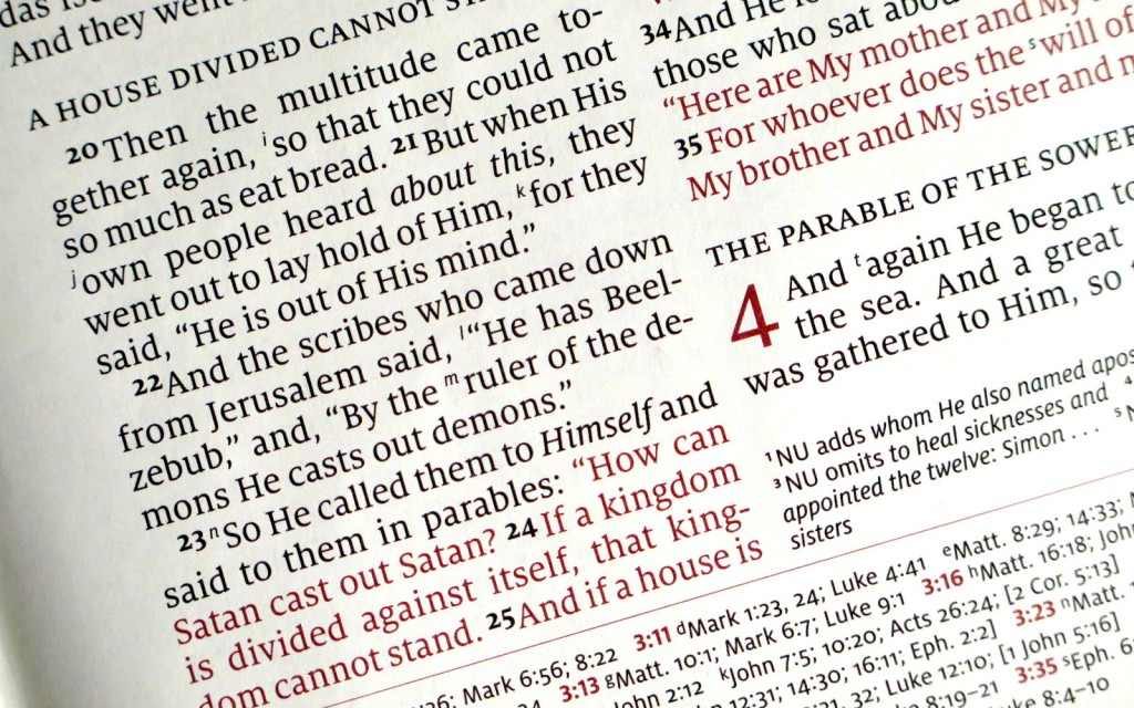
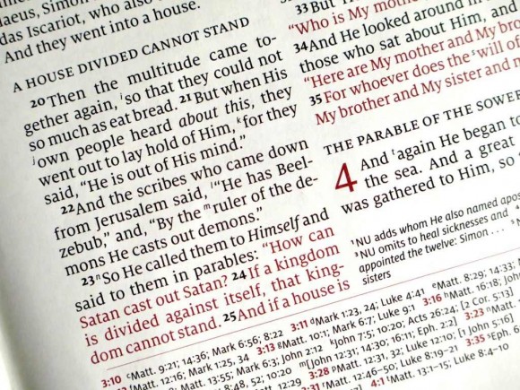
The Schuyler NKJV Quentel, arriving sometime in February or March, is now available for pre-order. Each edition of the Quentel makes improvements on the last. This one will include the expected typography but will add a red-letter option, raised spine hubs, and new maps. It will also have thinner paper, but at 36gsm it should still be very thick for Bible standards. The red letter looks a lot like the earth-tone red used for the chapter numbers. It’s available in goatskin with a leather liner and in several colors including black, dark green, dark brown, imperial blue, and firebrick red.
Maps
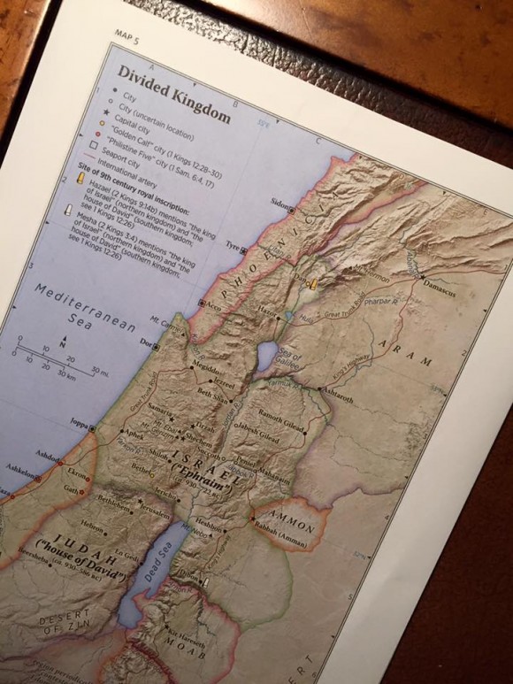
The maps look interesting. They were designed and produced by Barry Beitzel and include information that’s not typically found in Bible maps. The examples Schuyler gives include:
- where and when Paul wrote certain NT books
- the spread of Christianity
- map of Acts
Maps include:
1. World of the Patriarchs
2. Israel’s Twelve Tribe Allotments
3. Route of the Exodus
4. Kingdom of Saul, David and Solomon
5. Divided Kingdom
Kings and Prophets of Israel and Judah (Chart)
6. Assyrian and Babylonian Empires
7. Persian and Greek Empires
8. Ministry of Jesus
9. Jerusalem and the Passion of Jesus
10. Apostles’ Early Ministry
11. Missionary Journeys of Paul
12. Roman Empire & Spread of Christianity
These maps will be used in future Bibles from Schuyler. This is my favorite colors for maps. They look promising.
My Thoughts
I like that they’re using lighter paper. Maybe that will help bring the size and weight down and it should still be opaque and thick enough to turn the pages easily. I also like the leather liner. That should allow the cover to open flatter. The NKJV is extremely high on my list of Bible translations, but it’s sadly lacking high-quality choices. This Schuyler will fix that. With it’s new features I think this will be the best Quentel yet.
You can order it from EvangelicalBible.com
To see the BBG ESV review click here.
Images from EvangelicalBible.com


On the route of Exodus, where exactly do they cross? Why is there a universal (almost) consensus that Moses did not cross the Red Sea and that Mt. Sinai is in the Sinai peninsula. I simply don’t buy it.
That’s one of the reasons I like the Westminster maps
It actually shows a Red Sea crossing. Of course we don’t know exactly where they crossed and there are a lot of theories, but that’s better than no crossing in my opinion.
As far as the location of My Sinai, Paul clearly says Mt. Sinai is in Arabia. That shouldn’t be placed anywhere else as far as I understand.
What I find even more annoying are those that try to show the route at the Reed Sea. There’s no reason for that. They’re just placing doubt of God’s infallible Word.
I agree that the NKJV does indeed need more quality editions and as a person who greatly prefers the NKJV I’m glad to see this but still dissapointed in a couple areas.
I would like to see a v-b-v format. I know that paragraph is all the rage now but v-b-v is much better for study.
Why oh why did they abandon the silver gild and stamping on the blue edition?? Gold with silver is just odd.
Dave, the spine stamping and pages edges are both gold for the Imperial Blue edition.
My review copy of the ESV Quentel Had gold stamping on the spine. I’m used to seeing blue with silver, but I think I liked the gold better after seeing it. Partially because it was different, but I like the contrast between the gold and blue.
Correction to my comment above. I should have said “Blue with gold is just odd”
I know it’s a personal preference but it kind of goes beyond that in one sense. Silver and blue are cool colors/tones where as gold is warmer. There is the concept of complimentary colors in the fashion industry and there you’ll not see warm and cool tones together.
Alas, it is what it is though. That’s why I pre-ordered the brown. I’m hoping that the color under the gold is as it appears in the photos and not truly red.
And at least the Schuyler version of the TBS Westminster Reference in blue is still using silver. I hope there are no plans to change that.
Hi Dave. I know what you mean. Lately blue and gold have become a popular combination. Here’s an example from Google: https://www.google.com/search?q=navy+and+gold&espv=2&biw=1360&bih=643&tbm=isch&tbo=u&source=univ&sa=X&ved=0ahUKEwiY3PfUzZHKAhUGLyYKHacJBnAQsAQIGw
Yuck.
Glad to see the NKJV getting some much deserved attention. This will be the best NKJV on the market and thanks for the option of red or black letter. I’m not a red letter guy, but I’m thinking of ordering the red letter in this edition.