In a world where quality continues to plummet, Schuyler Bibles has set a new standard of excellence both in product and service. If I managed a Bible publisher I would definitely pay close attention to Schuyler Bibles.
So what makes a Schuyler Quentel so great? There are a few answers to that question, and to show why the Quentel is, deservedly, the best you can buy, we will also take a look at the other premium Bibles that I own, the NASB In Touch Ministries Edition Note Takers Bible (Foundation Publications), the NASB Side Column Reference Bible (Foundation Publications) and Holman Giant Print Reference Bible.
About the Quentel Bible
From the Website:
1. All the standard features of a reference Bible: 95,000 Cross References, Footnotes, Concordance.
2. 27 pages of extensive Oxford maps plus map index (include: Jerusalem, Land of Canaan, Exodus and Wilderness, Joshua Judges Samuel Saul, David and Solomon, Israel and Judah, Assyrian Empire, Persian Empire, Judah in the Persian and Hellenistic Periods, Empire of Alexander, Kingdom of Herod, Judea in the 1st Century AD, Places mentioned in the NT, Roman Empire, Paul’s Missionary Journeys.)
3. Cover: Goatskin – with full perimeter stitching. (Black, Brown, Imperial Blue and Firebrick Red) – 4 x 1cm ribbon markers.
4. Full leather linings. – with gilt line in the interior.
5. Art Gilt Edging (Red Under Gold) – except with blue cover – blue under silver.
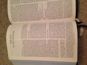
6. Paper – 45 gsm – the most opaque Bible paper found in any Bible- with line matching to offset any see through. (Many Bible have 19-24 gsm paper)
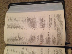
7. Font – about 11 point bold font. Black letter text with brick red color for chapter numbers.
8. Trim Size – 6″ x 9″; 1650 pages; 47 mm or 1.8″ thick.
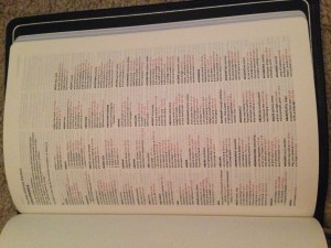
9. Cross References (95,000) & Concordance (20,000)
From My own observations during daily use…
(I have had this Bible for a few days and have been using it as my primary Bible.)
The Leather and Binding:
I have handled many leather Bibles, including a few calfskin Bibles that I own. I also own a wide range in covers including genuine leather (usually pigskin), genuine cowhide (and yes, there is a difference between the genuine cowhide and the genuine calfskin), bonded leather, and imitation leather. There is a reason why the finest Bibles use goatskin. The leather cover is extremely soft and supple, a real delight to the fingers. Not only can you clearly see the grain of the leather, you can feel the natural texture of the skin as it caresses your fingers.
This is the first leather Bible that I have owned which was not burgundy, brown, or black and I must say that I am pleasantly surprised. When I first heard about Imperial Blue as a color I thought of something else entirely. My mind pictured a lighter, almost robin’s egg color. In reality, Imperial Blue is more along the lines of Navy Blue but feels more majestic/stately, which would make sense given the color is Imperial and not Navy. The color is quite pleasing to the eye. 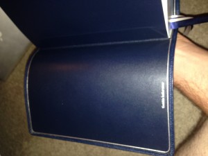
When I compare this to the 3 “premium” Bibles that I already own, I find the following about the covers:
Holman Giant Print KJV (Brown Cowhide) has a similar feel with regard to the grain but it is not as supple or limp as the Schuyler Quentel. Of all four of my high end Bibles, this one is the most stiff, however, it is also the smallest and feels most comfortable in my hand. 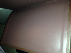
Foundation Publications NASB Side Column Reference Bible seems to have, and this was a shock to me, a more supple cover than the Quentel. I find this odd for two reasons: 1. It is made in China (and I could not find any information about the bindery) as opposed to being bound by Royal Jongbloed, who by all accounts that I can find, is one of the best binders in the industry. 
In Touch Ministries Wide Margin Edition NASB (also foundation publications) has a cover that is, for the most part, on par with the Quentel NASB. Again I was left devoid of any information regarding the binding house. That being said, the In Touch Wide Margin is top grain cowhide leaving the Quentel NASB with the more premium feel. (To be fair, most people would not really be able to tell the difference. My dad works quite a bit with leathers as a hobby and, while I am no where near an expert, he did teach me how to spot the quality differences. Between the two, I could not pick one over the other. Each is absolutely the best Bible you can get for its intended purpose. 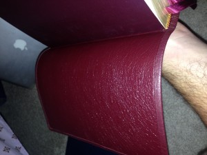
The binding, which is sewn, is quite sturdy. One can tell, from looking closely, that this is a very well put together binding with the obvious intent of being used on a daily basis and even in the field while ministering.
This is not a lightweight Bible by any stretch. It is noticeably heavier than my normal daily Bible, which is the In Touch Wide Margin Bible. In terms of weight/practicality to carry, it is about even between the HCSB Study Bible and the ESV Study Bible. Whether you carry daily and/or attempt to use one handed, is dependent on the size of your hand and how comfortable you are with the weight.
The Translation:
This is absolutely the most important part of choosing a Bible. Schuyler Bibles offers editions of the 4 major formal equivalence or word for word translations, though at the time of writing, only the NASB is available in the Quentel with the ESV, NKJV and KJV being available in 2014 (ESV), 2015 (NKJV) and 2016 (KJV). I choose NASB as often as possible because there is no Bible more literal. In point of fact, NASB is often accused of being “wooden” because the translation is so strictly literal. The English Standard Version, soon to be available in a Quentel Bible, is also an excellent choice. Several scholars find it to be somewhat less strict and therefore more readable. Whichever of the two you choose, you should be extremely pleased with your new Quentel Bible.
On a side note, a visiting pastor at my church had an ESV Schuyler Bible that I got to look at. While it is every bit as pleasing to the eye as its NASB counterpart, I still prefer the NASB both for its translation and for its font size as the ESV looked like 9.5 font. The ESV Quentel will be an 11 point font.
The Paper:
When you select your Bible the only other choice that deserves equal weight with the translation is the paper. The paper is critically important because you want your Bible to last your whole life and also because, I hope, you plan to write in it. As you study, the Lord will speak to your heart and you will want to write notes in it.
According to the Schuyler Bible website this paper is 45 GSMs thus making it the most opaque in the industry. As fas a I am aware, the other two premium Bible makers, RL Allan and Sons as well as Cambridge, both use 32 GSM Paper for many, but not all, of their Bibles, which is still much more opaque than most Bibles are using.
I have a wonderful contact at the distributor for Schuyler Bibles, here in the US, that tells me that the paper in the ESV Quentel will be 38 GSMs but it is actually as opaque and its NASB twin.
The color of the paper, along with its opacity, comes in quite handy when reading in lower light settings. For example, I keep the lighting in my bedroom lower than the rest of my apartment to help relax and many of my Bibles cannot be read from the light offered by my bedside table. This was an absolute non issue with the Quentel; the early morning light was also very easy to read from. I think it safe to say that even though it is a reference Bible and not a Reader’s Edition, this might actually be the perfect reading Bible.
Ghosting, which is a major problem with many Bible publishers is so minuscule that it hardly rates a mention but I know that many readers want to know about it. I feel confident in saying that with Quentel, you are free to highlight, underline, circle, or otherwise markup your Bible in accordance with your preferred study methods and will not have to worry about bleed through.
The Print and layout:
11 point font!! Wait. Read that again. 11 point font!! Ordinarily you have to get a large/giant print Bible for a font size so generous. My Holman Giant Print Reference Bible comes in at 14 point font but isn’t really more readable, at least in my opinion. My regular Bible, the In Touch Wide Margin comes in at a 10 point font, which is slightly less generous though still easy to read. The Side Column Reference Bible is also a 10 point font and in terms of readability, for me, I would put this one exactly even with the Quentel (again a surprise for me).
To be fair, the print size makes this a not small Bible and that is 100% ok with me; in general I am not a small person so I do not mind the trade off of a slightly larger, heavier Bible to get the font size that I want. Line matching helps to eliminate ghosting and also keeps the poetry from looking like a chopped up mess. The Scripture text, itself, is black but hides a wonderful treat for the eyes. The chapter numbers and the verse headings at the top of the page are a soft cranberry; it is absolutely gorgeous.
References are found at the bottom of the page along with translation notes. I have to admit, I was not excited with this fact at first. I am happy to say that the people who made this Bible are much smarter than I am and the references being at the bottom was genius. The reference location enables the larger text and it also makes for a more visually appealing layout. (It should, after all, be a joy to read the Bible.)
The one and only “dissatisfaction”
What I wouldn’t give for this to have been a wide margin edition (Those who know me know I prefer a wide margin)! Quentel is so close to being the absolute perfect Bible, and for most people it is, but my personal preference is for a wide margin Bible. I don’t often write in my Bible but sometimes the Spirit tells me something so important it has to find its way into a margin. I really cannot fault them, though, as making the Quentel Bible a wide margin Bible would probably make the Bible too cumbersome to be of any practical use.
Overall Impression:
If all you look at when you evaluate the Quentel NASB is the sticker price, you will miss out on what would otherwise be the best Bible you will ever own. I am absolutely certain that a Quentel Bible will easily last 50 years or more. It is, bar none, the most well put together Bible I have ever had the privilege to handle.
It is no cliche to call the Quentel Bible a work of art, though that does not do justice. The master craftsmen of the Schuyler family, along with their most excellent partners at 2k/Denmark and Royal Jongbloed have put together a true masterpiece to honor the Father and His word.
Schuyler Publishing provided this Bible free for review. I was not required to give a positive review. My opinions are my own.

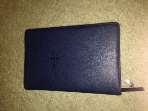





Dear Matthew:
This looks to be a wonderfully made bible. From what dealings I have had with EVB/Schuyler, I’m not surprised. I do have a bible made on the same text blocks as their premium Authorised version, this, the Westminister Referece bible published by TBS, that I am well pleased with. EVB’s excellent business practices and integrity are reflected in their products. As you know I have some minor reservations about all modern translations, though my primary bible for over 10 years was the NASB. I am happy with the Authoriised, it is a good accurate translation and I love the language, which probably is its biggest detraction for most readers. Having come to terms with that language, perhaps I shouldn’t stray, but I am hearing good things about the ESV, if that translation shows up in this same format I would be interested in buying one. For my own use, I am content with the Authorised, and enjoy it very much, but for witnessing, use in classes or indeed for use with others who are not familiar with the 17th century English, perhaps I should have something a little less challenging.
I expect I will take a close look at this bible, and perhaps buy a copy when it shows up in ESV. It is hard to see the Authorised ignored in common usage, it is an old and comfortable friend, but it is seldom used in churches today, and it is troublesome when reading it in public, there’s always someone will ask, “what does that mean in English ?”. It has taken me a long time to realize that not everyone is as familiar with the English language and its variations as I am. It is a sad fact that most of our population is at best, only functionally literate in even contemporary English. I am going to investigate the ESV and see what it has to offer, more for the others I come into contact with than for myself. It is awkward to have to translate to others from perfectly good English, though sadly, I find myself having to do that with contemporary 12th grade and above Modern English as well.
Thank you for your review, and your work in producing it.
Yours in Christ
Don Denison
Matthew, now that you have had the Quentel NASB longer, what do you think of it? I have been using the NASB for study and reading for about 40 years and am thinking about the Quentel. The format is different than my NASB and it appears to be quite a bit thicker and a whole lot more expensive. But it also seems top of the line in quality.
I would appreciate your impressions after using it longer.
Tim:
It is much thicker than most NASB Bibles and at around $200 it is most definitely a premium. I find it a little heavy for carrying around. Overall the font is excellent and is a wonderful asset for personal study.
Overall this Bible is about the same size and weight as the ESV Study Bible. I think it is definitely worth the money though
Well, it seems they have downgraded the quality of the paper since 2014 (the year you wrote this review). Now it is only 28 gsm. So this is quite the turn off for me. Even my Danish Bible worth about 100 dollars has 40 GSM.
The 28gsm is Indopaque from France. It’s actually more expensive because of the titanium pigment to get a high level of opacity at a lower gsm.
I went to evangelical website and schuyler does not have this bible. The wide margin which I don’t want only has 40gsm paper. They definitely don’t have the regular nasb with 45gsm paper. Do you have a link where I can buy that specific bible you wrote about? Thank you.
Hi David. Unfortunately, that one has been out of print for several years.