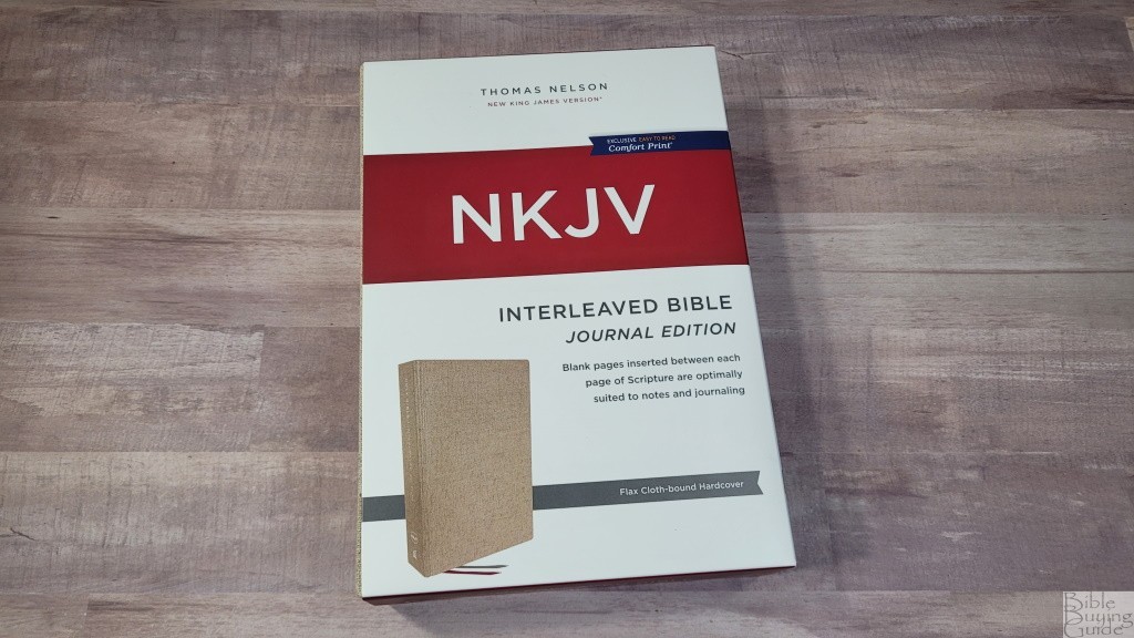
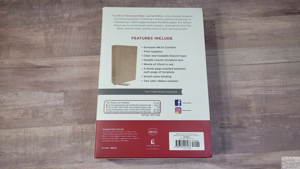
The NKJV Interleaved Bible Journal Edition is based on Johnathan Edwards’ blank Bible. This was a Bible that was taken apart and had a blank page inserted between each page. This gives you a full page for every page of Bible text. The interleaved pages are great for sermon outlines, commentary on the text, artwork, thoughts, prayers, songs, references, lists, charts, or anything else you want to write. This is ISBN: 9780785243168, printed in China.
Thomas Nelson provided this Bible in exchange for an honest review. I was not required to give a positive review, only an honest one. All opinions are my own.
_________________________________________________________
This Bible is available at (includes some affiliate links)
and many local Bible bookstores
_________________________________________________________
Table of Contents
Video Review
Binding
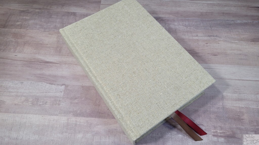
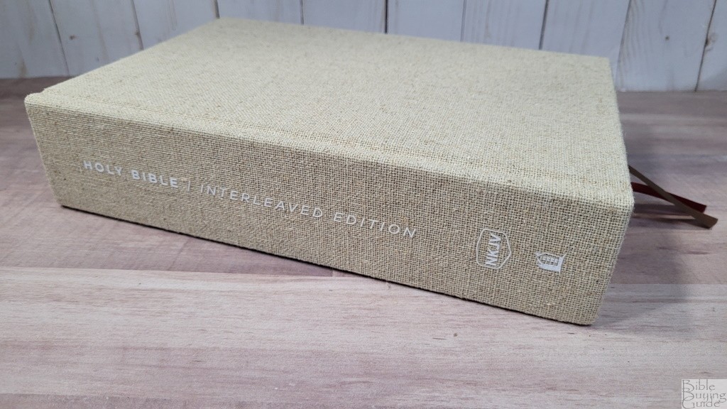
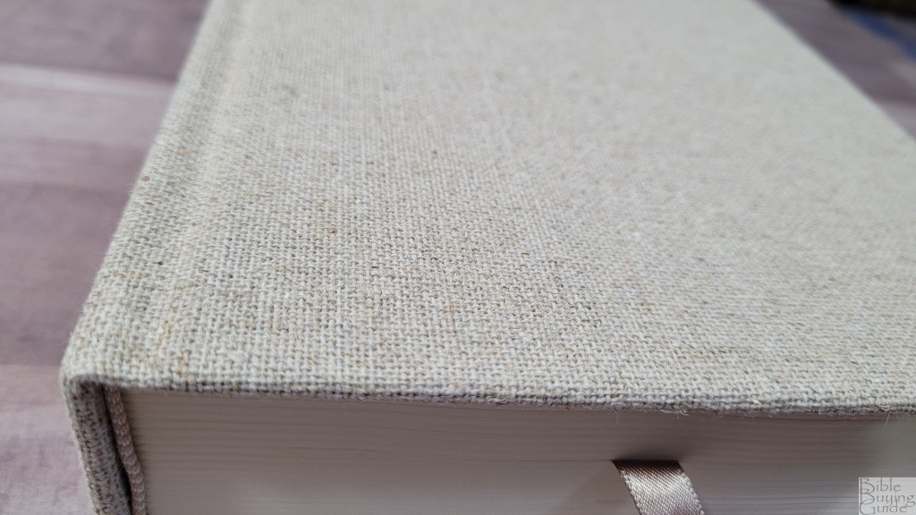
This edition is Flax Cloth-bound Hardcover. It’s tan (well, flax, actually) and has a rough and pronounced cloth texture with some color variation to give it even more texture. I like this cover a lot. Nothing is printed on the front. The spine has Holy Bible / Interleaved Edition printed horizontally, and NKJV and the Thomas Nelson logo printed as normal. All the spine text is printed in white. It’s small, all-caps, and uses a different font for Holy Bible and Interleaved Edition. It looks clean and elegant.
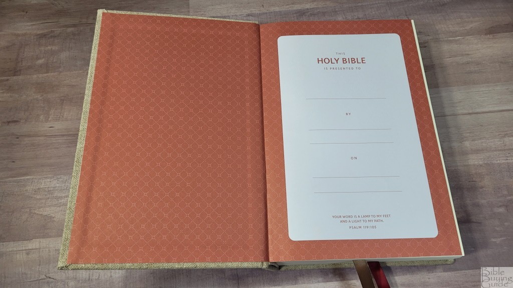
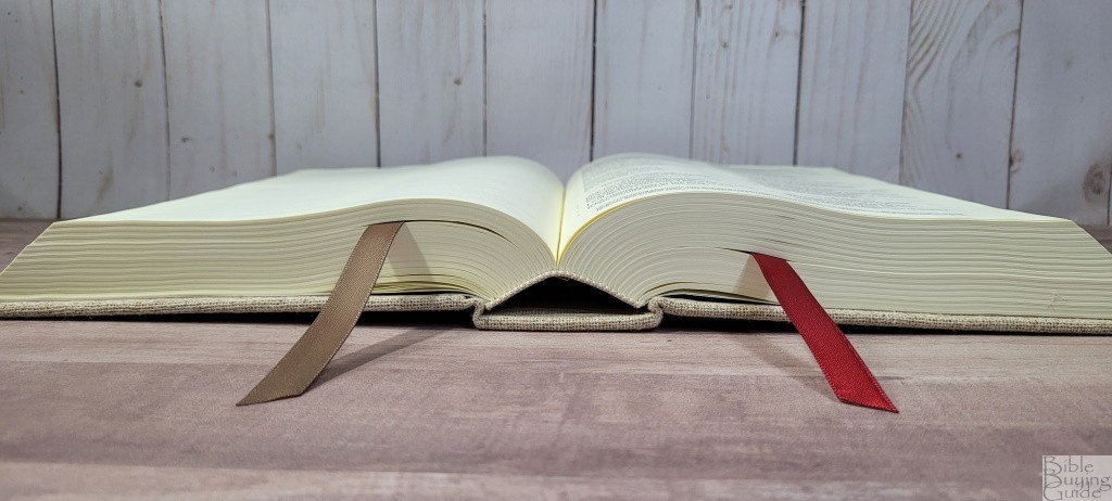
The red paper liner is pasted and it has a unique pattern. The liner doubles as the presentation page. It doesn’t have any thick end sheets to give it more structure, but it does feel sturdy. It’s sewn and stays open perfectly to any page. It does not include overcast stitching. When opened, the spine rises higher to make the pages flat. This is my preference and one of the advantages of hardcovers. It has two 3/8″ satin ribbons: one taupe and one burgundy. The overall size is 6.5 x 9.5 x 2.125″. It weighs 3 lbs, 7.2 oz.
Paper
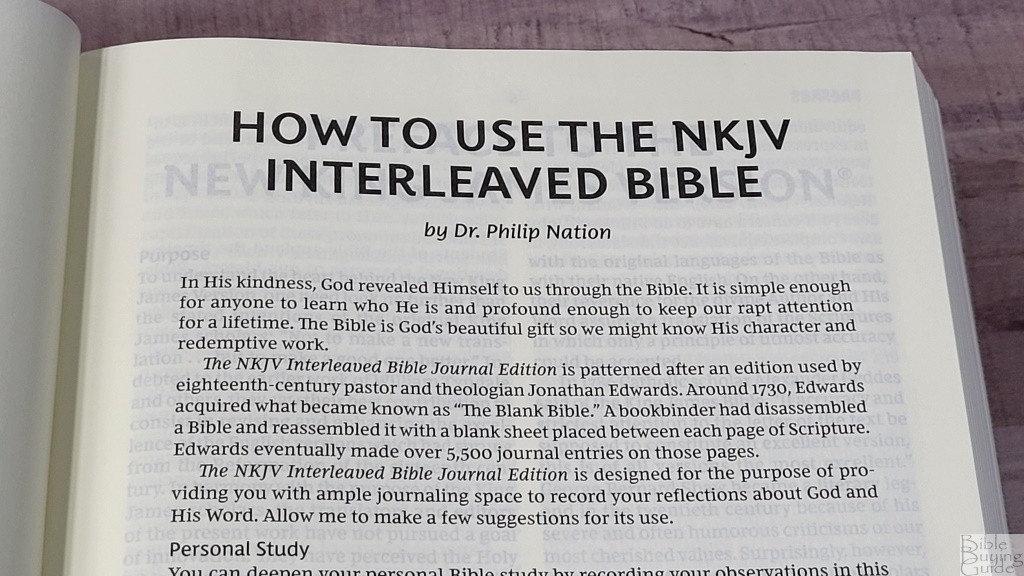
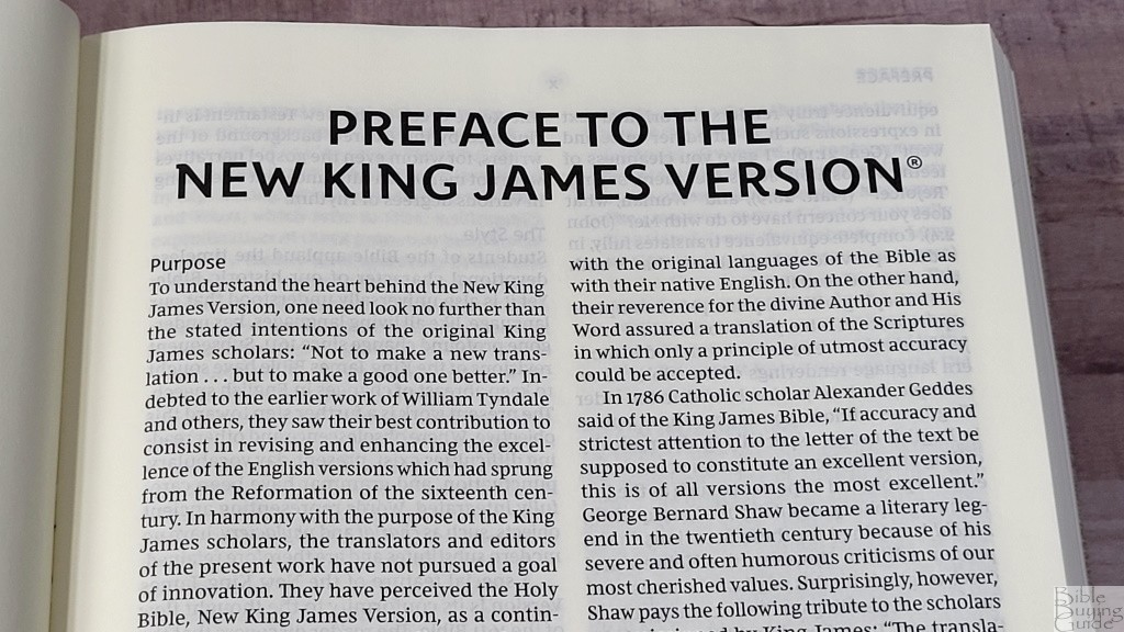
The paper is 40gsm. It has a cream color. It’s not yellow or dark cream. Fortunately, the print is dark enough that it still has enough contrast. It’s not as opaque as I expected. The texture is smooth but the paper is thick enough that it’s easy to grab and turn. This is good paper for pencils, Pigma Microns, and highlighters. In the front is a page with instructions from Philip Nation, the Vice President and Bible Publisher of Thomas Nelson. Dr. Nation also discusses the inspiration for the NKJV Interleaved Bible Journal Edition.
Interleaved Pages
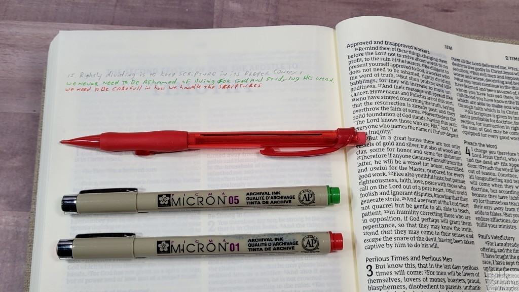
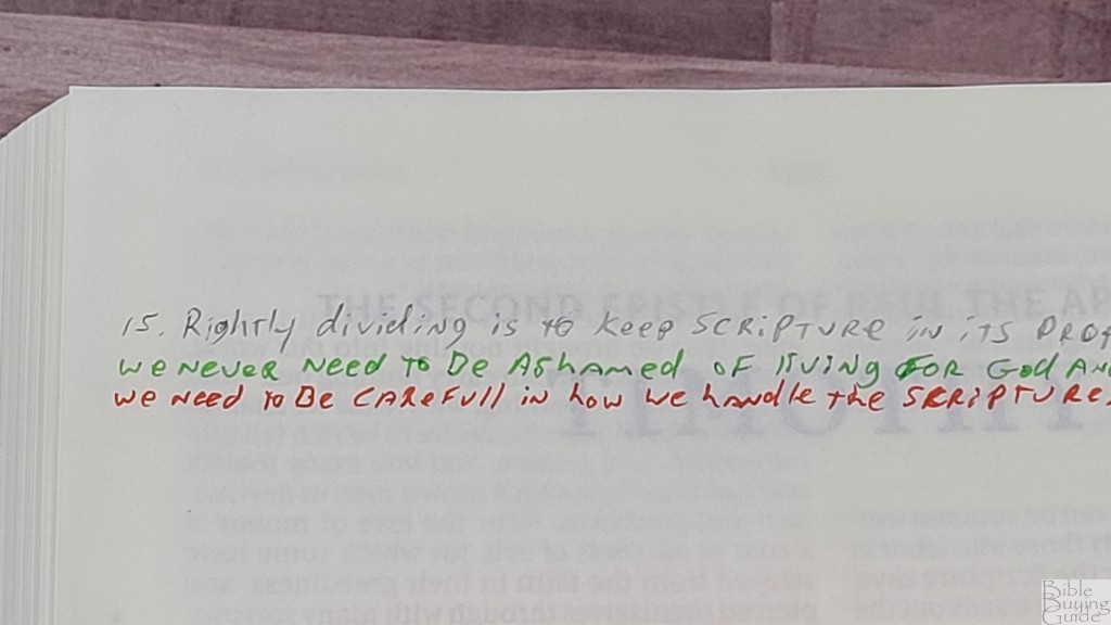
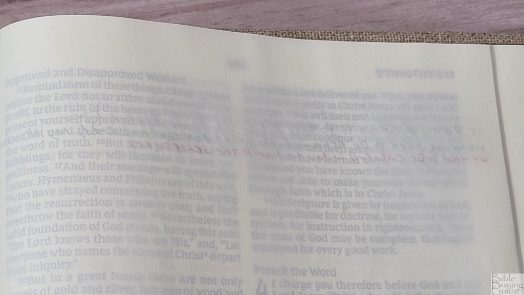
It has 912 pages for notes. These are blank pages inserted between every page of Bible text. This means half the pages are blank on the right side and the other half are blank on the left side. The first page has to use the blank side of the Old Testament introduction page, while the last page uses the blank side of the Comfort Print information page. It has a page in the front that can be used to create a key to symbols, colors, an index, etc. I’d like to have a couple more pages in the front or back for this.
I’ve used a mechanical pencil and Pigma Microns (green = 05, red = 01) on this page. For more tips on marking, see my book Easy Bible Marking Guide.
Typography and Layout
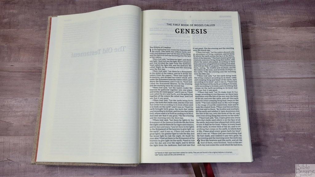
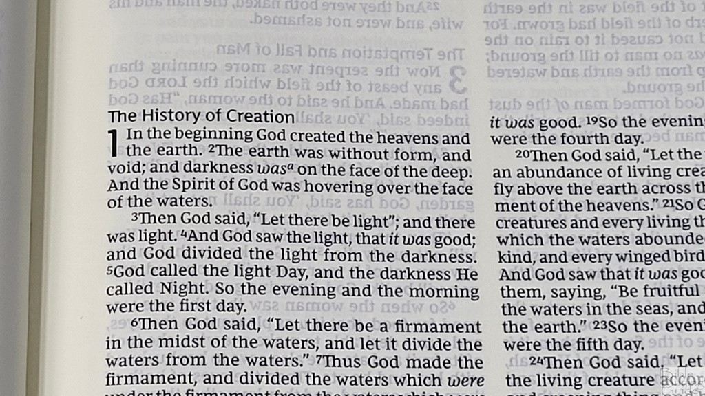
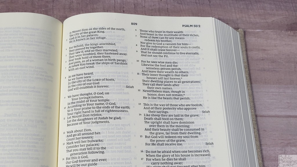
The text is presented in a double-column, paragraph layout. Poetry is set to stanzas and personal letters are indented. Letters are left-justified, meaning they have a ragged right edge. It includes the longer NKJV preface. Footnotes are placed across the bottom of the page in a single column. They’re in a smaller font and separated from the text with a horizontal line. The header includes the book name, chapter, and verse number in the outer margin. The page numbers are in the center. Blank pages are counted in the page numbering. Section headings are printed in a larger font in sans serif.
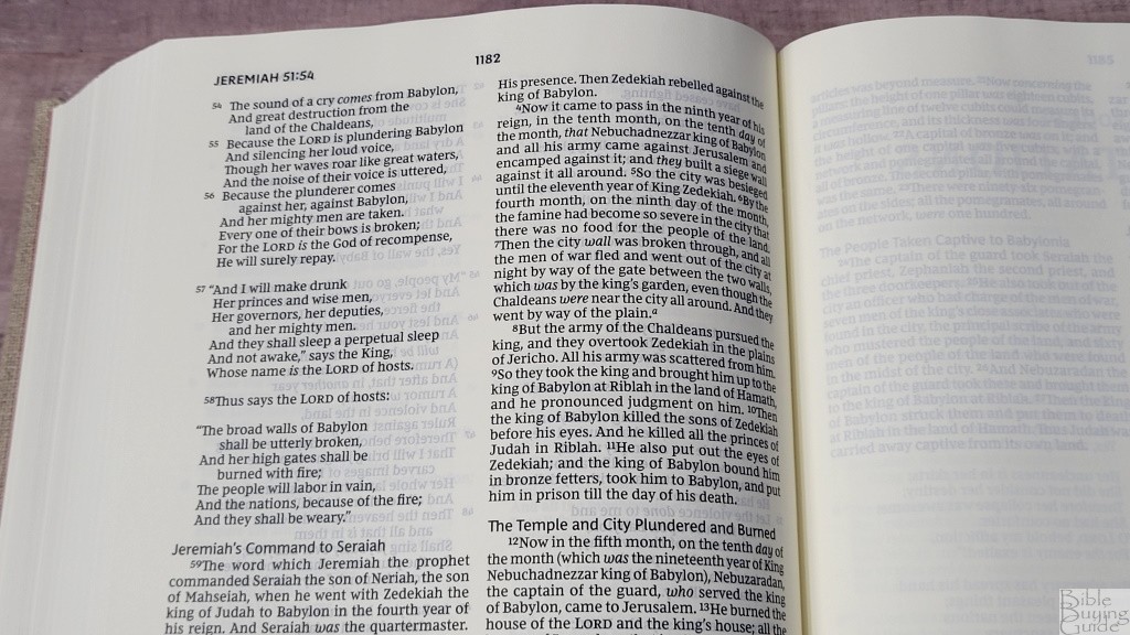
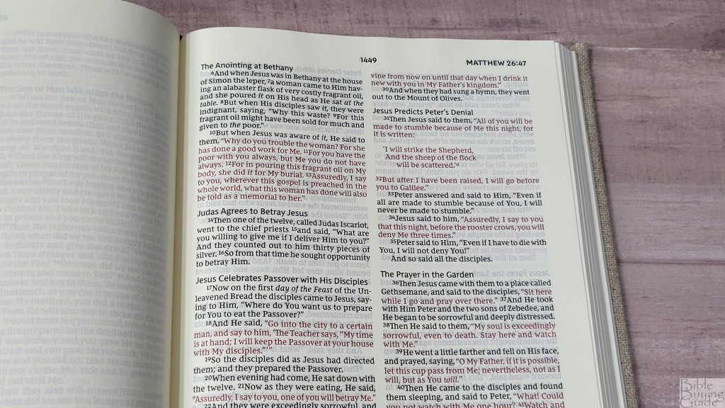
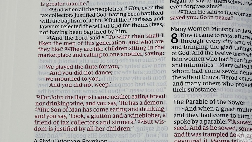
The font is 9-point, red-letter, Comfort Print. The black and red text are both dark. This is an excellent shade of red. There is some minor variation in darkness, but it’s still dark enough. It has plenty of space between the words. I find the leading, the space between the lines, to be a little tight. There’s still enough room to underline with a fine-point tip, but a little more space would be more comfortable. It’s printed with line-matching. It’s a dark font that’s easy to read even on cream paper. It has around 10 words per line, which I think is perfect for poetry, indented prayers, and indented personal letters. This gives it the best balance between poetry, indented text, and prose. This is an excellent example of how to create a double-column layout with poetry.
Footnotes
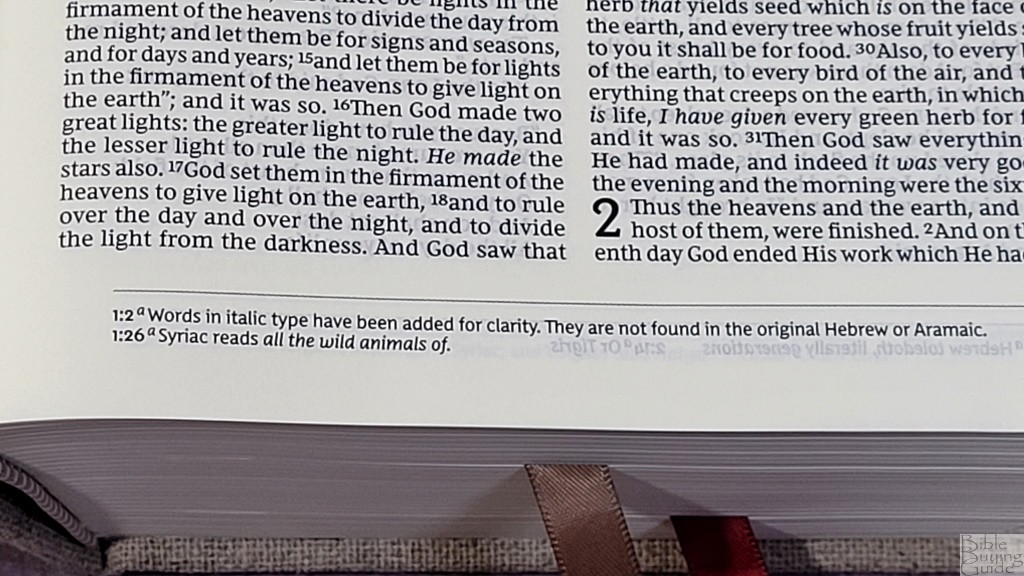
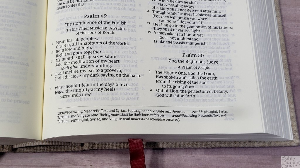
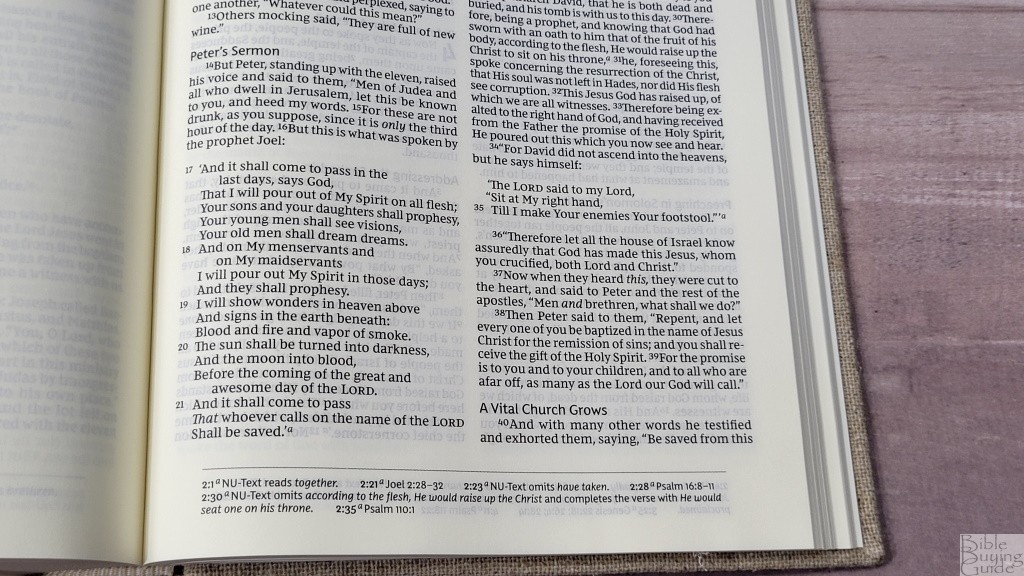
The NKJV Interleaved Bible Journal Edition includes the abridged set of translation footnotes. They’re placed at the bottom of the page in a single column. They include the chapter and verse number along with the footnote key from the text. There is extra space between the footnotes so they stand out. These are some of my favorite translation footnotes. They include manuscript variations and identify the manuscripts. They also include references to where something is quoted from, literal renderings, alternate renderings, information about the original languages, information about places, etc. Even though it’s an abridged set of footnotes, it still has a lot of information.
Comparisons
Here’s how the NKJV Interleaved Bible Journal Edition compares to a few similar Bibles.
ESV Journaling Bible Interleaved Edition
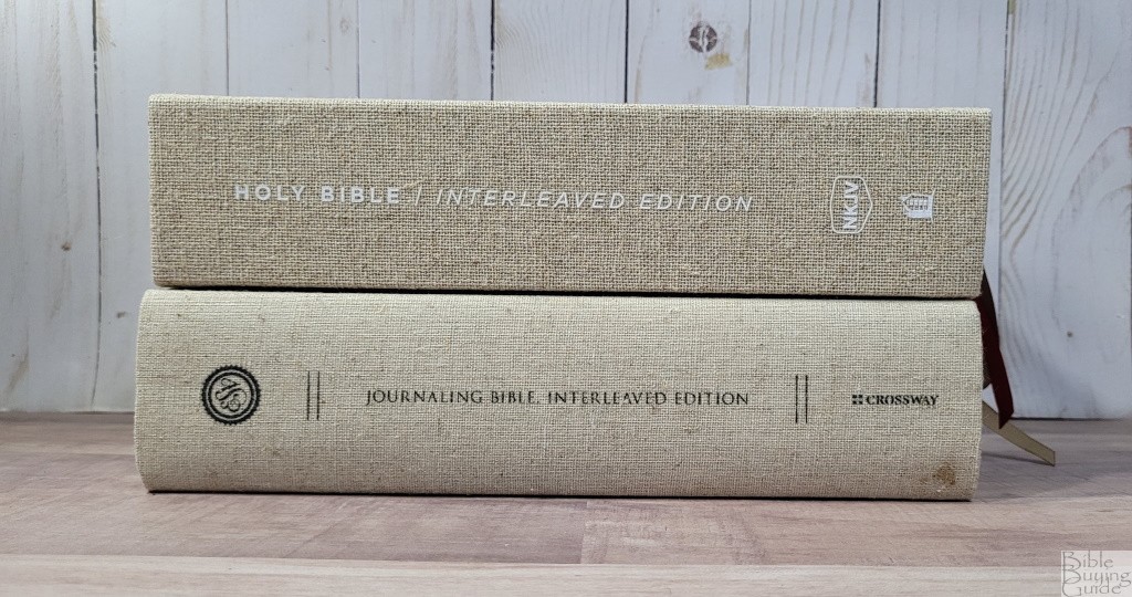
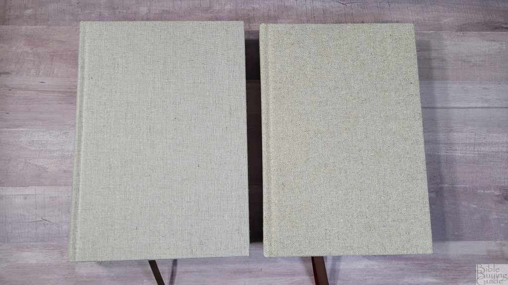
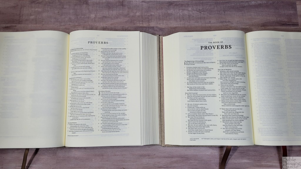
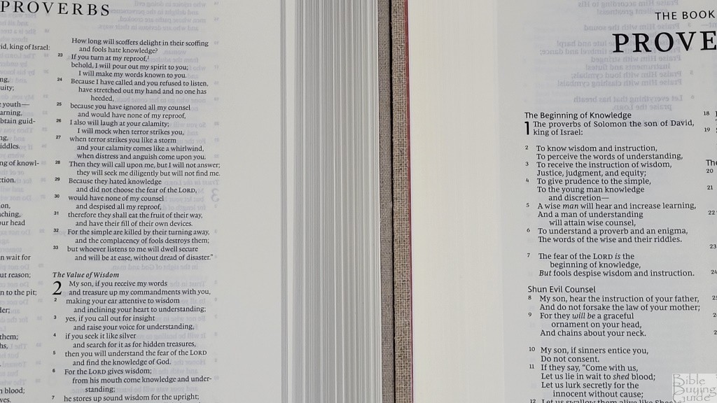
The ESV Journaling Bible Interleaved Edition is slightly larger and thicker. It has 50gsm paper and it’s noticeably more opaque. The print isn’t as large or as dark. It has wide margins on the outside and bottom. This is a black-letter edition. The paper is slightly creamier.
NKJV Journal the Word Bible
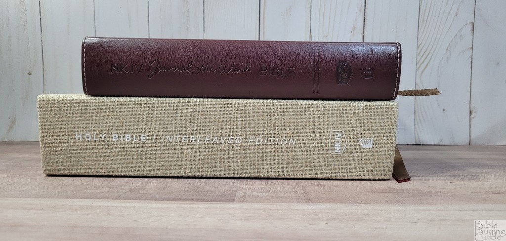
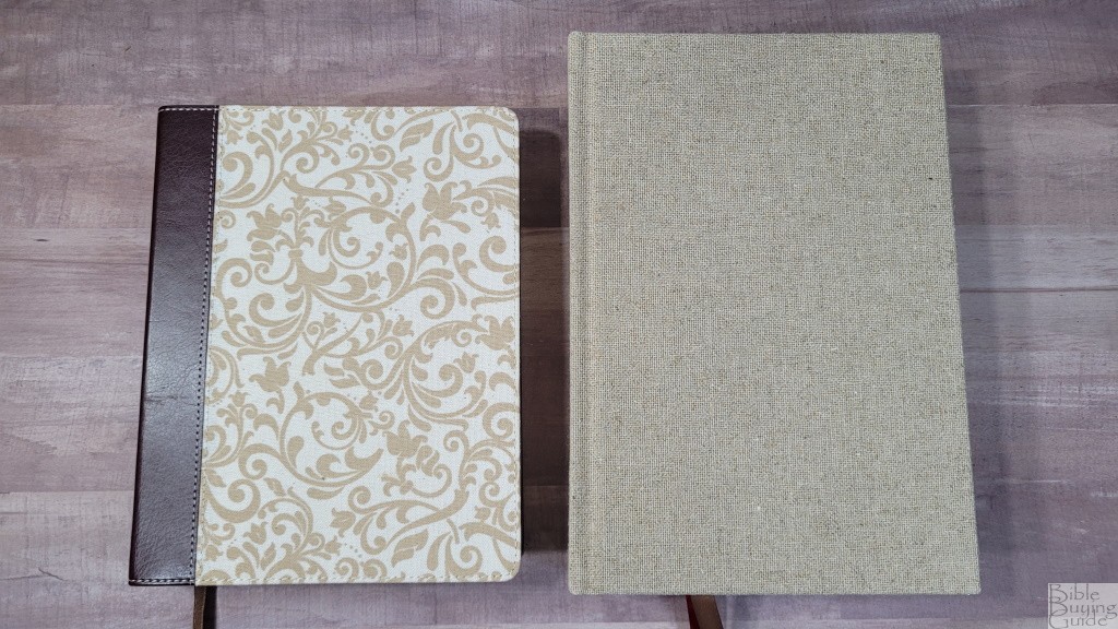
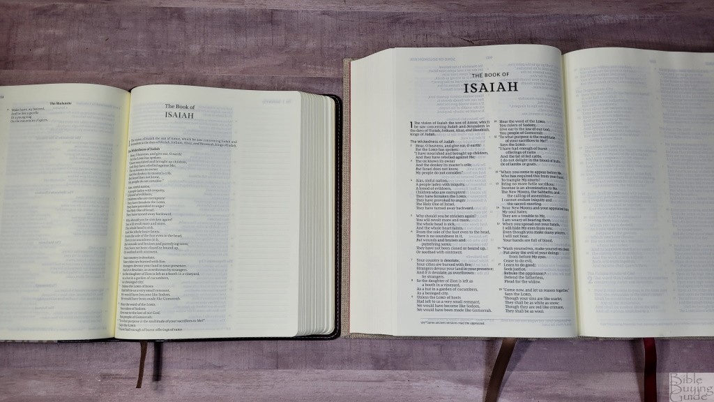
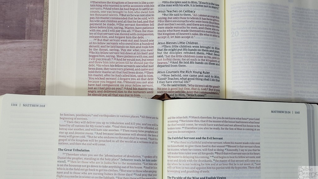
The NKJV Journal the Word Bible is a lot smaller. It has a smaller and lighter font in a single-column with a wide outer margin that includes lines. The paper is a deeper cream.
NKJV Large Print Wide Margin Reference Bible
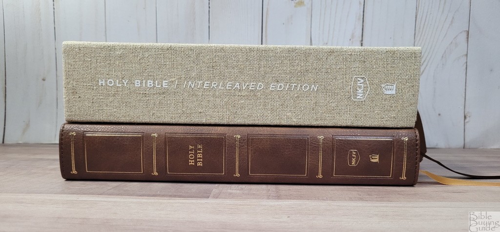
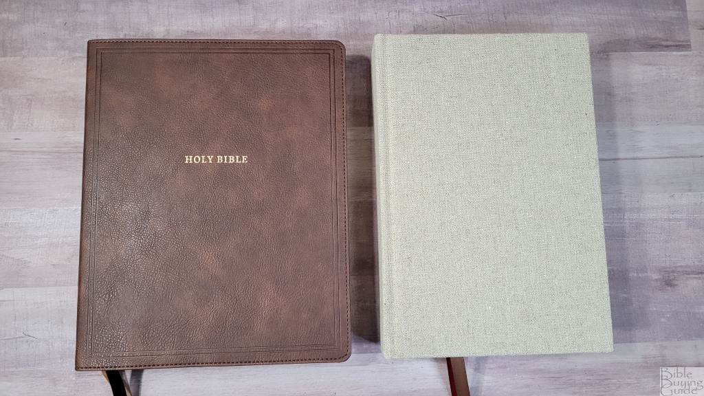
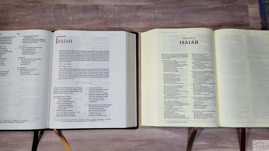
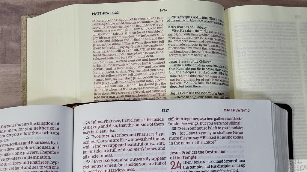
The NKJV Large Print Wide Margin Reference Bible is a lot thinner and has a larger footprint. It also has a larger and darker font. The margins are small, so there isn’t a lot of space for notes when compared to a journal edition. The paper is white and is excellent for notes. This is a reference edition and includes book introductions and maps.
Cambridge NKJV Wide Margin Edition
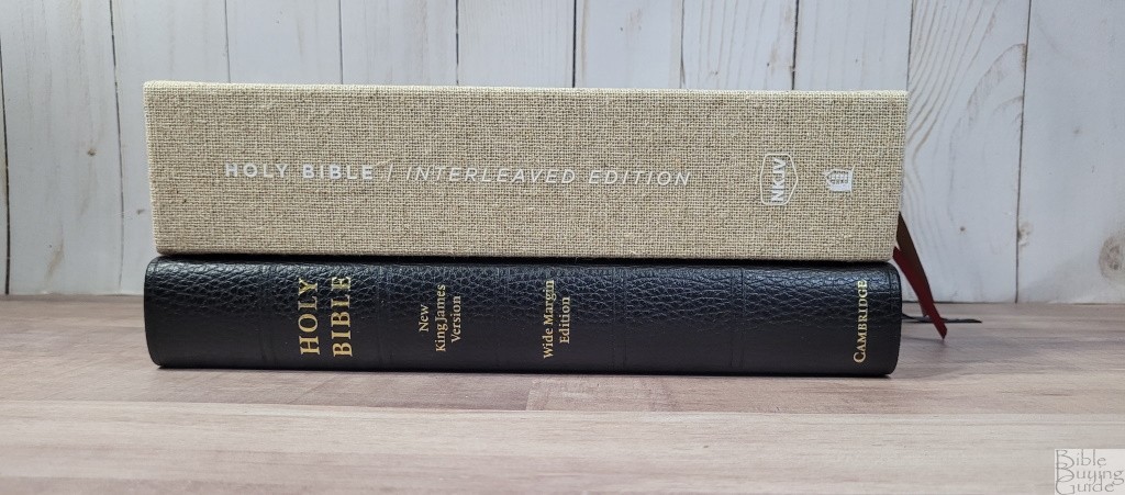
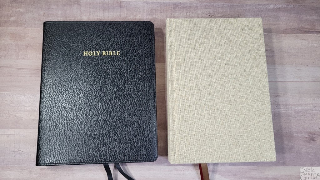
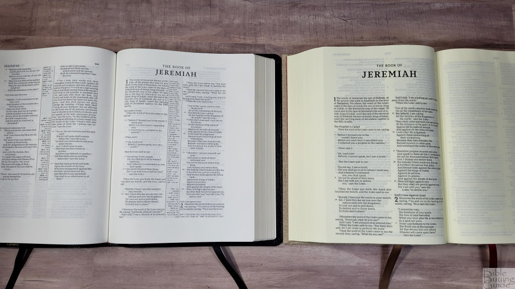
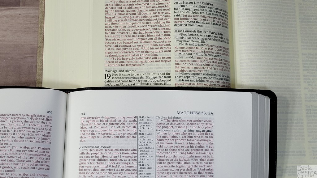
The Cambridge NKJV Wide Margin Edition is a lot thinner and has a wider footprint. The font is much smaller. This one matches the pagination of the Pitt Minion. It’s a reference edition with wide margins on all sides. It also includes a concordance, maps, and pages for an index, and notebook paper for notes.
Conclusion
The NKJV Interleaved Bible Journal Edition is an excellent journaling Bible. It’s made well. The layout is beautiful. Both the black and red type are dark and easy to read. The 10 words per line work perfectly for prose and poetry. Slightly more space between the lines would make it easier to underline. I prefer this 9-point font to those in the smaller journals. Having 912 pages for notes sets this apart from wide-margin and regular journal Bibles. The paper could be a touch more opaque, but it’s excellent for notes. If you’re interested in an NKJV for notes, or an interleaved in any translation, the NKJV Interleaved Bible Journal Edition is a good choice.
_________________________________________________________
This Bible is available at (includes some affiliate links)
and many local Bible bookstores
_________________________________________________________
Thomas Nelson provided this Bible in exchange for an honest review. I was not required to give a positive review, only an honest one. All opinions are my own.






Randy,
Many thanks for this excellent review! Lucinda said it was coming this week, and here it is!
Lately, and co-incidentally with the excellent NKJV Open Bible that you reviewed and recommended, I have regained a respect for the NKJV.
Personally, I do like to have cross-references in my Bible, and I generally do not like to write in my Bible! However, the attractiveness of these two Bibles is that they can very readily be used in tandem as complementary Bibles for many purposes, public and private. The one has cross-references, introductions, helps, concordance, etc.; and the other has enough space for notes etc. And one can use one of them for studying one place and the other for looking up other places!
So, you’ve made a sale! But, before I buy, have you made an arrangement with Amazon UK?
Thanks Alexander! I think the affiliate links work between the US and UK versions of Amazon, so I should still get credit. I appreciate you checking!