The NKJV Deluxe Reader’s Bible presents the New King James text in single column format and removes the extra’s that are usually placed within the text, tools such as chapter and verse numbers, references, footnotes, etc., in order to create an edition to improve the reading experience. At the same time, it includes a few design features that help the reader know where they are in Scripture without becoming a distraction.
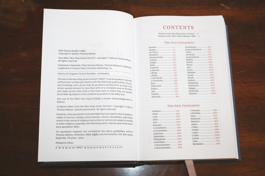
I’m reviewing cloth over board, ISBN: 9780785216070, printed in China.
Thomas Nelson provided this Bible free for review. I was not required to give a positive review, only an honest one. All opinions are my own.
_________________________________________________________
This book is available at (includes some affiliate links)
and many local Bible bookstores
_________________________________________________________
COVER AND BINDING
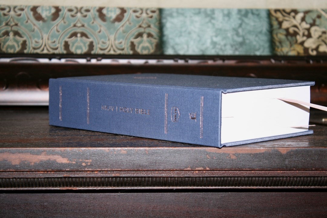
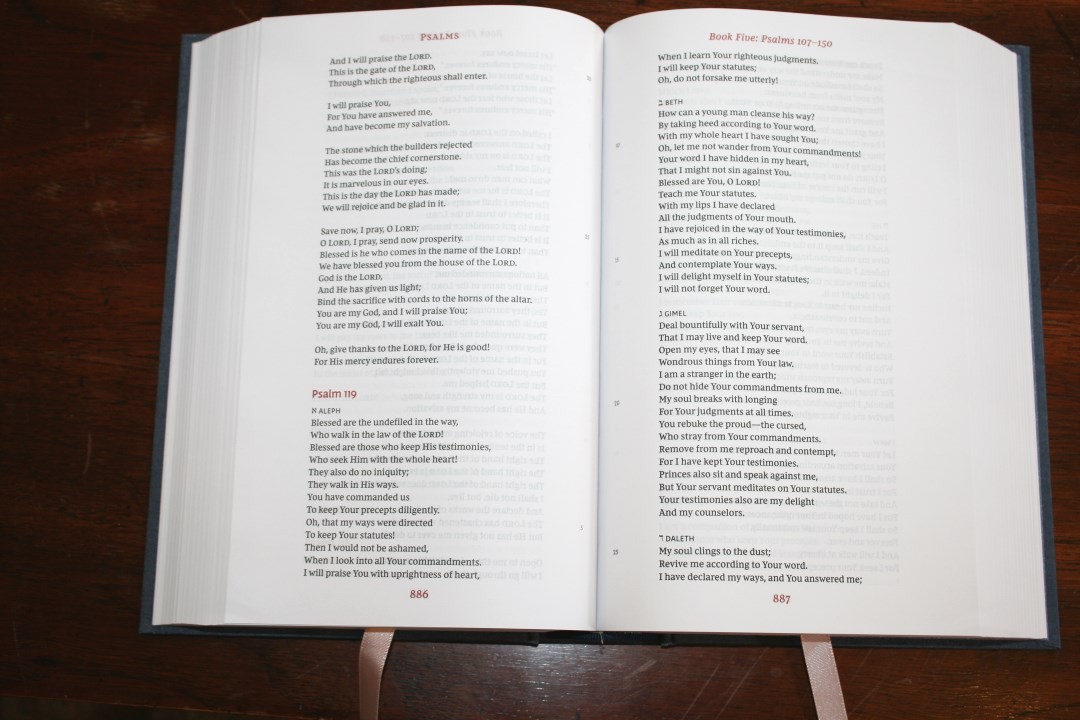
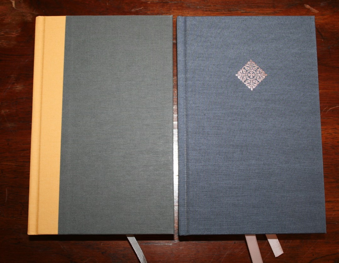
The cover is navy cloth over board with peach highlights. It’s actually darker than some of my photos. The front of the cover includes a diamond design stamped into the cover. The liner is paper. It has a pattern printed in blue. The binding is sewn and has no trouble laying completely open on page one. I like the spine design. It allows the spine to lift when opened, allowing the inner margin to come up, making the page flatter than most Bibles, which keeps the text from bending into the gutter. This is the same cover materials and design as the NIV Reader’s Bible.
It has two 10mm satin ribbons in pale peach to match the highlights. The overall size is 8.75 x 5.6 x 1.9″.
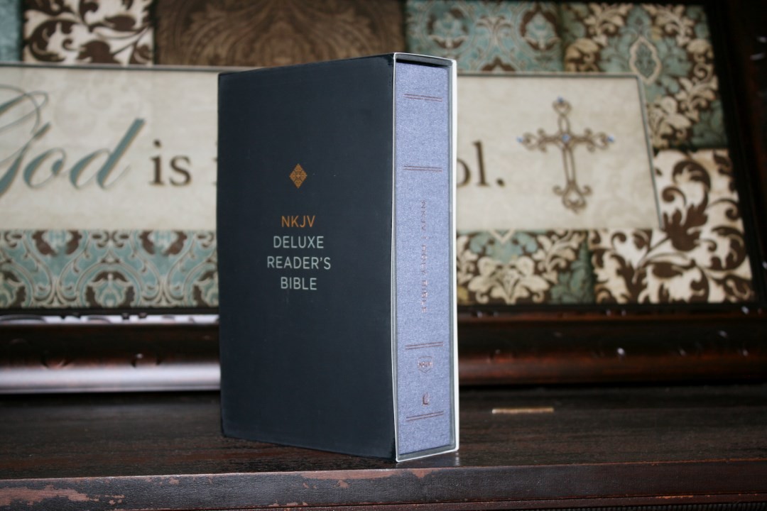
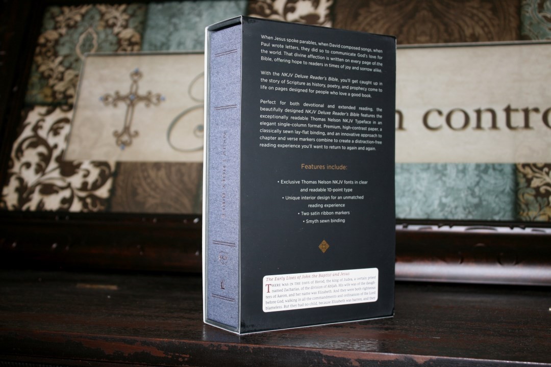
It includes a slipcase that’s covered with the same cloth as the Bible. The case is thinner material than the Bible but it’s made well and holds the Bible perfectly.
PAPER
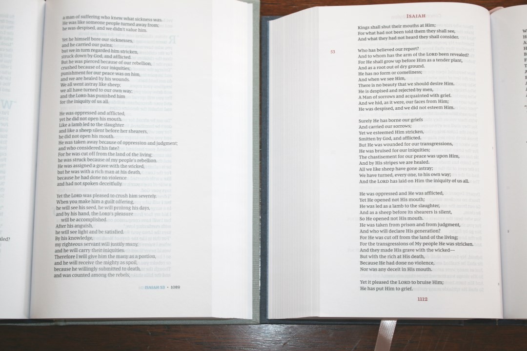
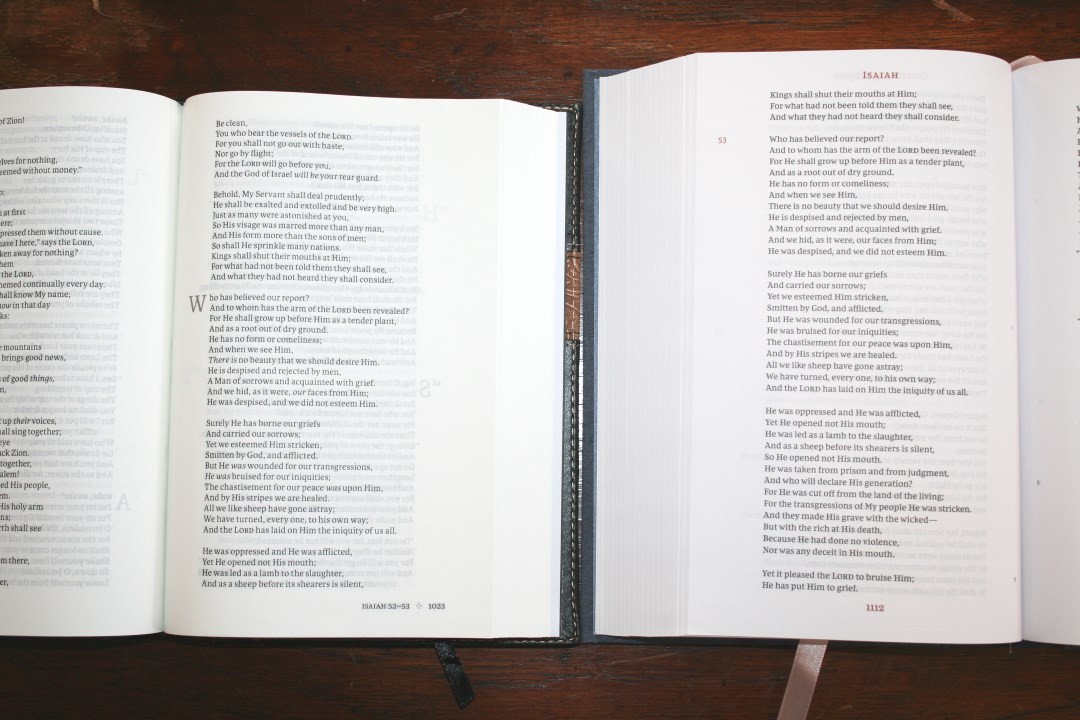
I’m not sure of the gsm (probably mid 30’s or better). The paper is white in color and highly opaque. I found it easy to turn. It has no glare under direct light. This is the same paper that is used in the NIV Reader’s Bible and is an excellent choice for a single volume reader’s edition.
TYPOGRAPHY
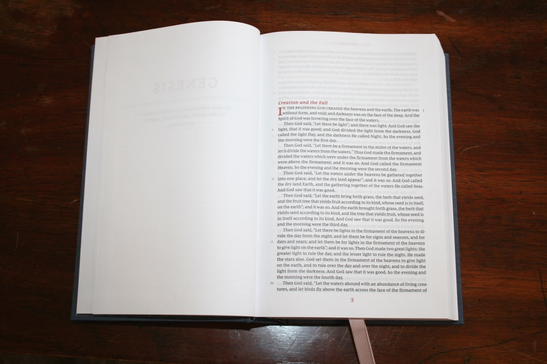
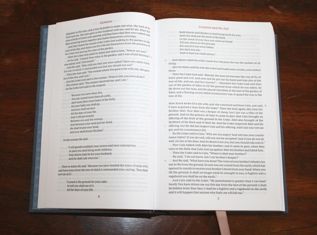
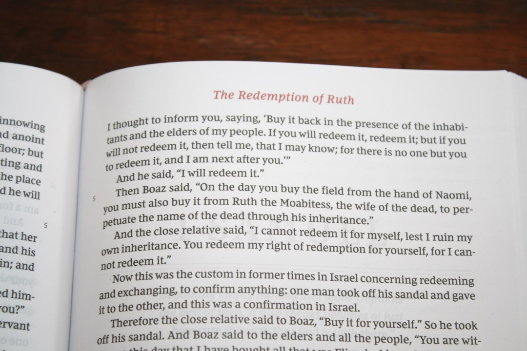
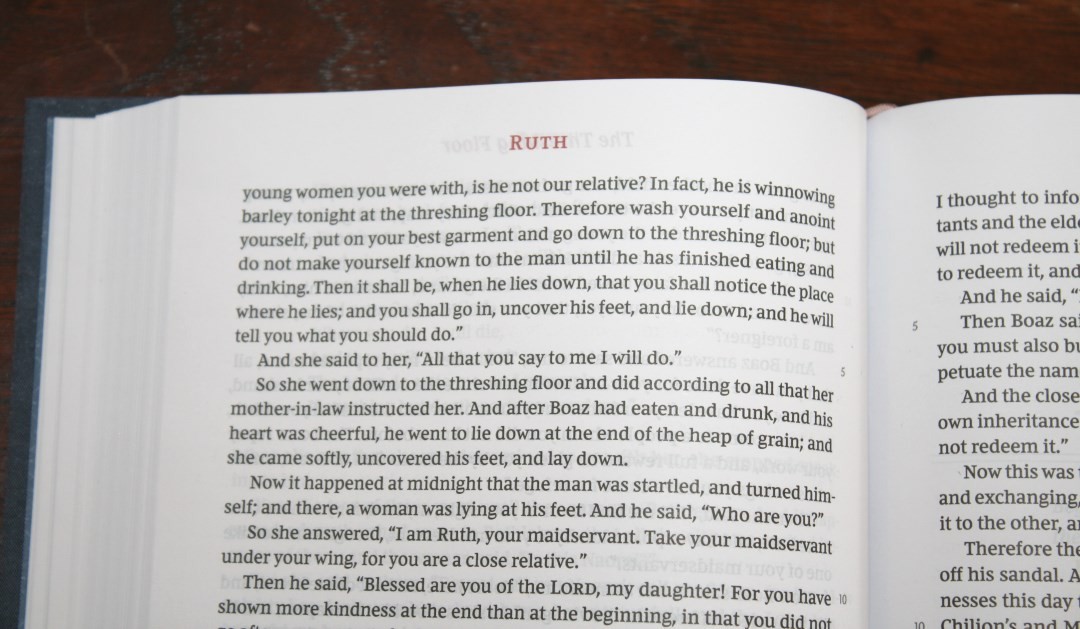
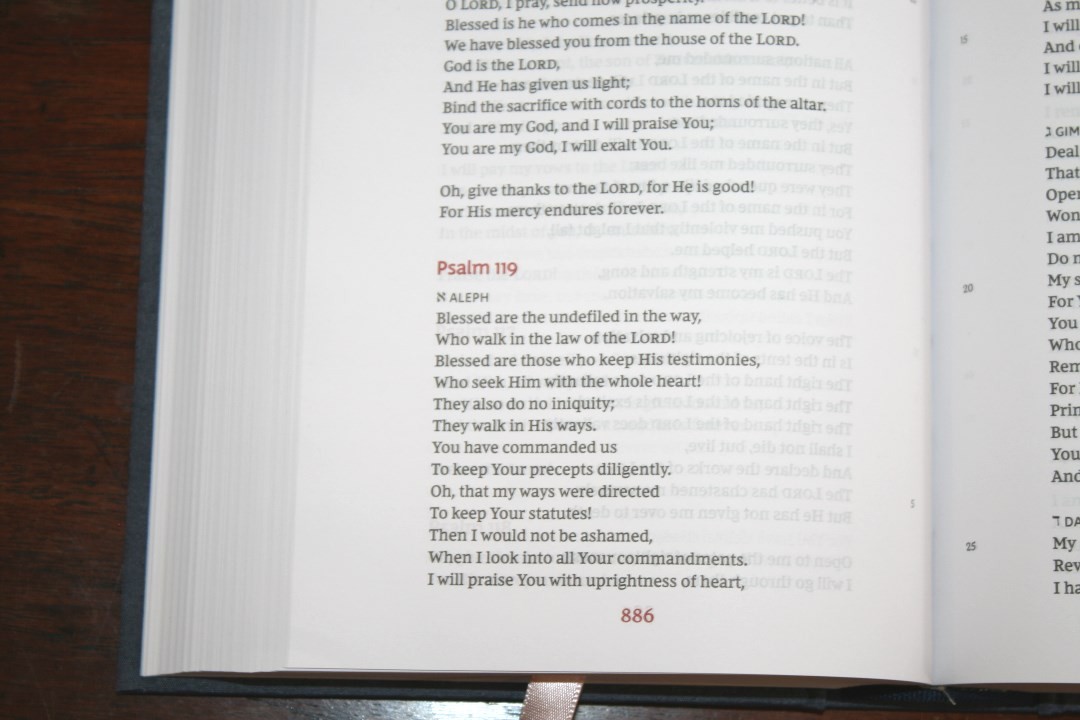
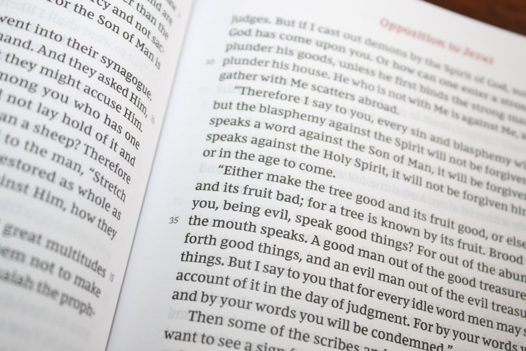
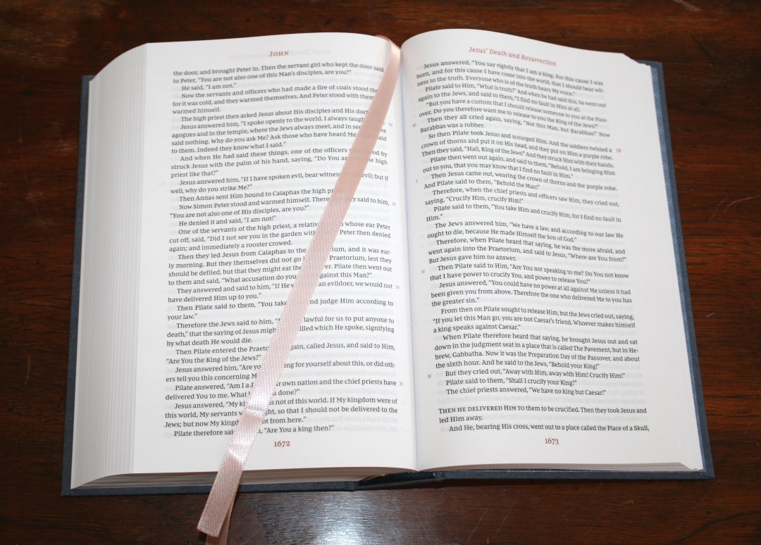
The New King James text is presented in single column paragraph format without chapter numbers or verse numbers, and with limited section headings within the text. It does have some supporting text around the biblical text. Most of this text is printed in red. The header shows the book name on the left page and the major heading of a section is on the right page. Page numbers are centered in the footer. I’d like to see the chapter number in the header so you don’t have a turn a page or two to figure out what chapter you’re in.
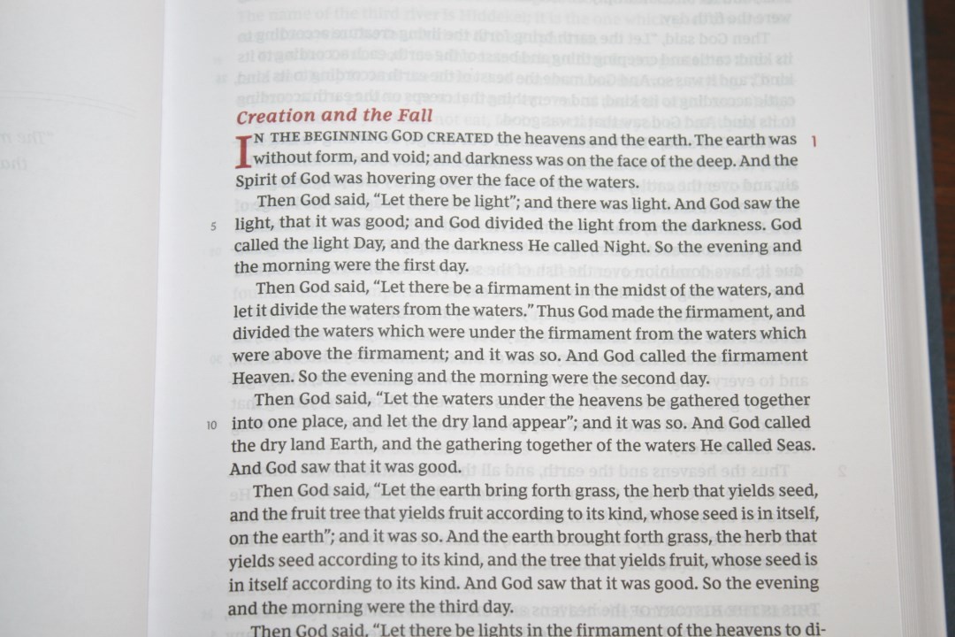
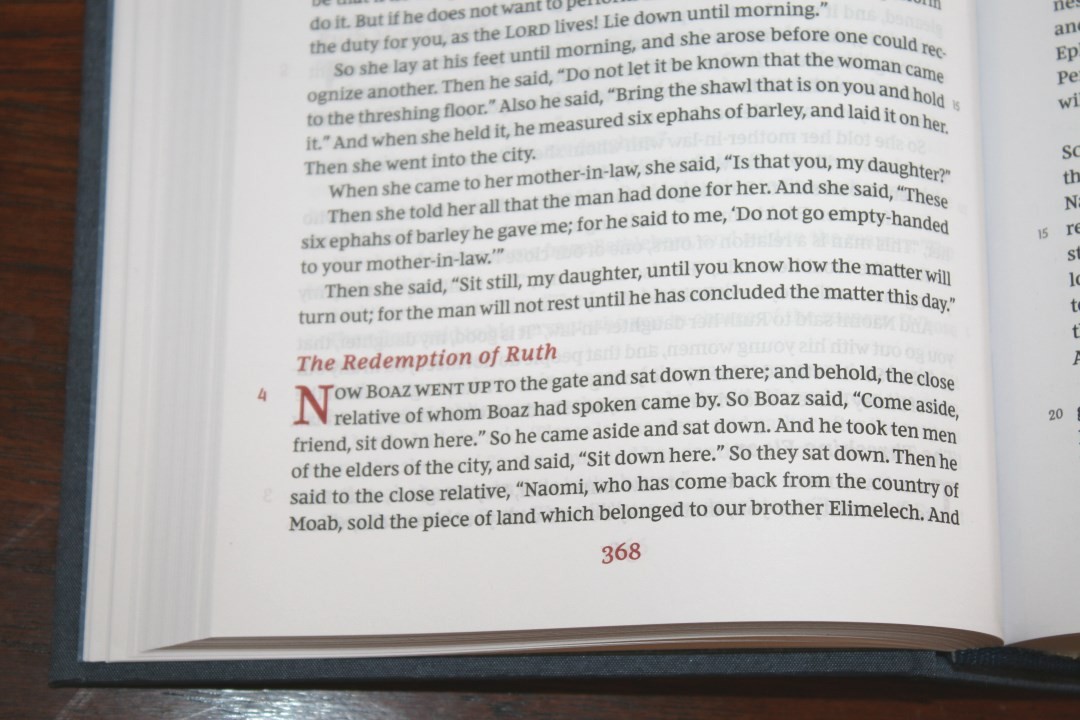
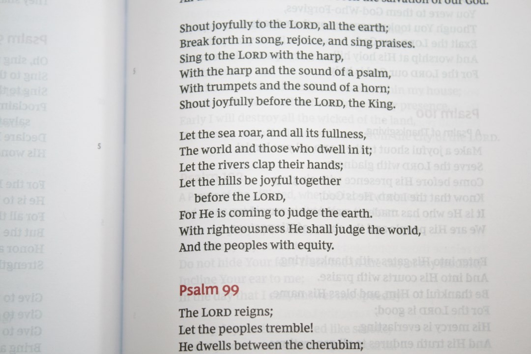
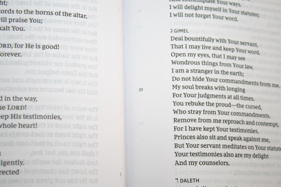
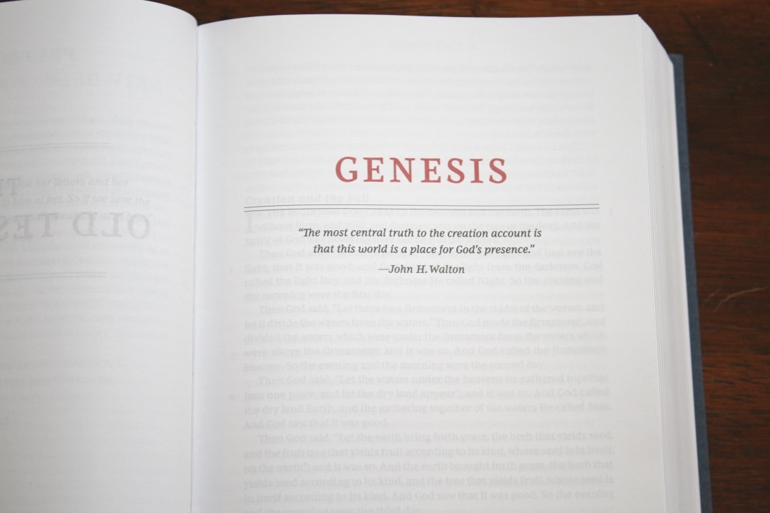
The typeface is the Comfort Print designed by 2K/Denmark. It’s 9-point with 10-point leading. It’s sharp, dark, and a joy to read. It has around 76-78 characters per line with around 14-16 words per line and is printed with line-matching. It does not use italics for supplied words or oblique type for Old Testament quotes. Drop caps for new sections are in bold red and take two lines. This edition does not include translation footnotes. Broken verses, such as Psalms 96:12 and 98:8 are fixed.
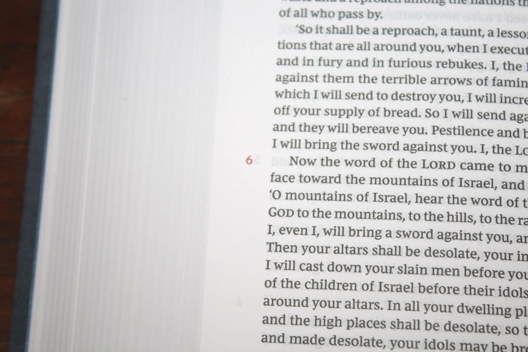
The supporting text I was referring to is chapter and verse numbers in the margins. For every fifth verse there is a small number in the inner margin. For every chapter there is a number in red in the outer margin. These are easy to ignore, but they’re also handy if you want to have an idea of where you’re reading. Some will find these distracting, but those who wonder where they’re reading will appreciate them. They will be able to focus on their reading rather than focus on where they are. This method is also easier to follow along with someone else because you have an idea of where to look for verses. I’d like to see this method used in regular Bible publishing. Instead of placing verse numbers in the text they could all be placed in the margins, reducing the man-made interruptions on God’s Word.
Although it does have section headings there aren’t that many of them. The book of John has 5 while Acts has 3. I don’t mind limited section headings. I like something to break up the major sections so everything doesn’t run together. Even a line would work for me though. I almost never read the heading when reading, so it kind of works like a line to me anyway. They are helpful for searching.
BOOK INTRODUCTIONS
Rather than the typical book introductions that provide information about the book, these introductions are quotes from lots of popular preachers and writers. They include names such as:
- John H. Walton
- Dwight L. Moody
- Matthew Henry
- C.S. Lewis
- Charles S.Swindoll
- A.W. Tozer
- John Wesley
- Charles Haddon Spurgeon
- Oswald Chambers
- N.T. Wright
- Warren W. Wiersbe
- John MacArthur
- F.F. Bruce
- John Bunyan
- R.C Sproul
- Robert H. Mounce
Comparisons
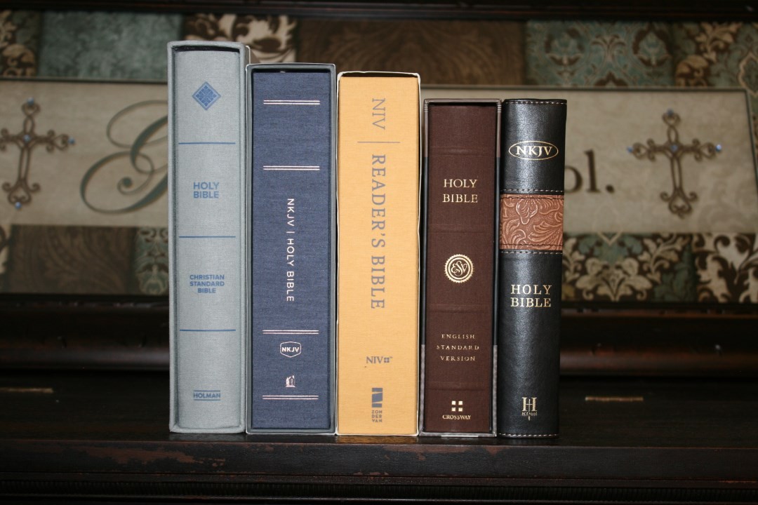
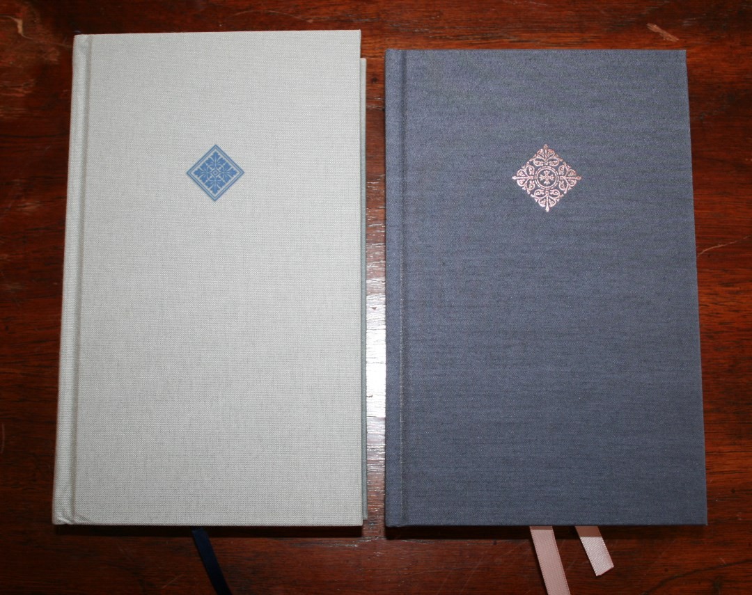
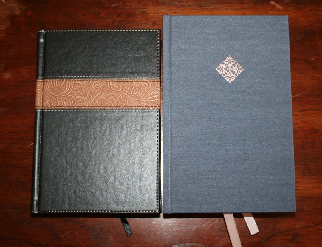
Here’s how the NKJV Deluxe Reader’s Bible looks sitting next to the NIV Reader’s Bible, CSB Reader’s Bible, and ESV Reader’s Bible.
NIV Reader’s Bible
Aside from interior layout differences, the NKJV Reader’s Bible is the NKJV equivalent of the NIV Reader’s Bible. Same size, cover, paper, etc. Of course the NKJV adds a slip cover and better ribbons.
CSB Reader’s Bible
The CSB Reader’s Bible has a similar shape and a slightly larger, but lighter, typeface. It has thinner paper than the NKJV.
ESV Reader’s Bible
The ESV Reader’s Bible is noticeably shorter and thinner, has slightly thinner paper that isn’t as opaque. The typeface is similar.
Holman NKJV Reader’s Bible
The Holman NKJV Reader’s Bible has a smaller footprint but the font is about the same size. The paper is much thinner.
FINAL THOUGHTS ON THE NKJV Deluxe READER’S BIBLE
As expected, it’s made well. It has an excellent cover design that brings the inner margin upward when opened and the paper is the best of the single volume reader’s editions. Thomas Nelson has found a way to be innovative in their design. Rather than just creating what we’ve already seen, just in a different translation, they’ve added a few features that helps the reader without getting in the way. I like this design a lot and I want to see more of it.
I now want to see a similar design for the KJV using the Comfort Print typeface. My personal preference would be to have this exact same layout (paragraph and poetry set to stanzas even in the New Testament) and place every verse number in the margin. This would make a Bible that’s both readable and usable for more than reading.
The NKJV Deluxe Reader’s Bible is a welcome addition to the growing line of reader’s Bibles. I highly recommend it to every fan of the New King James.
_________________________________________________________
This book is available at (includes some affiliate links)
and many local Bible bookstores
_________________________________________________________
Photography by hannah C brown
Thomas Nelson provided this Bible free for review. I was not required to give a positive review, only an honest one. All opinions are my own.














Thanks again, Randy, for another great review. I want add this one to the library.
Just got this one in leathersoft and wow am I impressed. Outstanding bible for $23 from CB. I agree, we need this format for KJV.