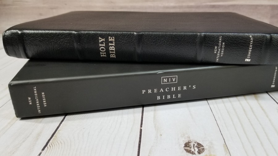
The NIV Preacher’s Premier Collection Bible provides the 2011 edition of the New International Version in a verse-by-verse setting that’s designed for preaching. It’s part of the Premier Collection, so it features a durable goatskin leather cover to ensure it will hold up to lots of use. It follows the Zondervan NASB Preacher’s Bible design in that it matches the first and last words on each page of the NIV Pew and Worship Bible, making it easy for the congregation to follow along on the same page. This is ISBN: 9780310453741, printed in China with materials from around the world.
Zondervan provided this Bible in exchange for an honest review. I was not required to give a positive review, only an honest one. All opinions are my own.
_________________________________________________________
This book is available at (includes some affiliate links)
and many local Bible bookstores
_________________________________________________________
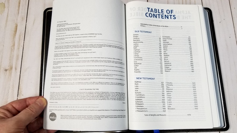
Table of Contents
Video Review
Cover and Binding
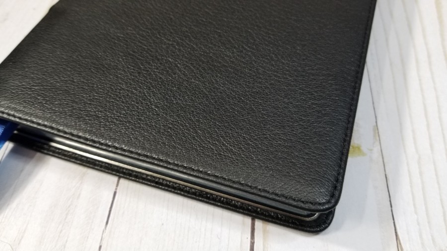
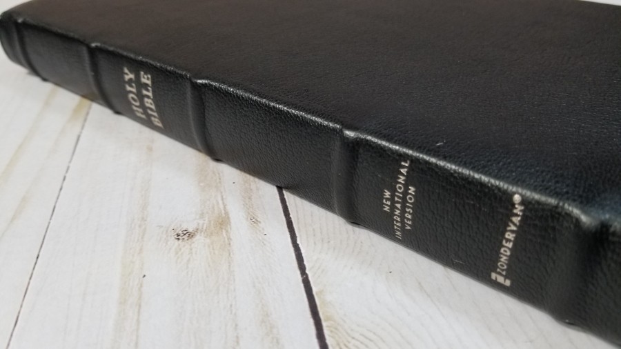
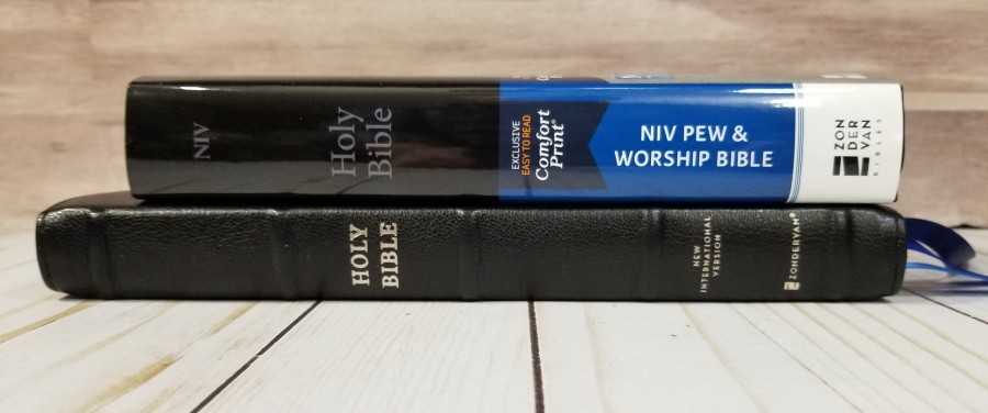
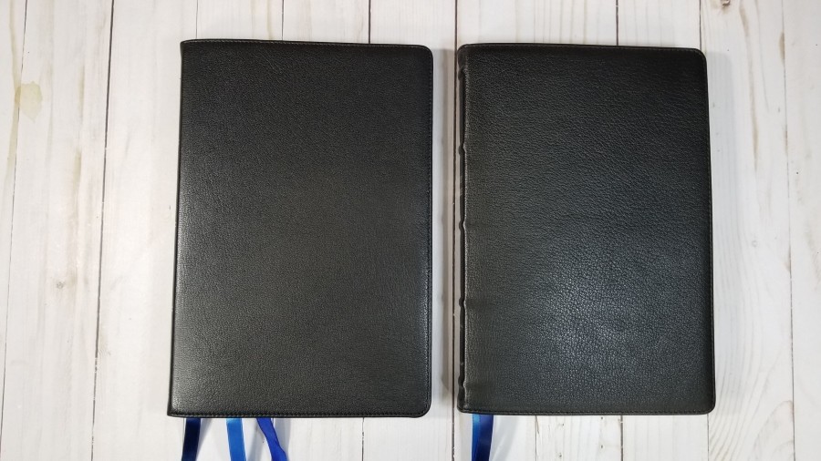
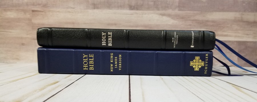
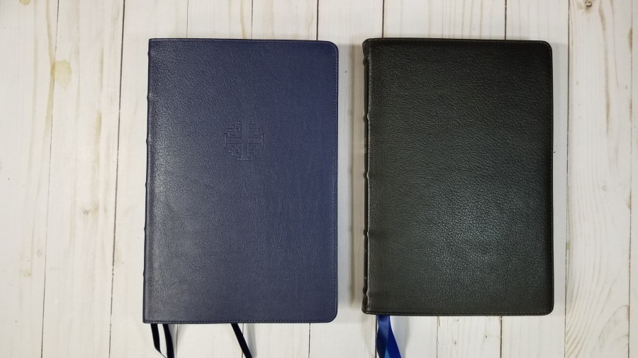
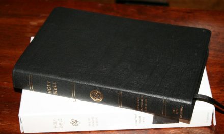
The cover is black goatskin. It’s softer than most goatskin and has a slightly raised grain. It’s stitched around the perimeter. It’s floppy and be rolled like a newspaper. The front has no printing. The spine has HOLY BIBLE, New International Version, and the Zondervan logo printed in silver. It also has 5 raised hubs.
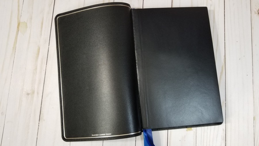
The liner is edge-lined leather. It has a silver gilt-line around the inside perimeter, giving it an elegant design. The tab is a little stiff. This causes and hump in the beginning portion of Genesis and in Revelation. It’s Smyth-sewn and has overcast stitching in the front and the back. This makes the pages lay awkwardly where the stitching is, but it’s normal for overcast stitching and it adds a lot of strength to the binding.
It has 3 satin ribbon markers at 3/8″ each in three different shades of blue. They’re extra-long and are easy to use. It also has black head/tail bands. The overall size is 6 1/2 x 9 7/8 x 1″. It weighs 1 lb, 15.3 oz.
Paper
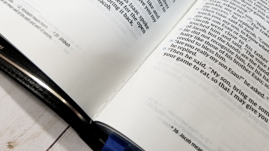
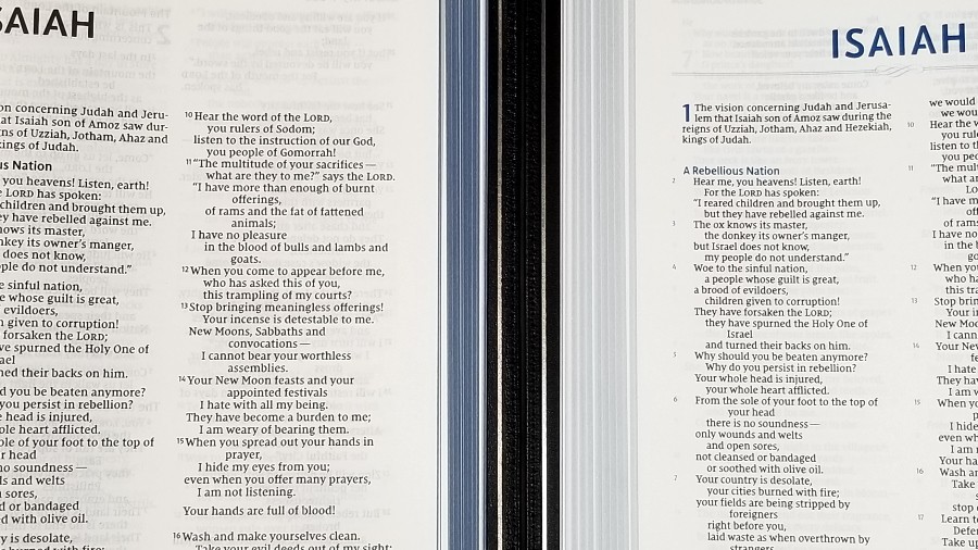
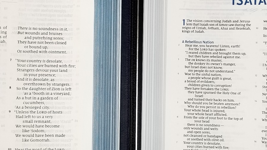
The paper is 36gsm premium European paper. It is off-white in color and highly opaque. It’s smooth to the touch, but it isn’t slippery and it has no glare under direct light. I find it easy to separate the pages to turn. This is excellent paper for reading and preaching. The edges are blue under silver art-gilt.
Typography
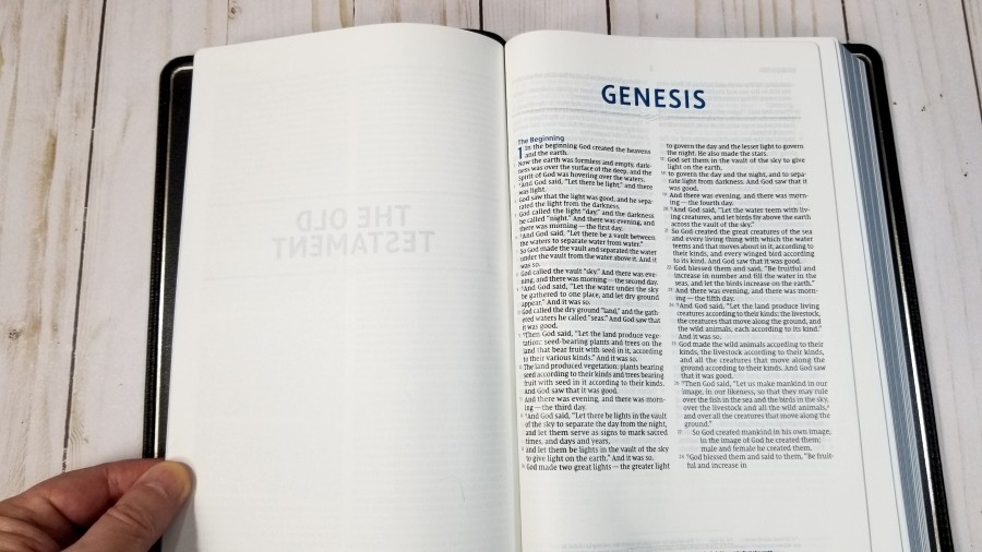
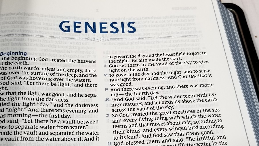
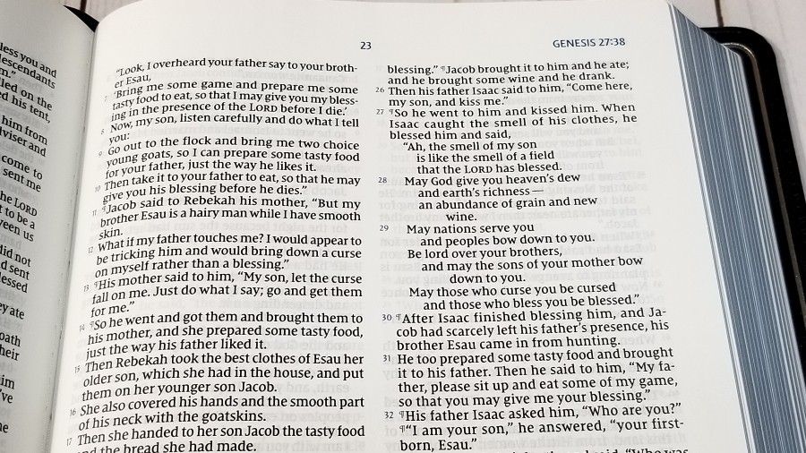
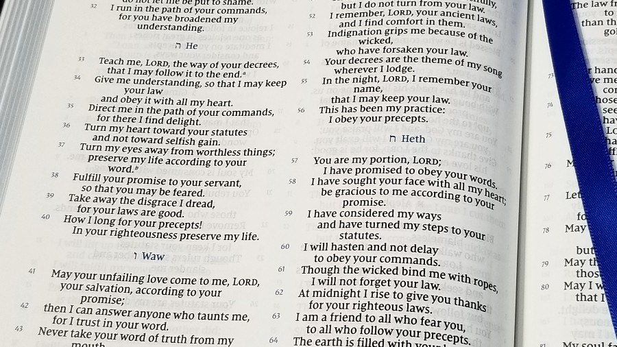
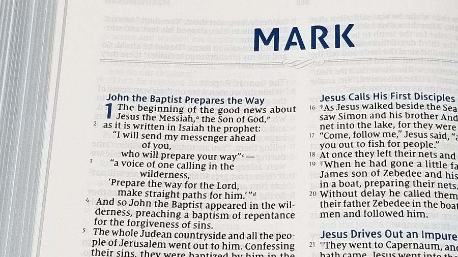
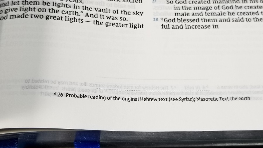
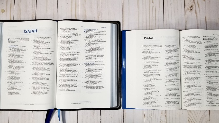
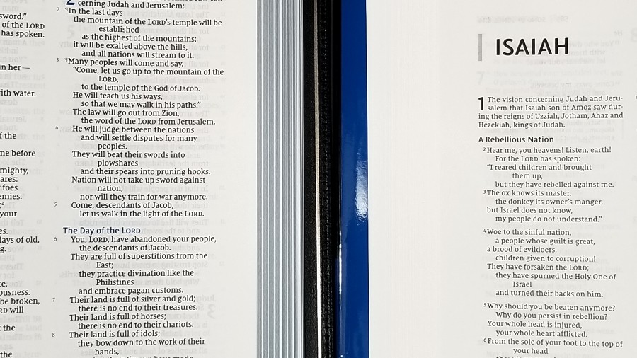
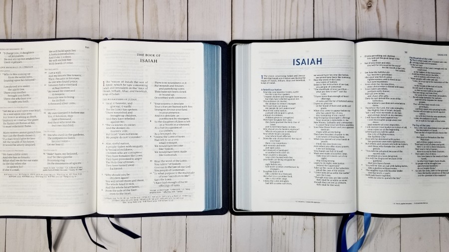
The text is presented in a double-column, verse-by-verse format. Poetry is set to stanzas. The header shows the page number, book name, and chapter number in the outer margin. Page numbers are placed in the center. The footer contains the translation footnotes in the center and is separated from the text with a line. Book names, section headings, chapter numbers, verse numbers, the header text, and the separator line for the footnotes are printed in blue.
The typeface is labeled as 9.5-point. This is the Comfort Print that was designed for the Zondervan NIV by 2K/Denmark. It’s dark and consistent throughout. It actually looks a little smaller than that to my eye. It also doesn’t have a lot of space between the lines. If you need a large print for preaching, then you might have trouble with this font size.
Most lines have 8-10 words. It’s line-matched, meaning the lines on both sides of the page are printed in the same space to improve readability. The verse numbers are placed along the side of the text. The text itself is left-justified. This makes verses extra-easy to find quickly. Letters, lists, and OT quotes in the NT are not marked in any way, so they don’t stand out. Brackets are used to label portions of the text that don’t appear in the Critical text. The text itself is printed in italics.
Many pages have 1-2 inches of space under the text. I think this is the space that’s leftover after making sure the pagination matches the NIV Pew and Worship Bible. This can be used for notes, but it does make the layout look a little awkward.
The NIV footnotes are placed at the bottom of the page. They provide insights into alternate renderings, the meaning of words, weights and measures, manuscript notifications, etc.
Comparisons
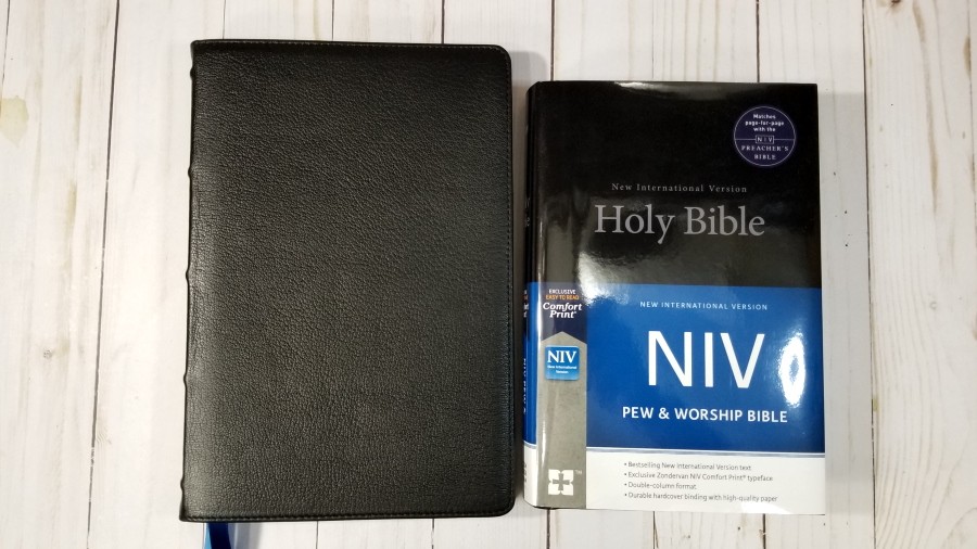
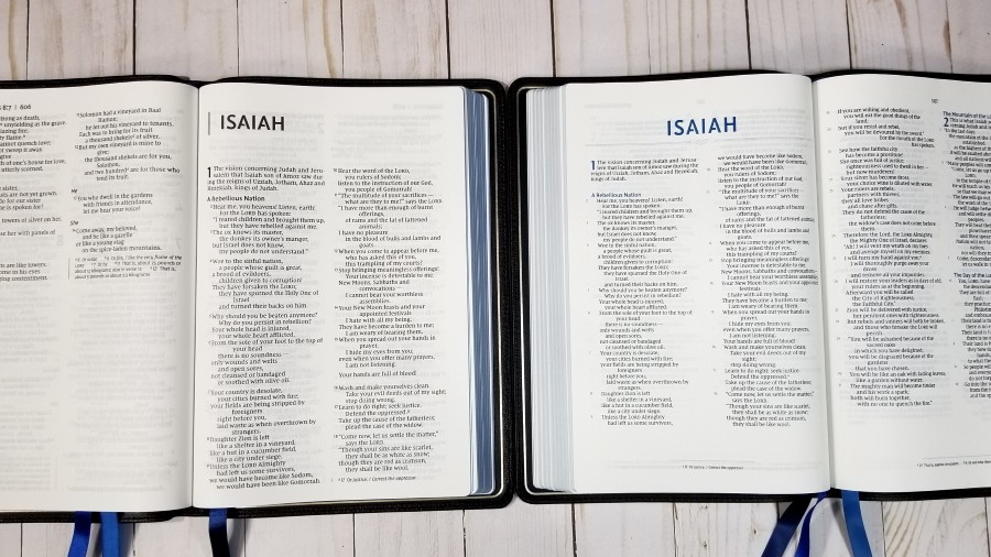
Here’s how the NIV Preacher’s Bible compares with the NIV Pew and Worship Bible, the NIV Large Print Thinline, and the Schuyler Quentel.
NIV Pew and Worship Bible
The NIV Pew and Worship Bible is smaller and has a smaller font. The page numbers match, so preachers can tell the congregation which page to turn to. I like this extra level of convenience. Although the pagination is the same, only the first and last word on each page match. The layout is different. The Preacher’s Bible is verse-by-verse and the NIV Pew and Worship Bible is in paragraph. This makes the fact that the pagination matches even more impressive.
NIV Large Print Thinline Premier Collection
The NIV Large Print Thinline Premier Collection from Zondervan has the same footprint and thickness but the font is a touch larger. It has a paragraph setting and uses the same materials. It does not include a concordance or maps. It’s an excellent choice if you prefer to preach from paragraph editions.
Quentel
This is the NKJV Quentel, which has the same font and design as the NIV Quentel. The Quentel is made in the Netherlands with higher quality materials, so it’s in a higher price range. It has more expensive, but thinner, paper. The font is larger and not as dark. It includes a concordance and maps. The footprint is the same, but it’s slightly thicker.
Conclusion
Zondervan’s NIV Preacher’s Premier Collection Bible is a good Bible for preaching as long as you don’t need a large font. I did find it to be easier to read from behind the pulpit than I expected, but I do think many preachers will want a larger print. The fact that it matches the Pew and Worship Bible is an added bonus. I especially like the paper and print quality. The font design is superb. The goatskin and overcast stitching should make this Bible last for many years of preaching.
Like the other Preaching Bibles from Zondervan and Thomas Nelson, this Bible doesn’t have preacher’s tools and can be used by anyone. What makes it stand out as a Preacher’s Bible is the fact that it’s verse-by-verse and isn’t cluttered with extras. The NIV Preacher’s Bible is a good choice for anyone interested in an NIV in a verse-by-verse layout. If you need a larger print, then I recommend taking a look at the Large Print Thinline.
_________________________________________________________
This book is available at (includes some affiliate links)
and many local Bible bookstores
_________________________________________________________
Zondervan provided this Bible in exchange for an honest review. I was not required to give a positive review, only an honest one. All opinions are my own.










Sigh…why does the NIV always get the best layouts and designs..I wish for a KJV in this format!
I read in another review of this Bible that it is the first NIV printed with a verse-by-verse layout.
As always, great review Randy!
Thanks Keith!
The advent of preachers’ Bibles without cross references or good marginal/translational notes makes me suspect that preachers ain’t what they used to be or should be!
And when are we going to get a Bible with Hebrew or Greek on one side and properly matched and lined up English on the other?
With all the resources now at our command, our Bibles are still poorly designed!!
Would you say preaching from the NIV Clarion is easier than preaching from the NIV Preachers BIble? It seems to me that the 8.75 pt font in the Clarion is comparable to 10pt or 10.5pt Comfort Print. What do you think?
Hi Pastor Dave. Let me test it and see. It will take a few days (the NIV Preacher’s Bible is at the Church at the moment). My initial thoughts are the size isn’t a major difference. The NIV is darker. The Preacher’s Bible being vbv helps find the verses quicker and the Clarion being a wider column is a little more difficult to trace the line as you read. I think the Clarion is easy enough to preach from, but I think the Preacher’s Bible might be easier. I’ll get back with you once I compare them.