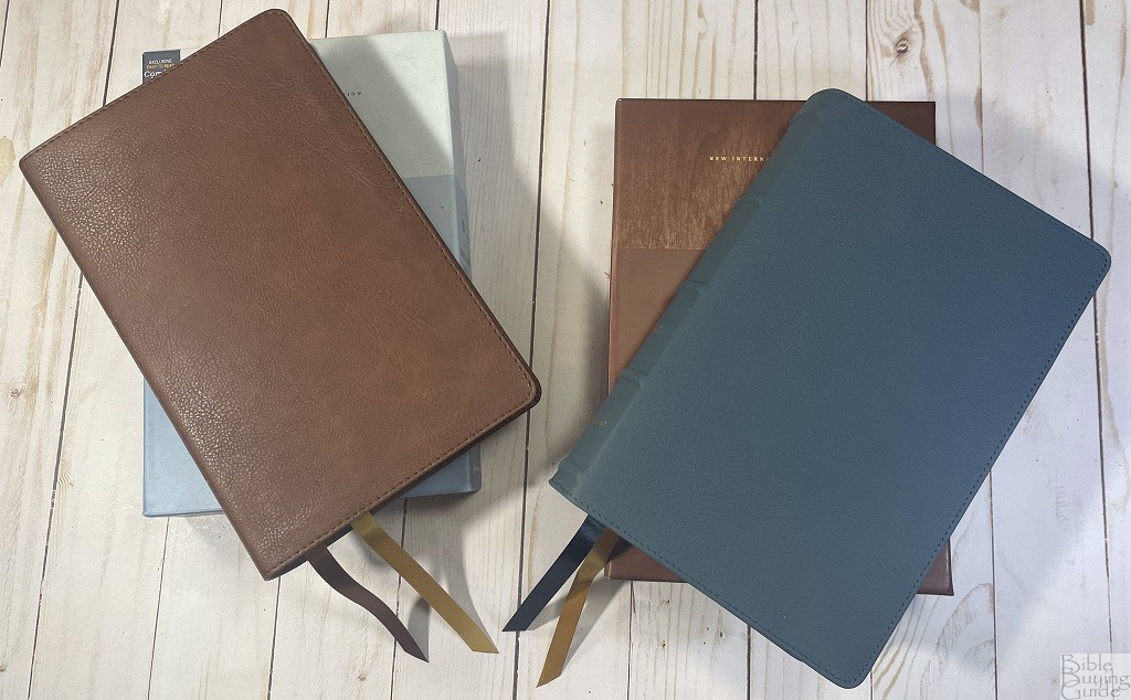
 Today I’m looking at Zondervan’s NIV Heritage Passaggio Setting Bible which combines single and double column text. The name Passaggio indicates this shifting in column numbers since it is a musical term describing a singer changing from one register to another. I will be looking at both the genuine leather and Leathersoft edition.
You can also check out Randy’s reviews of the NASB Heritage Passaggio Bible and the NASB Passaggio Setting Large Print Thinline Bible for more information about the Passagio Bible line.
Blue Genuine Leather Edition, Buffalo ISBN: 9780310456445 Printed in China
Brown Leathersoft Edition ISBN: 9780310456438 Printed in China
Zondervan provided these Bibles in exchange for an honest review. I was not required to give a positive review, only an honest one. All opinions are my own.
_________________________________________________________
These Bibles are available at (includes some affiliate links)
Amazon
(genuine buffalo leather) (leathersoft)
Christianbook (genuine buffalo leather) (leathersoft)
and many local Bible bookstores
_________________________________________________________
Table of Contents
Construction and Materials
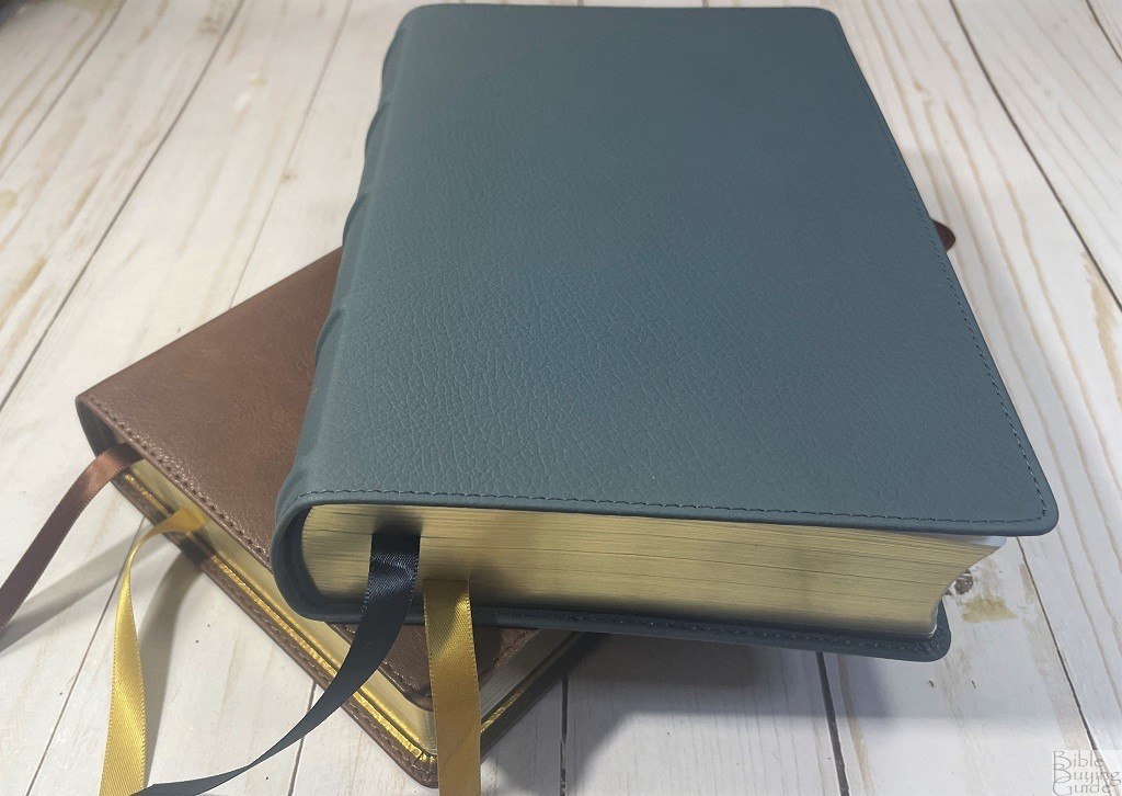
There are many ways the two editions of this Bible are identical and a few ways they are noticeably different. All of the differences are in materials and construction.
NIV Heritage Passaggio Setting Bible -Brown Leathersoft Edition
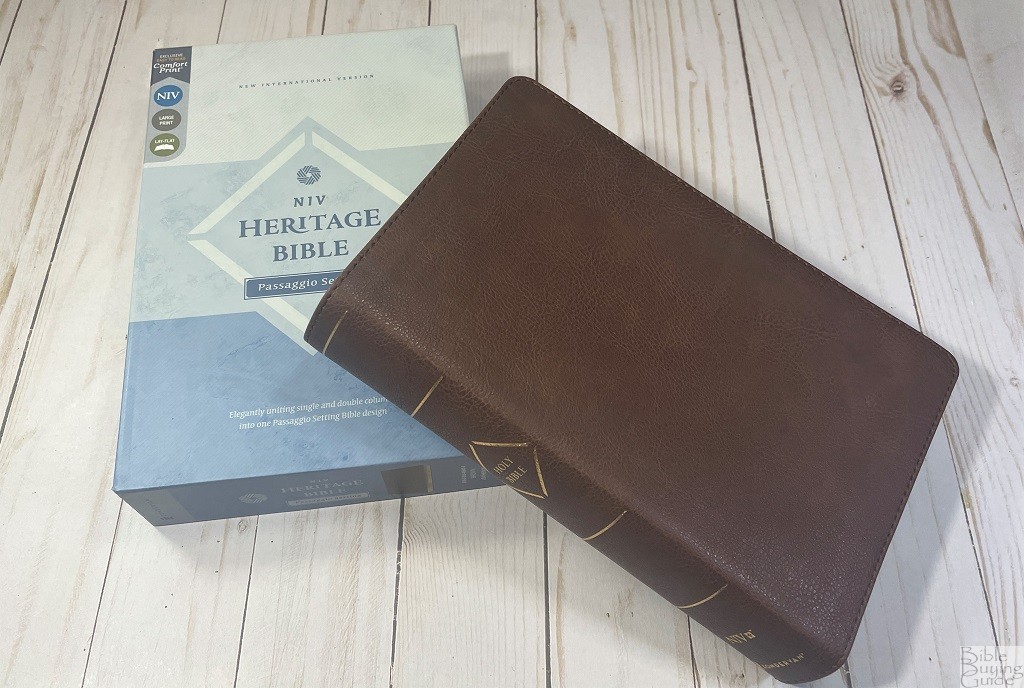
The leathersoft edition is done in brown with gold stamping on the spine. Because the dye isn’t quite a solid color the grain is much easier to see than feel. It weighs about 2 pounds, 3.5 oz, and measures 9″ x 5 7/8″ x 1 1/2″. It comes in a multitone blue clamshell-style box.
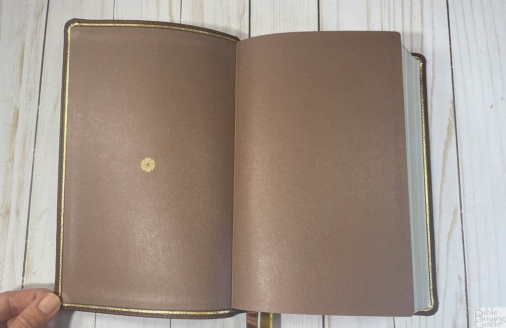
The endpapers are pastedown and made of a really thick paper that is printed brown with one little gold design. It has gold gilt page edges and two double-sided 3/8 inch ribbon markers attached, one gold and one brown.
NIV Heritage Passaggio Setting Bible – Genuine Leather Blue Buffalo
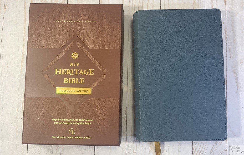
The genuine leather edition is done in blue-dyed water buffalo. It has raised spine hubs and a few words stamped in gold on the spine. Since this is dyed so evenly the grain is easier to feel than see. It weighs approximately 2 pounds, 5.6 oz, and measures 9″ x 5 7/8″ x 1 1/2″. Since it is the same text block the couple extra ounces are from the higher-end binding. It comes with a brown clamshell-style box that also seems higher-end with gold lettering, and some texturing on thicker cardboard.

The endpapers are made of high-quality navy vinyl and are pastedown with a small amount of gold stamping.
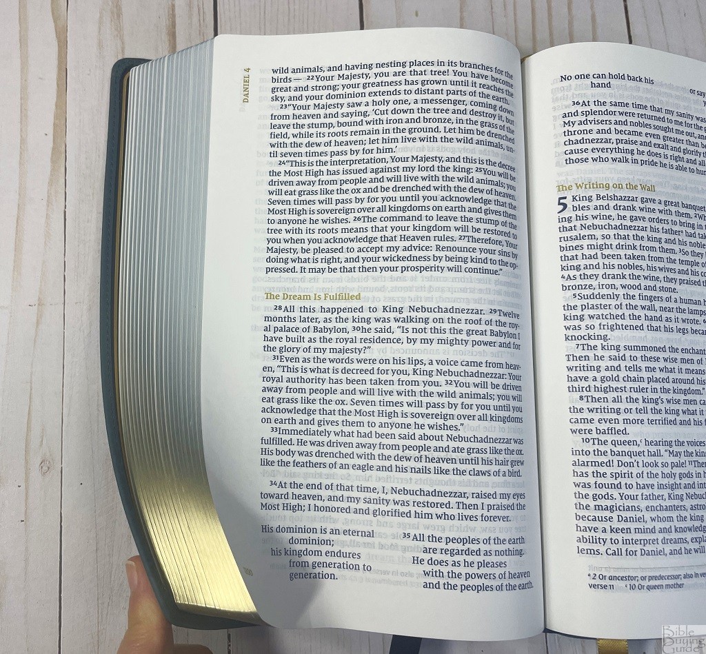
It has art-gilt page edges with blue under gold. The two attached markers are also double-sided 3/8″ ribbons, but in this Bible one is gold and the other is navy.
Construction features alike in both editions

Both editions are made with this beautiful off-white 36 GSM premium European Bible paper. This paper is smooth, easy to turn, and some of the nicest paper I’ve seen for a reading Bible.

And both Bibles are Smyth-sewn.
Typography and Layout
The text block in both editions is identical and the layout was designed by 2K/Denmark.
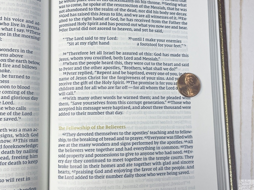
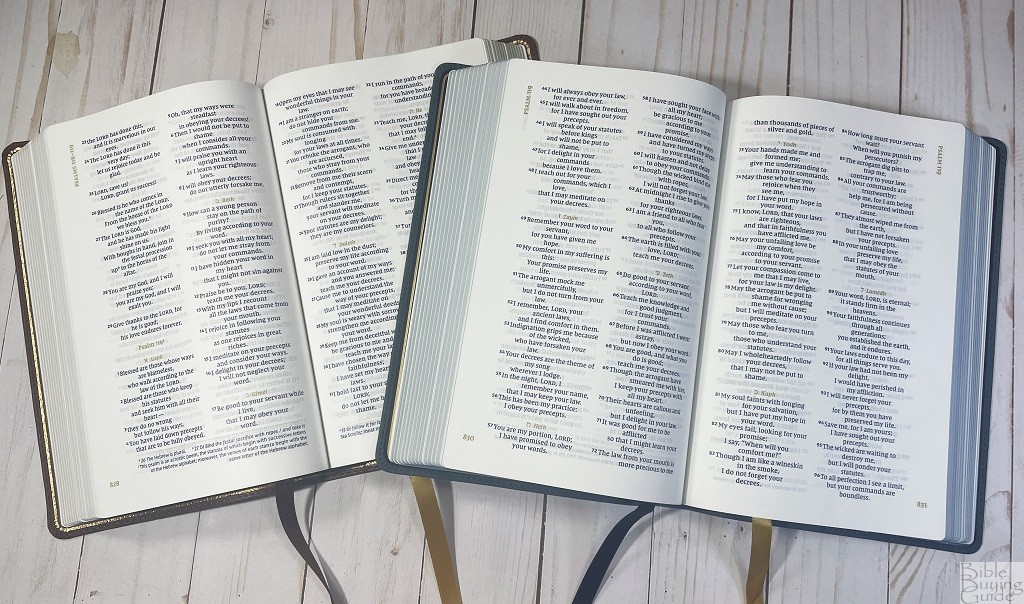
It has a 10 point NIV Comfort Print typeface with a little over 5 lines of text and 5 spaces between fitting in the height of a penny.
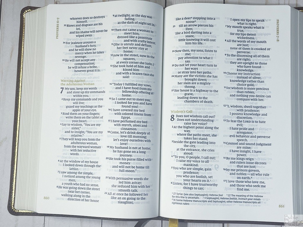
The text is a dark navy with a golden color for the section headings, page numbers, and guide chapters. Sections of the Bible that are all poetry look like a standard two-column Bible and sections that are are all prose look like a standard one-column Bible.
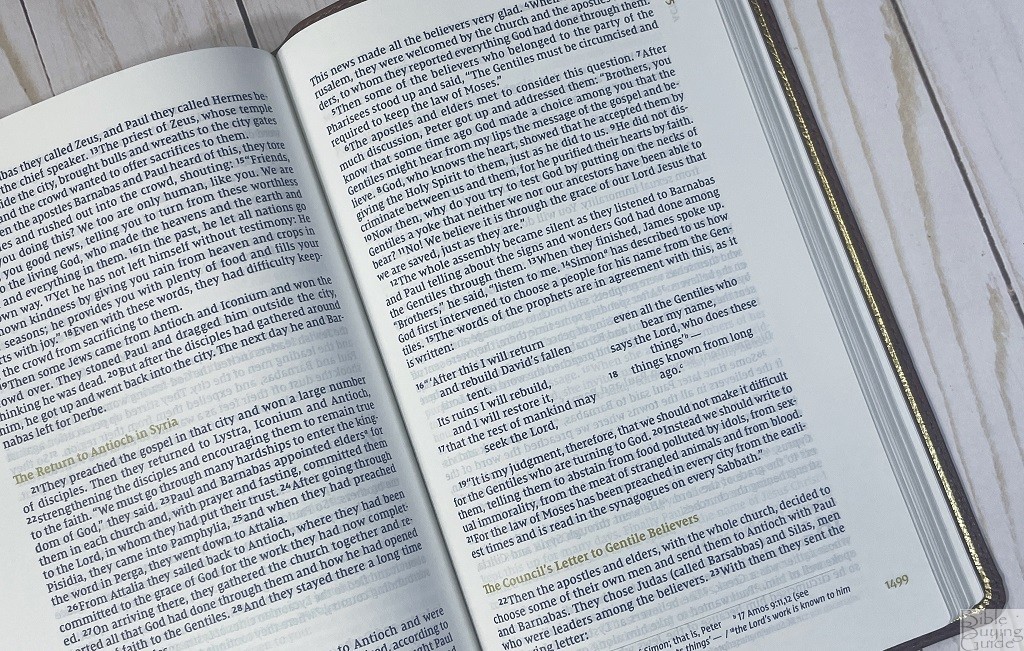
Sections that transition back and forth between poetry and prose or that contain quotes make the Passaggio setting much more noticeable. The switching back and forth looked a little odd to me at first but I quickly got used to it. The different column numbers does definitely draw my attention to the quotes and the transitions in writing form since it’s less what I’m used to in a Bible. It also requires less space for the poetry allowing you to fit a slightly larger text in the same size Bible.
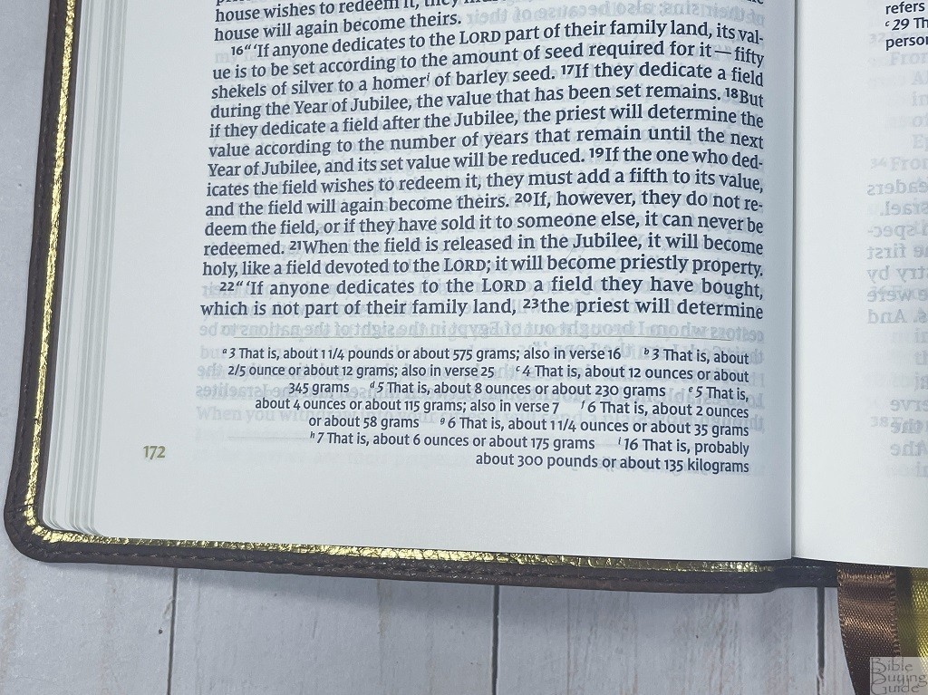
Footnotes are at the bottom of the pages separated from the text with a thin golden line. They are printed in a slightly smaller sans serif font. The footnotes are translation notes that include alternate translations, original words, and explanations of weights, measures, and a few other things.
Other Features
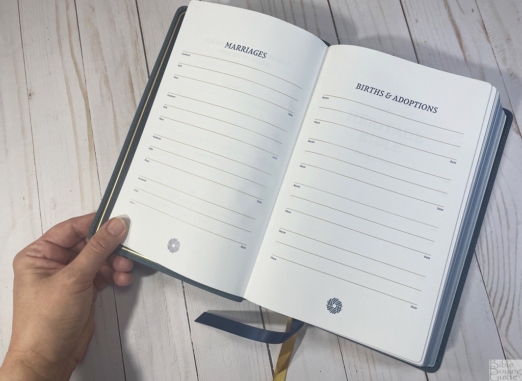
The front of the Bible has a presentation page, marriages page, births & adoption page, and a deaths page all printed on thicker paper like what is typically used for maps.
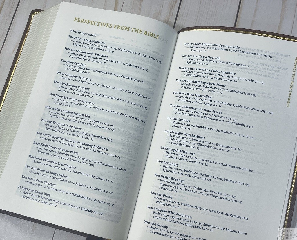
There are several useful lists in the back of the Bible. They are
- Table of Weights and Measures
- Miracles of Jesus
- Parables of Jesus
- Perspectives From the Bible
- Prayers of the Bible
- Promises From the Bible
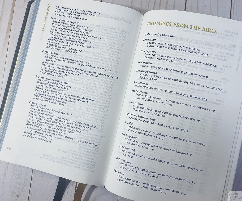
Perspectives or Promises would probably be my favorite of these, mostly because they are included in fewer Bibles.

The Reading Plan section has boxes for you to check off as you read each chapter of the Bible. It also has suggestions for reading the entire Bible in 1 or 2 years and a few books to start with if you are new to the Bible.
Maps
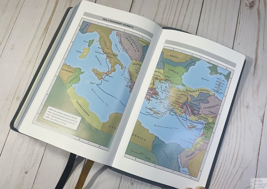
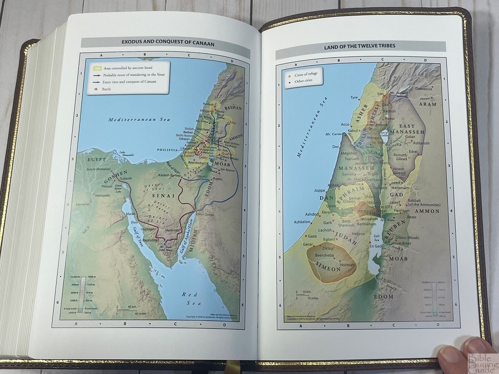
There are 7 full-color maps on 8 semi-glossy pages in the back. They are well labeled and the text on them is easy to read. There isn’t any sort of index so you’ll have to spend a little time hunting for places if you don’t know much about the geography of Israel.
Maps include:
- World of the Patriarchs
- Exodus and Conquest of Canaan
- Land of the Twelve Tribes
- Kingdom of David and Solomon
- Jesus’ Ministry
- Paul’s Missionary Journeys
- Jerusalem in the Time of Jesus
Comparison to the Premier Collection NIV Heritage Bible
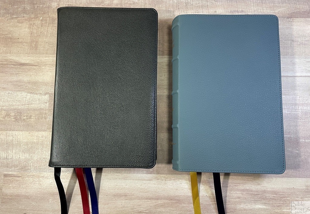
The Premier Collection NIV Heritage Bible seemed the most obvious choice for comparison, especially with the Blue Buffalo NIV Passaggio Edition.
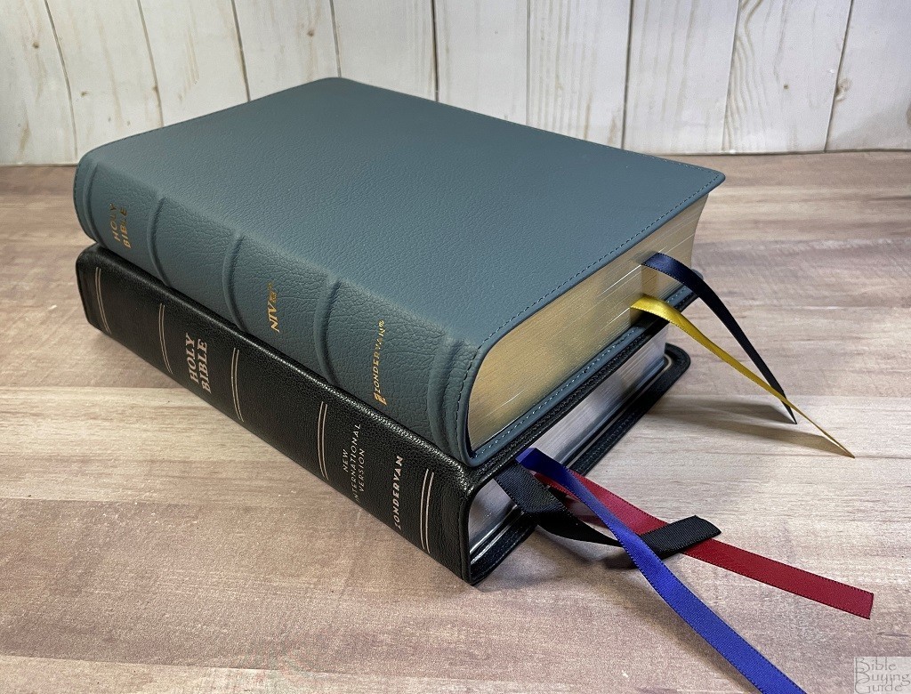
The Premier Collection Bible is just slightly larger at all three measurements by a tenth to a quarter of an inch and weighs a couple of ounces more. It has three ribbons instead of two.
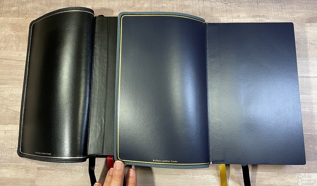
The goatskin on the Premier collection with its leather liner is much more flexible and lays flat at the front much easier. The hump from the edge lining shows less with the Buffalo leather and vinyl liner of the Passaggio.
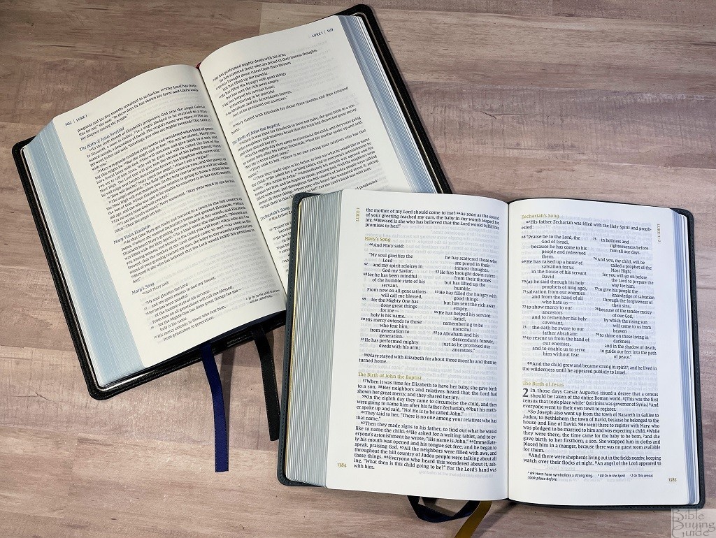 The paper in both is premium 36 gsm European paper. The color of the paper is almost identical. We believe any tiny variations in color or texture between the two are only because they are from different lots.
I try hard to make my pictures as accurate to the Bible in person as possible. Unfortunately, bright lights magnify showthrough. Phone cameras auto settings can skew colors slightly warmer or cooler than they appear in real life and are hard to turn off or adjust.
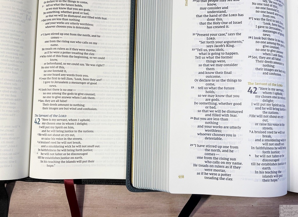
The text is about a point and a half larger in the Passagio. The Passaggio is blue text with golden highlights while the Premier collection is black text with blue highlights. The ink darkness is consistent in both Bibles.
Final Thoughts on the NIV Heritage Passaggio Setting Bible

With excellent paper, and a good balance between font size and Bible size either of the NIV Heritage Passagio Setting Bibles makes a nice choice as a reading Bible you can take with you.
_________________________________________________________
These Bibles are available at (includes some affiliate links)
Amazon
(genuine buffalo leather) (leathersoft)
Christianbook (genuine buffalo leather) (leathersoft)
and many local Bible bookstores
_________________________________________________________
Photography by Lucinda Brown
Zondervan provided these Bibles in exchange for an honest review. I was not required to give a positive review, only an honest one. All opinions are my own.




I really like the look of this edition, but when i tried it in person, it seemed like the text was almost bold. Compared to the original heritage premier edition, the boldness made the show through much harder to read. I think you can see a little of that in your comparison pictures.
I do wonder if I just got a bad one and if a different one would be better.
Hi Dave. It’s possible, but I think the boldness would vary a lot from one section to another. If it seems consistent, then I think it’s the normal boldness and a different one would be the same. THis one does have a bold font.